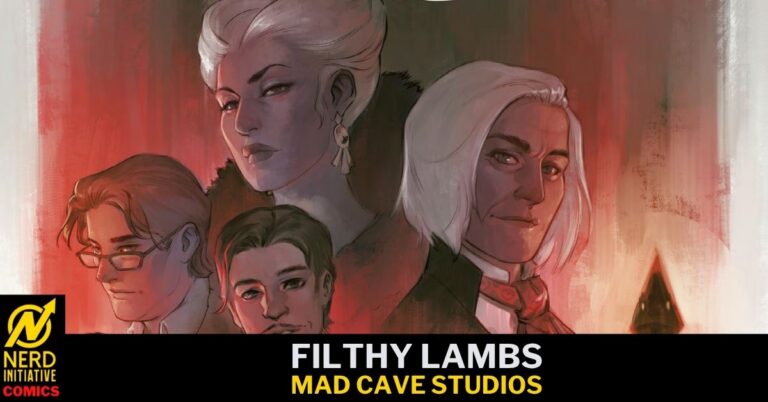
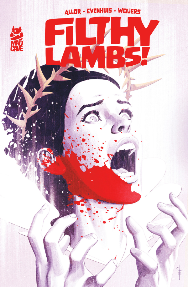
Filthy Lambs #1 is a dark, gothic horror story that drops readers into a world of old money, ritual sacrifice and a family held together by coagulated blood and sinew. Pallie Paul Allor, Chris Evenhuis, and Sjan Weijers create a debut that feels lavish and dangerous from the first page.
There are shades of Ready or Not and The Fall of the House of Usher, but Filthy Lambs does have its own identity, leaning hard into the melodrama and cruelty while giving each family member enough charm and depth to make them oddly likable.
Writing
Filthy Lambs is about family – specifically, the kind of family built on obligation, secrets, and the weight of inherited expectations. Allor introduces the central players with the care, style and proof of life that we’ve come to expect, giving every exchange an edge that makes even the quieter moments feel loaded.
The dialogue has a strong sense of character, balancing dry humor with a constant sense of unease. Nobody in this book feels entirely safe, honest, or free from the world they were born into. That tension is what makes the issue work so well. The horror is not simply something that arrives from outside the home; it IS the home and its inhabitants.
Like Ready or Not, the story illustrates how much menace can hide behind manners, tradition, and a perfectly composed family gathering. It also carries some closed-circle dread, where the rules of the world are not fully explained, but the consequences of breaking them are clear enough.
Without spoiling anything, Allor somehow managed to take something that felt familiar and bend it out of shape to make it wholly original and fresh. When the story begins to reveal itself, I caught myself saying “Whoa!” out loud and had to explain to my wife that a comic book genuinely shocked me. Honesty is virtuous, though it can be embarrassing.
Art
Chris Evenhuis brings a bold, theatrical style to Filthy Lambs. The character designs are expressive, the settings are richly detailed, and the visual storytelling makes the mansion feel like a character all its own. Every hallway, staircase, and shadowed room carries a sense of history.
Sjan Weijers’ colors are equally important to the book’s identity. Purples, pinks, sickly greens, and deep blacks create a palette that feels both luxurious and poisonous. The color work helps the book shift effortlessly between dark comedy, gothic melodrama, and full-on horror.
Evenhuis also knows when to let the art take center stage. The violent moments have impact because the issue establishes the strange, refined world around them first.
Chris Evenhuis, Mad Cave Studios
Final Thoughts
Filthy Lambs #1 is a stylish, sinister debut that blends family drama with gothic horror in a way that feels fresh and confident. Readers who enjoyed Ready or Not’s vicious take on wealthy family traditions or They Will Kill You’s locked-in horror energy should find plenty to love here.
Mad Cave has another strong horror book on its hands, one that proves that monsters are often most interesting when they are part of the family.
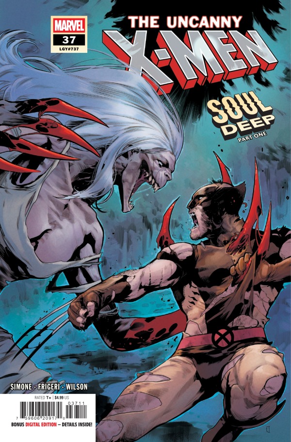
If it’s not one thing, it’s another for our favorite mutant couple, Rogue and Gambit. After Rogue valiantly ripped the Left Eye of Agamotto from Gambit’s chest, his problems were seemingly over. Now it was just a time for healing. However, who actually gets to relax in the world of the X-Men? No one. An old foe comes back and she has her eyes set on Rogue. The Hag, Sarah Gaunt, makes her presence known with her bloodthirsty chaos alongside her new group of followers she calls her children.
Cover art by Luciano Vecchio and Matthew Wilson. Published by Marvel Comics
If there was ever the time to bring Sarah Gaunt back, it’s during the Halloween season! Gaunt is spiteful, angry, and downright terrifying, so I’m thrilled she’s back! In this issue, however, Gaunt shows a side of her we’ve never seen before. She shows understanding. Granted, she has her revenge planned and has given a timeline, but I was very surprised at her actions. I’m very excited to see what she does next and how she plans to execute her plan of chaos.
What I loved about this issue was how we were able to see the team come together for the betterment of Rogue and Gambit. Time and time again, the X-Men prove just how true the phrase “X means family” truly is. They put their lives on the line for each other no matter what and in this issue, that sentiment shines brightly.
The Art
Oh, the artwork! Juan Frigeri, Matthew Wilson, and Clayton Cowles came to slay and that’s exactly what they did. Frigeri perfectly captures the haunting energy of Sarah Gaunt in her mannerisms and her presence. There are some panels that’ll send a chill down your spine thanks to the excellent line work Frigeri brings to the comic. Matthew Wilson leans heavily into the darker tones, bringing the spooky feelings to an all-time high. When powersets come into the story, the bold and striking colors light up the page and make those panels a masterpiece. Clayton Cowles perfectly finds the essence of what makes Sarah Gaunt so terrifying and portrays it perfectly in her dialogue.
Together, the artists captured the many different tones of the story and brought them in to the spotlight. While the horror aspects were aplenty, there were also tones of love and adoration from Rogue and Gambit that are center stage for the married mutants. You can feel the love and desperation Rogue has for Gambit and her need for him to get better. This was all beautifully handled by the artists and they deserve their flowers!
Final Thoughts
The Uncanny X-Men #37 is a smorgasbord of emotion and it’s all handled perfectly by Gail Simone, Juan Frigeri, Matthew Wilson, and Clayton Cowles! The heightened emotions are present throughout the read whether it’s love, fear, anger, or outright respect for a fellow X-Man.
This review was written by Megan from the Vigilante Vibes Podcast! If you liked my review, be sure to check out my other reviews! Let me know what you think of The Uncanny X-Men #37, or tell me what comics you’d recommend me trying out! Find me on my socials, and check out my Marvel podcast, Vigilante Vibes, by clicking here!
A 90s comedy sitcom made it huge, catapulting unfamiliar faces into stardom. Decades later one of them is dead, and the others seem to be hiding something.
Creative Team
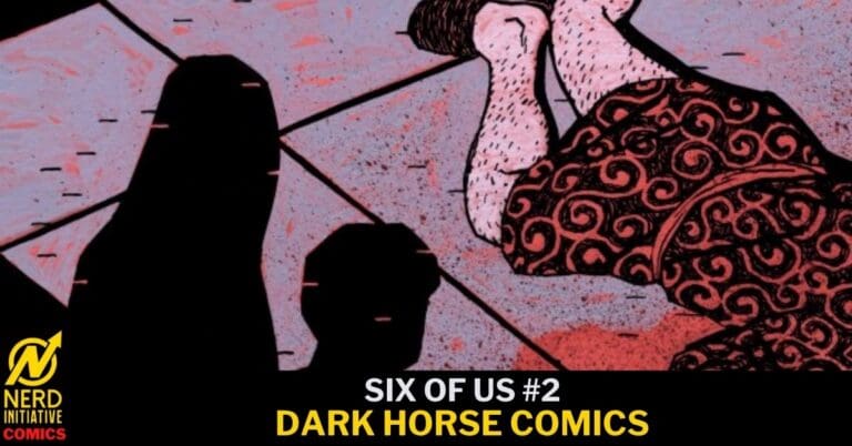
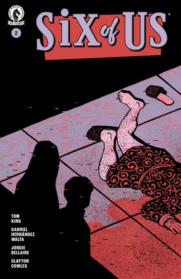
Six of Us #2 Cover. Image by Dark Horse Comics.
Script by: Tom King;
Art by: Gabriel Hernandez Walta;
Colors by: Jordie Bellaire;
Letters by: Clayton Cowles;
Cover A by: Gabriel Hernandez Walta;
Cover B by: Jill Thompson;
Cover C by: Joe Quinones.
SIX OF US created by Tom King & Gabriel Hernandez Walta.
As this eerily somewhat familiar story continues, it just gets more messed up. In the best way possible. Our narrator continues to be our dead body from issue 1. With each flashback we get to know the whole cast of Six Of Us better. Not every scene has a laugh track, but the ones that do almost feel darker than the ones that don’t.
As another body drops this one seems less mysterious and more insanely comical. However, why and what it means is still unclear. It’s also still unclear what exactly happened to our narrator.
The Art
Six Of Us is a dark comedy parodying one of the (if not THE) most popular sitcoms to have ever existed. Could there be a bigger sitcom out there? Even if you’ve somehow managed to avoid an episode of the show FRIENDS for the last 32 years (Wow… that just made my back hurt), you’ve probably still got an idea of who the characters were, and what the show was about. So this story being a dark murder mystery wrapped in a laugh track of nostalgia, needs just the right art.
Each page feels heavy even when the “scene” is light. The art beautifully nails the similarities the audience is most likely supposed to be picking up, while still making sure we know this story is NOT just a feel good comedy. The emotions are also perfectly portrayed on each characters’ face. Whether a shocking moment is revealed while boxing, or you show up to check on a friend and are met with a surprise. The reactions are hilarious and spot on. All while also being down right creepy at times. I’m loving it.
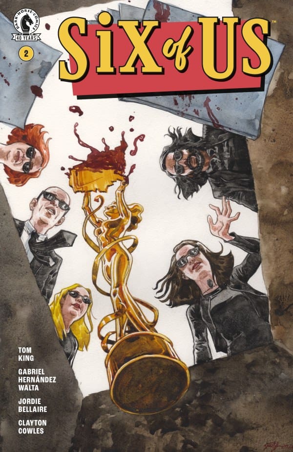
SIX OF US #2 Variant Cover. Image by Dark Horse Comics.
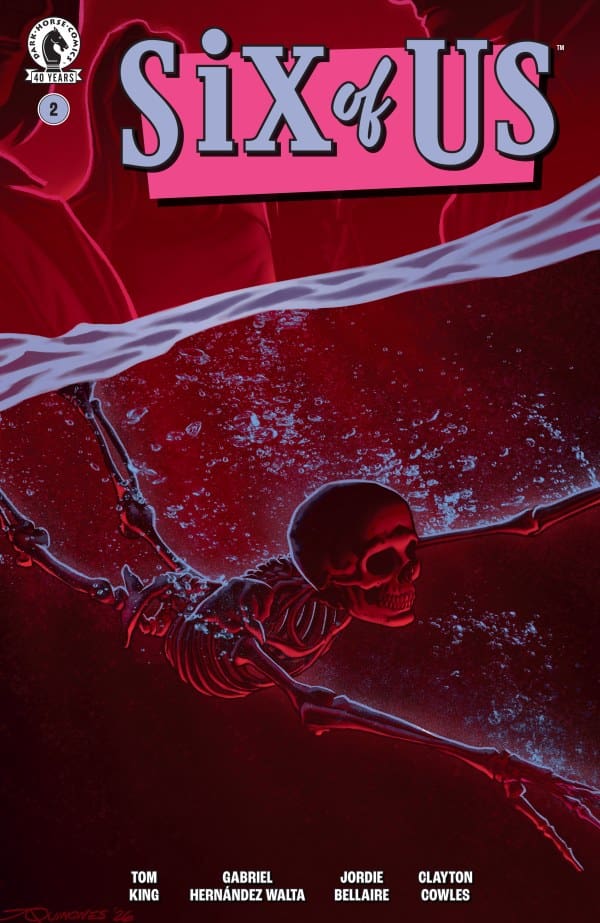
SIX OF US #2 Variant Cover. Image by Dark Horse Comics.
Final Thoughts
I distinctly remember going to middle school and talking all about how Ross and Rachel kissed in Central Perk, the other night on FRIENDS. Fast forward 3 decades and I’m sucked into this comic about 6 stars from a 90s sitcom who seem to find themselves in some very disturbing situations, and I’m loving it. Whether you love FRIENDS, or have a list of why Ross was the worst boyfriend ever (I have that list too), or you’ve never even given the show a chance, this comic is for you! It’s got a serious mystery building, some dark humor on top of very light humor, and some beautiful art. We’re only 2 issues in, and there’s no time like the present, as no one is promised tomorrow. Just ask the narrator.
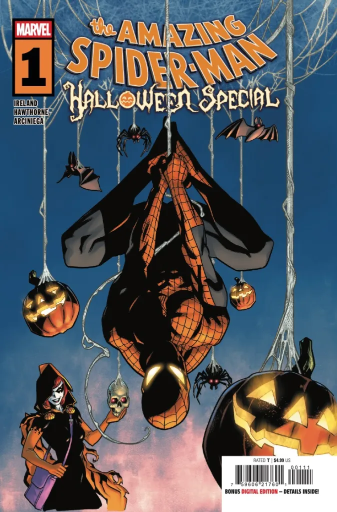
SPOOKY SEASON IS UPON US and swinging in this week is The Amazing Spider-Man Halloween Special #1! Of course, Marvel’s most famous webslinger is the perfect candidate for his own special of petrifying proportions (I’m channeling Stan Lee this morning!). The special hits on a variety of levels, delivering a fun and action packed foray into the Spideyverse. The art is colorful and creative. The writing fun, exciting, and engaging. While The Amazing Spider-Man Halloween Special #1 doesn’t add anything new, it provides a snack-sized one shot into the Spider-Man universe.
Spider-Man loves Halloween. What other holiday can he hide in plain sight, camouflaged by leagues of pint-sized and adult-sized Spider-People? Things are going wonderfully. The candy is flowing, the children are laughing, and all is going as it should. That is, of course, until Hallow’s Eve arrives to disrupt the festivities. This webslinging one-shot provides more than enough action and spectacle for any fan of Spidey and anyone looking to dive right in and swing along.
The Amazing Spider-Man Halloween Special. Courtesy of Marvel Comics
Creative Team:
Writer: Justina Ireland Penciler: Mike Hawthorne Inker: Wade Von Grawbadger Colorist: Erick Arciniega Letterer: VC’s Joe Caramagna
The Amazing Spider-Man Halloween Speciail. Courtesy of Marvel Comics.
Writing:
What fun it must be to be granted a character like Spider-Man to write an all but blank canvas in which to paint. Justina Ireland clearly took this opportunity and made the most of it as her story is exceptionally written and self contained. The Halloween Special #1 adds nothing new to the Spideyverse, outside of the establishment of Halloween as Spidey’s favorite holiday, but it didn’t need to. The goal, of course, was to provide a fun self contained issue that works and Ireland nailed the assignment.
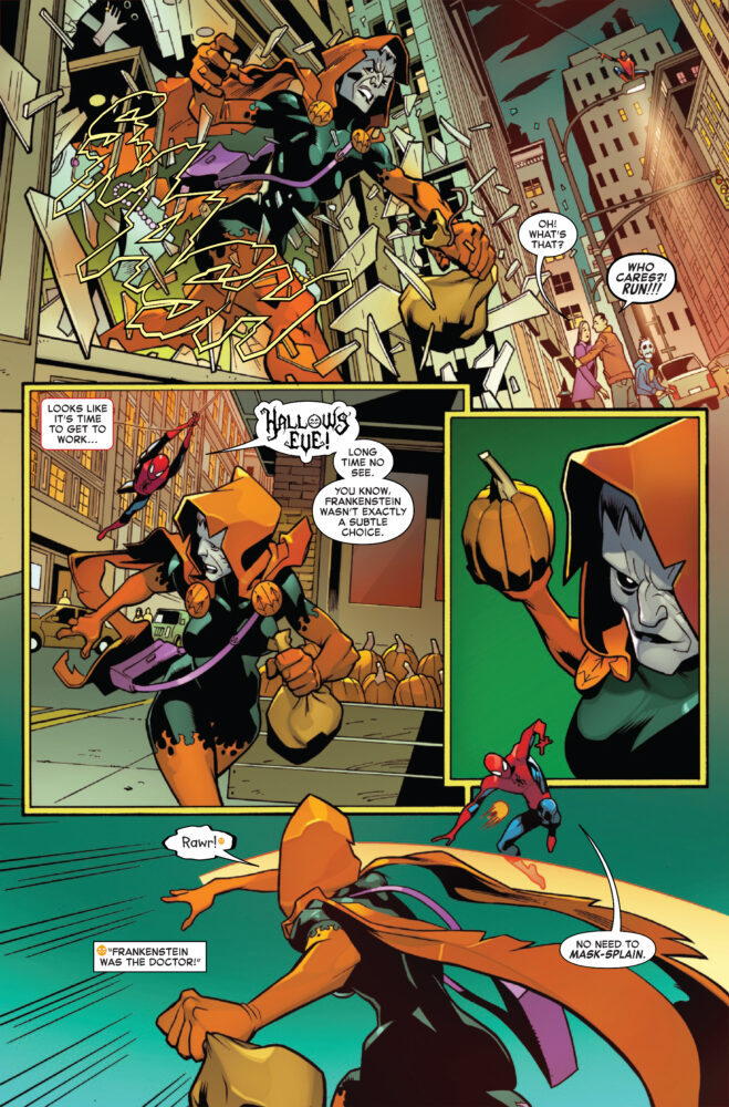
The Halloween Special #1‘s choice of villain is where it shines in particular. Hallow’s Eve is, very obviously, the perfect “villain” for this type of story. Her ability to utilize different masks is the perfect theme for a holiday predicated on becoming someone OR something else. Ireland focusing Hallow’s Eve’s powers on “classic” monsters was a nice touch to an already packed and easter egg filled issue. The book felt like Halloween, providing the perfect read to get into the spirit to celebrate the spirits.
The Amazing Spider-Man Halloween Special. Courtesy of Marvel Comics.
ART:
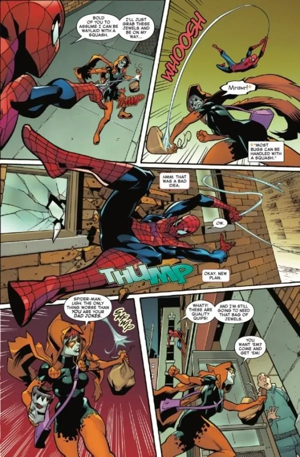
The art of Mike Hawthorne, Wade Von Grawbadger, and Erick Arciniega flies from the pages of this special with action-packed precision drawn on every page. Arciniega’s focus on the colors orange and black set the scene and tone for a book based around the spooky season’s high holiday, Halloween. In particular, Arciniega’s decision to change the traditional blue and red of Spidey’s suit to the orange and black associated with Halloween was a touch of brilliance. It draws the reader in and sets the scene exquisitely. Von Grawbadger and Hawthorne provided the perfect palette for Arciniega to provide his color work. The line work is refined and precise, never feeling muddy or lazy. It is apparent that this team put their all into this issue and readers will reap the benefits.
The Halloween Special #1, more so than most comics, is dependent on the work of the Letterer to help drive the story and make it complete. Joe Caramagna, like his colleagues, was up to the task. Caramagna’s lettering was easy to follow and digest. It never faded into the background or presented itself as confusing, flowing effortlessly across the page to tell the story. The flair that lines with in the lettering is where Caramagna shined. His presentation of “Hallow’s Eve” was eye catching and clever. For instance, highlighting the so-called villain of the story. The combination of art, color, and lettering has made this comic a stand out of the week, providing a new classic in the Spidey-verse.
The Amazing Spider-Man Halloween Special #1 is a colorful and spooky addition to the Spidey-verse this holiday. The story is compact, yet manages to pack a lot into its pages. Ireland, Hawthorne, Von Grawbadger, and Caramagna have provided a new holiday classic that can be read by anyone regardless as to whether or not they are current on The Amazing Spider-Man. This is a must read for anyone that is looking to make this haunted season a bit more spooky.
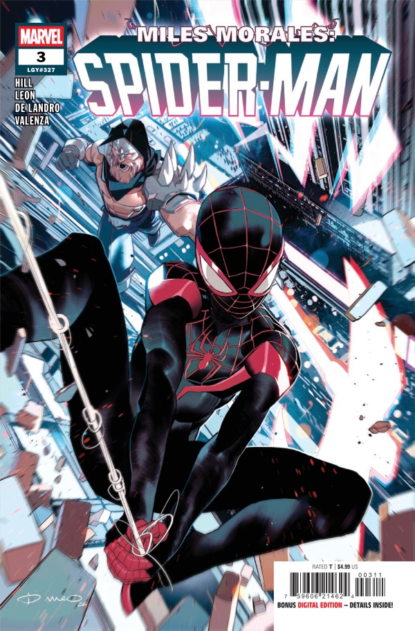
Miles Morales has been put in the middle of the new villain’s, Revenant, and his father’s complicated past. His father, Jefferson, lived a dark life that no one knows about and it’s coming back to haunt him, Miles, his wife, and the city. Revenant is on the hunt for Jefferson to get his revenge, and in the process, gets his hands on Miles who’s donning the Spider-Man suit. In this moment, Miles is unable to fight back and has no choice but to hear the sins of his father and what he’s done to Revenant in their past life. Unfortunately, it’s so much more than Miles could’ve guessed and it’s causing him to see his father in a whole new light.
Cover art by Simone Di Meo. Published by Marvel Comics
The tone was set immediately with Miles at the mercy of Revenant and it never let up. Revenant has a chip on his shoulder the size of a crater and he has no intentions of stopping the chaos he’s causing. What Miles Morales: Spider-Man #3 does is give us an excellent look into the mindset of Revenant, who has shown nothing but destruction and anger so far. Instead of yelling and destroying, he’s able to have a steady conversation with Miles, giving him a look into the origin of who Revenant is now. While the conversation is calm, there’s a looming presence of the threat of Revenant who’s made it clear his work isn’t finished.
All of this was brilliantly handled by the writer, Bryan Hill, who was able to show how big of a threat Revenant is, while establishing his origin story. Things are getting messier and messier for Miles, especially since he now has very complicated feelings towards his father. I couldn’t even guess where this story is going but I do know I’m very excited for the next issue!
The Art
Nico Leon, Valentine De Landro, Bryan Valenza, and Cory Petit continue to make Miles Morales: Spider-Man one of the most beautiful comic runs out there with many layers of different types of artwork. I loved how the flashbacks are so different from the present, with heavier line work and and more dramatic detailing. It puts the past in a different perspective and makes the flashbacks feel more haunting. The details in the artwork for the present are absolutely gorgeous. What I love is how well you can pick up on the emotions of the characters. Even behind the mask, you’re able to see Miles’ emotions worn on his sleeve. Every character wears their feelings on their sleeve, selling the story excellently. The colors are absolutely stunning! Bryan Valenza does a brilliant job with handling the light of the settings, whether it’s the light reflecting off of Miles’ suit or when Revenant steps into the light of the makeshift fireplace.
Final Thoughts
Miles Morales: Spider-Man #3 continues to exceed every expectation I have. The story is emotional, impactful, and keeps you on the edge of your seat with an excellent build up from Miles. If you haven’t checked out this run, there’s no time like the present! Make sure it’s on your pull list!
Overall Grade – 9/10
Let me know what you thought of this issue in the comments!
This review was written by Megan from the Vigilante Vibes Podcast. If you liked my review, be sure to check out my other reviews! Let me know what you think of Miles Morales: Spider-Man #3, or tell me what comics you’d recommend me trying out! Find me on my socials, and check out my Marvel podcast, Vigilante Vibes, by clicking here!
What if everything we thought about how the world came to be wasn’t true? What if a meteor is more than just a meteor? Today we find out in The Twilight Zone. This issue of The Twilight Zone now comes in partial color. This issue’s featured color is green.
This review is brought to you by Nerd Initiative’s Shawn!
Creative Team
Writer: Mark Russell Artist: Victor Alpi Letterer: Jeff Eckleberry Cover Artist: Victor Alpi
Writing
Mark Russell really tells a compelling story with this issue. There were nice little twists and turns throughout the issue that kept you on the edge of your seat throughout the pages. I genuinely enjoyed the story, and it was so unique. One of the best things about The Twilight Zone series is the self-contained aspects of the stories. Russell does a great job of making full use of the pages to tell a full and complete story that still manages to satisfactorily wrap up by the end of the issue. That really is a testament to Russell’s ability to pace the comic well to tell a rich story.
The story in and of itself is different from the usual Twilight Zone comics we’ve gotten in the series so far. Russell brings in a cosmic aspect that always felt like a bit of an underlying thread holding the original television series together. The cosmic horror aspect really hit home for me and created an enjoyable read.
Art
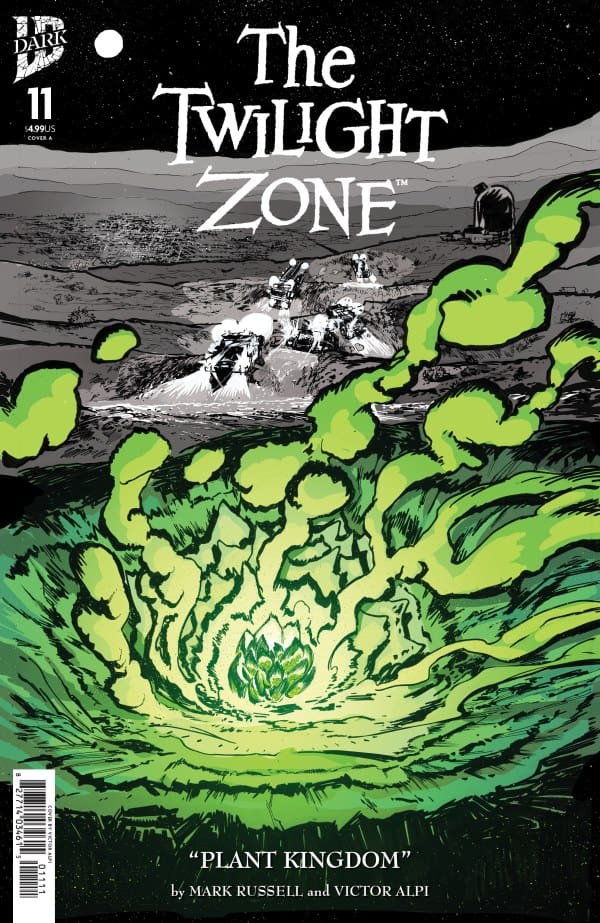
The Twilight Zone #11 cover by Victor Alpi. Image from IDW Publishing.
Victor Alpi got an exciting chance with this issue, and he took it and ran with it. Alpi got the honor of getting to do the first Twilight Zone story with just a little bit of color in it and goodness, what a great job he did. Alpi perfectly works the green into the issue while still preserving the rugged black and white colors and lines that made the first ten issues of this series so special. The line work is absolutely spectacular really making the colors pop.
The colors don’t usually get much discussion in a Twilight Zone comic, but in this instance, green marks the perfect choice to lead off this all-new run on The Twilight Zone. Alpi takes the chance to use the green and make it the star of the show bringing it to the center stage. That said, Alpi also showed a keen awareness of when to pull back with some pages still running the familiar black, white and gray color scheme. Jeff Eckleberry does a great job of leading you through the story but also pulling out some emphasis with the lettering. You can really feel the emotions particularly the panic come through the pages of the comic.
Final Thoughts
I’ve been waiting for this comic since the team at IDW Dark announced a splash of color would be making an appearance, and there could not have been anything better to ask for with this issue. Everything about this issue from the story, to the art and lettering, to the inclusion of the green scratches all the right itches. The cosmic horror story feels like a warm blanket for those who loved the original television series.
Overall Grade: 10 / 10
What do you think about the new color addition to The Twilight Zone? Let me know in the comments
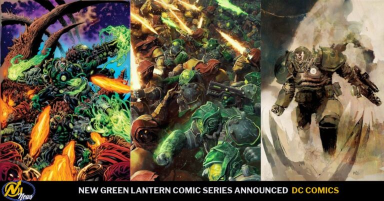
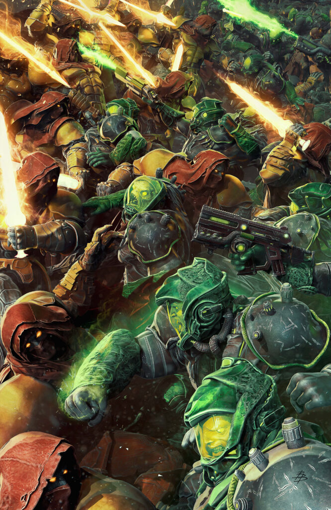
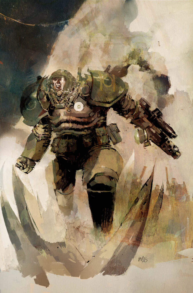
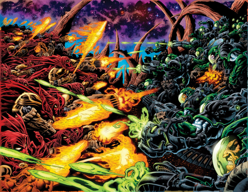
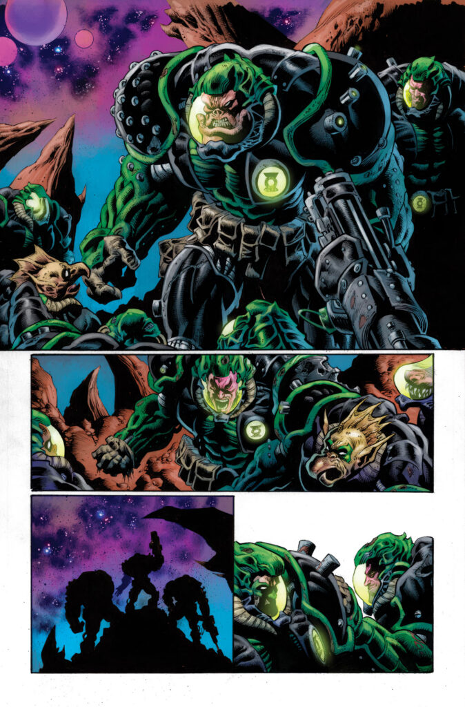
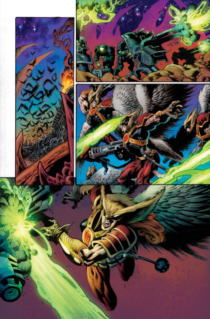
“For centuries, the Empire of Humanity has swept across the universe, laying siege to the cosmos planet by planet until all kneel before the might of the human race. Only the heavily militarized Green Lantern Corps dares oppose the human crusade.
And no human has ever fought for the Corps against the Empire. Until Hal Jordan.
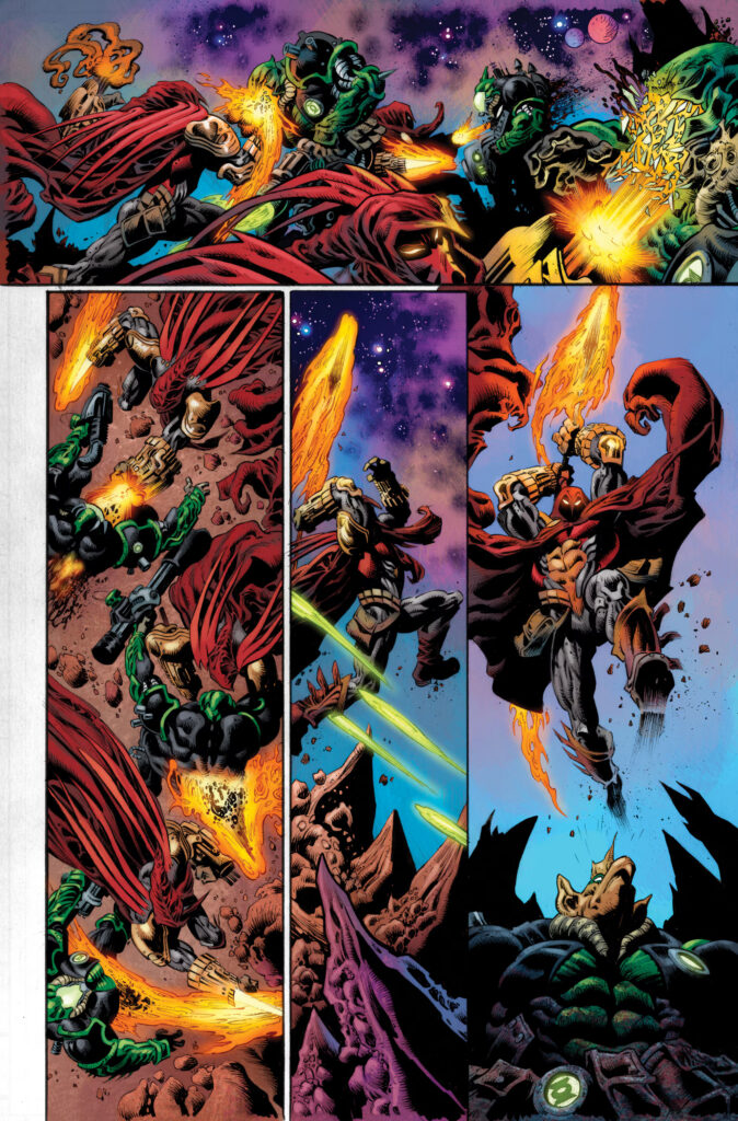
Once a soldier fighting on behalf of humanity, Hal was betrayed by his battle-brother Oliver Queen and left for dead on an alien world. Rescued and deprogrammed by the Green Lantern Corps, Hal is now the Corps’ only human warrior and a powerful strategic weapon in its war against humankind. Hal’s blood-soaked odyssey will carry him through the burning ruins of a DC Universe unlike any readers have seen before, as Hal fights for peace by taking the battle to the shores of Hell itself.”
Artist Kyle Hotz said this about the new series:
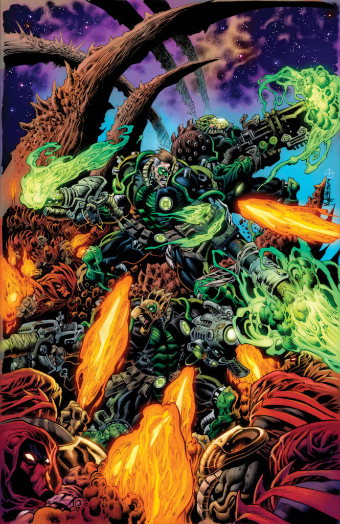
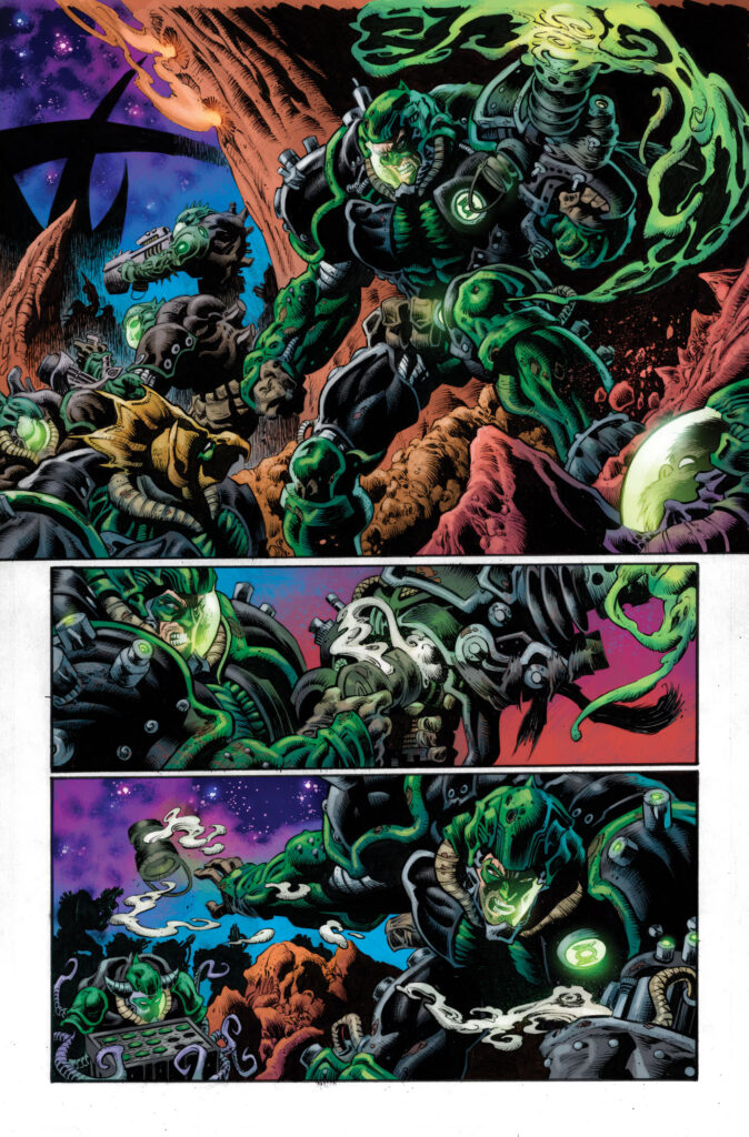
“Visually, I am trying to walk the line between over-the-top space opera and the emotional beats of the story. Apart from being a Green Lantern fan from when I was just a little kid, my prep for this was really spending time studying some of the best war films. I want to get the feeling across that the Lanterns are beat up, tired, and certainly the underdogs. Their armor is cracked and broken, and their weapons are held together with tape and wire. These are soldiers nearing the end of their fight.”
Green Lantern: Doomed Cosmos #1 releases January 20th.
Green Lantern: Doomed Cosmos #1 Main Cover By Kyle Hotz (Credit: DC Comics)
Green Lantern: Doomed Cosmos #1 Variant Cover By Björn Barends (Credit: DC Comics)
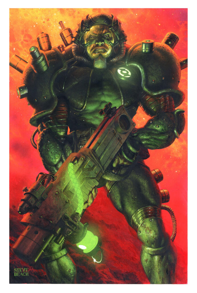
Green Lantern: Doomed Cosmos #1 Variant Cover By Steve Beach (Credit: DC Comics)
Green Lantern: Doomed Cosmos #1 Variant Cover By Ashley Wood (Credit: DC Comics)
Green Lantern: Doomed Cosmos #1 Interior Art By Kyle Hotz & Dan Brown (Credit: DC Comics)
Green Lantern: Doomed Cosmos #1 Interior Art By Kyle Hotz & Dan Brown (Credit: DC Comics)
Green Lantern: Doomed Cosmos #1 Interior Art By Kyle Hotz & Dan Brown (Credit: DC Comics)
Green Lantern: Doomed Cosmos #1 Interior Art By Kyle Hotz & Dan Brown (Credit: DC Comics)
Green Lantern: Doomed Cosmos #1 Interior Art By Kyle Hotz & Dan Brown (Credit: DC Comics)
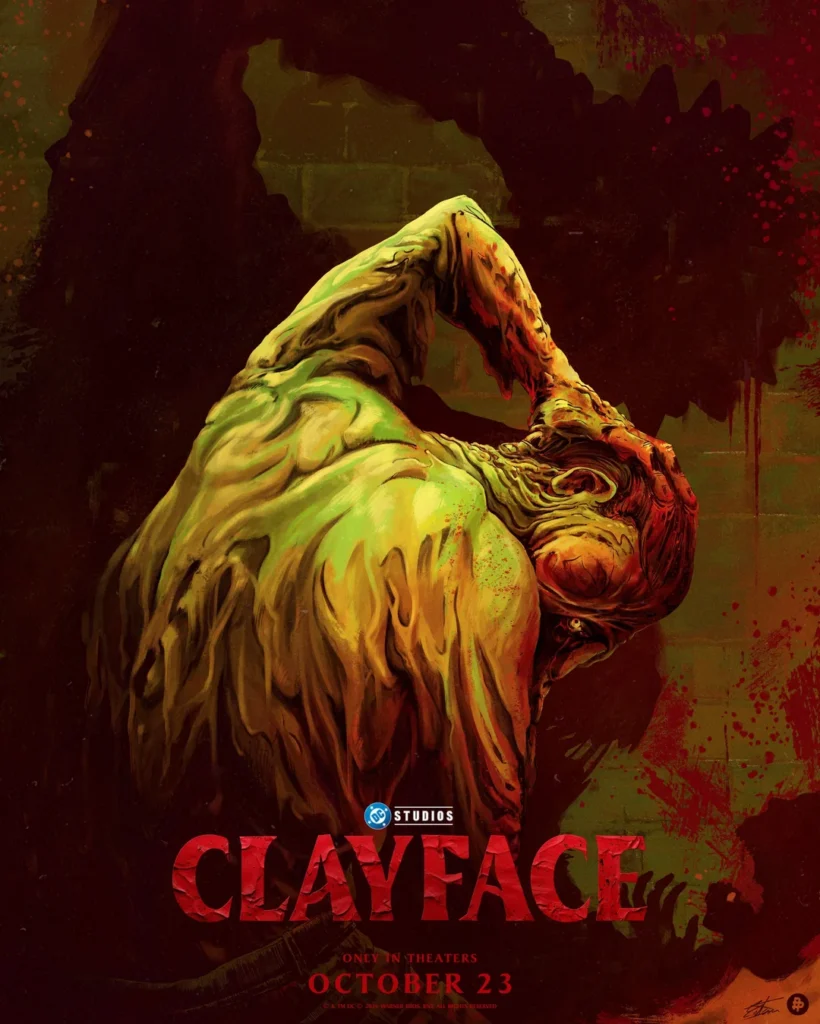
The DC Universe (or DCU) is breaking new ground with Clayface, releasing October 23rd. The film, focusing on the batman villain, tells the tragic story of the rise and fall of Matt Hagen, a Hollywood star that gains superpowers. Hagen’s super journey takes a darker turn as he becomes the villainous Clayface, a villain who crosses paths with Batman. There has been a massive marketing campaign showcasing just what Warner Brothers and DC have been crafting for their first horror feature. Let’s take a look at some of the things they’ve been using to build the villain – besides clay of course.
CLIPS, CLIPS, CLIPS
There have been a number of clips and trailers including a scene billed as one of the most stressful scenes in the movie. Hagen is on a plane when he realizes he’s losing face (So to speak) so he has to- well. Let the clip speak for itself. TRIGGER WARNING: Eyeball Horror!
We’ve also gotten a look at just how Clayface might get his titular powers thanks to this clip with Naomi Ackie and actor Tom Rhys Harries. The scene mirrors a scene from the original inspiration for the film. Writer Mike Flanagan has said he was inspired by the Batman: The Animated Series Episode “Feat of Clay”. Compare and contrast the two power origin stories below!
POSTERS AND UNIQUE ARTWORK; SHAPING THE MONSTER
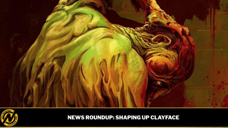
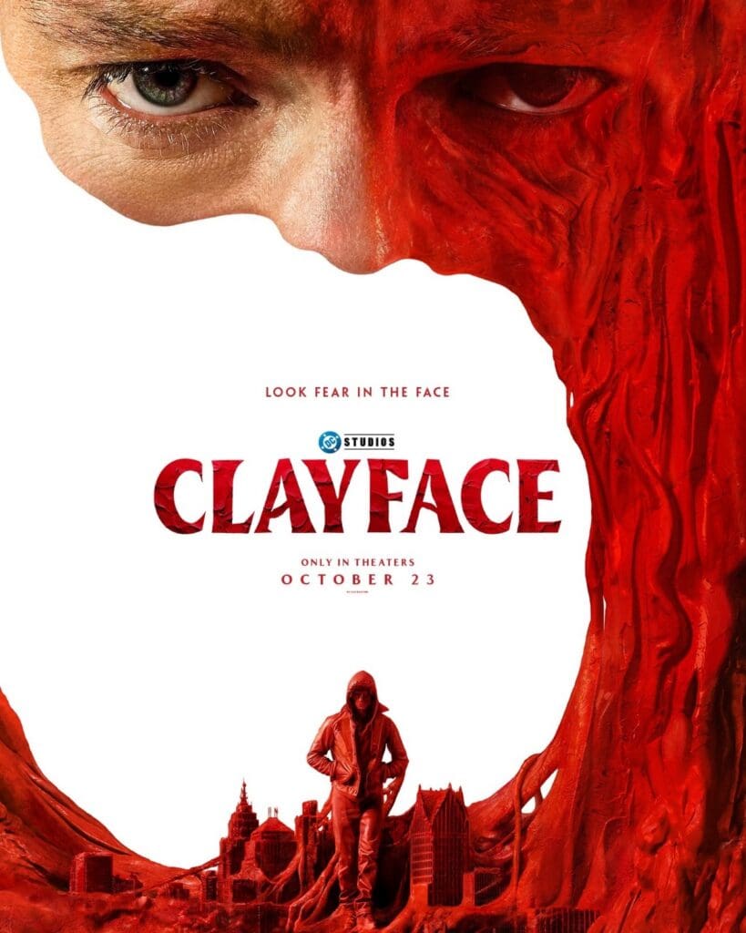
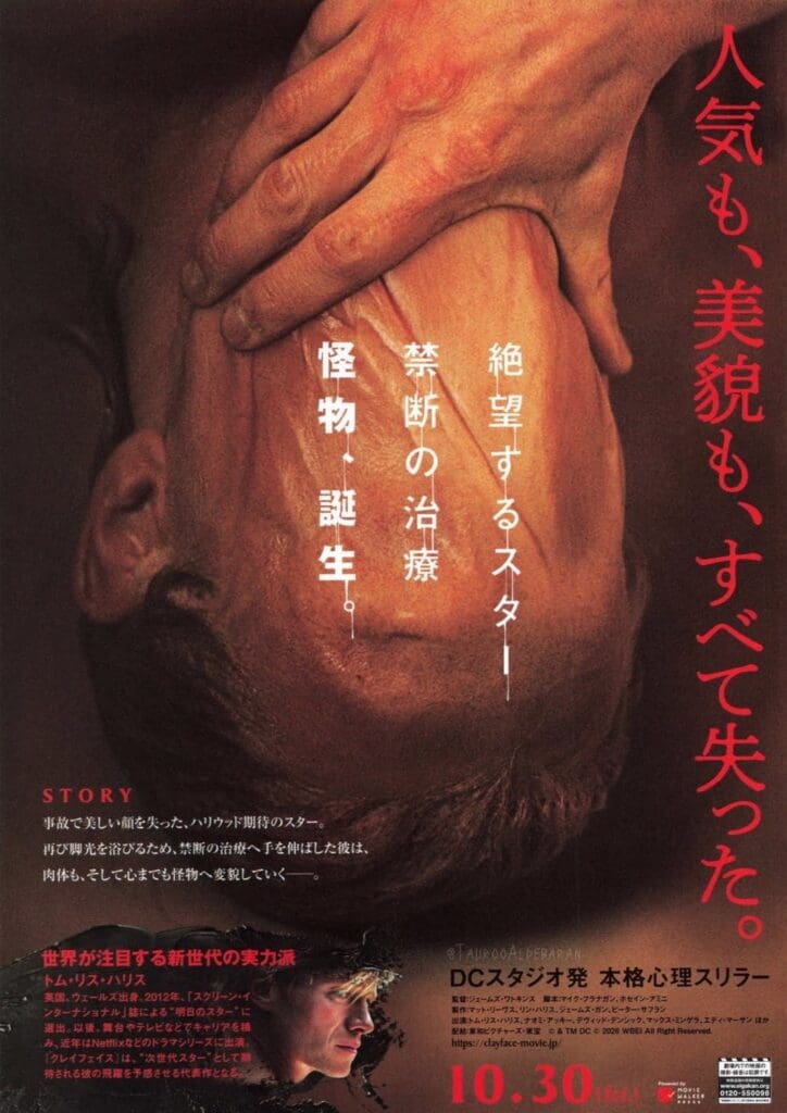
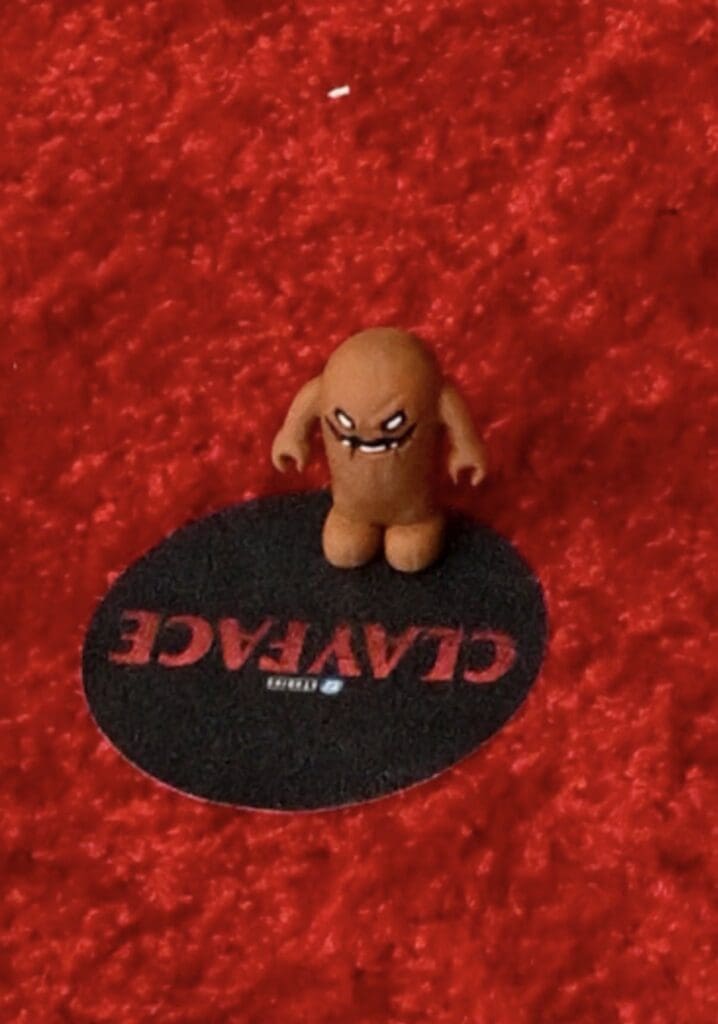
Clayface is at heart about an artist – no matter the circumstances. From Matt Hagen to Basil Karlo and other “clayfaces”, the whole concept is a character that represents how Batman can be seen as anything – even to himself. The concept has produced a number of art pieces from official ones to non official ones. Take a look at some of them below and tell us if they manage to capture the shifting horrors of this tragic character. Even the tagline “Look Fear In the Face” hints at this remarkable character!
Image courtesy of Warner BrothersImage courtesy Warner Brothers
This international poster adds a mysterious flare by showing us more of the monster and adding the human element underneath in an iconic moment from the trailer. It makes it look almost like an art house horror film!
DC and Warner Brothers have leaned into creating a horror character. It’s about time the studio did so too. For a publishing company with iconic characters like Swamp Thing, Man-Bat, Two-Face, and Batman himself, horror is essential. It’s past time James Gunn, writer of such body horror epics like Slither, was able to use his horror talents in both picking material and creating it. Just how audiences will receive Clayface remains to be seen; the reviews are just as mixed as the material from the character itself. Add to that the original promotional material and you have a very cool set up for a unique horror world with a comic book twist. Take a look at one of the original teaser images below!
THE ACTORS THEMSELVES; CALL IT ART CLASS
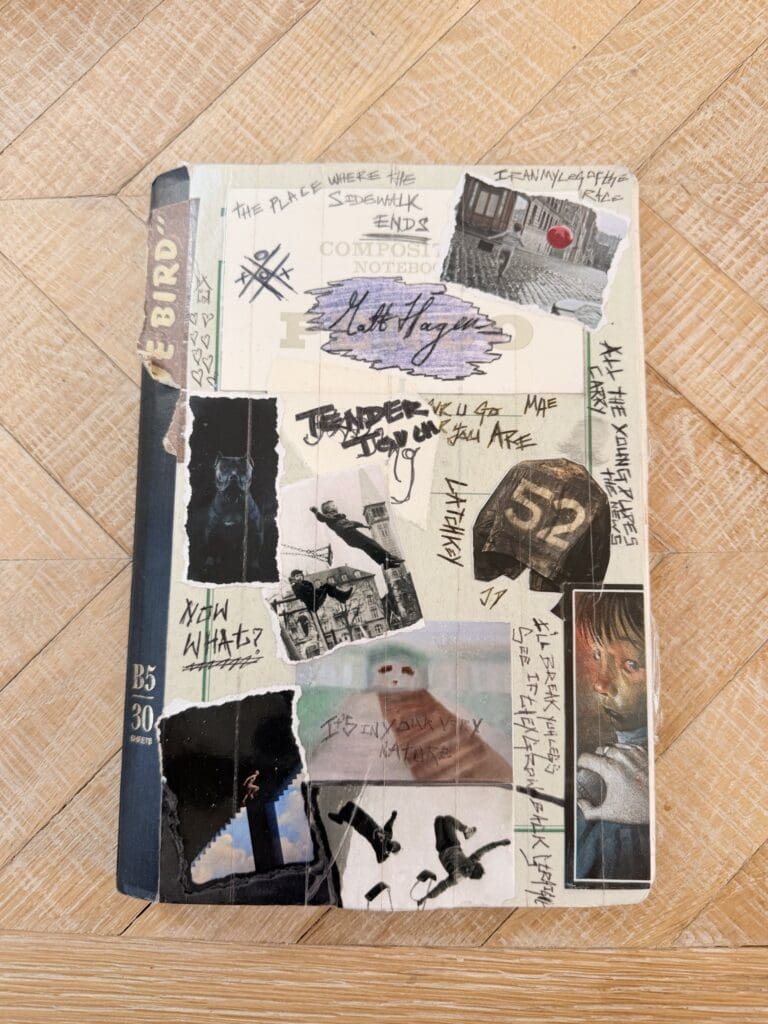
One of my favorite parts of films is when actors share their process. While Matt Hagen’s career was (tragically?) cut short, Tom Rhys Harries, portraying the character, shared his “creative notebook” on X. Check out the image below and check out the actual tweet here.
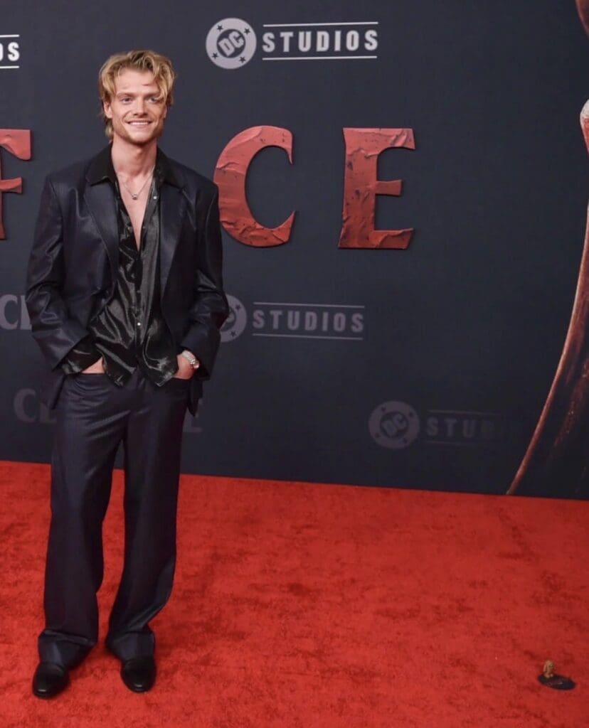
Harries also took to X to share he brought his character to the premiere with him. Check out the photos below and take a look at the tweet here to see just how much he’s embracing the character!
The trend of “bringing your character to the red carpet” is great, though it was popularized by Godzilla Minus One‘s VFX director, Takashi Yamazaki. He and his team also wore Godzilla shoes (perhaps Harries should consider Clayface-themed accessories for his character’s next outing?).
There’s tons of other material out there. Do you have a favorite! Share it with us in the comments below!
Clayface releases in theaters October 23rd. Will you be seeing it? Let us know in the comments.
The ocean is absolutely terrifying. There is so much we still don’t know about and there is no empathy or understanding of human life. Once you are in it, you are entering into a domain that is completely run by sea life. It’s dangerous and if you don’t know what you’re doing, it can be fatal. There are anywhere between 80 to 150 fatalities a year. If something goes wrong down there, you don’t just get to call for help. You are completely isolated. Listen, I understand the whole thrill-seeking thing and wanting to feel that rush in life, but don’t go into the ocean. There are some who love that lifestyle and I completely respect it.
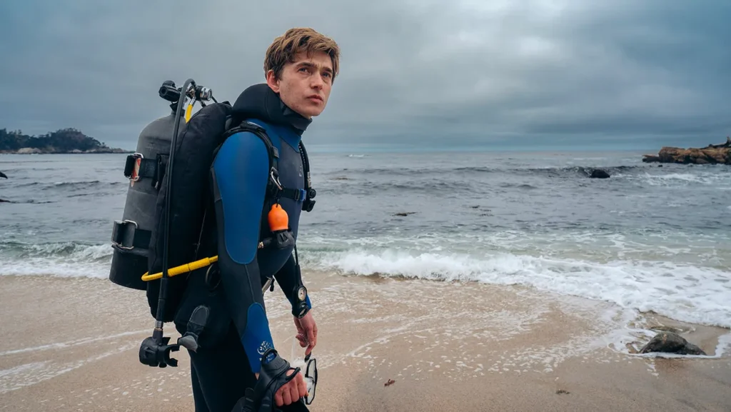
When Mitt Gardner (Josh Brolin) becomes terminally ill, he decides to end things on his terms. Mitt’s surviving family is left grieving without a body to bury. Jay (Austin Abrams) makes the decision to go on a dive and try to recover his fathers remains. As you can imagine, things start off shaky due to weather conditions. The beach is shut down so Jay has to sneak into the one parking area the police aren’t covering. As he is descending into the dark depths of the ocean (seriously brother no flashlight? What was the plan here?) he sees a squid being chased by a whale. Instead of staying on the edge where he most likely would’ve been safe, Jay makes his move along the ocean floor on his belly like a little sea serpent. Ok I made that part up but he does stay low to ocean floor and eventually gets swallowed up by the whale.
Austin Abrams in ‘Whalefall.’ Courtesy of 20th Century Studios.
Into the Belly of the Beast
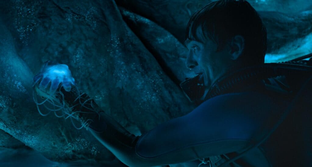
Once inside things get really bad, really quick. Jay has to fight off other creatures (seriously what was up with that squid? It felt personal like Jay owed him money or called is his wife an octopus) as well as trying to maintain enough oxygen to form an escape plan. There is a lot to like here for me personally. However, as someone who is both Claustrophobic and terrified of the deep ocean, I found myself clenching a lot. The film does a good job in my opinion jumping back and forth between past and present. The relationship between Jay and his father was very rocky due to Mitt trying to teach his son about survival and how to survive not only the ocean, but whatever life throws at you. Jay still loved his dad, he just wanted a normal father and son relationship. Boy, I bet now that he is in the belly of this majestic creature he was really appreciating his fathers tough love (and what felt like borderline psychological child abuse at times). Jay is able to use all of these tools, both physically and metaphorically, to survive this encounter.
Austin Abrams in ‘Whalefall.’ Courtesy of 20th Century Studios.
Final Thoughts
This was an enjoyable movie to me despite the fact that it felt like more than once I was going to go into cardiac arrest. It was emotional, intense, and a little funny at times (let’s be honest we can all relate with Jay talking to himself through a horrific situation). I think this film is for sure worth a one time watch and Austin Abrams is again brilliant in a movie where he has to carry most of it by himself. It made me want to read the book which is also titled Whalefall by Daniel Kraus.
Tackling something as gargantuan and iconic as Jason Voorhees is a massive feat. Rewriting the lore altogether while never losing what made the original special? Well, that’s near impossible. Fortunately, that’s exactly what the new Peacock series from a24, ‘Crystal Lake’ has been able to achieve and more. ‘Crystal Lake’ takes a look at how Jason came to be through the eyes of the original ‘Friday the 13th’ killer: Pam Voorhees. The approach of never compromising what made the original film special paired with phenomenal performances from a cast that includes Linda Cardellini, William Catlett, and newcomer, Callum Vinson, who steals the show as young Jason Voorhees, has given audiences a mindful, yet brutally shocking adaptation of a classic horror film. While it suffers from some pacing issues and some questionable side quests, ‘Crystal Lake’ pays off in a big way, leaving audiences wanting more.
Jason Voorhees wants to be a treated just like any other kid. Unfortunately, due to Jason’s appearance he’s under constant ridicule and bullying at the hands of his peers, something that has not escaped his very protective and loving mother, Pamela. After an accident that leaves Jason missing and presumed dead, Pam struggles to cope with the loss of Jason while their past begins to catch up with her. ‘Crystal Lake’ provides a thorough and respectful new layer to preexisting lore in a way that never seeks to insult the original source material. The series may be far from perfect, but it has all of the potential in the world to have a bright future filled with new layers to the ‘Crystal Lake’ mythos. .
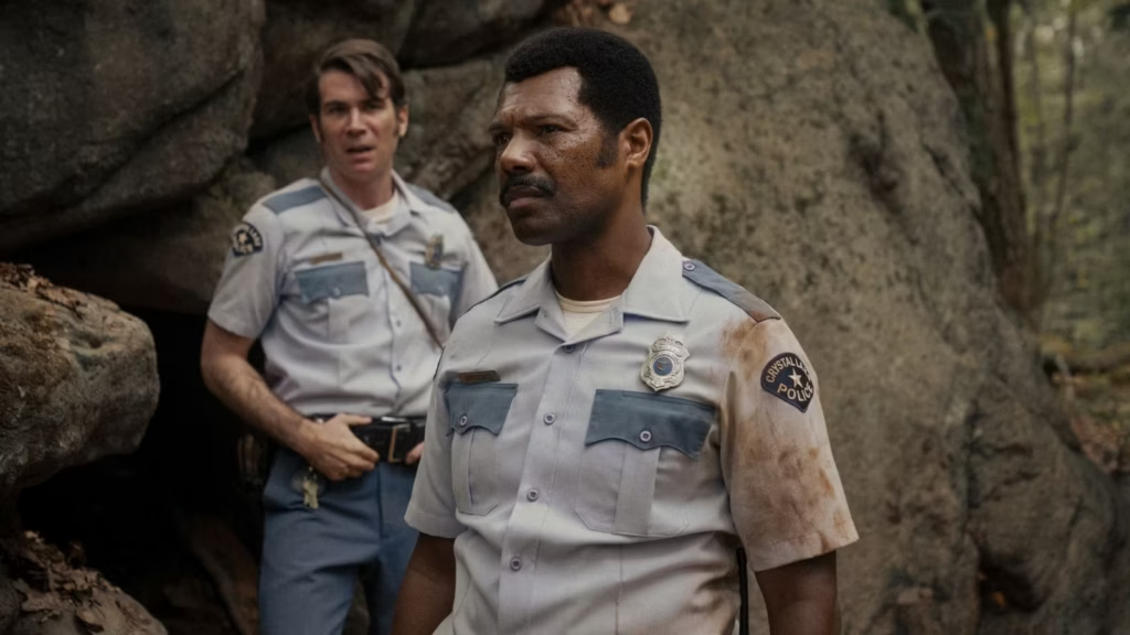
William Catlett and Cameron Scoggins in ‘Crystal Lake.’ Courtesy of NBCUniversal Pictures.
Let the Bodies Hit the Floor
‘Friday the 13th’ left a rather blank canvas in it’s wake, ripe for the showrunners of ‘Crystal Lake’ to paint a more detailed background for the original murderer. Pam Voorhees had no motivation outside of the death of her son and the negligence of teenagers. Brad Kane, the series showrunner, was able to not only give Pam one, but give her one where the audience was sort of on her side at times. It humanized her in a way that was lost in a movie that was released in 1980. ‘Crystal Lake’ made her a grieving mother again. The layers of grief and the lengths to which a mother will go were explored in a way horror has never looked at it’s antagonists. This new emotional layer hooks audiences in and drags them along the horrifying ride.
WARNING TO ALL FANS OF THE ORIGINAL: While there are shot for shot remakes of scenes from the original, it is important that you separate ‘Crystal Lake’ from ‘Friday the 13th.’ They do depart in some major ways. The show does, however, leave off in a way that makes room for a future continuation of the series. If audiences are unable to do this, they will have a bad time with this series.
Where ‘Crystal Lake’ struggles, however, is the side quests that audiences will find themselves on. At times, it feels like the showrunners needed there to be a reason for Jason to become the monster audiences all know him as so they forced a government conspiracy into his background. While the backstory can make sense if viewers have some knowledge of how probable those kind of experiments would be in a Cold War American world, most are just going to connect the dots to ‘Stranger Things’ and the plotline may lose it’s effect. ‘Crystal Lake’ manages to land the plane despite this in the end. However, the bumpy ride has the potential to lose viewers along the way.
Where ‘Crystal Lake’ truly stacks up is in it’s body count. Of course, there has to be grotesque kills and brutal sequences, this is a ‘Friday the 13th’ prequel after all. The blood and guts are all there as audiences won’t be disappointed by just how far this show was willing to go in this department. There is some truly shocking stuff sprinkled in throughout this season and in no way is that a bad thing. Kill after kill, audiences are rewarded for sticking with the show throughout.
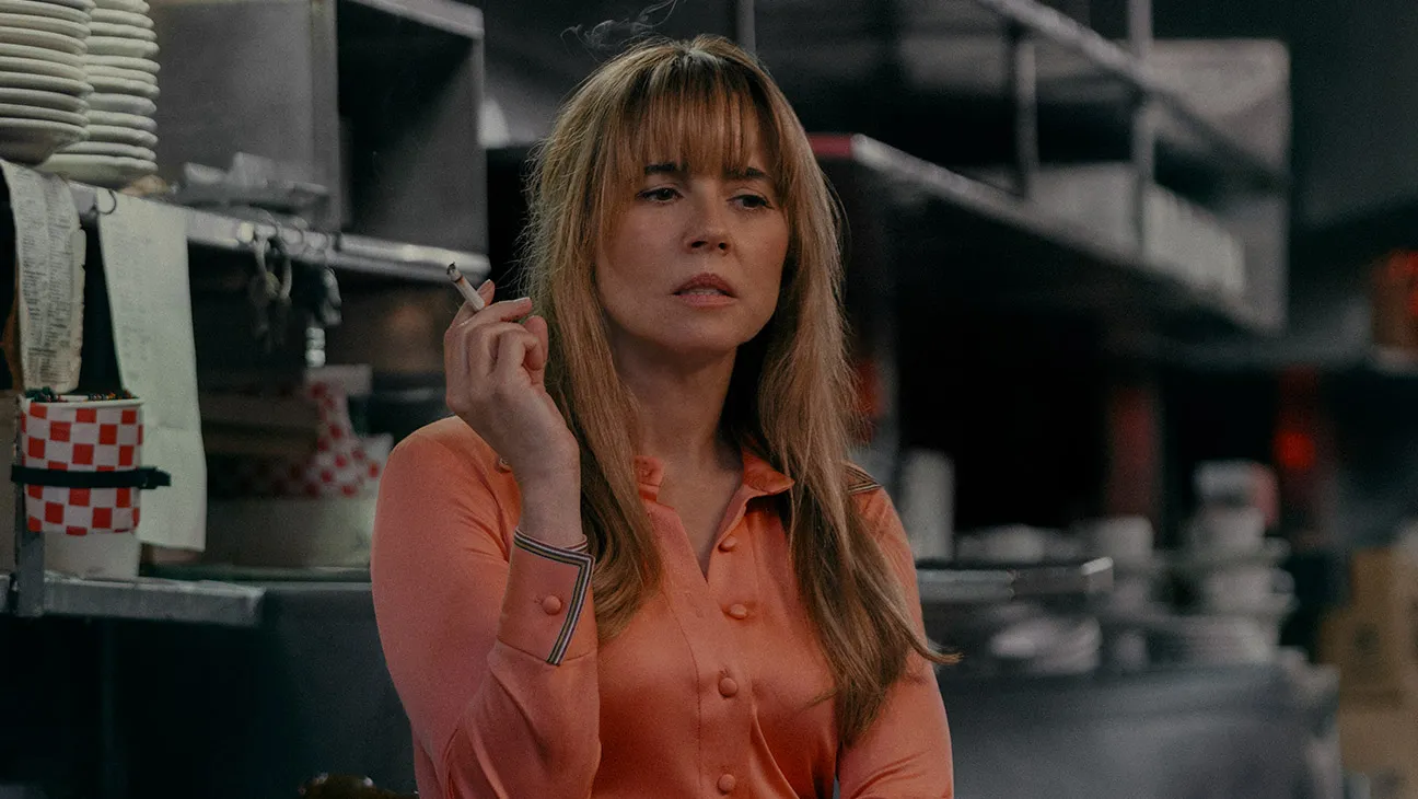
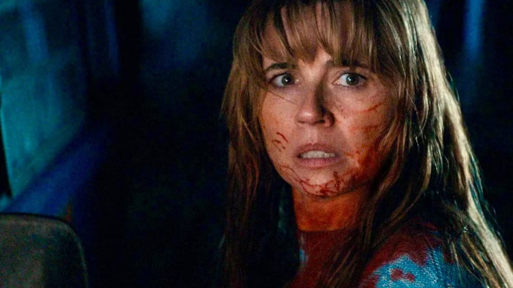
Linda Cardellini in ‘Crystal Lake.’ Courtesy of NBCUniversal Pictures.
A Mother’s Love
For ‘Crystal Lake’ to work and for audiences to care it’s protagonist (antagonist?), the series has to have an authentically motivated and emotionally empathetic Pam Voorhees. Audiences needed to believe that the events of the series would drive her to murder, but they need to keep an emotional connection to her as well. ‘Crystal Lake’ absolutely found their Pam Voorhees in Linda Cardellini. Cardellini was breathtakingly brutal in her portrayal of a broken and desperate mother who searches endlessly for the little boy rescuers never found. As Voorhees collapses more and more into her own psyche, Cardellinni never loses that hint of a mother’s love that brought Pam into the dark in the first place. With her incredible performance, Cardellini should find herself in quite a few awards conversations this awards season.
Cardellini was not alone in her mastery as the cast as a whole nailed each of their roles expertly. William Catlett’s portrayal of the stoic Sheriff Levon Brooks matched Cardellini’s at every turn. Catlett was charged with grounding ‘Crystal Lake’ in reality, a task he was more than up to as his performance was exceptional. The true shining star, however, is young Callum Vinson, who plays young Jason Voorhees. Vinson, who wore heavy make up throughout the shoot, was endearing and charming. His portrayal sets the tone and pace for the series, making audiences fall in love with Jason in a way that makes the monster more sympathetic and real.
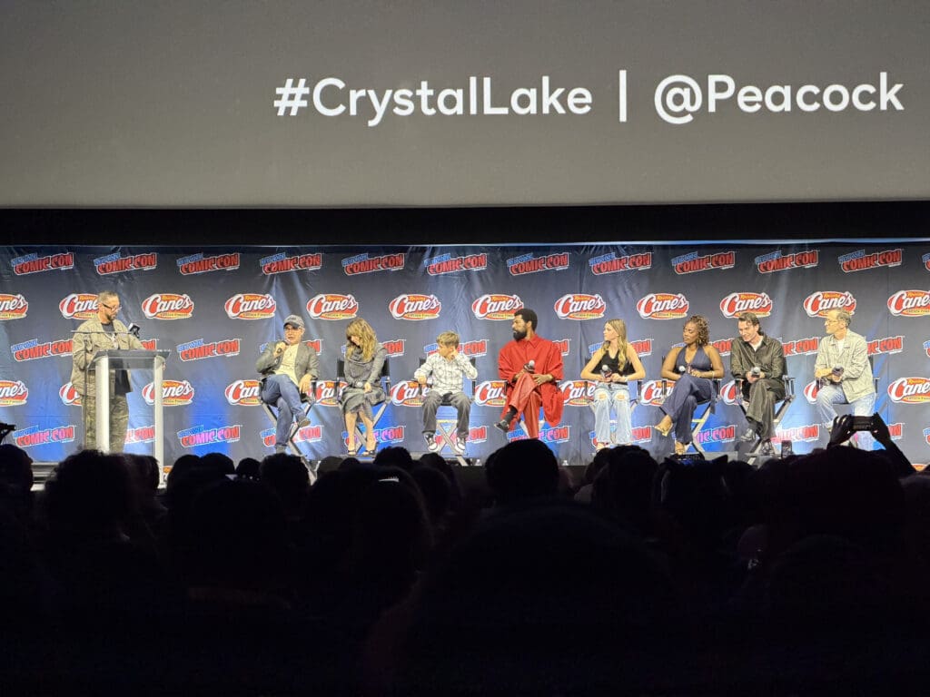
Brad Kane, Linda Cardellini, Callum Vinson, William Catlett, Gwendolwyn Sundstrom, Devin Kessler, Cameron Scoggins, and Nick Cordileone at New York Comic Con. Courtesy of Nerd Initiative.
The Future of the Franchise
Heading into the release of ‘Crystal Lake,’ there were many questions about the series longevity. Would this be a one and done series? The answer was hinted at during the ‘Crystal Lake’ Panel at New York Comic Con as the cast seemed more than eager to return for another season of the series. The series, itself, left plenty of room for quite a future, itself. It’s departure from the original lore allowed the show to provide breathing room for the series to bloom moving forward.
If other audience members are like myself, they’ll be left wanting to know what comes next in terms of the role other ‘Friday the 13th’ films will play in the series. Given the trajectory of the finale, it seems that, while there may be homage paid, the series is going to move far away from the campy horror of the later ‘Friday the 13th’ films. ‘Crystal Lake’ seems dedicated to remaining grounded even when it gets into supernatural territory with it’s explanation of why Jason is the immortal monster that he becomes. This is all before there is any discussion of the other countless loose ends that the audience is left with by seasons end in general. Loose ends that will most assuredly be tied up with another season.
Linda Cardellini in ‘Crystal Lake.’ Courtesy of NBCUniversal.
Final Thoughts:
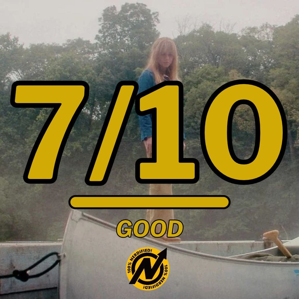
The innaugural season of the Peacock ‘Friday the 13th’ prequel series, ‘Crystal Lake,’ was a certified gorefest that provided much needed context and lore to a horror icon. While the season struggled at times with pacing and questionable storylines, ‘Crystal Lake’ delivered an overall shocking and exciting first season. I can’t wait to see what comes next.