Home Blog Page 5

Mighty Morphin Power Rangers #1 – Rangers Reunite

Ten years have passed since the original Power Rangers turned in their morphers and went on to live regular lives. But there is a new, but visually similar threat that has come to Angel Grove. Will this new threat pose a devastating challenge to the original rangers who’ve been out of the game for so long…


Creative Team

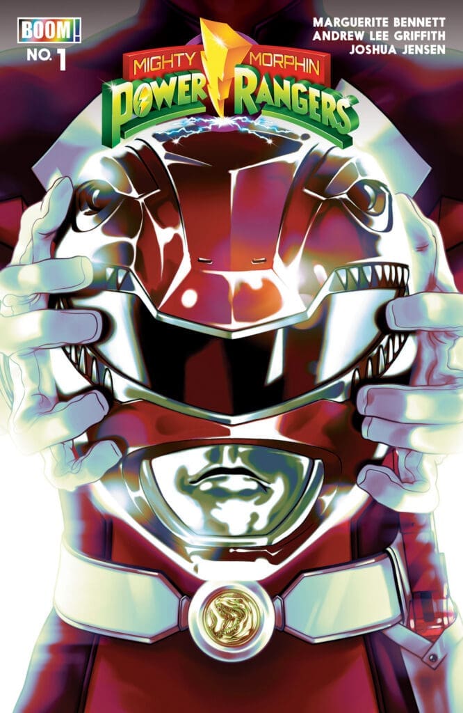
Marguerite Bennett (Writer), Andrew Lee Griffith (Artist), Joshua Jensen (Colorist), Ed Dukeshire (Letterer)

Madison Goyette (Designer), Ari Yarwood (Assistant Editor), Tea Fougner (Executive Editor),
Andy Schmidt (Editor-in-Chief)

Publisher: BOOM! Studios


Rangers Reunite

Mighty Morphin Power Rangers (MMPR) has made a come-back with this new number one coming from BOOM! Studios. As a 90’s kid, I am so excited to see this take on the original rangers that I grew up watching. Now I do understand that Mighty Morphin comics have been released over time with multiple variations of storylines. I can sadly but honestly say I never read them. But recently I have been diving back into the things that I enjoyed when I was a child, and this new story brought back all of the feelings from back then!

Rangers
Mighty Morphin Power Rangers #1, Credit BOOM! Studios. Cover by Jim Cheung.


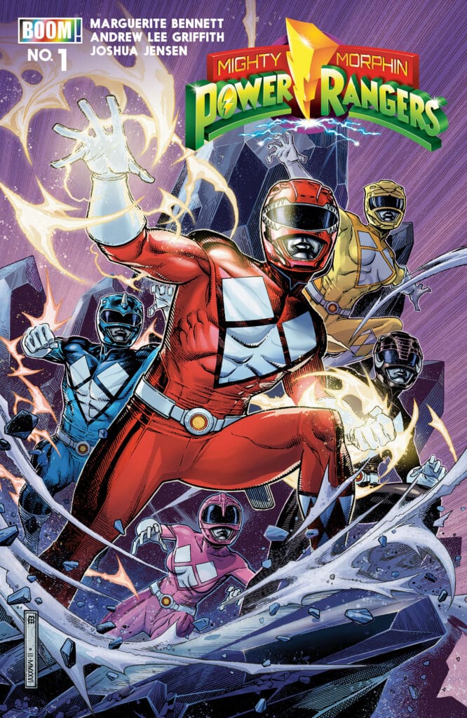
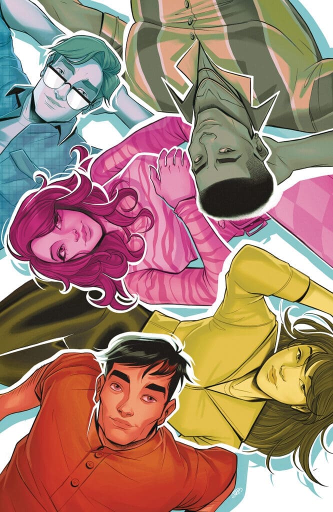
Issue one of this new storyline guides readers through pages of very important backstory for MMPR fans. The timeline is set ten years after the original rangers turned over their morphers and attempted to live regular ordinary lives as new rangers took over. The beautiful part of this entire issue is getting to see as a fan what the original rangers have been doing within the ten years, they were no longer rangers. Getting to visually witness them go on to do bigger and better things without having the responsibility of protecting the world really focusses on the fact they (the rangers) are simple ordinary people.

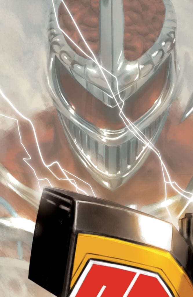
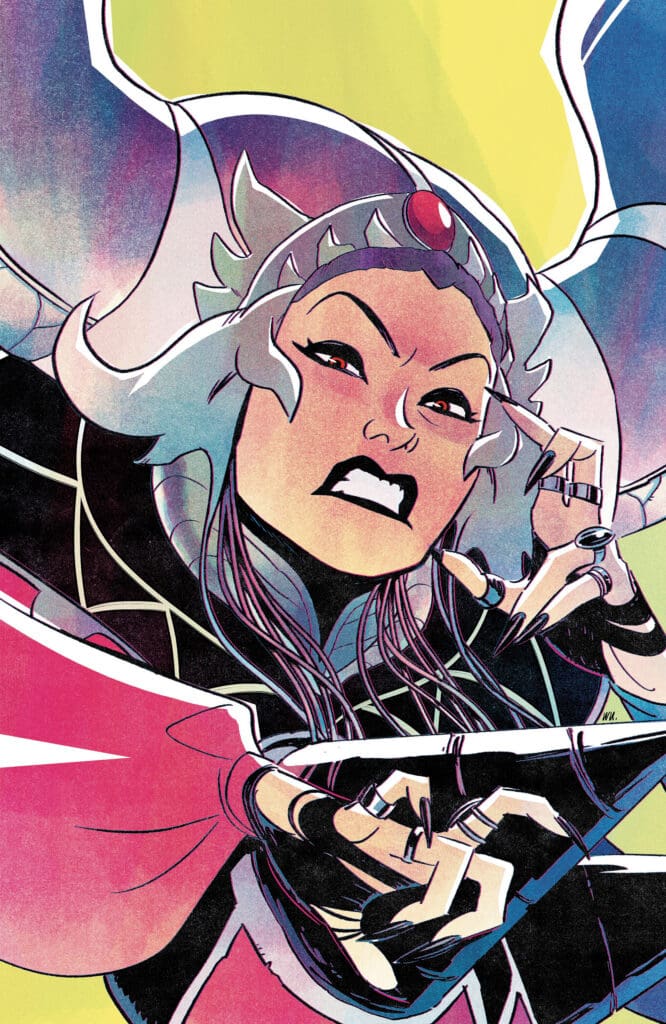
Fans of MMPR may become a bit confused when the villain for this story is revealed. Within this story the villain is none other than, Rita. Now you might be saying to yourself, how can this be? Rita was defeated by the rangers and is no more. In all actuality you would be correct! But this is not the same Rita that fans are used to. No, this Rita is new and has some pretty cool abilities that really draw off of the current society that we are in today.

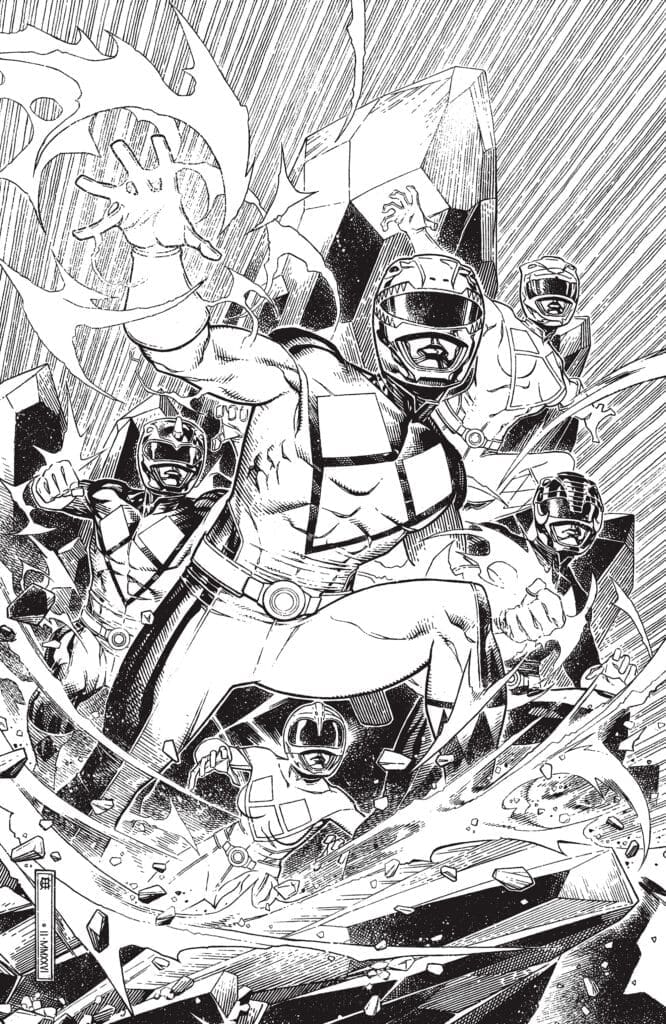
This issue brings back the full aura of the original rangers. Readers are going to enjoy seeing the original morphers, suites and so much more! Fans of the original show, movie and comics need to pick this series up for their collections. Get ready everyone because its MORPHIN TIME!


The Writing

The writing for this first issue is out of this world! It is so fundamentally sound that readers will enjoy every aspect of it. Marguerite Bennett does an amazing job at giving such detailed explanations of each of the rangers’ back story for the years that they have been away. The narration is strong and powerful when it needs to be making it so easy to feel what the characters are going through. Truly an entertaining and easy read!

The Artwork

The artwork is so stunning in this first issue! The pencil work is so crisp and to the point leaving easy work for the coloration of the panels. Andrew Lee Griffith and Joshua Jensen work so well together to bring the rangers back to life with even a hint of aging to them. Bold coloration throughout this issue begs the attention of the reader. One more phenomenal aspect of the art is the attention to details within each panel. One example is the details within the morphers, great job!

Ed Dukeshire is responsible for the lettering for this issue, and there is no disappointment! The sizing and font used make this an easy read. The changing of styles for bold emotion or high intensity moments adds so much flare to the lore of MMPR. Absolutely wonderful work!
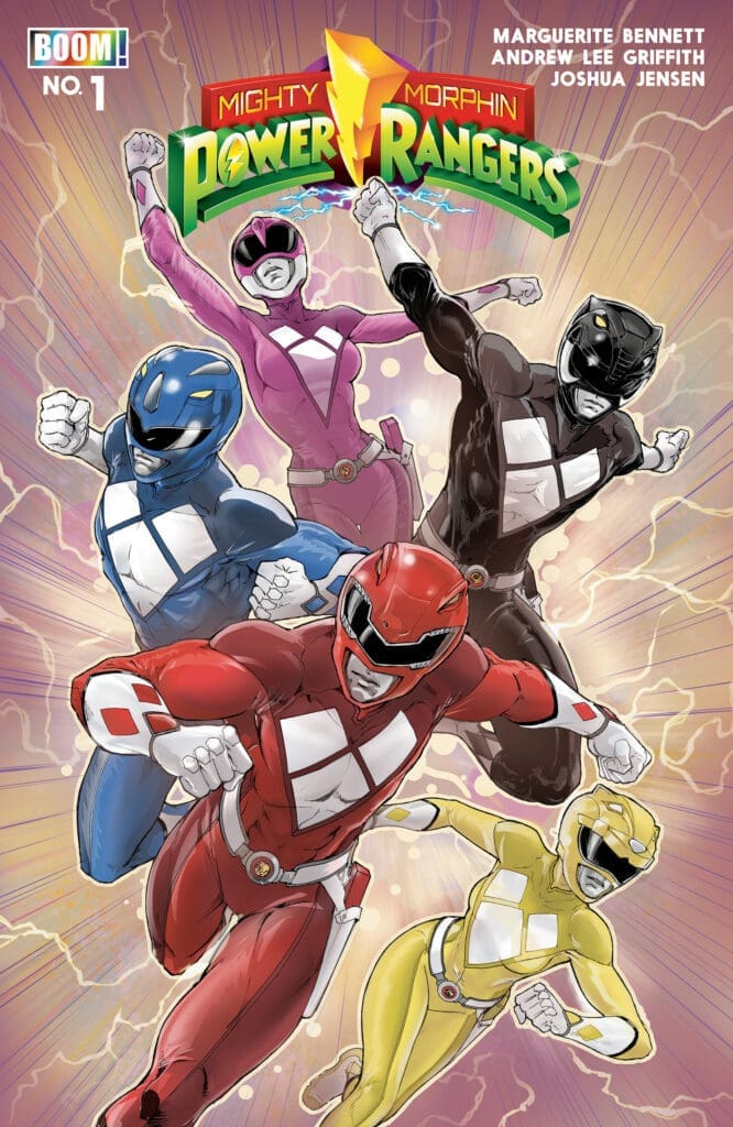
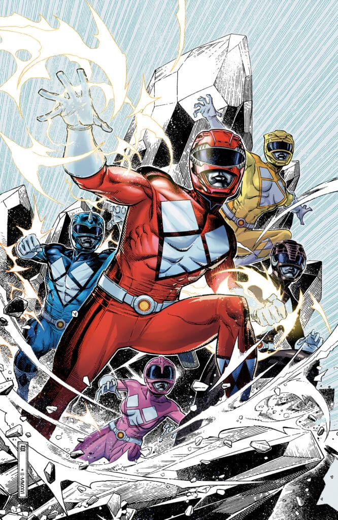
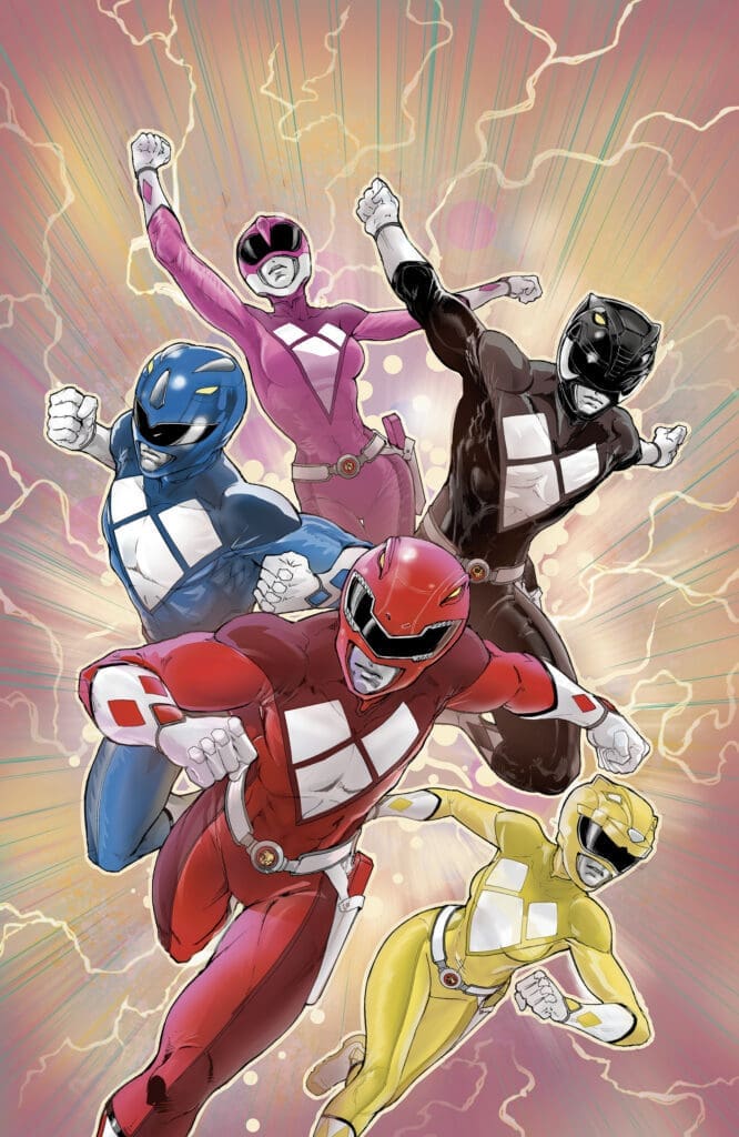
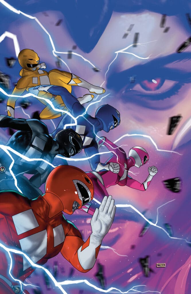
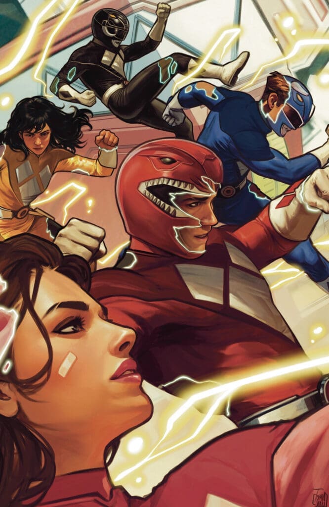

Variant Covers

  • Mighty Morphin Power Rangers team in colored suits charging forward, red in front, blue, yellow, pink, and black behind, with lightning effects and a stylized logo above them (comic-book cover style).
  • Close-up of a shiny sci-fi helmet with glowing white lines and a yellow–black control box in the foreground.
  • Red Power Ranger leads a squad of colorful rangers charging through shattered rocks and energy blastsl.
  • Five Power Rangers (red, blue, pink, yellow, black) leap forward in a dynamic battle stance with energy bursts in the background.
  • Five color-coded masked superheroes race through a lightning-filled sky in midair battle.
  • Group of colorfully suited superheroes fighting with glowing lightning in a dynamic action scene
  • A team of muscular armored heroes wearing helmets charges forward through flying debris and energy bursts in a dynamic battle scene.
  • Fierce female superhero with silver hair and a red gem headpiece, snarling and reaching toward the viewer.
  • Colorful illustration of six diverse young adults lying in a circle with heads toward the center, wearing bright outfits—blue, pink, yellow, orange, and green strokes.
  • Power Ranger in red suit pulling off helmet to reveal face, with Mighty Morphin Power Rangers logo above.

Final Thoughts

I loved this first issue of the new storyline for MMPR! Brought back memories of sitting in front of my television as a kid watching my favorite hero team battle against out of this world threats. This story is reuniting the original cast of rangers after a decade of separation from each other. Fans will truly love seeing what the characters have been up to in their absence. This is one story you will not what to miss out on! Go get your copy of Mighty Morphin Power Rangers #1 today!

Overall Grade: 10/10


Links

Comic Book Reviews & Entertainment News: Nerd Initiative
Previous Power Rangers Review: Power Rangers Prime #16 – The Final Mission
Travis’ NI Portfolio: TravisComicHaven – Nerd Initiative
Travis’ Personal Content: Travis’ Comic Haven


PLEASE SHARE YOUR THOUGHTS IN THE COMMENTS SECTION BELOW!

Leave a Reply

This site uses Akismet to reduce spam. Learn how your comment data is processed.

Iron Man #6 – Iron Man vs. Spider-Man and Norman Osborn?

Iron Man #6 – Cover – Ryan Stegman & Frank Martin (Credit Marvel Comics)

Iron Man #6

Writer – Joshua Williamson

Artist – Juann Cabal

Colorist – Nolan Woodard

Letterer – Joe Caramagna

Cover – Ryan Stegman & Frank Martin

Read the review of the last issue in this series HERE!

Iron Man #6 – Cover – Jim Cheung & Jay David Ramos (Credit Marvel Comics)

The Story:

The Iron Patriot armor, the armor worn by Norman Osborn while leading the Dark Avengers, has been stolen from one of Tony Stark’s warehouses. Now Spider-Man must protect the newly reformed Norman Osborn from Iron Man!

The Writing:

The framing device of this issue is absolute perfection. By retelling the story from each of the three character’s perspective, Williamson really gets to flex and show his ability to get into the mind of each of them. Williamson also builds nicely off of the history that Osborn has with Stark. Bringing the Iron Patriot armor into this story helps put the reader in the mindset of Tony by bringing up the memories of all the horrible things Norman did in that armor. Williamson continues to write these issues at breakneck speed, not letting the reader stop to breathe for too long and making it impossible to put this book down.

Iron Man #6 – Cover – Todd Nauck & Rachelle Rosenberg (Credit Marvel Comics)

The Art:

This team is just phenomenal! From the incredible action, to the perfect layouts during the retelling of the story, every page is a standout. Unfortunately, I cannot say what the standout moment is for the artwork in this book because I try to keep these reviews spoiler free, but the reveal of who is really behind this stolen suit is perfection! I really cannot say enough about the incredible work in this issue. My hat is off to the whole team!

Overall Grade: 10/10

This is the most fun I’ve had reading a comic in years! It’s the team up I didn’t know I needed. The quick wit of Spider-Man mixed with the technical speak of Tony and Norman, along with the killer reveal of the villain and the button at the end? This is an easy perfect score and I cannot wait to see where this story goes next month!

Check out more from Derek here!

Have you read this issue? What did you think? Let us know in the comments below!

Leave a Reply

This site uses Akismet to reduce spam. Learn how your comment data is processed.

Fantastic Four #12 – When in Rome / Si fueris Romae

0

What happens when a temporal alarm triggers at the Fantastic Four’s Farmhouse? The Fantastic Four leap into action to save the world as they always have. Yet what happens if there weren’t a Fantastic Four but a Fantastic Two? What if someone, tired of losing to the Fantastic Four, decided to try to fight them in a new way?


Creative Team

Writer: Ryan North
Penciller: Pat Boutin
Inker: Serge Lapointe
Color Artist: Edgar Delgado
Letterer: Joe Caramagna
Cover Artist: Humberto Ramos
Cover Colorist: Edgar Delgado

Writing

I am convinced Ryan North is trying to see just how weird he can get with the Fantastic Four, and I love it. The previous arc and so far this one as well have been adventure stories with a little bit of horror elements. Yes, we all know that Reed Richards can stretch his body, but how many of us ever think about what that truly means? With Fantastic Four #12, North really asks us to think about what that means.

North gave us a little bit of everything in this issue. There’s Latin, the Roman Empire, ancient weaponry, and some good banter between Johnny and Reed. Johnny continues to be both hilarious and hilariously self-unaware. North continues to show us why Sue Richards is the most patient women in the Marvel Universe because if there’s anything that we’ve learned, it’s that being married to Reed Richards while being the sister of Johnny Storm has to be one of the most exhausting things ever.

Art

Fantastic Four #12 cover by Humberto Ramos and Edgar Delgado. Image from Marvel Comics.

Pat Boutin, Serge Lapointe, Edgar Delgado, and Joe Caramagna teamed up for a really great issue. I thought the team did a really amazing job capturing ancient Rome. While I don’t know that they all sat down and studied Roman soldiers down to the detail, the pencil, inks, and colors let even the most casual observer immediately know where the setting for this crazy Richards adventure is.

Speaking of Richards, Thanks to Boutin, LaPointe, and Delgado, I was completely sure for a minute that I was reading a Motorhead comic rather than the Fantastic Four. The Lemmy version of Reed Richards might be more troubling than Johnny’s biker stache. Joe Caramagna helps guide us perfectly through the story capturing the humor and seriousness equally.

Final Thoughts

This was a weird issue of Fantastic Four but I loved it. Everyone has their Roman Empire, but for Reed and Johnny, it was a literal Roman Empire. I love that North integrated latin into the story. It felt like a neat way to further tie you into this setting to go with the roman numeral 12 on the cover.

Overall Grade: 9.5/10

How are you liking Fantastic Four? Let us know in the comments

Leave a Reply

This site uses Akismet to reduce spam. Learn how your comment data is processed.

ONLY THE SAVAGE ARE LEFT #1: All Together and None For All.

How far would you be willing to go to save yourself from an infectious disease that has spread rapidly across the world? What if the only way to save yourself was to be as savage towards another infected person as they were to you? Would you risk losing your humanity for another day on the planet? One man embarks on a journey to find the girl he loves, and what he encounters may challenge his faith in humanity more than ever.

Only The Savage Are Left #1. Credit: Dark Horse Comics. Cover by Stefano Raffaele.

Creative Team: Zack Kaplan, Stefano Raffaele, Thiago Rocha, and Hassan Otsmane-Elhaou.

SPOILERS AHEAD

The Story:

Zack is absolute aces in terms of bringing new life into genres that have been around for quite some time. Bringing us into this post-infection world and putting a savage spin on the story had me perked up instantly. He challenges our humanity through the characters of the story. We have Ryder, who holds onto hope and has found comfort in this new world; meanwhile, Oaklynn is ready to face the dangers of what lies beyond their community. We get flashbacks to how the virus started and a glimpse into their relationship. Zack can make us feel as though we’ve known these two for a while and their dynamics. He’s not afraid to take the story to some breathtaking places in terms of action either. This story is going to be something incredible; I can feel it.

The Art and Letters:

We are used to seeing Thiago use vibrant colorwork with his coloring, such as Kill All Immortals, and so it is a departure from his norm when we see a wasteland full of browns and emotionless colors. This makes the creatures or the blood, and the action burst out from each panel so much more, and works well with the story unfolding. Stefano’s using incredible imagination as he shows us glimpses of different creatures in various stages of the infection. They do some showing over telling through the artwork, and it’s vivid imagery that sets the tone for where this series will be taking us. There is an innocence to Ryder they’ve built, and it’s a stark contrast to the world he enters. You feel truly afraid for him, and it’s the way the duo along with the lettering from Hassan, have worked their way to tell this first issue.

Final Thoughts:

Only The Savage Are Left #1 is the comic of the week. It injects a flurry of emotion and fear into a world where humanity is a thing of the past. The only choices left are to become as savage as those who are infected or join their ranks.

Be sure to let us know your thoughts below and check out more reviews by Matt!

Leave a Reply

This site uses Akismet to reduce spam. Learn how your comment data is processed.

Royals #3 – Brothers and Fathers

What do you get when you find a way to out-hustle the hustlers? You get Royals. Paul and Castor Wahng are twin brothers with a telepathic connection. They use that connection to win at poker. One day they decide to take a shot at the big game. Playing in a televised poker tournament in South Korea, the brothers cheat and win the tournament. Unfortunately for them, Daeshim Kang, the leader of the fearsome criminal syndicate, The Bloody Cocks, is a victim of their swindle. Captured by Kang and forced to reveal their secret, the twins are forced to perform a heist for Kang after Castor blew their winnings. A quick in and out, right? Maybe, but what happens when the brothers are charged with stealing one of the most valuable relics is Seoul from someone they know?

This review is brought to you by Nerd Initiative’s Shawn!

Did you miss Royals #2?

Creative Team

Writer: Derek Kirk Kim
Artist: Jacob Perez
Cover Artist: Jacob Perez

Writing

Andddddddd breathe. Derek Kirk Kim went all gas and no brakes on this issue. This is not only packed with action but also with so much drama. From about the 5th panel, I was on the edge of my seat. Kim has crafted a really unique story that sits in pretty much its own space in the comic world. There’s a heist aspect, there’s siblings, there’s organized crime, and even telepathy. Kim combines all these aspects beautifully into an intoxicating narrative.

Royals #3 cover by Jacob Perez. Image from Image Comics.

The Wahng brothers could not be more different. They feel like oil and water, and it’s very clear that Kim showcases that as a strength and a weakness for the siblings. I think within all of this story about theft, poker, siblings, and danger, there’s another story about two people who clearly love each other, beginning to realize they’re very different people. While I can’t wait to see more play out narrative-wise, I’m really enjoying the interesting sibling dynamics that Kim is bringing into play.

Art

Jacob Perez continues to do an amazing job on this series, issue to issue. One thing I enjoyed about Perez’s work in this issue was that I feel like the narrative from Kim gave Perez a chance to be really expressive with these characters. I believe that an artist who can capture emotion so well that you could see what the characters are feeling without the word bubbles is someone who is doing amazing work.

While Perez focuses well on the characters, he doesn’t spare attention to detail when it comes to the scene. Even while the character is expressive, the world they are in feels crisp, clear, and yet lived in.

Final Thoughts

This series has become a fun, wild ride, and I can’t wait to see where it goes. Derek Kirk Kim and Jacob Perez are creating an absolute banger of a series that is unique and fun to read. Each episode builds the lore while introducing some new wrinkles and Royals #3 is the best in the series yet.

Overall Grade: 10/10

What do you think of Royals? Let me know in the comments

Leave a Reply

This site uses Akismet to reduce spam. Learn how your comment data is processed.

Star Wars: Rogue One – Jyn Erso #1 – Hope Within the Misery

Jyn Erso has been captured and sentenced to work for the Empire. When all hope is lost and life seems to be over, Jyn finds one last shred within an interesting encounter.


Creative Team

Ethan Sacks (Writer), Ramon Rosanas (Artist), Guru-eFX (Colorist), Travis Lanham (Letterer)

Carlos Lao (Designer), Mikey J. Basso (Assistant Editor), Mark Paniccia (Editor),
C.B. Cebulski (Editor-in-Chief)

Publisher: Marvel Comics


Hope Within the Misery

This issue of Rogue One – Jyn Erso brings back the lore of Jyn as readers go on another adventure with this underrated Star Wars character. Fans who recall Jyn from the movie Star Wars: Rogue One will instantly be transported back to the tone and continuing plot of that amazing Star Wars story. Jyn is an interesting character surrounded by infectious amounts of mystery. That infectious mystery continues to follow Jyn within this first issue!

Jyn
Star Wars: Rogue One – Jyn Erso, Credit Marvel Comics. Cover by David Marquez & Laura Martin


Issue one brings readers back to Jyn as she has been captured by the Empire and imprisoned to work on a construction field. This is where readers will get a chance to fully see the mental and emotional turmoil Jyn is going through. The loss of her parents plays a significant part within her memories, but so does the betrayal of her friend/boss, Saw. This spiral of depression will hit readers in their feelings in a monumental fashion.

As you continue to read, you will follow Jyn on a mission that she reluctantly chooses to help with. Trying to remain unnoticed within this prison seemed to be going well, till a team of prisoners recognized her from another planet. After pulling at Jyn’s heart to get her assistance, Jyn accepts the offer to help. The mission is going according to plan, till it doesn’t. This shift in the plot will send readers’ jaws to the ground. The emotional impact of this pivotal moment grants Jyn yet another hero badge. You are not going to want to miss out on this amazing issue!


The Writing

Travis: Ethan Sacks really brings to life within a comic book form the lore of Jyn and the Rogue One storyline. Adding more plot and character development along the way. The readability of this story is very attractive in the sense that the plot and pathos are throughout. The way Jyn is portrayed within this issue is par for the course. Readers will fall in love with this character once more after reading this issue.

Matt: Ethan is coming for the title of definitive Star Wars writer and pens another excellent entry into this franchise. This issue felt oddly hopeful despite the premise being an escape. He wasn’t shy about showing that not everyone survives the Empire either, which may be a small detail, but it felt as though there were stakes in this issue since we knew Jyn’s fate. Ethan sprinkles her past life since she was rescued by Saw throughout this issue, teasing us with being left behind and love. This issue fleshed her character out immensely, preparing us for the badass we meet in the film, and I could take a few more issues of her time in captivity and before with Saw’s army.

The Artwork

Travis: The art for this story keeps the dark tone that fans got from the Rogue One movie. The pencil work by Ramon Rosanas gives so much attention to the finer details of the art. One example is a close-up of a droid that is confronting Jyn. Readers will see so many details within the droid, making it seem lifelike! The coloration by Guru-eFX provides an authentic assist to the pencil work. The color palette used throughout keeps the dark, gloomy look that fans are so accustomed to from the film. Beautiful work on both accounts!

Travis Lanham did an amazing job of keeping dialogue and narration boxes separate throughout the story. Narration was kept within yellow squares while dialogue was housed in white bubbles. The format for the lettering was the perfect size for readers to read easily. Great work!

Matt: The art team really captures that look with Imperials and especially the officers, in which you want to punch them in the face so badly. There is this expression about them that they can bring to life on the pages through shading and linework, and it does an incredible job at bringing the spirit of this time period to life. We get to see a lot of various species and not just humans as well, which may always be a favorite of mine with the Star Wars universe. There are various colors and different looks showing how vast this galaxy truly is.


Variant Covers

  • Cover art for Star Wars: Rogue One—Jyn Erso, showing a group of robed figures against a starry blue background.

Final Thoughts

Travis: This issue proved to be an authentic continuation of the story and character from the Rogue One film. Readers get to experience personal growth that they may in some ways apply to their own lives. Star Wars fans will love this issue and the adventure that it takes you on. Do yourself a favor and go to your local comic shop and get your hands on this emotional and action-packed story!
Travis’ Grade: 10/10!

Matt: 10/10 easily! Ethan builds lore into a character we truly only spent one film with and makes her background both interesting and intriguing at the same time. The art team brings this universe to life through their detailing and color work, making this issue stand out and another excellent entry into the anniversary specials.

Make sure to check out more reviews by Matt!

Overall Grade: 10/10


Links

Comic Book Reviews & Entertainment News: Nerd Initiative
Previous Star Wars – Rogue One Review: Star Wars: Rogue One – Cassian Andor #1
Travis’ NI Portfolio: TravisComicHaven – Nerd Initiative
Travis’ Personal Content: Travis’ Comic Haven


PLEASE SHARE YOUR THOUGHTS IN THE COMMENTS SECTION BELOW!

Leave a Reply

This site uses Akismet to reduce spam. Learn how your comment data is processed.

HARLEY AND IVY: LIFE AND CRIMES #6 – Where We Are Now

Creative Team – Erica Henderson, Hassan Otsmane-Elhaou

Published by DC Comics

Catch up with Harley and Ivy: Life and Crimes #5!

The Story

Last we left our favorite couple, they were hanging out with the kids in a haunted house, when they found themselves in the midst of Clayface. Clayface takes them prisoner, along with the children. Now, in Harley and Ivy: Life and Crimes #6, we get to see how it all goes down and how their love story ends, and what an ending it was! It was as chaotic as you’d expect, especially when it was Harley who was recalling the details. Ending in a way you don’t expect, I’d say Erica Henderson nailed the end of their love story.

Cover art by Erica Henderson. Published by DC Comics

Throughout this run, there have been so many instances where we see Harley and Ivy grow together as characters, while being narrated by them. I think Henderson really understands what makes them so different from each other but also what makes them work so well together.

She’s someone who understands the characters and shows the best parts of them, along with the worst. The worst parts are just as important as it shows where they started to where they are now. I was thrilled to see that Henderson will be back writing for Harley and Ivy!

The Art

Erica Henderson also handles the art as well as the writing alongside Hassan Otsmane-Elhaou, who handles the lettering. Harley and Ivy: Life and Crimes has always had a fun and light tone to the art which I think fits the story very well with the narration. This is no exception to that streak. The emotions of the characters are worn on their sleeves, portraying the tones of the story perfectly. You can see every expression in the character’s faces, which practically tells the story itself. The lettering was a fabulous job as usual, capturing the emotions of the story, as well as the emotions of the narration, and having a great juxtaposition between the two. henderson and Otsmane-Elhaou knock it out of the park, yet again!

Final Thoughts

I have loved this run from beginning and to this issue, and I’m very excited to see Henderson come back writing for Harley and Ivy! This was an excellent job by the creative team!

Overall Grade – 9/10

Let me know in the comments what you thought of Harley and Ivy: Life and Crimes #6!

Leave a Reply

This site uses Akismet to reduce spam. Learn how your comment data is processed.

This review was written by Megan from the Vigilante Vibes Podcast! If you liked my review, be sure to check out my other reviews! Let me know what you think of Harley and Ivy: Life and Crime #6, or tell me what comics you’d recommend me trying out! Find me on my socials, and check out my Marvel podcast, Vigilante Vibes, by clicking here!

DC X SONIC THE HEDGEHOG: THE METAL LEGION #2

Creative team – Ian Flynn, Adam Bryce Thomas, Matt Herms, Becca Carey, Pablo M Collar

Published by DC Comics

Catch up with DC x Sonic the Hedgehog: The Metal Legion #1!

The Story

The world of the Justice League and the world of Sonic has been linked together, and the Legion of Doom has both of them as targets. The newest member of the Legion of Doom, Dr. Eggman, feels he’s leagues above his Doom colleagues and has a secret plan up his sleeve. Never one to be outsmarted, Lex Luthor has a secret scheme of his own. Both aren’t each other’s biggest fans, even though they’re both so similar, which I found hilarious.

Cover art by Pablo M Collar. Published by DC Comics

Each villain has sent a spy to the other, Catwoman and Rouge, who are two peas in a pod with how similar they are. Both con artists are playing the villain that hired them, so it’s all a mess. But Dr. Eggman and Lex are none the wiser. The evil geniuses have come up with a plan to take over both worlds in one go and there’s a lot of moving parts involved. Hopefully, Lex and Dr. Eggman are smart enough to have thought through every scenario, including the other’s secret plan.

The second issue of DC x Sonic the Hedgehog: The Metal Legion has a much more linear story as the first issue was seeing each character from the Sonic world meet their DC counterpart. Ian Flynn continues to keep the energy high, while keeping the fantastic team ups deep in the action. I can’t wait to see how the next issue turns out, because this ended with quite the cliffhanger. I’m not sure what will come of it, but if Flynn is behind it, it’s safe to say it’ll be excellent.

The Art

There’s so much to love in the pages of DC x Sonic the Hedgehog: The Metal Legion. The story is wrapped in so much action between so many different characters. Each character is drawn splendidly, and every one of them has their own light to shine while not dulling the others.

The coloring of the comic is vibrant and exciting, full capturing the energy of both Sonic the Hedgehog’s world and the world of DC. Becca Carey handles the lettering and always delivers high quality work and this is no exception. There are many different tones that change from character to character and Carey is able to perfectly capture their different vibes through the dialogue. All in all, the artists continue to impress in this run and they make me very excited to see what they’ll bring next issue!

Final Thoughts

DC x Sonic the Hedgehog: The Metal Legion #2 continues to be pure fun! I’m having the best time seeing some of my favorite characters from two different worlds team up together in what can only be described as a chaotically good time!

Overall Grade – 9/10

Let me know in the comments what you thought of the second issue!

Leave a Reply

This site uses Akismet to reduce spam. Learn how your comment data is processed.

This review was written by Megan from the Vigilante Vibes Podcast! If you liked my review, be sure to check out my other reviews! Let me know what you think of DC x Sonic the Hedgehog: The Metal Legion #2, or tell me what comics you’d recommend me trying out! Find me on my socials, and check out my Marvel podcast, Vigilante Vibes, by clicking here!

The Twilight Zone #7 – Death in the Illusion of Life

Henry Wallanowski brings death to life as a taxidermist. From decay and rot comes beauty. What if, though, the pursuit of that one perfect moment consumes you?

This review is brought to you by Nerd Initiative’s Shawn!

Creative Team

Writer: Tony Fleecs
Penciller: Andy Price
Inkers: Andy Price and Maria Keane
Shade Assist: Maria Keane

Writing

Wow, what a mind-bender. Tony Fleecs crafted a true-to-the-bone Twilight Zone adventure. Even when I thought I saw the twist coming, it still surprised me. This issue felt so unique and original. Despite the obvious gore etc associated with taxidermy, I don’t know that in a millions years and given hundreds of chances I would think to craft a horror or suspense story around taxidermy like Fleecs did in this issue.

Fleecs creates with Henry, a character who feels lonely and aloof. Who among us has never felt the impact of a parent asking when something will happen according to their timeline rather than ours? Fleecs draws you in, and makes you feel like you truly know Henry. It makes the surprise ending of this story all the more impactfly

Art

Cover of Twilight Zone comic: a deer with large antlers stepping through a doorway against a starry night, with a clock on the wall and flames at the bottom, title 'The Twilight Zone' above and 'The Taxidermist' by Fleecs and Price below.
The Twilight Zone #7 Cover by Andy Price. Image from IDW Publishing

Andy Price and Maria Keane did amazing work on this issue. The storefronts and the community look lifelike and lived in. Because of the focus of the narrative being on taxidermy, Price and Keane needed a severe attention to detail to accurately represent the animals in the story, and they nailed it. The shading helps not only make the lines more crisp, but also helps build the Twilight Zone feel to the story. When you’re relying on a limited color palette as the Twilight Zone series does, it can make it easier for errors and uncrisp lines to stand out. Price and Keane avoid this pitfall with every line, every shadow, every inch of each panel being perfect. The art helps sell this story in the best way possible.

Final Thoughts

IDW has dropped another fabulous entry into The Twilight Zone series. Fleecs, Price, and Keane work together to craft a beautiful narrative of a lonely, misunderstood man that you can’t help but be drawn into. Fleecs takes a unique setting and idea and weaves a spine-tingling narrative around it.

Overall Grade: 10/10

How are you liking The Twilight Zone? Let me know in the comments

Leave a Reply

This site uses Akismet to reduce spam. Learn how your comment data is processed.

SUPERGIRL SURVIVES #1: To Have Love And Lost.

KAl-El is the first natural born Kryptonian bringing happiness to his family and his cousin Kara. Meanwhile Kara, is struggling to navigate the hardships of being a teenager dealing with an upcoming dance and classes. Everything has suddenly come crashing to a halt as her home world of Krypton begins to explode forcing her and her newly born nephew to flee. With a course set for outer space Kara realizes her problems have only just begun.

Supergirl Survives #1. Credit DC Comics. Cover by Rod Reis.

Creative Team: Griffin Sheridan, Ethan S. Parker, Rod Reis, and Lucas Gattoni.

The Story:

To be completely honest the second I saw Griffin and Ethan on this book I knew it would be an instant pull for me. The duo have written some incredible stories the last few years and so I had high expectations coming into this one as well. Suffice to say I was not let down as this first issue had it all. We spend time with Kara and see her as just a regular normal Kryptonian teenager. She has friends, she has a crush, and she navigates school just as any of us have done. I love the idea of having the story lay this foundation and she us that Kara is a timid girl who just wants to live a normal life.

We get a glimpse into the horrors Krypton has faced with the Atom drills and then their dear Emperor pledging to stamp out anyone who isn’t loyal. It felt a little too real in that sense that by the time we get to the chaotic escape our hearts were pounding. The fluidly move from emotion to emotion telling a linear and tragic tale of Krypton’s final moments. Now we are set up for a Kara protecting baby Kal space adventure and I could not be more excited.

The Art and Letters:

I love Rod’s softer almost paint brush like way of coloring the panels in this issue. It gives this a softer tone that allowed me to warmly feel at home on Krypton and almost feels like a classic Sci-Fi book in a way. The opening panels of Kara and baby Kal were beautifully drawn with an innocence to them that isn’t there by the ending of the book. This is a different version of Krypton as well than I feel like we have seen as Rod builds skyscrapers and makes it look as though it were Earth itself we are watching explode. The fiery reds and oranges stand out against a dark background which sets the mood for the escape. Lucas aids in giving life with the soft touch in the lettering. There is so much of a child like innocence throughout this book matching Kara in tone.

Final Thoughts:

Supergirl Survives #1 gives us just enough backstory into who this version of Kara is and the amount of development I am sure we will see by the time she reaches Earth if she does at all. I love the coloring and the art as it brings a warmth to the pages along with the lettering. This is going to be a fun ride and I am here for it!

Overall Grade: 9.7/10

Be sure to let us know your thoughts below and check out more reviews by Matt!

Leave a Reply

This site uses Akismet to reduce spam. Learn how your comment data is processed.