Home Blog Page 6

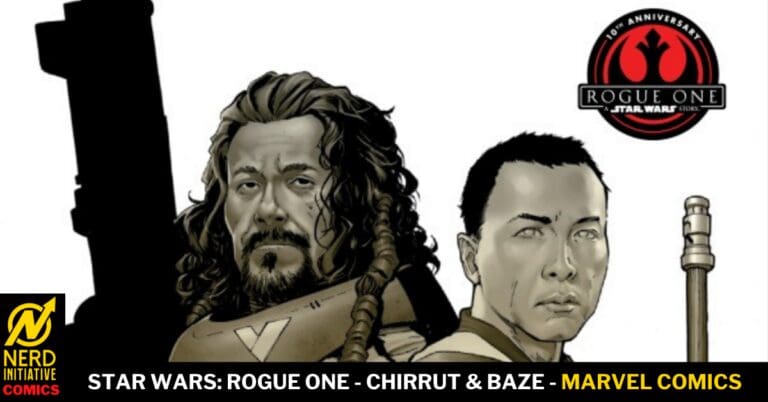
Star Wars: Rogue One – Chirrut & Baze

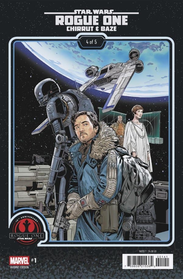
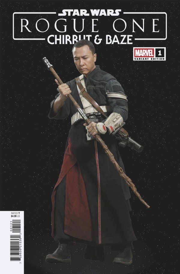
Baze Malbus and Chirrut Imwe are undertaking a covert mission to sabotage a Kyber mine in an attempt to prevent the precious crystals from falling into the hands of the Empire. If they wish to succeed and overcome unexpected obstacles, they both must learn to trust in the Force and make the impossible choices.


Creative Team

Stephanie Phillips, Yen Nitro, Sean Chen, Ariana Maher, David Marquez, and Laura Martin.


The Story:


Matt: The Duo of Baze and Chirrut has long been probably my favorite across the Star Wars Universe ever since I saw Rogue One on opening night. There is something beautiful about their relationship and how calm Chirrut is, while Baze is far less so. Seeing them back in action felt as though I was reuniting with two long-lost friends in a familiar area as well. Their fight against the Empire was already the two. of them before ever meeting our beloved band of Rebels and in this issue we see them once more ready to sacrifice themselves to stop the Empire if even for only a moment. The calmess of Chirrut is captured well by Stephanie who brings him to life through the Force once again. The duo change the lives of everyone they meet and show that even someone who may feel insignificant can play a huge role. There are times when I felt the story speaking more than about Star Wars and to the modern state of affairs which is why I think I connected so well with this issue. It was good to be back with these two heroes if only for a mere moment in time.

The Artwork:


Matt: The art captures the calm demeanor of Chirrut in contrast to the ever-so-stressed-out expressions of Baze. When they enter the Kyber mine, the bright blues radiate a hopeful glow in a way lightsabers often do when they ignite. While there are no lightsabers, of course, here, the mine is a rugged detail and texture, and it’s the way in which these colors bounce off of one another that brought this issue to life. Ariana brings their voices to life with the lettering and as I was reading this issue I could hear their voices as though I were watching a continuation of the film.


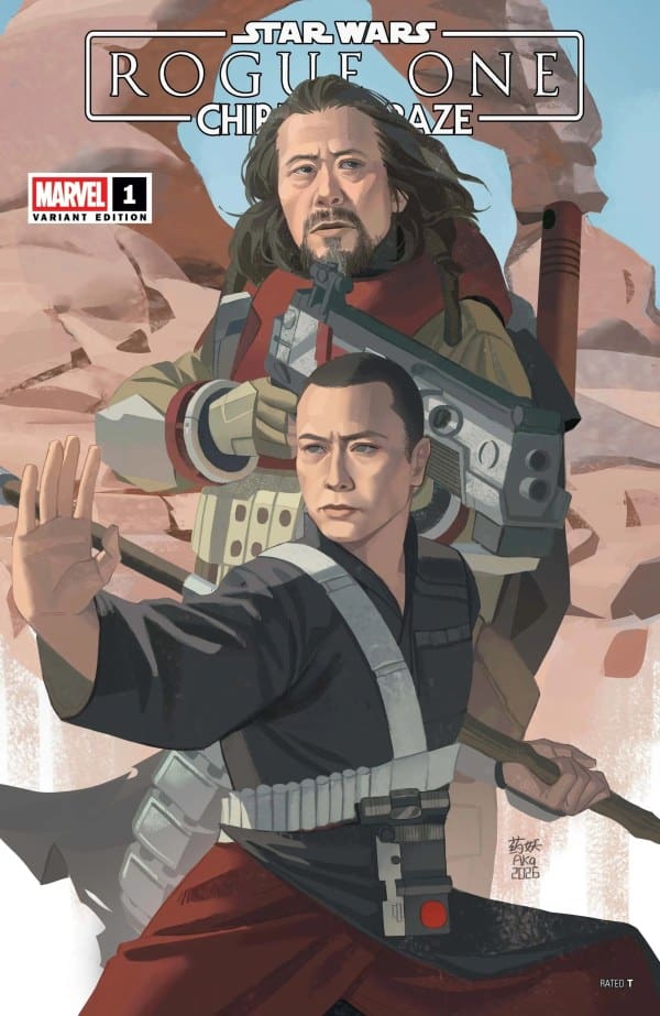
Variant Covers

Final Thoughts

Matt: I love this duo, and I love that this issue may have felt like a speed bump to the Empire, but it’s the words and the actions that spoke louder than ever to me. Some things truly are bigger than one person’s life, and this issue captured that perfect!

Overall Grade: 10/10


Links

Comic Book Reviews & Entertainment News: Nerd Initiative
Matt’s NI Portfolio: Matt!


PLEASE SHARE YOUR THOUGHTS IN THE COMMENTS SECTION BELOW!
Leave a Reply

This site uses Akismet to reduce spam. Learn how your comment data is processed.

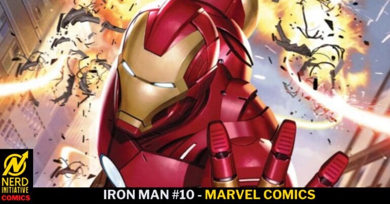
Iron Man #10 – Revelations and Betrayals!

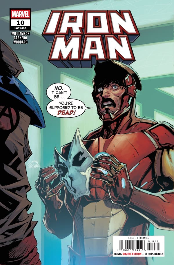
Iron Man #10 – Cover – Ryan Stegman & Frank Martin (Credit Marvel Comics)

Iron Man #10

Writer – Joshua Williamson

Artist – Carmen Carnero

Colorist – Nolan Woodard

Letterer – Joe Caramagna

Cover – Ryan Stegman & Frank Martin

Read the review of the last issue in this series HERE!

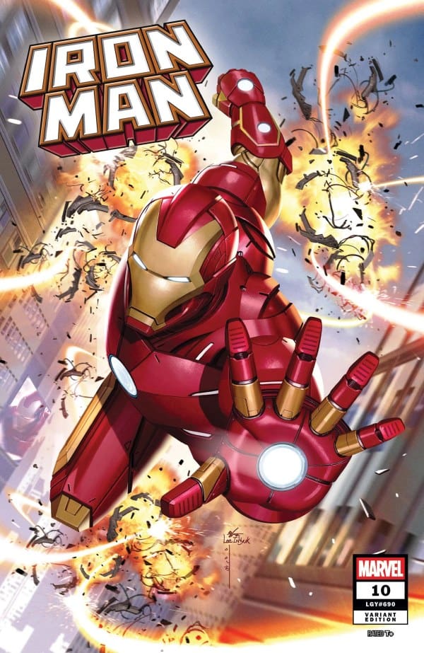
Iron Man #10 – Cover – InHyuk Lee (Credit Marvel Comics)

The Story:

It’s time to find out how Citizen V came to be in this story and whether or not Tony can trust him. While there are revelations to be had, Iron Man still has to deal with two villains with four whips. Also, A.I.M. continues to make moves behind the scenes.

The Writing:

Joshua Williamson has been digging deep into the long history of Iron Man in this run and this issue is no different. Within a few pages, Williamson is able to show Happy Hogan’s original introduction, and sum up his long relationship with Tony Stark. The way these few pages took me on a stroll down memory lane that I was not expecting is an understatement. I read those pages more than once with a big smile on my face… until he took me back to the beginning of Civil War and Happy’s tragic end. The amount of emotion that Williamson is able to pack into a few pages of monologue and nostalgia is impressive to say the least. Moving back into the present, the story picks right back up with the threat of last issue. Williamson is able to resolve the threat, pick up with the side characters so the reader doesn’t loose their plot threads, continues to set up the ongoing threat in the background, and pack an emotional punch at the end. This is comic book writing at it’s finest and Joshua Williamson continues to prove that he understands Iron Man and what makes him special!

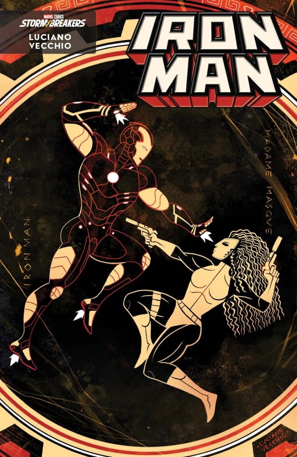
Iron Man #10 – Cover – Luciano Vecchio (Credit Marvel Comics)

The Art:

The art team crushed this issue. Starting off with the flashback pages, artist Carmen Carnero, colorist Nolan Woodard, and letterer Joe Caramagna crafted a beautiful tapestry of Happy Hogans past in Iron Man comics. From the fiery crash that introduced him to the fall during his fight with Spymaster, those pages really felt like a love letter to the character who has always been, in my opinion, underrated. Of course, as has been the norm for this book, the action and emotion on display is a work of near perfection. Any time I get to see a new version of Iron Man’s armor, I get absolutely delighted and it was no different here. The new upgrade to Tony’s armor is imposing and beautiful. The final page setting up the next issue is just… chef’s kiss. While lettering does not always get it’s due in these reviews, Joe Caramagna perfectly encapsulates Tony’s emotions during the final pages of this issue.

Overall Grade: 9.5/10

With each issue of this series I’ve waited for this team to let me down, I’ve been let down too many times in the past to expect greatness this far into a series. However, I’m done with that now. This team knows exactly what it is doing with this story, this art, this group of characters. This is exactly the team that Iron Man needed right now, a back to basics story with big goals for the future, an art team that knows how to handle a story this big, and this reader who is eagerly waiting for each issue!

Check out more from Derek here!

Have you read this issue? What did you think? Let us know in the comments below!

Leave a Reply

This site uses Akismet to reduce spam. Learn how your comment data is processed.

No Gods No Masters #2 – The Kaiju Aren’t The Only Monsters You Have To Worry About!

No Gods No Masters

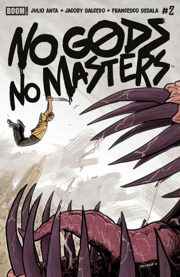
No Gods No Masters #2 Main Cover
No Gods No Masters #2 – Cover – Jacoby Salcedo (Credit BOOM! Studios)

Writer – Julio Anta

Artist – Jacoby Salcedo

Colorist – Francesco Segala

Letterer – Becca Carey

Cover – Jacoby Salcedo

Read the review of the last issue in this series HERE!

The Story:

Our trio of unlikely heroes continue to make their way through New York City in search of Felipe’s mother. Along the way, they will have to deal with monsters, both fantastical and mundane.

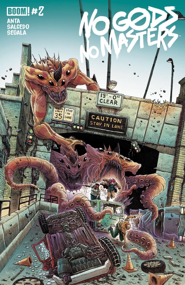
No Gods No Masters Variant Cover
No Gods No Masters #2 – Cover – James Stokoe (Credit BOOM! Studios)

The Writing:

Julio Anta continues this story by keeping it grounded in the personal relationships between these characters. By setting this story in New York during a massive attack, Anta has a built in mechanism to allow the character’s backstories to be slowly fleshed out during the long walk to their destination. Speaking of the backstories, I really appreciate the delicate use of exposition that draws the reader in instead of beating them over the head with word vomit. The little bits of background we’ve gotten in these issues fleshes out the characters in a way that makes me want more. Like any good apocalyptic story, the literal monsters are not the only ones our protagonists have to deal with. Anta handles a very timely interaction with a law enforcement group and it is so satisfying to see just how the three heroes decide to deal with it. Hats off on that confrontation, I found myself on the edge of my seat waiting for the first bat to be swung and I was not disappointed.

The Art:

I really don’t have the words to describe how wonderful Jacoby Salcedo and Francesco Segala are in this book. With this second issue, this art team has managed to take the art already laid out in the first issue and, somehow, made it more impressive. The line work, settings, and character design are all flawless. Each panel is a work of art and the layout of those panels during action scenes lend to a real sense of motion. The action and horror are visceral, and Francesco Segala’s colors add such a depth to the violence on the page. The art also never feels gratuitous, it’s not gory for gore’s sake. Once again, the actual monsters in this book are terrifying and fun to look at with a scale that feels daunting and impossible for our protagonists to deal with. The art team adds a layer of impossibility to the task at hand for Felipe and his friends.

Overall Grade: 10/10

At only two issues in, No Gods No Masters is already knocking at the door to become the best comic book of the year for me. This world is deep and interesting, and it is able to have fantastical elements while still feeling like the world you see when you look out your window. I need more of this story immediately. I will not be happy until I get, at least, 18 spin-off series, an animated series, and a live action adaptation on the big screen. Inject more of this story straight into my veins!

Check out more from Derek here!

Have you read this issue? What did you think? Let us know in the comments below!

Leave a Reply

This site uses Akismet to reduce spam. Learn how your comment data is processed.

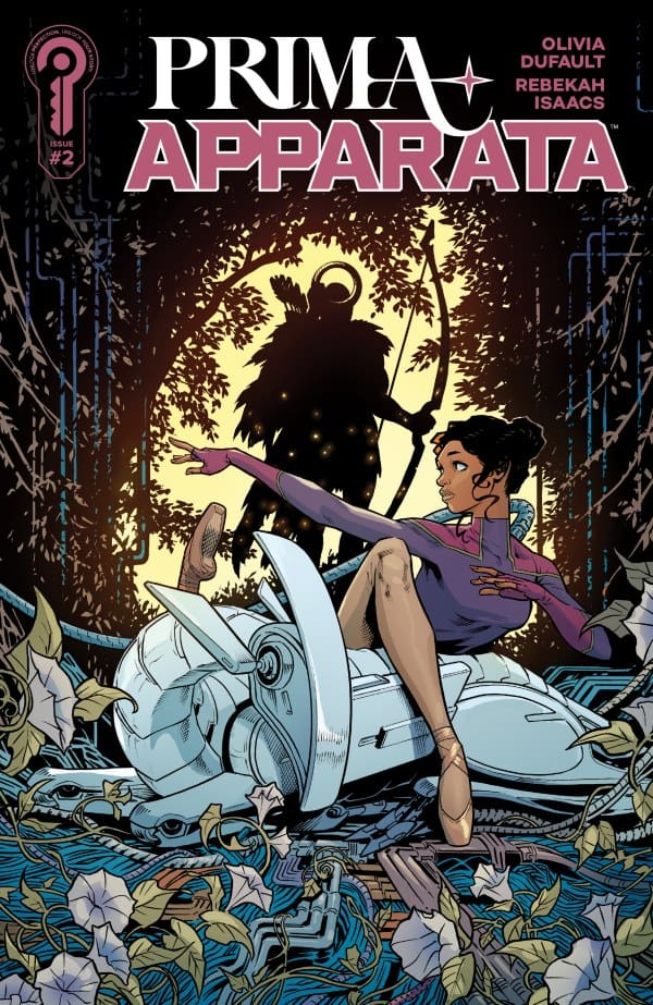
“Prima Apparata #2” Review – Dancing the Dream

The Run Down

The years go by and time moves along. Writer Olivia Dufault shows that as time moves, that doesn’t mean that friendships have to fade… but it doesn’t necessarily mean things won’t be hidden. What might we mean by this? Well, you may just have to join Eddie and me as we review “Prima Apparata #2” in order to figure that out!

Writer: Olivia Dufault

Artist: Rebekah Isaacs

Colorist: Marissa Louise

Letterer: Becca Carey

Source: Rebekah Isaacs, Ignition Press

The Writing

Eddie: Mar and Rhea are entering the full swing of their education and training as dancers. They are seeing firsthand how deadly and gruesome their life can be. Rhea’s rebellious nature is developing as fast as her talent as a dancer. Mar is still focused on becoming the Prima Apparata and she’ll do whatever it takes to get there.

”Prima Apparata #2” continues this science fiction epic with a distinct dystopian streak. Olivia Dufault’s writing is slowly unwinding this beautiful but brutal world. That dichotomy is strong, powerful, and shocking. The characters of Mar and Rhea are beautifully done. They represent two sides of the same coin, equally talented, but focused on different aspects of life. Their characterizations create interesting commentary on the role of social and economic privilege.

Eda: The way that Olivia Dufault writes this story is quite possibly among the most unique I’ve ever seen. While I very much enjoyed the previous issue, she truly sucked me in here. The dichotomy in Mar’s and Rhea’s friendship is highly interesting, but through it, she makes you worry about how things will turn out, dangling the endgame in front of you like shiny, jangling keys. Call me a pessimist, but I have a very sinking feeling things won’t turn out well.

To go along with the intriguing story beats is Dufault’s expert pacing. Everything here feels slow and methodical, like a dance with the minds and eyes of readers. That pace works to the story’s benefit, allowing us to take everything in and bask in each moment.

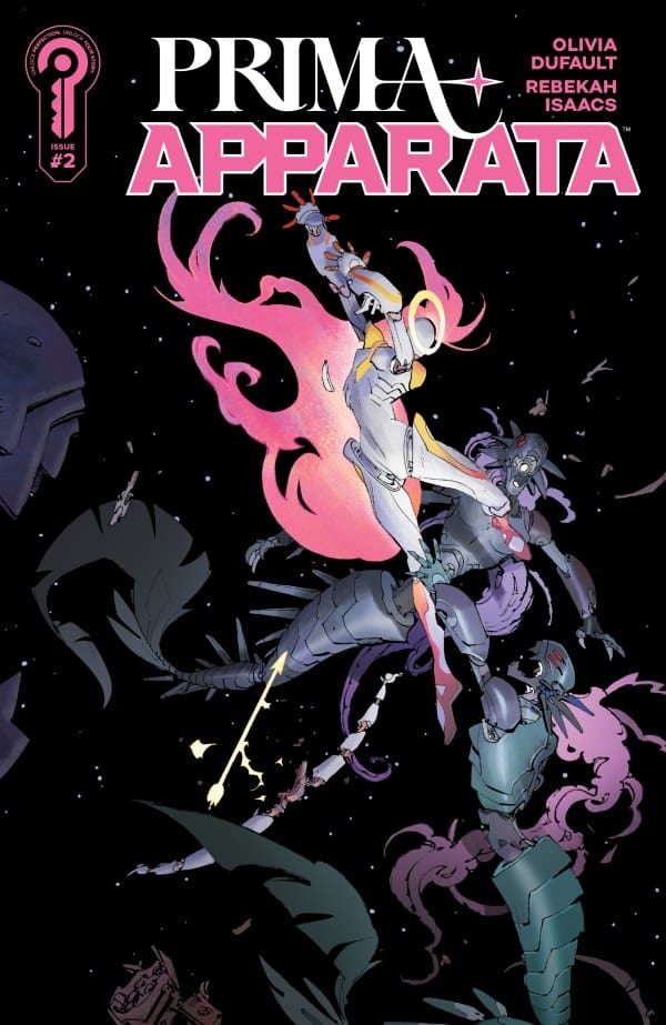
Source: Matias Bergara, Ignition Press

The Art

Eddie: The art of Rebekah Carey is beautifully detailed and jacks us directly into the action. Marissa Louise’s colors help solidify the dual nature of what we are seeing, gorgeous with an overwhelming edge of looming danger around every turn. Becca Carey’s letters drive the action with subtlety, injecting us into Mar’s mind and thoughts to the point where we feel we are one with her. The combination of those elements turns “Prima Apparata” into a gorgeous but scary symphony.

Eda: I don’t know how they did it, but Marissa Louise managed to capture every moment perfectly. Her colors truly breathe life and beauty into the space and destruction, perfectly capturing the dichotomy of the story. Meanwhile, Carey’s lines and inks are absolutely phenomenal, capturing the intensity of every moment from decision-making to the destructive dances. Lastly, Carey’s letters truly give voices to the voiceless and sound to the silence, making it easy to imagine how each character talks and how each machine sounds.

Final Thoughts

Eddie: “Prima Apparata #2” pulls us through the twists and turns of this world, and there are clearly more surprises to come. Olivia Dufault and team are in nearly perfect harmony as they weave this strong and refreshing original story.

Eda: Olivia Dufault and the team have truly made reading this feel like witnessing the world’s most beautiful ballet. The way the story, art, colors, and letters all play and dance together is a true wonder. “Prima Apparata#2” is something you truly need to read for yourself.

Eddie’s Grade: 9/10
Eda’s Grade: 9/10
Overall Grade: 9/10

Comments

Have you picked up “Prima Apparata”? If so, what are your thoughts? Let’s discuss in the comments below!

Leave a Reply

This site uses Akismet to reduce spam. Learn how your comment data is processed.

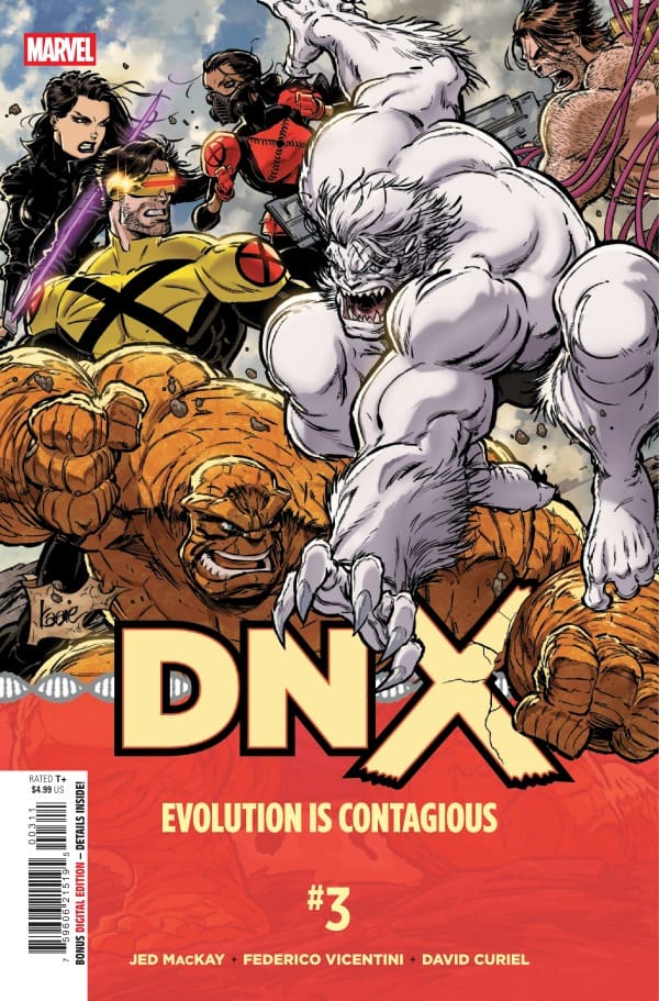
DNX #3 – It All Comes To A Head

Creative Team – Jed MacKay, Federico Vicentini, David Curiel, VC’s Clayton Cowles, Kaare Andrews

Published by Marvel Comics

Catch up with DNX #2!

The Story

This review is brought to you by Nerd Initiative’s Megan and Shawn!

Shawn – Jed MacKay really begins to pull out all the stops in this series with DNX #3. After picking up where we last left off, we see the aftermath of the cliffhanger from the last issue. One thing I really love about DNX so far is that Cyclops doesn’t get to take the easy way out. I’ve always had difficulty with the character because it always feels like he gets to win. He gets to make easy decisions and is proven right. In DNX #3, MacKay forces Scott to make some really tough decisions without the promise that they will turn out right. It makes for a high-stakes story that draws you in.

Cover art by Kaare Andrews. Published by Marvel Comics

One thing I really enjoy is that from Krakoa to her solo series to now DNX, MacKay has kept Magik as sassy and hilarious as ever. There’s no shortage of snappy comebacks and humor from Illyana, even amidst all of the drama the team is facing. The climax of this issue was perfectly done. While it was predictable if you’ve been reading the series and the tie-ins, it was done by MacKay in a way that still makes it impactful and an awe-inspiring moment.

Megan – There was so much packed into this issue! Picking up right where we left off, the Chairman unleashed the virus in Jupiter. Pandamonium follows. The X-Men have more than one problem on their plates. Along with the X-Virus, there’s also a gigantic spaceship slowly making its way to a crash landing in Philadelphia. The X-Men don’t have much to work with besides each other, so they’ll have to get creative. Meanwhile, Sue Storm and Reed Richards are preparing to shrink themselves down to help cure Magneto. Coincidentally, Magneto is the only one that would be able to stop the crashing ship.

The energy in DNX #3 was electric all the way through. The energy was high, but the stakes were higher. I have to say that this is easily my favorite issue so far. While the other issues were setting this up, it paid off handsomely with the X-Men trying to handle each issue as a team.

The Art

Shawn – Federico Vicentini, David Curiel, and Clayton Cowles really did a great job right out of the gate with DNX #3. Vicentini in particular had an uphill battle ahead of him with the aftermath of the fights in the last issue. He masterfully crafts the settings of each scene, ensuring there is significant line work to create details in the background without feeling like the scenery is so complex that it distracts from the narrative. The major reveal of the issue is given a full-page panel, and Vicentini takes full advantage of the space to craft a beautiful, poster-worthy panel.

That big panel works as well as it does in part because of the work of David Curiel. Curiel has done a spectacular job coloring DNX #3. The scenes are dynamic, and characters stand out because of his work. The deployment of the X Virus in the previous issue and the beginning of this issue really stand out. Curiel chooses a purple hue that feels both menacing and non-threatening at the same time. Clayton Cowles is the final piece of the puzzle on that full-page panel, with the lettering really making the reveal pop. Throughout the whole issue, Cowles helps guide readers through the story and feel the emotion coming from both the members of 3K as well as the X-Men.

Megan – Federico Vicentini, David Curiel, and Clayton Cowles set the tone immediately with looks at Juniper which is now a hazardous zone. Mutants are being made, humans are dying, and you can feel the high emotions throughout the panels. Vicentini gives an enormous amount of detail on every page, but I have to say that what pulled me in were the characters. The characters wore their emotions on their sleeves and could practically tell the story themselves. David Curiel handled the colors and brought a ton of vibrancy to a story that was drenched in darkness. With powersets on full display, Curiel made each one feel larger than life. My favorite panel is towards the end with a full-page appearance of an unexpected character. Keep an eye out for that! Clayton Cowles captures the different tones of the characters and allows the emotions to do the talking in the dialogue, while providing an even flow throughout the story.

Final Thoughts

Shawn – 9/10. DNX #3 is exactly what you would want for the middle issue of a five-issue arc. The story raises the stakes in a meaningful way. This creative team does a great job in this issue of giving you some resolution while also beginning to unwind new threads that may have lasting impact beyond even the DNX event.

Megan – 9.2/10. DNX #3 is easily my favorite issue yet! This issue captures you and doesn’t let you go until the very end. The energy was high, the stakes were even higher, and I was locked in.

Overall Grade – 9.1/10

Let us know in the comments what you thought of DNX #3!

Leave a Reply

This site uses Akismet to reduce spam. Learn how your comment data is processed.

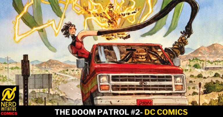
THE DOOM PATROL #2: Negative Spaces.

How much trouble could saving a missing cat bring our group? Well, apparently far more than they had bargained for, as the case takes a turn for the weird, leading Larry, Cliff, and Rita into peril far beyond their imagination.

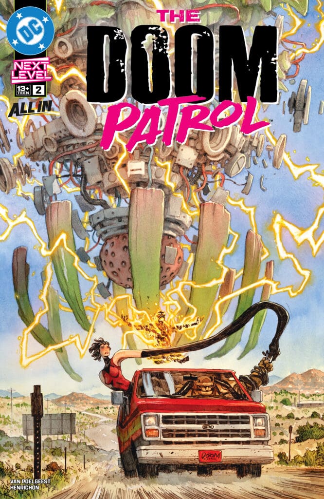
The Doom Patrol #2. Credit DC Comics. Cover by Niko Henrichon.

Creative Team: Darcy Van Poelgeest, Niko Henrichon, and Lucas Gattoni.

This review is brought to you by Nerd Initiative’s Megan and Matt!

The Story:

Megan: The Doom Patrol #2 does a brilliant job of giving us an inside look into the characters’ pasts that have shaped them into who they are today and in the present. These characters carry trauma with them that each one is still working through, while simultaneously doing their job as a group of superpowered beings. Robotman, Elasti-Girl, and Negative Man work together on a mission that may change their little group permanently. Surprising obstacles stand in their way and keep you on the edge of your seat.

Darcy Van Poelgeest keeps you locked into the story with the flashbacks and continuation of their mission in a way that makes your eyes never want to leave the pages. Before diving into this series, I wasn’t too familiar with the Doom Patrol, but Poelgeest has certainly made me a fan now.

Matt: I think what has drawn me so intimately into this story is the way Darcy humanizes each member of the team in a way that I can relate to so much. There’s a moment where they all are reflecting on their past and Rita is using that to image herself and then go on as though nothing was wrong and then even the creature they recently defeated being confused over the loss of someone who loved cats and not understanding the world. All of that is relatable in a way that stories can invite a reader into and become immersive. They may be fictional characters however Darcy has crafted a true realness to this story. Just when I thought I knew the direction this was headed in Darcy throws a curveball into things as well surrounding Dr. Caulder. I could not be more enthralled with this run and we are only two issues in!

The Art:

Megan: Niko Henrichon and Lucas Gattoni prove that the first issue wasn’t just a strong start but a great example of the high-quality work that we can expect from upcoming issues. What I love about Henrichon’s linework is the amount of detail that goes into every panel and every character. Each character is drawn in a way that they could be the main character, yet they all mesh together so well without watering down the other. Another thing I really loved is how Henrichon is able to convey so much emotion in the panels, such as the flashbacks of their past life. Every page has several layers in it, and the story benefits from it. Lucas Gattoni handles the lettering and captures the emotions of the characters excellently. There are many different emotions in this issue, so whether it’s the team singing to Sweet Caroline or confronting a disastrous explosion, the dialogue of the characters matches the energy of the story perfectly.

Matt: The artwork is beautiful because Niko brought Mr. Negative to life in the opening pages and crafted him to feel like an apparition come to life. A blend of greenish blues created a static-like setting that fit the character and his sense of being in a whole other world. The way Lucas even lettered him aided in that because it was a distorted voice that didn’t match any other dialogue. The emotionality in the artwork is peak; the sadness you feel from Larry through the sunglasses, or Cliff’s demeanor doing more than words could possibly do, adds so much depth to this story. Even the reflection in Niles’ eyes had me feeling sorry for him for even a brief moment, despite his character always having been awful. It speaks volumes about how Lucas and Niko do so much through the artwork.

Final Thoughts:

Megan: 9/10. The Doom Patrol #2 does a fantastic job of continuing the story while giving us a look at the devastating past of the characters. Darcy Van Poelgeest humanizes these characters in a way that makes them feel relatable yet still keeps them feeling larger than life.

Matt: 10/10. The Doom Patrol #2 is firmly cementing this run early on as one of my favorite things DC Comics has put out, which is no easy feat considering the run the company has been on. This team is able to humanize these characters in such a unique manner while keeping the core of who they are intact. There is mystery and weirdness, all culminating in a roller coaster ride that people should not be afraid to join in on.

Overall Grade: 9.5/10

Let us know if you’re riding in the van into action with The Doom Patrol in the comments below!

Leave a Reply

This site uses Akismet to reduce spam. Learn how your comment data is processed.

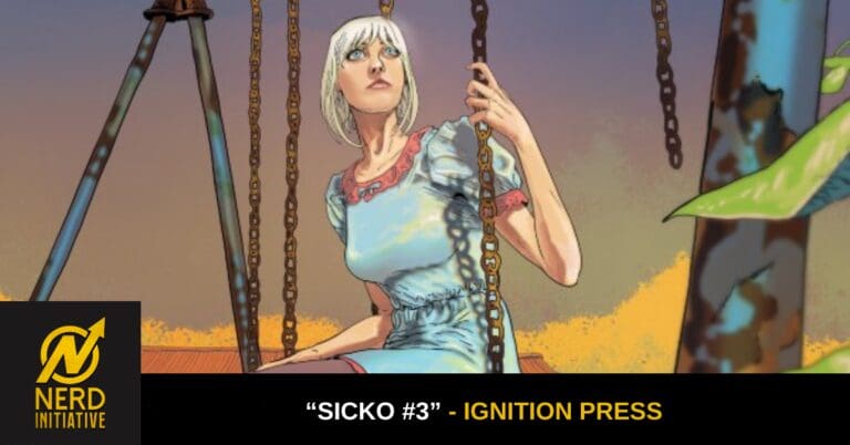
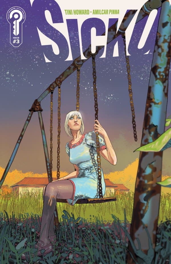
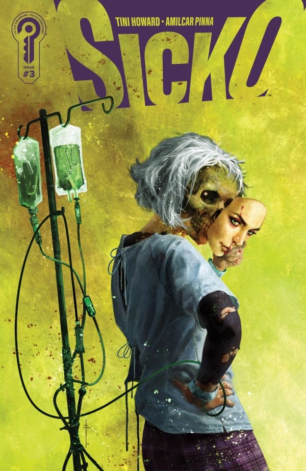
”Sicko #3” Review – Coming to Light

The Run Down

At the end of the previous issue, Valentine was officially captured and had her immune system taken from her. Unwillingly, she was placed in a Xavier’s School-like hospital environment. There are others like her, but how can this be? Well, my lovelies, that just might be coming to light. So come with me as we explore this new environment in Tini Howard’s “Sicko 3”!

Writer: Tini Howard
Artist: Amilcar Pinna
Colorist: Amanda Grazini
Letterer: Ariana Maher

Source: Amilcar Pinna, Ignition Press

The Writing

Just coming out of the issue, I feel it’s safe to say that this excited me more than any other. Howard’s made it extremely hard for me to review this without outright spoiling anything. Within just a single issue, so much is either answered or built upon, and it’s simply astounding! Howard is expertly building the tension with every turn of the page, flipping the script on what we’re used to.

The revelations made here don’t disappoint, but they certainly make me wonder what’s coming. I mean that in the absolute best and most excited way possible. At every turn, the pacing ebbs and flows as necessary while helping us get used to these new characters. Whenever I think or worry she’ll stop, Howard continues finding ways to keep this as my favorite run of the year.

The Art

As with the previous issues, Amilcar Pinna and Amanda Grazini are absolutely rocking it in the art department. In this issue in particular, I love the very unique angles that Pinna chooses. Each one feels disorienting on purpose, putting us in the mind of Valentine in more ways than one. The angles not only show us that reality can be played with, but that the way she views it is warping and changing.

Source: Sebastian Fiumara, Ignition Press

When it comes to the colors from Grazini, they’re absolutely gorgeous. Things such as sunsets are not only beautifully lit, but they work hard to set the tone. As things continue getting darker for Valentine, so does the color of her world, and they play together beautifully. As for the lettering, Maher keeps things super easy to follow and understand while perfectly using the boxes to set each scene.

Final Thoughts

I don’t know how she did it, but Howard managed to solidify this as my favorite run of the year with this issue. The revelations and twists made here were simply jaw-dropping and won’t leave any reader disappointed! I seriously can’t wait for the next issue and need it as soon as possible!

Overall Grade: 10/10

Read more from me here and be sure to check out my socials

Comments

Have you been reading “Sicko”? If so, what’re your thoughts so far? Let’s discuss in the comments below!

Leave a Reply

This site uses Akismet to reduce spam. Learn how your comment data is processed.

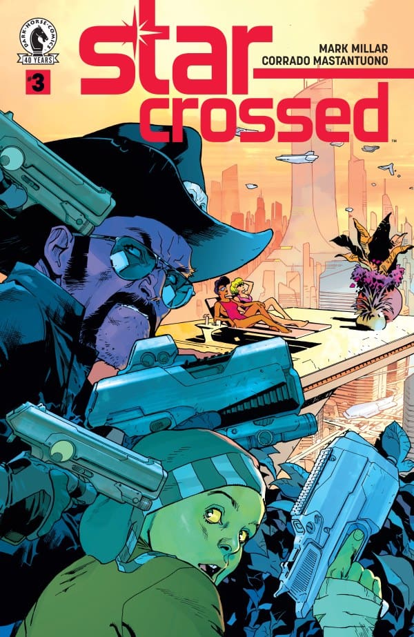
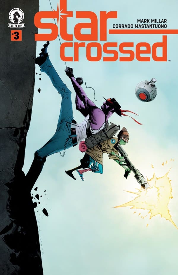
“Star-Crossed #3” Review – Tension Runs High in the Stars

The Run Down

Mark Millar left us truly hanging at the end of the previous issue. With Sharkey and Extra-Bill about to have Cody and Thena dead to rights in their own apartment. Add this to the fact that our heroines are finding out they’re due to die any day for an entirely different reason. How will things turn out? Well, find out with me as I take a look at “Star-Crossed 3”!

Writer: Mark Millar
Artist: Corrado Mastantuono
Colorists: Corrado and Niso Mastantuono
Letterer: Clem Robins

Source: Stuart Immonen, Dark Horse Comics

The Writing

With the stakes as high as they are right now, Millar makes sure to keep the tension tight and palpable. A massive part of that is him keeping us guessing as to what will happen next, because this issue was one twist after another. There wasn’t a single point in this issue where I could guess what would happen, and I absolutely loved it!

As things begin tightening for everyone involved, you truly feel each character’s despair and need for survival. The tension was so thick that you could cut it with a knife, and that’s exactly what the humor did! If the tension was a high-grade steak, then the humor was the sous chef, cutting without destroying.

Source: Jae Lee, June Chung, Dark Horse Comics

The Art

When it comes to the art of Corrado, he continues to kill it throughout this issue. Something I love in particular here is the grand ship designs. Despite being on a page, he manages to make them all feel grand in scale. This especially shows in an absolutely gorgeous splash that left my jaw on the floor. Not only was the scale grand, but the inking and color work were an absolute sight to behold.

Final Thoughts

Being at the midway point of the mini-series, this issue was an excellent turning point. Millar and Corrado are both at the top of their game and each issue is better than the last. You can go in never knowing what to expect next and have the ride of your life in this tight, gripping story.

Overall Grade: 10/10

Comments

Have you been enjoying “Star-Crossed”? If so, what’s been your favorite issue so far? Let’s discuss in the comments below!

Leave a Reply

This site uses Akismet to reduce spam. Learn how your comment data is processed.

Venom #1 -Different Rules Down Here

Eddie Brock is back, and so is Venom. In the aftermath of Queen In Black, Eddie finds himself partnering with the Venom symbiote again. This time, though, they want things to be different. This time they’re gonna do things the right way and help people.

This review is brought to you by Nerd Initiative’s Shawn!

Creative Team

Writer: Charles Soule
Artist: Tommaso Bianchi
Color Artist: Yen Nitro
Letterer: Cory Petit
Cover Artist: Davide Paratore

Writing

I really like the way Charles Soule is starting off this Venom story. While there’s always a little nagging voice in the back of your head when you hear the idea of Venom turning over a new leaf, Soule writes the story in such a way that it actually becomes easier to believe. That doesn’t mean we are dealing with a new Spider-Man here. Soule makes it clear that while Venom is going to change how he operates, he’s not going to change who he is at his core. This version of Venom and Eddie Brock is one that is done waiting to be allowed to do something a certain way.

The result is a Venom from Soule that feels independent and free. Eddie and Venom are trying to do something new and different. Will it stick? We don’t know, but Soule tells the story in a way that allows you to genuinely hope that maybe it will. Soule manages to work in plenty of cameos, also taking the time to remind fans who may not have seen him in a while that Luke Cage is still Mayor. The last page of the comic was a nice surprise that left me even more interested to see where this series goes from here.

Art

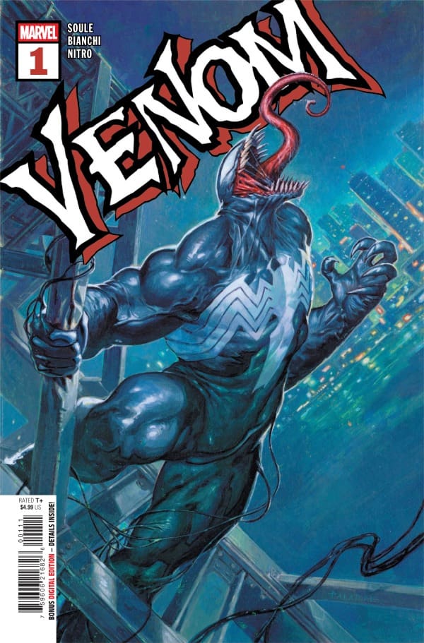
Venom #1 cover by Davide Paratore. Image from Marvel Comics

Tommaso Bianchi, Yen Nitro, and Cory Petit really did an outstanding job on this first issue. Bianchi crafts a version of Venom that is familiar yet distinctly his. The line work and little variations in the costume remind you that while you’re seeing a new version of Venom, the parts you love about the character are still there. As it an almost ironclad requirement for Spider-Man office stories, Bianchi does a beautiful job crafting cityscapes.

Yen Nitro absolutely brings the fire with colors. The last page in particular is just beautiful. Nitro perfectly captures the hue of the city lights at night and the diverse hustle and bustle of the city during the day. Cory Petit knocks the lettering out of the park. He chooses the right moments to emphasize words to ensure that you feel the emotion Eddie feels as he’s trying to craft this new version of Venom with everyone holding who he used to be against him.

Final Thoughts

This was an enjoyable first issue of the new series. I’m excited to see where the series goes. It feels like there’s a real sense of partnership with this creative team.

Overall Grade: 9.5 / 10

Did you like this story? Let me know in the comments

Leave a Reply

This site uses Akismet to reduce spam. Learn how your comment data is processed.

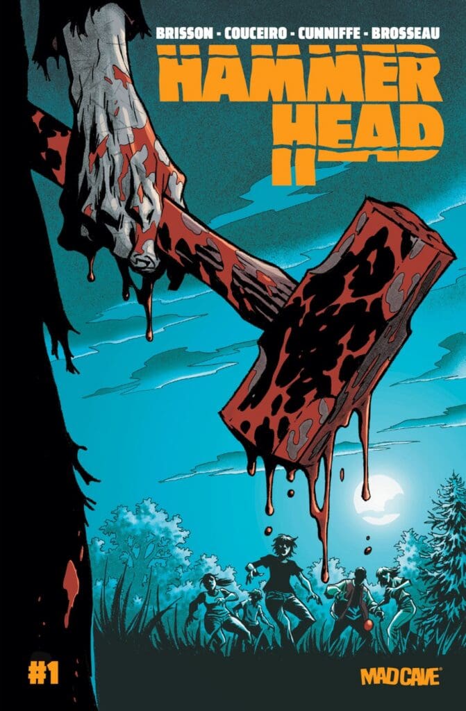
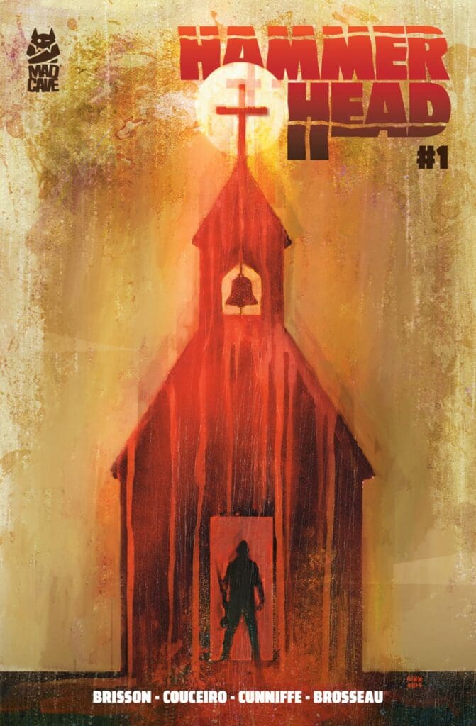
“Hammer Head #1” Review – Hitting the Nail in the Head

The Run Down

What would you do if the cops randomly arrested you for seemingly no reason and brought you to an unknown location? What if they somehow knew your traumatic past and used it against you in a twisted game? Those are the exact questions Ed Brisson presents us with in “Hammer-Head”. Come join Anthony and me if you don’t want to feel alone in the madhouse!

Writer: Ed Brisson
Artist: Damien Couceiro
Colorist: Dee Cuniffee
Letterer: Pat Brosseau

Source: Damien Couceiro, Mad Cave Studios

The Writing

Anthony: This is a strong first issue, y’all! Ed Brisson knows how to get under your skin! The mystery surrounding the prison is compelling, while Jules gives the story an emotional center amid all the violence and uncertainty. She starts pretty unlikeable, but as her story unfolds, you can’t help but feel for her. The book moves quickly, but it still gives the characters enough room to feel like people and not just disposable bodies in a horror setup. It’s got a bit of a “Cabin in the Woods” vibe, only it isn’t total nonsense.

Eda: Right from the start, it’s clear that, as with most horror, Brisson’s telling a story with a very relevant message. A problem that’s been ongoing for decades in the US is that of our prison/legal system. Couple that with today’s interest in true crime and darker entertainment, and you have yourself a recipe for a solid horror foundation. That’s exactly what this first issue is: a solid start.

Within just a little over thirty pages, Brisson manages to hook you in and set up a multitude of questions. How did Jules get here? How does the warden know her and her past? Most importantly, why is she being forced to relive her trauma with these seemingly random people? These are just a few of the questions I asked myself, and I’m so excited for whatever Brisson has planned going forward!

Source: Martin Simmonds, Mad Cave Studios

The Art

Anthony: Damien Couceiro’s art is raw, expressive, and perfect for horror. Every act of violence feels painful, hallways feel claustrophobic, and the final pages deliver the kind of shock horror you came for. Dee Cunniffe’s colors do a lot of work as well, using cold blues, sickly greens, and bursts of red to make the book feel grimy and dangerous.

Eda: Matching the vibes of Brisson’s writing is the art and colors of Damien Couceiro and Dee Cunniffe. When it comes to Couceiro’s penciling and inking, every single bit feels intentional. Like it all tells its own story to help shape this world. The characters we see are of varying ages, genders, and heights, each design indicating a life lived. That all just makes it hit even harder when things get visceral, and boy, do things get bloody.

Lending to this is the fact that Cunniffe colored everything to perfection. The blood looks viscous, and Jules’ world looks properly drab and dreary, indicating either lost hope or no hope in sight. The way the colors make the world is truly a sight to behold. As for the lettering, Brosseau did a fantastic job of keeping things easy to follow while making sure we knew exactly how to read each piece of dialogue.

Final Thoughts

Anthony: “Hammer Head #1” is a tense, violent, and gripping debut that feels like a mash-up of “Person’s Unknown” and “Cabin in the Woods”. It has the energy of a prison thriller, the unease of survival horror, and just enough mystery to make us want to see where this nightmare goes next.

Eda: “Hammer Head #1” is a near-perfect first outing from Brisson as he creates a horrifying tale wrapped around an intense, uncomfortable, and necessary message. With a fantastic team behind him, this is a horror run you’ll want to pay attention to. I know I will be.

Anthony’s Grade: 8.5/10
Eda’s Grade: 9.5/10
Overall Grade: 9/10

Read more from Anthony here and check out his Instagram

Read more from me here and check out my socials

Comments

Do you plan on checking out “Hammer Head #1”? If you’ve read it, what did you think? Let’s discuss in the comments below!

Leave a Reply

This site uses Akismet to reduce spam. Learn how your comment data is processed.