Home Blog Page 7

BATMAN AND ROBIN: YEAR ONE – DYNAMIC DUOS #1: The Wolfpack

Not every threat in Gotham is a massive one as we are back with Batman and Robin Year One! After Bruce gets robbed while on a date he enlists the help of Robin to go undercover within a mysterious new gang that may just be more than meets the eye.
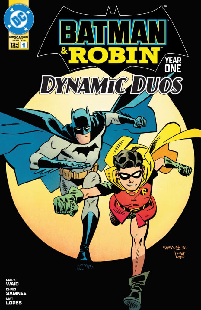
Cover of Batman and Robin: Dynamic Duos featuring Batman and Robin running forward with a yellow backdrop behind a bold title.
Batman and Robin Year One Dynamic Duos #1. Credit DC Comics. Cover by Chris Sammie and Mat Lopes.

Creative Team: Mark Waid, Chris Samnee, Mat Lopes, and Clayton Cowles.

This issue is joint reviewed by Nerd Initiative’s Matt and Megan!

The Story:

Matt – It is great to have Waid and Samnee back with our Dynamic Duo once more as I love how they capture the relationship between Alfred, Bruce, and Dick. There is so much snark between the three characters and it perfectly captures the relationship between them. There are moments where you want to strangle Dick Grayson for his sarcastic humor but, at the same time it is endearing because he is still a kid at heart. This issue sets up what will be a fun ride as Robin gets to go undercover and there are a couple of characters introduced that may have a major impact on the story at large.

Megan – You could see that Waid and Samnee had a lot of fun with this issue and it shows in the story. Batman and Robin, the dynamic duo, are doing what they do best, fighting crime and saving the people of Gotham. Things are all going as they usually do until Bruce gets met with a group of unsuspected criminals that leaves him nothing short of confused. There’s a ton of mystery surrounding the whole event, but the dynamic duo will do whatever they can to solve the crime. What I love is that there’s a great set up for Robin to take the lead here, and I can never get enough of Robin. This issue was a blast to read and has me very excited to see what’s next!

The Art:

Matt – There is a real newspaper style of art in this issue that transports us back into the time period of comics where this takes place within. The simplistic design of Batman and Robin’s costumes is perfect and it’s refreshing playing in this box without all of the new age fancy technology. Lopes’ use of colors and the way he shades and shadows makes the emotions within the panels pop out at the reader.

Megan – Mat Lopes, Clayton Cowles, and Chris Samnee really made this comic a fun read from the beginning to end with the excellent work on the artwork. I absolutely loved the old school comic vibe that the artists went out of their way to put into the comic. The characters were drawn beautifully with an excellent use of detailing on every page. The colors were vibrant and striking, practically making the characters pop off the panels. The lettering work was fantastic as you could easily feel the difference in tones when it came to Batman and Robin’s dialogues. Together, the artists deserve all their flowers because this was marvelous work.

Final Thoughts:

Matt – 8.5/10. Batman and Robin Year One Dynamic Duos #1 takes us back in time to a more simplistic feeling Gotham city. It’s full of humor as the team captures the personalities of our main cast while setting up some interesting mysteries that lie ahead. I’m intrigued to see where this goes and will be picking up the next issue for sure!

Megan – 9.1/10. Batman & Robin: Year One – Dynamic Duos #1 was an absolute blast to read! Make sure this one is in your pull list if you like feeling like you’re reading the old school Batman and Robin stories!

Overall Grade: 8.8/10

Let us know how you feel about this issue and check out more reviews by Matt!
Leave a Reply

This site uses Akismet to reduce spam. Learn how your comment data is processed.

EMPEROR AQUAMAN #20: The Wrath of Poseidon!

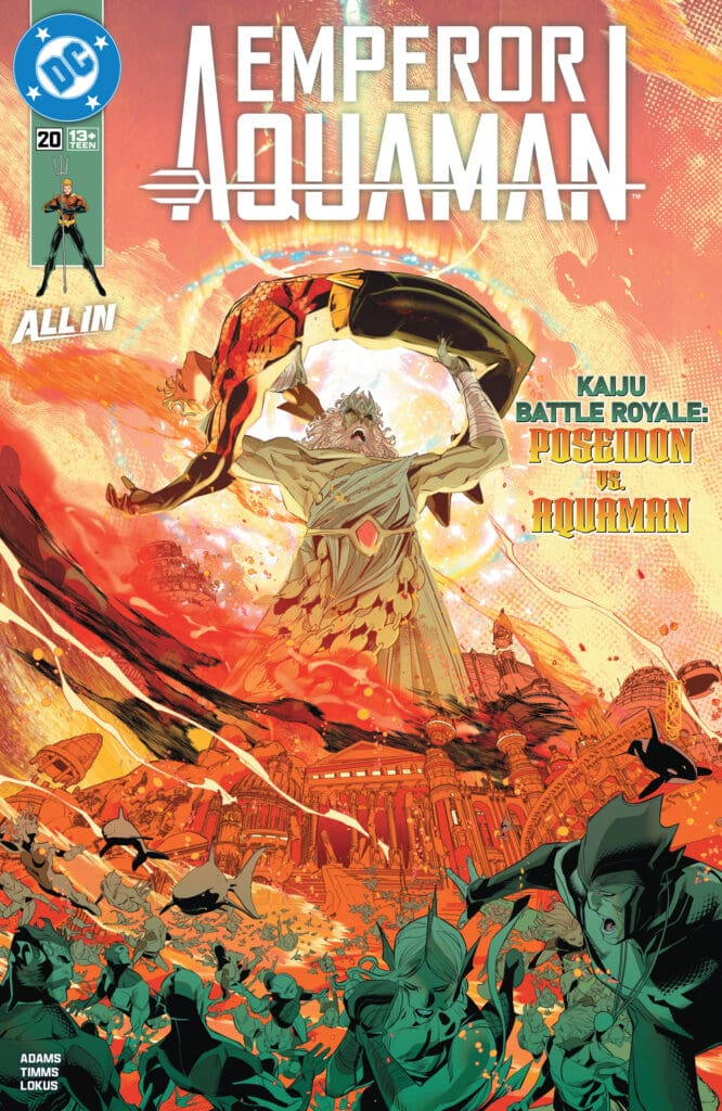
Emperor Aquaman #20 brings about an epic battle as Arthur’s connection to the Blue has been a gift and a curse, as it has now brought about the wrath of Poseidon himself! The duo battle not only for the power of the Blue but for control of the Oceans. Will they be able to settle their differences, or will the universe become their battleground?

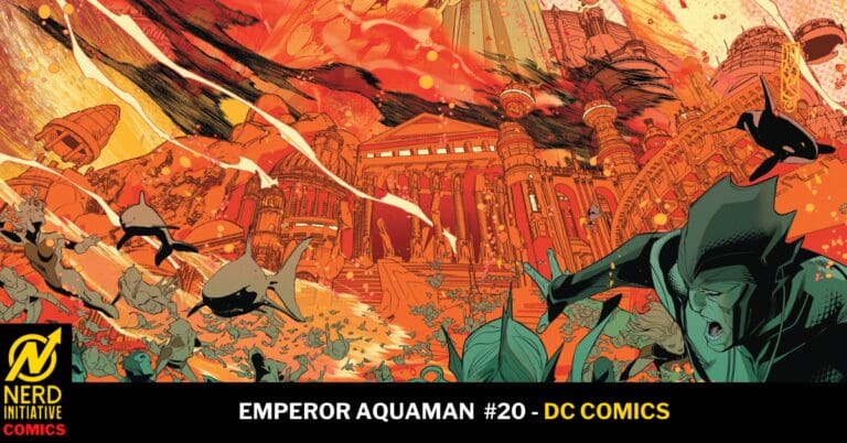
Emperor Aquaman #20. Credit DC Comics. Cover by John Timms.

Creative Team: Jeremy Adams, John Timms, Rex Lokus, and Dave Sharpe.

Jeremy continues to build up the mythos of Arthur and break every stigma Aquaman has ever faced. You can tell he is having a blast writing this character, and each issue brings us something new with Arthur and his legacy. Poseidon feels possessed in a sense in this issue, and I love how Jeremy makes it seem as though the God intends to protect the power Arthur is wielding, but as the battle rages on, his true selfish intentions become clearer and clearer. I will say I am eager to see Black Manta and Arthur go head to head, and after this issue, I am extremely curious as to how Manta can hold his own. It’s Adams’s ability to keep us hanging and guessing that makes this run continue to get better and better.

It has been an excellent week at DC Comics and their cover work because Timms cover for this issue might just be my favorite of the series to date! The stellar work carries over into the pages as his ability to wrap the water around Arthur and Poseidon. The water feels like it is its own character at times with how powerful Timms draws it. Lokus has beautiful coloring in these pages as well. The blackness of Poseidons eyes seem to grow darker as the fight rages on and the various shades of blue give life to the setting. One aspect that really stood out to me was Sharpe’s lettering. He matched the powerful boom and tone of voice for our God of the Sea and every word felt powerful and mighty. It set the tone from the first page setting us up for this battle.

Emperor Aquaman #20 gives us a good old fashioned fight from start to finish. However, this issue isn’t simply a fight for the sake of a fight as it delivers a powerful lesson and continues to grow the mythos of Arthur Curry. From the beautiful cover down to the last page this book is a lot of fun and gorgeous making it a standout for the entire run!

How do you feel about Emperor Aquaman #20? Let us know below and make sure to check out more by Matt!

Leave a Reply

This site uses Akismet to reduce spam. Learn how your comment data is processed.

The Twilight Zone #10 – The Most Interesting Thing You’ve Ever Seen

What happens when a girl decides at a frat party, of all places, to break out of their shell? What happens when secrets untold are revealed? When time passes without thought, what does it do to the brain?

This review is brought to you by Nerd Initiative’s Shawn!

Creative Team

Writers: Rosemary Soule and Charles Soule
Artist: Sean Peacock
Letterer: Jeff Eckleberry
Cover Artist: Sean Peacock

Writing

This was such an interesting issue from Rosemary and Charles Soule. I loved the setting. Each issue of The Twilight Zone brings something new to the table. For this issue, it was the age of the characters and the setting of the story. The story using younger characters was a nice change of pace from some of the previous issues. I also really liked the setting of the frat house. It was a unique setting to find in a story from The Twilight Zone, but it was greatly appreciated. It serves as a reminder that The Twilight Zone happens everywhere and is for any story.

I really enjoyed the growth that the Soules showed for Anabelle’s character over the course of the comic. It was great to see her come out of her shell. As the “boring” and timid one, it was nice to be able to connect with a character that experiences a coming out of their shell moment. The issue was filled with a few twists, each of which was a nice surprise and well hidden. The Soules did a great job with one twist serving as a tease before hiding the big reveal. I also appreciated the ambiguous nature of the story’s ending, allowing the potential for the Soules or someone else to build upon the story even further.

Art

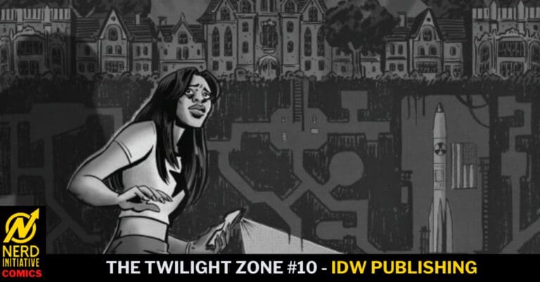
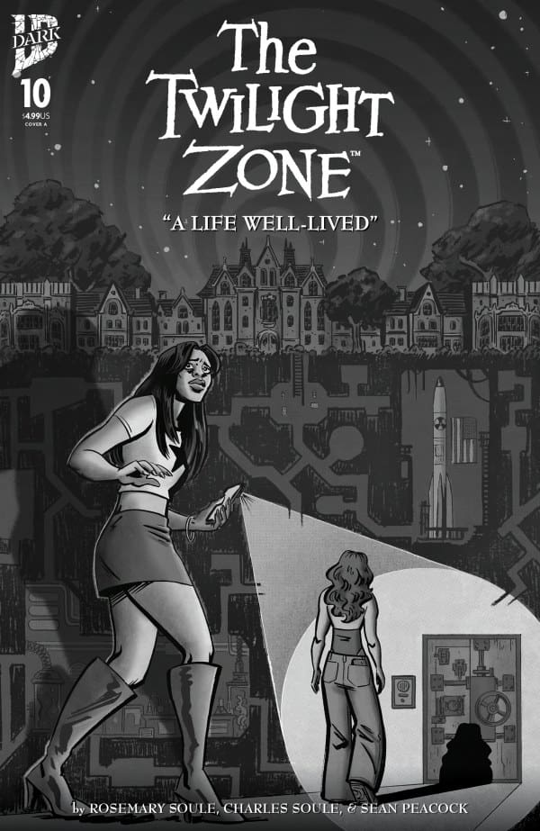
The Twilight Zone #10 cover by Sean Peacock. Image from IDW Publishing.

Sean Peacock does an amazing job in this issue. I’m always impressed with what artists can do in The Twilight Zone series due to the limited color palette. Peacock does an astounding job of helping you feel the characters with the limited palette and focus on shading. The line work is immaculate and stands out. The backgrounds are so well done that it feels like a living and breathing part of the story.

I like that Peacock was able to tease some of the story with the cover. The shading Peacock uses really helps to make the highlights in the hair and clothing pop. I enjoyed watching how Peacock manages to blend extra people into the background while still making him distinct. The backgrounds feel lifelike but also blend well, allowing the panels to feel three-dimensional.

Final Thoughts

Issue 10 is another great issue in the Twilight Zone series. The story is unique and manages to hit a few new areas that the series has not touched on in-depth. It was refreshing to see younger characters and a story that is so different than others in the series. Soules crafted a story that was addictive and full of nice twists, and the art was spectacular.

Overall Grade: 9.5 / 10

Ten issues in, where does this issue rank in your Twilight Zone rankings? Let me know in the comments

Leave a Reply

This site uses Akismet to reduce spam. Learn how your comment data is processed.

THE FURY OF FIRESTORM #5: Desperate Measures

The Fury of Firestorm brings us an emotionally charged issue as the hour grows short, with the Firestorm Matrix in full control of Ronnie’s body, as Lorraine and Stein resort to desperate measures in an attempt to bring him back from the void. Can Ronnie be saved, or has his mind been lost for too long, leaving nothing but his body behind?

This review is brought to you by Nerd Initiative’s Megan and Matt!

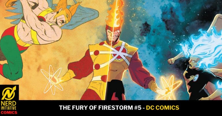
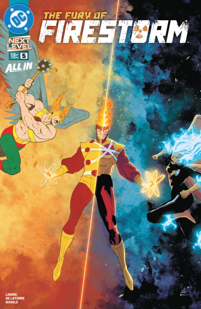
The Fury of Firestorm #5. Credit DC Comics. Cover by Rafael De Latorre and Marcelo Maiolo.

Creative Team: Jeff Lemire, Marcelo Maiolo, Rafael De Latorre, Lucas Gattoni, and Andrew Marino.

Writing

Megan: This was a very emotionally driven issue that Jeff Lemire handled beautifully. Throughout the issue, the question of whether Ronnie was still inside Firestorm was a looming presence, but now we have our answer. With some excellent work by Lorraine, we’re presented with the fight of Firestorm’s life, covered in emotional turmoil. This has to be my favorite issue so far. The energy was high throughout most of the issue with a beautiful build up leading to the action. If you haven’t checked out this series yet, there’s no time like the present!

Matt: This issue feels so simple and yet so emotional all at the same time. Lorraine feels as though she is almost all by herself, trying to pull Ronnie out from being trapped within the Firestorm Matrix. There are moments where you know she still feels and cares so deeply for him, such as when she corrects Stein, telling him how they were in love. The Matrix itself feels terrifying and robotic with only a single goal in mind. As we dive into Ronnie’s mind, I love the memory of him being nervous and the level of inexperience as he joins Green Arrow and Hawkman in battle. Lemire does a great job bringing out some of the Silver Age tone and banter from the Justice League in these moments, blending new-age comics with the old-school historical feeling.

Art

Megan: The artwork throughout this series has been all aces, but I have to say, there’s something special about this issue’s art. Maybe it’s the flashbacks into the mind of Ronnie, maybe it’s the artwork that is made with the emotions of the characters in mind, but the artists really cooked here and it shows. It’s difficult to give details as I don’t want to spoil anything for anyone, but there’s a dramatic change in the artstyle that is just absolutely flawless. Anyone that checks out this issue will love it from beginning to end.

Matt: The art remains a massive highlight and strong point with this entire run. Starting with the cover, which blends the ferocity of the sleeker and “shinier” art with the more simplistic old-school artwork. Within the book, the way they move from the duller colors and then create reflections off of the helmet of Firestorm in the present or the reflection in Stein’s glasses makes this run so unique. There’s a splash page that shows fragments of Ronnie being broken against a plain white backdrop that hits powerfully, and it’s an excellent use of imagery.

Final Thoughts

Megan: 9.7/10. This series gets better and better with every issue! The artwork is beautiful, the story is gripping, and the excitement for the next issue is huge!

Matt: 9.5/10. This issue sets us up for a big finale! I cannot get enough of how gorgeous the art style is within these pages, and the emotion is charged with Lorraine making a last desperate attempt to save Ronnie. If nothing else, the cover alone should sell you on this issue and tell you why you need to be picking this book up!

Overall Grade: 9.6/10

How are you liking this series? Let me know in the comments

Leave a Reply

This site uses Akismet to reduce spam. Learn how your comment data is processed.

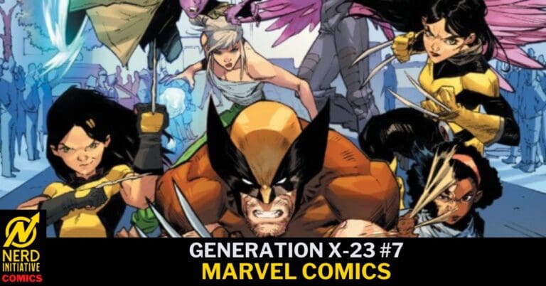
Generation X-23 #7 – “HOMECOMING”

Laura Kinney has been trying to help a new generation of mutants with a similar past to her own. With surprise after surprise, these new friends can’t seem to catch a break. As Generation X-23 gets a minute to breathe, they quickly realize there’s no time for rest, as Laura finds a familiar face in need of help.

Creative Team

Writer: Jody Houser;

Artist: Marco Renna;

Color Artist: Erick Arciniega;

Letterer: VC’s Ariana Maher;

Cover Artists: Partha Pratim Sarkar & Romulo Fajardo Jr.

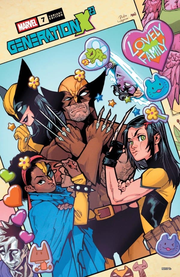
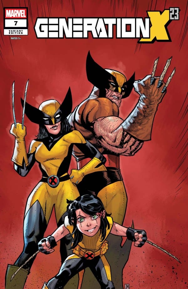
Variant Cover Artists: Justin Mason & Edgar Delgado; Rickie Yagawa & Nolan Woodard.

Check out an upcoming WOLVERINE series coming from Marvel Comics soon.

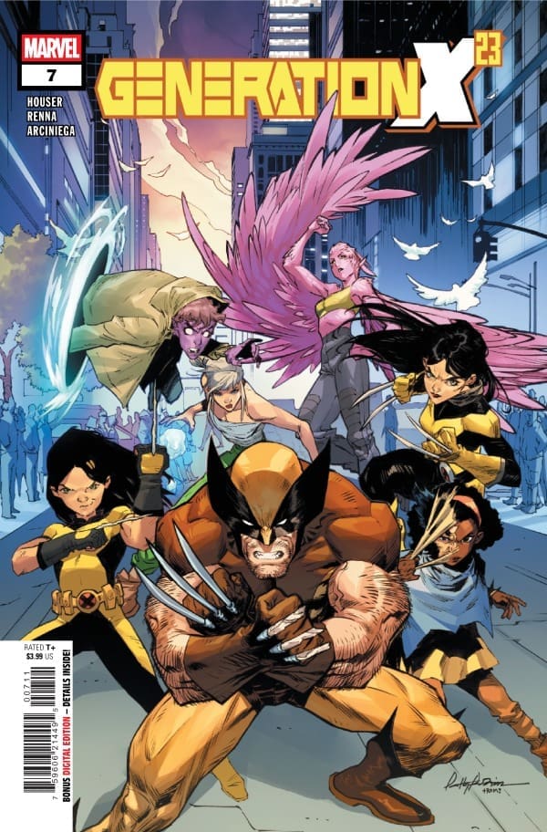
Generation x-23 #7 Cover. Image by Marvel Comics.

The Story for Generation X-23 #7

As Laura gets everyone to safety at Logan’s safe house, they find an injured and not healing Wolvie. He’s alive, but struggling physically. His sense of humor is still very intact. The two of them catch each other up, and Logan meets the GENERATED. They have a mission, and Logan decides he’s gonna help them to get the answers they want. However, they seem to get no answers, and just more chaos and questions. We’re left with a lullaby and a new mission.

Generation x-23 #7 Variant Cover. Image by Marvel Comics.

Art

The art in this issue of Generation X-23 was absolutely a ton of fun and gorgeous! From the expressions of Logan, Laura, and Gabby to the extra claws at play, this was a dream for any Wolvie fan to enjoy! It had a ton of beautiful Wolverine action moments, sprinkled with moments for our new GENERATED to showcase their skills.

Final Thoughts

While the overall story was fantastic and moved forward with a surprise ending, my favorite part was simply the relationship between Logan, Laura and Gabby. They showcased their fighting skills, detective skills, and humor, creating a perfect and entertaining story from beginning to end. I absolutely loved the back and forth with all 3 Wolverines. Gabby’s description of Logan was hilariously accurate, while Laura and Logan’s back and forth was just perfect. I didn’t realize how much I needed more comic book content with the three of them.

If you’re a Wolverine fan, then this is a must grab! What’s better than one Wolverine? TWO! Plus a honey badger. AKA Scout. SNIKT!

Overall Grade: 9.5/10

Check out more reviews from Lauren

Have you been reading Generation X-23? Let us know your thoughts.

Leave a Reply

This site uses Akismet to reduce spam. Learn how your comment data is processed.

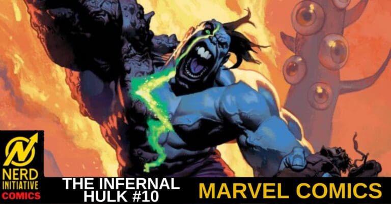
THE INFERNAL HULK #10 – The Riddle Game

Creative Team – Phillip Kennedy Johnson, Adam Gorham, Matthew Wilson, VC’s Cory Petit, Nic Klein

Published by Marvel Comics

Catch up with The Infernal Hulk #9!

The Story

This comic will be joint reviewed by Nerd Initiative’s Anthony and yours truly, Megan Nichole!

Anthony – Horror is a lot like comedy. With comedy, you’re either funny or you’re not. When you’re not funny, you’re just corny or cringe inducing. With horror, it’s no different. You either write scary stuff or you write stuff that feels more like Halloween festivities than anything that’s going to keep you up at night. Philip Kennedy Johnson has proven quite capable of delivering tales of terror. With Infernal Hulk, he doesn’t just write a book about monsters fighting. He goes for the gut and the psyche. He writes with the intent to make the story disturbing. A story that nobody would want to be a part of. A story that offers little in the way of hope. One where even the heroes are beyond broken and struggling to find purchase to avoid falling into the deep pit of dark despair. And yet… there is light in the distance. Reason to see the story through to the end.

Megan – Earth’s Mightiest Heroes tried their best to stop the Infernal Hulk by any means necessary and they failed. Now, there are only two options left that even have a ghost of a chance to defeat the Infernal Hulk and both are huge gambles. The first one is Bruce Banner himself. Bruce knows more than anyone that the only way to defeat a Hulk is with another hulk. However, Bruce also knows that his body doesn’t respond to gamma radiation anymore so he can’t make himself into a Hulk. The only option he has is to find one. In the last issue, Bruce and Doctor Voodoo headed to the Soul Cage where Voodoo’s enemy Sumanguru resides. We were left on a very interesting note where Bruce was leveraging Doctor Voodoo as collateral in case he lost a magical duel. Now we get to see all of this transpire, and it’s certainly not in the way I could have guessed. That goes back to Phillip Kennedy Johnson having the uncanny ability to keep the readers on their toes.

The other option is the wild card herself, Charlie Tidwell, AKA Lycana, who seems to be the factor no one saw coming. The Infernal Hulk #10 does a great job at creating a mystery around her as to how she’s going to help this way and I’m VERY excited to see what’s to come in the next issue.

The Art

Anthony – Writing horror for a comic book is even harder because you need the art team to properly translate your vision to the page. Adam Gorham is the right guy for the job. His art reminds me a bit of Bernie Wrightson and that is just what this book needs. Everything is ugly and withered and overly detailed. There is a crazy nice transformation scene in this issue that he just nails! My only note is that I would’ve loved to see more detailed backgrounds.

Megan – This issue packed a punch in more ways than one. Adam Gorham, Matthew Wilson, and Cory Petit do a fantastic job at bringing the menacing energy of Sumanguru that fit perfectly into the high energy of the story. In the Soul Cage, it’s made to feel like a whole new world that you’re terrified to be in. Doctor Voodoo and Bruce Banner are two fish out of water in the Soul Cage, and the contrasts between them and the monsters of the horrifying realm makes it clear. Adam Gorham puts a lot of work into capturing exactly what makes the setting so terrifying with his mixture of abstract details and and excellent linework. Matthew Wilson brings so much depth in making the Soul Cage visually dark and mystic with extraordinary color contrasts that make each page feel like its own horror story. Cory Petit really captured the differences in tones from each other characters and made the reader feel the emotions through the dialogue.

Final Thoughts

Anthony – 8/10. Infernal Hulk #10 continues the thrilling and horrifying battle between a Hulk controlled by the Mother of Monsters and humanity with Bruce Banner doing anything and everything he can to reel his monster in and get him back under control. It’s a great story and the art complements the writing very well, even if the panels are a bit lacking in the background department.

Megan – 8.6/10. The Infernal Hulk #10 continues the exciting story with a bit of a horror energy that brings the energy level up to an all time high.

Overall Grade – 8.3/10

Let us know in the comments what you thought of The Infernal Hulk #10!

Leave a Reply

This site uses Akismet to reduce spam. Learn how your comment data is processed.

“Jeff the Land Shark: Superstar #2” Review – Entertainment Beyond Measure

The Run Down

At the end of the previous issue, we witnessed as the unthinkable happened to our favorite land shark! Now stuck in Mojoworld, Jeff needs to learn to work with a new team if he wants to make it out alive. Will this new team of Avengers be able to keep it together long enough to survive? Or will things fall apart like a set built by Mojo? Find out with me as I review “Jeff the Land Shark: Superstar #2” by Kelly Thompson!

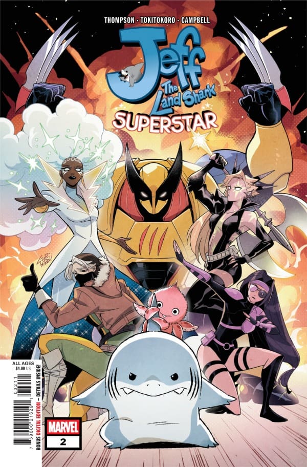
Source: Gurihiru, Marvel Comics

Writer: Kelly Thompson
Artist:Tokitokoro
Colorist: Jim Campbell
Letters: VC’s Joe Caramagna

The Writing

If you, for whatever reason, were worried that the energy would be toned down now that we’re in Mojoworld, what was your silly brain thinking? This is Jeff the Land Shark written by Kelly Thompson, meaning the chaos and fun are here to stay! In this case, the fun is intensified through some truly unique ideas that I would love to see stick around or come back at some point in the Marvel universe. One such idea is something that’s actually right on the cover, being amalgamated versions of mainline heroes.

That idea isn’t something that Thompson delves deep into right away, but she does start to skim the surface. For example, we’re told these characters were made for Jeff, but not really how or why other than to provide entertainment. In speaking of that, this also works to help drive the message being told: controversy sells.

As anyone in the entertainment industry will tell you, things like gender-bent characters can cause plenty of commotion. For example, say a headline purposefully has something worded a certain way. This is called clickbait and is used to drive engagement, whether it be positive or negative. As any Marvel fan knows, this is entirely within Mojo’s wheelhouse and Thompson’s handling it incredibly well.

The Art

As was with the first issue, the art and colors from Tokitokoro and Jim Campbell are just as incredible here! When it comes to the penciling, Tokitokoro makes every panel feel fresh and exciting. Their manga-like style continues to translate incredibly well, fitting Jeff’s personality perfectly. I especially love how they did facial expressions here, making every fight, argument or cute moment resonate in my soul.

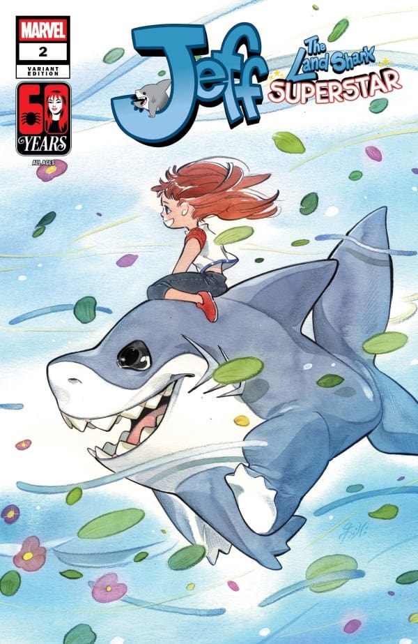
Source: Peach Momoko, Marvel Comics

When it comes to the colors, Campbell matched Tokitokoro beat for beat. As should be for a series such as this, the colors keep things vibrant and high energy. The two elements together truly make me feel like I’m seeing everything through Jeff’s eyes.

Final Thoughts

If you’re a fan of Jeff the Land Shark, this is an absolute must read. Thompson and crew continue to keep things fresh and exciting, ramping up the chaotic energy from the previous issue. If they can keep this up, I fear we may have one of Marvel’s best lighthearted reads on our hands.

Overall Grade: 10/10

Speaking of chaos and high energy, have you bought Bones Coffee lately? If not, be sure to use our code and receive 10% off your next order! To remain on brand with the comic, be sure to check out their flavors Shark Bite or Megalodonut!

Read more from me here and check out my socials!

Comments

Have you been reading this latest run on “Jeff the Land Shark”? Are you a fan of Kelly Thompson? Let’s discuss in the comments below!

Leave a Reply

This site uses Akismet to reduce spam. Learn how your comment data is processed.

X-Men United #6 – If I Had A Dollar…..

At Graymatter Lane, all mutants are welcome. Hoping to build teamwork, Iceman has brought Cyclops, Emma, Rogue, and Deathdream together for a little RPG play. Using Ben Liu’s reality-warping abilities, the X Leaders have stepped into a world that feels like D&D come to life. When a malevolent spirit possesses Ben, it all begins to fall apart. As Deathdream escapes, he returns to a world where the teachers are missing, and the students are under siege. In X-Men United, Graymatter Lane has a problem, and it’s time to find the source

This review is brought to you by Nerd Initiative’s Megan and Shawn!

Creative Team

Writers: Dr. Eve L. Ewing and Evan Narcisse
Penciller: Eduardo Pansica and Tiago Palma
Inkers: Tiago Palma and Oren Junior
Color Artist: Brian Reber
Letterer: Joe Sabino
Cover Artist: Stefano Caselli
Cover Color Artist: Federico Blee

Writing

Megan: X-Men United #6 was nothing short of a thrilling roller coaster ride that I didn’t want to get off of. With three separate teams of mutants all being attacked in different ways, you’re left on the edge of your seat. Dr. Eve Ewing and Evan Narcisse take you through so many different high-energy situations that you really don’t know what to expect next.

With so much happening in this issue, I don’t want to spoil anything. But I will say that there are dynamics tested, vulnerabilities put on display, and trust being turned into suspicion. Some of the most confident mutants you know are now second-guessing themselves and each other. The writers set up something really fantastic here, and I am more than excited to see what comes next in X-Men United.

Shawn: I really enjoyed the psychological thrill of this issue of X-Men United. Dr. Eve Ewing and Evan Narcisse crafted a true psychological thriller that has you doing a double-take on what you’ve seen and read so far. The issue continues to build on the suspense already established about Graymatter Lane and its vulnerabilities. I also really enjoyed that the issue leaned heavily on the main leader’s inability to trust the new mutant students. While it may not have been intended, Ewing and Narcisse crafted a conversation about a continual issue with the X-Men in general: the introduction of new mutants, only to be sidelined, while the same characters keep resurfacing.

I really liked the concept of the issue. It’s difficult to talk about without revealing too much, but it’s interesting to see an area where Kitty and Logan are perhaps more alike than fans had initially realized. Ewing and Narcisse provided a stark reminder that the cost of mutant continues to be one paid with blood and, at times, guilt.

Art

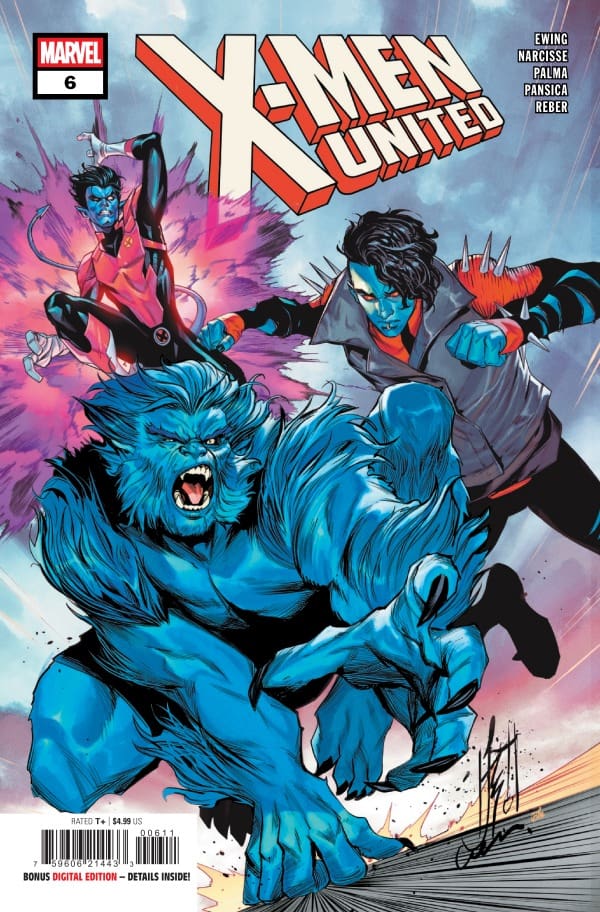
X-Men United #6 cover by Stefano Caselli and Federico Blee. Image from Marvel Comics

Megan: My goodness, if you thought the story was excellent, the artwork is something special. Tiago Palma, Eduardo Pansica, Oren Junior, Brian Reber, and Joe Sabino all came together to make this a more than memorable issue. This issue leans heavily into a horror aspect that we don’t get to see too often, and it was handled beautifully here. With the hair standing on the back of their neck, the mutants see some sights that are more than terrifying. Adding even more depth to the beautiful linework, the colors are dramatic and expertly handled to make the mutants the focal point. The lettering is absolutely top-notch. Perfectly capturing the mutants’ individual personalities through their dialogue, Joe Sabino does an excellent job of giving this story so many different voices. Together, the artists knocked this out of the park.

Shawn: Tiago Palma, Eduardo Pansica, Oren Junior, and Brian Reber really did superior work on this issue. Pansica and Palma set the tone right out of the gate with amazing line work. The characters are expressive, and the ability to shift back and forth between the scenes, capturing what makes each setting unique, was impressive. I genuinely felt the concert on Kitty’s face in this issue. On the other hand, they got to do some really cool versions of standard characters. Without any spoilers, that art really sets the tone.

Palma and Oren Junior also brought the heat with inking. There was a lot of opportunity for some shades and design in this issue that really allowed for inking to stand out. Brian Reber hit a home run with his color choices. They perfectly helped the tone of the story evolve, and Joe Sabino helped keep the story flowing through a few different settings as the team was split up.

Final Thoughts

Megan: 9/10. X-Men United #6 continues the streak of high quality and leaving me anxiously waiting for the next issue to drop. The creative team deserves all praise imaginable!

Shawn: 9/10. Another solid issue. Tiago Palma really flexes his creative muscle on this issue and continues to show why he’s a name so many people are talking about. The art feels fresh, and the arc sets up a story that I’m interested to see play out.

Overall Grade: 9/10

What did you think of this issue? Let us know in the comments

Leave a Reply

This site uses Akismet to reduce spam. Learn how your comment data is processed.

The Punisher #7: A Tale of Vengeance

Overview

Writer: Benjamin Percy

Artist: Farid Karami

Colorist: Frank D’Armata

Letterer: VC’s Cory Petit

Cover Artist: David Marquez & Guru-eFX

A tale of vengeance wrapped within a tale of vengeance. In the Punisher #7, Benjamin Percy uses body horror as the DNA for a rival that could be a long term problem for Frank.

Writing

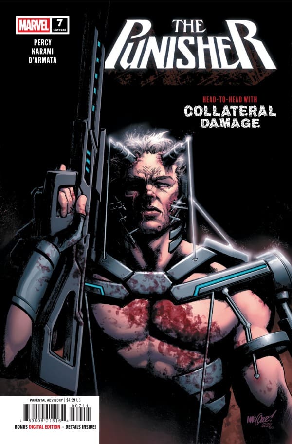
Benjamin Percy may not be a sick man (all data indicates he’s a super great guy), but he does have a sick, sick mind. He has a knack for creating moments that cause me to wince and imagine myself in sad horrific situations and blurt out expletives. My wife has witnessed this several times (mostly while I was reading Percy’s Ghost Rider run) and has to ask me if I was alright and my response would be something like “Hell yes, I’m alright!” because horror is my jam and it’s nice to see it done well in the pages of my favorite comics. Percy is on a tear in the punisher and there’s been a whole lot of wincing and cussing under my breath and reassuring the love of my life that I’m not having a heart attack or something. In #7, Percy introduces us to Collateral Damage (The character and his name are both on the cover so it’s not a spoiler, chill), a man hell bent on causing Frank as much pain as possible. To find out why, you’ll need to read this issue which is jam packed with high stakes action, bullets, blood and death! Percy is obviously not done putting Frank through the ringer.

Art

Farid Karami does some really nice work in this issue. The action is clear and easy to read and he knows how to tell a story with pictures. I could read this book with no dialogue or captions and have a really good idea what was happening. There is good detail that is enhanced with excellent placement of shadow and highlights. One thing that I did notice is that when the action kicks into high gear, the backgrounds disappear. He does backgrounds very nicely, and it would be nice if there were more of them.

Frank D’Armata. I feel like that’s all I need to say? D’Armata is a legend that has been at the top of the game for decades and shows no signs of slowing down. Here, D’Armata is having some fun with color temperature, using it to inform who’s story is being told in which moment. For Frank, it’s a warm yellow/orange. For Collateral Damage, blue. another character is seen under a red filter. It really is a great effect. I’ve seen the technique used by Lee Loughridge recently and D’Armata flexes here, proving he is still elite.

Punisher 7
David Marquez & Guru-eFX, Marvel Comics

Final Thoughts

Percy’s punisher has been a wild ride with a ton of gore and terrifying body horror. This issue doesn’t disappoint and the shock and unease that he delivers only as he can is fully on display. I’m really enjoying this run.

Overall Grade: 8/10

Leave a Reply

This site uses Akismet to reduce spam. Learn how your comment data is processed.

BLEEDING HEARTS #7: The Dead of Winter.

Bleeding Hearts #7 shows us that time may not heal all wounds as months have passed since the events of Outbreak Day and Poke is struggling to forgive himself as he, Mama, and Rabbit are facing the cold dead of winter. The dead have not moved on nor forgotten and are out for revenge as the journey to the livings resting place may never get easier.

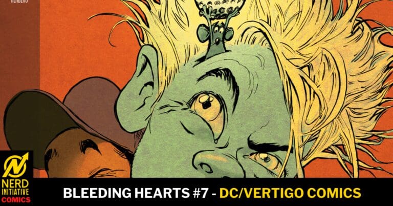
Bleeding Hearts #7. Credit DC/Vertigo Comics. Cover by Stipan Morian.

Creative Team: Deniz Camp, Stipan Morian, Stjepan Bartolic, and Hassan Otsmane-

The Story:

This issue takes an incredibly introspective and somber tone as Poke made a decision to honor and stand with the living and must face the consequences hereafter. This issue brings about the moral dillemas in a big way as both he and Mama made choices that sacrificed someone in the previous issue and spend this one justifying it to themselves. I will say I am loving how the bond between Poke and Rabbit grows stronger while the divide with Rabbit and her mother grows wider. It’s creating interesting character dynamics and really taking time to make them the focal point over an action focused issue. I truly still do not know how this ends and it’s keeping me on the hook as Deniz is telling a beautiful tale and even adding real world realities into it all.

The Art:

Maybe it’s just me but this cover looks like the package to a Reeses Cup? Sweet tooth aside the art is emotional and matches the somber and cold tone this issue takes. The contrast of the white snow to the dead zombie skin makes their blemishes and horrible looks stand out vividly. Speaking of horrible looks, this issue introduces a pregnant zombie whose baby has an eye peering at us through the bellybutton and it is just enough to make us feel uncomfortable. I love the various character designs Stipan crafts as every single one is vastly unique. The color work from Bartolic makes the blood and other fluids stand out against the snow and the useage of shadows lends its hand to the emotionless feeling we get. There is a panel that stands out to me as a picture is being burned and it appears to be of a certain character when they were living offering a reminder of the world that no longer exists.

Final Thoughts:

Bleeding Hearts #7 is a sad issue as our characters struggle to move forward with the decisions they have made for themselves culminating in a shocking cliffhanger. The artwork is extremely unique and creative immersing us into a world in which there are few beautiful things left in it.

Let us know how you feel about this issue of Bleeding Hearts and check out more reviews by Matt!
2 responses to “BLEEDING HEARTS #7: The Dead of Winter.”

  1. Fiendly Neighbourhood Terrorist Avatar

    I dislike Rabbit’s mother intensely, and one can easily tell that to her everyone except Rabbit, no matter how good they have been (Ms Ruby for example) is expendable. Without a doubt she’d murder Poke if she didn’t need him, and I’m fairly certain that this was what she was planning at the start of this issue as soon as she was well enough (as a result of Poke taking care of them, of course) to risk it. Without putting spoilers, it’ll be justice if a certain character is really dead and turns into a zombie too.

    1. Matthew Roth Avatar
      Matthew Roth

      I got the vibe that she was going to do something to Poke as well!

Leave a Reply

This site uses Akismet to reduce spam. Learn how your comment data is processed.