Home Blog Page 11

Queen in Black: Venom Unchained #1- Everybody’s Got Something

Eddie Brock is perhaps at his lowest. After a failed attempt to bond with Carnage, Eddie finds himself imprisoned. With Hela rising as the new Queen In Black, Eddie is desperate to find a way out. He longs for a reunion with Venom. Without Venom and reeling from a failed bonding with Carnage, how will Eddie escape before Hela’s plans for him can be revealed?

This review is brought to you by Nerd Initiative’s Shawn!

Creative Team

Writer: Charles Soule
Artist: Juanan Ramírez
Color Artist: Erick Arciniega
Letterer: Travis Lanham
Cover Artist: Leinil Francis Yu
Cover Color Artist: Guru-eFX

Writing

Charles Soule did a spectacular job in capturing not only the personality of Eddie Brock but also the despair he feels in his current predicament. Eddie is on a roller coaster of emotions after doing the wrong thing for the right reasons in his mind (see Eddie Brock: Carnage). That makes this issue all the more impactful as Eddie continues to struggle with who he is apart from the symbiote.

Soule crafts a downright impactful scene with Eddie’s prison visitor. It strikes all the right notes about who the character is and who he has become. It feels downright offensive to have Eddie sitting in prison as Earth is threatened by symbiotes, and Soule provides a compelling narrative that moves us closer to remedying that issue.

Art
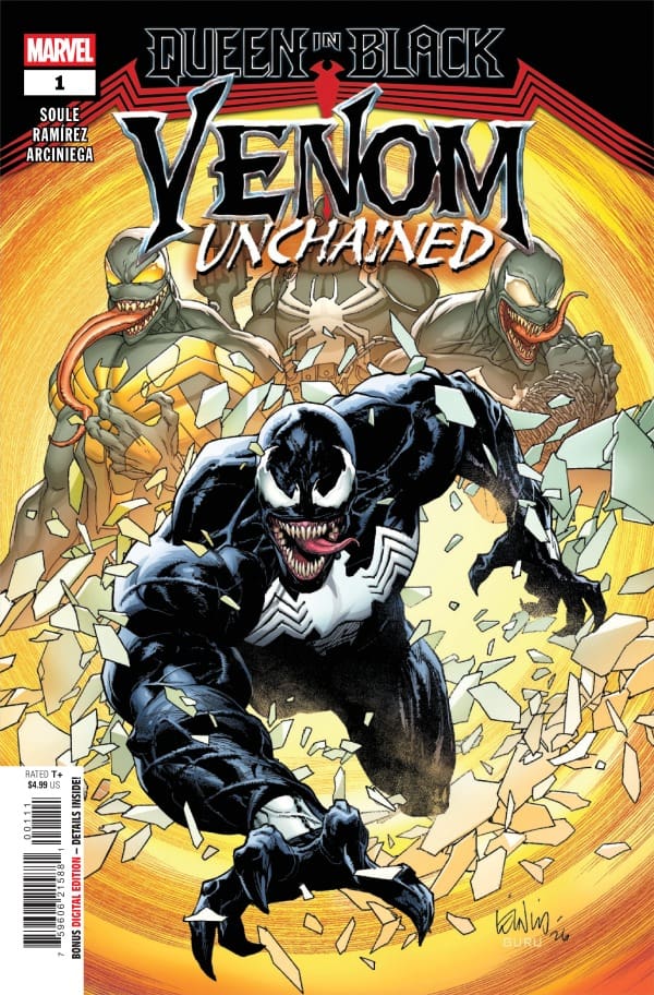
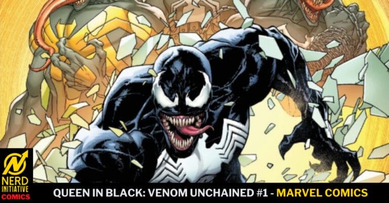
Queen in Black: Venom Unchained #1 cover by Leinil Francis Yu and Guru-eFX. Image from Marvel Comics

Juanan Ramírez and Erick Arciniega do a beautiful job with the art on this issue. Eddie Brock feels as imposing as ever, even without the Venom symbiote helping him, thanks to the line work of Ramírez. Ramírez allows the art to change, showing that time passes even without the word bubble texts. Ramírez helps readers feel the same sense of desolation that Eddie feels through lines that are at times thick and uneasy.

Erick Arciniega brings colors to the table that help create the darkness and grit of this story. The colors help readers understand exactly how dark being imprisoned in the Raft is and how desolate and alone one can feel. With the cool hues and tones, you feel like you, too, are stuck in the prison.

Final Thoughts

Queen in Black: Venom Unchained offers a unique glimpse into Eddie Brock’s world. It helps you feel how lost Eddie feels at this moment in life, stuck, unable to know where he goes from here, and struggling to understand how he can help. You feel the brief hit of joy that Eddie gets once an opportunity presents itself, only to have it snuffed out. This is a great start to this story, and I’m anxious to see how it feeds into the larger Queen in Black story.

Overall Grade: 9 / 10

What did you think of Venom Unchained? Did you like seeing this side of Eddie? Let me know in the comments
Leave a Reply

This site uses Akismet to reduce spam. Learn how your comment data is processed.

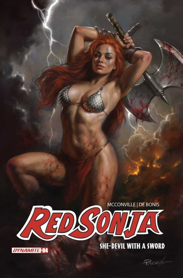
“Red Sonja: She-Devil With a Sword #4” Review – Twists and Chaos Abound!

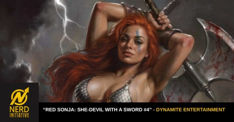
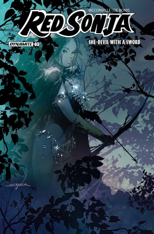
Source: Stuart Sayger, Dynamite Entertainment

The Run Down

Just in case you missed the incredible last issue, which, how dare you, if you did, allow me to help you catch up! In it, our heroines Red Sonja and Aretha worked together on figuring out a way to overcome the Rising Sun! In the meantime, Sonja’s been dealing with some past turmoil of her own. Will all of this come to a head? Will Red Sonja and Aretha come to terms with it all? Find out with me as I review ” Red Sonja: She-Devil With a Sword #4″!

Writer: Rory McConville
Artist: Pablo De Bonis
Colorist: Salvatore Aiala Neto
Letterer: Carlos M. Mangual

The Writing

In a move I don’t think anyone could’ve seen coming, McConville starts this issue with a genius decision: putting us right in the middle of chaos. Except, it isn’t done abruptly because that would be too simple. McConville slowly leads readers into it, letting De Bonis and Neto show, not tell, right away. Doing this left my mind scrambling, making me feel like I was in the shoes of our characters.

I don’t know how he does it, but McConville keeps finding new and unique ways to keep this story engaging and ramping up. Two other things that kept me fully sucked in this issue were an unexpected plot twist and a point of tension coming to a head. The twist itself is shocking up front, but it’s also something that makes sense when you look back, and as for the tension that comes to a head? It was so expertly well executed, my entire body leaning in while I read, smiling from ear to ear. That, to me, is a true mark of a fantastic read.

Source: Lucio Parillo, Dynamite Entertainment

The Art

As I previously stated, De Bonis and Neto were allowed to speak a bit more here, and it shows. It became even clearer that McConville trusts these two to help build the twists and turns, all while building and toppling the world they create. To speak on one thing specifically, De Bonis really had the violence be over the top here, and I loved every moment of it. The intensity of the action perfectly matched the intensity of the writing. However, the violence is just one example of that intensity, as the looks of fear, anger, and resentment were beautifully done throughout.

As for the colors from Salvatore Aiala Neto, they were absolutely next level in this issue. In each panel, one can feel the heat of the flames, pulses of magic and anger in the violence, all through the brilliant use of color. To top it off, the lighting and shadow work on so many of the panels was absolutely astounding.

Final Thoughts

This midway point was exactly what this run needed. I don’t know how they’re doing it, but McConville and his crew keep making this story better and more exciting with each issue. “She-Devil With a Sword” is a true masterclass in fantasy writing, and I can’t get enough.

Overall Grade: 10/10

Read more from me here and be sure to check out my socials!

Comments

Have you been reading “Red Sonja: She-Devil With a Sword”? How’re you enjoying it so far? Let’s discuss in the comments below!

Leave a Reply

This site uses Akismet to reduce spam. Learn how your comment data is processed.

Power Rangers: Green #1 – The Dragon’s Grave

It is sometime in the future and Tommy Oliver (original Green Ranger) is the only living Power Ranger left in existence. Is Tommy still the Ranger we remember as kids? Or, has he gone into hiding…?


Creative Team

Pallie Paul Allor (Writer), Gustaffo Vargas (Artist), Ed Dukeshire (Letterer)

Madison Goyette (Designer), Ari Yarwood (Assistant Editor), Tea Fougher (Executive Editor), Andy Schmidt (Editor-in-Chief)

Publisher: BOOM! Studios


The Dragon’s Grave

Power Rangers: Green is a new miniseries released from BOOM! Studios! With this debut issue, readers are introduced to a very different Tommy Oliver that Power Rangers fans of old are not used to. Tommy Oliver is the last surviving Ranger alongside Alpha-5. What is going on with Tommy? Where is he? Why did he walk away from the Power Rangers?

Green
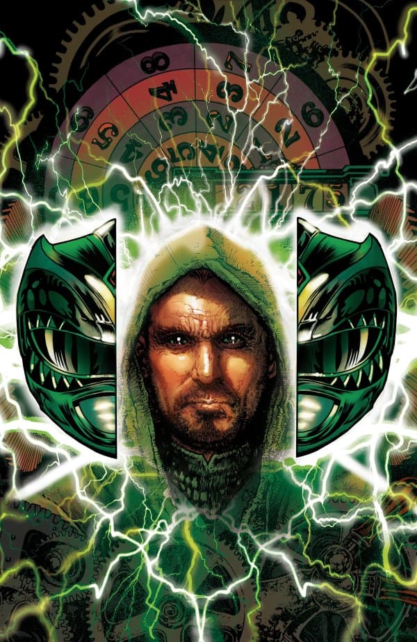
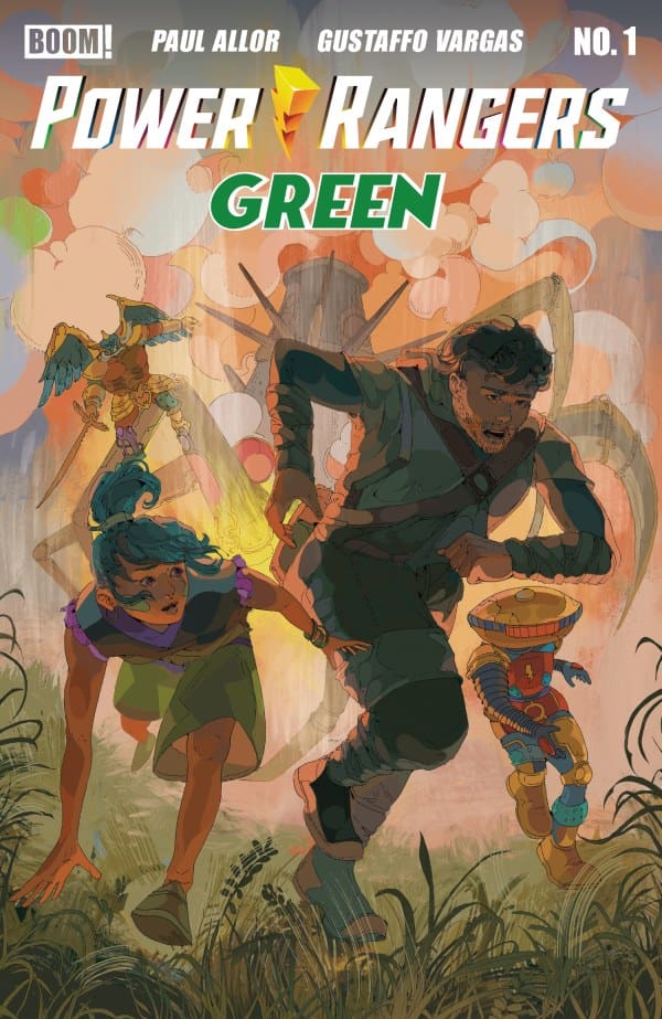
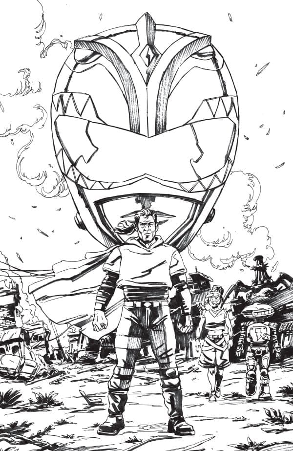
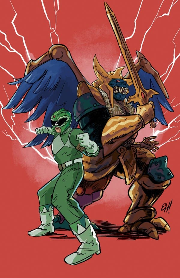
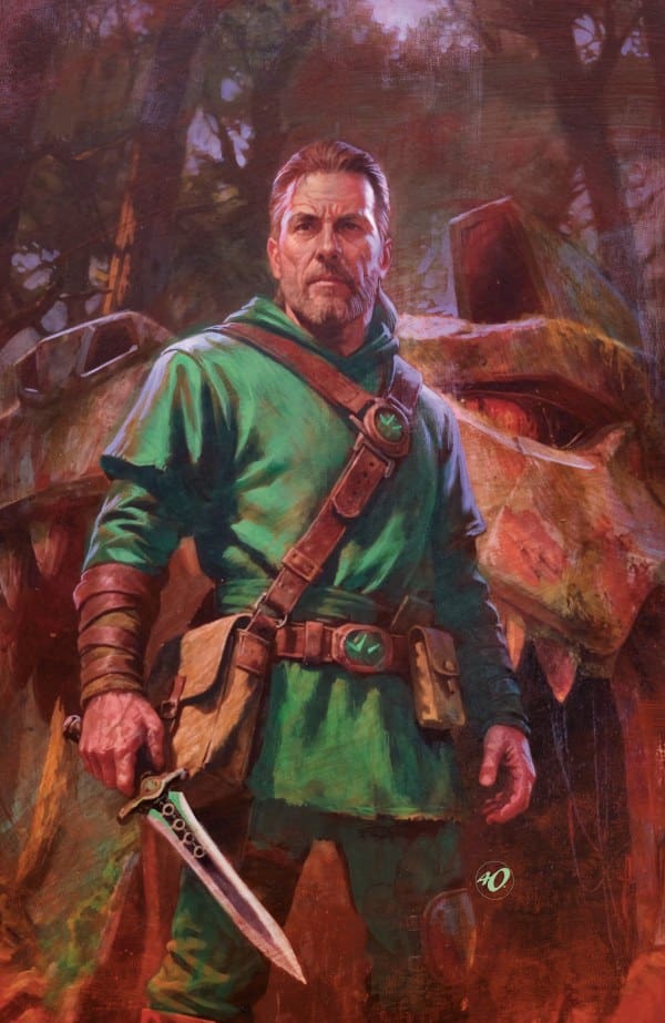
Power Rangers: Green #1, Credit BOOM! Studios. Cover by Tony Harris.


This first issue opens up to a futuristic planet and a much older Tommy Oliver. One would think that he would still be training or possibly meditating, but no. This battle-beaten shell of Tommy is now a farmer. Working with a trusted old friend, Alpha-5. It is not known where they reside or how they got here. But what is known is that Tommy is all about working the farm. Joining them (Tommy and Alpha) on their farm is another individual, Mirella. A teenager who does not share the same discipline for the farm that Tommy does.

Readers will see an unexpected arrival of a character within this first issue! Authentic Power Ranger fans will have to pick their jaws up off the floor once this foe arrives on the pages. This ultimately leads to a very strange “team up” between these two iconic characters. Something big and bad is coming, and it is targeting individuals who have “magical” abilities. Which is not good for Tommy or his newly acquired partner.

The start of this new miniseries is going to open some doors that some fans may not be aware of. I am in hopes of some questions being answered within this series on top of the storytelling that will take place. I would love to see some explanation of what makes Tommy walk away. And there has to be more to this new threat to make Tommy come back into the fold of being a Ranger again. There have been many different threats since he went into hiding. What makes this threat any different from the others to bring him back?


The Writing

Pallie Paul Allor brings a fresh futuristic feel to this new Power Rangers miniseries. I really enjoyed how he formulated a correlation between major Tommy Oliver events and the day Tuesday. Giving newer fans of Power Rangers a simplistic history of Tommy and some of his pivotal moments. The plot for this story is gripping while building into something major coming in future issues. The one aspect of this book that brings a higher level of respect from me is the character Mirella, who is deaf. Bringing in this level of inclusivity is heartwarming. Especially seeing Tommy use sign language with Mirella. Cannot wait to read more!

The Artwork

Gustaffo Vargas provides fantastic art for this first issue! The rough textured lines and coloration add to the lore of this older Tommy Oliver that we see. The amazing attention to aging details in Tommy is delightful to see while truly letting readers understand that Tommy is in the later stage of his life. Attention is also directed to the scenery. The farm is basic and the “farm house” is spectacular!

Ed Dukeshire nails the lettering for this issue! Tommy has a standard lettering style and coloration, while Alpha has a more technical or mechanical style of lettering. This makes reading this issue very easy to differentiate who is speaking. The placement of the dialogue and narration bubbles is perfectly done as well! Great job!


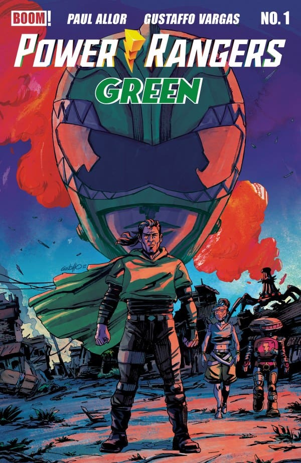
Variant Covers


Final Thoughts

This debut issue brings back an iconic original Ranger in a futuristic setting. No longer a practicing Ranger, but the last Ranger in existence. Teaming up with an old foe to take on a new threat that is bringing Tommy out of retirement. This issue doesn’t answer some of the more pivotal questions surrounding Tommy, but it paints a comforting picture that he is living a more simplistic life. This is a must-read for Power Ranger fans! So make sure you pick up your copy of this new miniseries and add this to your “pull list.”

A little bonus for this review! I had the opportunity to speak with Pallie Paul Allor about this issue as well as what readers can expect in issue two. If you are a fan of Alpha, you are going to want to see what he does in this debut issue because it leads to much more from him physically in issue two!

Overall Grade: 9/10


Links

Comic Book Reviews & Entertainment News: Nerd Initiative
Previous Power Rangers Review: Mighty Morphin Power Rangers #1 – Rangers Unite
Travis’ NI Portfolio: TravisComicHaven – Nerd Initiative
Travis’ Personal Content: Travis’ Comic Haven


PLEASE SHARE YOUR THOUGHTS IN THE COMMENTS SECTION BELOW!

Leave a Reply

This site uses Akismet to reduce spam. Learn how your comment data is processed.

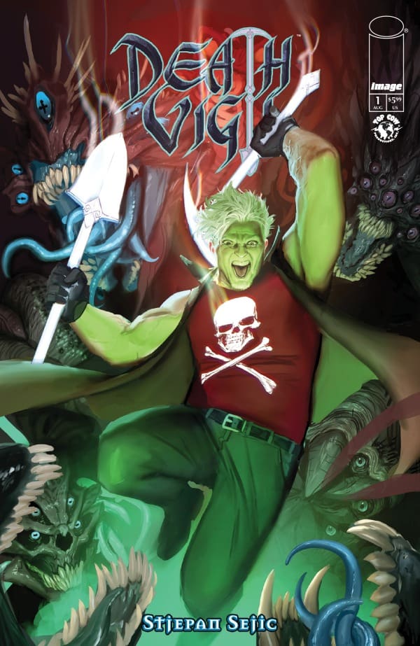
“Death Vigil #1” Review – A Triumphant new Beginning

The Run Down

After a little over a decade, comic writer Stejpan Šejić returns to his now-famed “Death Vigil” series with the new “Death Vigil #1”. Some might see returning to an old series as a risky move, but this feels natural. Some might say it even feels supernatural! So join me as we venture through this new journey of an old favorite in “Death Vigil #1”!

Writer, Letterer & Illustrator: Stejpan Šejić

The Writing

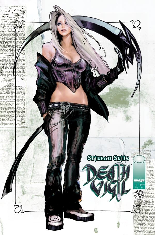
Source: Stejpan Šejić, Image Comics, Top Cow

While returning to a dormant series like “Death Vigil” can sometimes be a challenge, it’s one that Stejpan Šejić is ready to tackle, and it shows. In an astounding 56-pages for a singular issue, Šejić manages to capture what makes the original such a fan favorite. From the humor and horrors to the action and violence, he’s off to a strong, brand-new start.

One thing that I wholly appreciated about this issue was how it started. If you’re a newbie getting into this series, then have no fear! Just right within the first two pages are a diagram showcasing the characters as well as a “previously on…” page. Both of these work perfectly to tell you what you need to know in a very succinct yet detailed way, and it’s beautifully done. Speaking of the characters, something I love about how Šejić writes is that he makes it very easy to tell who’s talking. Each character has a distinct personality, and it completely shows in how their dialogue is written.

As for the story itself, this is a very promising new start. Right off the bat, I felt very engaged and sucked in. That’s largely due in part to the enigmatic characters and the action. If you love the “Guardians of the Galaxy” type family dynamic, you’ll feel right at home here. The characters bounce off each other really well and act as the crux of this twisted tale, with this opening issue ending with a bang you won’t want to miss!

Source: Stejpan Šejić, Image Comics

The Art

When it comes to Šejić’s art style, I’m personally a big fan. I don’t know how he does it, but he somehow manages to capture realistic body types and facial features in a stylized, almost cartoony way. At the same time, he keeps things looking rather gothic and dark, especially in this book. There’s an intense level of detail that comes with it, creating some rather nightmarish creatures in unexpected settings.

As for the colors, they’re very varied but not as bright or vibrant as some might expect coming from a comic book. Like I previously stated, the look and feel of this is very much gothic at heart, so a lot of colors come off as rather muted. I personally love that, but the look and style may not be for everyone, which is completely okay!

Final Thoughts

Stejpan Šejić’s new entry into “Death Vigil” is undoubtedly a risky one, but it more than paid off. In a great gateway into the series, Šejić managed to reintroduce these great characters to readers new and old in an utterly fantastic and fun first issue. If you see this on the shelves of your LCS, definitely pick it up if you feel it’s right for you!

Overall Grade: 10/10

Read more from me here and be sure to check out my socials!

Comments

Are you a fan of Stejpan Šejić’s work? How excited are you for new “Death Vigil” entries? Let’s discuss in the comments below!

Leave a Reply

This site uses Akismet to reduce spam. Learn how your comment data is processed.

THE UNCANNY X-MEN #33 – Coming to Terms

Creative Team – Gail Simone, Luciano Vecchio, Matthew Wilson, VC’s Clayton Cowles

Published by Marvel Comics

Catch up with The Uncanny X-Men #32!

The Story

In the last issue of The Uncanny X-Men, we were left on a somber note when Gambit and Rogue announced that they had to leave Haven House. The Outliers were understandably upset, most notably Calico, as they’ve looked at them in a parental role. The two mentors leaving truly was for the best, as Gambit has something in him that needs to be banished before it kills him or hurts the kids.

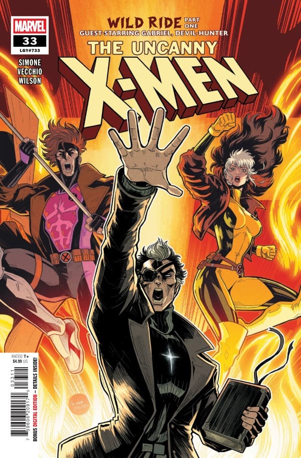
Cover art by Luciano Vecchio and Matthew Wilson. Published by Marvel Comics

In The Uncanny X-Men #33, the Outliers are still struggling with Rogue and Gambit being gone, especially when it comes to the new adults watching over them. Monet St. Croix and Quicksilver aren’t exactly excited for this venture either, but they’re trying. Calico quickly forms a deep dislike for Quicksilver, and Monet isn’t making many friends around Haven House herself. Time will tell how these relationships will change, but if they don’t improve quickly, Calico will put an end to both her new mentors.

While things are tense at Haven House, they’re nothing compared to what Rogue and Gambit are enduring. In the quest to free Gambit from the evil that’s taken him over, Rogue takes him to a character that made me clean off a very dusty part of my brain, Gabriel, AKA Devil-Hunter. I haven’t thought about him since Hellstrom: Prince of Lies, so it was an absolute pleasure to see him tossed in the mix. What Gabriel’s part in this does is confirm one thing: that Gambit’s problem is much bigger than anyone could have guessed.

The Art

Luciano Vecchio is the artist of The Uncanny X-Men #33 with Matthew Wilson on the colors and Clayton Cowles on lettering. What I loved about this issue was the vast differences in tones between the switching of stories from the Haven House to Rogue and Gambit.

At the Haven House, while it was much more vibrant and lively given the Outliers were flexing their New Mutant suits and training, the emotions were clear from the start. The uneasiness of Monet and Quicksilver was written all over their faces, while Calico’s anger stood out like a sore thumb. Vecchio allows the characters to wear their emotions on their sleeves, giving you a great insight into all the new growing dynamics.

With Rogue and Gambit, the artwork takes a drastic turn towards darkness and mysticism, which Vecchio absolutely nails. With Gabriel being the perfect character to pioneer this situation, with him comes the demon-filled drama that excellently puts Gambit’s problem into perspective. This is where Matthew Wilson thrived in this issue, with the darkness and the scariness of this mysterious place and the monsters that come with the story. Together, the artists brought a beautiful issue that has the perfect balance of darkness and light, with emotional turmoil mixed in.

Final Thoughts

It’s not talked about enough how incredibly different Gail Simone makes each issue of The Uncanny X-Men, and each issue is a winner. The Uncanny X-Men #33 is high in emotion and wrapped in layers of different depths. Right now, every character is carrying their own issues, and we get to empathize with each one of them and feel what they feel. That’s the magic of Simone’s writing: she allows the reader to have a personal connection with the characters, making us feel closer and closer to them and the story.

Overall Grade – 9.4/10

Let me know in the comments what you thought of The Uncanny X-Men #33!

Leave a Reply

This site uses Akismet to reduce spam. Learn how your comment data is processed.

This review was written by Megan from the Vigilante Vibes Podcast! If you liked my review, be sure to check out my other reviews! Let me know what you think of The Uncanny X-Men #33, or tell me what comics you’d recommend me trying out! Find me on my socials, and check out my Marvel podcast, Vigilante Vibes, by clicking here!

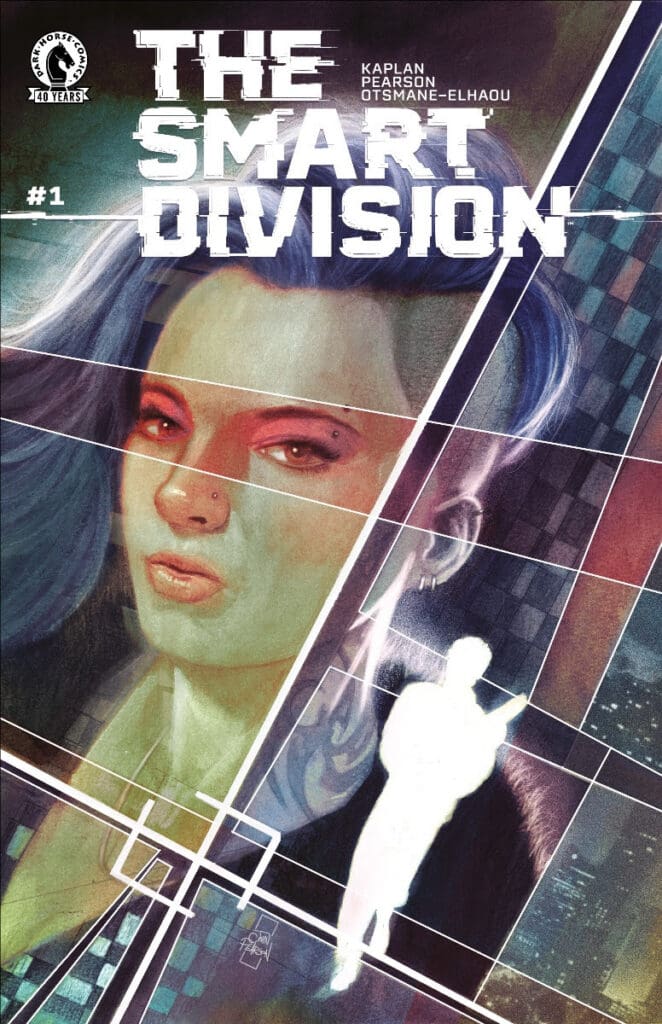
THE SMART DIVISION #1: The Perfect Crime.

Old school meets new school. Two FBI agents partner to investigate the mysterious death of one of their own agents. However, things quickly become complicated as they face The Smart Division, a perfect crime-making app. Now the duo must put their differences aside to solve the case before things spiral out of control.

The Smart Division #1. Credit Dark Horse Comics. Cover by John J Pearson.

Creative Team:

Zack Kaplan, John J Pearson, and Hassan Otsmane-Elhaou.

The Story:

It may feel like an overused trope today. However, I love the old-school versus new-school mentality of our two detectives. Will is the Danny Glover: I’m too old for this. Stevie is a know-it-all who wants to work alone. This sets up a great clash between them. Will shows he pays attention to small details. Stevie is a tech genius.

Zack crafts the exposition for their first meeting. Both characters show what they bring to the table. Zack draws us in. We get to know who we will work with and why we should care. I’m heavily intrigued by the tech. The Smart Division frames the institutions that exist and explores real issues.

The Art:

Get really familiar with John if you haven’t already, because the way he is able to create scenes packed with details is extraordinary. John makes the artwork feel as though we’re reading a book of paintings. It has a gritty type of vibe to it, and that is not a knock at all. I love the character designs. Stevie is tattooed and comes across as bad-ass. Will is the typical flannel and glasses nerd. The designs of each character help us engage with them. Hassan’s letters push us to buy into these characters. They invite us into the world we will be exploring.

Final Thoughts:

The Smart Division #1 introduces us to a world that is still catching up and understanding the real abilities and even threats of AI and technology. What if the wrong tech got into the wrong hands? Zack, John, and Hassan set us up for a new-age thriller in the best way.

Overall Grade: 9/10

How did you like this issue? Let us know below and make sure to check out more by Matt!

Leave a Reply

This site uses Akismet to reduce spam. Learn how your comment data is processed.


White Sky #5 – Hush Now and Find Peace

The world is a mess. Ghosts inhabit the world. Five years ago, the sky went white and stayed that way. Now, Violet, on a quest to reconnect with her dad, finds herself alone with a strange man named Walter as they wander through the world. As Walter fights to stay alive after being shot, his attacker begins to help Violet understand what is really going on in the world around them. In a world where ghosts are everywhere, and salt is the world’s most valuable commodity, what can a 16-year-old girl do to stay alive? White Sky #5 pulls back the curtain and begins to give answers.

This review is brought to you by Nerd Initiative’s Shawn!

Catch up with previous review for White Sky #1, #2, #3, and #4

Creative Team

Writer: William Harms
Artist: J.P. Mavinga
Color Artist: Lee Loughridge
Letterer: Ed Dukeshire
Cover Artist: J.P. Mavinga

Writing

Where do I begin? Bill Harms brought the heat this week in White Sky. Bill continues to show why he is such a brilliant writer through careful and detailed character exposition. While we don’t learn a ton more about Violet in this issue, she provides a vessel for us to learn more about the world around her. The world has gone to hell in a hand-basket, and being a good person isn’t usually synonymous with staying alive in this world. Harms treats us to a beautiful glimpse at how, even in this world of tragedy, where the hunger consumes ghosts, it’s hope that can keep Violet pushing forward.

It’s the moving forward into the unknown that continues to drive this series. Harms quickly outlined after the first issue of White Sky that while the first issue may have the dad/daughter apocalypse trope, this would fundamentally be a story about Violet. White Sky #5 takes the most significant step so far in cementing that truth. While Violet still wants to find her dad, this issue makes it abundantly clear that Violet not only is the center of this story but may have a bigger role to play in the world of White Sky than we even know right now. White Sky #5 shows us there’s more to death in this world. The existence between the souls, their hunger, and the living is complex and dark. This issue was perfectly chilling and eerie, and Harm’s author’s note at the end of the issue unexpectedly brought me to tears.

Art

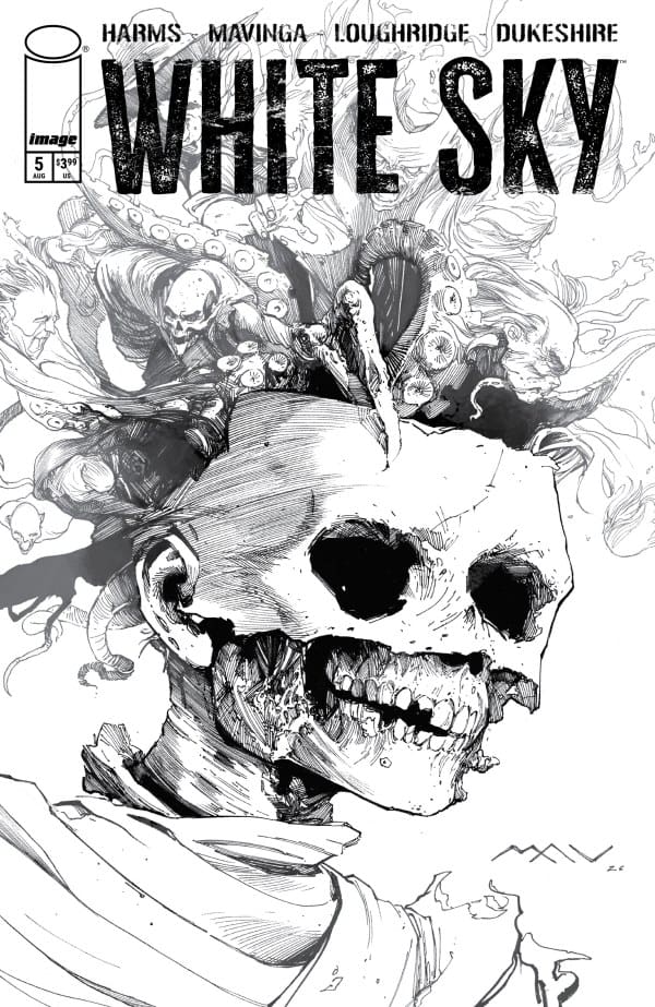
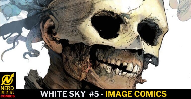
White Sky #5 Alternate Black and White Cover by J.P. Mavinga. Image from Image Comics

Without spoilers, it’s tough to highlight just how much stunning art J.P Mavinga brought to the story this issue, but what a treat. In this post-apocalyptic world, every stroke of Mavinga’s art feels like it serves a purpose. On top of a few new designs related to big reveals that are stunning, Mavinga shines in showing us ghosts that are both terrifying and familiar. It’s Mavinga’s ability to capture their spectral aspect while maintaining the details that easily identify them as lost loved ones that really make the ghosts spectacular additions to this story.

Lee Loughridge brings depth to Mavinga’s designs, giving the ghosts their haunting and spectral appearance. It’s the dark earth tones and shades that really bring the gritty feel to this story. Even the “bright” colors feel a little bit murky in this world, and that really helps sell the post-apocalyptic feel of this world. Ed Dukeshire ties all of the story together with perfectly styled word bubbles. It’s Dukeshire’s work that perfectly brings together the haunting world of White Sky, drawing the viewers deeper into this haunting and dark world

Final Thoughts

White Sky #5 answers so many questions. Bill Harms put together the best issue yet from a writing perspective. The story shows us so much of the world just beyond what Violet sees. Harms’s writing, combined with Mavinga and Loughridge’s art, reminds us that this is not a regular post-apocalyptic world. Here, death has a cost, the hunger is real, and dealing with ghosts that know who you are is a different realm of pain and fear.

Overall Grade: 9.5 / 10

What did you think of this issue of White Sky? Let me know in the comments

Leave a Reply

This site uses Akismet to reduce spam. Learn how your comment data is processed.

Chachu #1 – Hollywood, Heartbreak, and Home

Uncle. That’s what Chachu roughly translates to in Urdu, the official language of Pakistan, the setting of the story. Leila, a Pakistani-Canadian girl of 19, inches towards adulthood. Her journey takes her to California, seeking to connect with her Chachu. Once a private eye, now married to a Hollywood star, he was hired to find his wife, whose recent disappearance forces Leila and her Uncle to go on a journey of growth, regret, and realization to try and find her.

This review is brought to you by Nerd Initiative’s Eda and Shawn!

Creative Team

Writer: Iman Vellani
Artist: Marianna Ignazzi
Color Artist: Jordie Bellaire
Letterer: Lucas Gattoni
Cover Artist: Marianna Ignazzi

Writing

Eda: This being my first-ever Iman Vellani comic, I went in not exactly knowing what to expect. I, personally, had a genuinely great time with “Chachu #1”, feeling like I could heavily relate to the main character, Leila. While reading, I couldn’t help but feel like this was a deeply personal story for Vellani, as it felt real. I won’t spoil exactly how these two points connect, but it really helped make Leila feel heavily relatable to me and what I’ve experienced.

On a related note, there are so many moments throughout that ooze with tension. This tension helps elevate the starting hook that lures you in for the amazing midpoint plot twist. If the rest of the story can keep this up, I think we’re in for a truly good, emotional ride.

Shawn: Iman Vellani really hooks you in with this issue. Through her words, you begin to feel a connection with Leila even if you’ve never been in her shows. I found myself intrigued by Leila’s story as it continued. The characters all have such depth for a first issue that really makes the story enjoyable. Despite being set in the 1970’s, Vellani crafts a real golden era of Hollywood vibe with the story. The narrative feels like a healthy blend of coming of age and crime noir.

Vellani shows that, for all her abilities in acting, she is a storyteller at heart. The story flows and keeps you on the edge of your chair. It’s rare that a back story within a comic can pull you in and be interesting, but Vellani manages to connect with the audience throughout the first issue. Leila is an intriguing character, and Vellani does a great job with a “show don’t tell” style of comic, letting the reader learn more about Leila without needing to spell every part of her past and story out explicitly.

Art

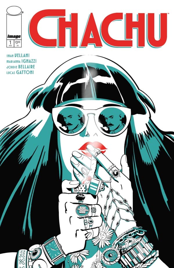
Chachu #1 cover by Marianna Ignazzi. Image from Image Comics

Eda: When it comes to the art and colors, the duo of Ignazzi and Bellaire delivered something truly unique here. While reading, I couldn’t help but sink into Ignazzi’s art style. It somehow evokes a blend of Sabrina Carpenter’s “Espresso” music video and the movie “Fear & Loathing in Las Vegas” while bringing in this noir vibe.

This was helped even further by Bellaire’s colors. The mixture of mocha browns, pastel blues, and sunrise oranges made for a dynamic that truly stands out from most books out right now. It wholly rounds out the character this comic brings, and I loved it.

Shawn: Marianna Ignazzi, Jordie Bellaire, and Lucas Gattoni really crafted a beautiful first issue on the visual art side of the coin. Ignazzi starts the team off strong with beautiful line work. Every stroke feels thoughtfully placed and calculated. The style Ignazzi deploys for this debut issue really helps establish the setting and capture the Hollywood feel of the story.

Bellaire does the yeoman’s work in helping to establish the mood and setting of the story through colors. Bellaire’s work really creates some stunning dynamics with the cool blues and tans contrasted sharply against the orange and yellows. The colors really help to sell not only the setting and time of the story but the narrative as well. Bellaire’s colors lie on Ignazzi’s lines to create the perfect feeling of noir and investigation. Gattoni really helps move the story along with some beautiful and creative visuals through the word bubbles. While showing the creativity of a well-polished letterer, Gattoni helps create a beautiful dance between the written and visual narrative.

Final Thoughts

Eda: 9/10. Iman Vellani’s “Chachu #1” serves as a promising start to what’s set to be a hopefully great series. From a relatable main character to the most intriguing art I’ve seen this summer, this is a series I very much look forward to reading.

Shawn: 10/10. I really didn’t know what to expect from this story, but Vellani hooked me right out of the gate with a story that feels both fresh and relatable. The artwork is simply stunning, allowing you to be drawn into the story. Chachu #1 manages to feel like a warm hug while keeping you on the edge of your seat.

Overall Grade: 9.5 /10

What did you think Chachu#1? Did it hit the spot? Let us know in the comments
Leave a Reply

This site uses Akismet to reduce spam. Learn how your comment data is processed.

Deadman #3: A Terrifying Field Trip to Hell

Boston Brand takes a field trip to Hell, and he mustn’t go alone. His ghostly companion Bobby was told to go with him, though Lucifer knows why. The duo crosses the various gates of Hell in search of what is causing the chaos above, and if they aren’t careful, it could swallow them up for eternity.

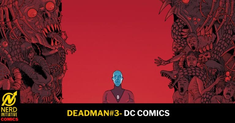
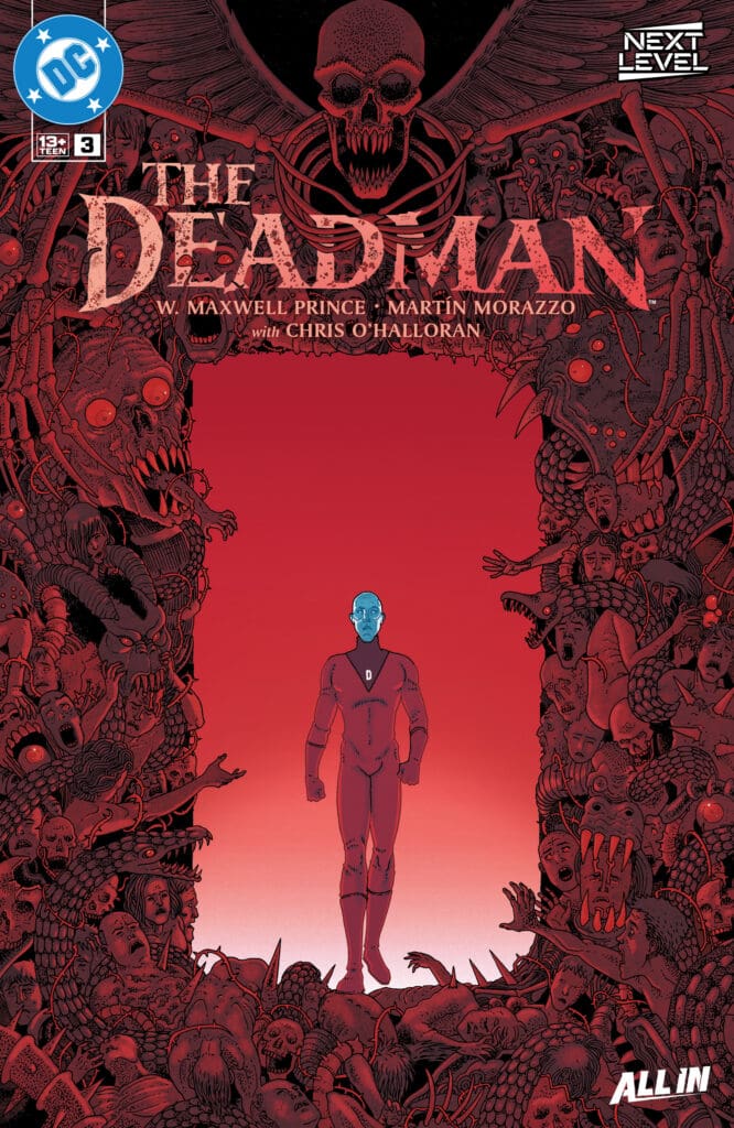
Deadman #3: Credit DC Comics. Cover by Martin Morazzo and Chris O’ Halloran.

Creative Team: W. Maxwell Prince, Martin Morazzo, Chris O’Halloran, and Good Old Neon.

The Story:

Who doesn’t love themselves a good road trip? Not one that leads into Hell’s gates, perhaps. This issue is as trippy as it gets, and I would expect nothing less from Prince. It is truly incredible how the story weaves vernaculars and sheets while telling a clear tale. Boston and Bobby head into Hell, and Lucifer is a child Boston brings red crayons to.

However, despite the tricks and jokes, a bigger crisis of faith lies ahead. Boston slowly loses his calm as he questions his purpose and the truth. The story sets out to find a demon’s source feeding the innocent, yet hints Deadman as well. This narrative could uncover something more for our janitor, tying faith, myth, and motive.

The Art:

The artwork for this issue alone deserves to be nominated for the Eisners and any other award. The single-page splash that is the gates of hell within a rib cage was enough to stop me in awe. Morazzo’s ability to depict the various stages of hell inside of these bones and with various artistic styles blows me away. Little did I know that was only the beginning for this issue! There are multiple pages fitting various art styles within them and displaying so many visions telling a story. The lettering work weaves within various styles and vernaculars, making this issue a display for the eyes.

Final Thoughts:

Deadman #3 is incredible and a visually stunning masterpiece. Poor Boston and Bobby may have bitten off more than they can chew by diving into Hell, and this issue deserves every ounce of praise. I cannot get enough of this run!

Overall Grade: 10/10

How was your journey into Hell? Let us know below and make sure to check out more by Matt!

Leave a Reply

This site uses Akismet to reduce spam. Learn how your comment data is processed.


“Vampirella vs Red Sonja: Red City #1” Review – A Gloriously Beautiful Battle

The Run Down

By now, it’s safe to assume that Dynamite will give us a Red Sonja and Vampirella crossover every few years. From the years of 2019 to 2020, we had a 12-issue crossover run from writer Jordie Bellaire. Then, from 2022 to 2023, we got a story from Dan Abnett. There the titular characters were recruited by a group called The Project. Finally, if we want to count it, both Red Sonja and Vampirella appeared as cameos in the massive “DC K.O.” event. Alongside the likes of Homelander and Annabelle from “The Conjuring”. Now, we’re here, with this fantastic and latest crossover by Eisner award winning writer Chuck Brown (check out Matt & Lauren’s interview with him here)!

Source: Sebastián Píriz, Dynamite Entertainment

Writer: Chuck Brown
Artist: Paulo Mel
Colorist: Marcos Antônio
Letters: Jeff Eckleberry

The Writing

If you’ve read some of the previously mentioned crossovers, rest assured that you’ll highly benefit when reading this one. As odd of a choice as it may seem on paper, Brown utilizes the character of Dyna Might, introduced during Abnett’s “Powers Saga” where we meet The Project, as the audience surrogate. She quite honestly works perfectly as that, being someone who understands how both Red Sonja and Vampirella operate, being able to clearly communicate that to the reader.

Brown also expertly works in an object of importance from Bellaire’s aforementioned crossover mini-series. In such a short amount of time, he manages to show not only how powerful it is, but why it’s being included here. The fact that he was able to bring in all of these previous elements without making things confusing or making new readers feel like they have to do homework is a testament as to why he’s an award winning writer.

Further proof of that is how he worked in a specific plot twist in such a short amount of time. While I won’t spoil what it is, how he managed to pull it off was mind blowing. The only thing I wish was that this was either a mini-series or an ongoing, just so that the tension preceding it had more time to sit and fester with the audience. Had that been the case, I feel like the twist could’ve been even more impactful. That being said however, it was very well done for the time allowed. At the end of the day, everything on display here made me want so much more as this was stellar!

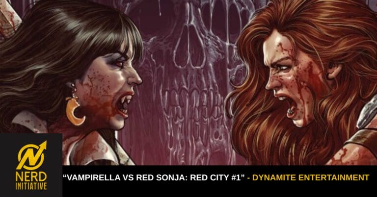
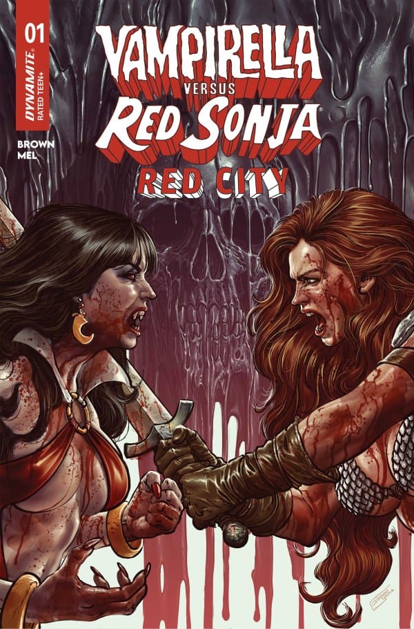
Cover for Vampirella versus Red Sonja from Dynamite Entertainement.
Source: Diego Yapur, Dynamite Entertainment

The Art

Can we get Paulo Mel and Marcos Antônio on more books? Because we need these two on more books. Seriously, the art and colors perfectly match Brown’s writing in how amazing they are. Mel’s art style here has an almost anime-likeness to it, particularly in the character reactions and some of the close-up panels. In speaking of the panels, Mel almost always made sure there was something going on or something to look at. I especially loved it when he has characters breaking frame in some way or another, as it lends heavily to helping these characters truly pop.

As for the colors, they worked in perfect conjunction with Paulo’s artwork. Where Mel made the characters pop through the paneling, Antônio made them pop through his expert use of color. He truly made this world and its characters come to life in a way that needs to be seen to be believed.

Final Thoughts

Whether you’re a fan of Chuck Brown or just love the titular heroines, this is a prime example of how single-issue crossovers should be done. Let alone crossovers between these two. After having put it down, I already want to give it another read. Brown and crew really worked together and made this a fun experience, albeit a short one that could’ve just as easily made for a fantastic series.

Overall Grade: 9/10

Read more from me here and check out my social media!

Comments

Are you a fan of Chuck Brown? Have you read the previous Vampirella and Red Sonja crossovers? Let’s discuss in the comments below!
Leave a Reply

This site uses Akismet to reduce spam. Learn how your comment data is processed.