Home Blog Page 10

WICCAN AND HULKLING: RAID OF ULTRON #1 – Family Dynamics

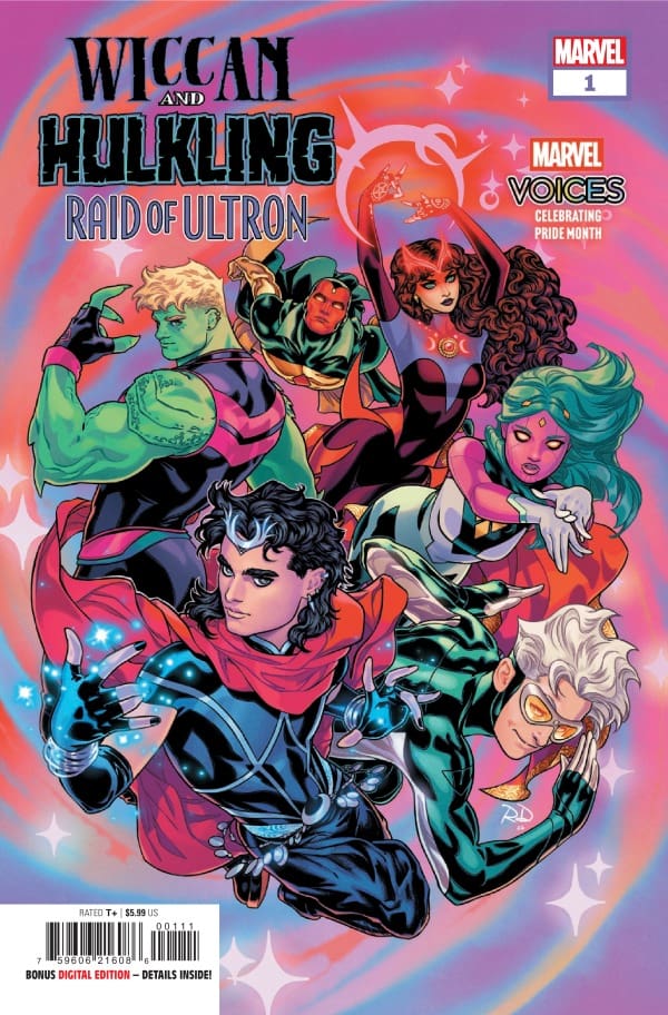
“Family Matters” Creative Team – Wyatt Kennedy, Stephen Byrne

“Mixed Signals” Creative Team – Tegan Quin, Luciano Vecchio, Brittany Peer

“En Garde” Creative Team – Zoe Tunnell, Rachael Stott

“Machine Learnings” Creative Team – Josh Trujillo, Bradley Clayton, Fabi Marques

Published by Marvel Comics

MORE FROM NERD INITIATIVE HERE!

The Story

This comic review is brought to you by the dynamic duo of Megan and Shawn!

Shawn – I genuinely loved the way this issue was set up. I’m not a huge fan of anthology-style issues where there are a bunch of different writers in the issue, but this is different. With Wiccan and Hulkling: Raid of Ultron, we were treated to a complete story crafted by different writers.

This style of writing felt less like an anthology and more like a really beautiful mosaic. Wyatt Kennedy does a beautiful job setting up the overarching story and then hands it off to several really talented writers to flesh out the story. You can feel the love each writer put into their section. Tegan Quin does an amazing job in her Marvel debut. Beyond just a great story, Quin provides a really fun sibling story with Billy and Tommy. Through the story Quin provides a chance to not only see the relationship between the brothers but also their support and love for each other.

This segues nicely into another sibling story from Zoe Tunnell, capturing the relationship between Teddy and Phyla-Vell. Tunnell does a really splendid job making the story unique. You still get the same feelings you felt with Tommy and Billy, but Tunnell makes sure readers understand that Phyla-Vell and Teddy have a different but no less loving relationship. Tunnell still manages to show off how powerful the characters can be while putting relationships front and center.

Josh Trujillo brings it all home with a heartfelt story between Vision and Viv. I have to say, as the father of a daughter, this story connected with me the most. Trujillo makes you clearly feel the love Vision has for his daughter as much as a synthezoid can. The entire story was heartfelt and just a genuinely good story crafted by four talented writers.

Cover art by Russell Dauterman. Published by Marvel Comics

Megan – Nothing makes me more happy than seeing Hulkling and Wiccan together, but then you add their family into the mix and I’m elated. Wiccan and Hulkling are celebrating their anniversary and what better way is there than to have a family party to celebrate? In their new house they acquired from Baba Yaga, all of their family shows up. Wanda, Vision, Quicksilver, Moondragon, Phyla-Vell, Viv, and Tommy all arrive to celebrate their family, but of course things take a turn. Showing up to crash the party is none other than Ultron, who claims he’s also a part of the family as he created Vision. According to Ultron, he’s there for Vision and Viv, but the family will absolutely not allow it.

What ensues next is a four part story of the family who have ventured off into teams of two to take down Ultron and his robots. Along with the fantastic action, we also get an up close look into the married life of Hulkling and Wiccan. We see the worries they have, the love they share, and that they’re not so different from every other married couple. The love between these two is clear and written beautifully in each chapter of the story. The writers came together and created something wonderful that’s glued together with love, love between a man and his husband, and the love the family has for each other.

The Art

Shawn – Where to start? Each artist brought their A game for this issue. Stephen Byrne, Rachael Stott, Luciano Vecchio, Brittany Peer, Bradley Clayton, and Fabi Marques all crafted beautiful visuals. The incomparable Ariana Maher tied everything together across the various stories with consistent lettering that was easy to follow and added just the right feel.

Stephen Byrne opened this issue with some really beautiful backdrops. It’s difficult to craft a setting as beautiful as the Alps in a way that feels authentic, but Byrne nails it. While the character art is magnificent, Byrne’s work really stands out for the attention to detail you can find in the panels. Whether it’s the wrinkles in a flower petal or the pattern seen on wallpaper in the background, Byrne really locks in and provides beautiful detailed work.

Luciano Vecchio and Brittany Peer take over from Byrne on the second story and elevate the art even more. Vecchio, as always, shows great attention to detail, carrying on what Byrne opened with, and the pairing with Peer provides panels that are really well done. Vecchio provides really acute detail in the characters in his panels, with the magic usage being particularly well drawn. Peer uses the cool color palette for the setting to really make everything from the magic to Ultron pop off the pages.

Rachel Stott crafts perhaps the most fun story of the series through her panels. The way Stott draws and colors the scenes really brings you into the panels and makes you feel warm. While the words capture the seriousness of Phyla-Vell and Teddy’s conversation, Stott’s art shows you that they’re still having fun. The battle feels almost secondary. It’s just another day at the office for these two and Stott makes it clear through the emotion expressed in the characters that their love and care for each other is paramount to yet another battle with Ultron.

Bradley Clayton and Fabi Marques wrap it up with the final story. They manage to perfectly capture one of my favorite settings in all of the Marvel universe. One of the things Clayton does really well in this story is capturing Viv and Vision. As both are synthezoids, you’re not exactly expecting them to be dripping with emotion, but Clayton helps the characters be expressive while still in the context of what you would expect from a synthetic being. Marques does a stellar job with colors, really making Viv in particular jump off the page with her bright, contrasting colors. Through all of the art is the unsung hero of the issue, letterer Ariana Maher. Through several writers and artists, Maher is the constant line that the story all ties to ensuring a thread of consistency that carries across different styles.

Megan – The artwork of Wiccan and Hulkling: Raid of Ultron #1 was absolutely glorious, all thanks to the many artists of the comic. The creative team is stacked, so it’s guaranteed that the art would be fabulous. With artists like Luciano Vecchio, Rachel Slott, Stephen Byrne, or Bradley Clayton, each chapter is beautifully detailed, with the characters telling the stories themselves through their facial expressions. There is a great amount of action in each chapter that puts a spotlight on the characters’ powers such as Viv or Wiccan. Ultron looks menacing and fits in with the other characters extremely well.

What really sold the art for me was the coloring of the chapters. With an excellent mixture of darker tones with bright colors, each page is an absolute masterpiece. You really couldn’t have picked a better group of artists to take on this story. Each one brought something new to the pages and the readers will benefit from it heavily.

Final Thoughts

Shawn – 10/10 I would love to see more of this type of story from these teams. Not only is this a really fun set of stories, but it’s also a fun look at the WILD family dynamic at play when Teddy and Billy’s families get together. No matter which story you are reading, you can really tell that every writer and artist working on this issue put everything they had into their portion. The story flows well while maintaining unique aspects of each writer and artist.

Megan – 10/10. Wiccan and Hulkling: Raid of Ultron is filled with action, family dynamics, and a whole lot of heart. The creative team knocked this out of the park!

Overall Grade – 10/10

Let us know in the comments what you thought of Wiccan and Hulkling: Raid of Ultron #1!

Leave a Reply

This site uses Akismet to reduce spam. Learn how your comment data is processed.

DoomQuest #1 – The Rise of the Doom Engine

Reed Richards has gone too far. Appearing at a prestigious international showcase, Reed Richards unveiled his vanity project: to optimize history. Richards plans to figure out the technology necessary to save trillions of lives through erasing all the time humanity has wasted on war and conflict. Unwilling to allow a world in which history is made in Reed’s image, Doctor Doom begins to concoct his own plan. One that will bring him and Latveria to what he sees as their rightful place of respect in the world.

This review is brought to you by Nerd Initiative’s Megan and Shawn!

Creative Team

Writer: Ryan North
Artist: Francesco Mobili
Color Artist: Frank D’Armata
Letterer: Cory Petit
Cover Artist:Alex Ross

Writing

Megan: Victor Von Doom is a person of priorities. He does whatever he can for what’s important to him, and will stop at nothing until he accomplishes his goals. In this story, it’s all about the betterment of Latveria. Doom knows that Latveria deserves more than it has now, whether it be respect or resources, and he will do anything to get his home what its deserved.

It just so happens that he catches his nemesis on the tv talking about his grand idea of a time machine. Reed Richards says he wants to create a time machine, go back into the past, and rewrite history in what he thinks is best, so no war and no violence. It’s an idea made with good intentions, but Reed doesn’t realize he sparked an idea in Doom’s head. With motivation and ingenuity, Doctor Doom creates the Doom Engine, and all hell breaks loose.

At this point, if it’s Ryan North writing for Doctor Doom, then I know I’m going to love it. No one has understood the character of Doom like North has, in my humblest opinion. North gives so much depth and so much power to the story, perfectly capturing what makes Doom such a compelling and complex character.

Shawn: In the past few years, Ryan North has become my favorite writer to take on Doctor Doom. DoomQuest #1 all but confirms that for me. In this issue, we not only see Doom’s brilliance, but we also see that for everything said about him, Doom is, at his core, a simple man. Doom’s life is simply built on the idea that he is second to no one. North perfectly captures and encapsulates that in these pages.

DoomQuest #1 Cover by Alex Ross. Image from Marvel Comics

Through this issue, North not only treats readers to an understanding of Doom’s accomplishments, but within the 20-plus pages establishes most of the key things a reader would need to know about Doom. What makes DoomQuest #1 so interesting is that it’s not just another Doom story, but one that you can pick up with limited knowledge of Doctor Doom or the Fantastic Four and jump right in. North catches a new reader up to the basic level of understanding about Doom’s life and the relationship with the Fantastic Four in a narratively satisfying way.

Art

Megan: Francesco Mobili, Frank D’Armata, and Cory Petit perfectly capture the power of the story and brings it to life through the art in a brilliant way. Mobili and D’Armata put the emotions of the story on full display through the characters whether it be the terror coming from Doom’s associate or Doom himself. The facial expressions throughout the comic practically tells the story itself. Even with Doom’s iconic mask on, Mobili expertly displays his emotions through his eyes. D’Armata works really well off of Mobili’s drawings, having a mutant tone over the vibrant colors of the superheroes.

Shawn: Francesco Mobli and Frank D’Armata captured this issue beautifully. Near the beginning of the issue, Mobli does a beautiful job crafting depth and detail in a single panel as we see Doom surrounded by the people of Latveria. Beyond that, Mobli does a really great job of using modern techniques and technology to establish a Silver Age of comics kind of feel on the pages. Panel after panel, Mobli crafts images reminiscent of the classic Doctor Doom and Fantastic Four art. Frank D’Armata then brings those lines to life with a modern paint job.

D’Armata simply put does outstanding work on this issue. Every color has a place, and every placement is perfect. Doom still feels every bit as connected to the original stories of Doom from Lee and Kirby, with a modern, updated color palette. Cory Petit really did some unique things in this issue and used DoomQuest #1 to remind us of the weight Doom carried, using Doom’s signature font to break out of world bubbles.

Final Thoughts

Megan: 10/10. This was a fantastic issue for Doomquest with the creative team firing on all cylinders. The stakes are high, the story is compelling, and the future is very uncertain for our main character. Consider me extremely excited to see what’s next for Doctor Doom in this run!

Shawn: 10/10. Amazing first issue. If you’re a fan of Doom or a fan of the Fantastic Four this one has to be on your pull list. In one issue, North captures everything that makes the battle between Reed Richards and Victor Von Doom not only one of the best in Marvel Comics, but one of the most enduring struggles across comics history. This issue is power and intrigue in pages that reminds you why Doom has his own font in the world of Marvel.

Overall Grade: 10/10

How was that for a limited series launch? Let us know in the comments.

Leave a Reply

This site uses Akismet to reduce spam. Learn how your comment data is processed.

Lost Fantasy #10 – Pain Prism

Things are not looking good for the five Hunter Families as their organization is under attack. Leaving the main character of this series in the middle of a pain prism. Will Henry choose the hunters organization or his blood brother…


Creative Team

Curt Pires / Franklin Jonas (Writers), Luca Casalanguida (Artist), Mark Dale (Colorist),
Micah Myers (Letterer)

Fernando Rosales / Wesley Griffith (Designers), Chris Stevens (Editor)

Publisher: Image Comics


Pain Prism

Issue ten of Lost Fantasy brings readers right to the ending of issue nine. The five Hunter Families are gathered to discuss the attack that is being implemented on their organization. Which leaves them all very vulnerable because they are all together at the same place at the same time. Making it really easy for anyone to attack all of them at once.

Pain
Lost Fantasy #10, Credit Image Comics. Cover by Luca Casalanguida


Henry Blackheart is still on his side mission with Miyamoto taking out this new villain which seems easy enough being a two on one battle. That is until another fighter joins in on the festivities. The action sequences within this bonus fight are out of this realm. Readers will see magic that is used in a new fashion for this story. Action mixed with amazing witty dialogue will grip a hold of the reader’s attention!

Returning back to the Hunter Families, two sitting members have been taken by the leader of the rebellion force. This is when this story starts to bring sections of the plot of prior issues full circle. Readers will see dark magic elements being implemented within this story resulting in a flair of emotions. The main question I kept asking is, how far is this rebel leader willing to go to seek the destruction of the Hunter Families?

The ending of this story will leave readers in utter shock! Just when you thought Henry Blackheart had someone, he was able to trust. The narrative takes a hard left making you wonder if there is anyone left loyal to the Hunter Families. This issue brings pain, but in multiple different forms. Readers will experience physical pain of the characters within the amazing fighting panels. While also getting a dose of emotional pain with the discovery of mysterious and undercover plot twists.


The Writing

Curt Pires and Franklin Jonas continue to build an amazing ongoing story that is captivating with every page. The narration and dialogue build off of each other in such a beautiful way that the story just flows effortlessly. Another amazing aspect of the writing for this issue is the scene jumping. Going back and forth to two different periods in time to two different parts of the story is so meticulous and easy to follow. The character development within this series has been so entertaining to read, and I’m sure readers like me are enjoying it as well!

The Artwork

Luca Casalanguida & Mark Dale provide such amazing and detailed work for the story being told. The attention to detail both large and small is spot on. The gritty texture added by the pencil work and shading add to the tone of this story so well! The coloration of the fight panels provide bright and vivid colors to really bring focus to the action that is taking place. Amazing work!

Micah Myers provides the lettering for this issue and he does not disappoint. The variation of text styles and boldness add to the verbal tone that the story is trying to give off. Mix that with the placement of narration boxes being perfect, really work hand in hand in making this story an easy read!


Variant Covers

  • Cover art for Lost Fantasy: two heroes—woman with a weapon and man wielding a giant sword—engage a spiked, dinosaur-like monster on a bright blue background.
  • Cover of Lost Fantasy issue 10: a muscular, white-haired warrior in brown, wielding a large sword, stands before a blazing orange tree background.

Final Thoughts

I must admit that I am new to the Lost Fantasy series. I did my homework though after reading Fireborn. I purchased volumes one and two of Lost Fantasy and enjoyed them so much that I wanted to cover this story moving forward. Issue ten really starts to bring sections of the plot together for readers. This is an amazing series mixing action, magic and personal problems all into one. This is a story that any category of comic book reader will enjoy! Jump on the Lost Fantasy train now, you won’t be disappointed!

Overall Grade: 10/10


Links

Comic Book Reviews & Entertainment News: Nerd Initiative
Previous Lost Fantasy Review: Lost Fantasy #9 – New Location, New Enemy
Travis’ NI Portfolio: TravisComicHaven – Nerd Initiative
Travis’ Personal Content: Travis’ Comic Haven


PLEASE SHARE YOUR THOUGHTS IN THE COMMENTS SECTION BELOW!

Leave a Reply

This site uses Akismet to reduce spam. Learn how your comment data is processed.

HYDE STREET #12: The Butcher’s Reign of Terror!

The Butcher of Hyde Street has escaped, and with him, his reign of terror has begun! There’s a reason he was locked away for so many years, and the citizens of Hyde Street are about to find out that something much worse has yet to come.

Hyde Street #12. Credit Ghost Machine/Image Comics. Cover by Ivan Reis, Brad Anderson, and Danny Miki.

Creative Team: Geoff Johns, Ivan Reis, Danny Miki, Brad Anderson, and Rob Leigh.

The Story:

Johns has been teasing the mysterious Butcher of Hyde Street, and we have finally gotten a taste of why he has been built up in such a terrifying way. I love how we are given more backstory behind certain characters, such as why Oddman has remained so loyal and guarded the door for so long.

There is even a character of whom we have spent 11 issues hoping something bad would happen to, and yet Geoff has written them so well that when The Butcher gets their hands on them, we feel a sense of sadness. In a world where these beings hunt souls and have all done something horrible, the fact that something and someone far worse is now on the loose is a testament to how well-crafted this story is.

The Art and Letters:

The Butcher’s grand reveal is so simple and yet incredibly effective. At first glance, his design is just a man, and nothing is frightening about him. However, the subtle darkness and sinister look they have given him and how large he looms hit like bricks and takes your breath away. Everyone is justifiably scared of him. Other panels, such as our sadistic doctor who loses his facemask for a moment, revealing an unhinged jaw, build on the horror elements subtly. There is a range of emotions throughout this issue, and Rob’s lettering allows the reader to step into everyone’s shoes and feel their fear, sadness, and more.

Final Thoughts:

Hyde Street #12 strikes like a fresh bolt of lightning, and it sends fear and shock throughout us as this issue delivers on The Butcher of Hyde Street and how horrifying he is. The team built up his mystique, and when they drop the curtain, the reveal hits as intended, which is shock and awe. Nobody is safe either, which isn’t a thought I had considered with these characters having been dead already, and I am eager to see what’s next!

Overall Grade: 10/10

Be sure to let us know your thoughts below and check out more reviews by Matt!

Leave a Reply

This site uses Akismet to reduce spam. Learn how your comment data is processed.

THE INFERNAL HULK #7 – Into the Takeover

Creative Team – Phillip Kennedy Johnson, Adam Gorham, Matthew Wilson, VC’s Cory Petit, Nic Klein

Published by Marvel Comics

Catch up with The Infernal Hulk #6!

The Story

If you thought the story of the Infernal Hulk was at an all-time high in terms of excitement, then you haven’t read The Infernal Hulk #7 yet. To catch up, Bruce Banner and the Hulk have split in the most gruesome of ways, and are now two separate beings. With Hulk’s body up for grabs, Eldest, using the powers of The Great Old Ones, takes over Hulk’s body. Eldest has been a problem for everyone she’s come into contact with and won’t stop until Hulk has taken over the world, and she’s getting pretty close. In the seventh issue, Eldest has decided that she is the rightful owner of Earth’s mutantkind, and the X-Men take that personally.

Cover art by Nic Klein. Published by Marvel Comics

Starting with a vision that every mutant saw, except Glob apparently, the mutants come together because they know something big is going down. They must come up with a plan on how to stop the Infernal Hulk, but if we’re being honest, they truly don’t know what kind of threat they’re dealing with. Eldest has her eyes set on one mutant in particular to see out the plan of the Infernal Hulk, and won’t stop until her plan is victorious.

The Art

If you want a look at some of the most talented artists in Marvel Comics, just look at all who has worked on this run. Adam Gorham, Matthew Wilson, Cory Petit, and Nic Klein knocked it well out of the park with The Infernal Hulk #7. In the comic, there are some truly gruesome panels that perfectly show the Infernal Hulk’s true power, like squishing a mutant into a bloody mess. Adam Gorham leaves nothing to the imagination and puts you right in the middle of the action, giving you every detail of the chaos.

Matthew Wilson brings a great amount of vibrancy to the pages, which make every page a visual masterpiece. Cory Petit handles the lettering, and does a brilliant job at bringing the emotions front and center through the dialogue. Nic Klein brings us another fantastic cover, giving you a perfect idea of the high quality you’ll see once you open the book. Together, the artists made this an unforgettable issue!

Final Thoughts

This series continues to do incredible things thanks to the creative team. Every issue is better than the last, and once you think to yourself that it can’t possibly get better, it does. The action, the depth, the high stakes, everything is all 10s for me.

Overall Grade – 10/10

Let me know in the comments what you thought of The Infernal Hulk #7!

Leave a Reply

This site uses Akismet to reduce spam. Learn how your comment data is processed.

This review was written by Megan from the Vigilante Vibes Podcast! If you liked my review, be sure to check out my other reviews! Let me know what you think of The Infernal Hulk #7, or tell me what comics you’d recommend me trying out! Find me on my socials, and check out my Marvel podcast, Vigilante Vibes, by clicking here!

KILL ALL IMMORTALS II #5:

The finale of chapter II is here for Kill All Immortals, and the weight of her family’s future rests solely upon Frey’s shoulders. She is taking the fight to their enemy, and in order to win, Frey must choose her path: become the leader, or fall like those before her.

Kill All Immortals II #5. Credit Dark Horse Comics. Cover by Oliver Barrett.

Creative Team: Zack Kaplan, Fico Ossio, Elisabetta D’Amico, Thiago Rocha, Hassan Otsmane-Elhaou, and Oliver Barrett.

The Story:

Chapter II has reached its conclusion, and Kaplan has set up an epic finale promising bloodshed. However, we get something even more unexpected, and that is the journey Frey has been on to this point. It’s led her to a crossroads, and Zack has shown how she has rejected her family and immortality. Which makes her decision all the more surprising to me, and at this juncture, it can take guts to take a story almost back to its roots. However, it isn’t just taking Frey and her family back to where we started in chapter 1; it is incredible character development for Frey, who has been written so well.

Her hero’s journey has culminated in this moment, and seeing Frey take control of her own destiny for a change is rewarding. The final fight against the Khans is as advertised, and the tease for chapter III has its hooks so deep into me I need it now.

The Art and Letters:

The brutality of every fight and the swiftness of these characters have remained constant, and yet the team is still finding clever ways to inflict damage and make every battle feel new. Khan is massive and is drawn as such; his presence is large, and I love how he is scaled against Frey. The way the team draws them, you can feel the difference in fight styles through each panel.

There’s a subtle change in how Frey is drawn as she has become the leader, bursting with confidence. Rocha brings out some beautiful colors in the final pages, and despite never revealing the look of our next big villain, even their tease brings out the most from our imagination.

Final Thoughts:

Kill All Immortals II #5 brings this chapter to a close in exhilarating fashion. Frey’s journey comes full circle and feels earned as we are set up in the final pages for what is to come. Kaplan and the team have a truly special world they’ve built, and it’s not too late to catch up before we are thrust into the chaos once more this fall.

Overall Grade: 10/10 Immortal Trees

Be sure to let us know your thoughts below and check out more reviews by Matt!

Leave a Reply

This site uses Akismet to reduce spam. Learn how your comment data is processed.

“Vampirella: Armageddon #11” Review – Holy Woah!

Following the rising of Dark Vampirella and Vampi herself coming to terms with everything, everyone’s in their places. The big and final war is blooming on the horizon. Writer Tom Sniegoski leads readers beautifully into next month’s final issue, leaving everyone on the edge of their seats!

Writer: Tom Sniegoski
Artist: Edu Menna
Colorist: Adriano Augusto

Source: Francesco Mattina, Dynamite Entertainment

Bloody Good Time

There are so many things that I could say about this issue, all of them good. I’m sure I’ve said this before, but Tom Sniegoski really brought his A-game here! With all of this massive build-up to Armageddon, I’ve been constantly left on the edge of my seat, helped by how it was written. While some might complain about the overuse of narration, I personally love it. It all perfectly sets not just the tone and tensity, but the events in the final pages of the book.

In the actual dialogue, however, came a surprising amount of good humor! Intercut almost perfectly with the horror and drama were these much needed, chuckle worthy jokes. I find the humor here really works to make these characters feel real and relatable, showing how even they react to traumatic events. Overall, this book was a fun and stellar read from start to finish. I’m beyond excited to see where this all leads in next month’s finale!

Source: Lesley Li, Dynamite Entertainment

Art of the Kill

Edu Menna and Adriano Augusto once again both worked their magic here. The lines and detailing from Menna really continue to make the characters pop off the page. Everything looks both insanely real and intensely stylized at the same time. Mix that with Augusto’s almost gothic painting-like style and you have yourself pages that look unique and inspired. This is the duo that any comic writer should have as their “work with” goal.

Source: Joseph Michael Linsner, Dynamite Entertainment

Final Thoughts

When the writer, artist and colorist all come together to create a triple threat, you know you have something amazing on your hands. From the humor-laced intensity in Sniegoski’s writing to the gothic realism of Menna & Augusto, “Vampirella: Armageddon #11” is a must add to your collection this week! With next month set for the finale, now’s as good a time as any to get caught up!

Overall Grade: 10/10

Read more from me here and follow my socials!

Comments

Are you reading “Vampirella: Armageddon?” What do you think so far? Let’s discuss in the comments below!

Leave a Reply

This site uses Akismet to reduce spam. Learn how your comment data is processed.

THE PERIL OF THE BRUTAL DARK: AN EZRA CAIN MYSTERY #4

Creative Team – Chris Condon, Jacob Phillips, Hassan Otsmane-Elhaou

Published by DC Comics

Catch up with The Peril of the Brutal Dark: An Ezra Cain Mystery #3!

The Story

The Peril of the Brutal Dark: An Ezra Cain Mystery continues to impress with the fourth issue, as excitement rises to an all-time high. After meeting the missing man he’s been looking for, Ezra gets to meet him at the Brooklyn Bridge. Learning what he already knew, Mr. Meyer tells Ezra he’s in danger. That couldn’t be proven more true in what takes place next, on the bridge. An erratic car chase, a mechanical menace, and Ezra blamed for a murder. As wild as all this was, this occurrence wasn’t even the wildest thing that happens in this comic. Now on the run from the police, Ezra has to stop the big bad thing that’s right around the corner.

Cover art by Jacob Phillips. Published by DC Comics

Chris Condon knows exactly how to keep the reader hooked into the story and he does just that. The story starts on a quiet but dangerous note, and the excitement doesn’t stop there. We learn more about the forces Ezra is up against, and at this point, all hope seems lost for Ezra to put an end to all of this.

What we also see is Ezra more vulnerable than he’s ever seemed before. Beaten down, out of answers, and lost on what to do, Ezra still keeps pushing because there’s no one else in the world that can fix this. If you haven’t gotten a chance to dive into The Peril of the Brutal Dark: An Ezra Cain Story, there’s no time like the present! You won’t regret giving this run a shot!

The Art

The artwork of the fourth issue is probably the most exciting it’s been in the comic run, and that’s saying something. Perfectly capturing the grittiness of the story, Jacob Phillips is able to contrast the darker art with the explosive and vibrant artwork that the story leads to. What sticks out the most to me in this issue is the facial expressions of the characters, who practically tell the story themselves with their looks. Ezra is pretty emotionally driven in this issue compared to the other issues and you can see it perfectly clear on his face. Hats off to Phillips for conveying the emotions of the story in such a brilliant way.

Final Thoughts

The Peril of the Brutal Dark: An Ezra Cain Mystery #4 has me hooked and anxiously waiting to see what happens next for Ezra Cain!

Overall Grade – 8.9/10

Let me know what you thought of The Peril of the Brutal Dark: An Ezra Cain Mystery #4!

Leave a Reply

This site uses Akismet to reduce spam. Learn how your comment data is processed.

This review was written by Megan from the Vigilante Vibes Podcast. If you liked my review, be sure to check out my other reviews! Let me know what you think of The Peril of the Brutal Dark: An Ezra Cain Story #4, or tell me what comics you’d recommend me trying out! Find me on my socials, and check out my Marvel podcast, Vigilante Vibes, by clicking here!

SWAMP THING 1989 #2 – New Life Awaits

Creative Team – Rick Veitch, Tom Mandrake, Trish Mulvihill, Todd Klein

Published by DC Comics

Catch up with Swamp Thing 1989 #1!

The Story

Swamp Thing is in the midst of the journey of a lifetime, or several lifetimes, going through space and time. Not knowing how or why, he tries to figure out which way is up and why this is happening. Being thrown backwards through time, as far back as you can imagine, Swamp Thing’s destination is finally revealed! Meanwhile, the love of his life, Abby, is hours away from giving birth to their child of three different worlds. Abby wants her birth to be as close to nature as possible, and for her child to come into the world as natural as possible. So, she’s opted for no medication, so to say she’s struggling would be an understatement.

Cover art by Rick Veitch. Published by DC Comics

So much happens in Swamp Thing 1989 #2! Different characters, new plans, new destinations, and even John Constantine, all of this factors into this issue being as fantastic as it is. Once you dive in, you’ll see the heightened emotions, the complex story, and the mystery of it all that adds to the overall story brought to you by Rick Veitch.

The Art

Tom Mandrake, Trish Mulvihill and Todd Klein bring so much depth to the pages of Swamp Thing 1989 #2. The artwork takes you back to the time of older comics, which is a vibe in of its own. Mandrake has wonderfully detailed panels and full page looks that are absolute works of art. Mulvihill brings a lot of vibrancy to the pages, even more so than the first issue. With the colors, Mulvihill made this comic absolutely stunning. Todd Klein handles the lettering, and brings so much depth to the story through the dialogue. Together, the artists made this second issue even better than the first, which I didn’t think was possible.

Final Thoughts

Swamp Thing 1989 #2 continues the exciting and impactful hidden story of Swamp Thing. If you haven’t check it out yet, there’s no time like the present.

Overall Grade – 9.3/10

Let us know in the comments what you thought of Swamp Thing 1989 #2!

Leave a Reply

This site uses Akismet to reduce spam. Learn how your comment data is processed.

This review was written by Megan from the Vigilante Vibes Podcast! If you liked my review, be sure to check out my other reviews! Let me know what you think of Swamp Thing 1989 #2, or tell me what comics you’d recommend me trying out! Find me on my socials, and check out my Marvel podcast, Vigilante Vibes, by clicking here!

ZATANNA #2 – The Grand Tour Continues

Creative Team – Jamal Campbell, Ariana Maher

Published by DC Comics

Catch up with Zatanna #1!

The Story

This is a joint review from Matt of Hops Geek News and Megan from the Vigilante Vibes Podcast!

Matt – First and foremost, Agent Di Manes better hope Zatanna cannot get back up, because he has set her up and caused all sorts of chaos and havoc. I love that Jamal dives into the Voodoo magic and history a bit in this issue, as it’s something that I have always been fascinated by. We get a little bit into what Agent Di Manes is up to; however, there is still so much left to explore. They appear to be letting Zatanna do their job for them. This addition has me curious about the endgame. Aside from that, I love how Jamal utilizes music and mixes in magic with music as well. Music can make us feel so many different things, and it has a magical spell on us when that song hits just right. Add in Voodoo and the ability to bring out spirits, and I am sold on the direction of this run!

Cover art by Jamal Campbell. Published by DC Comics

Megan – Jamal Campbell is continuing to impress with this second issue and it was created with the Zatanna fans in mind. There’s so much depth to this issue, that it feels so much more than just one singular comic. The Mistress of Magic’s job isn’t easy and that’s proven time and time again, but if there’s anyone that can manage it, it’s Zatanna.

Zatanna is on her grand tour as the Mistress of Magic and her next stop is in Tennessee where she hopes to find help from a friend of the ghost variety. Living it up in Memphis to the sound of soulful music, Zatanna hopes to get help with a dangerous spirit who has murder on the mind. Meanwhile, the Department of Occult Affairs follows her every move, making her mission even more complicated than it already was. Agent Di Manes needs to watch his back because Zatanna is not the one to mess with.

The Art

Matt – Jamal may be producing some of the best artwork in comics currently. Every panel and every page blows me away with the colors and the way there are variations of blues that range from softer, such as with the spirits, to darker blues in magic. The page that blew me away most was the musical sequence, with how the musical notes broke up the sequence of the full page layout, and there was incredible attention to detail throughout it. Ariana’s lettering almost has a ghost-like feeling to it when in this spirit world, and when it comes time for Zatanna to speak her magic, I love the subtle shift in the lettering for dialect.

Megan – Jamal Campbell is someone of many talents. Writing, story creating, and artwork. When you open Zatanna #2, you’re treated to a mystical wild ride that’s covered in magic and panels that are nothing short of stunning. Each page is drenched in detail and leaves all the magic on the table, showing you exactly what you’re going to get with the Mistress of Magic. The colors are absolutely beautiful with a perfect mixture of vibrancy and dark tones. Ariana Maher handles the lettering, and does so in a way that brings the magical vibe to the dialogue. With some excellent use of sound effects and the tone of the story perfectly captured through the words, Maher wraps the comic in a perfect bow.

Final Thoughts

Matt -10/10. This is perhaps some of the most under-the-radar work from DC and every publisher in production. The artwork alone is a story that flows so magnificently from panel to panel. This mysterious game between Di Manes and Zatanna has my full attention.

Megan – 10/10. Zatanna #2 proves that the first issue wasn’t just a strong start, but an example of the high quality work you can expect to see from Jamal Campbell and Ariana Maher on Zatanna.

Overall Grade – 10/10

Let us know in the comments what you thought of Zatanna #2!

Leave a Reply

This site uses Akismet to reduce spam. Learn how your comment data is processed.