Home Blog Page 12

”Marvel Mangaverse: Web of Destiny #1” Review – Spinning Future Webs

The Run Down

After the last few weeks, the incredible Mangaverse event ends here. In case you missed it, we found out in the last couple of issues that all of this was spearheaded by Blackheart. “But how”, you might ask. Well, if you put all of the pieces together, you’ll know. If you don’t, though… you may just have to read the final entry.

Writers: Joe Kelly, Jack Kelly
Artist: Kenny Ruiz
Colorist: Noiry
Letterer: Ariana Maher
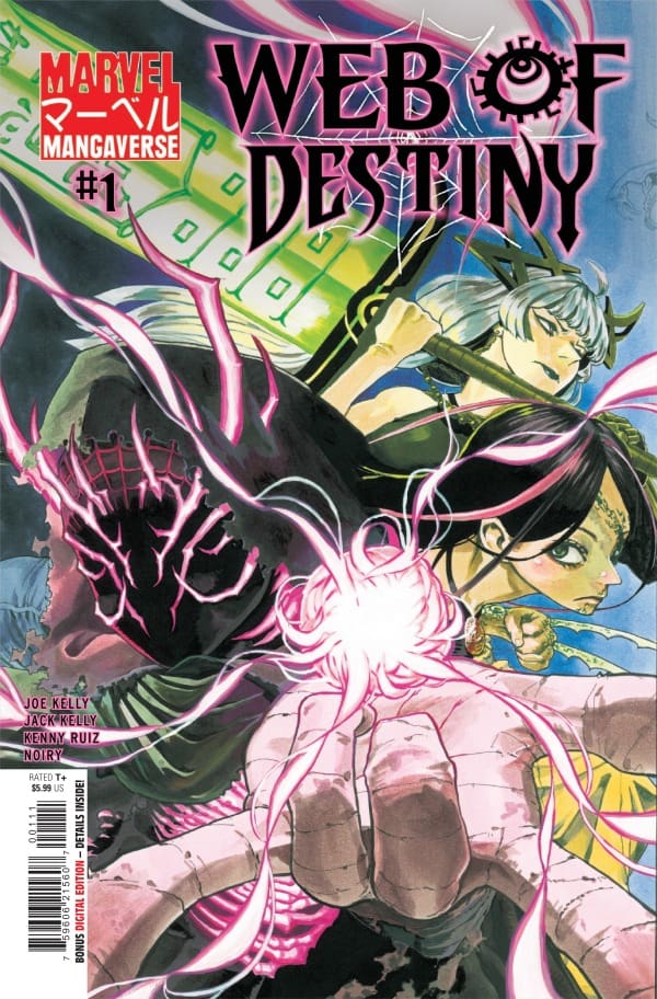
Source: Yuji Kaku, Marvel Comics

The Writing

I’ll just tell you right out of the gate that this event ended on an absolute high note. Joe and Jack Kelly wrote a wildly intense ride that was hard for me to put down. If for some reason you were looking for new and inventive things to be done with Magik, Laura Kinney, and Miles, you’ve come to the right place. What the duo managed to do here left me wanting more, and I hope Marvel does exactly that.

Not only did they manage to do some very inventive things, but they did so with proper pacing and structure. Not once did I feel like the story was going too fast or too slow in this issue. They gave the pace this really nice ebb and flow, slowing down or speeding up when the moment called for it. Them doing this made for a read that felt down-to-earth in a highly fantastical supernatural setting.

As for the story of this Mangaverse event as a whole, the entire thing felt compelling and warranted. Despite nearly every issue having a different writer, it had a strong consistency to it. Going through it all, you can feel the teamwork radiating through the pages, and the event is that much better for it. Marvel, if you’re listening, we need more Mangaverse, and this event proves it.

The Art

Along with the fantastic writing comes the stellar penciling and color work from Ruiz and Noiry. I know I’ve given similar words in previous reviews, but I seriously can’t get enough of their work. They both seemingly went all out here, and it shows. Part of where this shows is in the balance. Neither one drowns the other out, working in perfect harmony. I particularly love one page where Miles’ webs form panels as he hangs in the middle, causing destruction below.

Lastly comes the lettering, once again done by Ariana Maher. While not super intense here, she still manages to deliver some insanely great styles and differing boxes. All the while, she makes everything super easy to read while tugging at the heartstrings with how she places several boxes in panels at the perfect moments.
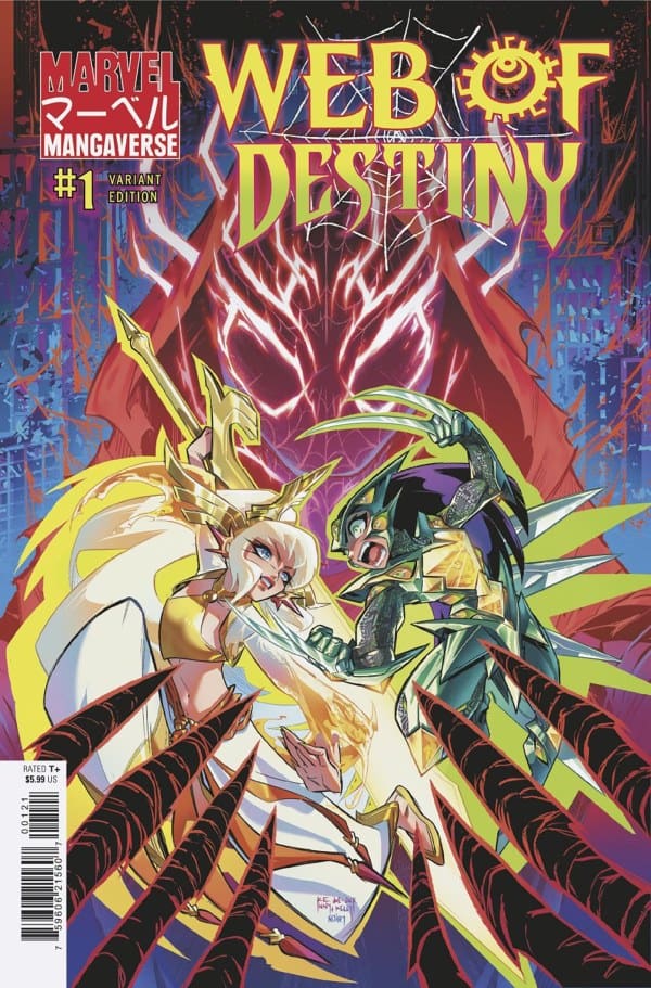
Source: Kenny Ruiz, Marvel Comics

Final Thoughts

All in all, the Mangaverse anniversary event was spectacular. Joe and Jack Kelly both started and ended this event on insanely high notes that I fear will be tough to top. All the while, Ruiz, Noiry, and Maher consistently delivered across the board. This team brought life to something dead, and they should be proud.

Overall Grade: 10/10

Read more from me here and check out my socials!

Comments

Were you able to check out the Mangaverse event? What are your thoughts? Sound off in the comments below!
Leave a Reply

This site uses Akismet to reduce spam. Learn how your comment data is processed.

”Three Worlds/Three Moons: Shift” Review – A Great Discovery

The Run Down

For those who may not know, “Three Worlds/Three Moons”, or 3W3M for short, is a universe created by Jonathan Hickman, Mike del Mundo, Nick Spencer, and Mike Huddleston. Within just the few years that it’s been going, there’s already plenty to sink your teeth into. In other words, if you plan on diving in, you’ll have plenty of water to wade. Without further ado, join Shawn and me as we review the latest in the franchise, “Three Worlds/Three Moons: Shift”!

Writer: Jonathan Hickman
Artist: Mike del Mundo
Colorists: Mike del Mundo, Marco D’Alfonso
Letterer: Rus Wooton

The Writing

Shawn: Shift marks another beautiful entry into the 3W3M universe. Dark Horse is slowly but surely bringing this universe to the masses, and one look at Shift helps you understand why. This story is typical Jonathan Hickman storytelling. Small bits and pieces of narrative that feed towards a bigger ending. Hickman handles both the shifting locations and shifting focus well by utilizing chapters. The chapter breakdown really helps you understand the cresting and waning of the ages and the balance between science and magic.

Again, in true Hickman fashion, there are pages throughout the issue that help explain the lore of the world in an easy and digestible manner. The art beautifully blends what is a rather complex examination of the relationship, albeit a delicate one, between magic and science. The result is a compelling story that provides Tolkien levels of world building in a sci-fi setting.

Eda: As a first-timer in this universe, I feel it’s safe to say that this issue sold me. Whenever I look for sci-fi, this is the exact type of thing I look for: big, inventive ideas in an expansive universe. For that reason with this, I’m so thankful that Hickman made the smart decision to split this book up into chapters. Doing that really helped make everything more digestible and easily paced, especially with all of the information having to be taken in.

That being said, what Hickman’s put on the page is simply incredible. The idea of magic versus science being chaos versus control is an ingenious one that makes a ton of sense. First, magic has always been wild and unpredictable, whereas science almost always has a predetermined outcome. Second, through that idea, Hickman manages to create a ton more layers and meanings involving the likes of religion, education, and power dynamics. I won’t go into too much more detail so as not to spoil, but what’s here will leave you fainting and wanting more.

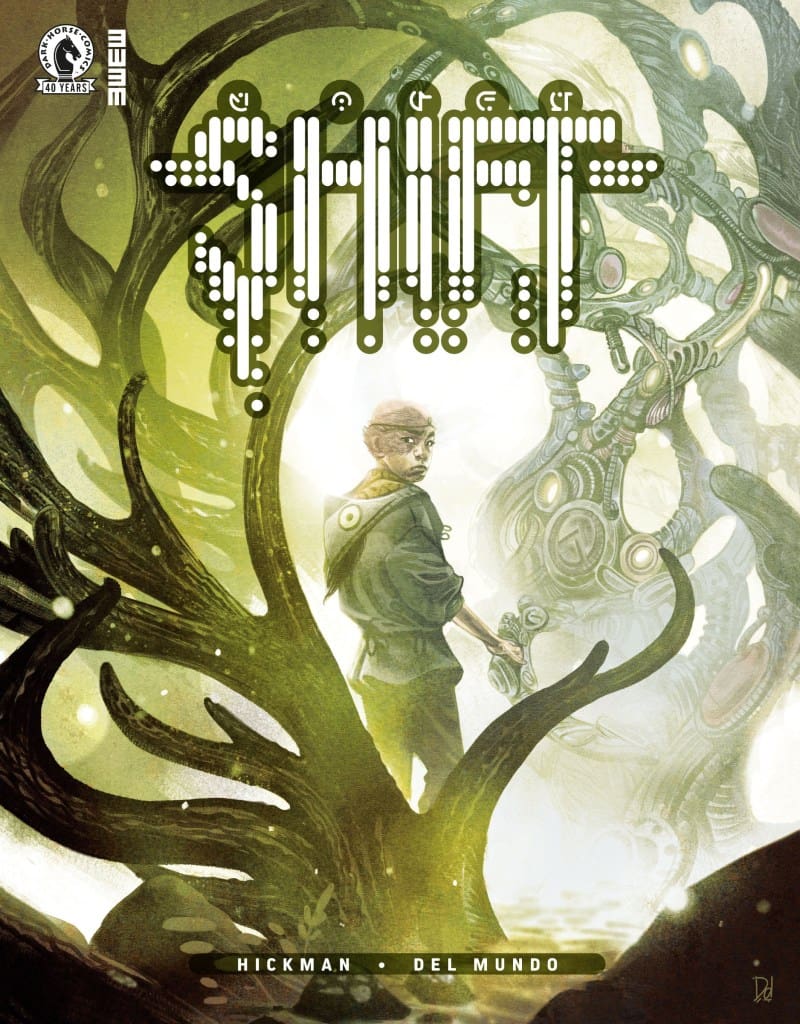
Source: Mike Del Mundo, Dark Horse Comics

The Art

Shawn: How do you write about art when every page feels like a poster? Mike Del Mundo and Marco D’Alfonso beautifully capture this world in vibrant color and detail. Mike Del Mundo does a beautiful job with the line work, showing exquisite attention to detail, as the landscapes are so lush and vibrant from world to world. In doing so, Del Mundo also manages to make each location feel distinct. As time shifts, so does Del Mundo’s linework to show time ever marching forward.

D’Alfonso beautifully colors the world, settling in a hotspot somewhere between transcendentalism and a trip from Willy Wonka’s factory. While Del Mundo’s line work is beautiful, it’s the vibrant and perfectly placed colors from D’Alfonso that really allow this world to shine. Wooton draws you in, making each conversation distinct and meaningful, leaving you hanging on every word.

Eda: I’ll be honest, I don’t really know where to begin here. The art and colors from Mike del Mundo and Marco D’Alfonso absolutely left my jaw on the floor. With how much detail there is and the elite line work, this is among the best comic art I’ve seen all year. Being that this is legend Mike del Mundo, this should come as no surprise. He truly brings this world to life with immense creativity in both world and creature design.

This is backed up completely by the colors. While Del Mundo’s penciling brings the worlds and creatures to life, his and D’Alfonso’s colors give them character and depth. On every single page, I had no words due to how awestruck I was. Everything was simply gorgeous. Lastly, Wooton once again killed it on the lettering. He managed to make everything easy to follow, and the onomatopoeia is among the best I’ve seen in months.

Final Thoughts

Shawn: Shift is a perfect entry point for someone into the world of 3W3M. It’s an invitation to enter a world of depth in an age where arcs are short and new first issues launch seemingly weekly.

Eda: Everything about “Three Worlds/Three Moons: Shift” is truly astounding and perfect. Story-wise, Hickman is on his A-game, while del Mundo and D’Alfonso delivered art that inspires. This is what true mastery looks like.

Shawn’s Grade:10 / 10
Eda’s Grade: 10/10
Overall Grade: 10/10

Comments

Have you ever read or seen anything from the 3W3M universe? What did you think of this latest story?Let’s discuss in the comments below!
Leave a Reply

This site uses Akismet to reduce spam. Learn how your comment data is processed.

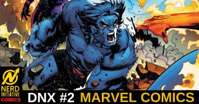
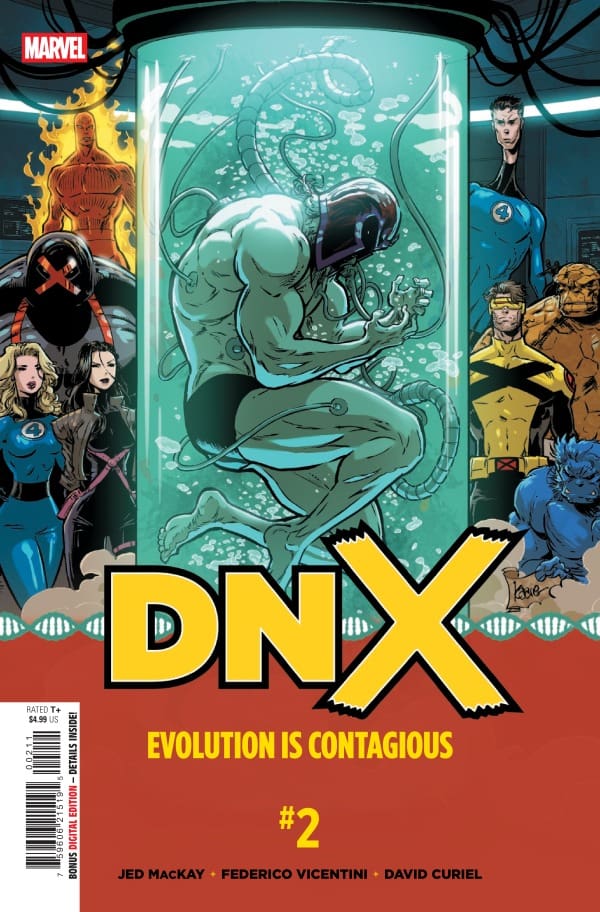
DNX #2 – In the Name of Science

Creative Team – Jed MacKay, Federico Vicentini, David Curiel, VC’s Clayton Cowles, Kaare Andrews

Published by Marvel Comics

Catch up with DNX #1!

The Story

Shawn – “Say Uncle, Hillbilly” might be my new favorite Magik line ever. Jed MacKay puts us right back into the action where DNX #1 stopped. It’s an all-hands-on-deck approach, and I love an opportunity for Johnny and Ben to team up. One of my favorite parts of this issue, other than that hilarious line from Magik, was seeing MacKay remind us how cerebral and calculating Psylocke can be. This issue also serves as a great reminder of how The Chairman continues to be the most depraved and cold version of Beast that exists.

On the other hand, I really enjoyed the high-level banter between Beast and Reed Richards. It was a nice reminder that even for someone familiar with various physiologies like Richards, the only thing essentially the same from X-Man to X-Man is the presence of that X-gene. MacKay doesn’t wait until the third, the midway point of this series, to get to the action. DNX #2 sees the issue end with a massive plot twist that will set the tone for the rest of the story moving forward.

Cover art by Kaare Andrews. Published by Marvel Comics

Megan – DNX #2 picks up right where it left off with the X-Men taking on the Chairman’s X-Men, with Johnny Storm and Ben Grimm valiantly joining the battle. The X-Men have more than enough on their plates with handling these mutants, so it’s a blessing that Johnny and Ben offered their help. The Chairman’s plan to release the X-Virus isn’t exactly going according to plan, but when dealing with Beast, it’s best to assume he has a backup plan. That assumption is right because it seems that he’s considered every possibility.

Meanwhile, Reed Richards, Sue Storm, and Beast are working hard to find a way to cure Magneto. Running into complications, it seems even the brightest minds in the world are having trouble trying to understand a way to help Magneto.

DNX #2 feels like the stakes have been turned up to a 10. The issue is action from beginning to end, with both teams of X-Men bringing all they have to the battle. There’s an excellent juxtaposition in the differing team members’ powers, and it was fantastic to see it all at work. We’re left on a huge note that I didn’t think would happen, so I’m excited to see where we go from here.

The Art

Shawn -Federico Vicentini, David curiel, and Clayton Cowles gave us some really great art in this issue. Where DNX #1 was more of a story establishing issue except for the end, Vincentini gets to go full gas out of the gate on this issue. Picking up where the last issue left off give Vincentini lots of line work and he begins to build up these massive action scenes not only littered with the physical characters but the debris from the characters using their powers. Combine this with the addition of Johnny Storm and Ben Grimm and Vincentini had his work cut out for him but he nails it.

David Curiel blew me away with his colors. I’m always excited to see, from artist to artist, how they will color the Human Torch. Some focus on the brightness, while some add more detail and depth with the colors. Curiel manages to find a sweet spot. The colors really set the mood and help you move easily between the two primary settings for this issue. Clayton Cowles, in part, helps you remember that you’re moving between The Chairman and The Beast. Both are versions of Hank McCoy, but the way Cowles manages to make you feel the independent voice of each is a credit to his talent and ability as a letterer.

Megan – Federico Vicentini, David Curiel, and Clayton Cowles continue to knock it out of the park with the artwork in this second issue. Vicentini absolutely thrives when it comes to the action-filled panels. Bringing so many powersets to the front row and having the X-Men flex all they have, you feel yourself sitting on the edge of your seat because you know literally anything could happen at any point. Vicentini is able to draw this battle in a way that keeps you guessing. The hits are dynamic, the powers are huge, and it seems that almost everyone has a trick up their sleeve. David Curiel brings so many different contrasting colors that look absolutely stunning on each and every page. The powersets are what truly lights up the pages, especially pages that involve Johnny Storm. Each power comes with its own energy as far as colors go and Curiel brings all the heat to the pages of DNX #2. Clayton Cowles nails the voice of the many different characters, allowing you to see just how different they all are in their dialogue.

Final Thoughts

Shawn – 9/10. DNX #2 ramps up the story by dropping a bombshell cliffhanger. It’s a bold move on a series with three more issues of story to tell, but Jed MacKay, along with the rest of the creative team, has shown they have the chops to take it the distance.

Megan – 8/10. We’re left on a huge note that really turns the whole event around. Jed MacKay knows how to keep your eyes locked on the story expertly, as he does in DNX #2. My eyes didn’t leave the comic until the very end, and even then, I wanted to know more.

Overall Grade – 8.5 / 10

Let us know in the comments what you thought of DNX #2!

Leave a Reply

This site uses Akismet to reduce spam. Learn how your comment data is processed.

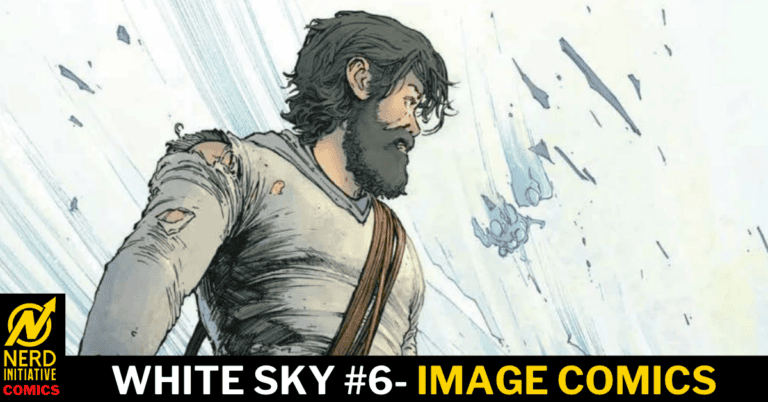
White Sky #6 – The Old World’s Dead, and It Ain’t Coming Back

0

Years ago, the sky turned white. In White Sky # 6, we see Violet struggling to deal with the fallout of the explosive last issue. We know more about the ghosts now: what they want and how they feel. With Walter gone, his gift is now Violet’s. As she struggles to navigate the world, truly alone again, what will be the cost of this gift? Will it save her or destroy her?

This review is brought to you by Nerd Initiative’s Shawn!

Catch up with previous review for White Sky #1, #2, #3, #4, and #5

Creative Team

Writer: William Harms
Artist: J.P. Mavinga
Color Artist: Lee Loughridge
Letterer: Ed Dukeshire
Cover Artist: J.P. Mavinga

Writing

Wow, what a satisfying end to the first arc from Bill Harms. I love that this arc of White Sky ended the way it began, with a tight focus on Violet. White Sky #6 really is a great bit of storytelling. Harms does a great job of pulling back the curtain and revealing a little bit more about this world while still focusing on Violet. While we don’t fully know the meaning of the gift that Walter gave Violet, Harm’s begins to show us some of the effects that it has. Sally actually tells the readers perhaps more than any other singular character about the world despite only showing up on eight pages.

Not content with simply wrapping up this arc, Harms does a splendid job of throwing in some plot twists that not only set the stage for the next arc, apparently introducing some new characters who will likely have a big role, but also reveal more about the world in general. While doing so, Harms also creates new questions in the reader. It’s difficult to describe without spoiling anything, but Harms does a great job with some conversations in this issue that help answer some questions you may have had through the first five issues of the series while also introducing new questions and wrinkles.

Art

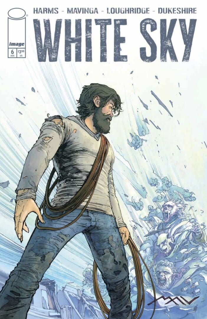
White Sky #6 Cover by J.P. Mavinga. Image from Image Comics

It was announced prior to release that White Sky #6, would be JP Mavinga’s final issue on the series, and what a way to go out. Mavinga truly did save his best work for last. As has been the case through the first five issues, Mavinga gets really creative with page layouts expertly using negative space to create non-traditionally shaped panels. In addition to the panels, Mavinga’s line work is spectacular. It’s this line work that actually makes Lee Loughridge’s job a little bit easier through some hatching and shading that establish the scene.

Loughridge plays a big role in this issue with the color work. There are a few moments that are either “oh I better pay attention to this” or “this is gonna be a major point going forward”. Part of the reason you brain tunes into that moment is because of the beautiful colors utilized by Loughridge to set the tone and moment of those impactful scenes. Ed Dukeshire brilliantly moves the story along but also draws you into the story. I love a point in this story where Dukeshire makes the letter boxes feel like they’re from the character who is speaking. It’s not something big and flashy that’s going to pull you out of the story, but it is a testament of how a seemingly small adjustment from a skilled letterer like Dukeshire can make the story even better.

Final Thoughts

White Sky has me hooked. This series has its teeth in me, and I can’t wait to see where it goes from here. This first six-issue arc has been so satisfying. It’s psychological, terrifying, and hopeful all at the same time.

Overall Grade: 10 / 10

What did you think of this issue of White Sky? Let me know in the comments

Leave a Reply

This site uses Akismet to reduce spam. Learn how your comment data is processed.

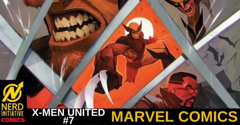
X-MEN UNITED #7 – A New Threat

Creative Team – Eve L. Ewing, Evan Narcisse, Ruairi Coleman, Victor Olazaba, Brian Reber, VC’s Joe Sabino, Stefano Caselli, Federico Blee

Published by Marvel Comics

Catch up with X-Men United #6!

The Story

This review is brought to you by Nerd Initiative’s Megan and Shawn!

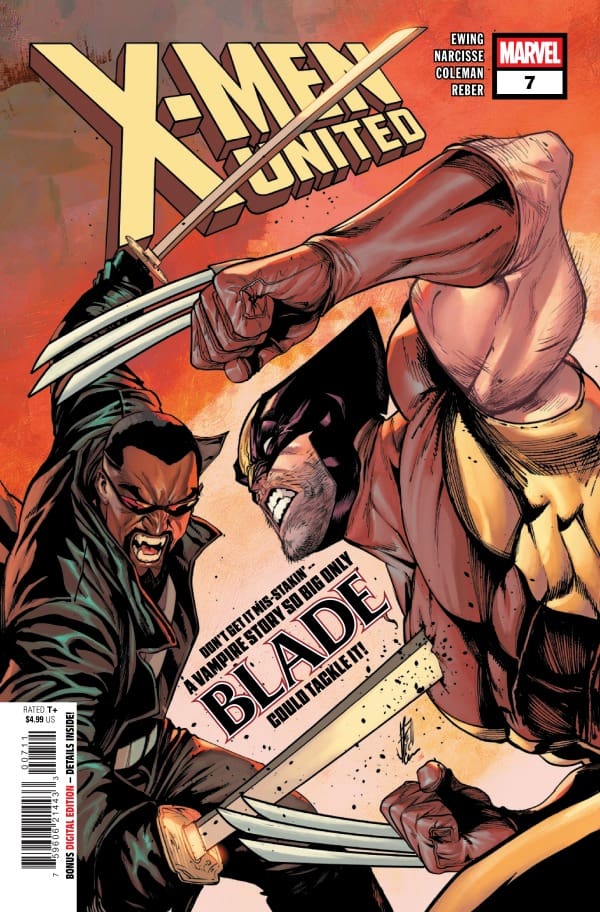
Shawn – What a great issue from X-Men United #7. I genuinely enjoyed seeing not only Blade mixing it up with the X-Men, but I’m always down for more Brielle in the Marvel universe. I was also surprised and delighted to see Eve L. Ewing and Evan Narcisse give us a chance to catch up with Wither. Seeing not only what Wither has been up to, but the ways he has changed was a nice twist on the story to tie it into Blade’s appearance. While we did get to see Brielle, we learn how short-lived it is, as the story is set in motion with Wither and Blade seeking to inform the mutants that Blade is about to go hunting on their territory.

I love the dynamics of Blade and Wolverine. They’re both so overly confident that they don’t realize how alike they are. Ewing and Narcisse also created, in just a few short pages, an interesting dynamic between Brielle and Wither that I would like to see more of. Brielle is often my answer to the “what character deserves more love” question, and I really hope that Ewing and Narcisse give her a little more chance to shine before this arc wraps up. Speaking of arcs, this is the beginning of what is on its way to be a super satisfying arc based on the way that Ewing and Narcisse are building this narrative.

Cover art by Stefano Caselli and Federico Blee. Published by Marvel Comics

Megan – X-Men United #7 brings us characters that I loved seeing in the X-Men world, new missions, and the looming threat of the problem that’s already happening at Graymatter Lane. Blade makes his grand entrance into Graymatter Lane alongside Wither, who hasn’t been seen since Krakoa. Wither and Blade bring a problem to the X-Men’s door that is of the most importance; Blade’s daughter is missing. Brielle, AKA Bloodline, has been taken and it’s said that she was taken by a mutant. Blade’s arrival is less than welcoming after the whole Blood Hunt incident, but that’s not what’s important. Getting Brielle back safe and putting a stop to whoever took her is what takes precedence.

Eve L. Ewing and Evan Narcisse bring whole new collaborations between Blade and the X-Men that I’m very interested to see go the distance. The dynamics are already interesting to see and with the new team put together to find Brielle, I think we’re in for some very interesting team ups. Blade obviously only has one thing on his mind and it’s the safety of his daughter, so he didn’t come to play. With this situation, and the looming threat that laws over the X-Men and the students of Graymatter Lane, the stakes are at an all-time high with Ewing and Narcisse excellently writing the excitement on each page.

The Art

Shawn -Ruairi Coleman, Victor Olazaba, Brian Reber, and Joe Sabino came out firing. There’s a nice balance of action and story in X-Men United #7, and I think that Coleman’s linework handles that really well. There’s a nice ensemble cast in this story but Coleman does a good job of trying to make each character distinct. Olazaba’s inks add nice shade and definition to the story. I love the work Olazaba does in this issue because when you’re running with characters like Blade and Brielle, you need a deft hand to make the characters pop and stand out because of their natural penchant for wearing black.

Brian Reber does an amazing job with colors. I love the shade of purple he chooses for Brielle’s hair. One thing that Reber has always done so well with colors is his lighting, and that’s not changing with this issue. Whether it’s Blade in Greymatter Lane or Brielle in the moonlight, Reber makes the colors pop with proper lighting. Joe Sabino does a beautiful job of helping you follow all the moving parts of this story. You feel like it’s easy to keep up with and follow along despite the setting jumps.

Megan – Ruairi Coleman, Victor Olazaba, Brian Reber, and Joe Sabino definitely put the work in to make this a beautiful issue. The action was intense and drawn in a way that you felt like you were right in the middle of the fighting, especially when it came to Brielle and her kidnappers. I loved how the characters were drawn as shadows, with their white fangs being the only thing you were able to see on them. That really pushed the horror aspect quite nicely. Brian Reber leaned into the darker tone of this issue very well when handling the colors. The flashbacks mostly took place at night, and Reber was able to capture the darkness of the story while having just the right amount of vibrancy in each panel. Joe Sabino always handles the lettering expertly and in this issue, I feel like the sound effects are what caught my attention the most. Bringing the energy up to an all-time high, Sabino brought sound effects that let’s you be apart of the action in a more personal way. Together, the artists made this a very memorable issue!

Final Thoughts

Shawn -9/10. I need more Brielle Brooks in my life. Call me a vampire, because Ewing and Narcisse gave me a little taste of seeing Brielle on the pages in this book, and I want more. I’ve always enjoyed the unique, if not strained, dynamic between Bri and her dad, Blade, so I’m excited to see where this goes.

Megan – 9/10. This issue got me very excited to see what happens next! Eve L. Ewing and Evan Narcisse are masters at keeping your eyes glued to the pages, and that rings true for X-Men United #7!

Overall Grade -9/10

Let us know in the comments what you thought of X-Men United #7!

Leave a Reply

This site uses Akismet to reduce spam. Learn how your comment data is processed.

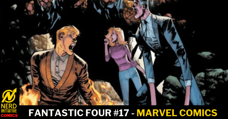
Fantastic Four #17- That Is, Also, A Hypothesis

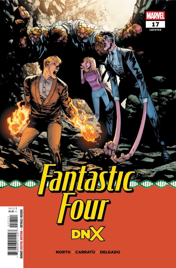
Our intrepid heroes, the Fantastic Four, wake up in a cave with no memory of who they are, what their powers are, or even their names. With injuries they don’t understand, the Fantastic Four must do what they do best and turn to science to solve the mystery.

This review is brought to you by Nerd Initiative’s Shawn!

Check out more about DNX!

Creative Team

Writer: Ryan North
Artist: Vincenzo Carratù
Color Artist: Edgar Delgado
Letterer: Joe Caramagna
Cover Artist: Humberto Ramos
Cover Color Artist: Edgar Delgado

Writing

Whether it’s One World Under Doom or DNX, Ryan North does such an enjoyable job with these Fantastic Four tie-ins to ongoing events. This issue really threw me for a loop. You know, based on the cover and the credits page, that it’s a DNX tie-in, but the twist is what really confirms it. My favorite thing about this issue is that it shows you that even when they don’t know their names or can’t remember they have powers, the Fantastic Four are easily some of the most gifted thinkers in the Marvel Universe.

Speaking of thinking, man, this issue really makes you think. One of the hallmarks of Ryan North’s run on Fantastic Four has been his awesome ability to bridge the enjoyability of a comic story with the nerdiness of science. This issue taps into that, showing the scientific way Marvel’s first family works to figure out who they are in a world where they are unknown even to each other. North perfectly captures hallmarks of deductive reasoning and theory proposition. The result is a story that feels like another great Fantastic Four story while also tying into the larger DNX saga that is ongoing at Marvel.

Art

Fantastic Four #17 cover from Humberto Ramos and Edgard Delgado. Image from Marvel Comics

Vincenzo Carratù, Edgar Delgado, and Joe Caramagna really brought their A game for this issue. Carratù’s art really shines in this issue with there being plenty of action but also significant close up panels where there’s less room to hide mistakes. Carratù perfectly captures the Fantastic Four in great detail. He takes advantage of North playing with Reed Richard’s abilities to craft panels that feel less like a scientific comic book and more like body horror.

Edgar Delgado continues to show why he’s one of the best in the business. In particular, his coloring of the adversary that the Fantastic Four encounter while in this case is incredibly well done. I also really love the way that Delgado does the depth and dimensions of Johnny’s flames when he’s in flame form. Joe Caramagna beautifully moves readers through the story while letting the art have room to breathe. The team “rediscovering” their powers gives Caramagna a chance to have some full with special effects that makes for a fun read.

Final Thoughts

I really enjoyed the way this story was able to simultaneously tie into the DNX event while still feeling like a Fantastic Four story. I’m always a little leery of tie-ins, but this creative team showed that they are up to the task.

Overall Grade: 9/10

Until next time, may your pulls be magical, and your multiverse remain stable

What do you think about Fantastic Four #17? Let me know in the comments

Leave a Reply

This site uses Akismet to reduce spam. Learn how your comment data is processed.

BIZARO YEAR NONE #3: Who Superman is Supposed to Be.

What makes Superman who he is supposed to be? Is it his strength, or is it the way he cares for the world around him? Bizarro has created a twisted world in Superman’s image, and he is about to get a lesson, as class is in session for Superman 101.

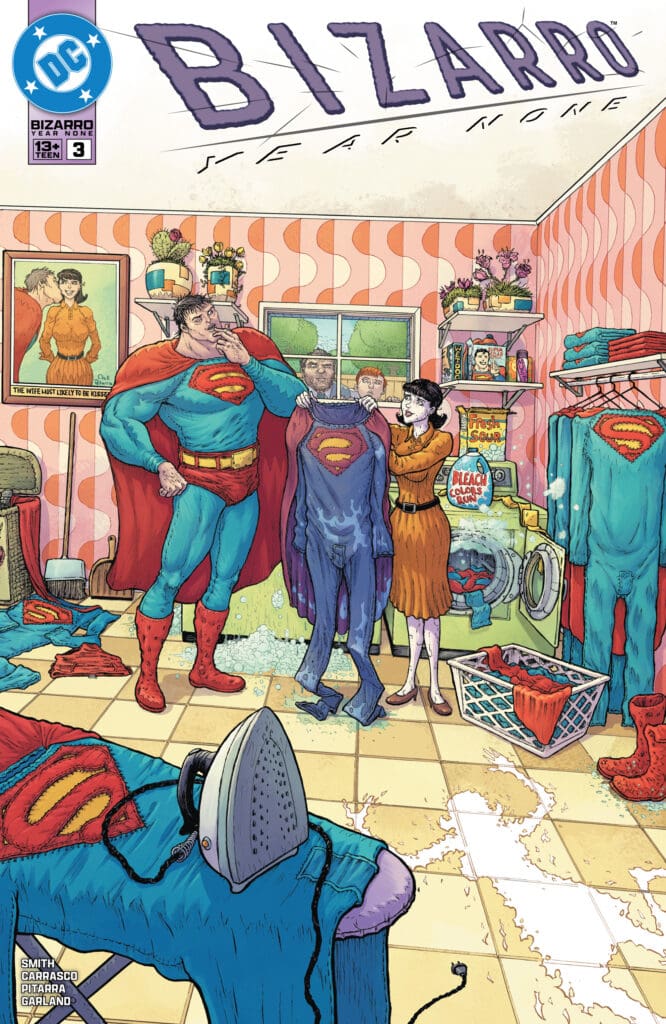
Bizzaro Year None #3. Credit DC Comics. Cover by Nick Pitarra and Michael Garland.

Creative Team: Eric Carrasco, Kevin Smith, Nick Pitarra, Michael Garland, and Dave Sharpe.

The Story:

This issue is multifaceted, with there being times I found myself sympathizing with Bizarro and other times seeing him for the monster he truly is. But I think what Smith and Carrasco have done well is shine a new light on the character and asking if he’s a product of his environment or there is good within him. Jimmy Olsen and Perry White continue to be so well written as they share a moment, drawing their characters closer together. White, for the first time, sees Olsen for what he aspires to be and sees himself within Jimmy at the same time. It’s not about action in this series but the characters themselves, which is why this run stands tall!

The Art:

Just when I think I cannot be more grossed out Nick and Michael prove me wrong. The close ups of hair down a drain or the way Bizarro mutates and transforms into something even more grotesque are marquees of how detailed this duo can be within the panels. However, there’s a page that stood out and brought out a ton of emotion. The design is a splash page broken up into fragments and I felt as though I were breaking with Bizarro and his illusion of Superman at the same time. It was beautifully colored and drawn with Dave’s lettering added a layer of emotionality I wasn’t expecting. Beneath the rough and tough to look at exterior there is beauty in the art and the same may be able to be said of Bizarro.

Final Thoughts:

Bizarro Year None #3 shines brightly on our characters who have become desperate to break free of Bizarro’s clutches. However, in doing so they may have made their lives worse, and it’s a race against time and I cannot wait to see how Olsen, Lois, and White escape this mess!

Overall Grade: 8.5/10

The Nerd Initiative crew will be taking over NYCC so if you see us say hello! Let us know how you feel about this issue and check out more reviews by Matt!

Leave a Reply

This site uses Akismet to reduce spam. Learn how your comment data is processed.

GEIGER #25 – The Future is BRIGHT

Last we saw Geiger, he had been ripped from the family he lost long ago, and the Northerner was sent back to the 19th century. All alone again, Tariq Geiger found himself surrounded and suddenly face-to-face with someone he believed could get him back to his family once again. No matter the cost.

This comic review is by Nerd Initiative’s Lauren

Creative Team

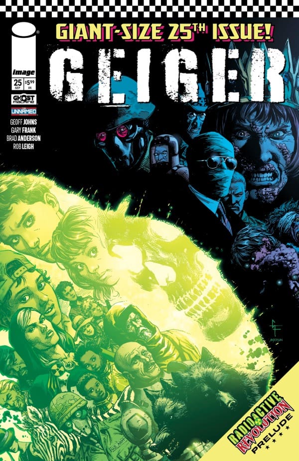
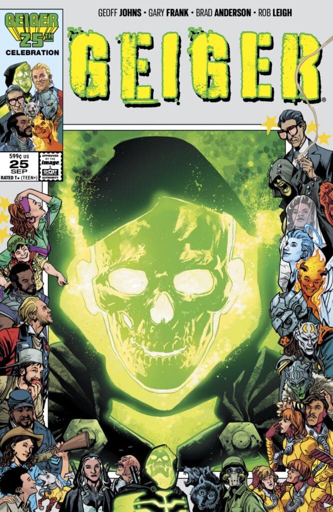
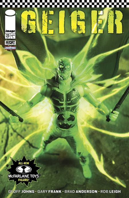
GEIGER #25 Cover. Image by Ghost Machine Pro at Image Comics.

Creators: Geoff Johns & Gary Frank;

Color Artist: Brad Anderson;

Letterer: Rob Leigh;

Editor: Brian Cunningham;

Designer: Steve Blackwell;

Cover A & G: Gary Frank & Brad Anderson;

Cover B: Bryan Hitch & Brad Anderson;

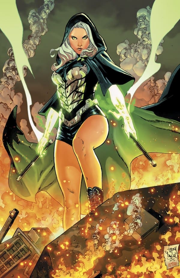
Cover C Art: Tony Daniel & Leonardo Paciarotti;

Cover D: McFarlane Toys Geiger Action Figure;

Cover E: 25th Issue Blank Sketch Cover;

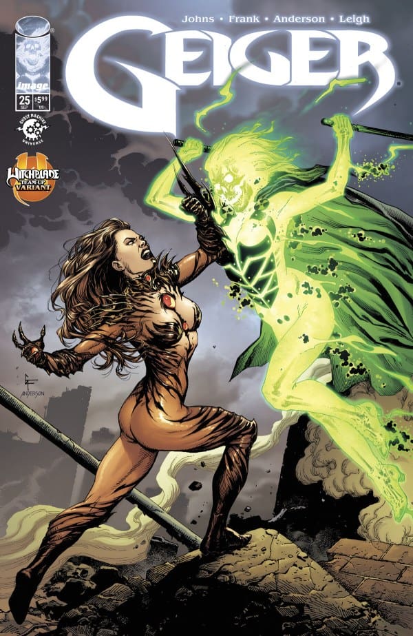
Cover F – Witchblade Variant: Gary Frank & Brad Anderson.

Check out the review for GEIGER #24

The Story for GEIGER #25

It’s the Glowing Man up against the President in this super sized issue of Geiger. One of them creates radiation, and the other absorbs it. Determined to get his family back again, Geiger demands to know how he was recently able to see and hold them. As he’s told it was all in his head, chaos erupts. As Geiger begins to give it his all, he suddenly gets a lesson on how family isn’t always who you expect it to be.

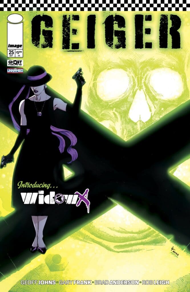
As wounds are then licked, plans begin to become clear. There is so much about to happen, as more than one person seems to be on the hunt for the Glowing Man, and a new face with a very particular cocktail preference makes a hell of a first impression.

The Art

The art was absolutely turned up a notch for this giant-sized issue. As Geiger and the President go head to head, the radiation explosions were so insanely impressive that the whole page felt as if it was literally lighting up. In addition to these explosions of light, we got an amazing shot of President Griffin that made me pause for a moment to take it all in. This issue was incredibly action-packed with amazing details, gorgeous fight scenes, and perfectly placed lettering to guide the reader flawlessly through another fantastic and tragic issue about Tarig Geiger, the glowing man.

Geiger #25 Variant Cover. Image by Ghost Machine Pro at Image Comics.

Final Thoughts

If I hadn’t known this was a “Giant Sized” issue, or seen the number of pages, I would have never known. I was so quickly caught up in the story and the captivating art that I was completely unaware of how many pages I had read. Geiger #25 absolutely killed it with the story, the emotion, the art, and setting up what’s looking to be a very exciting future… and past. I truly can’t say enough amazing things about this comic. Each issue creates a new pathway for our Glowing Man. Some inspiring, some tragic, but always entertaining.

Geiger #25 Variant Cover. Image by Ghost Machine Pro at Image Comics.

Overall Grade: 10/10

Geiger is such an amazing and unique story. It feels as if every issue is action-packed, while simultaneously being packed with emotional storytelling that sucks you completely in. There’s no time like the present (pun intended) to catch up on Geiger, as well as Redcoat.

Have you checked out the world of GHOST MACHINE? Are you a Geiger fan? Let us know your thoughts!

Check out more reviews from Lauren

Leave a Reply

This site uses Akismet to reduce spam. Learn how your comment data is processed.

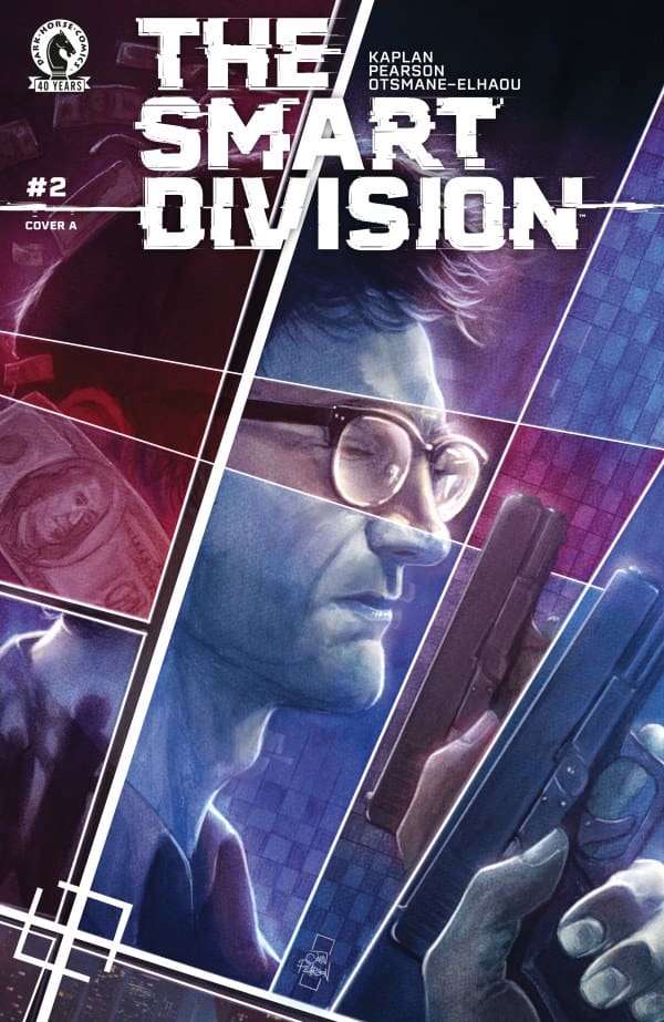
THE SMART DIVISION #2: Play Your Part.

Stevie and William are hot on the heels of those responsible for the mysterious recent deaths, despite being at odds over the transformation and usage of AI in today’s world. The duo must learn to become a team; otherwise they could be next on the list.

The Smart Division #2. Credit Dark Horse Comics. Cover by John J. Pearson.

Creative Team: Zack Kaplan, John J. Pearson, and Hassan Otsmane-Elhaou.

Zack really ramps up the stakes and intensity with issue while tying in so many current themes and morale debates. There’s a moment early on where the AI is discussing possible suspects and using location pings and it rings too real in current times. There was a case where Flock cameras sent the wrong woman to jail in a vehicular homicide using this same type of data ping. As far as our characters go they are beginning to endear themselves in their own unique way as Zack is forcing them to slowly open up with one another. There’s are moments where it seems as though the walls are ready to come down between the two and it strengthens the unspoken bond they are building. Perhaps the most frustrating bit to me is how good Zack is at raising these questions and then displaying the issues or holes in logic surrounding AI itself. This issue hits home and reality in ways I wasn’t ready for and I am loving this story.

John’s artwork continues to wow me, and there are some tricks he uses in this issue that create some tense sequences. For example, when there are moments of interrogation, the background fades to white, and I love how the characters move across their panel squares and into another. This allows the reader to feel under interrogation themselves, as though a bright light is displayed before us. There are other moments where the scenery burns a dark orange, igniting the panel along with it. The unique style of artwork lends itself to the thriller and mystery aspect of this story so well.

The Smart Division #2 will inject a level of fear into the reader that they may not have thought an issue could do. This may be a story, but, Zack, John, and Hassan blur the lines of reality, posing ethical questions regarding AI and leaving us with an ending that sinks us deeper into the mystery.

Zack and John will both be at NYCC as well as The Nerd Initiative crew! So if you see us say hello! Let us know how you feel about this issue and check out more reviews by Matt!

Leave a Reply

This site uses Akismet to reduce spam. Learn how your comment data is processed.

Teenage Mutant Ninja Turtles: The Hungar #1 – The Hunger to Live

New York City is going through some very concerning changes, all thanks to the Ninja Turtles. This dark magic change is starting to affect others within the city. Come along and see the devastation that is brought to the door of the Purple Dragons…


Creative Team

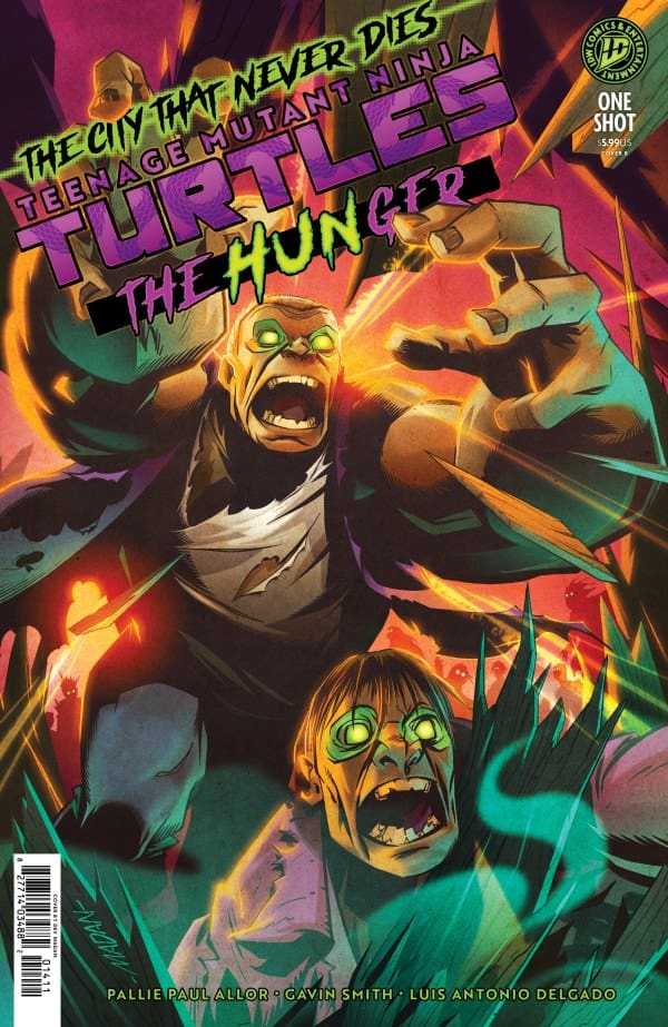
Pallie Paul Allor (Writer), Gavin Smith (Artist/Cover Artist), Luis Antonio Delgado (Colorist), Shawn Lee (Letterer)

Nathan Widick (Designer), Tommy Stella (Assistant Editor), Jake Thomas (Editor)

Publisher: IDW Publishing


The Hunger to Live

This new one-shot issue of Teenage Mutant Ninja Turtles: The Hungar is a tie in to the main TMNT story that is currently going on. With that said, readers will not see the Turtles or Splinter or any of the other heavy hitter characters from the main story within this issue. That is because this is a side story that WILL directly feed into the main storyline. Which is awesome (in my opinion) because this allows other creators an opportunity to give their spin on the TMNT brand while also adding to the continuation story!

This issue shows another side of New York City that is now starting to see the repercussions of the mistake the Turtles caused by ignoring the messages from the Land of the Dead. Readers will be introduced to the previous leader (Hun) of the Purple Dragons, another crime syndicate within New York like the Foot Clan. But Hun has been dead for some time. Until a magical portal presents itself allowing him and other dead members of the Purple Dragons to pass through back to the Land of the Living.

Within this story you will be reintroduced to Slash and Ninjara. Two foes who have no choice but to team up and try to survive. They do not come from hero backgrounds. But within this issue, it seems that they are doing their best to change that negative stigma that over shadows them. Especially when they witness the carnage and devastation that is awakening within the city. Things take an interesting turn when Slash stumbles upon Hun in the streets.

While Hun has returned to the Land of the Living it is very apparent he has but one mission, reclaim control over the Purple Dragons. But while that is going on within the background of this story, there is another issue that Slash and Ninjara are focused on. The citizens of the city are being attacked by the souls of the dead who are returning to the Land of the Living via the portals. One would think that once they are dead and make a return that they would simply stay dead… Wrong. Each dead soul has a “hunger” to live again. But in order to satisfy that hunger they must take the life of someone living.

The ending of this story plays into the theory of an internal hunger within everyone. It is in no way suggesting that the internal hunger in question is to cause harm to individuals. But rather has a general undertone of a hunger or striving for something. Could be love, friendship, belonging and a multitude of other things. Having a hunger for something in a strong way can have different effects to different people. But within this story that hunger is to live again.


The Writing

Pallie Paul Allor brings a dynamic tie-in story to the TMNT main line! This story is so well written, bringing backstory mixed with current storyline events. I love the fact that this is a TMNT story without having the Turtles within it. Giving other characters within the TMNT scope some “page time” within the story. The narration within this story carries a gloomy tone to it as it explains events to readers. That same tone shifts over to the character dialogue as well! The plot for this one-shot tie in fits the scope of the main story so perfectly! This gives off a feel of Avengers: Infinity War/Endgame in the sense of separate stories under the same umbrella. I really hope TMNT continues this if that is in fact what they are trying to accomplish!

The Artwork

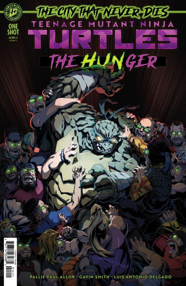
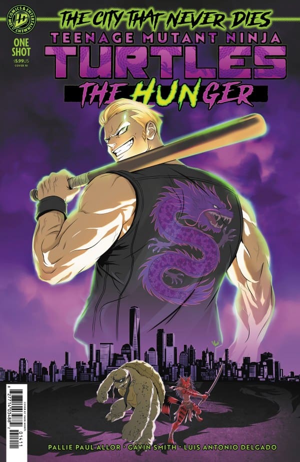
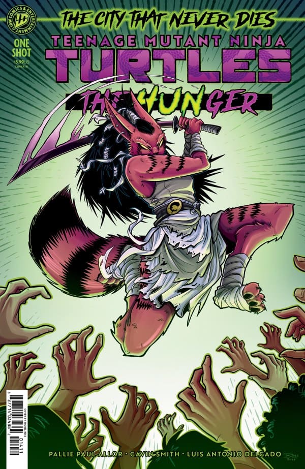
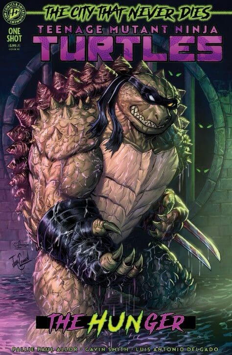
Gavin Smith and Luis Antonio Delgado are rock stars on this issue! I was first introduced to Gavin’s work on TMNT: The Last Ronin. I was also looking forward to this issue since Indiana Comic Con this past June. Gavin shared with me the details of his work on this issue, and I am beyond impressed by the work he put into this story. The linework is rough which helps to give the tone of the story a dark and gloomy feel. Flowers also go to Luis for his coloration of this issue! The dark shades that engulf this issue are brightened up with bright neon greens and purples that adds to the “zombie” lore of the story! You will continue to see Luis’ work on the main TMNT storyline as well!

Shawn Lee gives the lettering of this issue so much power! The narration boxes are a faint yellow color which gives them their own distinct look. Slash also gets his own style of text box coloration as well! The sizing of the text boxes is perfect within the panels. Not one complaint from me when it comes to the lettering of this story!


Variant Covers


Final Thoughts

A dynamic one-shot tie-in story to the TMNT main story! This issue will have you entranced from page one. This issue also gives more plot lines to the main story, giving other TMNT characters their moment to shine. A great story with amazing dark art that will send your eyes on a wild ride between reading and witnessing. You are not going to want to miss this story, especially if you’re reading the main TMNT arc right now. Part one and part two of the main story are in shops currently. So while you’re picking up your copy of this story, make sure to pick up parts one and two as well!

Overall Grade: 10/10


Links

Comic Book Reviews & Entertainment News: Nerd Initiative
Previous TMNT Review: Teenage Mutant Ninja Turtles #22 – The City That Never Dies Pt. 2
Travis’ NI Portfolio: TravisComicHaven – Nerd Initiative
Travis’ Personal Content: Travis’ Comic Haven


PLEASE SHARE YOUR THOUGHTS IN THE COMMENTS SECTION BELOW!

Leave a Reply

This site uses Akismet to reduce spam. Learn how your comment data is processed.