Home Blog Page 90

THE INFERNAL HULK #5 – Bringing the Fight Home

Creative Team – Phillip Kennedy Johnson, Kev Walker, Cam Smith, Matthew Wilson, VC’s Cory Petit, Nic Klein

Published by Marvel Comics

Catch up with The Infernal Hulk #4!

The Story

The harrowing story of The Infernal Hulk continues with the Avengers now having to get involved. Arriving to Cincinnati, the team spots Eldest in the Hulk’s body right before something unbelievable happens. The One Above All makes their way down from the heavens to take out Eldest once and for all. The battle between the Infernal Hulk and the entity rages on as the Avengers overlook the whole thing. This will be Eldest’s hardest fight yet and sure to be one that goes down in history.
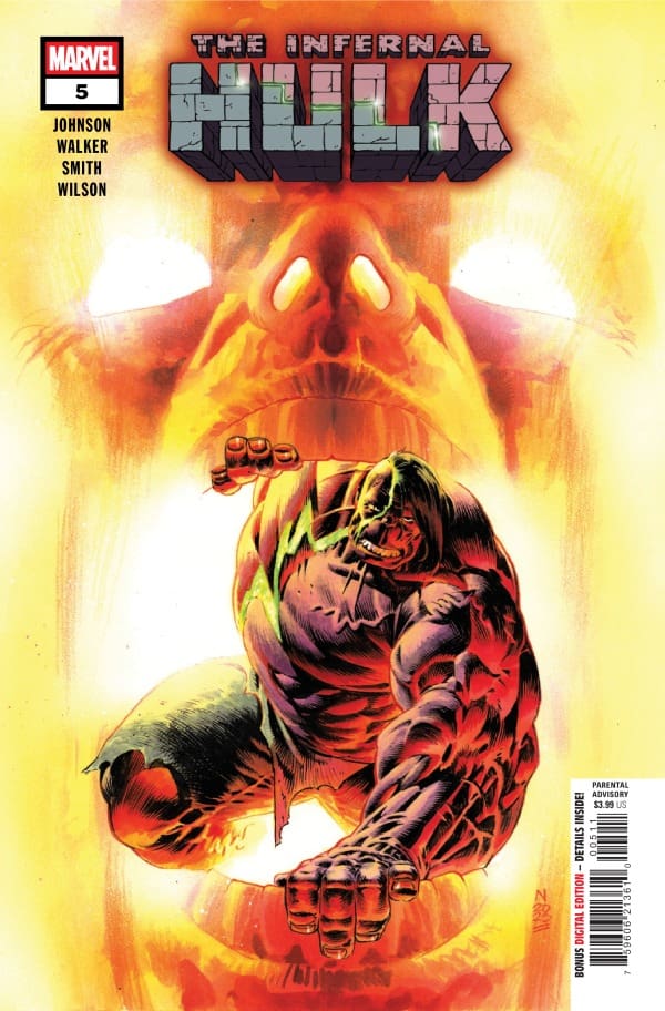
Cover art by Nic Klein. Published by Marvel Comics

Meanwhile, Bruce is very content with his normal life away from the superhero world with Betty. Unfortunately, he has to attend a funeral of a young soldier who was destroyed by the Infernal Hulk and happens to be the son of him and Betty’s friend. Hitting too close to home, Betty and Bruce are feeling the after effects of this senseless killing. But Bruce says it’s okay, because no one would ever find him or Betty where they’re at in his new life. Perhaps Bruce has spoken too soon.

Things are heating up at an astronomical in The Infernal Hulk with the fifth issue being the most chaotic part of the story yet. On one hand, you have Eldest battling The One Above All and on the other hand, you have Bruce realizing he isn’t as safe as he thinks. I’m not sure where Phillip Kennedy Johnson is going with this story, but I am sat, I am ready, and I am excited!

The Art

Kev Walker, Cam Smith, Matthew Wilson, and Cory Petit all came together to make this a hard-hitting story that matches the energy of the story. There are some pages that are just drop dead gorgeous. Walker and Smith bring excellent detailing and pictures that pack pure power. The outlandishly gorgeous pictures are broken up by scenes with Bruce banner in a more normal setting. The back and forth creates great depth in each story. Matthew Wilson handles the colors that have been consistently very high quality throughout the run, and the fifth issue is no exception.

Final Thoughts

The Infernal Hulk #5 continues the powerful story with higher stakes than ever. If you’re a Hulk fan at all, then this NEEDS to be on your pull list.

Overall Grade – 10/10

Let me know in the comments what you thought of The Infernal Hulk #2!

Leave a Reply

This site uses Akismet to reduce spam. Learn how your comment data is processed.

This review was written by Megan from the Vigilante Vibes Podcast! If you liked my review, be sure to check out my other reviews! Let me know what you think of The Infernal Hulk #5, or tell me what comics you’d recommend me trying out! Find me on my socials, and check out my Marvel podcast, Vigilante Vibes, by clicking here!
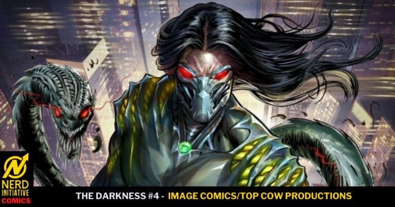
The Darkness #4- Problems Everywhere

Image Comics and Top Cow Productions’ The Darkness is back with Issue #4, and so is the all-star creative team:

  • Writer: Mark Silverstri 
  • Artists: Raymond Gay, Giuseppe Cafaro & Agustin Padilla 
  • Colorist: Arif Prianto 
  • Letterer: Troy Peteri

Read The Darkness #3 Review Here

The Darkness #4 Cover B By Bruno Abdias (Credit: Image Comics/Top Cow Productions)

Raymond, Giuseppe & Agustin all created beautiful art for this issue. I love how each of them take their specific pages, and then weave them together to make them all look cohesive. Arif’s coloring and Troy’s lettering help tie all of the beautiful art together. 

Mark’s writing on this issue is so phenomenal. He has taken this classic comic and added a wealth of fresh new content to it. He has written these characters so well, and I love where everyone is going in the series. He has also built a world that is so approachable for new readers, but still feels familiar for long-time fans of the series. 

Now this issue sees Jackie still dealing with the events that transpired in the previous issue. But he is also harboring a secret from Jenny, which is not a good thing to be doing at all. Jackie finds himself in a multi-page fight, which looked and flowed so well. But the issue ends at a chess match in the park, with a surprising reveal. 

Overall Grade: 10/10 
If you still haven’t checked out The Darkness yet, this needs to be on your radar IMMEDIATELY. The art and story flow so well together, and it’s a series that every comic book fan will love.

Leave a Reply

This site uses Akismet to reduce spam. Learn how your comment data is processed.

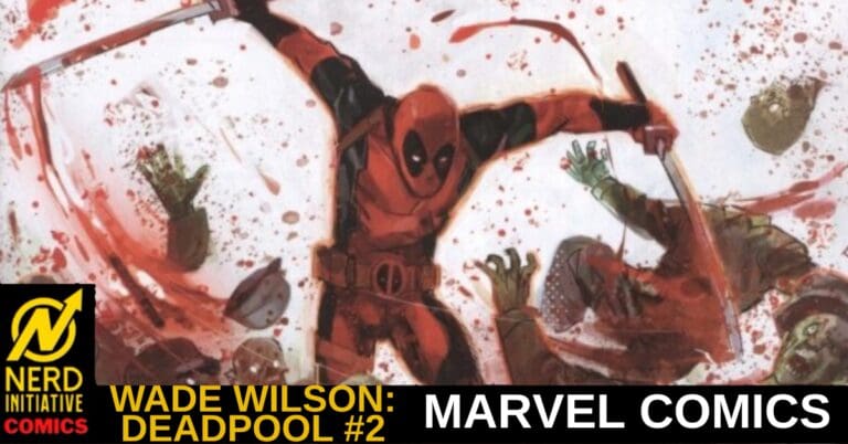
WADE WILSON: DEADPOOL #2 – Money Talks

Creative Team – Benjamin Percy, Geoff Shaw, Alex Sinclair, VC’s Joe Sabino

Published by Marvel Comics

Catch up with Wade Wilson: Deadpool #1 here!

The Story

This review was written by the dynamic duo of Megan and Shawn!

Shawn – Admittedly Deadpool is not my favorite Marvel character but I love what Ben Percy has done with Wade Wilson. The humor that has become such a signature for readers of Deadpool is there but Percy doesn’t use the humor as an excuse to slack on storytelling.

Percy’s stories through the first two issues have been silly and fun but still really well done. I really enjoyed the premise behind this issue and i’m excited to see how it plays out with Hammerhead. Percy does an amazing job reminding us that while Deadpool is funny and a fan favorite, he’s no hero.

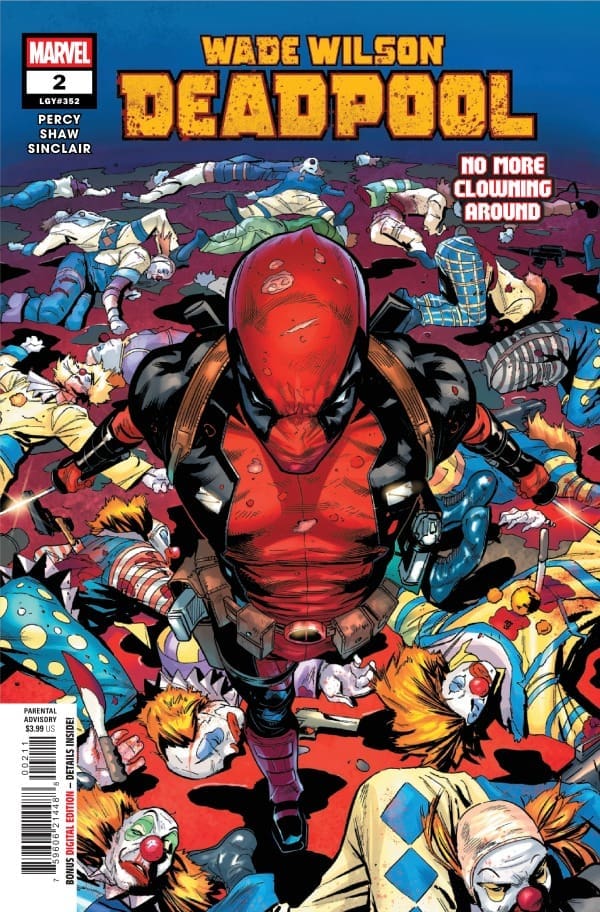
Cover art by Geoff Shaw and Alex Sinclair. Published by Marvel Comics

Megan – In Wade Wilson: Deadpool #2, our title character continues to get these written letter omens, and of course, in usual Deadpool style, he’s looking to bank off of it. He’s willing to do the tasks, but he wants to monetize it first. According to him, Deadpool is his own boss now and there’s no stopping him. Until someone stops him.

What I love about Wade Wilson: Deadpool is that the stories have been as humorous and unhinged as you’d expect with Deadpool, but there’s a looming dark presence over the story. Deadpool doesn’t explain what’s happened with his daughter, Ellie, but it’s clear it’s something he regrets and it’s something that’s changed him. Benjamin Percy does a fantastic job at creating a story that has multiple layers at once and it shows. Especially in this issue.

The Art

Shawn – Geoff Shaw is doing some really great work with Wade Wilson: Deadpool. There’s a distinct attention to detail that has felt missing from past Deadpool books that I really enjoy seeing. Whether it’s the rivets on a subway’s steel beams or the hatch patterns on the tablecloth of a restaurant, Shaw commits to details that enrich the environment.

Much like it feels that Shaw is doing something new with Deadpool art, it feels like Alex Sinclair is doing the same thing with the colors. Even when coloring fire, Sinclair avoids a lot of red tones which allows Wade to stay the focus of every panel he’s in. When panels do occur that have red elements, the choice of red and the shading used by Sinclair is distinct enough to make you notice without distracting you. Joe Sabino crafts panel lettering in a way that allows the story to flow without distracting you. It can be easy to botch lettering in a series like this with so much reflection and fourth wall breaking, but Sabino does a great job ensuring everything flows and the art is not hidden behind boxes.

Megan – Geoff Shaw continues to thrive with Wade Wilson: Deadpool #2 along with Alex Sinclair! Both artists work compliments the other’s in a very satisfying way. Shaw offers very detailed pages with framing work that brings a new level of excitement to the story. Sinclair makes each page drip in vibrancy with Deadpool being used as a perfect focal point. Joe Sabino handles the lettering and masterfully carries the many tones of the stories as they change on a dime.

Final Thoughts

Shawn – 9/10. This is another really solid issue from this creative team. I really enjoy the fact that this team builds stories that are both self-contained and part of a larger story. The series is fun, easy to read, and doesn’t take itself too seriously while still committing to good storytelling.

Megan – 9.2/10. Benjamin Percy continues the hijinks of Deadpool while having a darker story that’s waiting to be told. Wade Wilson: Deadpool #2 is a really fun read with a lot of classic Deadpool antics. I can’t wait to see what’s next!

Overall Grade – 9.1/10

Let us know in the comments what you thought of Wade Wilson: Deadpool #1!

Leave a Reply

This site uses Akismet to reduce spam. Learn how your comment data is processed.

The Amazing Spider-Man #24: Death Spiral Pt. 4 – Family is Blood

The past of Eddie Brock’s family comes back to haunt him. Torment takes advantage of that and sends Carnage into a spiral.


Creative Team

Charles Soule & Joe Kelly (Writers), Jesús Saíz (Artist), Matt Hollingsworth (Colorist),
VC’s Joe Caramagna (Letterer)

Giuseppe Camuncoli, Lorenzo Ruggiero & Dean White (Main Cover Artists)

Lee Bermejo / Iban Coello & Jesus Aburtov / Mark Bagley & Dean White / Mike Hawthorne & Edgar Delgado / Rod Reis (Variant Cover Artists)

Sarah Spadaccini (Designer), Kaitlyn Lindtvedt (Assistant Editor), Tom Groneman (Associate Editor),
Nick Lowe (Editor), C.B. Cebulski (Editor-in-Chief)

Publisher: Marvel Comics


Family is Blood

Issue twenty-four of The Amazing Spider-Man (ASM) happens to also be part four of this exceptional cross-over story, Death Spiral. This issue of ASM happens to focus on Eddie Brock and his personal issues from his childhood. Our villain for Death Spiral, Torment, is toying with Eddie and his family tree.

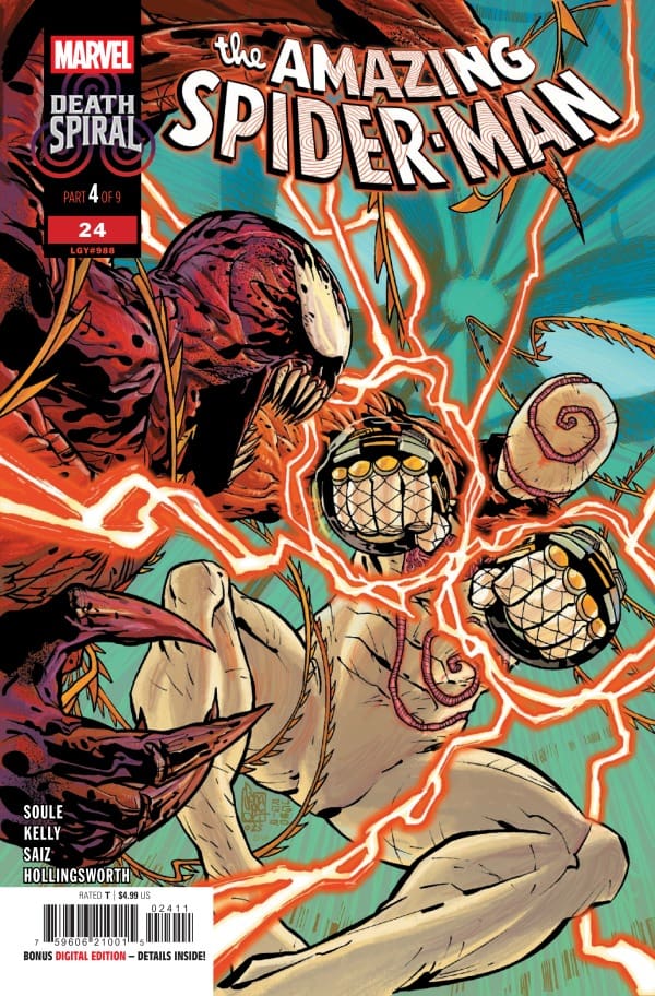
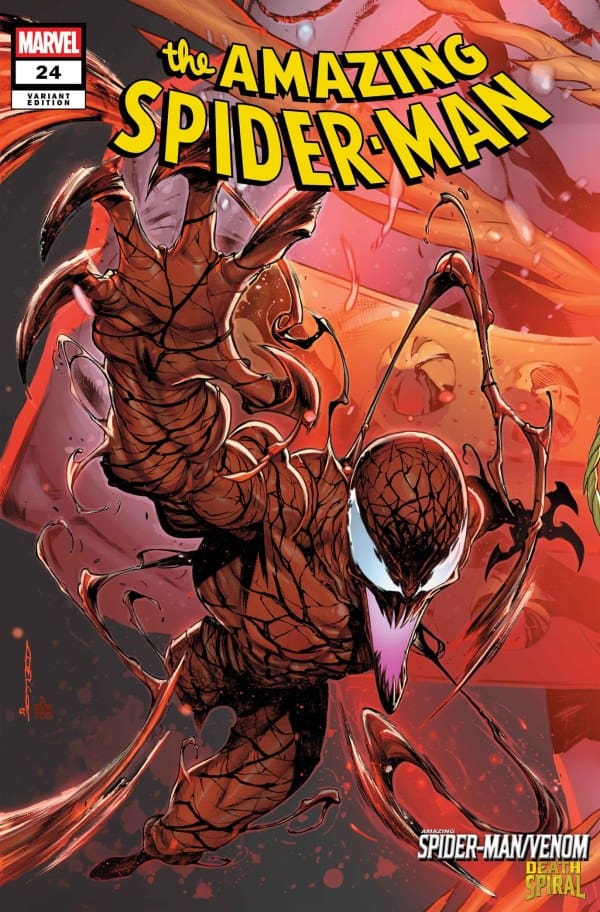
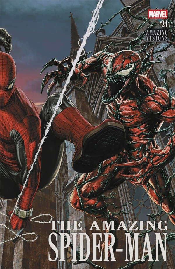
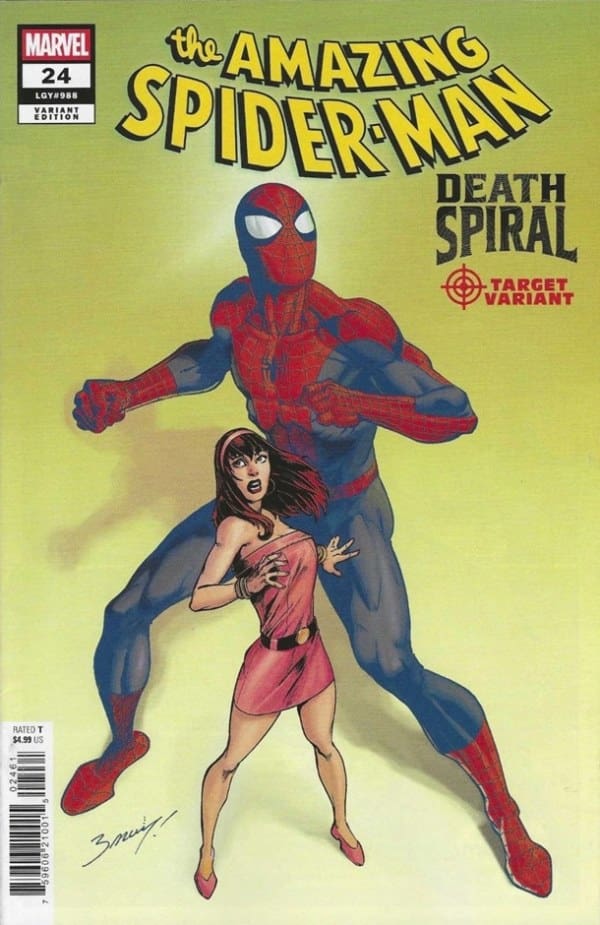
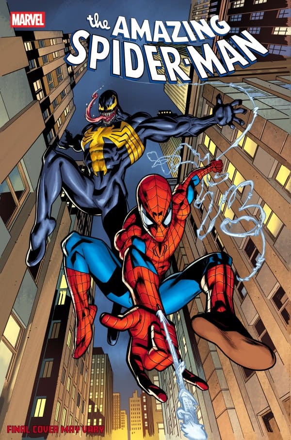
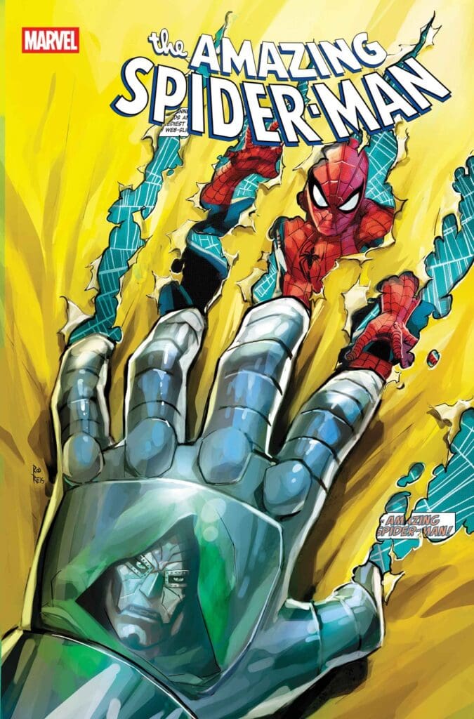
The Amazing Spider-Man #24: Death Spiral Pt. 4, Credit Marvel Comics. Cover by Giuseppe Camuncoli, Lorenzo Ruggiero & Dean White


This issue starts off going back in time to when Eddie was a child. His father wasn’t the best to him, and he openly admits to it. Eddie and his father have multiple panels of dialogue that break down the entire scenario, and it is absolutely heartbreaking. Sure, this is happening within a comic book but that doesn’t negate the fact that children go through this sometimes daily within their family.

We also get to see a team up that may give readers mixed feelings: Spider-Man and Venom. If you’ve been reading this series of ASM you already know that MJ is bonded to Venom. And you should also know that this knowledge is still very fresh to the “real” Peter Parker. Watching Spider-Man and Venom work together as make-shift detectives is pure comedy. To the extent that they make an assumption on who did a certain crime, and they couldn’t be farther from the actual truth. They simply are going off of previous experiences with their suspect.

The end of this issue brings understanding to Spider-Man and Venom. They have tracked down Carnage and offer their services in helping Carnage find Torment. Once they find Torment, this story takes a spin on corkscrew, and you are left stunned with what just transpired till the next installment of Death Spiral.


The Writing

The team of Charles and Joe is beauty in emotion. These two produced a story for this issue that plays with your emotions from the very beginning. The dialogue and narration are scripted and delivered perfectly to administer the most effect to your feelings. Every panel flows so easily to the next. The amount of suspense in the ending of this issue leaves you yelling for it not to end this way.

The Artwork

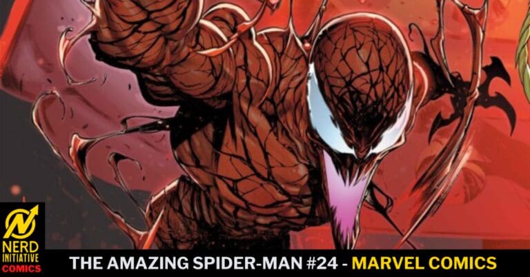
Jesús Saíz & Matt Hollingsworth did such a good job with this issue! The pencil work is amazingly smooth! And the attention to detail is out of this world! The coloration continues to have this dark tone to it adding to the darkness of this story. Everything about the art in this issue is beautiful to look at! Especially when Carnage extends himself into extra limbs, the details in all the parts all at once are spectacular!


My Thoughts

This run of ASM has been a complete joy to read from Joe Kelly. With the addition of this side story of Death Spiral and the addition of Charles Soule, it has reached a new level for me. This is an amazing story full or action, mystery, suspense and emotional turmoil. Amazing Spider-Man continues to have amazing storytelling as well as impeccable art to support it! This is a cross over story spanning from ASM to Venom. Meaning there are other issues to collect to complete this Death Spiral story. I highly recommend you get your hands on the first four issues, as well as the next five to come. Amazing story!

Grade: 9.5/10


Comic Book Reviews & Much More: Nerd Initiative
Previous Spider-Man Review: The Amazing Spider-Man #23: Death Spiral Pt. 2 – Truth Hurts
My Personal Content: Travis’ Comic Haven


PLEASE SHARE YOUR THOUGHTS IN THE COMMENTS SECTION BELOW!

Leave a Reply

This site uses Akismet to reduce spam. Learn how your comment data is processed.

The Sentry #1- A Story of Light Versus Darkness

The Sentry is Bob Reynolds. A superhero of incredible power as The Sentry, Bob’s darkness born out of despair grows into The Void. The Void seeks balance. For every good deed Bob completes as the Sentry, the Void must balance with villainy. With the same abilities and powers as The Sentry, the Void seeks pain and destruction where The Sentry seeks to protect and save. Now the Void has his sights set on The Kingpin, Wilson Fisk.

Creative Team

Writer: Paul Jenkins
Artist: Christian Rosado
Colorist: Matt Milla
Letterer: Joe Caramagna
Cover Artist: Alex Maleev

Writing

Matt: I am relatively new to The Sentry, and as this is the first time I have dove into a number one for him, I must say what an intriguing character. Paul has painted such a two-sided coin for Bob and the Void, and has really dove into the crisis of identity that he faces.

Sentry has been a mental health study of sorts, and Paul shows off both the good and the bad that he can do. When The Void goes after Fisk, it is truly suspenseful and terrifying in every way. The story also shows us how Bob can do just as much good, all while showing an existential crisis that will have us even thinking about our own lives.

Shawn: I really love what Paul Jenkins did in Sentry #1. It’s impossible to tell the story of Bob Reynolds without discussing mental health and darkness. That said, it’s such a bold decision by Jenkins to jump right out into the darkness inside of Bob, not only from issue one but really from the first few panels. This issue felt real, gritty, and raw from the jump. It’s such a bold departure from many of the comics on the market.

I applaud Jenkins for not shying away from making Bob’s mental health issues seem less serious than they are. I thought giving a little backstory to Bob, identifying the moment that the Void began to grow inside of him, was a brilliant piece of storytelling.

Art

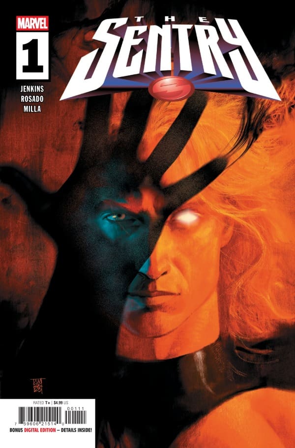
The Sentry #1 cover by Alex Maleev. Image From Marvel Comics

Matt: The artwork perfectly matches the rugged tone that was met with in this issue. The sequences of The Void are not only colored and drawn perfectly, but the background itself, despite still having life to it, also feels lifeless all at the same time. The way in which they are able to do that impresses me so much. There are some shocking panels as well, such as how Hulk has crystals coming out of places including his eyes. It is an uncomfortable scene, and the art plays into why this felt so unsettling to read.

Shawn: Christian Rosado and Matt Milla perfectly captured the tone in Sentry #1. Everything in this issue feels like perfect symmetry between the visual and written arts. Rosado shines not just with the art, but the shadows. The use of shading by Rosado goes a long way towards helping Jenkins establish the tone of this series from the very first panel.

Milla does a great job choosing little pops of color to draw your eye. There are a lot of dark and muted colors used in this issue, which works for the narrative. The colors feel perfectly matched to the words on the page. Together Rosado and Milla’s work on this issue is bound to invoke comparisons to the strong work of Aja and Hollingsworth on their run with Hawkeye. This issue feels similar in style and feel which is a testament to the quality of work Rosado and Milla produced. Caramagna’s decision to use inverted colors to distinguish between Sentry and Void works really well allowing you to focus on the Void and not be distracted.

Final Thoughts

Matt: 9.5/10 Sentry #1 brings Bob’s crisis of identities to the forefront and delivers on the adage that for every action there is an equal and opposite reaction. The team truly makes The Void feel every ounce of terrifying he can be while invoking sympathy for Bob, who is struggling with his dual identities. It does feel as though something sinister is bubbling and ready to burst, and this first issue has my attention as a book everyone should be checking out!

Shawn: 9.5/10 Jenkins, Rosado, and Milla do an amazing opening issue with Sentry #1. You feel both the depth of the darkness within Bob but also sympathy for what he is dealing with. It’s rare to find a comic where the synchronization between the writing and the art is so perfect, but Sentry #1 is one of the best examples you’ll find out in the world now. This issue literally sent a chill down my spine as I read it, and I loved it.

Overall Grade: 9.5/10

For more from Matt or Shawn, check out the links.

Are you glad to see the Sentry return? Let us know in the comments below.

Leave a Reply

This site uses Akismet to reduce spam. Learn how your comment data is processed.

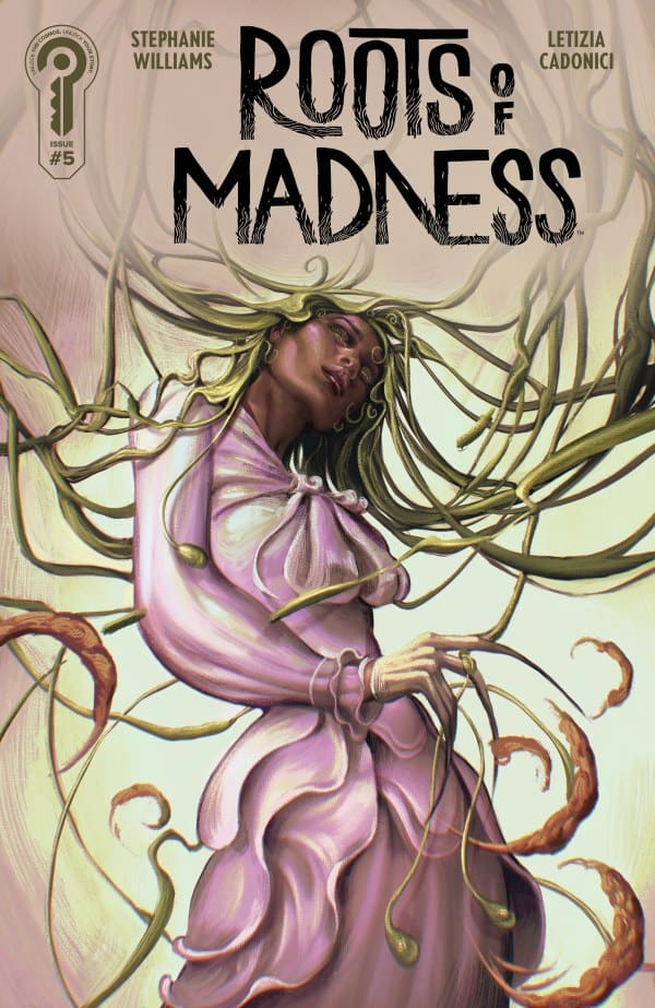
Roots of Madness #5 – The Darkness and Stars Call

0

As the Meridian Fellowship pushes, Etta is forced to confront the dark forces in the world and within her own family’s legacy. Etta heads to the swamp to try and find the answers she so desperately seeks. What happens if the answers you seek are more than you bargained for? This is the heart of Roots of Madness #5

Creative Team

Writer: Stephanie Williams
Artist:Letizia Cadonici
Colorist: Alessandro Santoro
Letterer: AndWorld Design

Writing

How is it that Stephanie Williams is so phenomenal at everything she writes but still feels criminally underrated? Roots of Madness has been an absolute treat, and issue #5 is no exception. As Williams has done with so many other characters of both her own creation and with major IPs, Etta feels down-to-earth and relatable, even in a supernatural horror series.

Whether it is Etta’s conversations or Solomon’s care for her you truly feel connected to these characters. With issue 5, Williams begins to offer readers the payoff from pulling back the curtain on the Meridian Fellowship in issue 4. We begin to see how the Fellowship not only needed someone for their purpose, but specifically needed Etta. There’s a section of the story that really hits home when Williams discusses choice.

Art

Roots of Madness #5 cover by Juliet Nneka. Image from Ignition Press

Letizia Cadonici continues to shine with the illustrations for this book. Cadonici gets a chance to dabble in all different areas of art in this issue and really nails all of them. Whether it’s an extreme closeup, nature, or even Etta herself, Cadonici makes every illustration feel forboding, yet crisp and clean.

The shadows legitimately send a shiver down your spine in this issue every time they pop up in a panel. Alessandro Santoro does a beautiful job with colors. In a series set in the early 1900s, such as Roots of Madness, there can be some severe limitations on the palettes a color artist can use. For Santoro this is not an issue with the colors feeling thoughtful and purposeful without unnecessary flourish. Simple colors and tones match the time period for the narrative and serve to enhance Williams’ words and Cadonici’s lines.

Final Thoughts

Roots of Madness #5 is another slam dunk from this creative team. Williams, Cadonici, and Santoro give readers enough information to grow the narrative and tell more of Etta’s story without cutting the legs out from under issue #6. Issue #5 is satisfying in adding to the story we’ve been given, while giving you enough breadcrumbs to make you ready for issue #6 to drop tomorrow rather than having to wait. William’s ability to connect to a character regardless of genre is unmatched in the industry today and I can’t wait to see how this series winds down in issue #6.

Overall Grade: 10/10

Until next time, may your pulls be magical, and your multiverse remain stable

Did you enjoy Roots of Madness? Let me know in the comments below

Leave a Reply

This site uses Akismet to reduce spam. Learn how your comment data is processed.

BATWOMAN #1: Fighting the Devil

How do you fight the devil when the devil is real? Kate has had a prophecy mixed with religion following her throughout her entire life. It has even taken her twin sister from her, and now it has come from within the shadows to collect her soul.

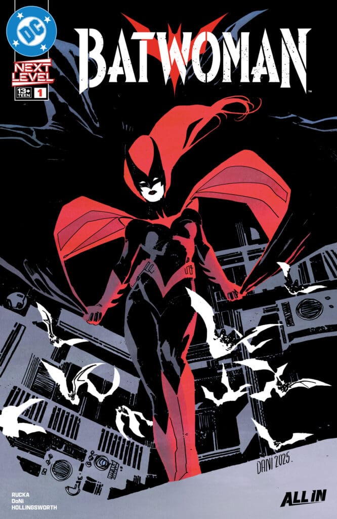
Batwoman #1. Credit DC Comics. Cover by Dani and Matt Hollingsworth.

Creative Team: Greg Rucka (WRITER), Dani (ARTIST and COVER), Matt Hollingsworth (COLORS and COVER), and Hassan Otsmane-Elhaou (LETTERS).

This is a joint review from Matt of Hops Geek News and Megan from the Vigilante Vibes Podcast!

SPOILERS AHEAD

The Story:

Megan: Batwoman #1 starts with Kate in what seems to be a mental health clinic. The doctors are discussing her progress, which seems to be at a minimum. Kate later finds herself in therapy, recanting the death of her twin sister, Beth. There’s a huge amount of mystery surrounding the first issue, and especially within Kate’s story. Kate is clearly suffering emotionally with the hauntings of her past, but she’s plagued with the question “How do you fight the devil when the devil is real?”

Greg Rucka set up a story that already has so many layers to it. There’s a lot of emotion put into the story, and I’m excited to see where it goes. With as much mystery as we see in the story, something tells me that this is just the start of Kate’s story.

Matt: Greg sets up just the right amount of mystery in this anticipated issue. Kate is in therapy dealing with the loss of her twin sister, and there is clearly something traumatic there for her to work through. As she references the past, we get to see sequences of her as Batwoman fighting “The Devil,” and the mystery brings in a bit of a haunted vibe to it all. I’m not too familiar as I would like to be with her past, but Greg makes it so you can be caught up while using this as a perfect jumping-in point to this story.

The Art and Letters:

Megan: The artwork is what really drives this first issue home. Thanks to Dani, the artwork feels like a blast from the past in the old school look of the drawings. Capturing that classic DC work, the artwork is detailed, yet somewhat abstract in some of the details. Matt Hollingsworth handles the colors, and brings a great amount of vibrancy that rivals the more muted tones.

Matt: Dani and Matt deliver different cultural aspects and details in their art and coloring with this issue. This takes place in Greece, and you can almost feel the warm sun as it radiates off the panels into the therapy room. There were panels where, to me, the room was detailed in such a way that it felt stifling to me and captured the essence of what therapy can be for some people. The final page features a splash page featuring Kate standing tall, allowing her costume to stand vibrantly against the back setting, amping us up for the future.

Final Thoughts:

Megan: 8.6/10. I’m very interested to see where this goes. The creative team will have you hooked into the story immediately, and will have you staying to ask “what’s next?”

Matt: 9/10. Batwoman #1 is taking us into the shoes of Kate Kane and bringing us a dark and mysterious past that is simmering at the surface. This first issue will draw you in leaving us ready for what is next.

Overall Grade – 8.8/10

One response to “BATWOMAN #1: Fighting the Devil”

  1. Yancy Arce Avatar

    The hype is real my friends, great review!

Leave a Reply

This site uses Akismet to reduce spam. Learn how your comment data is processed.

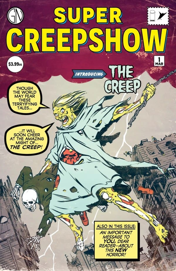
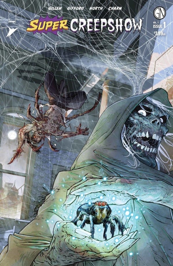
“Super Creepshow #1” Review – An Unstoppably Great Horror Show

Writers: Kieron Gillen (“Creeping”), Ryan North (“Speed Freak”)
Artists: Rossi Gifford (“Creeping”), Derek Charm (“Speed Freak”)
*POSSIBLE SPOILERS AHEAD*

Source: Simon Parr, Image Comics & Skybound Entertainment

A Super Creepshow Indeed

For any fans of Creepshow, I can tell you right off the bat that this is a completely worthwhile treat. As for those that may not be aware of what Creepshow is, it’s a long-running anthological franchise where each installment tells several short horror stories, hosted by the man of the hour: The Creep. In this instance, the stories center around the idea of “superhero origins gone wrong.”

Creeping

The first story we get is “Creeping” by Kieron Gillen, a total play on the classic Spider-Man origin story with perhaps a dash or two of the infamous Man-Spider arc. Reading this story was probably (definitely) the first time in awhile I’ve had a visceral reaction to what was going on. The writing from Gillen was so perfectly creepy and grotesque that there was a point where even I, an avid horror movie and Spider-Man fan, had to look away because I knew where things were going.

As for the story itself, I found it to be a surprisingly very heartfelt love story! Gillen does a fantastic job at keeping the reader engaged throughout, making us wonder what horrors or plot developments we’ll see as we turn the page.

Speed Freak

That now brings us to our second story, “Speed Freak” by Ryan North. Going by the title, you can probably guess where this one’s going… or perhaps not, as I almost certainly didn’t. This story was a fairly simple one, yet was just as impactful, showing how far one’s sense of justice can go when unchecked. I won’t spoil what happens here, but this story most certainly left an impact on me as I’ve thought about it over the last few days.

How would I be if given that sort of power? Can someone having the power of speed be trusted to maintain their sense of justice while knowing they can’t be caught? North also does a fantastic job at showing how one person seeking justice can effect others negatively.

All in all, both stories are great reads from start to finish.

Source: Carmine Di Giandomenico, Image Comics & Skybound Entertainment

Grotesque Yet Lovely

One thing that’s absolutely stuck with me after reading was the artwork by Rossi Gifford in “Creeping.” Everything about it was simply phenomenal. Being this odd blend of old school pulp and new school horrific greatness. The level of detail is astounding, from seeing an eye dart across the panel in a spray of blood to the shading and how it helps further enhance the different settings. While I won’t completely give it away, there was a panel at the end that I thought would absolutely give me nightmares. All I’ll say is you’ve never seen a mother spider like this, and you should hope you never will in real life.

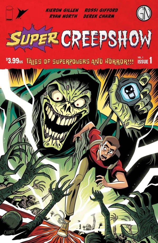
Comparatively, I found the art by Derek Charm to be rather simplistic and a bit lacking in “Speed Freak.” Outside of getting a sense of the super speed, everything else felt rather flat and one-dimensional, which is a shame as the story itself is amazing. This isn’t at all a knock towards Charm himself, as his style is great in the right context, but I feel as if it didn’t entirely work here. That being said, there were a couple of panels I genuinely loved towards the end, specifically in relation to the house of one of the main characters. I also thoroughly enjoyed the cover art he created, shown below!

Source: Derek Charm, Image Comics & Skybound Entertainment

Overall Thoughts – 8.75/10

Between the artwork of Rossi Gifford being a standout and the writing from both Kieron Gillen and Ryan North being horrifically stellar, “Super Creepshow” is sure to deliver the frights and screams to any and all who add it to their collection!

Read more from me here and follow my socials!

Comments

Are you a fan of the “Creepshow” franchise? Do you intend to pick up “Super Creepshow #1”? Let’s discuss in the comments below!

Leave a Reply

This site uses Akismet to reduce spam. Learn how your comment data is processed.

Sorcerer Supreme #4 – The Dark Truth of The Uroath

Wanda Maximoff rescued the Cloak of Levitation and the Eye of Agamotto. In doing so, she claimed the title of Earth’s Sorcerer Supreme. Frustrated by her claim, the Vishanti empowered her friend and mentor Agatha Harkness as their choice for Sorcerer Supreme and invoke her Uroath. As the battle continues and Wanda escapes from Limbo, she comes face to face with the darkness of the Uroath and what it means for her friend.

This review is brought to you by Megan and Shawn!

Creative Team

Writer: Steve Orlando
Artist: Bernard Chang
Color Artist: Erick Arciniega
Color Artist: Ruth Redmond
Color Artist: Rod Fernandes
Letterer: VC’s Joe Sabino
Cover Artist: LEIRIX

Writing

Megan: Sorcerer Supreme has shown so many different sides of Wanda, many highlighting why she is suited well for the title of Sorcerer Supreme. However, Sorcerer Supreme #4 shows a side of Wanda that cements why she’s the best person for the title in all regards. Agatha is still attempting to go toe to toe with Wanda for the title, and Wanda isn’t about to let her win. Wanda knows she’s deserving of the title as the Eye of Agamotto called out to her, despite what the Vishanti think.

Instead of destroying Agatha, as so many would choose to do, Wanda decides to go deeper to see exactly why Agatha is intent on taking the title. What do the Vishanti have over her? In a true example of friendship and empathy, Wanda gets to the bottom of the mystery to save Agatha from feeling the wrath of the Sorcerer Supreme.

Shawn: What a really great story we got in this issue. I loved that I got a combination of serious conversations about the value of friendship, epic battles, and even some meme-worthy moments. Steve Orlando continues to show readers why he just “gets” Wanda Maximoff.

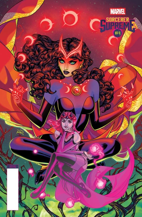
Sorcerer Supreme #4 Variant Cover by Russell Dauterman

Every bit of this issue feels purposeful and poignant. This issue deals with perhaps the most significant challenge that Wanda has faced in her time as Sorceress Supreme and Orlando’s words make you feel the true weight of the title. I really loved the way he conveyed Wanda’s stubbornness not as a point of ego as we often see with Stephen Strange, but as a point of tenacity.

Art

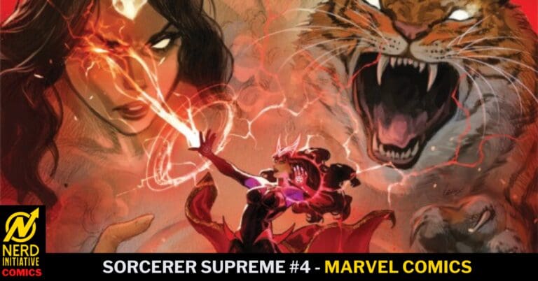
Megan: The artwork of Sorcerer Supreme #4 is downright beautiful. Bernard Chang seems to outdo himself, yet again, with the gorgeous drawings that perfectly capture the magic of the story. Erick Arciniega, Ruth Redmond and Rod Fernandes match Chang’s mystic art with colors that cover all places of the spectrum. What I really loved was the clashing of Wanda’s magic drenched in tones of red versus her nemesis’ shades of green. It was a beautiful way to show how these two characters clash.

Joe Sabino excellently captures the emotions of the various characters through the dialogue. Whether it’s Wanda’s calmness or Agatha’s rage, you can feel the emotions portrayed perfectly.

Shawn: While Orlando’s writing continues to be great, this is the first issue of the series where I feel like the art was not only amazing but outshone the writing. Bernard Chang and the combination of color artists in Erick Arciniega, Ruth Redmond, and Rod Fernandes really stood out in this issue.

The decision by the art team in the first page to use a nontraditional outline for the panels was so brilliant and it just worked spectacularly. As this issue covered a lot of ground and a lot of settings, it was a real challenge for the art team but they handled it perfectly. The colors and hues perfectly align with each setting and situation Wanda finds herself in.

Final Thoughts

Megan: 8/10. The artwork of Sorcerer Supreme #4 was the driving force here. The artists really captured the mystic energy of the story and brought it to life.

Shawn: 10/10. If you gave me this issue with not a single word bubble on it, I would give this issue a 10/10 for the art alone. The team of Chang, Arciniega, Redmond, Fernandes, and Sabino blew me away with art that was crisp, colorful, easy to follow, and flowed beautifully to enrich and grow the story.

Overall Grade – 9/10

How are you enjoying the Sorcerer Supreme? Let us know in the comments!

6 responses to “Sorcerer Supreme #4 – The Dark Truth of The Uroath”

  1. ShawnFoles Avatar
    ShawnFoles

    Cool. It’s okay to not like something. I’m not really sure what your aim is here. You visited our joint review to rant about how you hated something we enjoyed. Our review isn’t changing just because some random person on the internet doesn’t agree with it. It’s fine to dislike something but I’m not sure ranting in the comments of a review written by two people likely better versed in the mystical side of Marvel than you is the best expenditure of time. If you want to rage farm you to not gonna be in the comments of a Nerd Initiative article. There’s plenty of places you can do that but NI isn’t one.

  2. Steven Stahl Avatar
    Steven Stahl

    I suggest that you look at issues of Dr. Strange, and Dr. Strange: Sorcerer Supreme #43 specifically, to see how the Vishanti have been interpreted in the past. They’re not humanoids with vague magical powers; they’re noncorporeal deities who inhabit their own dimensions and respond to invocations from sorcerers. Their misinterpretation by Orlando isn’t a minor mistake; it’s the basis for the storyline. If Oshtur is immaterial, there’s nothing for Wanda to attack. The story is disastrously bad.

    1. ShawnFoles Avatar
      ShawnFoles

      I hear you. That is how they have been portrayed in the past, but the Vishanti being susceptible to damage is not a new concept. Doctor Voodoo fought Agamotto. Marvel has been leaning heavily for the last 10 years at least into the idea that the Vishanti can corporealize even if their true form is abstract. It’s okay if you don’t like the story, but what Orlando is doing is not a new idea or concept. If she’s “fleshy” enough to have descendants on earth (Storm) then she is fleshy enough to engage in battle. Thanks for reading the review!

      1. Steven Stahl Avatar
        Steven Stahl

        Yes, Bendis had Doctor Voodoo kill Agamotto in New Avengers #6. The plot was junk. As you may have noticed, Agamotto came back.

        Their characterization as abstract entities in issues of Dr. Strange and elsewhere (Marvel Premiere #5, for example) isn’t something to dismiss. It emphasizes that they’re deities, something Wanda isn’t. What possible reason is there for them to become material, except for Orlando needing something for Wanda to attack, with, naturally, a deus ex machina?

    2. Yancy Arce Avatar

      Every single elder god in Marvel has a corporeal form to an extent and are succesptible to magic forces, hence why Chton is still imprisoned in a pocket dimension. Conceptual beings fught all the time in marvel, so no, you are incorrect. Respectfully!

      1. Steven Stahl Avatar
        Steven Stahl

        The Vishanti aren’t elder gods like Chthon and Gargantos (Shuma-Gorath). They’re deities who generate their own magical energy. Orlando is a hack writing a power fantasy for Scarlet Witch fans.

Leave a Reply

This site uses Akismet to reduce spam. Learn how your comment data is processed.

KILL ALL IMMORTALS II #3: Family Ties

Frey and her family are ready to make their move and strike down the tree of the Khans and end this blood feud for good. However, Erik has a different idea that will put their family in jeopardy and could leave their family broken and dead. The time of the Khans is now!

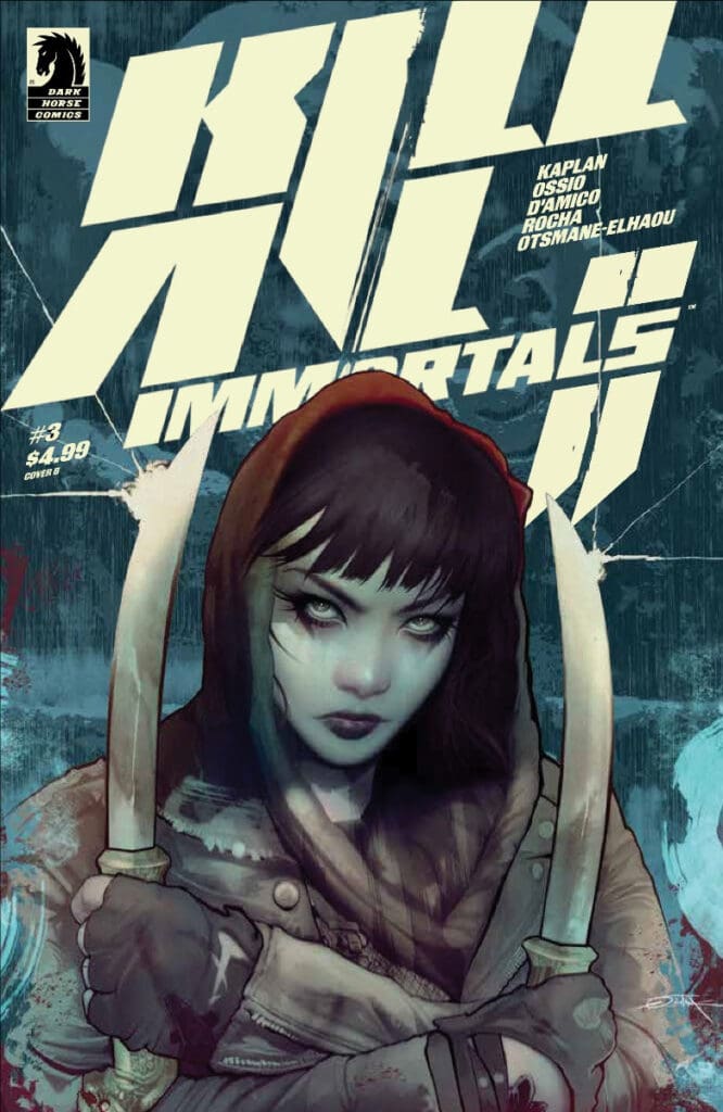
Kill All Immortals #3. Credit Dark Horse Comics. Cover by Oliver Barrett.

Creative Team: Zack Kaplan (WRITER), Fico Ossio (ART), Elisabetta D’Amico (ART), Thiago Rocha (COLORS), Hassan Otsmane-Elhaou (LETTERS), and Oliver Barrett (COVER).

SPOILERS AHEAD

The Story:

I was not ready for where this issue went! Zack shows how fundamentally broken Frey and her family appear to be, as they can’t agree on how to take down the Khans, and one of their brothers is now against any sort of violence. It showcases how true power and greed can corrupt and just how power-hungry Erik can be. To this point, any deaths have resulted in resurrection but, I wasn’t ready for the deaths that took place in this issue as the Khans led them into a trap and now seem to be unbeatable. At its heart, however, Frey is the glue, and her story continues to keep me so engaged and loving every moment and every panel of this book.

Art and Letters:

The art is every bit as bloody as we would expect. A detail that stuck with me is how Frey remained stained in blood after the opening fight. Typically, we will see a change of clothes, but the choice to leave her covered in blood for some reason was such a minute detail, and yet it stayed with me the most. Thiago’s colors in the background of each fight take a darker tone than normal, which fits the theme of how this is not the usual triumphant story for our Viking family. It’s these details that may be small to some but stand out to me immensely.

Final Thoughts:

Kill All Immortals II #3 takes a shocking turn in this issue, and for the first time, you can feel the desperation from Frey and her family. We see them challenged and up against the wall for the first time in this story, and the team sets it up perfectly. I may be a broken record but this run has been nothing short of spectacular.

Overall Grade: 10/10

For more from Matt at the Hops “Geek” News podcast!

Leave a Reply

This site uses Akismet to reduce spam. Learn how your comment data is processed.