
The Sentry is Bob Reynolds. A superhero of incredible power as The Sentry, Bob’s darkness born out of despair grows into The Void. The Void seeks balance. For every good deed Bob completes as the Sentry, the Void must balance with villainy. With the same abilities and powers as The Sentry, the Void seeks pain and destruction where The Sentry seeks to protect and save. Now the Void has his sights set on The Kingpin, Wilson Fisk.
Creative Team
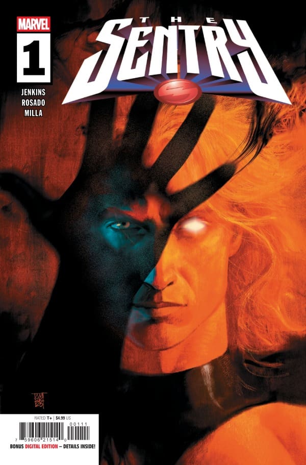
Writer: Paul Jenkins
Artist: Christian Rosado
Colorist: Matt Milla
Letterer: Joe Caramagna
Cover Artist: Alex Maleev
Writing
Matt: I am relatively new to The Sentry, and as this is the first time I have dove into a number one for him, I must say what an intriguing character. Paul has painted such a two-sided coin for Bob and the Void, and has really dove into the crisis of identity that he faces.
Sentry has been a mental health study of sorts, and Paul shows off both the good and the bad that he can do. When The Void goes after Fisk, it is truly suspenseful and terrifying in every way. The story also shows us how Bob can do just as much good, all while showing an existential crisis that will have us even thinking about our own lives.
Shawn: I really love what Paul Jenkins did in Sentry #1. It’s impossible to tell the story of Bob Reynolds without discussing mental health and darkness. That said, it’s such a bold decision by Jenkins to jump right out into the darkness inside of Bob, not only from issue one but really from the first few panels. This issue felt real, gritty, and raw from the jump. It’s such a bold departure from many of the comics on the market.
I applaud Jenkins for not shying away from making Bob’s mental health issues seem less serious than they are. I thought giving a little backstory to Bob, identifying the moment that the Void began to grow inside of him, was a brilliant piece of storytelling.
Art
Matt: The artwork perfectly matches the rugged tone that was met with in this issue. The sequences of The Void are not only colored and drawn perfectly, but the background itself, despite still having life to it, also feels lifeless all at the same time. The way in which they are able to do that impresses me so much. There are some shocking panels as well, such as how Hulk has crystals coming out of places including his eyes. It is an uncomfortable scene, and the art plays into why this felt so unsettling to read.
Shawn: Christian Rosado and Matt Milla perfectly captured the tone in Sentry #1. Everything in this issue feels like perfect symmetry between the visual and written arts. Rosado shines not just with the art, but the shadows. The use of shading by Rosado goes a long way towards helping Jenkins establish the tone of this series from the very first panel.
Milla does a great job choosing little pops of color to draw your eye. There are a lot of dark and muted colors used in this issue, which works for the narrative. The colors feel perfectly matched to the words on the page. Together Rosado and Milla’s work on this issue is bound to invoke comparisons to the strong work of Aja and Hollingsworth on their run with Hawkeye. This issue feels similar in style and feel which is a testament to the quality of work Rosado and Milla produced. Caramagna’s decision to use inverted colors to distinguish between Sentry and Void works really well allowing you to focus on the Void and not be distracted.
Final Thoughts
Matt: 9.5/10 Sentry #1 brings Bob’s crisis of identities to the forefront and delivers on the adage that for every action there is an equal and opposite reaction. The team truly makes The Void feel every ounce of terrifying he can be while invoking sympathy for Bob, who is struggling with his dual identities. It does feel as though something sinister is bubbling and ready to burst, and this first issue has my attention as a book everyone should be checking out!
Shawn: 9.5/10 Jenkins, Rosado, and Milla do an amazing opening issue with Sentry #1. You feel both the depth of the darkness within Bob but also sympathy for what he is dealing with. It’s rare to find a comic where the synchronization between the writing and the art is so perfect, but Sentry #1 is one of the best examples you’ll find out in the world now. This issue literally sent a chill down my spine as I read it, and I loved it.
Overall Grade: 9.5/10
For more from Matt or Shawn, check out the links.
Are you glad to see the Sentry return? Let us know in the comments below.
Leave a Reply