This episode review was made possible from screeners from Amazon MGM Studios.
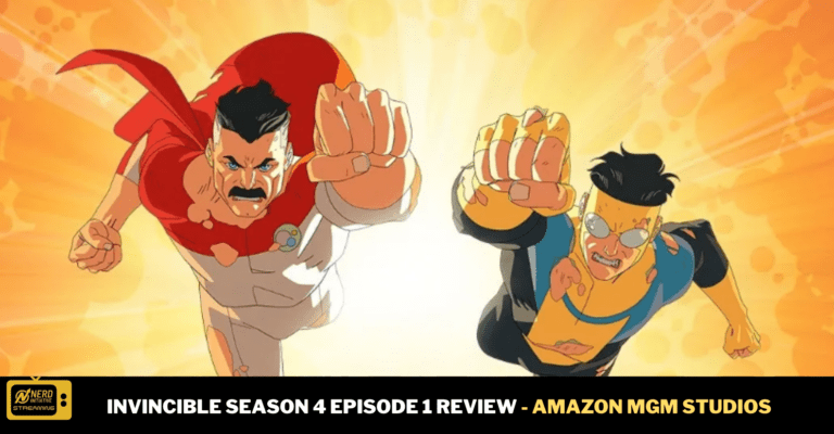
Getting into season four of Invincible, it is apparent that Mark Grayson (voiced by Steven Yeun) is in a different head space that he has never been before. There are a ton of new elements, foes, and allies that are coming into play. I love seeing Eve (voiced by Gillian Jacobs) back in this new season. Another new thing is Oliver (voiced by Lincoln Boldin), has grown older, and has a lot more opinions in his teenage years. Most of this first episode also sees Mark evaluating his choices that he makes, and questioning if they are the right ones.
What I love about Invincible is that Mark always has been a complex character. He usually goes by his gut. Now, it seems more and more apparent that he might be more like his father than he realizes. In this first episode there is a clear absence of Nolan (voiced byJ.K. Simmons) but, I am sure that he will be back. He is a foe that is notable and exciting to see.
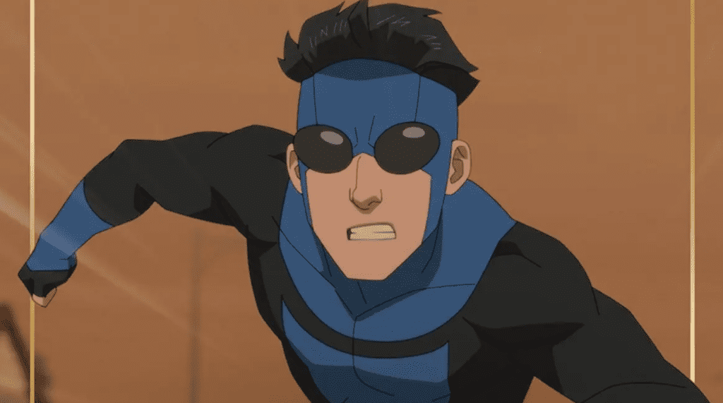
One of the things I loved to see in this episode were the fight scenes.
Credit: Amazon MGM Studios/ Invincible
This show amazes me every time, hooking me with that first episode. Cecil (voiced by Walton Goggins) always has been the one to wrangle in everyone. He is still trying to keep things in order, and trying again to get some new faces together for the Guardians.
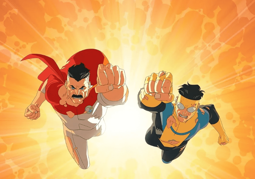
Credit: Amazon MGM Studios/Invincible
There is so much depth that is among each episode, I always feel like I’m right in the midst of it. Most of the first episode focuses on Mark trying to grapple with his romantic and family relationships. Mark’s mom, Debbie (voiced by Sandra Oh), seems to be moving on in her life. Overall, this was a solid good episode, with lots of action packed sequences. I just hope that Mark gets his head in the game, and keeps being himself, while not turning into Nolan.
You can watch Invincible Season 4 Episode 1 on March 18th, only on Amazon Prime Video.
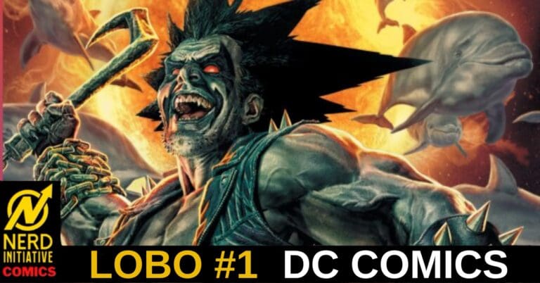
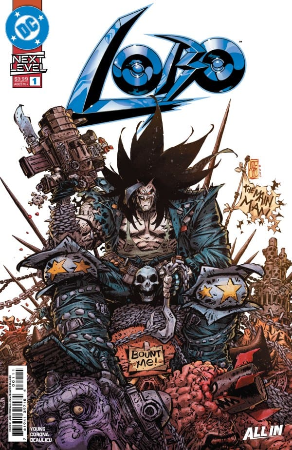
If there’s one DC character that is sure to have a comic run that’s filled with excitement and unhinged behavior, it’s Lobo. Written by Skottie Young, we see Lobo on a mission to collect a bounty. Of course, with it being Lobo, he leaves chaos wherever he goes. Just as he finds his bounty, the mission is called off. Still feeling he’s deserving of a payout, Lobo travels to corporation that bought out the bounty business, Omni Mega+ Entertainment Corp. Once he shows up there, he’s welcomed with open arms and a new deal. Lobo now has the opportunity to be The Main Man in a whole different way.
Cover art by Jorge Corona and Jean-Francois Beaulieu. Published by DC Comics
Skottie Young brings a story of Lobo that highlights the best and worst parts of the character. Lobo is unhinged, he’s reactionary, but he still goes by a code. In Lobo #1, alongside the main story, we also get some background on the character which was very helpful for new fans jumping into the character. There’s no better way to describe this comic other than fun and thrilling. Skottie Young hooks you into the story by the first page and keeps you locked in until the end.
The Art
Jorge Corona, Jean-Francois Beaulieu, and Nate Piekos all bring their own highly talented skills to the pages of Lobo #1. Capturing the energy of Lobo and bringing it to life, Corona draws gritty and chaotic panels that perfectly matches the tone. Beaulieu brings a remarkable amount of vibrancy to the pages that’s juxtaposing with Lobo’s classic white and black look. Nate Piekos is able to create a perfect flow of dialogue while having sound effects that keeps the energy high and exciting. All in all, the artists really put their talents on full display.
Final Thoughts
Lobo #1 is as exciting as the character is himself. Where Skottie Young is going with this story, I have no idea, but I’m very excited to find out!
Overall Grade – 10/10
Let us know what you thought of Lobo #1 in the comments below!
This review was written by Megan from the Vigilante Vibes Podcast! If you liked my review, be sure to check out my other reviews! Let me know what you think of Lobo #1, or tell me what comics you’d recommend me trying out! Find me on my socials, and check out my Marvel podcast, Vigilante Vibes, by clicking here!
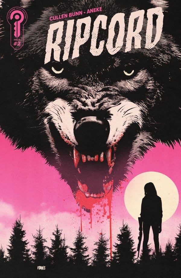
To start, I need you to know that “Ripcord #2” is an adrenaline rush from the start. Making for an impressive showing, Cullen Bunn sets the stage for an apocalyptic tale unlike most others. One that feels full of unforgiving dread that would make “The Last of Us” weep. The first page alone is a perfect way to let readers know exactly what they’re in for, a perfect showcase of tact and craft.
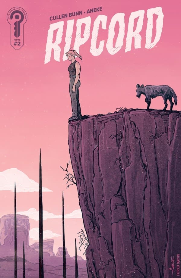
For those who don’t know, the story centers on Dillon searching for her sister Janelle in the Australian Outback. We pick up with Janelle in an unknown facility, her dead friend lying beside her, blood spilling from her eyes. This was such a stunning way for me to be introduced to this world, and I absolutely loved it. Later on, when I met Dillon for the first time, I loved it even more. As a main character, for any Marvel fans out there, she feels like Jessica Jones, Punisher, and Elsa Bloodstone collectively raised a child. Exactly my type of main character. Her drive and how far she’s willing to go for a loved one also feel all too relatable.
Not only is the story and its characters intriguing, but it’s intimidating as well. However, when I say that, I mean they’re deep and make this an absolute page turner. From a drug-dealing biker gang to a mysterious yet violet villainess and high-octane action, Bunn made this impossible to set down.
Not to be outdone, the artwork and coloring by Aneke and Patricia Martin are both absolutely fantastic as well. Not only does the art match the story’s tone, but it also heightens how dark this apocalyptic world is. Whether it be bullet holes or flesh being torn from the bone, I just couldn’t look away. The entire time I was reading, I was in shock and awe by how beautiful yet disturbing everything looked.
To help back up what I’m saying, imagine if a “SAW” film met that one issue of Scott Snyder’s “Absolute Batman”. I know you know the one. The art and colors are that intense, and every single panel will stick with me for a while. I just know it.
Overall Thoughts – 10/10
From Bunn’s no-holds-barred writing to the bone-chilling artistry of Aneke and Patricia Martin, “Ripcord” is something you need to keep on your radar. This, for sure, is something I’ll be adding to my pull list, guaranteed.
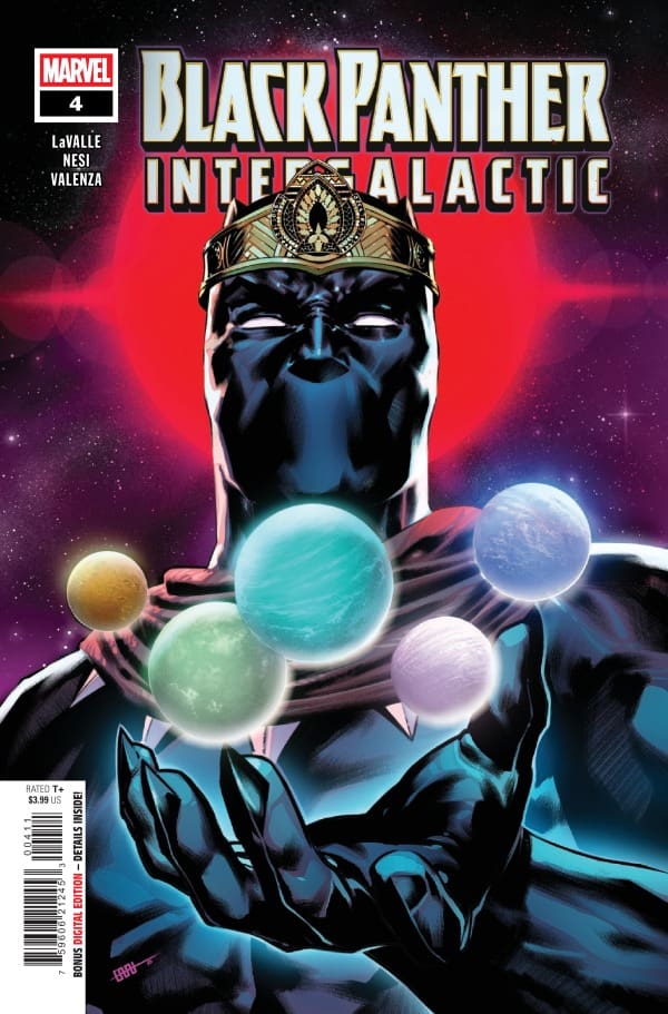
T’Challa, the Black Panther, having been stripped of his memories and imprisoned within the Benhazin Star System, has led an escape from the space-faring tyrannical Wakandan Empire. Experiencing fragmented memories of his past while being hunted by the symbiote-bonded Emperor N’Jadaka, T’Challa finds himself stranded on a strange planet with unique life forms that resemble him, combined with various superpowered individuals from Earth. As Femi and Shuri try and find T’Challa, they encounter the creations of B’Wete.
Creative Team
Writer: Victor LaValle Artist: Stefano Nesi Color Artist: Bryan Valenza Letterer: VC’s Ariana Maher Cover Artists: CAFU & David Curiel
Writing
What a beautiful ending Victor LaValle crafted to this story. I loved everything about this issue. You can really see LaValle’s fingerprints all over this issue. The growth the characters have experienced through this series has been so fun to observe.
The strength of this issue has been LaValle’s ability for suspense and storytelling. This series was such a unique take on the Black Panther story, and I’m glad that Marvel gave LaValle the ability to tell the story he wanted to tell. Seeing a vulnerable side of T’Challa was great and seeing him grow as both a leader and a person in this story was amazing.
Art
Stefano Nesi did an amazing job with this issue. The lines on M’Baku’s armor are gorgeous and is such an amazing drawing. The landscapes for Planet B’Wete are stunning and look both crisp and clear and extremely foreboding. Nesi crafts such a beautiful world that feels as much of a character as T’Challa and Shuri.
The beautiful work of Nesi is amplified by Bryan Valenza. One of the great things about the cosmic setting of Black Panther: Intergalactic is the beautiful colors available to Valenza. Valenza is able to use a wide variety of colors and shade and they all blend perfectly. The use of the color in contrast to the shade as well as the uniforms of T’Challa create such a beautiful interaction.
Ariana Maher crafts some amazing SFX in this issue. There are a few times where you see the SFX, but when you look deeper at them, there’s shaping and color that better reflect what happens in the panel that you may miss on the first read.
Black Panther: Intergalactic #4 cover by CAFU. Image From Marvel Comics
Final Thoughts
This was such a satisfying series. I really enjoyed the work that LaValle put into crafting this series. With the series ending, Black Panther: Intergalactic becomes a must for the collection of anyone who loves Black Panther. The story is unique, suspenseful, and high-stakes.
Overall Grade: 10/10
Until next time may your pulls be magical, and your multiverse remain stable
How are you enjoying Black Panther: Intergalactic? Let me know in the comments!
Writer: Tom Sniegoski (“Vampirella Strikes!”) Artist: Edu Menna Colorist: Adriano Augusto *POTENTIAL SPOILERS AHEAD*
Source: Francesco Mattina & Dynamite Entertainment
Sinking The Teeth In
As I was going into this book, I had very little idea what was going on. I admittedly am picking things up in the middle. I personally find that, oddly enough, can sometimes be the best route to take. If the writer can make someone like me understand what’s going on in the middle of an arc, then that is a mark of great writing. I’m more than happy to say that Tom Sniegoski is exactly that and more than proves it here.
In order to prove what I’m talking about, Sniegoski is able to tell readers within these pages not just where we are currently, but also where we were. First, readers learn briefly about the Danse Macabre and Sepulcher City. Second, we learn a bit more about the war going on in Hell and how the Drujh gave rise to Dark Vampirella. All of this information comes to flawlessly and easily, a feat that only a writer like Sniegoski can do.
Lasty, I was able to find out in my research that this story is a follow-up to “Vampirella Strikes!”, keeping with the same horror vibes. I love this because it works in stark contrast to the fantastic work that Christopher Priest is doing on the mainline “Vampirella” run. Where Priest’s work is more of a cosmic, time-traveling sci-fi adventure with horror mixed in, Sniegoski’s work is straight up scary. It leans heavy into darkness, demons, werewolves and vamps and I love every second of it.
Source: Lesley Li & Dynamite Entertainment
Dreadfully Great Art
As previously stated, this book has heavy horror vibes and the art more than backs that up. Illustrated by Edu Menna with colors from Adriano Augusto, both are at the top of their game here. Having to turn from page to page was making me scared of the horrors I’d witness next. One moment shows readers Dark Vampirella in all her glory, while the next shows vast demon hordes ready to overtake our heroes.
All of this was shown beautifully, feeling at times like a horrifying fantasy epic being put to paper. With nearly every shot, I could feel the emotions and fire leaping off the page. The monsters looked appropriately terrifying, matched only by the near perfect shading and color blending, capturing the vibes in a way readers can only dream of.
Source: Joseph Michael Linsner & Dynamite Entertainment
Overall Thoughts – 10/10
From the masterclass writing that Sniegoski delivers to the horrifyingly great art and coloring of Menna and Augusto, this is a run everyone needs to keep an eye on! I couldn’t put this down and I don’t think you will either.
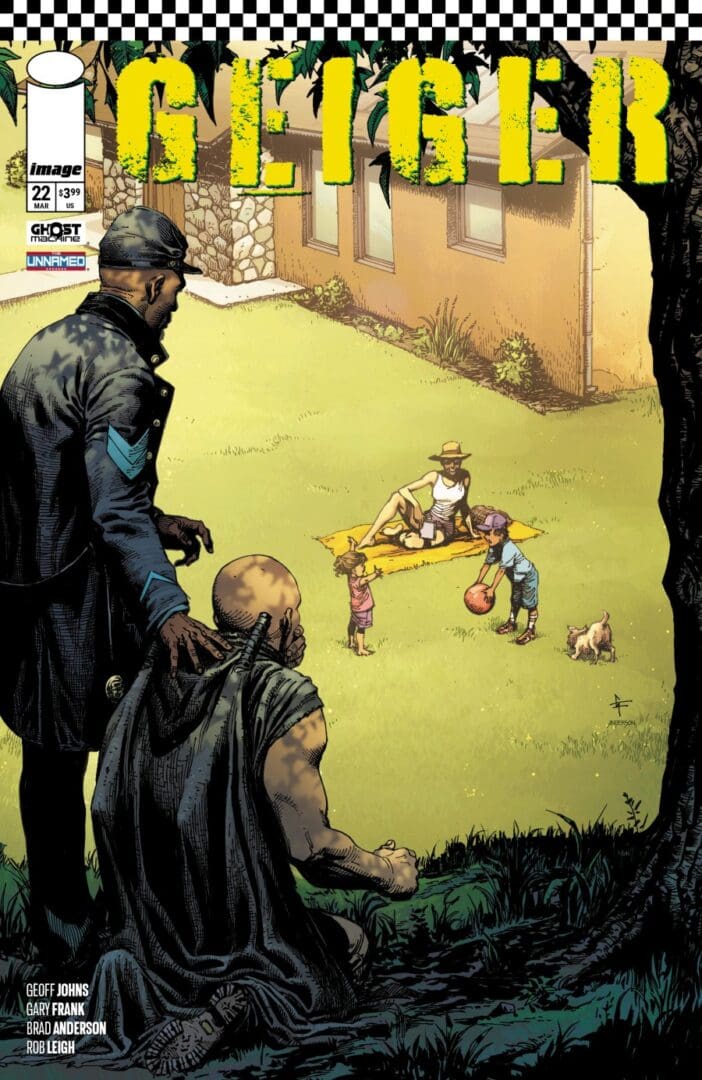
Geiger #22 from Ghost Machine comics is out today. Last we saw the glowing man he had teamed up with the Northerner. Despite thinking there is no actual way to change the past and get his family back, he’s seen crazy things, and has nothing left to lose. After a WWII tank falls from the sky, this dynamic duo heads off on an impossible mission, until they’re derailed by some unexpected kids.
Creative Team
Creators: Geoff Johns & Gary Frank;
Color Artist: Brad Anderson;
Letterer: Rob Leigh;
Editor: Brian Cunningham;
Designer: Steve Blackwell;
Covers A & D Art: Gary Frank & Brad Anderson;
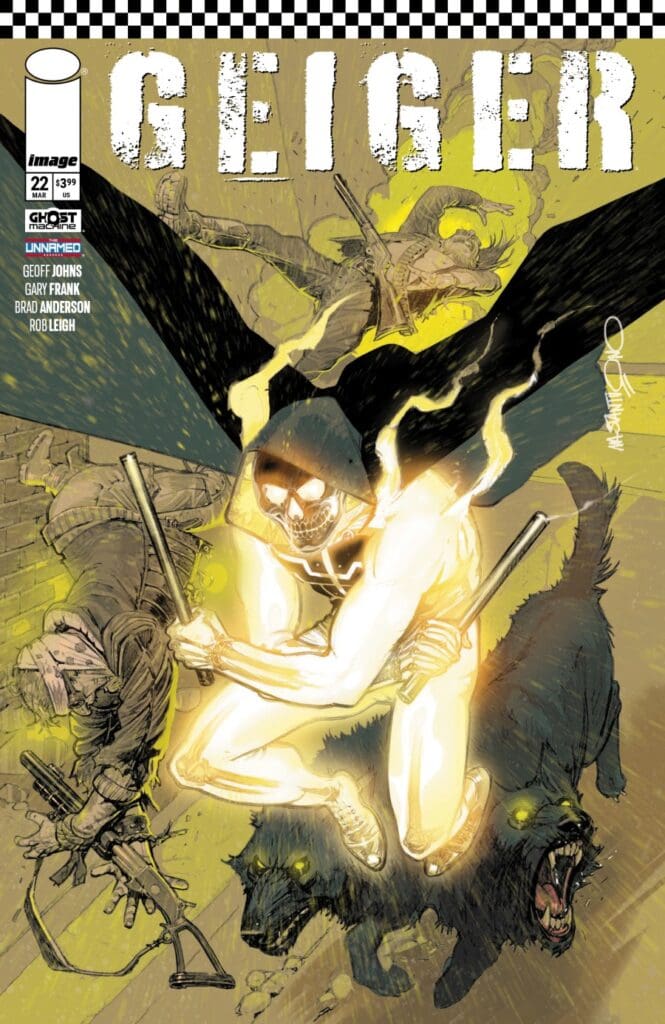
Cover B Art: Corrado Mastantuono; &
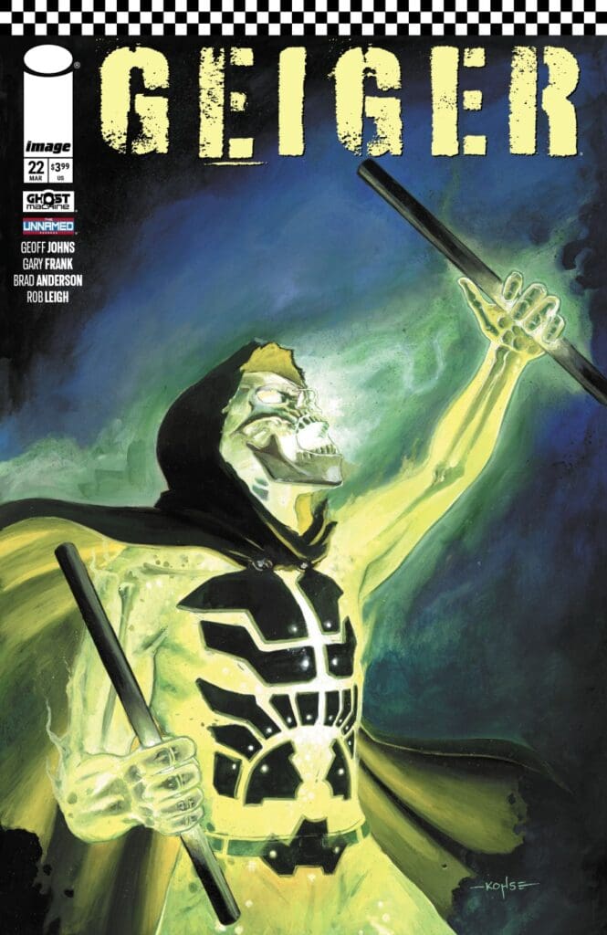
Cover C Art: Lee Kohse.
Check out the review for the last issue of Geiger by CLICKING HERE.For an interview regarding the current story and future of Geiger, CLICK HERE.
Geiger #22 Cover from Ghost Machine Pro at Image Comics.
The Story for Geiger #22
As Tariq Geiger and Malcolm North make their way to the Department of Historical Preservation, the kids they run into provide an unexpected type of detour. One that showed The Northerner a peak behind the curtain that is the Glowing Man, and one filled with clever ads for Brad Meltzer’s newest novel (which is now in my Thrift Books cart, so well played). A hiccup or two later, and their journey continues. Along the trip, we learn Geiger’s reasons for going along may be less hope, and more curiosity. Nevertheless, he never could have expected what was waiting for him.
Geiger #22 Variant Cover. Image from Ghost Machine at Image Comics.
Geiger #22 Variant Cover. Image from Ghost Machine at Image Comics.
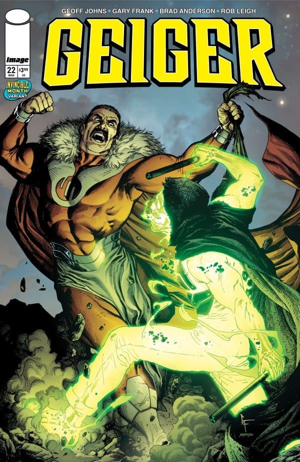
Geiger #22 INVINCIBLE Variant Cover. Image from Ghost Machine at Image Comics.
The Art
Geiger continues to absolutely kill it with the art. From the expressions of grief and glimpses of happiness, the art perfectly moves the story along with action and, more importantly, emotion. While we got a beautiful explosion, the best art in this issue was the look on Geiger’s face as we leave him on the last page. When one single expression is all you need to convey an array of emotions, you know the artist nailed it.
The level to which I was completely sucked in was evidence that the lettering could not have been more perfect. I was lost in the comic, and that only seems possible when the story, drawing, colors, and lettering are beautifully in sync.
Final Thoughts
This was one of those endings where I cursed the last page, solely for being the last page. The story felt too short, until I realized it was the same length it always is; I was just completely sucked in. The story of The Northerner and the Glowing Man continues to surprise, create mystery, and overall has a fantastic story that keeps me wanting the next issue immediately.
Overall Grade: 10/10
To anyone who loves a good story, Geiger is an absolute must-read. As these worlds/comics from Ghost Machine Pro continue to intertwine, the stories become bigger, while still maintaining the story and feel that started it all. I absolutely cannot wait for the next issue!
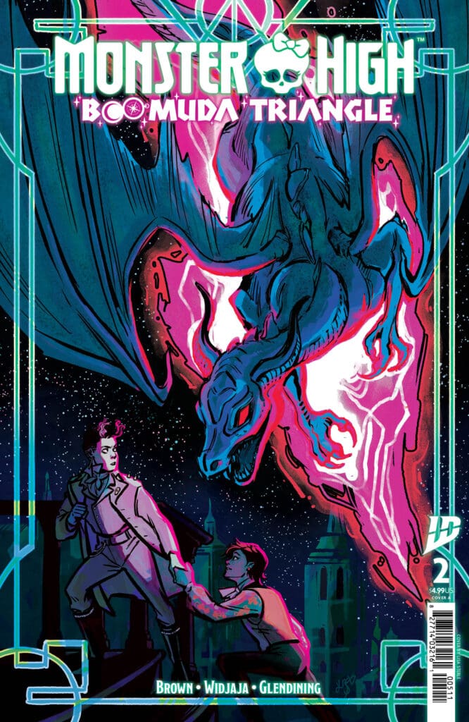
We’re not in Monster High or New Salem anymore. Writer Megan Brown, Artist Eileen Widjaja, Colorist Bex Glendining, and Letterer Johanna Nattalie have made another beautiful issue.
Monster High: Boomuda Triangle #2 Cover A By Lisa Sterle (Credit: IDW Publishing)
So, the issue starts off with Spelldon seeing the alternate reality version of both him and Kieron. Now these 3 end up having a full conversation about what is happening, which ends up being really fun to read. We then find Kieron in an alternate reality of New Salem, and everyone is in fancy dresses.
Now, he ends up seeing everyone in Bridgerton-inspired looks, and is then under a spotlight. Spelldon then find Lagoona and Dayna Treasure Jones, and her offers to help fix their ship. He then sees pirate versions of everyone, and proceeds to fix the ship.
Kieron is having a freak out, and then out comes Spelldon, and fire comes out from where he appeared. A dragon is on the roof of the house. The boys have a conversation, and then we see them on the ship having another conversation. The ship then gets attacked, and they didn’t have cannons to attack.
The dragon shows back up, and Kieron ends up helping it. After he pretends to kill it, a chandelier falls from the ceiling. Cleo and Deuce then thank Kieron for stopping the dragon, and then the rift shows back up. The final panel shows Spelldon flying off the ship.
Overall Grade: 10/10
Megan and her team crafted a beautiful story in this issue. I love anytime a comic does something with an alternate reality, and this series does it best. I cannot wait to see where we’re going from here.
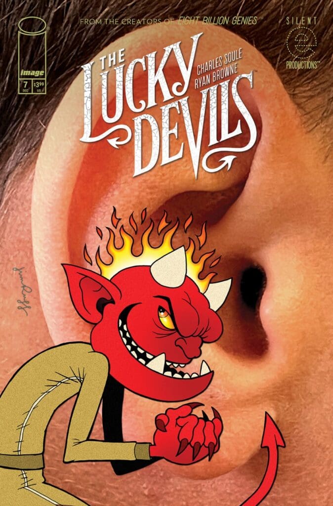
Our lucky devils do their evil work in the shadows to ensure hell remains stable. However, Collar and Rake decided to try a different approach and do some good, while making themselves visible to their humans. Now they’re being hunted, and one of their humans outed them to the world.
Creative Team
Written by: Charles Soule;
Art, Design, & Cover A by: Ryan Browne;
Cover B by: Jim Rugg;
Colors by: Ryan Browne & Kevin Knipstein;
Letters by: Christopher Crank;
Logo by: Thomas Quinn;
Production Design by: Erika Schnatz.
Check out another review by Lauren for a comic with art by Ryan Browne: Minor Threats’ BARFLY.
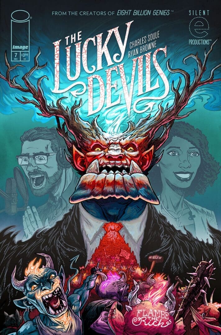
The Lucky Devils #7 Cover. Image by Image Comics.
The Story for The Lucky Devils #7
Collar and Rake still on the outs, and being hunted, are really feeling lucky these days. In a world of devils, no one is to be trusted, and everyone is guilty. As the devils seem to put out one fire, another is about to burst! Rake is in it to win it, and Collar is still all about the revolution. As Collar busts out his human from the looney bin (courtesy of his attempt to out the devils), their next stop is about to send a shiver to hell and back.
The Lucky Devils #7 Variant Cover. Image by Image Comics.
The Art
Oh the details! Those glorious, disgusting details are truly amazing. Every single devil and human are incredibly distinct. Especially the devils. From their toes to their ears, to their teeth. They are each creepily amazing, and I love to take in this art as I dive further into the politics of a chaotic hell.
The backgrounds are no different. So many amazing details, that absolutely require a second look on every single page to take it all in. Whether that extra detail provides ick or comedy, it’s all worth it. With lettering that perfectly helps showcase the world of The Lucky Devils.
You never can tell what someone will do. The good break bad, and the bad can be redeemed. Either way, it’s always interesting to see how they get where they’re going. While I love a good power couple, I’m really enjoying Collar and Rake having gone their separate ways. As their humans continue to surprise, the devils on their shoulders are no different. This was another absolutely amazing issue of The Lucky Devils.
Overall Grade: 9.5/10
The Lucky Devils is at 7 out of 9, and all hell is breaking loose. I loved the duo of Soule and Browne in 8 Billion Genies, and it looks like they are absolutely nailing it again in story and art. I can’t wait to see how this story wraps up.
With Thor now known as the Mortal Thor, Magni, the God of Strength and Son of Thor, is front and center. Yet Magni, refuses to assume the rule of the Golden Realm. As Enchantress sets her plan in motion, Magni and Blackjack find themselves helping perhaps the most unlikely of people to achieve their goals.
Creative Team
Writer: Al Ewing Artist: Juann Cabal Colorist: Jesus Aburtov Cover Artist: Alex Ross Published by Marvel Comics
Writing
I really enjoy the way Al Ewing has been crafting The Mortal Thor. Thor and indirectly other characters involved in his story are not just superheroes but living legends. This means that the stories people tell about them are just as important. Telling the story of Magni serves as a beautiful continuation of this style.
I really appreciated the inclusion of Longfellow in this issue and how it was woven into the tale in a way that felt meaningful and developed instead of loose connections. A lot of Ewing’s run on this series has pulled from various issues, even if indirectly. These characters feel like they’re part cosmic adventure of Lee and Kirby, the Simonson mythology, and the J. Michael Straczynski “Gods among us” style feel. Magni’s story feels both grounded and tragic. I can’t wait to see the repercussions of this issue play out.
Art
Juann Cabal and Jesus Aburtov crafted a beautiful issue. One of the things that I really appreciated about this issue is the way Cabal crafted and drew some of the wood carvings built into the walls. It’s a small detail that shows such a commitment to the craft.
Aburtov does a stunning job with coloring, crafting some beautiful use of both shade and color. I’m particularly fond of the job does with Aburtov shifting the light, really well to create shade. Aburtov seems to always pick the right colors to pop exactly when they need to and subdued colors when they are needed.
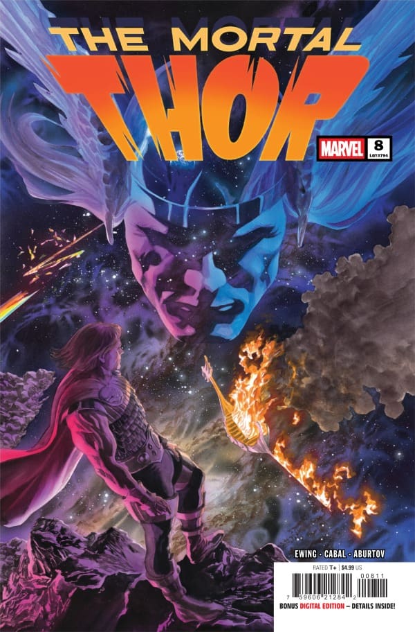
The Mortal Thor #8 cover by Alex Ross. Image from Marvel Comics
Final Thoughts
This is a really enjoyable issue of The Mortal Thor. I really enjoy the way Ewing writes Magni and Enchantress. This feels like a solid story while also building towards some bigger revelations and a larger part of the overarching story. The ability of Ewing, Cabal, Aburtov, and Sabino to craft such a compelling story was phenomenal.
Overall Grade: 9/10
Until next time, may your pulls be magical, and your multiverse remain stable.
How have you enjoyed The Mortal Thor so far? Let me know in the comments below.
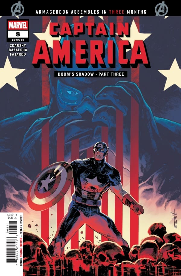
Doom has fallen, and Salvation has risen. Captain America heads to Latveria to try and discover Doom’s hidden weapons in a country torn apart by war as leaders fight to fill the void left by Doom. After meeting Alina Von Doom, the leader of the Homeland Party, Captain America heads into the sewers with her to discuss Latveria’s future before taking on a mission that may be more than he bargained for.
This review is a joint review from Shawn and Travis. Click on their names to see more reviews from Travis and Shawn.
Creative Team
Writer: Chip Zdarsky Artist: Jan Bazaldua Colorist: Romulo Fajardo Jr. Letterer: Joe Caramagna Cover Artist: Valerio Schiti Cover Colorist: Frank Martin Published by Marvel Comics
Writing
Shawn: What’s in a name? That’s the powerful question that Chip Zdarksy begins asking in this issue. After meeting Alina Von Doom (See Captain America #7), Cap rightfully has some questions. One of the things that I’ve enjoyed in works by Chip Zdarksy and Captain America is no exception is that you can find signatures of Chip’s writing style coming through in each issue, but not at the expense of what makes the character unique. This issue of Captain America feels uniquely Chip, without losing the heart of what makes Captain America, well, Captain America.Seeing a Captain America that revels in the ideals he stands for while not standing for those who would twist those ideals is refreshing.
Travis: Chip continues to produce such amazing works for this Captain America series. The recent blending of this run into the One World Under Doom event brings more to this story. The writing for this issue is poetic. But with a glimpse of what was experienced in World War II. The dialogue within this issue becomes so powerful from Steve Rogers. So much so that you continue to question what Steve Rogers is going to do next.
Art
Captain America #8 cover from Valerio Schiti and Frank Martin. Image from Marvel Comics
Shawn: Jan Bazaldua and Romulo Fajardo Jr. crafted an exquisite issue with Captain America #8. It’s no secret that comic books are produces under relatively condensed timelines, so I always appreciate when artists still take time for details. I love after I’ve done the first read through when I can go back and look at the background of an issue and see where the artist and colorist took their time and added detail.
This art just “feels” like Captain America. Bazaldua and Fajardo Jr. perfectly capture war torn Latveria in the grit and destruction that has been wrought on it. Joe Caramagna lets the eyes flow easily and does a particularly stellar job with SFX this issue.
Travis: The art from Jan Bazaldua and Romulo Fajardo Jr. is exactly what this issue of Captain America needed. I absolutely enjoy it when artists can use their abilities to tell a story without words. The color choice and shading add to the dark tone of this issue. The pencil work is so crisp and smooth that it feels like you’re looking at this in high definition!
Final Thoughts
Shawn: 9/10 I’ve always loved Captain America but man, do I love what this creative team has done with Captain America. While there is plenty of action in this story, I love the world-building we get in this issue. Chip is building a Captain America that feels battle-tested. As much as I love Captain America, a lot of early Captain America felt naive and unrealistic. Chip Zdarksy’s Captain America feels more grounded.
Travis: 9/10 This eighth issue of Captain America continues to provide shock & awe to the readers. Chip is so poetic within this series to create world problems in other countries, only to steer the ship back around and provide evidence of how America is no better than any other country. This is an amazing series with continuous character development and plot lines! Get this issue today and see what Captain America does next.
Overall Grade: 9/10
Check out more Nerd Initiative reviews from Shawn and Travis.
Are you looking forward to Armageddon? Let Shawn and Travis know!