Share this

UNIVERSAL MONSTERS: DRACULA #1 (OF 4) – SKYBOUND ENTERTAINMENT & IMAGE COMICS
CREATIVE: James Tynion IV, Martin Simmonds and Rus Wooden
Some characters just last forever.
It’s an X factor that they possess just works. It’s what makes myths into legends and moments in time stay still throughout the years. This has always been evident in the Hollywood side of monster characters.
Through various incarnations, some have always stood out with the pop culture audience. It can be a look. It can be a sense of fear and danger surrounding them. It can be an unique charisma that plays off a great story.
Some have just one feature to them, but few have the reach and effect on the audience like the king of vampires hailing from Transylvania.
There is only one DRACULA
Since his debut in books in 1897 and in film in 1931, Dracula has become associated with the genre of Horror. Through the nearly 100 years of his existence, Dracula has had many incarnations in various forms of media, but nothing like what is debuting via Skybound Entertainment and Image Comics.
MORE N.I. BULLPEN DISCUSSION
Having arguably one of the biggest writers in Horror and overall comics on board is an instant win. Adding in his partner in crime from The Department Of Truth and fans are in for a real treat. The latest tale of Dracula is delivered via James Tynion IV and Martin Simmonds (along with Rus Wooden on lettering). With a character on the iconic level with pop culture, there is a lot of expectation for a big first impression.
With a book carrying this much hype, the N.I. Bullpen have a lot to say about it. That’s why for this review, it’s a N.I. Bullpen group discussion with Marty Stoked, Matt from Hops Geek News and yours truly (Ken – ODPH podcast/NI Comics EIC) breaking down this incredible debut! *** POSSIBLE SPOILERS WARNING***
LET’S TALK STORY
Marty: Universal Monsters: Dracula Issue 1 brings a classic horror vibe with a story crafted by James Tynion. The comic is brought to hauntingly beautiful life by Martin Simmonds. The comic’s standout feature is its non-standard panel layout, which creates a cinematic flow, enhancing the overall reading experience.
Tynion’s writing weaves an interesting narrative filled with mystery and setup. Readers are immediately drawn into the story, which follows the traditional old-school spooky theme. It’s a true delight, as we know more about the eerie happenings than the characters themselves. The doctor and his assistant’s quest to unravel the mysteries of Renfield keeps readers on the edge of their seats.
TRANSFROMERS HAVE RETURNED!
Matt: Tynion is at his best once again, issue 1 is building the suspense of the return of “The Master” as we almost find ourselves second guessing if Renfield is just a man gone mad.
Ken: The tone captures the vintage horror feel right from the opening sequence. Keeping the focus on Renfield was a ploy that helped with keeping readers guessing at where things were heading. The chess match between Dr. Seward and Renfield is a noteworthy point in the story. With the focus not being on the title character, it makes the moments the latter appears play a bigger role in future events.
The side story involving Lucy is one that might be overlooked by some but with all great introductions, there has to be more clues held back to let the events grow on their own. Pacing never loses focus on this is more Renfield’s story than anyone’s (thus far). The lead to the closing moments builds nicely to where the final image will lock readers in for more horror and suspense to come.
HOW ABOUT THE ART AND PRESENTATION
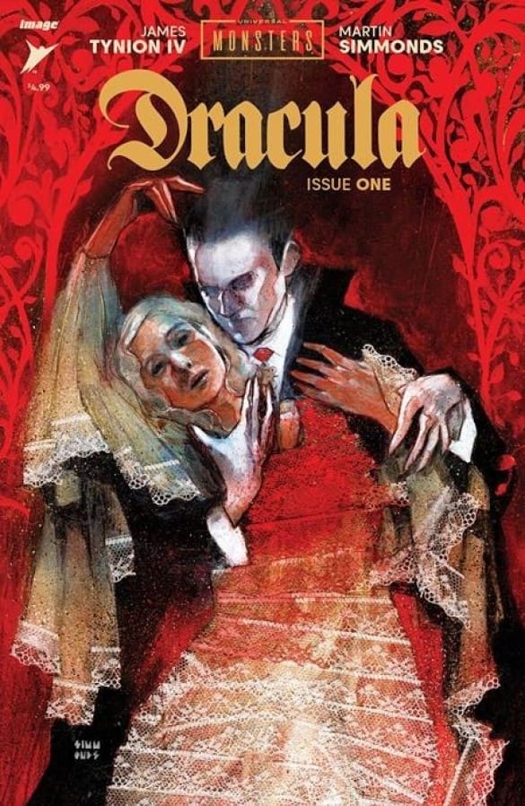
Marty: The art and colors in this comic are truly a visual treat. The soft palette chosen by Simmonds effectively creates an eerie and spooky setting, reminiscent of watching a classic horror movie. The art style itself, with its painted feel, is beautifully executed. Simmonds’ attention to detail and the visual storytelling add layers of spookiness to the comic. The spooky elements blend seamlessly with the narrative.
Matt: the return of universal monsters is upon us in a terrifying way as simmonds paints on a ghastly canvas in issue 1. He does a great job leaving Mr. renfields ever changing appearance to our imaginations and the art has a rustic classic feel that is very much alive
THE STORY OF ALAN SCOTT!
Ken: Simmonds painted style is a great compliment to Tynion’s writing. The depiction of Renfield looks horrific and haunting. This plays into the manic behavior he exhibits. A great example of this is Renfield talking to Seward about how “his blood belongs to his master”. This is followed by an excellent two page full image of Dracula looming.
There are a few full page panels giving Dracula a bigger presence on the opening chapter. Lucy’s interpretation locks in the effect the nefarious monster has on her with a solid blend of coloring. The emotional moments do not stop there as Renfield and Seward meet later in the issue, talking about Renfield’s condition. All rods lead to a powerful closing page which will stay with readers once the issue is put down.
OVERALL GRADES ON UNIVERSAL MONSTERS: DRACULA
Marty: Final Grade: 8 out of 10. Universal Monsters: Dracula Issue 1 captures the essence of classic horror and delivers it in a visually stunning and mysterious package. It’s a must-read for any fan of the Universal Monsters collection and classic horror tales.
Want More Reviews From martystoked? Click HERE
Matt: 5/5 cigars. This issue is the return to classic horror. Building to Dracula’s triumphant return the stage is set in issue 1 in a horrifying and bloody way. To me this is an absolute do not miss comic run helmed by the best in the business.
FOR MORE FROM MATT FROM HOPS GEEK NEWS
Ken: 8 out of 10. The team of Tynion and Simmonds deliver on a classic horror story that throws the spotlight on characters surrounding the monster’s effect moreso than the actual lead himself. Sharp writing and beautifully crafted images make a bold statement of what’s to come. Not everything is peeled back for the audience but there’s enough to make waves and stand out on New Comic Book Day.


