Lobo is the Main Man that everyone either loves or loves to hate. In this issue of Lobo, we get to see both of those types of people. At the Omni Omega+ Entertainment Corp Headquarters, Lobo’s former boss is elbows deep in fanmail. This is apart of the gig, so it’s nothing new to these guys. However, all of this fanmail is about Lobo, and how much the audience adores him. This doesn’t sit well with Mr. Kzzt, who absolutely hates Lobo. However, what is he to do when he’s being pushed into rehiring the Main Man? Well, he chooses to kill him off of course, and makes sure it’ll be on camera.
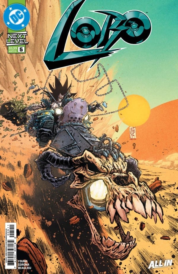
Cover art by Jorge Corona and Jean-Francois Beaulieu. Published by DC Comics
Skottie Young keeps this run exciting and energy as high as Lobo’s ego, and that’s no different in Lobo #5. Lobo fights for his life against all these unhinged killers who are out for his head, and he doesn’t even know why! But in true Lobo form, he will retaliate however he sees fit.
The Art
The artists continue to impress making the artwork as chaotic as Lobo is. The colors are vivid and there’s a lot of contrasting vibrancies that make each page stand out. The details are plentiful with excellent linework that matches the tones of the story extremely well. What I enjoyed the most was seeing the different looks of the alien assassins that Lobo had to go up against. Each one was very unique in their own way and even made Lobo look like a normal guy in comparison. The lettering kept the flow of dialogue even, while capturing the very high energy throughout the comic. All in all, the artists made this a very fun and exciting story to read.
Final Thoughts
Lobo #5 continues the extremely fun comic run that puts the Main Man at the center of the chaos. If you haven’t checked out this run yet, there’s no time like the present! Make sure it’s on your pull list!
Overall Grade – 9.1/10
Let me know in the comments what you thought of Lobo #5!
The year is 2036 and monsters have taken over the world, making us their slaves and establishing a new food chain. The land is now known as the Four Territories, which is oddly divided into five sects. Now that the stage is set, join Eddie & I as we review “Kingdom of Earth #1”!
Writers: David Dastmalchian, Leah Kilpatrick Artist/Colorist: Soo Lee Letterer: Frank Cvetkovic
The Writing
Eda: First things first, I’ll say that I’m really digging the world set up here by Dastmalchian and Kilpatrick, though it’s leaving me with questions. How did we get here? What’s going on? While we’re let known that the monsters have only been on Earth for a few years, that’s really all we get. With only two upcoming issues, I’m hoping that we get some background and answers because I’m finding this world to be highly interesting!
That being said, what is here is absolutely intriguing. The character introductions and twists keep things interesting despite some of the questions that arise for such a short run. Despite my reservations, I’m still more than excited for what awaits in the next issue!
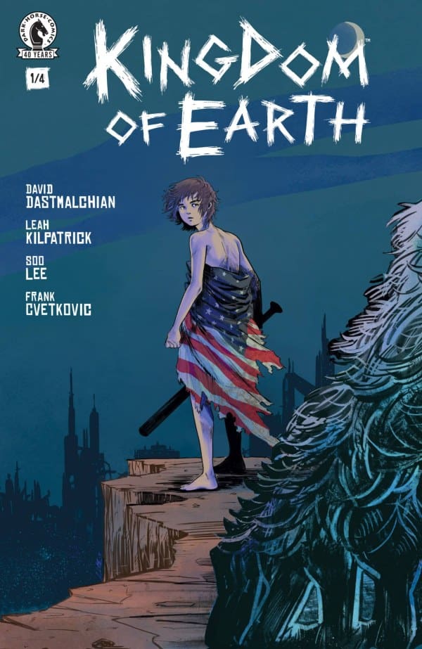
Source: Soo Lee, Dark Horse Comics
Eddie: In the near future, North America has succumbed to demonic forces. Strange and terrifying creatures enslave and treat people like livestock. A young girl escapes their control and is now on the run. It’s a quest for her own survival and maybe even humanity’s future? This is where we begin in “Kingdom of Earth #1” from Dark Horse.
David Dastmalchian and Leah Kilpatrick are introducing us to this dark version of our own world. The environment is equal parts recognizable and terrifying. Their mixture of post-apocalyptic and horror storytelling is reminiscent of classic stories from the 1970’s comics, harkening back to writers like Len Wein, Gerry Conway and Steve Gerber, especially with regard for the villains of the story. We can feel the fear and evil as it exists in this world.
“Kingdom of Earth” has a unique sensibility as well. Without knowing much about our main character, not even a name, we immediately identify with her. She is as lost and scared as we would be. Dastmalchian and Kilpatrick expertly steer and navigate her actions to immerse us in the action.
The Art
Eda: The art here by Soo Lee was honestly absolutely incredible! This being my introduction to her work, I’m more than enticed to check out more of her stuff. In terms of both her drawing style and use of color, she filled this world with so much dread and detail that my eyes stayed glued to every panel.
Through her art, I was able to resonate with our nameless character’s fear while feeling like I was living in this world with her. Artwork and colors do so much to provide extra story to every book and Lee seems to know that on a deep level. Even if the writing wasn’t great, which it is, her art would be more than enough to get me hooked.
Eddie: The artwork and lettering of Soo Lee and Frank Cvetkovic are strong. They paint an absurd but effective portrait for the reader. The detail of the monsters and the impact of the apocalypse on our world become palpable. Their use of lettering and changes in color are subtle but provide clues of where we’re going with this story. The fusion of script and art is a testament to the strength of the comic book medium.
Final Thoughts
Eda: While this opening issue left me with questions I fear won’t be fully answered in such a short series, I overall loved it! Through a mix of the writing and artwork, the main character is easy to relate to and the scares are aplenty. The quadruple threat is crafting something deep and dreadful within these pages and I’m hooked enough to see more!
Eddie: “Kingdom of Earth” has enough familiar elements to make it accessible, but the symphony of writing and art is gorgeous. I can’t wait to see where this story goes and so should you.
Eda’s Grade: 9/10 Eddie’s Grade: 10/10
Overall Grade: 9.5/10
For Eddie’s video review of “Kingdom of Earth”, keep an eye on Nerd Initiative’s YouTube page! Also be sure to check out WretchedHiveComics on Instagram!
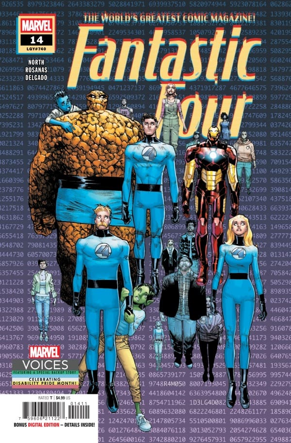
When everyone is enraptured, who will save the day? This is the question Fantastic Four #14 asks. With all of our heroes predisposed, it’s up to the youngest of the family to take the lead. In Fantastic Four #14, Ryan North gives Jo and Nicki a chance to shine. So, sit down, strap in, and hold on for the next Fantastic Four one-shot as the youngest Grimms take the lead! Then stay for a beautiful bonus story Mind and Matter as part of Marvel’s Disability Pride initiative.
This review is brought to you by Nerd Initiative’s Shawn!
Creative Team
-Irrational- Writer: Ryan North Artist: Ramón Rosanas Color Artist: Edgar Delgado Letterer: Joe Caramagna Cover Artist: Humberto Ramos Cover Color Artist: Edgar Delgado
-Disability Pride: Mind and Matter, Part 3- Writer: Marieke Nijkamp Artist: Andrea Di Vito Colorist: Erick Arciniega Letterer: Joe Caramagna
Writing
Irrational: Ryan North may have written the nerdiest Fantastic Four story ever, and I love it. What started as a really serious story turns into a really funny story that you can’t help but laugh at. Everything about the story was enjoyable, and it was so great to see Jo and Nicki get a chance to shine as they did. The synopsis of the story for the solicitation did a beautiful job of hiding the true story of this issue and that made it even better.
Ryan North continues to be on a legendary run with the Fantastic Four series. The last few issues after the Invincible Woman story arc have returned to the fun, silly, and at times scientific one-shots that made Fantastic Four one of Marvel’s signature comics during the Silver Age. It’s also nice to see that even in a story where Jo and Nicki are the main characters, they’re still having to pick up Reed’s mess.
Mind and Matter, Part 3 – In this bonus story, we get a beautiful story from Marieke Nijkamp about the power of seeing people who may have a disability as they are, rather than who you hope they would be. This is a powerful story, especially for parents. The story makes a particularly poignant story about a parent being so focused on something that could “fix” their kid into who they thought their kid would be that they look right past the kid actually standing there in front of them.
Art
Fantastic Four #14 cover by Humberto Ramos and Edgar Delgado. Image from Marvel Comics
Irrational – Ramón Rosanas, Edgar Delgado, and Joe Caramagna served up a really great issue with Fantastic Four #14. The art was fresh and despite having some of our favorite heroes featured in the story, it really gave the creative team a chance to shine a light on the smallest Grimms. Jo and Nicki are drawn delightfully and it was so fun to see their creative “solution” to the problem of the story drawn out in a really unique way.
Delgado does a beautiful job with coloring, bringing the kids’ emotions to life, helping us realize the weight of the problem. Joe Caramagna guides readers perfectly through the story, keeping you on track and helping you flow to the big surprise perfectly.
Mind and Matter, Part 3 – Andrea Di Vito and Erick Arciniega do a beautiful job on this bonus issue crafting characters like the Hobgoblin and Echo. Joe Carmagna gets special mention for this small story for a beautiful job of providing word bubbles for Mya’s signing as she speaks with Clint.
Final Thoughts
Fantastic Four #14 is everything you want in a classic Fantastic Four story. It draws you in and then completely turns you on your head. North and team show that you don’t have to rely on a new arc every 3-5 issues to craft a really satisfying story. Fantastic Four #14 continues a great trend of contained one-shots that are a delight to read. Mind and Matter is so well written that it marks one of the best bonus stories I’ve found in a comic and I can’t wait to read the final part.
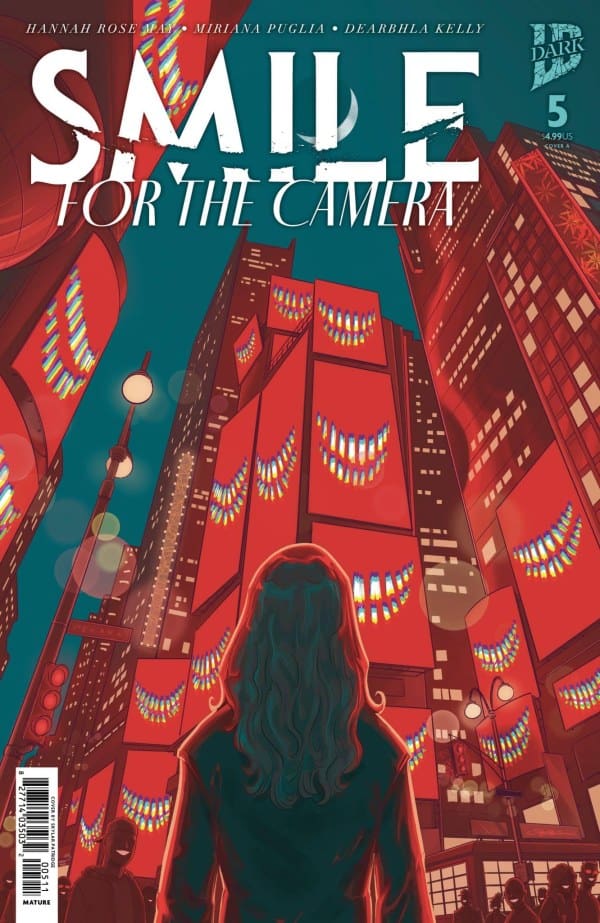
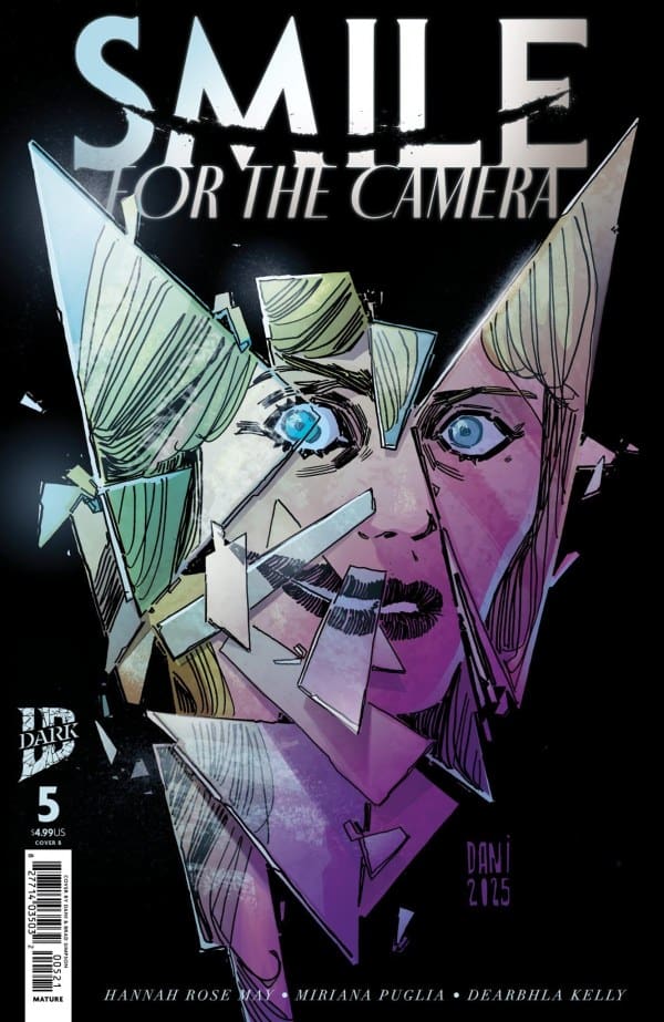
Well, here we are. After as many months, we’re on the fifth and final issue of Hannah Rose May’s fantastic “Smile: For The Camera”! In the previous issue, it inevitably all came down to Ivy after she witnessed the death of another one of her friends. Upon going to reporters, Ivy begins filling the holes with all of the dirt, one by one. Will she make it out alive, or be buried by her demon? Come find out with me as we take a look at “Smile: For The Camera #5”!
Writer: Hannah Rose May Artist: Miriana Puglia Colorist: Dearbhla Kelly
Source: Skylar Patridge, IDW Publishing
The Writing
If it isn’t too much to say, this was arguably a perfect run from start to finish. What Hannah Rose May and crew crafted here was utterly amazing. From the first page to the last, I was absolutely stunned and hooked. All of the messaging about the entertainment industry and what it does to women’s mental health was extremely on point and topical. For that alone and how brilliantly it was written, this is a run that deserves way more recognition.
There wasn’t a single point in any issue where I felt bored or wanting to put the book the down. While Hannah Rose May is deservedly getting praise for “The Exorcism at Buckingham Palace,” she deserves just as much praise for “Smile: For The Camera.” Every issue answers whatever questions raised in the previous, leaving you at some of the most jaw dropping cliffhangers of the year. I can’t sing the praises for this enough and I highly recommend buying the trade paperback when it releases if you haven’t been keeping up!
The Art
Source: Dani, Brad Simpson, IDW Publishing
Just like with Hannah Rose May, I don’t know what to say here that I haven’t already said about the previous issues. Miriana Puglia and Dearbhla Kelly once again both killed it as they always do (just look at “Justice League: Dream Girls” if you need a prime example of Kelly’s work)! Miriana still, this many issues in, makes me question everything I see until the final moments. Which smiles are real and which are the demon at work? Are these moments happening in Ivy’s head or are we seeing things in motion? Only a true artist can consistently make you feel that much tension on every page turn.
As for the colors, Kelly matches the vibes perfectly just like always. She really knows how to bend the use of color to her will, making them a distinct style. Seeing just how many colors she uses and blends together consistently makes me believe I’m looking at the real world. Albeit a somehow more horrifying version of it.
Final Thoughts
From the first page of issue #1 to the final page of issue #5, “Smile: For The Camera” is a horror story for the ages. What Rose May, Puglia and Kelly crafted throughout is simply astonishing and something I’ll never cease to recommend. Brilliance in motion is all I can say and I’m beyond sad that it’s ending. I can’t wait to read more from Hannah Rose May and am super excited to see whatever she has cooking next!
Were you reading “Smile: For The Camera”? Are you also a fan of Hannah Rose May, Miriana Puglia or Dearbhla Kelly? Let’s discuss in the comments below!
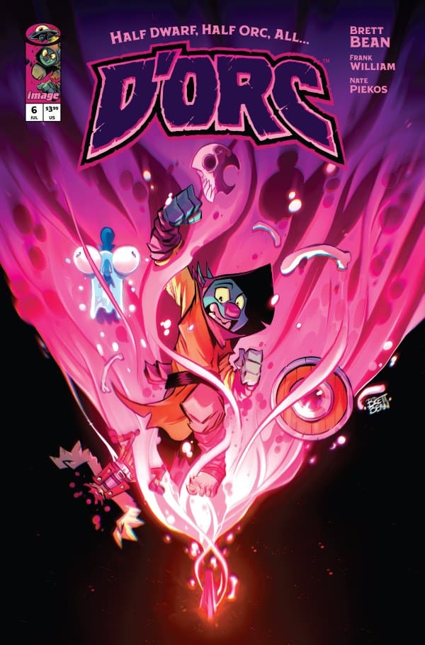
The Bone Witch has trapped D’Orc in a crystal to keep him safe. While inside, Fate takes D’Orc on a highly inappropriate trip in time to see where he came from… whether he wants to see it or not!
The Writing:
Brett Bean cannot be stopped. The writing in this series is consistently incredible. The creativity in this story is unmatched and when a trope is brought in, I don’t see it coming. There is a “twist” in this issue that should have had me rolling my eyes, but instead, I laughed with glee when I read it. At this point, I have run out of positive things to say about Brett Bean’s writing so I’ll just have to start repeating myself. D’Orc is a career defining achievement!
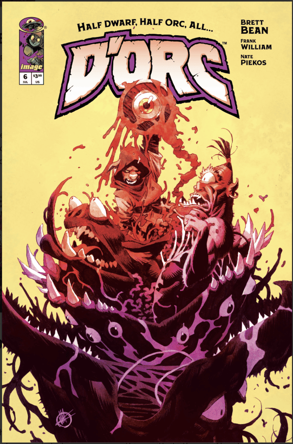
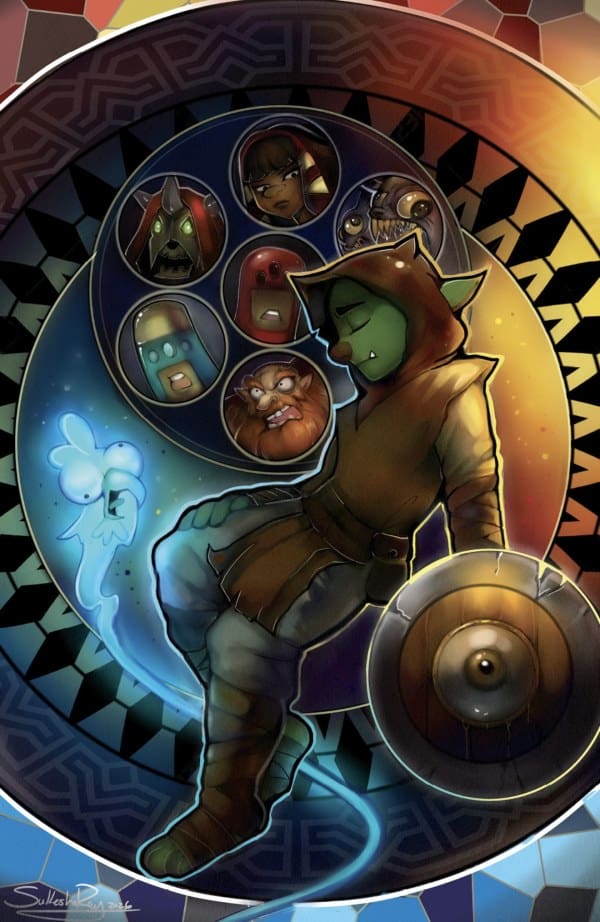
D’Orc #6 – Cover – Sukesha Ray (Credit Image Comics)
The Art:
Just like the writing, Brett Bean’s art is stellar. Add into that Frank William’s color work and you get a masterpiece of chaotic fantasy action and mayhem! Each page is dripping with style and fun, and it’s all such a blast to look at. I’ve never seen gore depicted in such a “fun” way! (Was that a weird statement?) This artwork is just that, fun in every sense of the word.
Overall Grade: 10/10
Chaotic, gory, fantasy perfection! D’Orc has been my book of the month since the first issue and it doesn’t look like that is going to change any time soon. This book shows exactly what you can do with the comic medium!
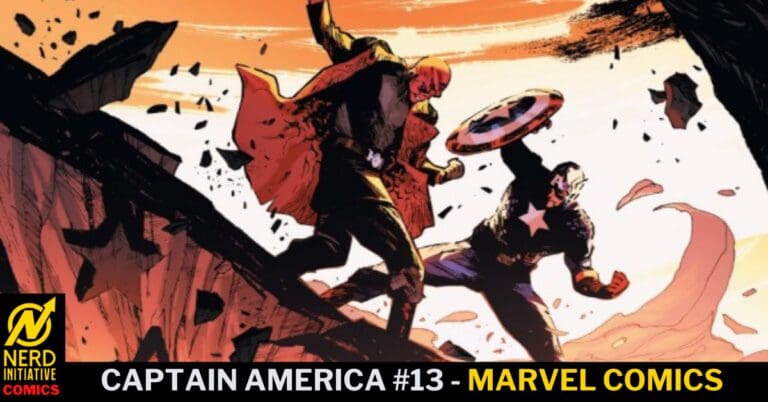
Cap in a coma? With the fall of Doom and the power vacuum in Latveria, Steve Rogers went on a mission to help S.H.I.E.L.D. try to protect the country from Ross. Now, New America, Ross is on a rampage. Now in Captain America #13, Steve Rogers lies in a hospital bed in a coma after protecting a civilian from the wrath of Ross. While his body heals, his spirit and his consciousness travel to Hell. Who should he discover in Hell but none other than the soul of one Victor Von Doom. Now Cap finds himself in a new battle with a surprising teammate as Doom leads an attempted takeover of Hell from Mephisto. Not one to go down without a fight, Mephisto has enlisted Cap’s oldest nemesis, The Red Skull.
This review is brought to you by Nerd Initiative’s Shawn!
Creative Team
Writer: Chip Zdarsky Artist: Ton Lima Color Artist: Romulo Fajardo Jr. Letterer: Joe Caramagna Cover Artist: Valerio Schiti Cover Color Artist: Romulo Fajardo Jr.
Writing
It’s good to see Chip Zdarsky write Spider-Man again. He always did a great job of capturing Peter’s wit and his ability to use humor to defuse situations. On top of that, Captain America #13 does a good job of showing readers that for his long-running feud with Reed Richards, Steve Rogers perhaps makes a more stunning contrast to the will and ruthless drive of Doctor Doom than Richards does. Zdarksy shows us what a real enemy of my enemy moment looks like when Rogers works alongside Doom despite the obvious ideological differences in pursuit of a common enemy in Mephisto.
I really enjoyed the conversation Zdarsky puts down between Doom and Rogers. It’s also nice to see some clear lines in the sand for Victor. Having been a god himself, he has a surprising soft spot for the suffering of souls, even if it is only to ultimately benefit himself. I also really enjoyed how perfectly Zdarsky captures the mannerisms and attitude of the Red Skull. He feels delightfully evil as always, but we get the reminder that even in death, the Red Skull is smug. Zdarsky closes by ratcheting the story up a notch with the craziest cliffhanger of the year so far.
Art
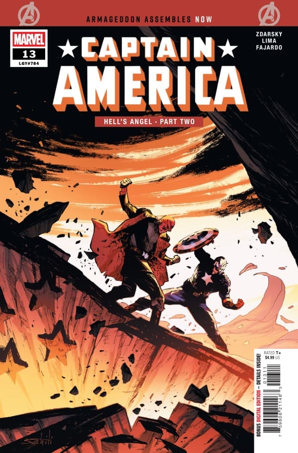
Captain American #13 cover by Valerio Schiti and Romulo Fajardo Jr. Image from Marvel Comics
Ton Lima, Romulo Fajardo Jr., and Joe Caramagna did really good work on this issue. The art is stunning, and Lima becomes one of the few artists to ever get to draw and unmask Victor Von Doom for Marvel comics. Lima’s line work perfectly captures not only the characters, but the hopelessness, pain, and suffering of Mephisto’s Hell. The demons are terrifying and feel ready to devour anything in their path, but the damned souls of the Nazis, ready to serve Red Skull, are perhaps even more terrifying.
Romulo Fajardo Jr., and Joe Caramagna take terrifying art and a great story and bring it to life. The colors are so vivid. Fajardo Jr. doesn’t rely solely on red tones to paint the desperation of Hell. He does it through a variety of beautiful palettes, making even minor demons seem unique. The final cliffhanger at the end of the issue was beautifully colored. Joe Carmagna takes readers carefully through the story, helping your feel the weight of the words and the art.
Final Thoughts
Captain America continues to be one of the best series Marvel comics has going right now. This issue finished on one heck of a cliffhanger and I can’t wait to see what happens from here. Even before the cliffhanger, the artwork and narrative were perfect. Rogers and Doom make such a contrast of service vs brute force, helping vs power and control.
Overall Grade: 10/10
What did you think about this issue of Captain America? Let me know in the comments
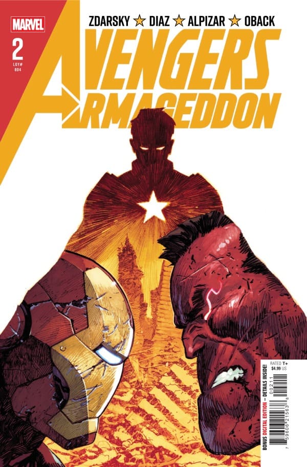
The Red Hulk and his team of Hulks are on a rampage. Fighting to bring democracy to the world by force, Avengers Armageddon #2 sees what happens when the heroes of the world are unwilling to turn a blind eye to Ross’ ideological romp through the world. With new powers, Super Soldier David Colton joins the fight, but will he be able to stop when it’s time to stop?
This review is brought to you by Nerd Initiative’s Megan and Shawn!
Writer: Chip Zdarsky Artists: Delio Diaz and Frank Alpizar Color Artist: Sonia Oback Letterer: Cory Petit Cover Artist: Dike Ruan Cover Color Artist: Moreno DiNisio
Writing
Megan – The fight is on between the Avengers and Thunderbolt Ross! Ross is willing to do whatever it takes to put a stop to them, but the Avengers have a trick up their sleeves in the name of David Colton. Ross isn’t prepared for this unexpected guest, and he has to change up his plans to accommodate. The fight between the Avengers and the Red Hulk doesn’t go exactly how you’d picture because of a wild card of character. Now, things are up in the air, the stakes are higher than ever, and the devastation is growing by the minute.
Avengers Armageddon #2 does an excellent job illustrating the varying emotions that the Avengers feel. Whether it be the frustration, the the guilt, or their confidence running on an all-time low, the reader is able to feel every tone in the story. Chip Zdarsky keeps the energy high throughout the comic, keeping you on the edge of your seat. Zdarsky matched the energy of the first issue, and doubles it with the excitement of the fight. We’re left on a very interesting cliffhanger, and I am excited to see where it goes.
Shawn – This issue had me fighting for air. While I still enjoyed Avengers Armageddon #1, this issue felt more like what the series had been hyped to be from the get-go. I loved getting a glimpse of how powerful Colton has become. Zdarsky is really giving us a look at the real-world impact these battles have. It’s not enough for the heroes to fight Red Hulk. It’s the world reeling from the impact of these battles, the everyday people stuck in a battle between heroes and a newfound villain who thinks useless deaths are just part of the price he will pay to bring his form of democracy to the world.
Zdarksy gives us a glimpse that we got to see a little bit of during the One World Under Doom event, which I truly enjoy seeing, which is our heroes on their toes. The Avengers and even the infamously self-righteous Tony Stark have no real answers for what happens next. I love that we finally get confirmation from Zdarsky what Doom’s Machine was that Ross had been looking for, and that it will continue to play a roll going forward after that cliffhanger at the end.
Art
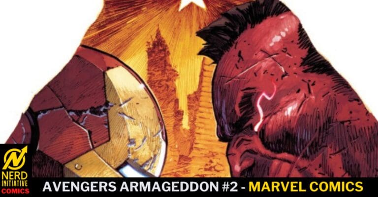
Avengers Armageddon #2 Cover by Dike Ruan and Moreno DiNisio. Image from Marvel Comics
Megan – Delio Diaz, Frank Alpizar, Sonia Oback, and Cory Petit do some really brilliant work in Avengers Armageddon #2. The detailing that goes into the linework is absolutely stunning. With how detailed the panels are, nothing is left ot the imagination and no stone is left unturned. Diaz and Alpizar do a phenomenal job with this and makes each page nothing short of stunning. Oback handles the colors and brings a great juxtaposition of vibrancy and neutral tones. Cory Petit is behind the lettering and nails the emotions of the characters through the dialogue. Together, the artists made this a memorable issue that’s wrapped in gorgeous artwork.
Shawn -Delio Diaz, Frank Alpizar, Sonia Oback, and Cory Petit managed to put in some of the best work we’ve ever seen from any of these creators. The Avengers alone are a tough group to draw. Regardless of the makeup of the Avengers, the entire group is always a hodgepodge of well-known characters with a certain expected aesthetic. Delio Diaz and Frank Alpizar craft versions of these characters that are instantly recognizable while putting their distinct touch on them. In addition to the Avengers, the team of Hulks as well as David Colton provide a new playground for Diaz and Alpizar to craft images with that turn out spectacular.
Sonia Oback brings this world to life through the vivid colors. You feel the impact of the words, the battles, and the actions of our heroes. The vivid coloring makes me hurt when I see characters tangle up and start fighting because, through Oback’s colors, you can almost feel the impact of super powered individuals fighting. Cory Petit does a ridiculously good job of guiding readers through the story and using impactful SFX that bring depth to the action.
Final Thoughts
Megan – 8/10. I’m very interested to see where it goes after Avengers Armageddon #2. Chip Zdarsky leaves us on an interesting note and there’s no telling what’ll happen next.
Shawn – 10/10. This is what I wanted to see in the first issue. Everyone is a loose cannon, and no one knows what will happen next. The heroes are caught flat-footed and don’t even realize the depth of their trouble yet. I can’t wait to see where this creative team goes next.
Overall Grade: 9/10
What do you think will happen next in Avengers: Armageddon? Let me know in the comments
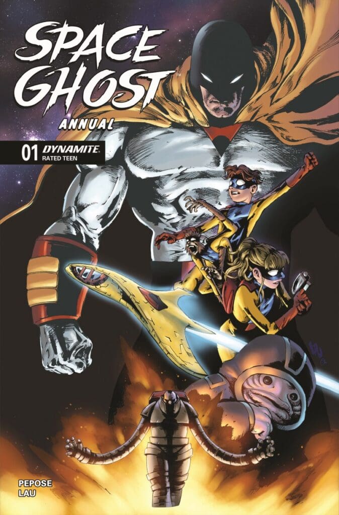
The cosmic vigilante is here in Space Ghost Annual #1. What happens when Dax has to recount his own failures and shortcomings? With the past threatening to repeat itself, Dax struggles. What follows is a story of emotion, sacrifice, and doing the right thing even if it’s hard.
This review is brought to you by Nerd Initiative’s Megan and Shawn!
Creative Team
Writer: David Pepose Artist: Jonathan Lau Colorist: Andrew Dalhouse Letterer: Taylor Esposito Cover Artist: Jonathan Lau
Writing
David Pepose does a beautiful job keeping you on the edge of your seat this entire issue. The Space Ghost Annual issue is surprisingly heartfelt and shows us the delicate side of Dax. Pepose crafts a beautiful narrative that shows the events leading up to where we find the story now and the impact it has had on Dax. Ultimately we see that while Dax truly enjoys the good he’s been able to do as Space Ghost, there are other priorities he has in his life.
Life, finding a way to sometimes kick us in the teeth even when we have the best of intentions, may be the best lesson we can take from this issue. Pepose gives us the same Space Ghost kind of story we have come to love, but adds a little more heart to this one. You can truly feel through Pepose writing and Lau’s art how much Dax truly cares for the twins. While the story is heartfelt, it is not without action and suspense. I felt like Pepose kept me on the edge of my seat, carefully hiding the outcome of the story. The result is a roller coaster of emotions in an issue that promises only greater things to come in the world of Space Ghost.
Art
Space Ghost Annual #1 cover by Jonathan Lau. Image from Dynamite Entertainment.
Jonathan Lau, Andrew Dalhouse, and Taylor Esposito did a superb job with art on this issue. Lau crafts panels that feel like a delightful blend of old school and new school techniques. When even a monkey sidekick feels emotive, you know you’re watching an artist who truly gets the characters they are representing on the pages.
Andrew Dalhouse does a beautiful job with colors, capturing both the darkness of the conversation between Dax and Space Ghost and the bright action of the story flashback. The colors feel like a perfect blend between color and shade. Taylor Esposito does a really good job with lettering. Even in panels where SFX add huge impact to the panel and the story, Esposito finds a way to include the SFX in a meaningful way while still letting the art shine.
Final Thoughts
This was such a great annual issue. If you haven’t picked up Space Ghost before and take a look at this issue, it will be what convinces you to add the stories to your pull list. The story will well done, heartfelt, and features beautiful visuals.
Overall Grade: 9.5/10
How did you like the Annual? Let me know in the comments
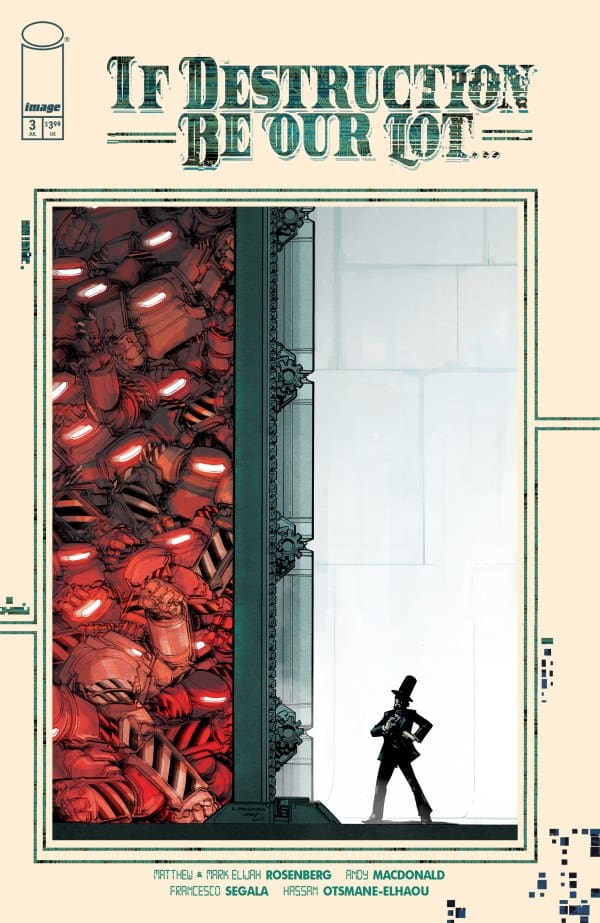
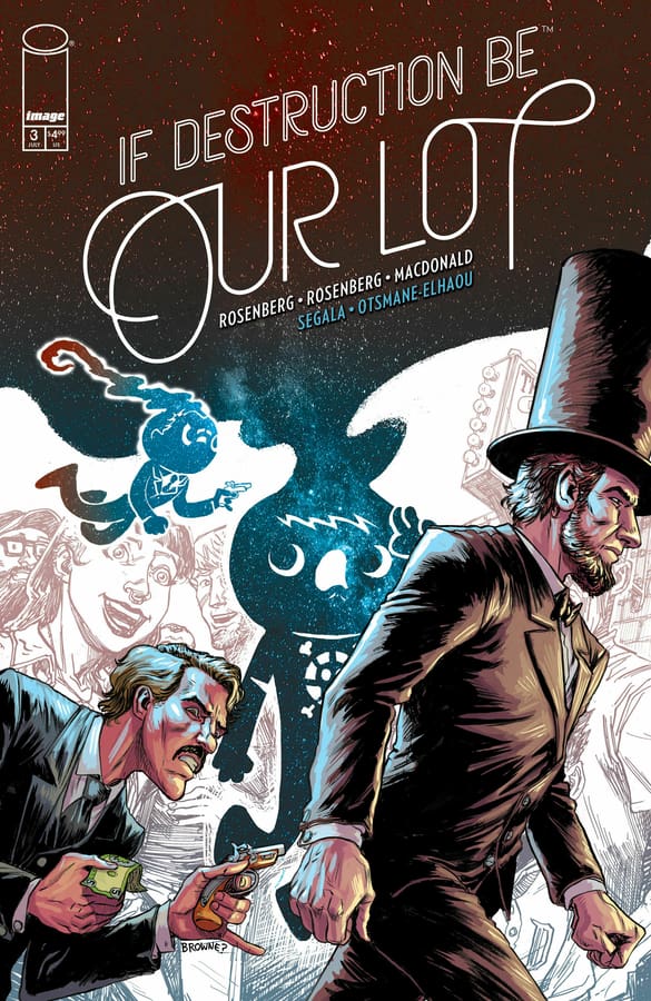
At the end of the excellent previous issue, our heroes Abe and Speed did the unthinkable: ran into possibly the last human alive. Picking up right where we left off, will our heroes escape? Or will the unthinkable happen? Well, find out with me as I review “If Destruction Be Our Lot #3”!
Writers: Matthew & Mark Elijah Rosenberg Artist: Andy MacDonald Colorist: Francesco Segala Letterer: Hassan Otsmane-Elhaou
Source: Andy MacDonald, Francesco Segala, Image Comics, Ashcan Press
The Writing
The Rosenberg brothers continue to prove that they’re excellent at doing the impossible: keeping readers on their toes with a creative & innovative idea issue after issue. With each new entry, we get just a bit more about the rules of this robot society and how they operate. For as different as they think they are, there’s so much about human society and culture still within this world. It truly makes this universe feel alive and lived in but also dark and sinister.
Within each installment, it becomes more and more obvious that humans are meant to be a stand-in for the oppressed with Abe being one just trying to understand. That being said, for as excellent as the writing has been, I really do hope that the next issue starts to give us some answers. Why did the robots rise up and cause an apocalypse? What happens to the bots who get trashed and smelted and why are some just okay with that? There’s so far been a lot of fantastic set-up and world building, but an answer or two would be great as well.
The Art
Source: Ryan Browne, Image Comics, Ashcan Press
What can I say that I haven’t said before? MacDonald and Segala are serious pros at their craft and continue lowing me away! Every detail of the environment feels so purposeful and intricately placed, contributing heavily to the world building. It’s as if the Rosenberg’s handed him a blank slate and said “we’ll form the writing around whatever you draw”.
As for the colors from Segala, be still my beating heart! They continue to really breathe life into this apocalyptic world. The dark greens and blues really help set the moody tone while the lighting is some of the most realistic I’ve seen be put to page. I don’t know how these two do it, but together, they work serious magic.
Final Thoughts
The Rosenberg brothers and crew continue to prove that “If Destruction Be Our Lot” is one of the best books of the year. While I’m left waiting for some answers, I can’t deny that everything overall is still holding strong. A definite must read!
This comic review is brought to you by the dynamic duo of Megan and Shawn
Shawn – I really enjoyed how Justina Ireland handled this story, on top of how she created the narrative for the story. It would be easy to rehash the hero origin story, showing how different things would have been if Jessica Jones had fully taken the Peter Parker route. Instead, Ireland treats us to a delightful alternative history where parts of Jessica Jones story stay pretty much the same, even if her powers are different because of absorbing the radioactive spider bite rather than Peter Parker.
That said, Ireland treats us to little snippets throughout the narrative of how Jones arrived at this point, where, like her regular Jessica Jones counterpart, she learns to live with her powers, even if she sometimes resents them. I loved seeing Ireland shine a bit of the spotlight on Misty Knight as well, who feels like such an underused character in the Marvel Universe. It truly feels like Ireland understood the parts of what makes Jessica Jones such a compelling character and where she should take the “What If?” idea and really run with it.
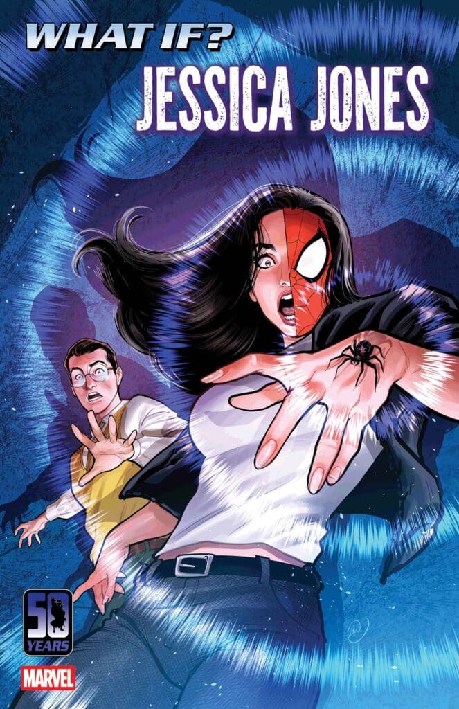
Cover art by Lucas Werneck. Published by Marvel Comics
Megan – Now this is how a What If..? story is done! Justina Ireland dives into the universe where Jessica Jones was the one bitten by a radioactive spider and not Peter Parker. In this story, we see where it started, and then we’re put in the present day where Jessica has moved passed her Spider-Girl persona and has decided being a superhero wasn’t for her. However, when the superhero life calls, you have to answer it.
In What If…? Jessica Jones, we’re met with the classic Jessica that we all know and love, who has her own trauma, her own story, and prefers to be left alone. As Spider-Girl, she has the usual Spider-Man villain, but one in particular that sets out to ruin her life. What I love that Justina Ireland did was make this Spider-Story so tailored to Jessica. Instead of relying on the usual Spider-Man tropes, this was based on Jessica Jones first and foremost. Justina knocked this story out of the park! I’m not even a huge fan of the What If…? comics, but I loved this story from top to bottom.
The Art
Shawn – David Messina, Brian Reber, and Joe Sabino deserve a round of applause. Not only did they provide killer art for this issue, but they did so with variety and style. Messina’s lines capture both the newer style of comics as well as the old school pencil and ink vibe of the throwback sections of the story that provide context for how Jessica got to where she is today. Whether it’s the modern style or the old newsprint style, Messina nails both. Brian Reber does a beautiful job capturing the feel of this being a modern story with vibrant modern colors as well as the more subdued tones from the newsprint era. While the writing and lines are perfect, it is perhaps Reber that deserves the most credit on this issue for his ability to perfectly ensure that you move easily between the modern setting and art style and the older newsprint style through beautiful color choices. Joe Sabino makes the story easy to follow and understand despite the time jumps.
Megan – David Messina, Brian Reber, and Joe Sabino gave so much to the story and in so many different ways. David Messina gives fantastic artwork, excellent detailing work, and multiple styles in the comic. The flashback scenes with Jessica have to be my favorite, as they capture the old school feelings of comics in a beautiful way. Brian Reber brings a gorgeous vibrancy to the pages, that makes each page absolutely stunning. Joe Sabino expertly uses well-timed sound effects that make the experience of reading the story feel even more powerful. Together, the artists made this a stellar comic!
Final Thoughts
Shawn – 10/10. This is the What If comic I was perhaps most looking forward to when they were announced, and it did not disappoint. The story was fun, relevant, and true to the characters while changing around just the right things to make it unique and interesting, including the twists. The art was stunning and truly felt like stepping back in time through a modern lens. This issue will be tough to beat with more What If? still to come.
Megan – 10/10. This is my favorite What If…? story I’ve read all thanks to the creative team. This story had a lot of fun, a lot of emotion, and Jessica Jones was at the heart of it. The creative team was firing on all cylinders when making What If…? Jessica Jones!
Overall Grade – 10/10
Let us know in the comments what you thought of What If…? Jessica Jones #1!