The family from the future is still looking for dad, and wondering what to do with their amnesia riddled half evil aunt. However, a new surprise shows up at their door. A surprise that connects other Ghost Machine stories to the Rocketfellers.
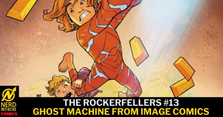
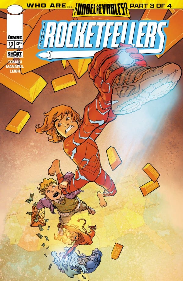
The Rocketfellers #13 Cover. Image from Ghost Machine at Image Comics
The Story for The Rocketfellers #13
The Trillion Dollar Kid #1 kicked off last month and introduced us to Tommy. A rich kid whose parents were tracking people they thought were “unbelievable.” Sadly they disappeared so Tommy decided to track down these unbelievables himself. After getting Hornsby & Halo on his side, they head to Washington to meet The Rocketfellers.
Approaching a family hiding centuries before their own time is easier said than done. Especially when the world’s best guard dog is on duty. As the chaos begins to settle and nerves ease, an unexpected metaphorical wrench is thrown into everyone’s plans. The future seems to be starting way ahead of time.
The Art
We got some fun, crazy, and beautiful art in this issue. From Rose and Zach’s other dimensional attire, to Tommy’s android, to the always full of surprises Rocketfellers, there was not a dull moment with the art. A stand out moment for me was when Richie confronts Zach. He’s full of emotion, as Zach is a bit stunned. It’s a beautiful moment that shows these worlds perfectly colliding.
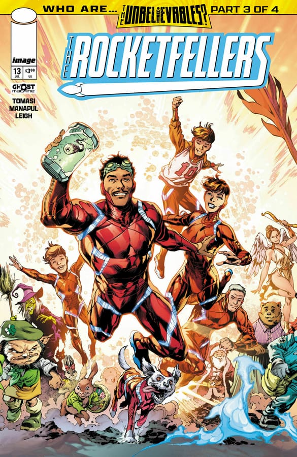
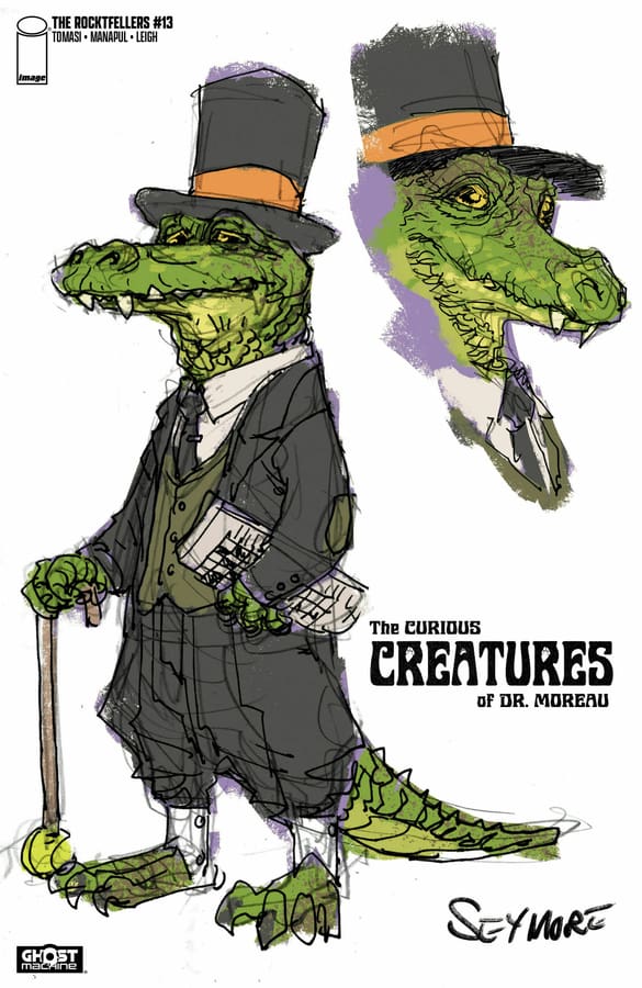
The Rocketfellers #13 Variant Cover. Image from Ghost Machine at Image Comics.
The Rocketfellers #13 Variant Cover. Image from Ghost Machine at Image Comics.
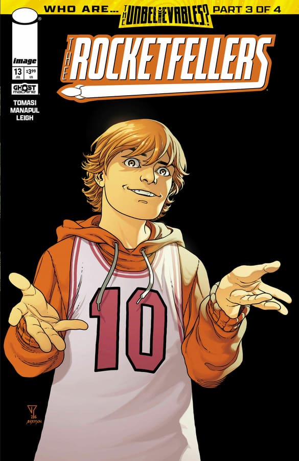
The Rocketfellers #13 Variant Cover. Image from Ghost Machine at Image Comics.
Final Thoughts
We were introduced to the Rocketfellers and Hornsby & Halo at the end of 2024. With the recent addition of the trillion dollar kid, these stories are being taken to another level, and I’m here for it. An innocent meeting between these different Ghost Machine worlds has opened the door for so much more chaos. With multiple parents missing, and these Unbelievables not as hidden as they thought, there is no telling how the future will turn out now. Even for those from the future.
Whether you’ve dipped your toe into this world, or been thrown into it by a demon, now’s a better time than ever to dive into THE ROCKETFELLERS.
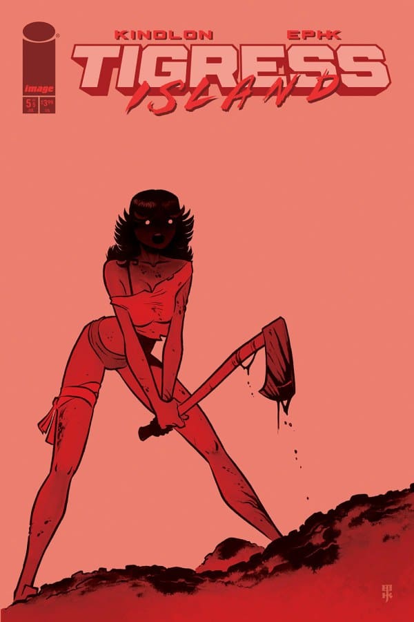
A sex traffic empire goes down in flames in Tigress Island #5 by Patrick Kindlon & EPHK, Image Comics.
TIGRESS ISLAND
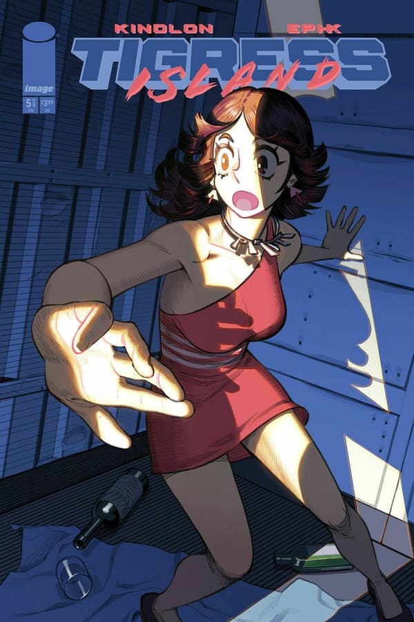
Tigress Island #5 Cover D by NIW, Image Comics
Previously, I had personal concerns about Tigress Island as a story. More specifically about the story that it wanted to tell. So, here’s a quick recap. A bunch of ladies with questionable pasts and questionable decisions, go to Tokyo where they were kidnapped. Followed by trafficked to a private island, where women are used as sex slaves. When I say women, I’m not talking about a handful of women, or a dozen of women. No, I am talking about hundreds of women. Maybe enough to fill an entire town. From all over the world from all walks of life from all races, religions, and ethnic backgrounds. Being kept against their will on a private island so they could be exploited. Presumed to be mostly men. Men with power and resources. Basically, the kind of people that have a tight hand on the leverages of society. CEOs, politicians, business moguls, you know the deal.
SORINAH THE PROVOST
Another important character that we met in this series who plays a giant role in the story is Sorinah. The provost of the island and the first in command of this criminal enterprise. This is the lady that is in charge of the custody of all these women that are being held on this island against their will. I wouldn’t call her a madam or a pimp. Because those words don’t necessarily cover her entire role. Not only is she in charge of the health and welfare of the kidnapped women residing on the island. But she’s also responsible for the maintenance, or the upkeep of the specific aesthetics of these victims. So, they could be up to standard to suffice the needs of the patrons of this establishment.
*SPOILERS FOR ISSUE #5*
SOLICITATION:
“The girls are loose on the island, but there’s an army on their tail. They’ve faced dangers up to now, but the stakes are about to go up in tragic and irreversible ways!”
Preview of Tigress Island #5, Image Comics
LACKSUTER END
There’s not much to tell about the conclusion of this saga. As the ladies continue their march to freedom, many more of them meet a tragic end. The sponsors and owners of the island are presumably killed by one of their victims. So there’s some poetic justice in that I guess. But overall, it’s mostly an 80’s action movie type of ending. Very uninspired if you ask me. The one personal concern I have about this story started to come about halfway through the series.
FALLING SHORT
My concern was mostly about its messaging. More specifically, about the lack of a message from this story. I have said this in a previous review, but in a time like this when there is a huge shining light over The Epstein Island, the files and that entire criminal enterprise, Tigress Island. Yet has nothing to say. The creators of this series were so close to making a statement about a one-to-one parallel that we have in the real world. But they actively went out of their way to avoid being political or to avoid sharing a perspective. If you’ve been following the news, there’s been a lot of hearings, testimonies and coverage speculating on this case. But we are still in the stages of speculating on justice as one of the outcomes still in 2026.
NO JUSTICE
That maybe, the patrons, facilitators, enablers and the active participants of the Epstein Criminal Enterprise face some kind of justice. Speculating is all we got because as of today, nobody has been arrested. Nobody has been charged with anything. Tigress Island went out of the way to do a story about women getting kidnapped and going to a private island to be trafficked and sexually abused and held from society from civilization from friends and family against their will. And the main antagonist of the story that got a name and some real estate in the pages of this book was another woman. All the patrons, even the owner of the island who gets shouted out constantly is just another nameless faceless man.
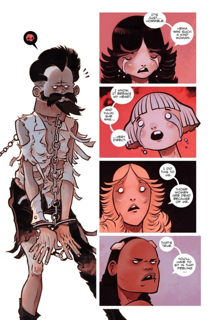
Tigress Island #5 by Patrick Kindlon & EPHK, Image Comics
IT SHOULD MATTER
I found myself asking why? Why was that the choice here? Why was the decision to have this parallel one-to-one story to real life and also keep the patrons of this kind of crime anonymous. I think it matters in real life, and it should in fiction how we tell these stories.
How about the art?
If you’re a fan of overly sexualized and cartoonish female body figures, then this is definitely up your alley. I’m a straight male. I have nothing against sexualized characters. I think it can be done tastefully or justified. Depending on the execution and application to a story. I’m not against comic books being sexy every now and then. But your mileage may vary.
Overall Grade: 4.5/10
Final thoughts
I understand that this review might be out of character for myself. I typically do not share overly negative thoughts when he comes to the media I like to consume. Because art is about perspective and the required knowledge to understand or interpret said art. Obviously, it’s not lost on me that I am judging this series by what it could have been versus what it is. Yet, I’m okay with the way I have passed judgment. Because this was a funny and sexy throwback to a foregone era; when action sequences, and explosions were the point. But that era of pointless entertainment is gone. And this was a wasted opportunity.
Welcome to Three Worlds/Three Moons, better known as (3W/3M). With Foundations #1, 3W/3M moves from its online world to the comic world. Foundations #1 serves as the introduction to the creator-owned sci-fi fantasy concept from Jonathan Hickman, Nick Spencer, Mike Del Mundo, and Mike Huddleston. With Jerome Opeña and Matt Hollingworth, as well as Rus Wooten, joining for Foundations. Set in a distant interconnected solar system, as the name suggests, the story features three distinct habitable planets and three distinct moons. Join in Foundations as we enter the world of 3W/3M and meet Tajo Vallar
This review is brought to you by Nerd Initiative’s Shawn!
Creative Team
Writers: Jonathan Hickman and Nick Spencer Artists: Mike Huddleston, Mike del Mundo, and Jerome Opeña Color Artist: Matt Hollingworth Letterer: Rus Wooton
Writing
Jonathan Hickman and Nick Spencer really did a great job. It’s such a treat for Dark Horse to bring the world of 3W/3M to print for everyone to enjoy. This story, while serving as the introduction to the world, has all the hallmarks of a Hickman story you come to expect as a comic fan. Foundations #1 does a beautiful job building out the beginnings of not only the story but the setting.
While the setting is obviously sci-fi, there is a psychological thriller aspect that Hickman and Spencer bring to the story. There’s a really beautiful section of this story that occurs across a few panels with Syg and Tajo where there’s a conversation about wants. The conversation moves to how those wants were in the past, and Death has had her way with the past already. It’s a really beautiful look at how we often must look forward rather than remain in the past. The story beautifully shows the collaborative and experimental nature of what 3W/3M is and what it contains the promise to be.
Art
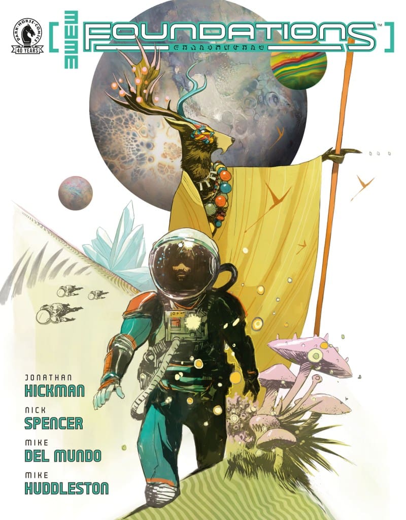
Three Worlds/Three Moons: Foundations #1 cover by Mike Huddleston. Image from Dark Horse Comics
Where do I even begin? As great as the story for Foundations #1 is, the art from Mike Huddleston, Mike del Mundo, Jerome Opeña, and Matt Hollingworth is worth the cost of this issue alone. Foundations #1 shows an absolutely beautiful universe. Huddleston, del Mundo, Opeña, and Hollingworth craft a world that is vibrant, unique, and stunning.
The line work on this issue is absolutely stunning. Unique shapes and lines are creating the bold and interesting flora and fauna of the world. The colors are pleasing to the eyes. It is the colors of this issue that brings the world so much vibrancy and “lived in” feeling despite such a new and unique space setting.
Final Thoughts
Everything is stunning. The art, the writing, the colors: all of it is absolutely perfect. 3W/3M will continue to grow by releasing previously hidden online content for the world to see. This setting, these stories only grow from here and I can’t wait to see what the creative world of 3W/3M do with it.
Overall Grade: 10 /10
Did Foundations #1 draw you into the new world of 3W/3M ? Let me know in the comments
Tabby’s quiet retreat to her grandmothers continues to take a horrifying turn as her grandmother begins to act out all the while something lurks in the basement waiting. She may need to reach into the life that she left behind if she hopes to make it out alive.
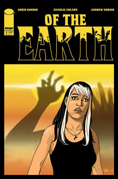
Of The Earth #3. Credit Image Comics. Cover by Charlie Adlard.
Creative Team: Chris Condon, Charlie Adlard, and Andrew
The Story:
This issue feels like a true horror and has kicked things into next gear and it all begins with a creepy grandmother. Condon and Ehrich use Tabby’s grandmother to their advantage as the last couple of issues we have been expecting her to act out or come into play. This issue she finally does and it helps build the suspense within this story. Not only that but, we begin to find out breadcrumbs about Tabby’s life on the run as they offer a peak inside of a box leaving our imaginations to run wild. It truly feels the narrative and mood the duo have created that our minds now over analyze every interaction and every detail putting us on edge.
The Art:
Charlie manages to flip the switch on the artwork detail with her grandmother accompanying the edge of our seat feeling. There isn’t a lot of action or blood however, the way her face twists and portrays this sense of hatred was done well. We still do not know what this creature is however, there is a better look as Charlie is able to create almost a void in the panels featuring the creature. The lack of color and detail again play into our imaginations allowing it to run wild and aiding in that sense of anticipation behind every page turn.
Final Thoughts:
Of The Earth #3 begins to prey on our built up anticipation and fears as we’re offered a glimpse as to what is stalking Tabby. The team continues to do a wonderful job at crafting the horror atmosphere building the suspense and giving us just enough with each issue.
The Rogues have come to take out Grodd leaving Wally caught between two friends. Can he convince them that Grodd is not the enemy while they fight to liberate the town from Grodd’s father’s control?
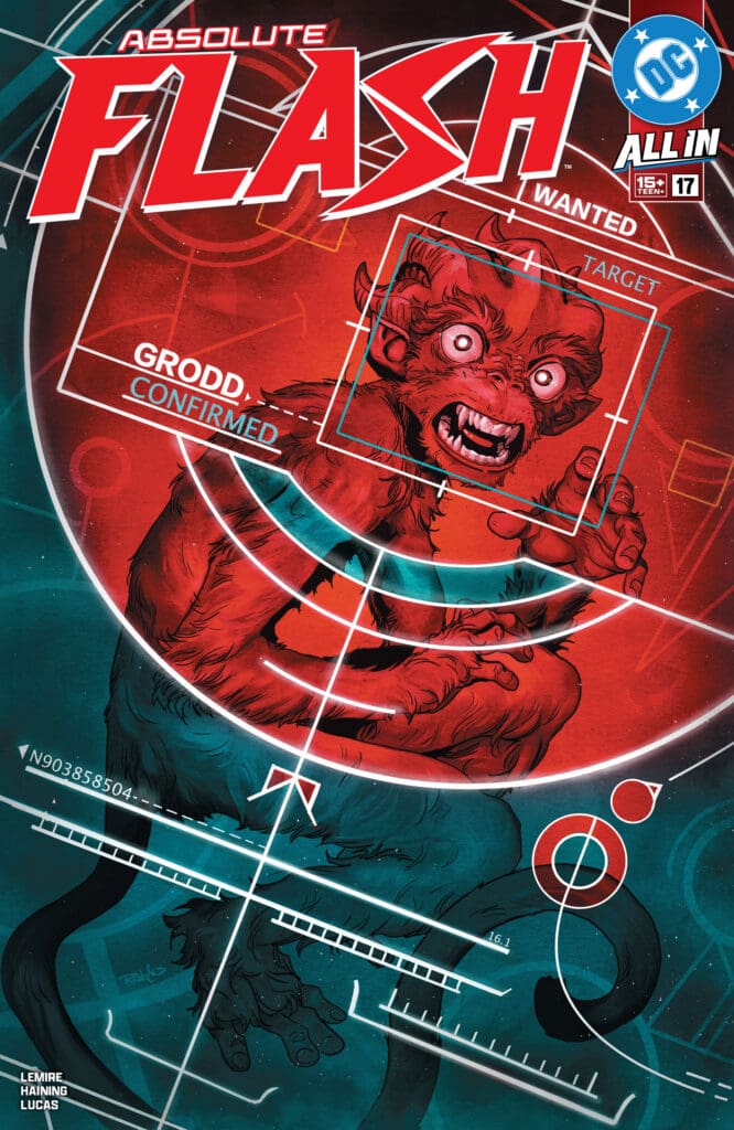
Absolute Flash #17. Credit DC Comics. Cover by Nick Robles.
Creative Team: Jeff Lemire, Haining, Adriano Lucas, Tom Napolitano, and Nick Robles.
The Story:
Trickster may as well be public enemy number one after this issue and Lemire has brought depth to a character in the Rogues gallery that has never been a focal point in this way. This issue is heartbreaking and emotional as Wally and Grodd’s relationship is left hanging in the balance due to the Rogues involvement.
As far as setting up the villains and the future conflicts Jeff has done a great job at giving personal reasons as to why The Flash and these characters would begin to come to blows. It’s giving us a reason to care rather than having the Rogues simply being agents of chaos to a degree. There is still plenty of humor within this issue and we see how smitten Linda has become with Wally. Everyone insists on calling Grodd a monkey and the running joke has become correcting them which seems so trivial but, still that humor aspect works for me. The longer this run goes on the more in love I become with it and it’s a run that continues to get stronger and gain legs.
The Art:
I love how Haining and Lucas style Wally’s new found abilities. There are some new tricks that get shown off such as a ground pound attack where Wally punches the ground sends bolts, incapacitating anyone nearby. The way Haining sizes and details this scene mixed with Lucas’s colorwork make it feel like a big moment. There are more subtle details such as the softness to Linda’s face and the way her eyes show how she is falling more and more for Wally that tell so much through the artwork. When the art is able to tell as much of the story and when the team takes chances to extend moments beyond one panel, these things work extremely well and make the issue feel more alive.
Final Thoughts:
Absolute Flash #17 begins to draw lines amongst Wally and certain characters and setting up for future conflicts. His search for Thawne makes headway but at what cost exactly? The more this run goes the more I fall in love with it and see all of the possible future storylines being laid out without sacrificing the current moments.
Welcome to Rock Bottom, New York City! The site of rough living and traditional ninja training. Follow along as The Last Ronin (Michelangelo) attempts to train a hard-headed Casey Marie. While also answering the question of when are traditional training methods outdated and needing changed?
Welcome to another chapter of the infamous The Last Ronin series! This iconic new arc of the Teenage Mutant Ninja Turtle (TMNT) universe brings a fresh new take on a futuristic plot resulting in the survival of only one ninja turtle. If you have not read The Last Ronin or The Last Ronin II – Re-Evolution, you will want to check those titles out to get a better understanding of this new “one shot” story.
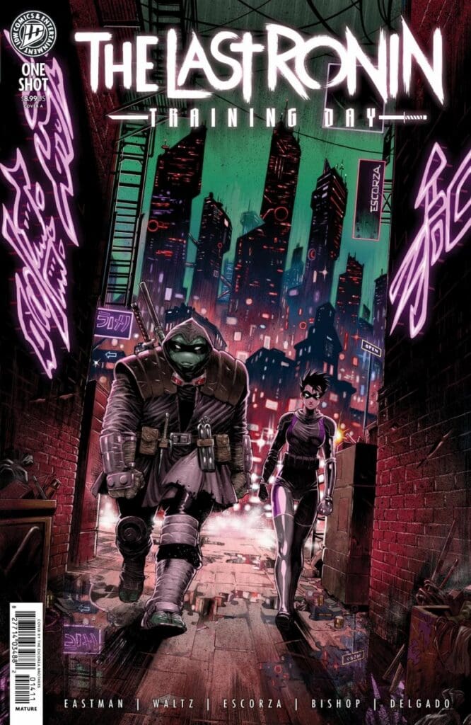
Teenage Mutant Ninja Turtles: The Last Ronin – Training Day #1, Credit IDW Publishing. Cover by the Escorza Brothers
Training Day takes readers on a dynamic story about Casey Marie Jones. She is the daughter of the iconic April O’Neal and Casey Jones from the original TMNT story arc. Within this story you will witness two different versions of Casey Marie. This issue starts off with Casey Marie being a rough nose sensei to a new group of mutant turtles wanting to take over the mantle of TMNT. The bulk of this story is centered around Casey Marie’s training years earlier with her over-bearing sensei, Michelangelo.
Flashing back to the training days of Casey Marie gives readers and TMNT fans a blast from the past to the original training of the turtles by Master Splinter. Now that Michelangelo is the sole survivor of the ninja family he feels it is his obligation to share his knowledge of ninja training with Casey Marie. Training her is proving to be a challenge that Michelangelo is not prepared to deal with.
There is some comedic relief within this story that takes down the intensity of it. The comedy comes in the form of Michelangelo’s brother’s spirits. Once they present themselves, they start to poke and pry at him. Making digs and sarcastic comments about his training regiments. Once Mikey gets overly irritated and snaps at their spirits, his father’s (Master Splinter) spirit arrives to give his fatherly advice for the situation. Which turns the comedy into a very somber heartfelt tone.
After the conversation with Master Splinter, Mikey changes his way of training. Stepping down a less traditional road with Casey Marie. This new path resonates with Casey Marie to the extent that her attitude towards ninja training changes and she becomes a much better student. Within this learning curve Mikey and Casey Marie embark on a spontaneous mission that was not part of the training plan. Will Casey Marie become the student that Mikey will be proud of? Or will she remain like her father, stubborn and hardheaded? You’re going to have to read this issue to find out!
The Writing
Kevin Eastman and Tom Waltz provide fans of The Last Ronin a fresh new story and dynamic of Mikey and a pupil. This is a great story of teacher and apprentice. Some of the context clues within this story make some connections to Star Wars. One of the connections is the use of Master Splinter’s Ninja Journal. This gives the feel of training with the ancient Jedi texts. This story provides deep dialogue and narration giving the reader an in-depth view of the relationship and struggles between sensei and student. This is a very entertaining story, one that should be added to your Last Ronin collection.
The Artwork
The artwork by Ben Bishop, Escorza Brothers, Freddie E. Williams II and Luis Antonio Delgado is absolutely beautiful! The pencil work is done in a way that brings TMNT lore into the present day. Crisp lines added with amazing coloration provide an impactful issue. This team does an amazing job of giving emotional details to a turtle face that one might not think possible. The spirits are a beautiful shade of blue giving them a ghostly feel as they should. This issue is a great visual piece to look at!
Variant Covers
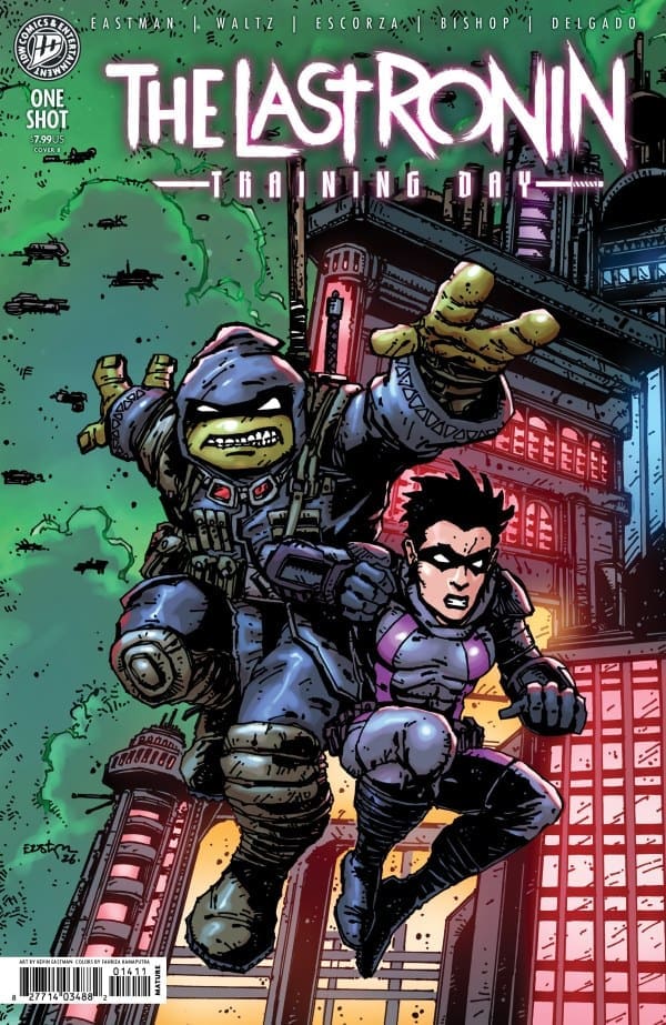
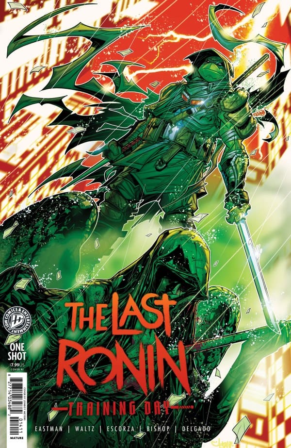
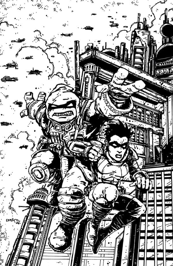
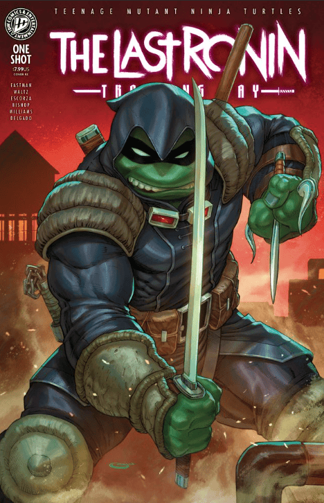
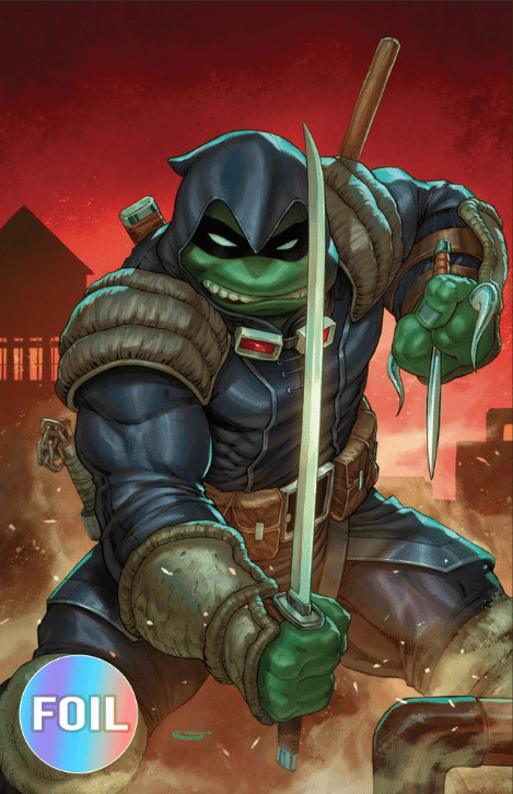
Kevin Eastman Variant
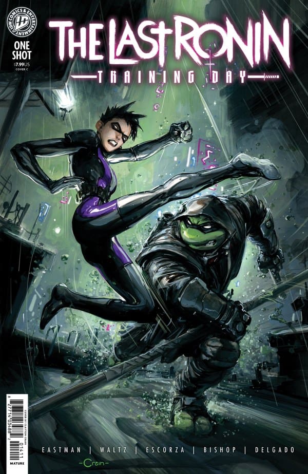
Clayton Crain Variant
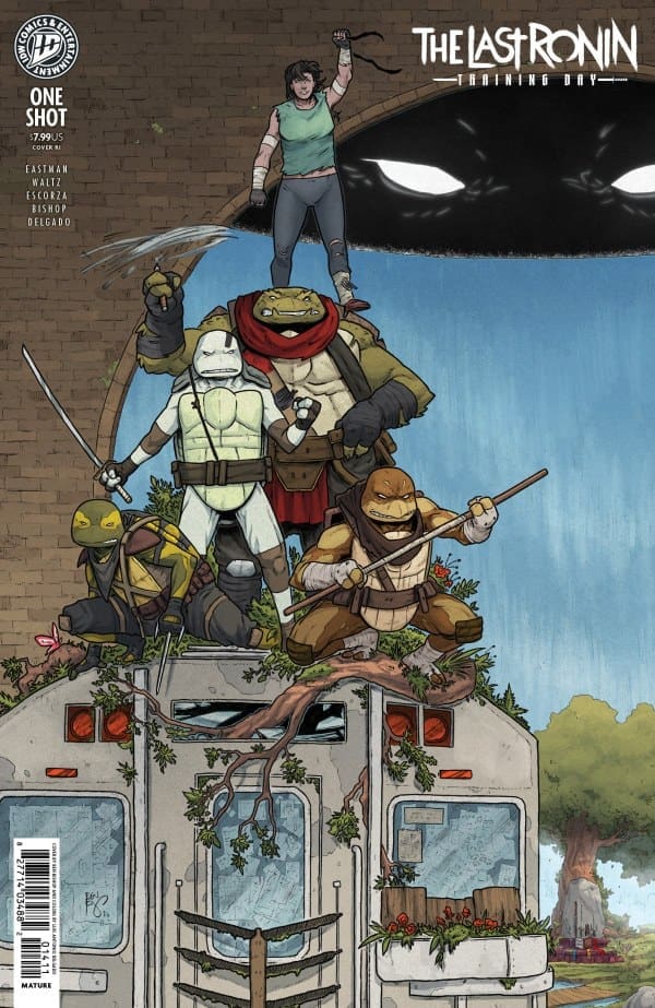
Ben Bishop Variant 1:15
Jonboy Meyers Variant 1:25
Kevin Eastman – Black & White Virgin Variant 1:50
Sajad Shah – PCB Hobby Exclusive Variant
Sajad Shah – PCB Hobby Exclusive Virgin Variant
Final Thoughts
The Last Ronin story arc is one of the best refreshes to TMNT. This issue adds to that lore in a monumental fashion. Fantastic character development between both star characters really brings meaning to the story, as well as adding much more potential to stories to come. Training Day increases the plot line for this arc, opening the door to so much more within The Last Ronin arc. TMNT fans will not regret purchasing this issue for their collection. You will not want to miss this meaningful story!
Read the review of the last issue in this series HERE!
The Story:
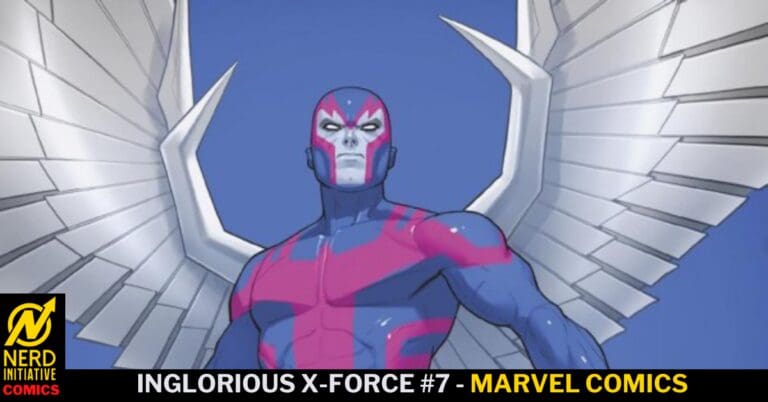
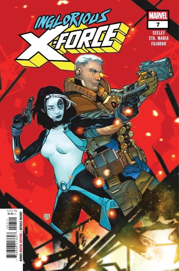
While X-Force tries to get the information they need from the MLF, the team is visited by Cyclops and Quintin Quire. Meanwhile, Domino is on the run for a group of angry humans while trying to remember who she is and where she is supposed to be heading.
The Writing:
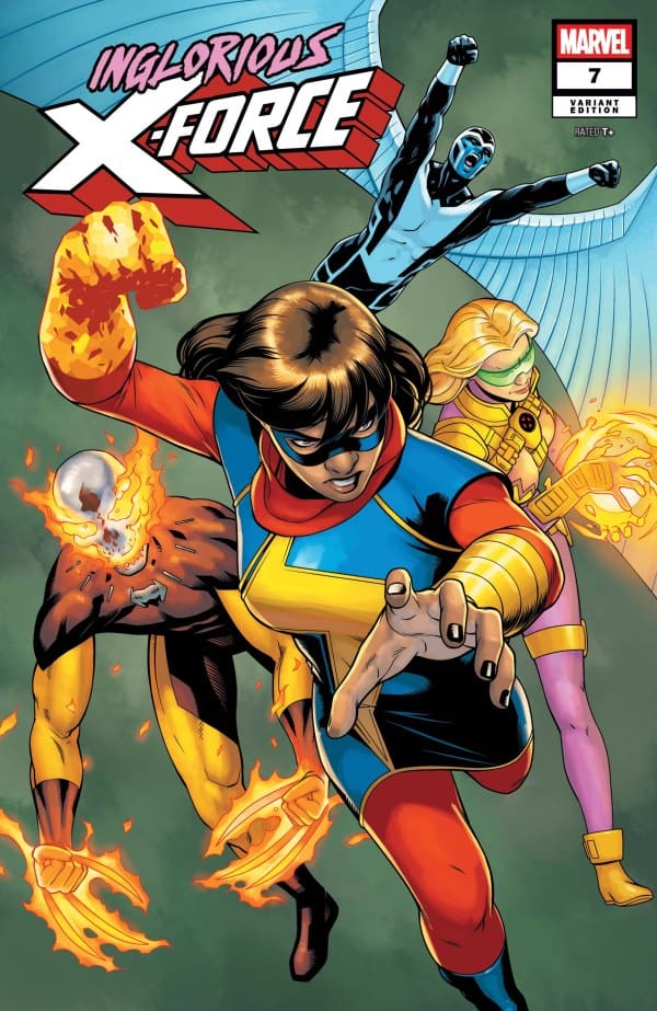
Tim Seeley continues to show a perfect understanding of how to write multiple storylines in one book. The transitions between Domino, Cable, and Ms. Marvel are wonderful and perfectly paced. On top of the expert movement between storylines, the conflict among the team and the quiet conflict between Cable and Cyclops keep the tensions running high. The highlight of this series is the interpersonal relationships and the conflict in this group of dangerous people.
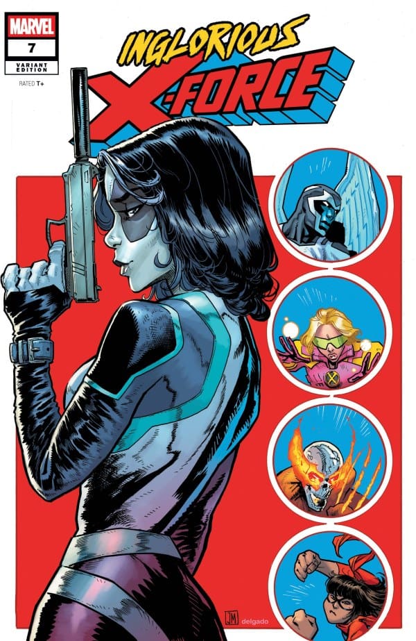
This art team continues to push the story forward with wonderful line work, colors, and layouts. Each member of this team understands the assignment, put out a book that showcases the emotion and powers of this team of X-Force. There are not a lot of powers on display in this issue but when they show up they look incredible. The standout work here has to be the wonderful display of Domino’s powers. That is not something that is easy to put on paper and it’s handled perfectly in this issue.
Overall Grade: 9.5/10
This series has been excellent from the start. Each issue builds on the mystery and deepens the dynamic between the team. The writing and art meld together to create a deep narrative, full of excitement and intrigue.
Eddie’s dad has kicked him out of the house and out of the town of Pluto, but there’s not much Eddie can actually do to get out. The closest bus station is 45 minutes away and Eddie doesn’t have a car. So, he’s stuck in the streets until he comes up with a plan. Unfortunately, with him actively being hunted down, this puts him at greater risk and an even bigger target on his back.
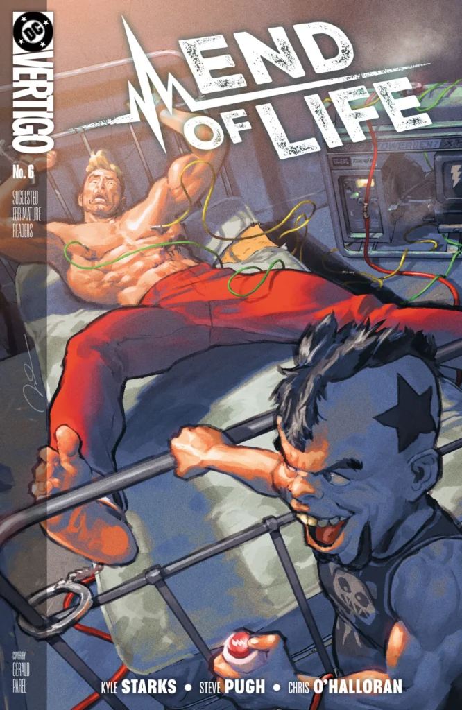
Cover art by Gerald Parel. Published by DC Comics
Meanwhile, Eddie is causing more of a problem than he realizes. Back at the Menagerie, word is getting around just how much of an impact Eddie is having, causing a domino effect of problems. If the Menagerie was ever going to give Eddie any grace, that chance is long gone.
The story of Eddie Stallion keeps getting more exciting as the run continues. End of Life #6 is definitely the most comedic issue that’s come out yet, and it’s handled brilliantly by Kyle Starks.
The Art
Steve Pugh, Chris O’Halloran, and Becca Carey continue to knock this run straight out of the park. What stands out the most to me in this issue are the facial expressions. Steve Pugh makes each character practically tell the story themselves with their expressive faces and demeanor. Chris O’Halloran handles the colors and makes each page absolutely stunning with the use a vibrancy juxtaposing the more neutral colors. Becca Carey captures the varying emotions of the story through the dialogue, giving the pacing a great flow. Together, the artists continue to impress with End of Life.
Final Thoughts
End of Life is a comic book run that everyone should check out! It has action, adventure, comedy, depth, really anything you would want in a comic book.
Overall Grade – 9/10
Let me know in the comments what you thought of End of Life #6!
This review was written by Megan from the Vigilante Vibes Podcast. If you liked my review, be sure to check out my other reviews! Let me know what you think of End of Life #6, or tell me what comics you’d recommend me trying out! Find me on my socials, and check out my Marvel podcast, Vigilante Vibes, by clicking here!
The Infernal Hulk is in the process of putting his big plan into action as he marches the Fallen Army on to his next place to conquer. Meanwhile, the Avengers think they have figured out what they need to take down The Infernal Hulk completely, and sends Carol Danvers deep into space on a mission that Tony Stark calls “the only one that matters”. Everyone is scrambling to do whatever they can, all the while Bruce Banner has a mission of his own. Banner seeks out the help of Doctor Voodoo for help as this is far out of his realm of expertise. Instead of relying on science, Bruce will have to use magic to put his plan into action.
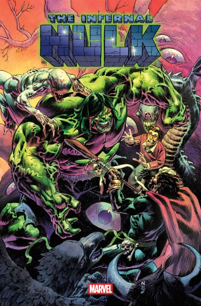
Cover art by Nic Klein. Published by Marvel Comics
The Infernal Hulk #9 does an excellent job showing just how high the stakes are to each character. The Avengers are willing to send Carol off when they know they’re the most vulnerable, as Eldest is on the way to even more chaos. The Infernal Hulk has the Fallen Army in action, and taking out innocent civilians along the way. Bruce has a plan and will make it happen any means necessary, even if that means betraying those who have come to his aid. Each character puts their varying desperation on full display, and you can cut the tension with a knife.
The Art
Adam Gorham, Matthew Wilson, and Joe Caramagna put some fantastic work into The Infernal Hulk #9 that perfectly brings the writing to life. Gorham’s linework is spectacular, especially when it gives every detail to push the mystic energy of the Soul Cage. Matthew Wilson has knocked every issue of this run out of the park with the phenomenal vibrancy. However, in the ninth issue, there’s a great contrast of vibrancy and muted tones that really set the emotions of the settings. Joe Caramagna captures each tone of the story excellently in the dialogue. Whether it’s Banner’s desperation, Doctor Voodoo’s even tone, or Samanguru’s heightened emotions, each one is felt by the reader perfectly.
Final Thoughts
At this point, I know I sound like a broken record, but I can’t help it! This run just keeps getting better and better! Phillip Kennedy Johnson has written a story that captures you and doesn’t let go. The stakes get higher and higher, as does the excitement. If you haven’t checked out The Infernal Hulk yet, there’s no time like the present!
Overall Grade – 9.4/10
Let me know in the comments what you thought of The Infernal Hulk #9!
This review was written by Megan from the Vigilante Vibes Podcast! If you liked my review, be sure to check out my other reviews! Let me know what you think of The Infernal Hulk #9, or tell me what comics you’d recommend me trying out! Find me on my socials, and check out my Marvel podcast, Vigilante Vibes, by clicking here!
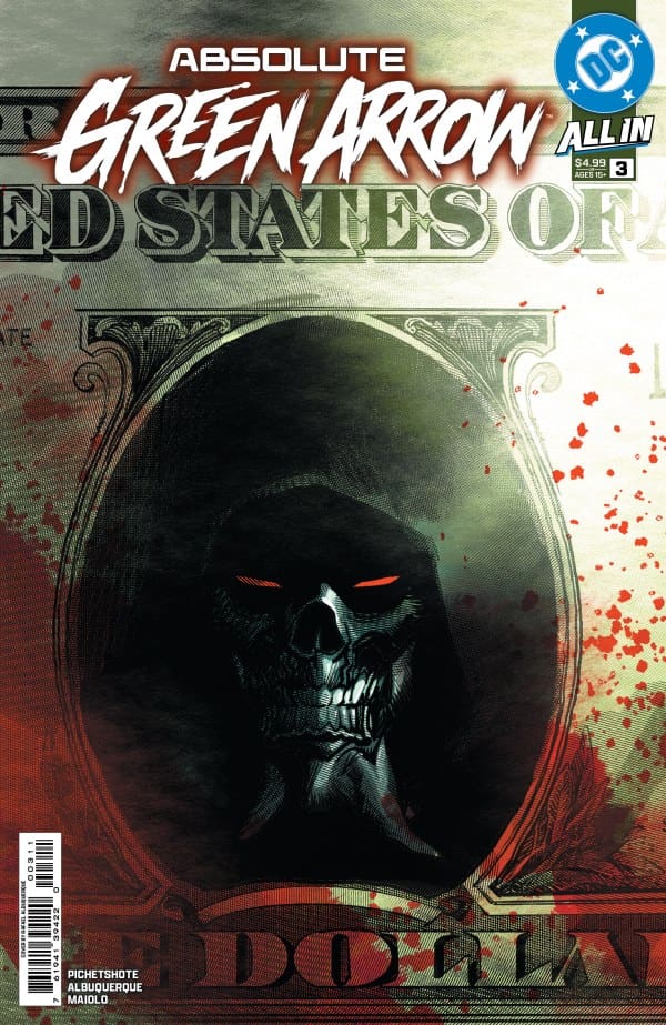
Things take an interesting turn with the mysterious hooded killer as he is only going after certain targets leaving Canary more confused than ever. Her investigation brings her to a strung out Roy Harper who has been busy burying his skeletons as he brings Dinah down the rabbit hole of conspiracies brought to life.
This review is brought to you by Nerd Initiative’s Megan and Matt!
Creative Team:
Pornsak Pichetshote, Rafael Albuquerque, Marcelo Maiolo, and Jeff Powell.
Writing
Matt: Pornsak is continuously finding ways to combine both new backgrounds for these characters that are melted together with lore that is steeped in history and importance from where they come from. This issue focuses on Roy Harper who in various iterations is known to have struggled with drugs and gone by Red Arrow which Pornsak pays respects to with this issue. Meanwhile, I love a good conspiracy theory and ones that are proven true such as in this issue grab my attention like no other. Roy has secrets to hide and Pornsak makes him a grey character who has history with Ollie and a troubled past. Not everything is clear cut which this story is showcasing to us.
Absolute Green Arrow #3. Credit DC Comics. Cover by Rafael Albuquerque.
Meanwhile, we have been introduced to a killer for the past two issues and this issue finally breaks the mold and makes us question ourselves a bit. Since this run is also steeped in realism with the modern world, our mysterious Longbow Killer seems to have an agenda and has begun to save innocent lives. Again, the way Pornsak is able to twist and turn and bring out character flaws is so well executed in this issue and run overall. The final pages culminate in what we have been building towards and almost has my initial theories correct while giving us an unexpected surprise character!
Megan: In the Absolute Universe, there’s mystery all around, but the most mysterious circumstances come from Absolute Green Arrow. There’s a serial killer on the loose and their victims are very specifically chosen. Dinah, AKA Black Canary, is on the case, but things just get more and more outrageous the deeper she digs. After coming face to face with the Green Arrow Killer and narrowly escaping with her life, she finds Green Arrows protege, Roy Harper. Roy is filling in the cracks of the story Dinah can’t figure out, and just when she thought this case couldn’t get any more crazy she realizes that what she knows is just the beginning.
Art
Matt: I could not be more in love with the artistic choices in this issue! Starting off with Marcelo’s colorwork which instantly from the first page have a beautiful lightly shaded background of pinks and sunset like colors to them. The way Marcelo is able to make even the gunfire standout with a bright orange against the darker background just fills the panels with amazing eye catching coloring. Rafael gets extra creative with the detailing in the art especially with Roy. One thing Rafael does so well is as the issue goes on and Roy becomes more unhinged his face slowly becomes more and more creepier along with it. The little details in characters faces and things like that tell as much of the story as Jeff’s letters who match intensity as we culminate in a shocking ending to this issue.
Megan: The artists of Absolute Green Arrow #3 really lean into the grittiness of the story, leaving no stone unturned when it comes to the chaos. Rafael Albuquerque, Marcelo Maiolo, and Jeff Powell each do their part to make this run, and this issue specifically, very memorable. Albuquerque brings a lot of horror energy to the comic, from the tension of the characters to the unhinged facial expressions that leave you trusting no one. Maiolo has a beautiful contrast between the darker tones and vibrancy. There’s an interesting use of vibrancy in the shading that makes each panel even more impactful and full of depth. Jeff Powell wraps the comic in a perfect bow with his excellent work on the lettering. The emotions of the characters are felt loudly, but in the dialogue, you can experience them even better as Powell captures the tones with ease.
Final Thoughts
Matt: 10/10: This issue is the best of the run so far in my opinion! Between the incredible artistic decisions that make the panels stand out and grab our eyes and attention to the slow boil of intensity that Pornsak is delivering with the plot. I would love to see this run get extended because I love the world the team is building here!
Megan: 9/10. Absolute Green Arrow #3 really puts it into perspective how high the stakes are and how deep this mystery truly goes. If anyone had any doubts on this run, I can assure you that the third issue will change your mind.
Overall Grade: 9.5/10
How are you liking this Deadpool series? Let me know in the comments