Last we saw Tariq Geiger, AKA The Glowing Man he was mourning his family all over again after a brief encounter into the past. The Northerner wants to help him, but is suddenly sent back to 1864, and Geiger is left alone to fight an army.
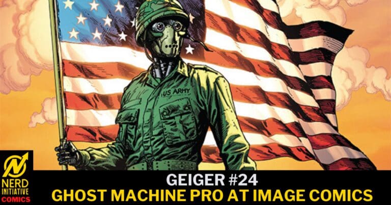
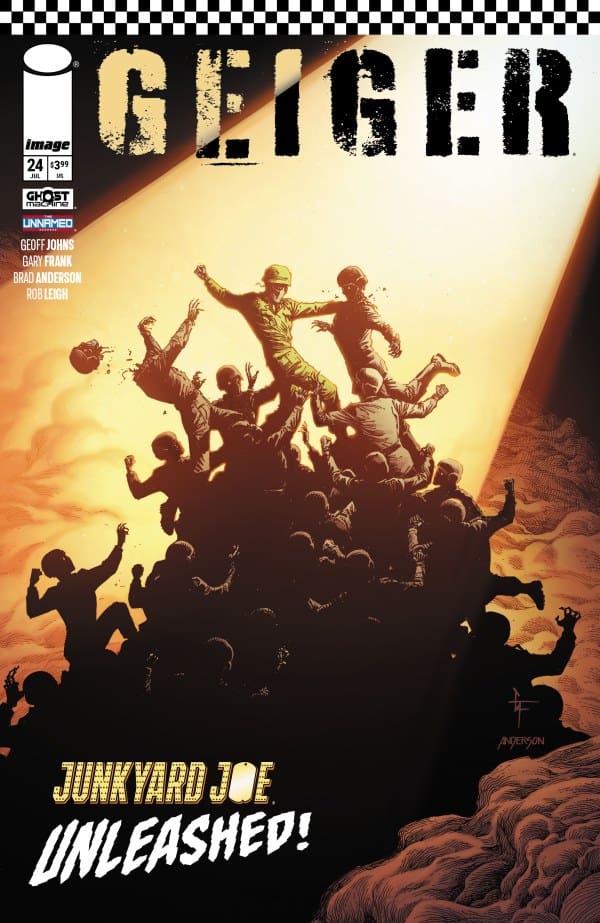
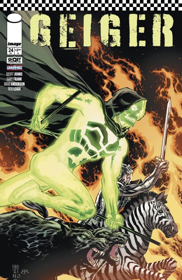
Geiger #24 Cover. Image by Ghost Machine Pro at Image Comics
The Story for Geiger #24
As the attack continues, Geiger sees nothing but red. His attackers are more than meets the eye, and despite his “best friend” helping, the Glowing Man is put in chains. However, he quickly learns the reason for his kidnapping isn’t so simple. Geiger is bait. As the bait begins to work, a new face shows up. Geiger recognizes him immediately. Still in chains he’s adamant this new face is going to get him the information he needs.
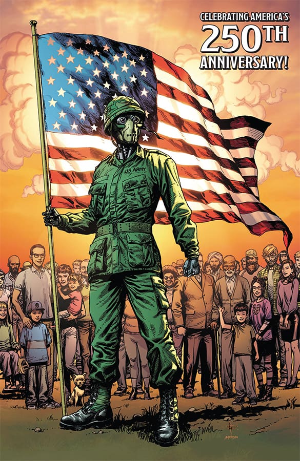
Geiger #24 Variant Cover. Image by Ghost Machine Pro at Image Comics
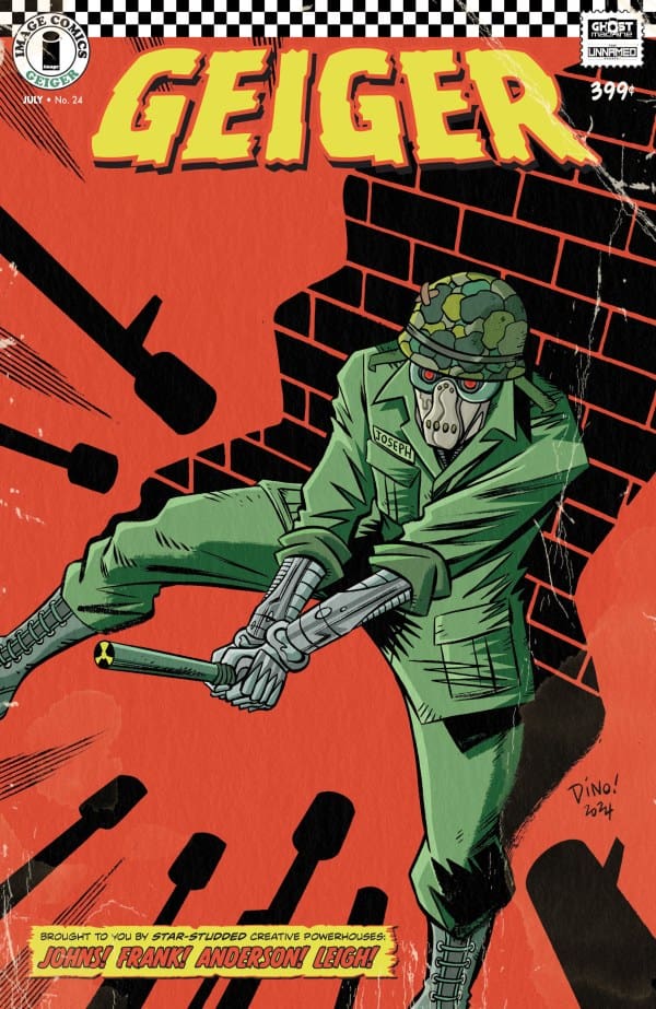
Geiger #24 Variant Cover. Image by Ghost Machine Pro at Image Comics
Geiger #24 Variant Cover. Image by Ghost Machine Pro at Image Comics
The Art
This was an absolutely action packed issue, and the art delivered in showing just how ruthless the fighting was. A highlight was a splash page where no space was wasted! The introduction of Geiger’s new potential source of information was another beautiful page. Both those made me ooh and awe, in all the good ways. All the while, though the story is perfectly moved along with the expressions on our characters’ faces. Despair and regret come through perfectly and show just how different everyone has handled TheUnknown War.
Final Thoughts
Much like Geiger, I’m still processing what happened with the Northerner, and what it all means. This issue moves along the story, and shows there is something big coming, and it’s all connected. Geiger continues to be a superb comic with action, gorgeous art, and a story that keeps you on your toes!
Overall Grade 9/10
There is so much from the world of Ghost Machine, it’s hard to pick a favorite, however, I am loving where this comic is going, and the nods to their other stories has been amazing! If you haven’t jumped into this world yet, the sooner the better!
Have you checked out the world of GHOST MACHINE? Are you a Geiger fan? Let us know your thoughts!
We’re in season 1 of SUPERNATURAL, and Sam and Dean have been on a hell of ride. Issue #8 revealed the villain’s goal, and gave us some back story. Now we kick off the penultimate issue, as we brace for the conclusion to this ever winding supernatural mystery.
Creative Team
Writer: Greg Pak;
Artist: Daniel Scalisi;
Colorist: Ellie Wright;
Letterer: Jeff Eckleberry;
Cover Artist: John Amor;
Packager & Editor: Nate Cosby.
Special Thanks to Josh Anderson, Victoria Selover & Megan Logan.
We kick off with a flashback again, and it’s Dean experiencing his literal worst nightmare: Sammy is missing. We then cut to the present with a history lesson from our villain, and an interestingly creepy realization. As we learn more theories on who or what Sam is, chaos from past issues suddenly becomes a very real current problem. As we wrap with an explosive ending, we’re left with questions and shock, as we now wait for the final issue to close this case.
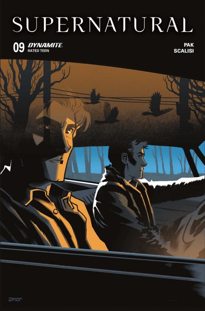
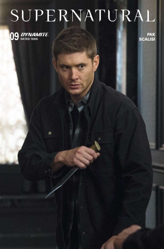
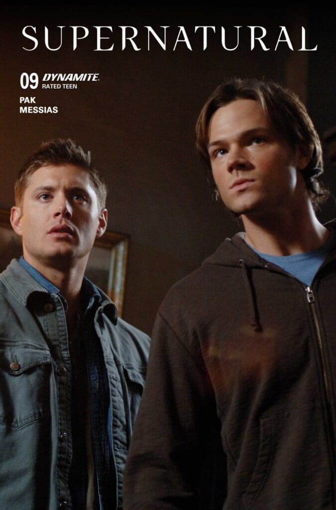
SUPERNATURAL #9 Variant Cover by Dynamite Entertainment
SUPERNATURAL #9 Variant Cover by Dynamite Entertainment
The Art
There was so much life and action in a comic about the undead, the dead, and the supernatural. The art was beautiful from the first page to the last. Dean’s big brother overly worried face was spot on from the flashback to the present (well, 2006-ish). Meanwhile, the explosions and action moments were almost like an improved old school style comic with zoomed in moments, and some amazing colors and expressions. I absolutely loved the art in this issue. No space is wasted, and it’s a ton of fun to take in.
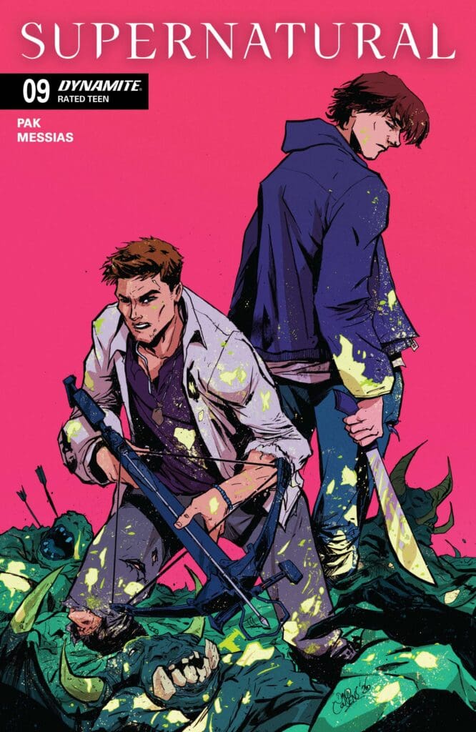
Supernatural #9 Variant Cover from Dynamite Entertainment
Final Thoughts
This issue really leaned into the bond between Sam and Dean, and Dean’s responsibility over Sammy that he’s felt since that day his mother went up in flames. While also showcasing their “brotherly love” for each other in ways only siblings can. Some struggles the boys faced in season 1 and 2 were touched on as well, and we even got some later in the show foreshadowing. I always love when a good story ties into a bigger one, and comes full circle. As we await the final issue, I can’t wait to see how it all wraps.
Overall Grade: 8.5/10
If you’ve ever found yourself overly excited when ‘Carry On’ or ‘Night Moves’ comes on, then you absolutely should be reading this Supernatural run! As well as the recent Valentine’s Day special and Castiel comic from Preeti Chhibber. They all are best enjoyed with a beer and some pie.
If you’re sad to see this comic, almost coming to an end, fret no more! As both Winchester brothers are getting their own comic runs this October from DYNAMITE ENTERTAINMENT.
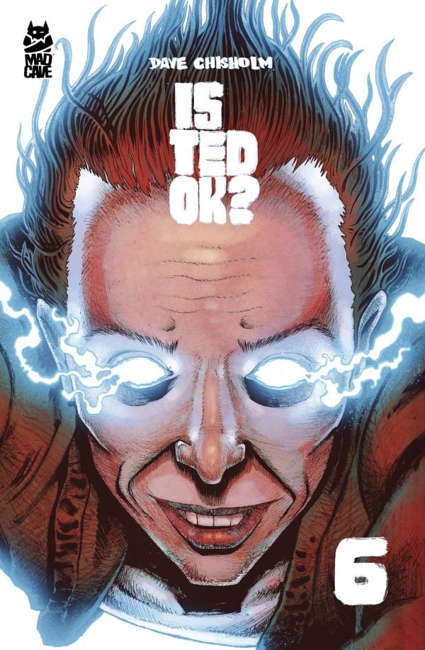
It was very clear immediately that Ted was not Ok. However, the level to which he was not ok, was an insane sci-fi mystery. Now in issue 6, the question ‘Is Ted Ok?’ is officially answered, as this intense mystery comes to a conclusion.
Creative Team
Story, Art & Letters: Dave Chisholm; Editor: Ryan Carroll; Book Designer: David Reyes; Book Production: Roxana Ayala; Cover Artist: Dave Chisholm. Publisher: Mad Cave Studios.
If you were wondering how this was all going to wrap up in one issue, worry no more, as this is a double issue in one. We kick off right where we left off. Ted is dead, or is he? We suddenly see Ted peering into an overwhelming world of mediocrity, as an epiphany seems to come over him. Top side, our villain becomes extra level super villain as he awaits his minions. However, he underestimated the foundation for how he built his minions and how strong a bond can be between people.
The Art
I have truly loved the art since issue 1, but issue 6 took it to another level entirely. More than one page had a layout that sucks you into the intensity that is occurring. The lettering on these pages is mixed in with art that helps to convey intense levels of emotion in a way I’ve never seen. In addition to these amazing pages, we continue to get characters who seem real as their emotions perfectly come off the page. All mixed with beautiful colors. Is Ted Ok? is a comic that feels like the story is just as good and meaningful as the art that tells its story.
Final Thoughts
Wow! This has been a roller coaster of what the hell moments, and OHs! Now that it has wrapped up, I want to go back and binge all 6 issues in one sitting. Is Ted Ok? is an emotional, relevant, sad, hopeful, intense, sci-fi story with consistent twists, a lot of cats, and an ending that brings it all full circle in an incredibly poignant way. If you’re looking for a fresh new story to keep you on your toes, definitely pick up Is Ted Ok?
Frankie “Playtime” Follis has lived a life of off and on crime. While, lately she leans more toward committing crimes, she’s determined to do good and save Redport from being gentrified by the most evil of all evil real estate developers there is! A mission that’s not as easy as it sounds, when your ex is secretly out for revenge and your daughter is ready to throw you back in jail. At least Frankie still has S***eater, and a few others on her side, as we see how this Minor Threats run: The Last Devil Left Alive concludes.
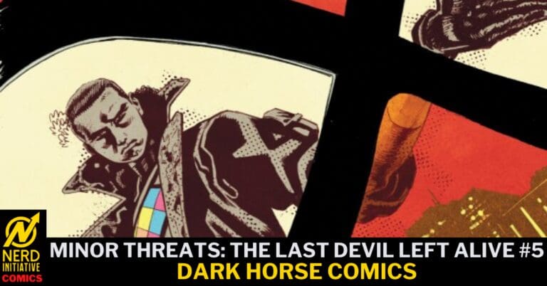
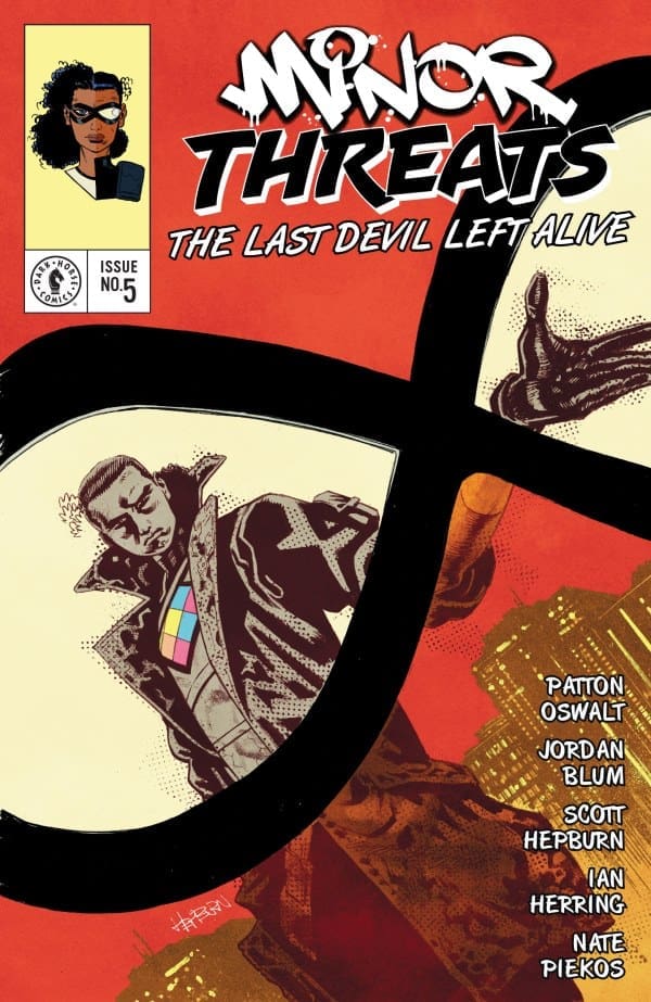
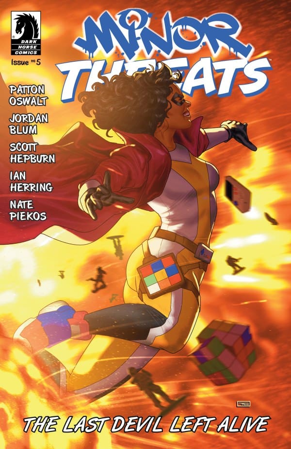
‘Minor Threats: The Last Devil Left Alive’ #5 Cover from Dark Horse Comics.
The Story for MINOR THREATS: The Last Devil Left Alive
We kick off with another flashback to Frankie’s very disturbed past courtesy of her mother. Now in the present her multi-step plan to save Redport, and not be her mother, is not going how she had hoped. However, never underestimate an unlikely and bizarre team up, as they come face to face with Scadlock, the evil real estate dude. As generational trauma, and terrible parenting continue to play a big part in the Minor Threats world, we see it all come to an undead conclusion. For now…
‘Minor Threats: The Last Devil Left Alive’ #5 Variant Cover from Dark Horse Comics.
The Art
The World of Minor Threats has truly mastered turning a gruesome murder into an absolute work of art. Not in a Dexter, I’m a psycho look at the blood way, but in a “Wow, that’s beautiful…Oh SH**! What’s Happening???!” kind of way. And I absolutely LOVE it! Every page perfectly moves this insane story along, while conveying some of the purest emotions along with vulgar and hilarious lines. From Sh**eater’s terrified little face, to Frankie’s detailed toys, to the perfect lettering and colors throughout, there isn’t a page that the art alone didn’t make me smile.
Final Thoughts
The Last Devil Left Alive is the latest comic run from The World of Minor Threats. It’s another fantastic story that will make you laugh, cringe, and immediately want more. While it has a lot of shock and awe, there’s also a damn good story going on, and it all comes together perfectly. Now I just want to know how long until they make the precious half man/half fly into a Funko pop.
Overall Grade: 10/10
If you’re looking for a fresh new world that surprises you and never leaves you asking.. ugh, why did they let him go… AGAIN? The World of Minor Threats is for you! Assuming you’re at least a teenager. It’s not suitable for children.
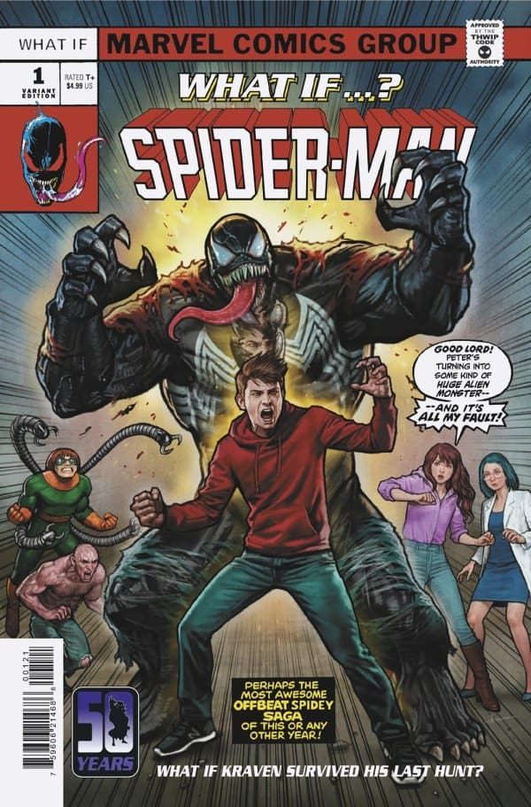
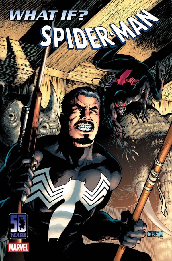
What if… You finally got the opportunity to better your foe. What if… Doing so makes you have an internal reconning with yourself. What if… You make a change in your ideals and who you are as a person… That is what this issue is about in regards to Kraven and Spider-Man!
This issue of What If… takes readers down a deep dark road of a story between Kraven the Hunter and Spider-Man. As Spider-Man fans know, Kraven is one of his rogues or “villains.” Part of Kraven’s history is being a notorious hunter. Which is on full display as he is on the hunt for one of his biggest foes.
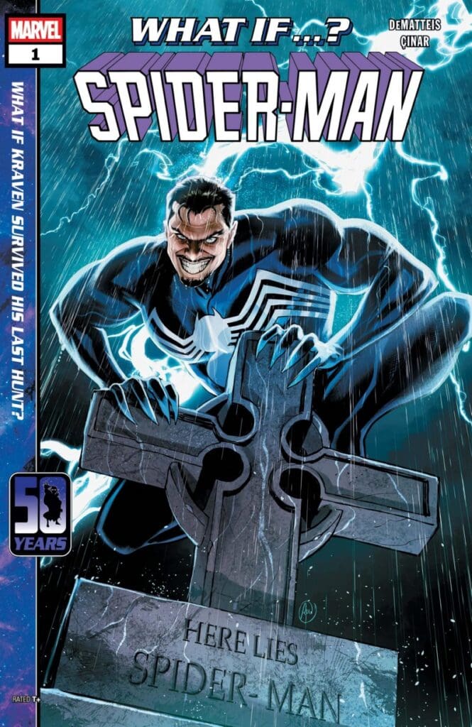
What If… Spider-Man #1, Credit Marvel Comics. Cover by Lucas Werneck
Kraven goes to a new darker level within his hunt for Spider-Man. Which makes him do things that reader may not be ready to witness. But this level of darkness takes its toll on Kraven. After “completing” his hunt, his moral compass becomes a train wreck. Which gives off such a powerful emotional impact to this story. This internal battle Kraven is taking on is something readers will probably relate to.
Being a witness to the moral change of Kraven is fascinating to see. This rough textured hunter obtaining a heart and compassion is poetically beautiful! Which makes the ending so profound and powerful for this What If… story. But it is also at the end of this story that a cliffhanger is introduced, proving that there is more to this story than just this single issue.
The Writing
Travis: The dialogue and narration by J.M. DeMatteis for this story is dark and very informative for the reader. The inner narration of Kraven gives the reader an in-depth look and understanding to the mental processes of Kraven. While also showing elegant character development as Kraven’s feelings towards Spider-Man shift and essentially turn Kraven into the Grinch who get’s a heart. A very dark yet highly emotional story that will keep the attention of its readers! Amazing work for this What If… issue!
Megan: J.M. DeMatteis brings a story to the world of What If..? that’s dark, compelling, and keeps you on the edge of your seat. Seeing the world through Kraven the Hunter’s eyes was fascinating and gave an interesting perspective into his own life. The reader can see where Kraven thrives and struggles, especially with his guilt, in a way that we really don’t get to see very often. Along with that, we see a Peter Parker that’s broken, his body has been used and abused by the symbiote, but still carries his compassion with him. By the end of the book, we see who the true hero of the story is, with DeMatteis making us feel every emotion along the way.
The Artwork
Travis: The artwork for this issue by Yildiray Cinar and Alex Sinclair keeps pace with the dark tone of this story. Dark coloration and shading give life to this gloomy yet mysterious story that leaves readers wanting more within the next panel. The gritty texture of the pencilwork gives the art a rough tone which fits perfectly with the plot line. The attention to detail within the characters is phenomenal as well! The capturing of the emotional turmoil from every character is absolutely perfect! You will know how a character is feeling before you even read the dialogue! Both facets of the art (pencilwork and coloration) come together to hit this story out of the park!
Megan: Apologies to Yildiray Cinar because I was not familiar with your game. Cinar does a fabulous job with the drawings, giving each page excellent detailing work that results in each panel being dramatic and holding a lot of emotion. The tones of the story are on full display as the characters wear their emotions on their sleeves. There’s no denying what Peter is feeling, but also the side characters with him can be seen wearing their emotions loudly. Kraven, who goes through many emotions in the story, has excellently drawn facial expressions that practically tell the story themselves.
Alex Sinclair handles the colors, and as usual, knocks it straight out of the park. The coloring is absolutely stunning, with darker colors juxtaposing the darker toned vibrancy, selling the tones of the story perfectly. Joe Caramagna captures the feelings of the characters and shows them loudly through the dialogue, making it easy to understand where the character’s headspaces are at. Together, the artists truly made this a gorgeous issue that is an excellent example of high quality.
Variant Covers
Stonehouse Homage Variant
Yildiray Cinar Variant
Final Thoughts
Travis: 9/10! This issue is an emotional roller coaster that I did not know I was ready to ride. Knowing the backstory of Kraven and Spider-Man helps in following along but the emotional and moral twist from Kraven is something that Spider-Man fans should respect, I know Spider-Man would… Gripping storytelling combined with outstanding art make this a must read, not only for Spider-Man fans, but comic book fans across the board. Do not sleep on this What If… issue!
Megan: 9/10. What If…? Spider-Man #1 brings all the darkness that I would have wanted with this story. Along with that, there are beautifully written emotions, excellent drawn panels, and colors that will stay in my mind rent-free. This was a gorgeous comic from the beginning to end. If you’re a Kraven fan, this is a must read!
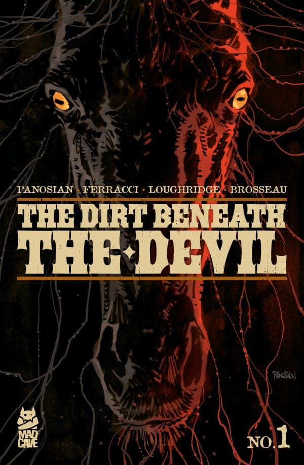
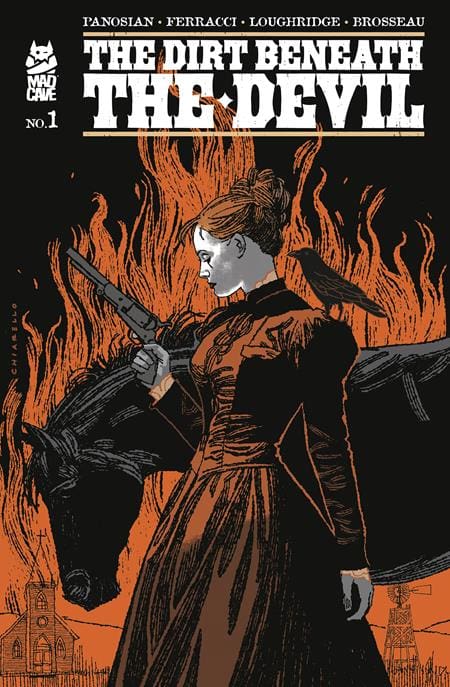
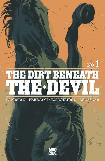
In this new Old West set story by Dan Panosian, we meet June, coming into town for her monstrous father’s inheritance. However, she’ll come to learn that inheritance comes at a cost. Is she ready for the darkness and tension in her family to come to the light? Find out with Eddie, Anthony and I as we review “The Dirt Beneath the Devil #1”!
Writer: Dan Panosian Letterer: Pat Brosseau Artist: David Ferracci Colorist: Lee Loughridge
The Writing
Eddie: The year is 1981. A woman finds out her estranged father has passed away and she travels from New York to Kansas City for the reading of the will. There is something strange about the conditions of her inheritance. They have to travel by horse from Kansas City to Wichita, a journey of about 200 miles through somewhat treacherous territory. That’s the premise of “The Dirt Beneath the Devil #1” written by Dan Panosian, illustrated by David Ferracci, colored by Lee Loughridge and lettered by Pat Brousseau from Mad Cave Studios.
Source: Dan Panosian, Mad Cave
Industry veteran artist Dan Panosian takes the writing reins for this western mystery. The premise is compelling, an example of the breadth of story the comic medium can tell. Western comics are an integral part of comic history and I can appreciate what Panosian is trying to do. He lays out the initial parts of the story in a similar way to what you’d see in an old John Huston or Howard Hawks western.
Where the writing of the issue falters is that this issue focuses a lot on plot and character exposition versus the real intended action of the story itself. This may be a deliberate narrative technique to preserve mystery or action for future issues, but it affects the pacing for the reader, preventing the early “grab” that readers want to feel from the first issue.
Anthony: Over the last 7 – 8 years, Dan Panosian has been building quite the resume as a dark/horror comic book writer. “An Unkindness of Ravens”, “Alice Ever After”, “Canary”, “Black Tape”, “Last Boy”, and now his latest offering “The Dirt Beneath the Devil”! Panosian does a fantastic job of setting up a story and immediately grabbing the reader’s interest. It’s almost like a John Williams movie score. Layers build on each other with each adding a bit more complexity than the last until you start to see the larger overarching plot start to take shape.
The characters are deep and rich right out of the gate. They feel like real people to the point you empathize with some, hate others and feel a little uneasy about the rest. He builds tension and unease gradually from page one right up to the cliffhanger (which I was waiting for the whole issue)!
Eda: Going into this, I had very little idea of what to expect. All I knew was that it was Dan Panosian, and I was on board. This being the first western comic I’ve ever read, I’ll say that while the writing is certainly there, it took me a minute to get used to it due to the pacing. That being said, it still hooked me through its character development and use of symbolism and meaning.
Source: Mark Chiarello, Mad Cave
Speaking on the pacing, while it won’t be for everybody, it feels almost intentional at times. The pacing really seems to work at helping build the tension, making us wonder what will happen and when the trigger will finally be pulled. Within that time, we really get to know these characters and the background of what’s going on. As previously stated, this book introduces us to June as she and the others have to ride 200 miles for the reading of her father’s inheritance. What wasn’t stated however was the horse she specifically has to ride… Hendido.
For those who don’t know, “hendido” is a word meaning “split, cleft or cracked.” Surely enough, Hendido has an unusual split in one of his hooves. This mirrors exactly what June is experiencing, being estranged from both her father and family. What this might mean for the story overall, I’m really anxious to find out!
The Art
Eddie: The artwork from David Ferracci and Lee Loughridge is the star of this issue. They capture the feel, dirt, grittiness and sense of looming danger of the Old West era of the United States. Ferracci’s pencils and paneling build the framework of the world for the reader. We can see and feel the wonder and potential dangers lurking. Loughridge’s colors are especially effective in creating this environment. He helps us feel the heat of the sun, the dust blowing in the wind and the change in mood when day shifts to night.
Anthony: David Ferracci is a good, solid visual storyteller. His backgrounds & environments are beautiful and technically perfect. The only note I have on his work here is that sometimes a couple of the characters were difficult to tell apart and I had to really dial in on identifying details. It’s a minor gripe, but it’s the kind of thing that disrupts an otherwise fully immersive experience, even if only for a moment. Mind you, the characters LOOK different, but there are some panel sequences that are zoomed in and I just found myself wondering “whose hand is that?”
Source: Jacob Phillips, Mad Cave
Lee Loughridge is becoming my favorite colorist. He’s a magician! I’ve never gotten jazzed up over a colorist more than I am right now about this man. The colors for this issue are superb. Moving from cool to warm to scorching hot in perfect sync with the demands of the story. His color work serves as a guide for the eye, making movement from panel to panel so smooth you forget the pictures aren’t moving.
Eda: The art and colorwork here were fantastic across the board. Ferracci worked wonders in each panel, going into great detail with his linework to create a truly desolate wild west. His work made it very easy for me to envelop myself into the world, while each character design felt distinct, outside of maybe one or two characters.
As for Loughridge’s colors, I completely agree with both Anthony and Eddie! His colors effortlessly created these fantastic looking sunrises and sunsets, reflecting beautifully on the settings and characters. Even when we get to the night, it’s full of deep blues and colors that truly stand out.
Final Thoughts
Eddie: “The Dirt Beneath the Devil #1” has some pacing issues that the rest of the series can overcome. There’s just enough meat on the bone here for me to give the series a second try.
Anthony: “The Dirt Beneath the Devil #1” has hooked me! Panosian, Ferracci, and Loughridge have crafted a dark, unsettling introduction to a horror series that, if it continues on this path, could be one for the ages. I really hope the series lives up to the high expectations set by the first issue!
Eda: While it slightly stumbles, “The Dirt Beneath the Devil #1” is a pretty great start overall! Panosian and crew could truly have something great on their hands.
For more from Eddie’s video review on “The Dirt Beneath the Devil” keep an eye on Nerd Initiative’s YouTube channel and WretchedHiveComics on Instagram!
This review is brought to you by Nerd Initiative’s Megan and Shawn!
Shawn – I felt like Saladin Ahmed really turned it up in this issue. It was already going to see Bishop interacting with Shard but Ahmed gave us a payoff that was more than I was expecting. I really like the narrative idea of Shard trying to protect Bishop while Bishop is trying to protect her. It really hammers home the sibling aspect of the story.
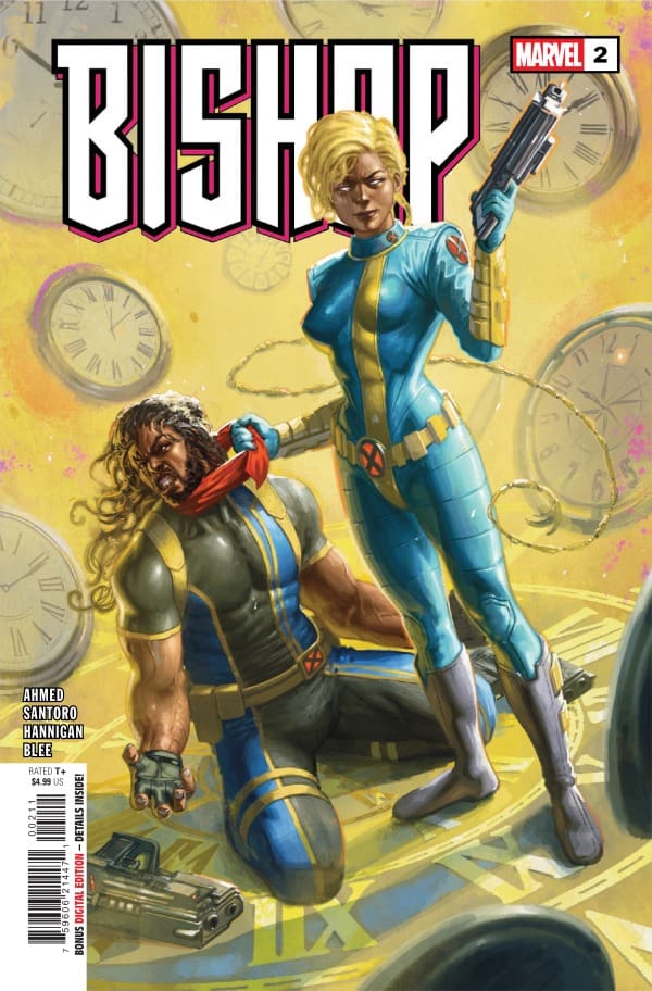
Bishop #2 hit the gas right out of the gate with Ahmed not only giving us some great action but some exposition about how we got to this point. I’ve always laughed at the fact that in a world filled with X-Men some of whom have had multiple codenames, Bishop’s has always just been his last name. It’s good to see from Bishop #2 that I’m not the only one.
Cover art by Davide Paratore. Published by Marvel Comics
Megan – Multiplying the energy that we left off on in the previous issue, Saladin Ahmed really kept the energy high throughout this comic. Bishop #2 picks up right where we left off with Lucas Bishop and Shard reuniting, and both are very confused for very different ways. Bishop can’t believe his eyes that his sister, the one he saw die, is back and in the flesh. Shard can’t believe that Bishop is the final Brotherhood target. There are so many emotions in the air, and Ahmed does a great job at showing Bishop struggling with these.
As for the action, it’s constant and keeps you on the edge of your seat. Even between the fighting, there’s the tension with Bishop as he tries to navigate how to handle seeing his sister again. Does he warn her about her death? Does he savor the moment? He has little time to figure this out before the action starts back up again. All in all, Bishop #2 brings a lot to the table and continues the high quality of the first issue.
The Art
Shawn – Mario Santoro, Reese Hannigan, and Federico Blee did a really wonderful job on this issue. The art was crisp and clean and the colors were prefect. It was clear this issue was truly a team effort built on good communication because everything just fits. The line work and environments crafted for the panels by Santoro and Hannigan were spectacular. Even if the colors were removed the panels would have so much depth and detail.
Despite that fact, it’s the color work from Federico Blee and lettering from Travis Lanham that really make the story move and breathe. Blee’s colors particularly in the action panels really draw your eyes forcing you to take in the details within the line work. Lanham does a great job with some really impactful SFX. He makes the story flow naturally preventing it from ever feeling too heavy or narratively dense.
Megan – The artists came together to make this issue absolutely stunning. There’s plenty of action in this issue, and the panels are drawn out so detailed that you feel as if you’re right in the middle of the action. Particularly with the fight involving Flamequake, you could feel the intensity of the situation by the body language of the characters or even their expertly drawn expressions. The colors were handled brilliantly, showing a huge amount of different contrasting colors. In some panels, the backgrounds juxtaposed the characters in such a great way that the characters practically popped off the page. With the lettering, I really appreciated being able to feel Bishop’s varying emotions through his words, while having a nice and even flow of dialogue throughout the comic.
Final Thoughts
Shawn – 10/10. This was just a great issue. There’s family drama, action, and tension that you can cut with a knife. I’m really enjoying seeing Bishop front and center and can’t wait to see where the story goes from here.
Megan – 10/10. This was an excellent continuation from the first issue that brought even more of the excitement and even higher energy. The creative team is cooking hard here and I can’t wait to see where we go from here.
Overall Grade – 10/10
Let us know in the comments what you thought of Bishop #2!
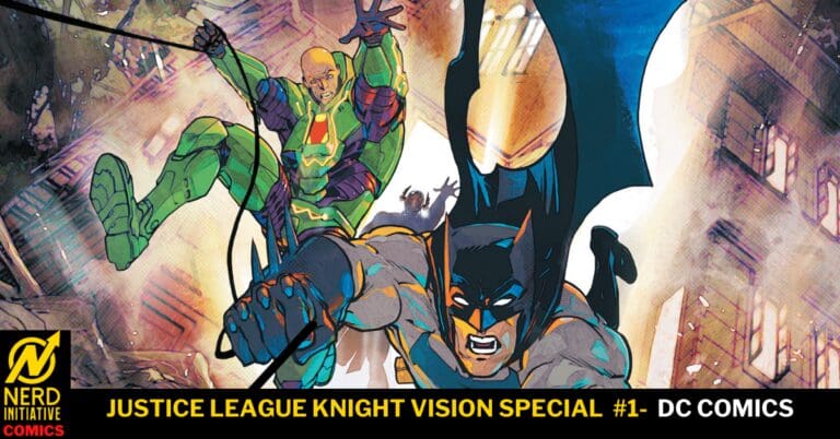
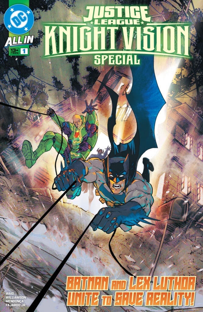
On the heels of barely escaping Darkseid’s wrath, the Justice League has opened up an amnesty program allowing villains into their ranks. This brings Batman and Lex Luthor together in an unlikely partnership as they prepare for war against Darkseid.
Justice League Knight Vision Special #1. Credit DC Comics. Cover by Carmine Di Giandomenico.
Creative Team: Joshua Williamson, Mark Waid, Miguel Mendonca, Romulo Fajardo Jr, and Steve Wands.
The Story:
Have you ever spent time with someone you absolutely loathe, and yet you have more in common than you’d like to admit? Waid and Williamson pair Lex and Bruce in a team-up that works beautifully. The duo is two sides of the same coin; each thinks they are smarter than everyone else. This issue gets even more exciting when the duo is forced to match wits with Prometheus. The banter back and forth between the two was often hilarious and full of tongue-in-cheek sarcasm, as expected. Although they refuse to admit they worked together better than they thought, I wouldn’t mind seeing more of these two team up. Lastly, we are building up towards something massive as has been teased, and the final pages have thickened the plot as there is someone else at play.
The Art:
The artwork was excellent in this issue, offering a wide array of vibrant colors as bursts of power flashed from panel to panel. Miguel and Romulo worked beautifully in tandem, crafting epic action sequences and allowing each character to have their moments to shine and feel important. The moments felt big, and with Steve’s lettering, the snark was on full display.
Final Thoughts:
Justice League Knight Vision Special #1 gives us our first villain-hero team-up, and it’s fitting that Lex Luthor and Batman would kick off this next installment leading into DC’s big event. The colors and story have a lot to offer and have me heavily intrigued by what’s next.
War is here! Hela, the new Queen in Black has drained Knull of his power. To combat her treachery, Knull has become a god of light. Now, as Knull prepares to bring the war to Hela, she prepares to claim Earth as her own. Now The King in White and the Queen in Black lock into a power struggle for control of Earth. As light and dark battle for control, will the Earth ultimately be lost?
This review is brought to you by Nerd Initiative’s Shawn!
Creative Team
Writers: Al Ewing Artists: Iban Coello and Zé Carlos Color Artist: Guru-eFX Letterer: Clayton Cowles Cover Artist: Ryan Stegman Cover Color Artist: Frank Martin
Writing
What an amazing first issue. Not only does Al Ewing craft a really good issue, but he does so in a way that you can enjoy the first entry into the Queen In Black saga even if you aren’t up to date on all the going ons of the Marvel Universe. This issue was packed full of fun. There’s a lot of really great cameos, and Ewing provided a great introduction into how groups are going to break out and fight this threat. I loved seeing some characters that I wasn’t super familiar with. It put me on a path to learn more about them and how we got to the point we are at in their story.
This is shaping up to be a really interesting story. I’m intrigued by the concept of Knull basically being the same person in a different outfit. Despite changing to a god of light, Ewing is still writing him as a being that desires nothingness. Queen In Black #1 really feels like it’s laying out a story where victory for the heroes isn’t just a foregone conclusion. Ewing is crafting a narrative where the heroes are going to have to get creative and perhaps even a bit lucky to come out on top. While we won’t know until the end of the story what happens, it does genuinely feel that, particularly for some of the characters in Queen In Black #1, narrative aspects of the story will have long-term impacts.
Art
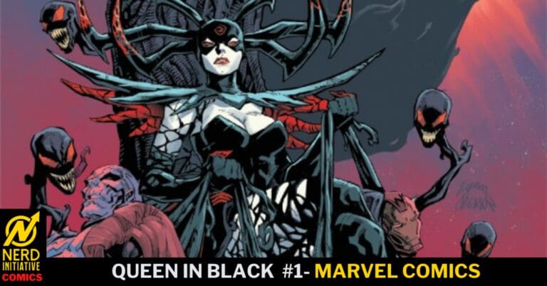
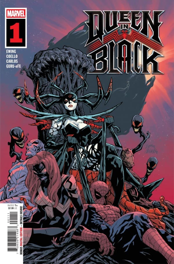
Queen In Black #1 cover by Ryan Stegman and Frank Martin. Image from Marvel Comics
Iban Coello, Zé Carlos and Guru-eFX came out really strong in this first issue. Coello and Carlos did a really good job adding depth to symbiotes and to Hela despite their natural black looks. Knull feels intentionally jagged and rough helping really sell the god of light aspect of his character in this issue.
Guru-eFX did a great job on colors. Particularly, the highlighting on the symbiotes, Hela, and other dark-costumed characters really allowed the line work to pop. The colors of Spider-Man and his allies provide a nice, strong contrast off the page against the dark and subdued colors of the symbiotes. Clayton Cowles had a lot of voices to manage in this issue and does so perfectly. Cowles ensures the reader can easily follow the flow of the story without getting bogged down. Character conversations and internal monologue are easy to keep up with ensuring you know exactly who is speaking.
Final Thoughts
A stellar first issue in this new Queen In Black series. The creative team put out a first issue that feels fresh, updated, and unique while playing on some themes as we saw in the previous King in Black event. The team-ups let us get to see some of our favorite characters side by side.
Overall Grade: 10/10
What did you think about this new series? Let me know in the comments
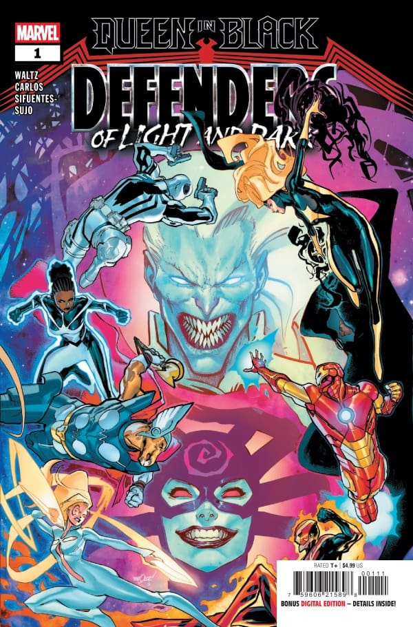
Knull, defeated and drained of his power by Hela must become that which he once sought to destroy. With Hela as the new Queen in Black, Knull has become a god of light. As the two battle for control of Earth, will the defenders of Earth be able to rise and stop one or both of them? Which heroes will show up to defend Earth? It may be some you don’t expect.
This review is brought to you by Nerd Initiative’s Shawn!
Creative Team
Writers: Al Ewing and Tom Waltz Artist: Zé Carlos Color Artist: Fer Sifuentes-Sujo Letterer: Joe Caramagna Cover Artist: David Marquez Cover Color Artist: Federico Blee
Writing
Right out of the gate, I really love the teams and the way they break down in this series. Al Ewing and Tom Waltz are doing something really unique with the team light and team dark setup. Not only is it giving characters we aren’t seeing much like Beta Ray Bill a chance to shine, but who wouldn’t want to see Monica Rambeau and Tandy Bowen team up to face off against Hela’s army? Perhaps the most impressive aspect of issue #1 of Queen In Black: Defenders of Light and Dark is the way that, despite nine different characters functioning across two teams, Ewing and Waltz seem to perfectly capture what makes each team and the characters on the team unique.
This is best illustrated when Tandy questions her role on the team due to the presence of heavy hitters like Sunfire and Photon on her team. Despite her power and abilities, Tandy has always been a little self-conscious about her abilities when functioning as a team outside of just her and Ty. They capture Monica’s humor and dedication perfectly. Ewing also masterfully works in a bit of a plug for The Mortal Thor in the event someone picks up this issue that hasn’t been following by reinforcing the fact that some heroes don’t know what Asgard is. What an ending to this issue! I can’t wait to see where Ewing and Waltz go from here.
Art
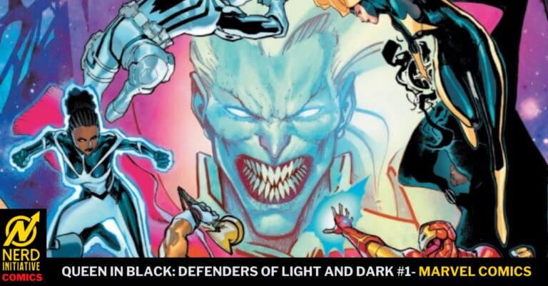
Queen In Black: Defenders of Light and Dark #1 cover by David Marquez and Federico Blee. Image from Marvel Comics
Zé Carlos, Fer Sifuentes-Sujo, and Joe Caramagna did a superb job with this initial issue. Carlos perfectly captures the characters with beautiful line work, particularly with Knull and Ty. As beings of light and darkness, it can be hard to really make them stand out, but Carlos does a wonderful job of making them distinct and powerful.
Fer Sifuentes-Sujo really got creative with the color palette in this issue. I would imagine that working on an issue that features such drastic contrasts as light vs dark can be both challenging and a color artist’s dream. Sifuentes-Sujo really runs with the challenge crafting not only beautiful colors for the panels but breathtaking backgrounds. The cosmic nature of this battle really let them play with the look, and it turned out so good. Joe Caramagna deserves a special tip of the cap for his work on this issue. On top of managing separate battles between two teams, there’s also managing the communication between Tandy and Ty which Caramagna handles perfectly. Despite the chaos going on within the panels, I never struggled to follow the story or be aware of what was going on.
Final Thoughts
This was a really exciting entry into the Queen In Black series. I like the team-ups and enjoy seeing some characters that we don’t get to see often. Ewing and Waltz crafted an enjoyable story while Carlos and Sifuentes-Sujo put beautiful art on the page to push the story even further.
Overall Grade: 9/10
What did you think about this new series? Let me know in the comments