Home Blog Page 14

ROGUE #5 – Hauntings of the Past

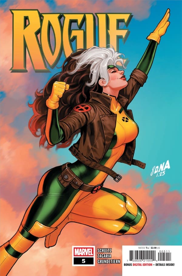
Creative Team – Erica Schultz, Luigi Zagaria, Espen Grundetjern, VC’s Ariana Maher, David Nakayama

Published by Marvel Comics

Catch up with Rogue #4!

The Story

This comic is reviewed by Nerd Initiative’s Shawn, and your truly, Megan!

Shawn – Erica Schultz isn’t writing this story just for me, but she might as well be. Hitting the mystical side of Marvel in the first panel? You have my attention, ma’am. I always knew, despite his gruff exterior, Remy had a pure soul, but it was so nice to see Schultz make it canon. This issue hit me at an emotional level I didn’t expect.

I grew up with the X-Men. I’ve been reading them for a long time. The growth that Schultz gives us in Rogue with this series is one of the most powerful and emotional stories I’ve gotten from a solo X-Men series. Rogue isn’t running from her past; she’s trying to make a better future. In doing so, Schultz has crafted a series that connects with anyone who believes in simply trying to be better today than they were yesterday. The ending was surprising and satisfying.

Megan – The ending of what’s been a fabulous run was heart-wrenching and emotional in the best way possible. Rogue finally finds out where John is located, and she has a plan to make things right. However, when there’s a bridge burned, is it so easy to rebuild? Rogue finds that out the hard way, and this will be something that sticks with her.

Comic book cover featuring Rogue leaping upward in yellow-green suit with brown jacket and orange gloves, 'ROGUE' title above.
Cover art by David Nakayama. Published by Marvel Comics

Rogue #5 isn’t the ending you’d expect, but it’s the ending that needed to happen. It was the most realistic ending. Erica Schultz has knocked this miniseries out of the park and ends it on a very interesting note. I’m very excited to see how this story impacts Rogue in the future, and also other factors in the story that are building, namely with Gambit. If you haven’t gotten a chance to check out Rogue, you absolutely should. It’s a fantastic look at who Rogue is as a character, past and present.

The Art

Shawn – Whewwww. Luigi Zagaria and Espen Grundetjern really did a beautiful job with this issue. One of the great things about this limited series has been the interplay between written and visual art. There were issues where the words were subdued and let the art speak. There were other times when the art was built, but the words were the main character. With this issue, it felt like Luigi Zagaria and Espen Grundetjern created a beautiful blend of the previous five issues. Both written and visual art were beautiful.

This was a heavy issue, and the visual side of the team really helped you feel that weight. I felt every tear, every emotion, every bit of pain the characters felt in this issue, not just through the words but through the art. I also felt the joy and love from Remy and Anna Marie. Ariana Maher wrapped it all up in a beautiful bow. She ensured that both the words and the art sang a beautiful song together. Maher made it easy to follow the internal monologue versus the conversation

Megan – Luigi Zagaria, Espen Grundetjern, and Ariana Maher do some really fantastic work in the ending of Rogue. The story itself is emotionally driven, and the artists perfectly captured that. Zagaria’s drawings are expertly done, with the characters showing every bit of emotion in the story on their faces. Grundetjern brings a lot of vibrancy that contrasts the muted tones of an ordinary life very beautifully. Maher carries the emotions of the story through the dialogue excellently, making the reader feel every bit of the story. Together, the artists knocked this out of the park, bringing this wonderful miniseries to a great end.

Final Thoughts

Shawn – 10/10. I’m not a huge fan of limited series, but I would be a bigger fan if more were like this series. This team crafted a full, deep, and satisfying story over the course of five issues. The series shows character growth while reminding us of what the Rolling Stones told us long ago, “you can’t always get what you want, but if you try sometimes you get what you need”.

Megan – 9/10. If you haven’t checked out Rogue yet, there’s no time like the present! If you’re a Rogue fan like me, then this is absolutely the comic run for you!

Overall Grade – 9.5/10

Let us know in the comments what you thought of Rogue #5!

Leave a Reply

This site uses Akismet to reduce spam. Learn how your comment data is processed.

The Rocketfellers #0 – The Past Never Stays Put

A family from the 25th century, hiding in the 21st century. The Rocketfellers have been through it, and just when they thought all was lost, Dad took a major hit. With dad still missing, and his sister, the murderer, turned pool cleaner, still has no memory. The Rocketfellers #0 gives us a glimpse back to when they first landed in the 21st century, while also giving us a glimpse into a new Ghost Machine Pro comic, coming soon.

Creative Team

Story & Words: Peter J. Tomasi;

Story & Art: Francis Manapul;

Letterer: Rob Leigh;

Cover A: Francis Manapul;

Cover B: Gary Frank & Brad Anderson;

Cover C: Leila Leiz & John Kalisz;

Designer: Steve Blackwell; and

Editor: Brian Cunningham.

From the world of Ghost Machine, check out the review for the last issue of The Rocketfellers.

The Rocketfellers #0 Cover. Image from Ghost Machine at Image Comics

The Story for The Rocketfellers #0

We kick off this issue with a glimpse into something unfamiliar, and a nod to another comic in the Ghost Machine family. While the world-building kicks us off, we’re then right back to where we last saw The Rocketfellers: still trying to figure out where the hell dad is, and when the hell dad is. All to then be thrown back into the day that The Rocketfellers became “The Smiths.”

The Art

Loss, time travel, and hot dogs, oh my. Whether our futuristic family was working with their futuristic technology or simply mourning the loss of their matriarch, the art was beautiful. As we go back and forth from wondering where and when Dad is, to reliving the loss of Grandma, the emotions were high, and we see that so deeply on the faces of the adults. Expressions that can truly give a scene incredible depth.

Meanwhile, an unexpected attack gave us some fun art and kickass lettering. As did a disgustingly gross moment of a kid from the future falling in love with an American classic: hot dogs. Being able to take a moment like that, and still make it somehow look like art, is truly impressive.

The Rocketfellers #0 Variant Cover from Ghost Machine Pro at Image Comics.

Overall Grade: 9.5/10

The Rocketfellers #0 did a fantastic job of showing us where our family is today, and diving more into what happened that day that their lives changed forever. All while teasing a new upcoming story. A story that is clearly going to be woven through other stories we’ve already fallen in love with.

I continue to stand by how perfectly balanced The Rocketfellers is with sci-fi and family. This time-traveling story continues to be relatable, mysterious, and fantastic. Can’t I wait to read more in the next The Rocketfellers as well as learn more about THE UNBELIEVABLES?

Check out a review for a recent issue of Geiger also from Ghost Machine at Image Comics.

For more from Lauren, check out ‘Hops GEEK News.’

Have you checked out the world of GHOST MACHINE? Let us know your thoughts!

Leave a Reply

This site uses Akismet to reduce spam. Learn how your comment data is processed.

Ultimate Impact: Reborn #1 – Protecting the Past and The Future

The Ultimate Endgame is here. The Ultimate Incursion has happened. Ultimate Impact is here. Miles Morales has returned to the 616 Universe, and with him, a dangerous secret. Miles is the keeper of several Origin Boxes. Engineered by The Maker to alter timelines and strip people of their future as heroes, the boxes, if opened, instantly grant specific and high-level superpowers to whoever opens them. Miles plan is simple. Protect the boxes. What happens when a new player on the scene wants what Miles has?

This review is brought to you by Nerd Initiative’s Shawn!

Creative Team

Writer: Chris Condon
Artist: Stefano Caselli
Color Artists: Marte Gracia and David Curiel
Letterer: Joe Sabino
Cover Artist: Ben Harvey

Writing

Chris Condon came out firing with this one. I genuinely can’t believe this is a first issue because there is so much packed into this first issue. It’s really great to see Miles Morales with such a pivotal role in the connection between the Ultimate universe and the upcoming Armageddon event. Condon does a really good job writing Miles in this issue.

Perhaps the best thing Condon does is make you feel the weight that Miles carries by being the keeper of the Origin Boxes. You truly feel like Miles understands the pressure and the importance of the powerful relics that he is charged with protecting. Not only does Condon write Miles well, but he does a really amazing job of giving us some background on the characters that will inevitably become important over the next issues of this series. Each new character feels unique with distinct personalities, problems, and hopes. This is an amazing way to start a key series, and I can’t wait to see what great writing Condon puts out after this.

Art

Ultimate Impact Reborn #1 cover by Ben Harvey. Image from Marvel Comics

Stefano Caselli, Marte Gracia, and David Curiel really had a challenge ahead of them with this issue, and I think they nailed it. This issue functions as an almost anthology from a single writer. Caselli, Gracia, and Curiel were given a collection of characters and their stories to tell through art that are all unique and distinct in their setting, tone, and mood.

Caselli gets the story going by crafting unique designs and brands for each of these new characters. They are obviously connected by a common theme, but Caselli reinforces Condon’s writing by making sure each character has a distinct style. Gracia and Curiel follow up by ensuring that while there are some overlapping colors, the palette for each character is different from the others and unique to just their character. This helps you separate out the story and move along in the narrative. Joe Sabino helps bring it all together by making the tone and cadence of each character unique through word bubbles that help keep the narrative on track despite all the different characters’ stories we are following.

Final Thoughts

Marvel couldn’t ask for a better opening salvo in this series. Call me a fish because we are one issue in, and I am hooked. I love what this creative team is crafting. It feels like we finally may be getting some new characters that actually impact the Marvel Universe as we know it, and that is exhilarating.

Overall Grade: 10/10

Did you enjoy Ultimate Impact: Reborn? Let me know in the comments

Leave a Reply

This site uses Akismet to reduce spam. Learn how your comment data is processed.

ABSOLUTE GREEN ARROW #1 – Secrets in the Dark

Creative Team – Pornsak Pichetshote, Rafael Albuquerque, Marcelo Maiolo, Jeff Powell

Published by DC Comics

MORE FROM NERD INITIATIVE HERE!

This is a joint review by Matt of Hops ‘Geek’ News and Megan of Vigilante Vibes Podcast!

The Story

Matt – This run has been highly hyped up for months since we saw what happened to Oliver Queen in the one-shot, and Pornsak has absolutely delivered on an intense story. The choice to make the Green Arrow work as a sort of horror vigilante who appears and brutally murders his enemies delivers some intense action sequences and sets up a ton of mystery. There are moments when I am questioning if this is Oliver returning from the dead or someone else, as we see a list of familiar names come across a panel. Could this be the introduction of the Lazarus Pit into the Absolute Universe, even? Pornsak sets up a lot of intriguing questions with this first issue.

The story is told from Dinah Lance’s point of view, and it works well as she is a former MMA star turned bodyguard with a history with Ollie as well. Her narration adds mystery, and we learn how Queen was always out to change the world for the better. The Green Arrow’s first victim is his partner, which thickens the plot a fair amount. I can say I am beyond excited to see where these plot threads take us down the road.

Megan – I was really looking forward to Absolute Green Arrow’s debut and, good lord, Pornsak Pichetshote did not disappoint. In the aftermath of Oliver Queen’s death, there’s a serial killer on the loose who’s hunting down billionaires. These billionaires are the scum of the earth, and all their wrongdoings are being made public, so it’s hard to have empathy for them. They needed the best protection they could get, so they offered a job to Dinah Lance, AKA Absolute Black Canary. Dinah is desperate for a payday to help pay for her dying father’s treatment, and the billionaires make it nearly impossible for her to turn them down. Now, Dinah is to watch after these awful people while they’re being hunted, but is it enough to keep them alive?

Cover art by Rafael Albuquerque and Marcelo Maiolo. Published by DC Comics

From the first page, I was hooked. Pornsak Pichetshote does such a fantastic job at keeping you guessing and making it hard to look away from the comic.

The Art

Matt – The artwork is amazing and delivers on the brutality when the action kicks in. The team has crafted a familiar look for Green Arrow’s suit; however, the addition of the skeleton mask adds the right horror element that helps create the vibe they are going for. We don’t see a lot of him in this book, which is a smart thing, but when we do get Arrow, there are the additions of his trick arrows leaning into his gimmick. It gets bloody at times when hands get chopped off, or arrows are shot into the eye sockets, which the team colors and details extraordinarily well. I couldn’t help but oddly be into it. We’re off to a fantastic start, and the character designs are familiar with some twists to them, which I think fans will enjoy.

Megan – The artwork of Absolute Green Lantern #1 is raw, it’s gritty, and it’s perfect for the story. Rafael Albuquerque, Marcelo Maiolo, and Jeff Powell did such a fantastic job with this comic that it’s hard to look away. What I love the most is the facial expressions of the characters. Telling the story themselves through their expressions, you can see the fear on Dinah’s face or the sadness on the face of her father. Alongside that, the colors were dark and ominous, which highlighted the mystery of it all. Jeff Powell knocked the lettering out of the park, perfectly capturing the heightened emotions of the story. Together, the creative team did a phenomenal job on this!

Final Thoughts

Matt – 10/10 Arrows. Absolute Green Arrow #1 explodes onto the scene in such a violent manner. There is a lot of mystery tied up in this issue, which drops breadcrumbs to follow, but also delivers on the brutality of the action. This issue has been rightfully hyped up, and it’s lived up to it in my opinion!

Megan – 10/10. The creative team showed up and showed out for Absolute Green Arrow #1! There were so many things to love about the story and the art that this deserves a solid 10/10.

Overall Grade – 10/10

Let us know in the comments what you thought of Absolute Green Arrow #1!

Leave a Reply

This site uses Akismet to reduce spam. Learn how your comment data is processed.

LOBO #3 – A Blast into the Past

Creative Team – Skottie Young, Nicoletta Baldari, Jorge Corona, Jean-Francois Beaulieu, Nate Piekos

Published by DC Comics

Catch up with Lobo #2!

The Story

Lobo #3 is as unhinged as the first two issues, which it absolutely should be. Skottie Young never misses, and that holds for his writing in Lobo. In this issue, unemployed and feeling down on himself, Lobo gets a call from Omega+ Department of Bounty Affairs saying that he can have his job back. All he has to do is a physiological evaluation. Now, if you know anything about Lobo, then you know this is going to get crazy, and like clockwork, it does. After answering some of the usual questions like “do you have a history of drinking” or have you been experiencing any anxiety or depression”, he’s asked to tell a story of a time he experienced joy. To clarify, he’s asked to name a time he experienced joy that didn’t have to do with killing.

Cover art by Jorge Corona and Jean-Francois Beaulieu. Published by DC Comics

This leads us into a memory of Lobo’s from when he wasn’t the Main Man, but the Main Kid. Proving that he’s been about this chaotic life since the beginning, he tells a story that explains just how wild he was as a child. The story is outlandish, involves the Lanterns, and is just so Lobo. By the end of the story, I wanted an entire series just about Lobo’s childhood.

The Art

Nicoletta Baldari, Jorge Corona, Jean-Francois Beaulieu, and Nate Piekos put in the work to make this issue as high-quality as the previous issues, and they nailed it. The artwork matches the tone of the story, which, in short, is absolute chaos in the best way. The artwork in Lobo’s memory has an interesting, mystical feel to the drawings, which I adored.

That, along with the gorgeous, vibrant colors, makes this comic absolutely stunning. The vibrancy in the colors, with Lobo being the dark contrast, was handled perfectly by Jean-Francois Beaulieu. Nate Piekos is the letterer for this issue and captures the varying tones of the comic, whether it be the wild child Lobo or the frustrated teacher. Along with some perfectly used sound effects, I would say Piekos did a fantastic job of having a solid flow of dialogue.

Final Thoughts

Lobo #3 continues the exciting comic run about the Main Man, written by Skottie Young. The best way to describe this series is “fun”. It’s a good time, a fun read, and I’m very excited to see what’s next for the Main Man.

Overall Grade – 9/10

This review was written by Megan from the Vigilante Vibes Podcast! If you liked my review, be sure to check out my other reviews! Let me know what you think of Lobo #3, or tell me what comics you’d recommend me trying out! Find me on my socials, and check out my Marvel podcast, Vigilante Vibes, by clicking here!

Let me know in the comments what you thought of Lobo #3!

Leave a Reply

This site uses Akismet to reduce spam. Learn how your comment data is processed.

SUPERNATURAL #7 – If you love something, set it free…to haunt someone

It’s Season 1, Sam and Dean, and they have found themselves in a case that seems never-ending. Every time they think they’ve figured it all out, another wrench is thrown into their theory. However, as more unravels, the more they start to piece it all together.

Creative Team

Writer: Greg Pak;

Artists: Daniel Scalisi;

Colorist: Ellie Wright;

Letterer: Jeff Eckleberry;

Cover Artist: John Amor;

Packager & Editor: Nate Cosby;

Special Thanks to: Josh Anderson, Victoria Selover & Megan Logan;

Consulting by: Preeti Chhibber.

Check out the review for the SUPERNATURAL Valentine’s Day Special by Preeti Chhibber, who will be doing a Castiel comic dropping this June!

SUPERNATURAL #7 Cover. Image by Dynamite Entertainment

The Story for SUPERNATURAL #7

Once again, we get a flashback that then drops us into a ‘NOW.’ This flashback, however, sheds some light on the mystery woman, Steff, that they’ve been dealing with. The haunted car continues to stalk and confuse Steff and the boys. Unable to figure out what’s happening, they let the car take them on another joy ride. A ride that ends in more questions, and eventually leads them to face a type of “monster” they’ve never seen before.

In Honor of Stroke Awareness month, Rob & Rich from Supernatural take a look back at the last decade

SUPERNATURAL #7 Variant Cover. Image by Dynamite Entertainment

The Art

Season 1 of Supernatural was dark. Quite literally. The art in this comic, however, did a beautiful job of maintaining that feel of darkness in the early days, while embracing some beautiful colors in certain moments. These may be characters we’re familiar with, but it’s still a story in a completely different medium, and I’ve loved the art throughout.

Comic books don’t need to worry about budget regarding storytelling. They can blow things up, destroy property, create insane monsters, and the budget doesn’t suddenly go off the charts. That being said, we got some beautiful action moments in issue 7. All while still nailing the emotional expressions of all our characters. We saw smug Dean, horny Dean, angry Dean, and everyone’s favorite: worried about Sammy Dean. The art in this issue was badass, beautiful, and a hell of a lot of fun.

Check out a review for a Supernatural novel: Heart of the Dragon

Final Thoughts

Over 15 years of the show, we saw Sam and Dean grow up and mature (in some ways). This, however, is season 1 and issue 7 absolutely nailed the early on Sam and Dean. I could hear their voices and immediately thought of early episodes like Hell House or Tall Tales. It’s always fun to see them lean into the fact that they are brothers first. There’s no love like sibling torture.

In addition to capturing the Winchesters so beautifully, we’re also seeing the overarching story come together. With 2 issues left, I’m very excited to see how this all wraps up, and where in the show it drops us off.

Overall Grade: 9/10

If you still suffer from the ending of Supernatural, and find yourself rewatching again and again (while skipping the finale), I highly recommend this comic run. It takes you back to the beginning with something new, while making you feel like the boys never left.

Check out Lauren’s First Supernatural Convention

For more from Lauren, check out HOPS GEEK NEWS! Her, and her co-host, Matt, do all sorts of GEEK content, and regularly talk SUPERNATURAL!

Are you part of the Supernatural family? Did you grab this comic? What are your thoughts?

Leave a Reply

This site uses Akismet to reduce spam. Learn how your comment data is processed.

Invincible Universe: Battle Beast #9 – Unexpected Guest

Yet another challenge to the death has been survived by Battle Beast. With this survival, Prince Salaka has returned home to rule over his people. But things start to take unexpected turns leading to the arrival of an unexpected guest.


Creative Team

Robert Kirkman (Writer), Ryan Ottley (Artist/Main Cover), Annalisa Leoni (Colorist/Main Cover),
Rus Wooton (Letterer)

Ben Abernathy (Editor), Andres Juarez (Logo/Publication Designer), Jillian Crab (Production)

Publisher: Image Comics / Skybound


Unexpected Guest

Issue nine of Battle Beast brings readers right to the end of issue eight and the massive fight that was still taking place when the issue closed. Readers will finally see the end of that battle and how the story moves forward from there. Which entails a lot of story building for all of our characters involved.

Battle
Invincible Universe: Battle Beast #9, Credit Image Comics / Skybound. Cover by Ryan Ottley & Annalisa Leoni


Prince Salaka has returned home and reclaimed his rightful place on the throne. With that taking place, Battle Beast is ready to leave and continue his life’s mission. But things go amiss soon after. The technology on the planet is not advanced enough to get Battle Beast off world to continue his quest. Some time is needed and he is not thrilled about having to stay longer than necessary.

During Battle Beast’s short extended stay, King Salaka comes to his friend in hopes of his help with an issue. Battle Beast gleefully accepts so he can put a cork in the boredom he is swimming in while waiting to leave. It is during this portion of the story that readers are graced with the introduction of a character that has been teased ever since before the “break” took place.

The dialogue between Battle Beast and this “unexpected guest” is short and intimidating. Generating a buildup of Battle Beast’s next epic fight to the death. This is what readers have been waiting for, and you only get a few pages of teaser panels of them speaking to one another. But you can guarantee that issue ten, the battle begins!


The Writing

Robert Kirkham has returned after the short writing break with a fierce fire for this series. This issue sets up the most anticipated fight for Battle Beast since this series debuted. Readers will find that the plot grows at a decent pace while the narration and dialogue are very simplistic making this an easy read. Love where this story is potentially heading, but Robert could throw a wrench into this story…

The Artwork

Ryan Ottley and Annalisa Leoni continue to do an amazing job with this series. One of the major visuals within this issue are the two to three full spread pages of the castle of King Salaka. So many details that had to be drawn and then colored. This really displays the amount of skill these two artists have! As always, the pencil work and coloration for this story is nothing short of perfect. Love getting the newest issue to see what awaits!

Rus Wooton does a fantastic job distinguishing the various characters’ speech within this issue. Giving certain characters a totally different font and coloration of the speech bubble. As always, the placement from Rus is spot on to deliver the narrative but not take away from the art.


Variant Covers


Final Thoughts

Battle Beast overall has been a series that has not disappointed at all! This issue adds to that track record by setting up what could be two to three issues worth of a battle that fans of the Invincible Universe are ready to see. Great addition to the story and the art continues to add to the lore of Battle Beast. Readers will not want to miss out on this newest issue!

Grade: 10/10


Links

Comic Book Reviews & Entertainment News: Nerd Initiative
Previous Battle Beast Review: Invincible Universe: Battle Beast #8 – Two of A Kind
Travis’ NI Portfolio: TravisComicHaven – Nerd Initiative
Travis’ Personal Content: Travis’ Comic Haven


PLEASE SHARE YOUR THOUGHTS IN THE COMMENTS SECTION BELOW!

Leave a Reply

This site uses Akismet to reduce spam. Learn how your comment data is processed.

Moonstar #3 – Home is The People You Love

With the collapse of the Society of the Eternal Dawn, Dani Moonstar finds herself on a new path. Having returned to her parents’ home in Colorado to process her grief and clear her mind, her peace is interrupted by the presence of surviving Society members Kian and Yanisa. They come bearing an apocalyptic-level warning. The soul-devouring sword Dainsleif has been unleashed on the world by Kyron. After Yanisa sacrifices herself for Kian and Dani’s escape, the pair seek a way to stop Kyron’s obliteration of life. Confronted by Kyron, Dani engages in a physical and psychological battle not only against Kyron but with who she used to be. The battle may change her forever as Dani finds herself interacting with the power of Dainsleif.

This review is brought to you by Nerd Initiative’s Megan and Shawn!

Creative Team

Writer: Ashley Allen
Artist: Edoardo Audino
Color Artist: Arthur Hesli
Letterer: Clayton Cowles
Cover Artist: Germán Peralta

Writing

Megan: In Moonstar #3, we get a good look at the incredible past of Dani Moonstar. With her passed out due to her fight with cursed sword Dáinsleif, Dani was in her own dreams and memories. But Dáinsleif was also in there, prying and combing through her memories. Dani is fully aware of the intrusion once she realizes what’s going on. Dáinsleif has no plans on stopping any time soon, so it’s up to Dani and her memories to fight against the cursed sword, or wake up in time to stop it. However, there’s a much more sinister plan at play that puts the people Dani loves the most in danger.

This was an emotionally driven issue that gave us a whole new appreciation for Dani’s past. Ashley Allen has does nothing but show how truly powerful Dani is, mentally and physically. Moonstar #3 proves that even when it’s her own memories of the ones she loves, used against her, Dani will not stop until she prevails. The stakes are higher than ever and Allen is intent on taking us with her on this roller coaster of mystical excitement.

Shawn: I was frustrated I had to wait a month and a half for the next issue of Moonstar, but man, does Ashley Allen know how to make the wait worth it. Dani just oozes power and confidence in this issue, and I genuinely loved it. One of the things that I’ve always appreciated about Ashley Allen as a writer is that when she takes on characters like Magik or Moonstar, she doesn’t want to erase their past but wants to help it inform the person they’ve become. That is perhaps no more evident than in Moonstar #3.

Moonstar #3 cover by Germán Peralta. Image from Marvel Comics

Allen writes this issue as a testament to everything that Dani has been through and what she has become. Moonstar #3 feels like Allen’s love letter to a character that has been through the fire despite finding acceptance from a family that few mutants have found, and still coming out on the other side tempered and stronger. Allen beautifully showcases not only that family relationship, but how powerful an influence it is on Dani.

Art

Megan: There’s so much to love about the artwork of Moonstar #3 thanks to Edoardo Audino, Arthur Hesli, and Clayton Cowles. With the emotions being as high as they’ve ever been, Audino perfectly captures those tones of Allen’s writing. Dani is seen feeling every bit of the emotions of her memories, whether it’s being back at the X-Mansion or in battle with the Valkyrie, and seeing the very detailed panels or Dani’s facial expressions was imperative for the comic, and Audino gave it to us perfectly. Arthur Hesli perfectly works off of Audino with his work in the colors. There’s a good amount of juxtapositions in the colors that make the focal points pop off the page. Together, the artists went out of their way to make this comic well worth the wait.

Shawn: Edoardo Audino and Arthur Hesli have been the perfect team on this series. The art could at times, give you whiplash in this issue if not handled by such skilled artisans. This issue features a lot of contrast in colors with one panel of dark muted colors followed by one full of splashes of color.

Whether a dark scene or a bright one, Edoardo Audino does such a perfect job capturing the emotion and weight of Allen’s words. You feel like you are right there in the moment with Dani, and her emotions feel like yours, all because of the quality of Audino’s art. Hesli’s colors beautifully complement the line work. The coloring on various panels featuring reflections is simply spectacular. In these panels in particular, Hesli seems to choose the perfect colors to provide a deep contrast for the scene. Clayton Cowles crafts beautiful SFX that contribute to some of the action scenes in very meaningful ways.

Final Thoughts

Megan:10/10. Ashley Allen gave us so much in Moonstar #3 that gives you a clear vision of who Dani Moonstar is as a character. What Ashley Allen writes for Dani Moonstar is powerful, incredibly complex, and a perfect look at how truly underrated she is as a character. Moonstar has already given us so much in the story, and it’s only the third issue.

Shawn: 10/10 I love a story that makes you feel like you’re climbing in the character’s skin and seeing the world through their eyes. At its core, that’s exactly what Moonstar #3 does. Allen, Audino, Hesli, and Cowles draw you in. Every letter, word, line, and color feels perfect for the story. I love that Marvel has allowed this creative team to let Dani Moonstar shine the way she has always deserved.

Overall Grade: 10/10

Are you enjoying Moonstar? Let us know in the comments

Leave a Reply

This site uses Akismet to reduce spam. Learn how your comment data is processed.

Sorcerer Supreme #6 – Chaos Clothed In Good Deeds

Earth’s Sorcerer Supreme has saved her friend, Agatha Harkness. Agatha, held under a uroath, was forced to fight her friend on behalf of the Vishanti. Having fended off the Vishanti, Wanda has now left her friend under the protection of Archimago, the caretaker of London’s Sanctum Sublimium. Agamatto warned that the Vishanti were too focused on Wanda. The original Sorcerer Supreme warned that the focus on Wanda could spell trouble not just for the Vishanti but the world….

This review is brought to you by Nerd Initiative’s Megan and Shawn!

Creative Team

Writer: Steve Orlando
Artists: Bernard Chang and Von Randal
Color Artist: Ruth Redmond

Letterer: Joe Sabino
Cover Artist: Lesley Li

Writing

Megan: Wanda’s life as the new Sorcerer Supreme is anything but easy. She’s unable to make any moves without them being criticized. Even if it’s something as simple as ensuring that the people of Earth all have a good day. On this particular day, Wanda put a hex on the planet that will guarantee that everyone’s day will be met with luck and magic. Of course, no good deed goes unpunished as the In-Betweener has some choice words for her. This is one of many examples of how Wanda having the title of Sorcerer Supreme sits unwell with many magical beings. However, Wanda doesn’t allow that to deter her.

After the meeting with the In-Betweener, Wanda receives an emergency message from her son Billy asking for help. As any good mother would do, she drops what she’s doing and heads to him immediately. Billy is in his dreamscape, where Nightmare has attacked him. Seeing that this is much more than he can handle, he calls on Wanda for help. With the help of the King of Dreams, Somnus, the three must take down Nightmare. It’s easier said than done, especially since Nightmare has a few magical tricks up his sleeve.

Shawn: What if everything just went right for once? That’s not only what we are introduced to in this issue of Sorcerer Supreme, but probably the mantra for Wanda Maximoff during her time as Sorceress Supreme. I think at this point, Wanda would just settle for encountering someone in the mystical realm other than Stephen and Clea Strange, who don’t nitpick every decision she makes. Wanda always seems to find herself on the short end of the stick but always meets resistance when she finally tries to tip the scales back.

The introduction of the Extinction King was beautiful. I also really loved that, despite being a Wanda-centered comic, we got to see an example of how Billy has grown into his own, taking on powerful entities. I truly appreciated the use of Nightmare and Somnus. While some have jumped into the comments to critique the lack of respect for established canon, I love that Steve Orlando is taking chances. The lore is shifting, it’s deepening, and it’s being used in new creative ways. Love it or hate it, that’s how stories evolve and move beyond the same kind of story being told over and over again with the same character.

Art

Sorcerer Supreme #6 cover by Lesley Li. Image from Marvel Comics.

Megan: Bernard Chang, Von Randal, Ruth Redmond, and Joe Sabino make this issue a magically dark story with the perfect amount of mystical action. Chang and Randal bring drawings that capture the depth of the story very well. Magical powersets are put on full display, which are illustrated in an absolutely stunning way. Along with Chang and Randal, Ruth Redmond handles the coloring.

Redmond leaves their mark in everything they work on with gorgeous vibrant colors that make the story feel larger than life. In Sorcerer Supreme #6, that’s precisely what was done, while juxtaposing the much more darker tones. Joe Sabino handles the lettering and is able to bring the differing tones from the characters out excellently. There’s many different tones here, like an ominous tone, or a feisty or confident tone, that allows the readers to experience the story in a deeper way that Sabino captured perfectly.

Shawn: Bernard Chang and Von Randal owe me a jar of melatonin. The Wanda-Faced Owl will be in my nightmares for weeks to come. While beautifully drawn and colored, that thing was nightmare fuel. I thought the art on the Extinction King was simply superb. The character comes onto the scene with art befitting a major player in the game, and that is a testament to this art team. Bernard Chang, Von Randal, and Ruth Redmond did some unique things in this issue.

One highlight of the issue for me was some of the shifts in color palettes we got to see from Ruth Redmond. Somnus and Nightmare provided some really cool contrasts, such as Redmond contrasting the warm purple hues of Somnus against the dark subdued greens of Nightmare. Joe Sabino gets an SFX moment that echoes the infamous Doom vs Thanos moment in Secret Wars (2015), that sends a shiver up my spine. This art team perfectly captures the mystical aspects of this story.

Final Thoughts

Megan: 8.8/10. I’m a sucker for a Wanda and son team up and I think it was done well here. Wanda continues to prove why she’s the rightful Sorcerer Supreme and I can’t wait to see what’s next for her.

Shawn: 9/10. This was such a satisfying team-up. With Wiccan’s limited series ending, you knew Billy would show up here, but it was done in a way that gave us an interesting story and some beautiful visuals. I continue to love the idea of Wanda having a council to guide her despite all the opposition to her even being Sorceress Supreme.

Overall Grade: 8.9/10

What did you think about the beginning of this new arc? Let us know in the comments

Leave a Reply

This site uses Akismet to reduce spam. Learn how your comment data is processed.

X-MEN UNITED #3 – From the Past to the Present

Creative Team – Eve L. Ewing, Tiago Palma, Brian Reber, VC’s Joe Sabino, Stefano Caselli, Federico Blee

Published by Marvel Comics

Catch up with X-Men United #2!

The Story

This comic review is brought to you by the dynamic duo of Megan and Shawn!

Shawn – Eve L. Ewing gave us a little bit of everything in this issue. There were serious moments and even moments of humor. I didn’t have Magneto being a source of humor on my bingo card but thanks to Dr. Ewing. I love that despite all he’s seen, Cap still wants to resort to trying to talk things out.

I always appreciate when a writer surprises me. I really felt like I had a bead on where this story was going and Dr. Ewing pulled the rug out from under me with Cap’s conversation. This story was gut-wrenching and tough to read, but more true than any fiction in the comic. Dr. Ewing’s sociological background really shown in this issue and it was a beautiful thing to see.

Cover art by Stefano Caselli and Federico Blee. Published by Marvel Comics

Megan – A team was formed to assist Steve Rogers, AKA Captain America, in righting a wrong from his past, but things played out in a completely different way than planned. The goal of the plan was to track down victims from way back when the Super-Soldier experiments were changing the lives of good men to make more Captain Americas. Cap was hoping to make amends, and the team was going to help him achieve that goal. Jitter, Wolverine, Melee, and Cap made their way to the house and didn’t know what to expect, but it sure wasn’t an attack from a mutant.

This wasn’t any ordinary mutant. This was a mutant fueled by anger and hatred from his past. Looking back into his past, it’s very easy to emphasize with his hatred. The story was raw, it was emotional, and it was beautifully written by Eve Ewing. So far, X-Men United has been fantastic, which isn’t a surprise given Ewing’s writing talents. Each issue has had a different energy to it, and this one was easily the most heartbreaking.

The Art

Shawn – Tiago Palma come on down! Absolutely amazing work on this issue. Palma really got to show the depth of his abilities on this issue. Ewing’s narrative had Palma drawing across a variety of settings, timelines, and emotions, with the artist capturing them all beautifully.

The narrative shift that occurs near the middle of this issue wouldn’t be possible without the amazing work of Brian Reber. The step back in history limited the color palette Reber could work with to stay within the narrative and he absolutely crushed it. From the first panel to the last, Reber’s colors are front and center bringing depth and light to the story. Joe Sabino gets a workman’s load of SFX work in this issue but also does a noteworthy job of navigating the shifting timelines in this issue while still keeping the story on track.

Megan – The artwork matches the tone of the comic so perfectly, all thanks to Tiago Palma, Brian Reber, and Joe Sabino. With the flashbacks, the artists did a fantastic job at capturing the emotions of the story. The sadness, the grief, the worry, all beautifully handled. The action sequences were filled with excitement, with each character being able to show their strengths.

Tiago Palma continues to hit a homerun with every issue of X-Men United. Palma captures a huge amount of depth on every page, elevating the story. Brian Reber handles the coloring and does so in a way that mixes the muted tones with vibrancy that makes the characters stand out on every page. Joe Sabino is the letterer of X-Men United #3 and carries the dialogue with an excellent flow while the character’s tones are perfectly displayed through their words. Together, the artists made this another superb issue.

Final Thoughts

Shawn – 9/10. I wasn’t really sure about bringing Cap in so early in the story of the new X-Men United, but Dr. Eve L. Ewing handled it perfectly. You can clearly tell Ewing’s passion for history and how it forms us in this issue. Tiago Palma, Brian Reber, and Joe Sabino bring the story to life making you feel the weight and depth of Ewing’s words.

Megan – 10/10. X-Men United continues to impress as we see new stories and new team ups coming together with the excitement at an all time high.

Overall Grade – 9.5/10

Let us know in the comments what you thought of X-Men United #3!

Leave a Reply

This site uses Akismet to reduce spam. Learn how your comment data is processed.