Home Blog Page 105

GENERATION X-23 #1 – “A NUMBER’S GAME”

Laura Kinney, and her sister/clone, Gabby Kinney are products of mutant cloning, and experimentation. Despite being brought into this world as living weapons, they’re so much more than that. They’re truly sisters in every way, including the relentless teasing. Now, together, they’ve been forced to face their past in an unexpected, yet comical, way.

Creative Team

Writer: Jody Houser;

Artist: Jacopo Camagni;

Color Artist: Erick Arciniega;

Letterer: VC’s Ariana Maher;

Cover Artists: Partha Pratim Sarkar; & Romulo Fajardo Jr.;

Variant Cover Artists: Lee Garbett & Arthur Hesli; Jeehyung Lee; Marcus To & Rachelle Rosenberg; Elizabeth Torque & Federico Blee [After Jim Lee]; Skottie Young.

This comic is reviewed by Lauren of Hops Geek News and Megan from the Vigilante Vibes podcast!
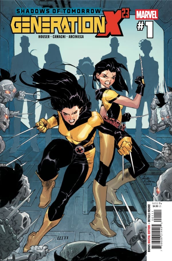
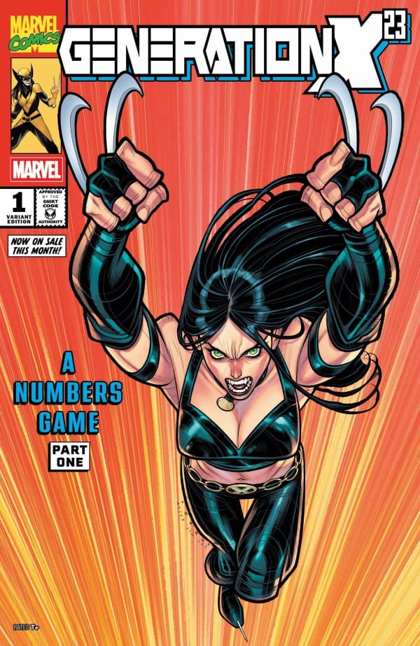
GENERATION X-23 #1 Cover. Image by Marvel Comics.

The Story for GENERATION X-23 #1

Megan: Jody Houser brings a new and compelling story for Laura Kinney, one that hits close to home for a number of reasons. Starting off with Laura and Gabby saving a young mutant who’s currently in danger of mutant-hating humans, Houser establishes the tone very quickly. While Laura is fighting off the angry mob, something very strange happens involving time manipulation. Laura, who is almost positive she knows who’s behind it, chases after the culprit only to find that the situation is absolutely not what she thinks it is. Someone is experimenting with mutant DNA, the DNA of people Laura holds dear to her heart.

Lauren: Laura Kinney AKA Wolverine, is doing what she does best: protecting a fellow mutant. As her and her sister, Gabby AKA Scout, protect a terrified mutant from some bigoted humans, time begins to slip in all directions. While everyone panics, Laura senses something familiar. As she begins to put pieces of her past together, and uncover why time is slipping, she’s literally forced to face herself. Only to then come across an unexpected fan club.

Check out another current Wolverine comic: SPIDER-MAN & WOLVERINE #9
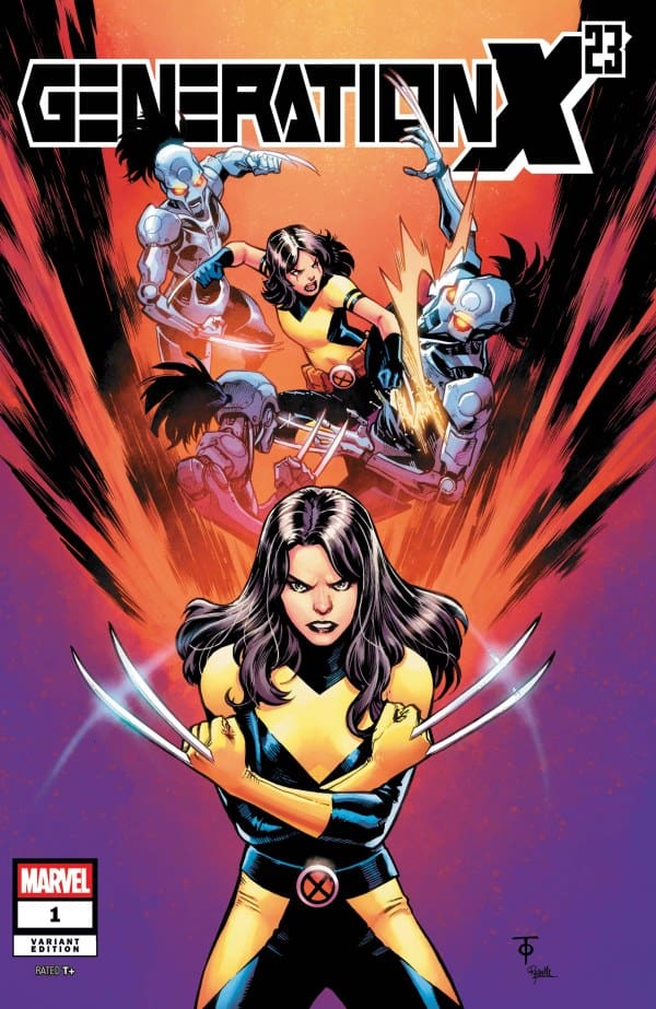
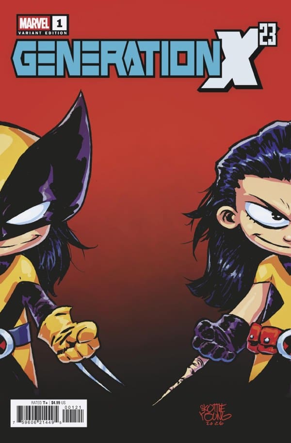
GENERATION X-23 #1 Variant Cover. Image by Marvel Comics.

The Art

Megan: The artwork of the comic was phenomenal all thanks to Jacopo Camagni, Erick Arciniega, and Ariana Maher. The time manipulation scenes were beautifully done with so many different details in each shard and ended up being some of my favorite parts. Alongside that, the characters are drawn wonderfully with Laura’s sit usually being the focal point with her bright yellow juxtaposing the black. All of this fantastic artwork is tied together with the excellent lettering talents of Ariana Maher, who keeps the energy high with a looming sense of mystery throughout the dialogue.

Lauren: The art in Generation X-23 was absolutely gorgeous from beginning to end. It had everything you would want from a Wolverine comic plus some. The time slipping power created moments that epically pushed the story along, showing why stories told via comic books are so amazing. Furthermore, Laura is perfectly portrayed as the complete badass that she is.
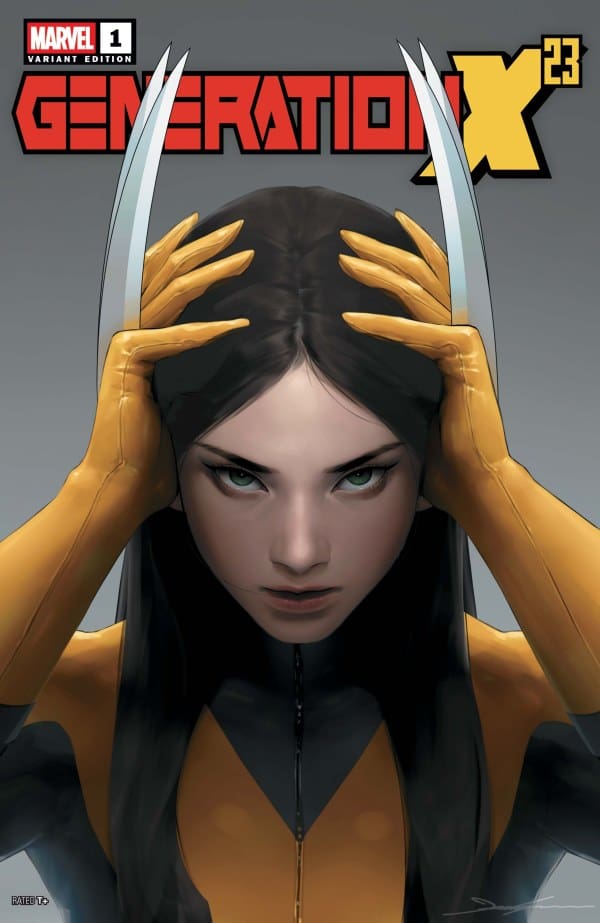
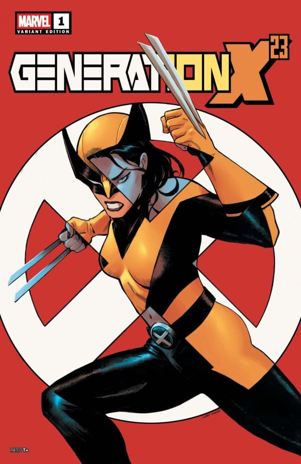
GENERATION X-23 #1 Variant Cover. Image by Marvel Comics.

Overall Grade: 9.3/10

Megan: 9.1/10. This was a fantastic start to what seems will be a thrilling comic run. Jody Houser brings a story that’s compelling and keeps your eyes hooked on the pages of the comic until the very end. This comic should be on everyone’s pull list this week!

Lauren 9.5/10: Another amazing Laura Kinney Wolverine run has kicked off. The groundwork for a fantastic story has been laid. Complete with gorgeous art, and the constant back and forth that only siblings can perfectly master. As we wrapped up with Laura’s look of sheer confusion, I was left smiling, and excited for what is to come.

I love the stories we’re getting of X-23 lately, and this one seems to be up there with the rest. Any and all Wolverine fans, must grab Generation X-23 #1, as it’s clear there is a lot more action packed fun in the near future. SNIKT!

For more from Megan, check out Vigilante Vibes Podcast.

For more from Lauren, check out ‘Hops GEEK News.’

Have you checked out this comic? Let us know your thoughts.
Leave a Reply

This site uses Akismet to reduce spam. Learn how your comment data is processed.

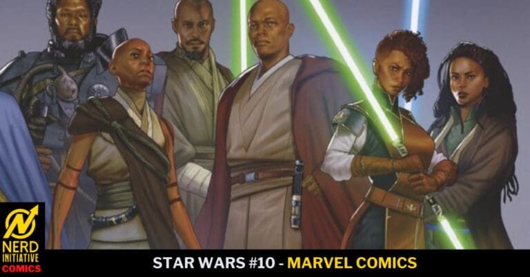
Star Wars #10: Final Gambit

“With losses on both sides, the battle between the New Republic and Oskure’s forces rages toward a final confrontation…” – Alex Segura


Creative Team

Alex Segura (Writer), Luke Ross (Artist), Chris Sotomayor (Colorist), VC’s Clayton Cowles (Letterer),
Phil Noto (Cover Artist)

Mikey J. Basso (Assistant Editor), Mark Paniccia (Editor), C.B. Cebulski (Editor-in-Chief)

Publisher: Marvel Comics


Final Gambit

Issue ten of Star Wars by Alex Segura is a beautiful conclusion to a continuation from issue nine. This is the very definition of action packed! From start to finish there is non-stop action! Which is expected when you have Luke and Han together on a mission.

Star Wars #10, Credit Marvel Comics. Cover by Phil Noto


X-Wings soar through the air invoking carnage against enemy ships. A team consisting of Luke Skywalker and Han Solo try to establish order on the ground. You also see some of the galactical political dealings regarding this very war that is taking place. Trying to display that politics and war need and require each other.

The people of this planet being taken over are split in their beliefs. And it comes to fruition when they start fighting their own kind because of promises made to them. Till the fighting slowly comes to an end and one of the natives takes it upon themselves to address this division.

The end of this issue shows us joy with unity amongst the New Republic and an Independent World. War is over, and the rebuilding phase now takes over. A somber tone of helping those who can’t help themselves. Luke offers powerful words of inspiration. “These moments are why we fight. Even if the fight feels endless. These moments give us life.”


Writing

The writing by Alex Segura is riveting in this issue. From the first page to the last page there is nothing but fighting and destruction. The dialogue and narration spread a tone of not only despair but also courage. Han and Luke always being in trouble are not phased. Alex is also very good at keeping the flow of the story on track. There was not one panel in this issue that would confuse you as you continue reading. Very informative considering all of the action and fighting taking place in this issue.

Artwork

The art for this issue is gorgeous! Luke Ross and Chris Sotomayor are just showing off in this issue. The amazing details and colors used in the opening of this book showing the destruction of a ship in space is eye popping! Another great facet of the art is the blaster fire and “swoosh” of lightsabers within the battle panels. Such a good job!

Final Thoughts

Star Wars #10 is a good read, and stunning on the eyes. Seeing the dynamic team of Luke and Han together gives it that “original trilogy” feel. This issue is the conclusion of a continuation story, and it ends in such a beautiful heartwarming Star Wars fashion. I cannot wait to see where this Star Wars comic book takes us to next within the galaxy! True Star Wars fans need to pick up this issue from their local comic book shop!

Overall Grade: 9/10


More Comic Book Reviews/News: Nerd Initiative

Previous Star Wars Comic Book Review of Mine: Star Wars: Jar Jar #1 – The Unseen

My Personal Content: Travis’ Comic Haven


PLEASE SHARE YOUR THOUGHTS IN THE COMMENTS SECTION!

Leave a Reply

This site uses Akismet to reduce spam. Learn how your comment data is processed.

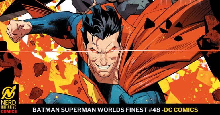
BATMAN SUPERMAN WORLDS FINEST #48: Earth-3.

Welcome to Earth-3, where the mightiest of heroes reign over the planet with only each other as opposition. Owlman has a proposition for Ultraman, but first, they must obtain a stolen super weapon from S.T.A.R. Labs. As the duo kills their way towards this superpowered weapon, what has become of Earth Prime’s heroes?

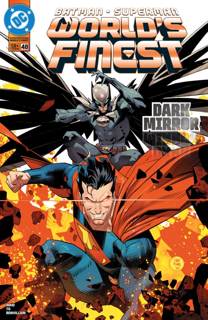
Batman Superman #48. Credit DC Comics. Cover by Dan Mora.

Creative Team: Mark Waid (WRITER), Marcus To (ARTIST), Tamra Bonvillain (COLORS), Steve Wands (LETTERS), and Dan Mora (COVER).

*SPOILERS AHEAD*

The Story:

Waid kicks this story off with a bang as we meet Bruce of Earth-3, who pays to have his parents killed, shockingly. It sets the tone for this issue because the death does not stop there. I love seeing what Batman and Superman would be like if they were evil, as Owlman and Ultraman kill anyone and everyone in their path. The focus isn’t on Batman or Superman at all in this issue, which I really enjoy as well. It’s full on evil at its finest which personally speaking, is a refreshing thing sometimes.

The Art and Letters:

Marcus is detailing some explosive panels in this issue through the artwork. Starting off with a scene we have seen over and over again with the Waynes dying. Marcus manages to still pull emotion and shock through the placement of characters, and with Steve’s lettering. Tamra is coloring up a lot of bright and beautiful colors, as well as making this Earth feel just slightly off from the one we are used to. The way Ultraman’s suit is so familiar through the red, blue, and yellow helps bring out emotions as Ultraman holds nothing back in his destruction. The art team manages to capture the sinister expressions as well, making things feel a bit more creepy through the art, and the final page leaves a lasting impression in this first part of a multi-part event.

Final Thoughts:

Batman Superman Worlds Finest #48 is a fun excursion into Earth-3, where not everything is happy and feel-good. The team has set the stage for the classic multiversal battle, and I cannot wait until next issue!

Overall Grade: 9.5/10

For more from Matt at the Hops “Geek” News podcast!

Leave a Reply

This site uses Akismet to reduce spam. Learn how your comment data is processed.

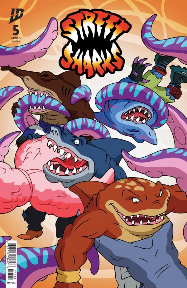
Street Sharks #5- It’s the Sharkdown of the Century

0

The Street Sharks have been after Dr. Paradigm, and now they are closer than ever. With a new mall opening and even stranger things going on near the new mall, the Sharks may finally get Dr. Paradigm where they want him.

Did you miss my review for Street Sharks #4?

Creative Team

Writer: Stephanie Williams
Artist: Ariel Medel
Colorists: Valentina Pinto and Heather Breckel
Color Assistant: Ricardo Giardina
Letterer: Jeff Eckleberry

Writing

I know we are still getting the Street Sharks Annual later this year, but what a satisfying wrap-up to this series. IDW Publishing should have Stephanie Williams on the phone yesterday about turning this into an ongoing series. As with pretty much everything Williams writes, the characters are front and center exactly where they are supposed to be. The personality of each shark and even Dr. Paradigm is perfect.

In five issues, Williams crafted a really fun and enjoyable story that felt new but still familiar. It’s a shame this is only scheduled to be a limited series because it’s rare to see such a fun and humorous series like the Street Sharks be led by such a talented writer. Usually, comics that make even serious moments funny aren’t lucky enough to have such talented words leading the way.

I really liked the way the story evolved heading into this issue. The “public enemy #1” vibe had been building over the last four issues, and Williams finally rewarded our patience with the payoff in this issue.

Perhaps one of the best takeaways from this series and this issue in particular is the way the Street Sharks serve as a reminder that sometimes, no matter what you do, how you do it, or how many people you help, some folks just aren’t going to like you. Williams also reminds us that if you do all of those things, even if you can’t win everyone over, when the time comes, and the rubber hits the road, the folks who will appreciate what you’ve done will be there to support you.

Art

Street Sharks #5 Cover by Philip Murphy. Image from IDW Publishing

The art for issue five was so funky and fun. Ariel Medel did such a great job capturing the style of the original Street Sharks 90’s kids grew up on, while still creating something that had the artist’s imprint on it.

The colors are so bright and crisp. Pinto and Breckel did a great job choosing color palettes that were familiar but took full advantage of the colors available in modern printing and art. I know the visual team had to have their hands full with the perfect predator, and I think they nailed it.

The perfect predator is part grotesque, part scary, part creepy, and all 90’s. The art team really brought a character to life that felt like everything you would want in a Street Sharks comic.

Final Thoughts

With Street Sharks, Stephanie Williams and the rest of the creative team crafted a story that feels like a love letter to 90’s kids. This feels like one for the kids who grew up reading the comics and watching the shows and wanted to taste that nostalgia with a fresh look. If ever there was a candidate for a series moving from a limited to an ongoing series, this would be it. What do you say, IDW? Can we get this creative team on board for more Street Sharks?

Overall Score: 10/10

Until next time, may your pulls be magical, and your multiverse remain stable

What do you think? Does Street Sharks need to be converted into an ongoing?

Leave a Reply

This site uses Akismet to reduce spam. Learn how your comment data is processed.

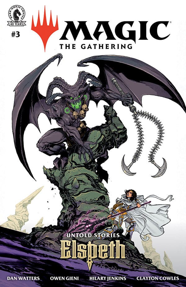
Magic: The Gathering: Untold Stories- Elspeth #3- Underworld Support

Elspeth is getting a lot of Underworld support. Writer Dan Watters, Artist Owen Gieni, Colorist Hilary Jenkins, and Letterer Clayton Cowles are back with Issue #3 of Dark Horse’s Magic: The Gathering: Untold Stories- Elspeth.

Read Magic: The Gathering: Untold Stories- Elspeth #2 Review Here

Magic: The Gathering: Untold Stories- Elspeth #3 Cover A By Owen Gleni (Credit: Dark Horse Comics)

Owen’s art in this issue is incredible. He has taken this story, and really outdid himself. I love seeing Elspeth’s story from Theros: Beyond Death expanded into a comic series, and the creativity with the art is beautiful to see. Add in Hilary’s coloring work, and Clayton’s lettering, and this comic is beautifully illustrated. 

Dan’s writing on the series is incredible. He knows Elspeth so well and is able to create a beautiful story for her. I also love that he can take a complex character, and make the world the character lives in not feel complex at all. 

This issue sees Elspeth’s underworld support grow even more. We also see her in a fight with the Nyxborn Calix. Calix is an agent of fate, and this fight was super interesting to see play out. 

Overall Grade: 10/10 

This series has just one issue left, and I cannot wait to see what happens in the end. Magic: The Gathering: Untold Stories- Elspeth, has been so fun to check out.

Leave a Reply

This site uses Akismet to reduce spam. Learn how your comment data is processed.

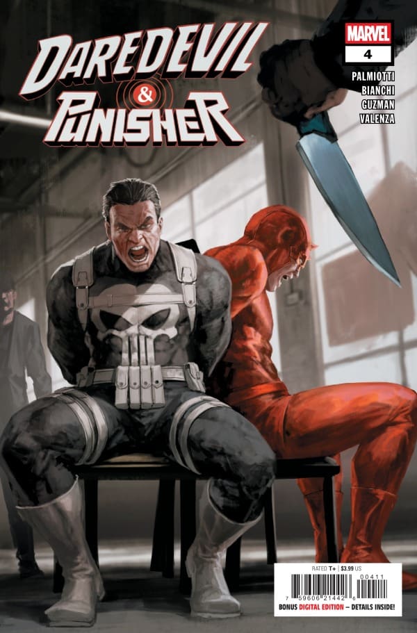
DAREDEVIL/PUNISHER: THE DEVIL’S TRIGGER #4 – Sides Collide

Creative Team – Jimmy Palmiotti, Tommaso Bianchi, Gabriel Guzman, Bryan Valenza, VC’s Joe Sabino

Published by Marvel Comics

Catch up with Daredevil/Punisher: The Devil’s Trigger #3!

The Story

This comic is reviewed by both Megan from the Vigilante Vibes Podcast and Matt from the Hops “Geek” News podcast!

Matt – This run has been a non-stop cat-and-mouse game between Frank and Matt. So in this issue, Jimmy slows things up just a little bit for a moment. Some of the best moments in comics are when Matt and Frank simply talk about their ideals and how they deal with the crime problems. Jimmy once again delivers excellent exposition as the duo is having a drink at a table, and it may be one of the best sequences in this issue. The way Jimmy can take a suspenseful story and easily weave through action to engaging conversation is what makes this run continue to pull me in deeper.

Aside from the two now working together, Jimmy brings in Foggy as a type of guy in the chair. Which I always enjoy. Foggy, more often than not, is seen as angry at Matt in various ways or uninvolved, so Jimmy brings him in even for a couple of moments, which helps build out Matt’s relationships as well.

Cover art by SKAN. Published by Marvel Comics

Megan – After the complete chaos happening in the city and between Daredevil and Punisher, Matt Murdock knows the only way to simmer things down is to join forces. With the goal of coming to a compromise, Matt asks Misty Knight to set up a meeting with Frank Castle, AKA The Punisher. With Frank on a rampage and not thinking before shooting, it was too close of a call when he almost took out an undercover FBI agent. The only way so this doesn’t happen again is if Matt and Frank work together. Matt knows this could go terribly with Frank playing by his own rules, but the stakes are too high not to try.

Jimmy Palmiotti has an unmatched way to changing tones in a story smoothly while still keeping you on the edge of your seat. There was a great build up of incoming excitement while Frank and Matt were sitting down to talk civilly. While the two powerhouses were coming to an understanding, a plan was put into action to take Frank’s life, a plan that neither character was aware of.

Daredevil/Punisher: The Devil’s Trigger #4 proves the multiple layers that comes with this story, layers that make each issue stand on its own in terms of quality and excitement.

The Art

Matt – I simply cannot get over how good the artwork has been for these issues. Issue 4 may not be full of fighting and guns blazing, but there is a satisfying fight sequence. The team delivers some extra gnarly action with Daredevil gouging an eye out with his club and Frank bringing his knife to a gun fight. It moves so swiftly across the panels and yet doesn’t sacrifice any detail in the agility of the two’s movements. Valenza has gone with the darker red suit, which to me stands out in the colors of the panels even more so. It adds the stark contrast to both Matt and Frank, cementing them as two individual entities of New York.

Megan – The artwork of Daredevil/Punisher: The Devil’s Trigger #4 is a perfect example of matching the tone of the story and elevating the story itself. There’s a good amount of action in the comic that the artists excellently captured the excitement of. The fight that involves both titled characters brought so much intensity to the pages, showing the violence in a close up manor.

Bryan Valenza is the colorist of the comic, and continues to capture the grittiness of the story. Sticking with the darker tones of the comics, Daredevil’s dark red suit acts as a focal point in many of the panels, making the blood of their enemies a focal point as well. Along with Valenza is Joe Sabino, who is the letterer of the comic. Sabino does a fantastic job at putting the different tones of the characters on display, whether it’s Daredevil’s even tone, or Frank’s harsh and dismissive voice.

Final Thoughts

Matt – 10/10. This is moving into buddy cop territory between Daredevil and Punisher, which I absolutely adore. This is a more narrative issue that allows Jimmy to slow things down a bit, also bringing depth and layers to these two characters. I cannot get enough of Matt and Frank working together despite being two opposing magnets of justice.

Megan – 10/10. This comic perfectly captures the qualities of the characters that make Daredevil and the Punisher who they are and why they’re constant fan favorites. Jimmy Palmiotti expertly shows the oil and water effect of the two characters that shouldn’t work together, but work oh so well. This should be on everyone’s pull list!

Overall Grade – 10/10

Let us know in the comments what you thought of Daredevil/Punisher: The Devil’s Triggers #4!

Leave a Reply

This site uses Akismet to reduce spam. Learn how your comment data is processed.

“Smile: For The Camera #1” – A Great First Outing

Writer: Hannah Rose May

Art: Miriana Puglia

Source: IDW Publishing & Paramount Pictures

Color: Dearbhla Kelly

Design/Lettering: Brian Kolek

Senior Group Editor: Heather Antos

Associate Editor: Bixie Mathieu

*Spoilers ahead*

Sharp, Cutting Writing

Now, I’m going to say right off the bat that I’m no fan of the “Smile” franchise. That isn’t to say it’s a bad franchise, I just haven’t seen the movies… yet. I wasn’t sure I ever would, but this issue alone has sold me on wanting to watch them. Writer Hannah Rose May has made me so intrigued as to what’s going on here that I need more pronto.

In a different approach from what I’m used to, the first character we meet is actually a side character! She’s affectionately called “Crazy Cami,” and we follow her little side story throughout the issue, leading to a massive payoff in the end. To lend credence to the name, it becomes increasingly difficult for her to determine reality from insanity. As such, it makes it hard for us as readers to do the same, slowly guiding us into the horrors to come.

As we find out, Cami’s one of the roommates of our main lead, Ivy, a veterinary student using modeling to pay for school. Through her eyes, we learn and see just how slimy the world of modeling is and how passive some of those in it can be. Hannah Rose May brings readers into this twisted world, and I’m unsure I ever want to leave it.

Bloody by Design

Upon seeing the first page, I was immediately thrown back to my middle school MySpace days. This was such a creative way to not only introduce us to Cami but also show off the usual comic book credits and copyrights. The colors pop, and the whole thing completely gives the vibe of a “mid-20s fashionista”.

However, Miriana Puglia and Dearbhla Kelly are very quick to remind us that this is a horror comic. Only two pages later, we’re treated to a gory feast for the eyes that isn’t for the faint of heart. In bloody red and striking detail are guts strewn across the ground, the remnants of someone having their life cut short by a jet turbine. The level here is grotesque yet genius. That level of detail is carried throughout the book, violent and non-violent moments alike. That isn’t even mentioning the final panel, where I had to look away in terror from the grotesqueness before looking back again.

As for the cover art… it was the first thing that immediately grabbed my attention and hooked me. The contrast of the red and white on black is pure perfection. The scissors forming a smile are beyond creative, and the blood running down them is such a neat added detail.

Final Thoughts

From the writing of Hannah Rose May to the artwork of Miriana Puglia and Dearbhla Kelly, this is easily a piece that any horror fan will gain a smile from! Absolutely stellar from start to finish and I can’t wait for more.

Overall grade: 9/10

Read more from me here and follow my socials!

Are you a fan of the “Smile” franchise? Did you love this comic and can’t wait for more? Let us know in the comments below!

One response to ““Smile: For The Camera #1” – A Great First Outing”

  1. Hancuff, Basil M Avatar
    Hancuff, Basil M

    OMG i want to get this book so much, I am such a fan of smile and smile 2, but smile 2 is my favorite out of the 2 movies

Leave a Reply

This site uses Akismet to reduce spam. Learn how your comment data is processed.

END OF LIFE #1 – On the Run

Creative Team – Kyle Starks, Steve Pugh, Chris O’Halloran, Becca Carey, Gerald Parel

Published by DC Comics

MORE COMIC REVIEWS HERE!

The Story

In End of Life #1, Kyle Starks brings an all new story with new characters that make their grand entrance with a bang. Setting the tone immediately, we meet Eddie, who has a group of assassins on the search him as he has a huge bounty on his head. When asked what he possibly could have done, we’re taken back to a recent memory of a group of robbers on the heist of a lifetime. One of their men couldn’t make it, so they subbed Eddie Stallion in to take his place. Eddie is no ordinary thief, but actually apart of the international cabal of assassins called the Menagerie. This secret crime group is nothing to scoff at, as they have rules that, if broken, will be the last thing you do.

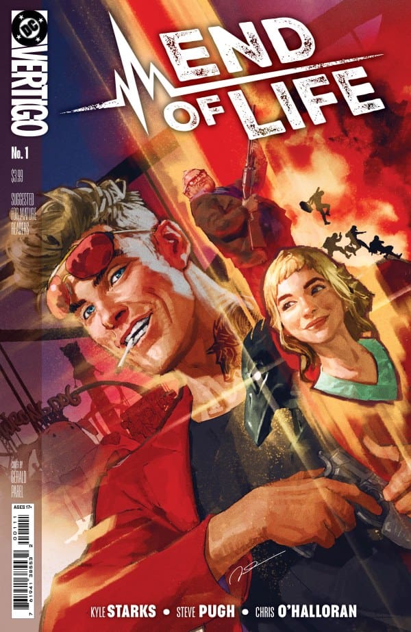
Cover art by Gerald Parel. Published by DC Comics

Things are going well on the heist, Eddie is taking down security left and right, and the group of robbers make it to their prizes. All the jewels, collectibles, priceless collections they could ever want. That is, until Eddie realizes something that ruins the entire heist. They are actually robbing one of the highest ranking bosses of the Menagerie, the Raven. This changes everything. Eddie knows now that they have broken into the Raven’s house, they’re as good as dead.

Running from the Menagerie, and knowing it’s only a matter of time before they find him, Eddie heads home to his estranged father’s house.

The Heading

Kyle Starks knocked it out of the park with End of Life #1! This comic is filled with an expletive-loving, ego-driven main character who makes it easy to not like. When you meet Eddy, you realize why is so easy for others to hate. With his daddy issues, his lack of empathy, and him only caring about himself, Eddie now has to confront the ghosts of his past and lean on others like he never has before.

End of Life #1 is full of action, filled to the brim with excitement, and has a story that keeps you hooked in until the very end. Like I said, Starks knocked it out of the park. I’m very excited to see what the next issue will bring!

The Art

With a fantastic story such as this, you have to have artwork that matches the quality, and that’s exactly what Steve Pugh, Chris O’Halloran, Becca Carey and Gerald Parel gave us. The cover art instantly caught my eye, and that quality stays that high throughout the comic. The drawings on each page are dripping with detail and excellent use of juxtaposing colors to make the characters practically pop off the pages. The lettering is done in a way that you can feel the harshness of the characters words and the heightened emotions of the story. The artists really showcased their talents in a huge way with End of Life #1!

Final Thoughts

End of Life #1 is a fresh story that keeps your eyes locked into the comic. You’re immediately locked into the story and want to read so much more by the end of it. Hats off to the creative team because this was phenomenal!

Overall Grade – 10/10

Let me know in the comments below what you thought of End of Life #1!

Leave a Reply

This site uses Akismet to reduce spam. Learn how your comment data is processed.

This review was written by Megan from the Vigilante Vibes Podcast. If you liked my review, be sure to check out my other reviews! Let me know what you think of End of Life #1, or tell me what comics you’d recommend me trying out! Find me on my socials, and check out my Marvel podcast, Vigilante Vibes, by clicking here!

Fantastic Four #8: What Makes The Invisible Woman?

Writer Ryan North

Penciler Humberto Ramos

Inker Victor Olazaba

Colorist Edgar Delgado

Letterer Joe Caramagna

Cover Artists Humberto Ramos and Edgar Delgado

Publisher Marvel Comics

In Fantastic Four #8, the person who is focused on is Sue Storm. When it comes to Sue, she is a good representation of a woman that is among men, and gives a unique perspective. Sue is balancing a lot in her life, including motherhood and also being a superhero. Like many women in the world, multitasking a big thing that has to be done to get daily tasks done. Beside that, Reed, Johnny, and Ben are in the background helping her. I enjoy that they all don’t mind Sue being in charge of the team. There is something also that happens in this comic, and it shows that Sue is really resilent.

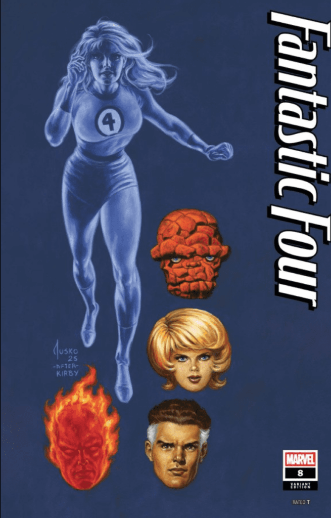
Credit: Humberto - Image by Marvel Comics.
Credit: Humberto – Image by Marvel Comics.

As far as story, it is interesting to see Sue’s dynamic with the others remain strong. I love that Sue can rely on Reed as well, to be that supportive partner in her life. As well as her brother Johnny, who cares deeply about her feelings. It’s nice to see all the characters have emotional depth within them. I enjoy that there is a lot of action going on during the story. One thing I feel that is lacking, is connecting all the dots from the previous issue. It seems that the beginning tries to connect it, but I don’t see the rest of the issue making me feel like I had more answers. I am hoping for the rest of the issues, that Sue is taking the lead and she can be the center of the story. I love woman-led stories, because I can relate to them a lot more.

When it comes to the art, it’s really good. It looks and visually represents what Sue Storm is doing in the story. I love seeing Reed’s powers, when it comes to him stretching to go and do certain things. Even when Ben Grimm is fighting, I love that I can see his powers as well. Marvel art always tells a story that I believe is important to show. I like intricate colors, that blend well and represent what the characters need to look like.

Overall, this comic issue is solid. Like I mentioned previously, I want to see more Sue led stories when it comes to the Fantastic Four. I am hoping to see how they overcome some of the obstacles that are presented at the end. I always enjoy seeing the “family” come together, and also fight together for the greater good.

Overall Grade: 9/10

What did you think of The Fantastic Four #8? Sound off in the comments below!

CLICK HERE TO READ MORE COMIC REVIEWS FROM JANELLE!

Leave a Reply

This site uses Akismet to reduce spam. Learn how your comment data is processed.

TITANS #32 – Fixing the Problems

Creative Team – John Layman, Pete Woods, Wes Abbott

Published by DC Comics

Catch up with Titans #31!

The Story

There are many balls in the air for the Titans, as most of them are in a pretty dangerous position. Donna and Arsonal are being held by Grail, who has plans to put them down permanently. Cyborg is currently gone at the tournament and there’s no way to know if he’s okay or not. Nightwing and Raven are currently at the hands of Terra, who is only gaining strength thanks to Gemworld. Surely there has to be a way for all of the Titans to get out of their situations safely. What it’ll take is some thinking outside of the box, ingenuity, and maybe some help from fellow superheroes.

Cover art by Pete Woods. Published by DC Comics

John Layman brings a satisfying ending to the Titan’s dangerous ending as they await the ending of the tournament. Layman brought the best out of the characters in Titans #32 and was able to finish the comic on a feeling of friendship and teamwork. As always, I am very excited to see what’s next for this group of superheroes.

The Art

The artwork is top quality, as usual, thanks to Pete Woods and Wes Abbott. Woods gives each character their own chance to shine, without dulling the others. With some really beautiful powersets on display, each page is an absolute work of art. Ending on a particularly gorgeous note, Woods brings so much vibrancy to the end pages that will make it hard to take your eyes off the comic.

Wes Abbott brings so much emotion to the dialogue with his fantastic work on the lettering. While making you feels the different tones of the story, he’s also able to create a perfectly even flow of dialogue. Together, Woods and Abbott knocked it out of the park yet again.

Final Thoughts

Another excellent issue if Titans from the extremely talented John Layman, Pete Woods, and Wes Abbott. If you haven’t checked out Titans yet, it’s never too late to dive in!

Overall Grade – 9/10

Let me know in the comments below what you thought of Titans #32!

Leave a Reply

This site uses Akismet to reduce spam. Learn how your comment data is processed.

This review was written by Megan from the Vigilante Vibes Podcast! If you liked my review, be sure to check out my other reviews! Let me know what you think of Titans #32, or tell me what comics you’d recommend me trying out! Find me on my socials, and check out my Marvel podcast, Vigilante Vibes, by clicking here!