Home Blog Page 106

Doctor Strange #3 – A Mother’s Love, A Son’s Betrayal

Doctor Strange and Angela must figure out what comes next. The realm of Heven is under attack from Vyrbodin. Family secrets are revealed, and tears are shed as the pair work to try to unravel the secret behind Vyrbodin’s apparent immortality before it is too late.

Did you miss my review of Doctor Strange #2? Check it out!

Creative Team

Writer: Derek Landy
Artist: Ivan Fiorelli
Color Artist: Dono Sanchez-Almara
Letterer: VC’s Cory Petit
Cover: Alex Horley

Writing

Derek Landy continues to do a great job with Doctor Strange all while forcing me to like Angela a little more each issue. This issue was so drastically different from the previous two in the best of ways. While the issue may have arisen from the aftermath of conflict, Landy managed to work in some serious, heart-wrenching moments into the story. He did so in a way that was both meaningful to the story and impactful for the reader.

Even a seemingly offhanded self-reflection from Doctor Strange can be poignant, as Landy has Doctor Strange consider the pain of a mother losing her daughter twice. One of my favorite subplots that continues in this issue may be the constant pressure Angela faces from the angels to be their Queen and her insistence on refusing to be Queen.

With the setting of Heven and Asgard, as well as other realms, Landy has really been able to build on the Doctor Strange lore. Marvel has faced some criticism before for doing the same thing over and over again, but with Doctor Strange, Landy has been given the free rein to add to the lore. We’ve already seen some new magical items utilized by Strange and Angela, and in this issue, we see some new spells specific to Asgardian magic. It’s not that there’s anything wrong with the familiar standbys like the crimson bands of Cyttorak, but it’s also refreshing to see new spells and magic in a new light.

Art
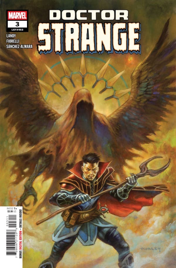
Doctor Strange #3 cover by Alex Horley

Fiorelli and Sanchez-Almara continue to craft a beautiful world. It’s one thing for the writer to have the character passively comment to themselves how each world they travel to in the realms is more beautiful than the next. It’s another thing for the artists working on the visual side to bring that beauty to life.

As the realms we’ve seen through issues 1 and 2 have been beautiful and brightly colored, it was also nice to get a chance to see what kind of work Fiorelli and Sanchez-Almara could do with dark tones and scenes. We finally get to see that when Strange and Angela visit Skravarede.

The artwork on this issue is really top-notch, but Cory Petit also deserves some serious credit for the hard work on the lettering in this issue. As in previous issues, certain points are made or conveyed forward by Doctor Strange’s internal monologue, and Petit does a great job ensuring that those moments are not only clear but that they don’t interrupt the flow of the comic.

Final Thoughts

This issue marks another satisfying entry into the story of Doctor Strange. Landy does a masterful job of taking advantage of the setting offered by the story to explore new magics, spells, and items in the lore and world of Doctor Strange. The buddy cop story vibe that is created between Angela and Strange has been a joy to read and watch. Landy has crafted my favorite version of Angela I have encountered in a comic book.

The subplots (Angela refusing to be Queen and Strange pining for home on Earth) continue to be enjoyable additions to the story. I’m really enjoying the series so far, and happy that Marvel signed off on Landy being able to explore other realms beyond the Doctor Strange of Asgard limited series that ran during One World Under Doom.

Overall Grade: 10/10

Until next time, may your pulls be magical and your multiverse remain stable

What did you think of Doctor Strange #3? Let me know in the comments below, and don’t forget to check out my other reviews!
Leave a Reply

This site uses Akismet to reduce spam. Learn how your comment data is processed.

Stitch #6- Lie Detector Time

No one panic: Stitch has lie detecting robot armor. Dynamite’s Stitch comic is back with Issue #6, and the book’s all-star creative team is also back:

  • Writers: Connor Ratlif & James III 
  • Artist: Greta Xella 
  • Letterer: Fabio Amelia

Read Stitch #5 Review Here

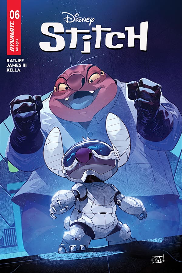
Stitch #6 Cover A By Edwin Galmon (Credit: Dynamite Comics)

We start the issue with everyone watching The Wombat Who Fibbed on the TV. While this is happening, everyone is telling Jumba to be quiet. After that, we see him working on something for Stitch. Jumba then reveals he made lie-detecting armor for Stitch. 

Stitch then tests out the armor on Lilo & David, who are lying to Nani. The armor then proceeds to spray a fart-like gas onto David. Lilo then lies about not knowing what David’s gift to Nani is, and she then gets sprayed with the gas as well. 

Nani then says she likes David’s new shirt, and she gets sprayed with the gas as well. Everyone then shows up for the party. We then see a group of aliens deciding to both block communication with Jumba, and to go and check out his experiments. 

We cut back to the party, and Nani is getting gassed again. The aliens then show up to surprise Jumba, and they start talking to everyone. Stitch’s suit then sends out a flag that says “Liar! Liar! Pants On Fire!” on it, and then Jumba and Pleakly both get gassed. The aliens then get gassed and proceed to fight. The issue ends with everyone promising not to fight ever again. 

Overall Grade: 10/10 

This issue was so good. I loved seeing everything that happened, and I cannot wait for the next issue.

Leave a Reply

This site uses Akismet to reduce spam. Learn how your comment data is processed.

”Sai: Dimensional Rivals #2” – A Triumph of Teamwork

Writers: Peach Momoko, Esad Ribić, Natacha Bustos

Lettering: VC’s Joe Sabino

Cover artist: Peach Momoko

Designer: Kat Walkington

Editor: Danny Khazem

Editor-In-Chief: C.B. Cebulski

*Spoilers Ahead*

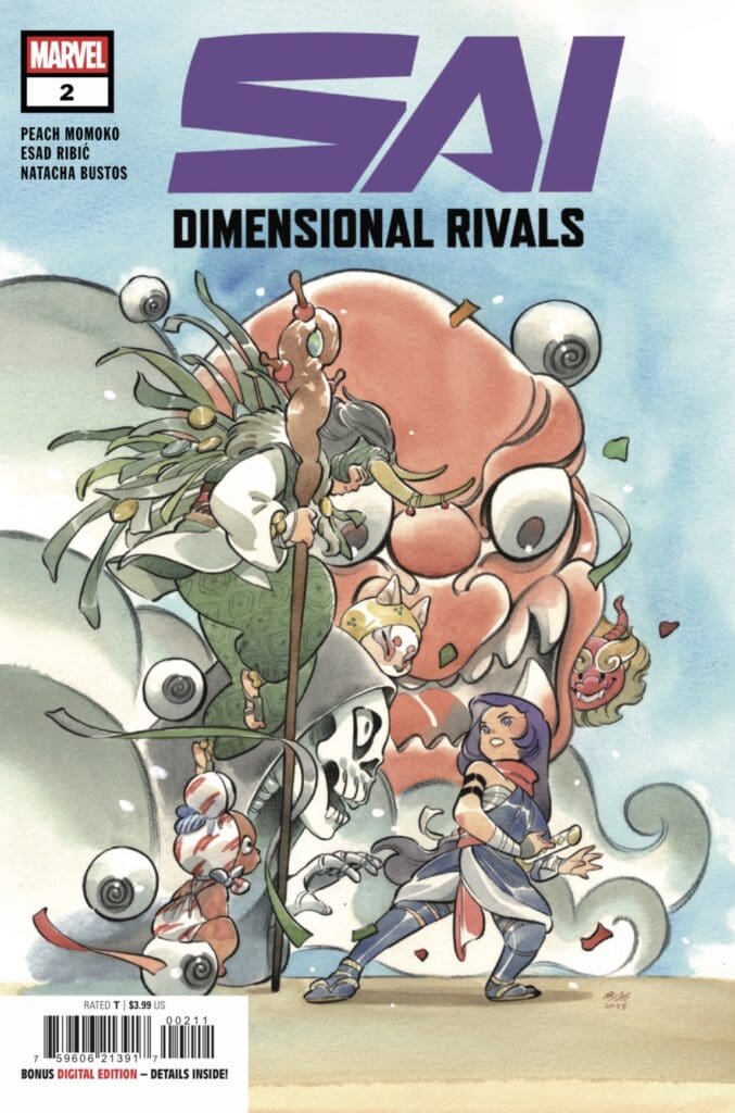
Cover art by Peach Momoko. Published by Marvel Comics

Inter-dimensional Writing

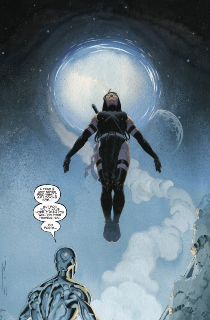
Yancy: Sai’s adventure continued in the hands of multiple creators. Starting off with Esad Ribić who puts Sai a surreal cosmic face-to-face experience with the Silver Surfer. Based on the art style and the dialogue by Ribić, this was the more serious and ominous moment in the series so far. Surprisingly enough, Sai has enjoyed her interdimensional travels. In searching for the magical stones, Sai has seen different worlds along with different versions of herself. Unfortunately, the search for the stones has been futile so far. But she will not be deterred, quite the contrary. Instead, she volunteers to continue the adventures in issue #2 by requesting Galactako to send her to more worlds. Finally, the third and final act of this issue comes from Natacha Bustos. Who takes Sai to a world where villains go to school. The vibe of this world is more playful and jovial. At least at the surface level. Besides being the god of lies and mischief, Loki is also part of the teaching staff of this school.During Sai’s encounter with Professor Loki, she’s forced to do some self-reflection by the trickster. Where is Sai going next? We’ll have to continue reading to find out!

Eda: Continuing on from issue #1, the writing here was absolutely phenomenal. One of the last things I ever expected to see in this run was Sai meeting Norrin Radd. When he came up, my jaw was on the floor. That jaw fell deeper and deeper as we saw more and more further into the issue. No twist or layer was without purpose and the reader’s left wondering where things will go. Momoko, Ribić and Bustos are a powerhouse to be reckoned with.

Source: Marvel Comics

Art Makes the World(s)

Yancy: This comic book allows readers to consume a story from multiple artists with individual storytelling choices and styles. While at the same time telling a cohesive story collectively. One could say this is a showcase of art and writing talents.

Eda: I agree with Yancy here! While each artist’s style is distinct, they tell a very cohesive story. Not a single detail feels lost. This is a true test of how artists can work together to create something wonderful!

Final Thoughts

Yancy: Obviously, there’s a lot more to be revealed in this story. But so far Sai’s story is one of filled with wonders, intrigue and a fun mystery. This is an incredible collaboration by some of the most talented creators in comic books. Marvel is setting a new standard for teamwork in storytelling with Peach Momoko at the forefront of this project.

Eda: This was a great follow up to an incredible first issue. This is such a defining change up from what most of the industry is doing right now. This project spearheaded by Peach Momoko is an absolute triumph and artistic spectacle!

Overall rating: 8.5/10

Where To Find Us

Read more from Yancy and follow his socials!

Check out more from me here and check out my socials here!

Comments

Are you reading “Sai: Dimensional Rivals”? If so, what’d you think of this latest issue? Let us know in the comments below!

Leave a Reply

This site uses Akismet to reduce spam. Learn how your comment data is processed.

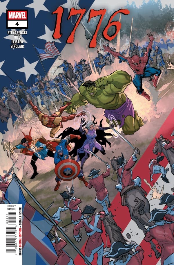
1776 #4: Bloodlines

Peter is shot and quickly dying, which causes Captain America to put the fate of his future country on the line to save him. Meanwhile, Tony is on his way to help aid the struggling Colonials, but it may be too late for some, including Bruce, whose life force is being drained out. Not all is lost, however, as Peter may have just saved his family’s future bloodlines by risking his life, showing that not all sacrifices come at a bad price.

1776 #4. Credit Marvel Comics. Cover by Pete Woods.

Creative Team: J. Michael Staczynski (WRITER), Sean Damien Hill (PENCILS), Jay Leisten (INKS), Joe Caramagna (LETTERS), and Pete Woods (COVER).

This is a joint review by Matt Roth and Shawn Foles! Check out more reviews from Shawn and from Matt at the Hops “Geek” News podcast!

Matt: I am continuing to love how silly and yet how high-stakes this story is. J is weaving in fun moments, such as Tony’s and Ben Franklin’s conversations, with heavier moments. He gives us an extremely cool full circle moment as Peter saves a member of his family tree and cements the name Ben in his long storied history. This is one story I truly could not tell you what is coming next, and that is what makes this so gripping as we move from panel to panel. Despite Peter being near death, J ensues that Spider-Man’s spirit is there as he jokes about how much he could get for the musket ball that hit him in endearing Spidey fashion.

Shawn: In the midst of a very serious battle, J Michael Straczynski manages to inject his wit and humor into the story in the most delightful way. He does an amazing job in the story of painting the cost that both our heroes and the founding fathers of the country are willing to pay for the new country. I found myself getting surprisingly emotional at the Uncle Ben reference Straczynski worked into the story. The interactions between Tony Stark and Benjamin Franklin continue to be some of my favorites, and I can’t wait to see how Stracynski wraps up this story in the next issue.

Matt: The opening panel of Peter lying on the ground bleeding hit me as though I, myself, was shot. It is a heavy moment in which Jay and Sean open up this book, and one that is the right choice. Perhaps one of the best moments comes when Cap is carrying Peter on his back. The colors from Caps suit in his bright blue outfit mixed with the Colonial attire pop from the panel as Peter is on his shoulders. The imagery stands out to me so heavily, and that’s what makes a good comic. I do want to shoutout the cover as well, depicting the two sides running into battle against each other.

Shawn: As much as I love the writing of this limited series, the art may be even better. The period setting of the story could really limit the art if the artists allowed it, but they don’t. The characters are fresh and distinct. Clea in period dress is perhaps one of my favorite looks I have seen her in throughout her history as a character. The lettering, colors, and lines are all clear and crisp, with the story easy to follow thanks to the clear lettering. I’ve enjoyed the way the art team has continued to highlight the magic aspects of Morgan’s work and spells without doing so in a way that distracts from the overall impact of the art and story.

Matt: 9.5/10. 1776 #4 brings heavy stakes to the fight as we see our heroes thrown against the ropes and their backs against the wall. It’s full of heart, humor, and spectacle, which has me sucked in entirely.

Shawn: 10/10! Overall, this has shaped up to be another really great limited series from JMS. I don’t exaggerate when I say the comic is enjoyable because it makes a historical event enjoyable through mainstream comics. This limited series provides a fun way to explore the Battle of Saratoga that is easy to connect with.

Leave a Reply

This site uses Akismet to reduce spam. Learn how your comment data is processed.


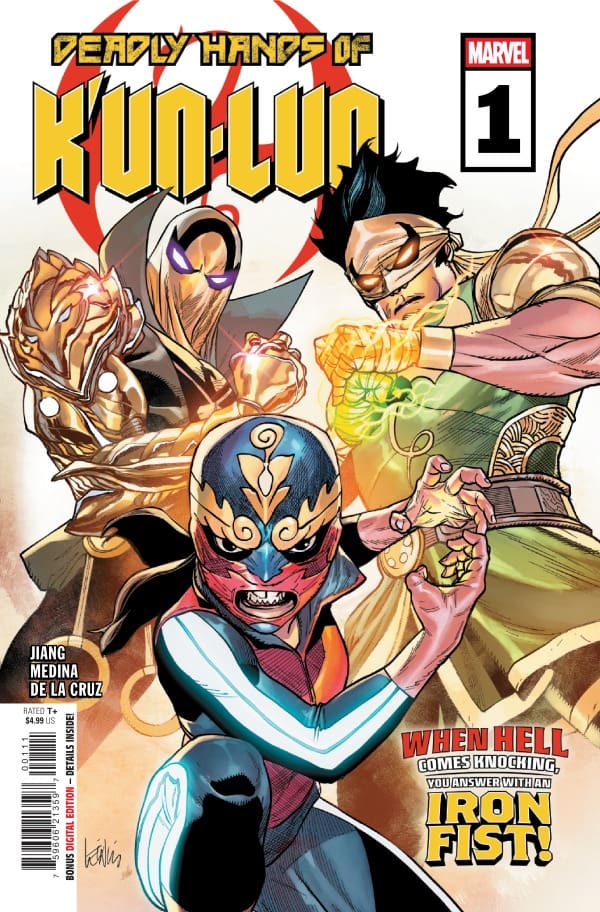
DEADLY HANDS OF K’UN-LUN #1 – The Battle of Brothers

Creative Team – Yifan Jiang, Paco Medina, Ceci De La Cruz, VC ‘s Cory Petit, Leinil Francis Yu, Federico Blee

Published by Marvel Comics

MORE FROM NERD INITIATIVE HERE!

The Story

This comic was reviewed by Nerd Initiative’s Shawn and yours truly, Megan Nichole!

Shawn – I really loved that Jiang gave us a little darker tone that we are used to seeing out of Iron Fist. The overall trajectory of the character has been a little darker in recent runs but man this one got real right out of the gate before quickly changing tone.

I think the ability to shift from a serious to a more humorous tone near the middle of the issue was a great example of quality writing. The story became a little more funny without making the earlier tone feel useless.

Cover art by Leinil Francis Yu and Federico Blee. Published by Marvel Comics

MeganDeadly Hands of K’un-Lun #1 takes all the exciting parts of the Iron Fist lore and combines them into one story. While Danny Rand is no longer the Iron Fist, he is succeeded by Lin Lie, who isn’t aware that forces stronger than he’s ever seen are forming a plan. After storming the Seven Heavenly Cities, Lin Lie’s brother, Lin Feng is on the search for The Last Orb of Chiyou in order to bring back Chyou. Gathering himself a demonic army of power-hungry beings, Lin Feng will stop at nothing to get what he’s after.

Yifan Jiang brings so much heat in this first issue with seeing Lin Feng take down the immortal weapons of the Seven Heavenly Cities. Then Jiang quickly changes pace by showing Lin Lie, who’s right in the middle of saving a town from a gigantic octopus alongside AMi Han, AKA White Fox. Jiang doesn’t just stop there with characters he’s bringing into this story. Pei, Elektra, and White Tiger are also along for this story, which makes me incredibly excited to see what’s next for the new Iron Fist.

The Art

Shawn – Paco Medina and Ceci De La Cruz really treated us to some good and unique art. You can definitely feel the East Asian influences in the art but they are very well blended with distinct features from the artist and colorist.

Cory Petit really shined in this issue as well. There were a lot of introductions that required a delicate touch from a seasoned letterer to avoid becoming jumbled and too much for the story, but Petit was up to the task.

I really love the shading work, particularly on the characters’ faces such as White Fox. I’m also a sucker for the reference by the art and writing team to the Death of Doctor Strange.

Megan – The artists bring so many beautiful aspects to the pages of Deadly Hands of K’un-Lun #1, it’s hard to narrow it down to which parts are your favorite. Paco Medina, Ceci De La Cruz and Cory Petit all showcase their talents in a huge way on each and every page. Paco Medina draws the characters in a way that each one has their own spotlight to shine without dulling the others around them. Ceci De La Cruz brings so much vibrancy to the pages using their fantastic talents of coloring. Cory Petit makes you feel the emotions of the characters clearly through the dialogue. The artists truly made this first issue a homerun.

Final Thoughts

Shawn – 9/10. Overall I thought this was a really solid first entry featuring a team folks might not be used to seeing in the same comic. I think Iron Fist and White Fox actually work really well together and want to see what this creative team can cook up for them going forward.

Megan – 9/10. So much happened in this first issue and I’m very excited to see what happens next! There’s action, there’s emotion, there’s a fantastic story. This is exactly what you’d want in a comic!

Overall Grade – 9/10

Let us know what you thought of Deadly Hands of K’un-Lun #1!

Leave a Reply

This site uses Akismet to reduce spam. Learn how your comment data is processed.

You can check out more reviews from Megan and Shawn here!

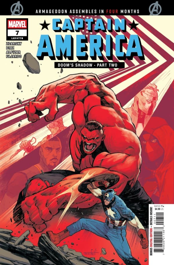
Captain America #7-What If The Bad Guy is What People Need?

Captain America is back on team S.H.I.E.L.D. and SHIELD is on a mission to secure and protect Latveria in the aftermath of the fall of Doctor Doom. There’s just one thing standing in their way….The Red Hulk, Thunderbolt Ross. In his quest to establish peace in Latveria, Steve Rogers runs into an old friend who has become more than even Steve Rogers could have predicted.

Miss Part One of Doom’s Shadow? Check out my review for Captain America #6

Creative Team

Writer: Chip Zdarsky
Artists: Delio Diaz and Frank Alpizar
Color Artist: Romulo Fajardo Jr
Letterer: VC’s Joe Caramagna
Cover Artist: Valerio Schiti and Frank Martin

Writing

Man, Chip, did you have to give us so many big reveals in a single issue? I know that Captain America and what is happening in light of the fall of Doctor Doom is set up to play a big role in the upcoming Armageddon event, but this issue had me on the edge of my seat the entire time. This issue felt like the best of Captain America. Fighting, some great dialogue, tension, and even a little espionage.

One of the things that I have appreciated about Zdarsky’s take on Captain America is that he uses the narrative to paint Steve Rogers as more of a realist than he has ever been, without being jaded. Steve understands that everything is not star-spangled awesome and that no matter how good you want things to be, sometimes they simply just aren’t. However, Zdarsky never allows that to make Steve jaded.

Art

Captain America #7 Cover by Valerio Schiti and Frank Martin. Image from Marvel Comics

The art for this issue was simply outstanding. I could feel the tension between Red Hulk, Captain America, and Nick Fury Jr. in my bones. Diaz and Alpizar crafted clean lines that felt rugged at all the right times.

There’s one particular panel that catches you off guard and once you’ve read this issue you’ll know exactly what I’m talking about but it is perhaps the most beautiful panel in this entire issue. Diaz and Alpizar drew the panel beautifully with Fajardo doing an amazing job on colors. Joe Caramagna put the cherry on top with the lettering on the panel.

The art is gorgeous from front to back cover and really serves to push the story forward

Final Thoughts

Overall, I really loved this issue of Captain America. Zdarksky with these issues of Captain America is really capturing the best of what makes Captain America the hero that he is. Zdarksy can do that while still updating the character to be realistic and yet optimistic.

Marvel has told us that Captain America and Wolverine: Weapons of Armageddon are the series that will set the tone for the upcoming Armageddon event and if that is the case then I can’t wait to see what Zdarksy does when he’s behind the wheel driving the bus for the whole show.

Overall Grade: 10/10

Until next time, may your pulls be magical, and your multiverse remain stable

Did you enjoy Captain America #7? Let me know in the comments below

Leave a Reply

This site uses Akismet to reduce spam. Learn how your comment data is processed.

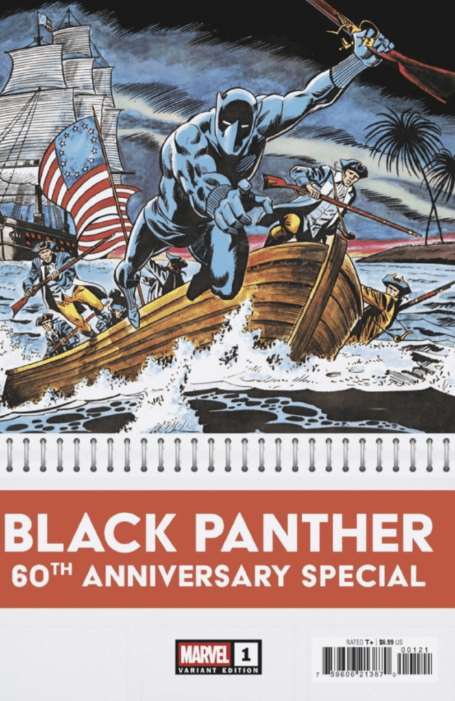
Black Panther 60th Anniversary: What Makes The Black Panther?

Credit:Mateus Manhanini Marvel Comics

Writer Christopher Priest

Writer Cody Ziglar

Writer Evan Narcisse

Writer Murewa Ayodele

Letterer Cory Petit

Artist Alitha Martinez

Artist Eder Messlas

Artist Javier Pina

Cover Artist Mateus Manhanini

Publisher Marvel Comics

Black Panther is celebrating the 60th Anniversary issue. This is especially exciting because it is also is in Black History Month. When it comes to the Black Panther, he is one of the intricate characters needed for Wakanda to keep safe and keep going. T’Challa’s choices has a whole nation being affected for the rest of their existence. The question that is asked in every issue is, what makes the Black Panther unique and what is his legacy going forth?

This issue has a collection of stories, that shows the Black Panther in a light that has him using his knowledge and power. One of the main questions is, what is T’Challa when he takes off his suit? Is he just a typical man? I know in the Black Panther film, those questions are brought up as well.

Story

When it comes to story, I like how detailed the writer is in terms of T’Challa. There are a lot of cameos from certain characters that I was surprised to see. Again there are so many questions posed in the stories, and there are some answers. That doesn’t mean that T’Challa didn’t have to work for them. It is a fast paced story, filled with things that he has to fight. Which I find really good, because I love action in comic books, especially in Marvel comics. T’Challa diligently uses resources in order to help himself and that also helps him defeat who he needs to defeat.

Art

In terms of art, I love how the artist uses vibrant colors. I also love the different hair styles represented, like locs and also details on T’Challa’s suit. Additionally, I love the brown that is mixed, to portray all different shades of Black people. I also like how each character has a distinct look. Even the crowds of people in Wakanda, are beautifully drawn with wonderful colors.

Overall Grade: 10/10.

Overall, this was a wonderful issue. It is emotionally, gut punching and at the same time has a lot of heart. I can’t wait to see more of the Black Panther in Marvel comics. Maybe also see him work with the Avengers, because he would be a wonderful asset to any team he joins.

What did you think of the Black Panther 60th Anniversary? Sound off in the comments below!

CLICK HERE TO READ MORE COMIC REVIEWS FROM JANELLE!

Leave a Reply

This site uses Akismet to reduce spam. Learn how your comment data is processed.

Ultimate Spider-Man #24 – What’s Missing Isn’t What Matters

0

The battle is here. Spider-Man and his family are ready. As Richard and Felicia work behind the scenes, Peter squares up for the ultimate battle against Mr. Negative and Kingpin. When everything is falling apart around you, how do you hold it together? Family, love, and a little luck. The truth is revealed, and Peter finds out that what he was missing might not have been what mattered all along.

Creative Team

Writer: Jonathan Hickman
Artist: Marco Checchetto
Artist: David Messina
Color Artist: Matthew Wilson
Letterer: VC’s Corey Petit
Cover Artist: Marco Checchetto
Cover Colorist: Matthew Wilson

Writing

This is not a spoiler as much as it is a disclaimer. If you are a dad, Jonathan Hickman is probably going to wreck your emotions with this issue of Ultimate Spider-Man. It’s been a long time since a comic brought me to tears but I’ve gotta be real with you, this one just hit all the right spots.

I’ve been fortunate enough to read the last issues of the other Ultimate comics that are ending but this is easily the best so far, and it’s not even close. Hickman really has been at the top of his game during this run of Ultimate Spider-Man, and this may be the best issue he has written. There’s action and drama and then there’s the family moments that have made Ultimate Spider-Man so different from everything that has come before it.

I think the last time I was this genuinely sad to see a run coming to an end not knowing when or if I would see the creative team again was when Jed MacKay’s run on Doctor Strange ended. Hickman, Checchetto, and Wilson crafted a beautiful farewell to the story.

Art

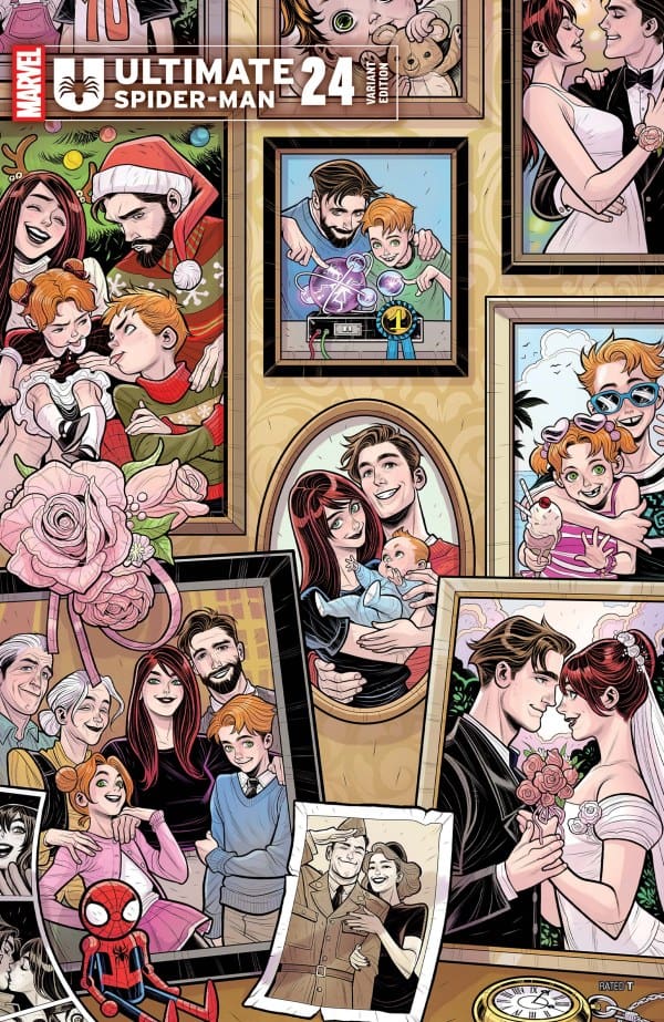
Ultimate Spider-Man #24 Elizabeth Torque Variant Cover. Image from Marvel Comics

What do I even put here? What can I say about the work that Marco Checchetto has done on Ultimate Spider-Man that either hasn’t been said or would do justice to the work that’s been done?

This issue is more of the same great work from the entire visual team. It’s clean lines, easy flowing lettering, and beautiful colors. The team manages to nail a range of art from buildings to close-up facial portraits to family art.

The visual team brought such clarity and beauty to the words that Hickman put on paper. Matthew Wilson is absolutely delightful with colors on this issue. It’s not just that Wilson chose the right colors, but the right shades. Without reading the words, the colors conveyed the tone.

Final Thoughts

Hickman and Checchetto reminded everyone the reason that Spider-Man was the keystone arc of the entire Ultimate universe. This is not to subtract from any of the other amazing teams that have worked on this iteration of the Ultimate universe, but Ultimate Spider-Man from beginning to end is one of the most unique, satisfying, and ultimately gratifying stories of Spider-Man that Marvel has released in a generation. I genuinely want more from this team and feel sad that it’s over

Overall Grade: 10/10 (Honestly I’d give it an 11/10 if I could)

Until next time, may your pulls be magical and your multiverse remain stable.

Check out my other reviews HERE! and let me know what you thought about Ultimate Spider-Man in the comments below.

Leave a Reply

This site uses Akismet to reduce spam. Learn how your comment data is processed.

Dungeons of Doom #2- Whispers, Death, Betrayal, and Sight

The Dungeons of Doom are open and everyone is seeking to claim a piece. The U.S Government led by Thunderbolt “Red Hulk” Ross, Umbra the Wakandan, Hydra, and even Latverian Freedom Fighters seek to claim a piece of what hides below. What was Doom keeping from the world? What was Doom protecting the world from? Join Megan and me as we team up and jump into the depths with Dungeons of Doom #2.

Need to catch up? Check out our joint review for Dungeons of Doom #1!

Creative Team

Writers: Phillip Kennedy Johnson & Benjamin Percy
Artists: Justin Mason, Robert Gill, Carlos Magno, George Jeanty, & Karl Story
Color Artist: Guru-eFX
Letterer: VC’s Travis Lanham

Writing

Megan: So much happens in Dungeons of Doom #2, and it perfectly matches the intensity of the first issue. Phillip Kennedy Johnson ad Benjamin Percy bring a continuation of Doom’s death that’s wrapped in a horror energy that keeps you on the edge of your seat. The different teams who want to lay claim on what Doom left behind are stuck inside of the former World Emperor’s most forbidden dungeons. It’s very clear that no one other than Doom can handle what’s inside these dungeons.

From seeing a dungeon that’s looks like a ritual spot for Khonshu to a brand new piece of Wakanda lore from Umbra, there’s so much uncovered in this comic. All that we see in Dungeons of Doom #2 puts it into perspective exactly how secretive and powerful Doom was, but also how unhinged his mind must have been.

Shawn: Whenever you have multiple writers and artists working on one project, there tends to be some complexity and often confusion. That is not the case with Dungeons of Doom. Phillip Kennedy Johnson and Benjamin Percy do a great job utilizing the chapter format to tell compelling stories. I love that the chapter format creates a story within a story. Each chapter feels unique and distinct both in writing and art.

In using the chapter format, Johnson and Percy effectively channel some of the old-time radio dramas for me. I can almost hear the “tune in next week to find out” in my head as I reach the end of each chapter. I find myself wanting more each time I reach the end of a chapter and start a new one. I loved the introduction of a new piece of Wakandan lore as well.

Art

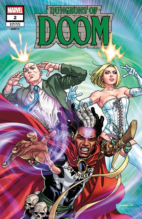
Dungeons of Doom #2 Variant Cover by David Yardin. Image from Marvel Comics

Megan: The artists do an incredible job and sending a shiver up your spin while keeping you entranced in the artwork of the comic. With such a stacked creative team filled with extraordinary artists, it’s no surprise that the art is fantastic.

In Dungeons of Doom #2, the artists were able to capture the horror aspects of the story as well as the goriness. All panels are drawn and colored beautifully, even if their subject matter is dark. I really enjoyed how Guru-eFX was still able to bring vibrancy to the comic, even with the characters being in a dark dungeon. Alongside that, the artists go out of their way to ensure that each panel is very detailed, providing a clear look at all the evil to take place in Doom’s dungeons.

Shawn: How is it that every single chapter of the Dungeons of Doom series has distinct styles and all of them work? I think the art teams on Dungeons of Doom is part of why the style and narrative work so well. Each chapter feels unique despite all being set in the same dungeons.

When you’re dealing with a dimly lit dungeon, you are really kinda limited in what you can do color-wise. Still, the color artists do a great job making each faction we encounter easily identifiable, even with the limited palette created by the setting. Travis Lanham particularly shines with lettering work in the Whisper Man chapter. The art team combines to give us some pretty cool flashback featuring fan favorite characters.

Final Thoughts

Megan: Dungeons of Doom is absolutely not what I expected it to be, in the best way possible. Phillip Kennedy Johnson and Benjamin Percy brings a story that nightmares are made of inside Doom’s most secret dungeons. Dungeons of Doom #2 continues the excitement the surprises at every turn.

Shawn: You know how you feel when you finish reading a comic, and you’re waiting not so patiently for the next issue so you can see what happens? It’s one of the best feelings in comics, and it lets you know that you’ve got in your hands a well-done comic. With Dungeons of Doom #2, I got that feeling four separate times. Each time I made it to the end of the chapter, I was desperate for more. I want to know what happens to each team and where they go from here. The writing is top-notch, and the team of Johnson and Percy hit their stride even more than in the first issue, and it’s really starting to get to the point that every page of this comic is a page turner.

Overall Grade:

Megan: 9/10

Shawn: 10/10

What did you think of Dungeons of Doom #2? Let us know in the comments.

Leave a Reply

This site uses Akismet to reduce spam. Learn how your comment data is processed.

ABSOLUTE BATMAN #17: Poison Ivy

Something is brewing in Gotham City as trees and other plant life are growing from a building in the city at the hands of Poison Ivy, leading Batman inside to investigate. Bruce must struggle with not only vines and killer plants, but also with the choices he has made. Batman has become something he could never have dreamed of, so have his friends and the city itself.

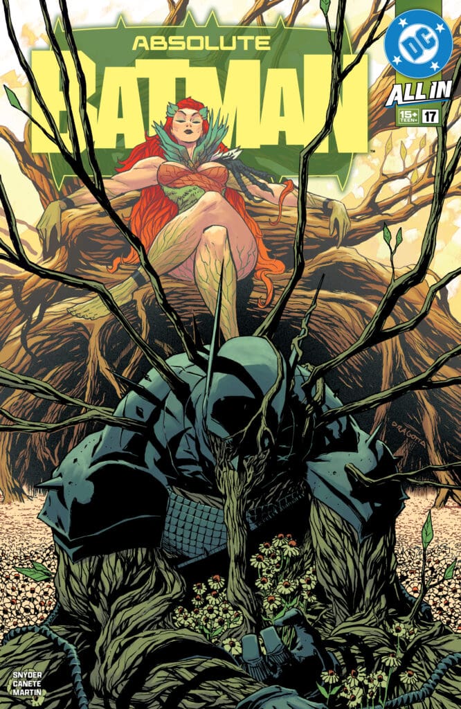
Absolute Batman #17. Credit DC Comics. Cover by Nick Dragotta and Frank Martin.

Creative Team: Scott Snyder (WRITER), Eric Canete (GUEST ARTIST), Frank Martin (COLORS and COVER), Clayton Cowles (LETTERS), and Nick Dragotta (COVER).

The Story:

Every villain that we continue to meet in this outstanding run has had an incredible backstory to them. Scott delivers yet another heartbreaking one to Ivy, who was never out for revenge of any kind. Her mother was sick, and so Ivy set out on a course to cure her and, in doing so, unlocked something much worse. This issue also delivers more inner workings for Bruce as he is doubting himself at times. Batman has become something much more to the city. Ever since he defeated Bane, Batman has become a symbol, and it has caught him off guard. It’s these little elements that Scott throws in that add depth and meaning behind the absolute unit of a man known as Batman. We even get to see Bruce and Alfred work together more, bringing their relationship closer. The writing is so beyond clever and has me glued to every panel with the help of Clayton, who is masterfully lettering every detail without the panels ever feeling too much.

The Art:

For all of the death and nightmares behind every plant in this issue, it is an absolutely gorgeous issue. Eric steps in as a guest artist and delivers intense detailing within every panel. Moments of Bruce with double chainsaws on his arms might honestly be one of my favorite shots of the series. I love how the vines and the plants all feel thick, and the detailing and line work Eric brings allows them to take on a life of their own. Frank’s colors aid in this as the panels and splash pages pop. Frank is using an array of colors, making the details stand out that much more, and really making this a beautiful issue. Nick’s cover needs to be a poster immediately because the imagery sets us up for what’s inside. There is something that is haunting and yet beautiful about this cover.

Final Thoughts:

Absolute Batman #17 is a visually stunning issue that breathes life into every panel. The story itself is one of tragedy as only a Batman story can be, but it has so much depth and layers to it. Scott, Eric, Frank, and Clayton kick off Ivy’s story wonderfully, and there is a MASSIVE surprise on the final page.

For more from Matt at the Hops “Geek” News podcast!

Leave a Reply

This site uses Akismet to reduce spam. Learn how your comment data is processed.