Home Blog Page 64

“Ripcord #3” Review – Revenge Reaches New Highs

In the previous issue, we witnessed our main character, Dillon, unleash the exact level of violence she’s willing to dish out in her mission to save her sister. Now hitting the road with her new partner, Colebee, Dillon’s out to track down those who may have her. Will she learn anything new? What will she find? Read on to see if you’re enticed enough to find out!

Writer: Cullen Bunn
Artist: Aneke
Colorist: Patricia Martín Samaniego
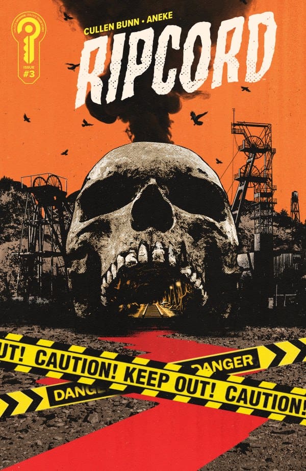
Source: Jorge Fornés, Ignition Press

The Writing

So much like in “Ripcord #2”, the writing from Cullen Bunn remains top-notch here. Where that felt like an adrenaline rush, the action takes much more of a backseat here in favor of story and character development. I personally felt this was done in a clever way, as we get Colebee and Dillon asking each other questions. Since these two just met, this feels very organic and not at all out of place while keeping the story moving forward.

Bunn keeps up the dread from the previous issue, but in a much different way here. Where the last book showed violence, here he shows just how this gang treats those they kidnap. Not with violence, but with pure depravity, showing how addiction can take its toll. If mine is the first review that you see, then let me warn you that this story is not for the faint of heart, and it’s utterly fantastic. This isn’t even to mention the cliffhanger that left me on the edge of my seat!

The Art

Matching the writing, the artwork, and coloring of Aneke and Martín are near perfect. I absolutely love Aneke’s style, as her penciling keeps an edge to it. It’s like she doesn’t play by the rules. Both the pencil work and detailing keep perfectly in line with the story and its tone, creating a perfect cohesion that keeps your eyes glued.

The colors of Martín only work to enhance this point even further. When Dillon seems to be feeling her most hopeful, we get this backdrop of a beautiful sunset colored by an amazing blend of reds, oranges, and yellows. However, the second she starts to lose that hope, she’s surrounded by pitch black, deep reds, and cold blues. The work here is pure genius.
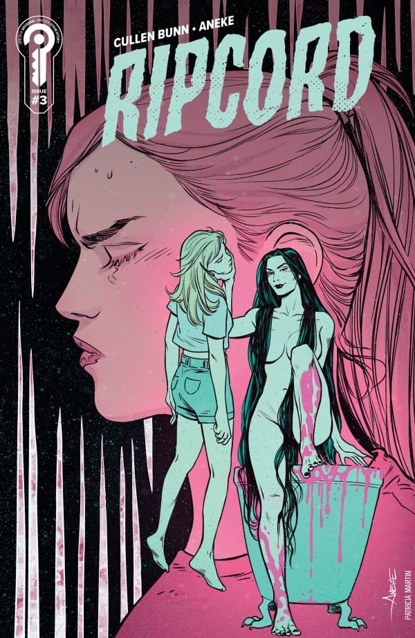
Source: Aneke, Ignition Press

Final Thoughts – 9.5/10

Bunn, Aneke, and Martín continue to prove that they’re a force to be reckoned with. From the insane artwork to the deep storytelling, “Ripcord” continues to say that it deserves to exist and will do whatever it takes to get the recognition it deserves. This should be an immediate add to your pull list if it isn’t already.

Read more from me here and follow my socials!

Comments

Have you been keeping up with “Ripcord”? If not, do you plan on picking it up? Let me know in the comments below!
Leave a Reply

This site uses Akismet to reduce spam. Learn how your comment data is processed.

Deadly Hands of K’un-Lun #3 – The Flaws and The Fists

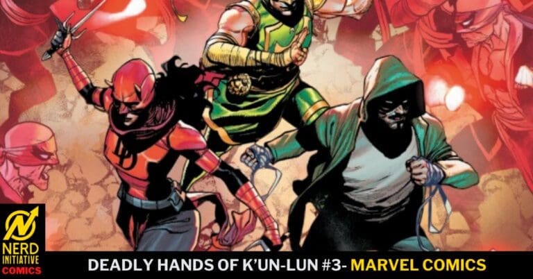
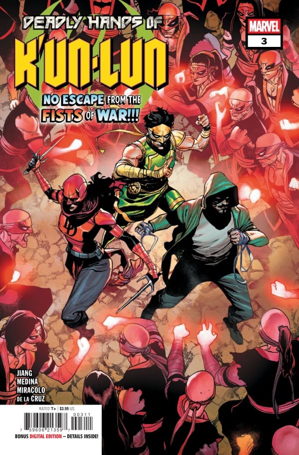
War has broken out. New York is under siege. Deadly Hands of K’un-Lun sees Lin Lie, Elektra, and White Fox joined by Karnak of the Inhumans, as well as Aero, as they begin to try and take the fight to the War Fists. As Pei begins to try to uncover where the War Fists are coming from, it may not be an origin she’s ready for.

This review is brought to you by Nerd Initiative’s Shawn.

Creative Team

Writer: Yifan Jiang
Artists: Paco Medina and Alessandro Miracolo
Color Artist: Ceci de la Cruz
Letterer: Travis Lanham
Cover Artist: Leinil Francis Yu
Cover Color Artist: Federico Blee

Writing

I really feel like Yifan Jiang hit his stride in this issue. This issue flowed a lot more than previous issues. I loved the decision to include not only Karnak but also give us the version of Karnak from Ellis’ run, rather than the older version. One of the things this issue did well was finally tie together some of the threads that have been building throughout the issue.

Jiang crafted what is easily the best issue of this series so far. Everything felt organized and like the story just flowed. This issue really sets the tone for where the series is going. It really felt like readers were allowed to understand the task that is ahead and how everyone will have to work together to make it happen.

Art

Deadly Hands of K’un-Lun #3 cover by Francis Yu and Federico Blee. Image from Marvel Comics

Paco Medina and Alessandro Miracolo continue to shine on this series. This entire series has been beautiful to read, if at times narrative-heavy. Even when the narrative was thick, Medina and Miracolo show an adept attention to detail.

I love the way Medina and Miracolo drew Karnak. It was nice to see him drawn with such great flow and action. Additionally, Ceci de la Cruz did an amazing job with the colors in this issue. The colors really popped and felt impactful. Some of the scenes really utilized colors to set the tone, and Travis Lanham continues to do some of his best work so far in this series on lettering.

Final Thoughts

Issue #3 was the best issue of the series so far. A lot of the buildup finally started to pay off, and it feels like the series is really starting to find its legs. The narrative has felt heavy at times, and now begins to feel like it’s flowing well. I can’t wait to see where this ride goes from here. The Deadly Hands of K’un-Lun is turning into a real treat, and it can only get better.

Overall Grade: 9/10

Did you enjoy this comic? Let me know in the comments below

Until next time, may your pulls be magical, and your multiverse remain stable.

Leave a Reply

This site uses Akismet to reduce spam. Learn how your comment data is processed.

Wolverine: Weapons of Armageddon #3 – Live Long Enough to Deny The Devil

The march to Armageddon continues, and Wolverine is along for the ride. After working with Teri O’Barnes to find a mutant named Tyler Torrens, Wolverine happens upon the newest Captain America, David Colton. PRIMEWARRIOR wants in on the super soldier game, and they’re hot on Tyler’s trail. Deploying super soldier Frank Simpson, aka Nuke, to trail them, Nuke brings quite the welcoming party, destroying the cabin. As Wolverine and Colton take on Nuke, PRIMEWARRIOR learns a little more about who else is after Tyler.

This review is brought to you by Nerd Initiative’s Shawn

Creative Team

Writer: Chip Zdarsky
Artist: Luca Maresca
Color Artist: Jesus Aburtov
Letterer: Travis Lanham
Cover Artist: Leinil Francis Yu
Color Coverist: Romulo Fajardo Jr.

Writing

What an amazing penultimate issue from Chip Zdarsky. This issue feels like a runaway train from the very first panel. I love that with Zdarky’s writing, Logan appears to have found a kindred spirit in David Coulson. I enjoyed the introduction of David Coulson, and it was nice to get even more background on who he is and why he laid it all down.

Zdarsky really sets up an amazing finale with this issue, and I’m super intrigued to see the role that PRIMEWARRIOR and these characters play in the upcoming Armageddon event. With Wolverine: Weapon of Armageddon, Zdarksy is crafting a story that functions well as a standalone narrative while being undeniably important to future plot points within his upcoming Armageddon event.

Marvel has teased Armageddon for a while now, and I’ve said since issue #1 of this series that if this series, combined with Captain America, is setting the tone for Armageddon, then I believe we really are in for a treat. This series, combined with Captain America, is doing a great job as a lynchpin series, setting the tone for the future while exploring the past.

Art

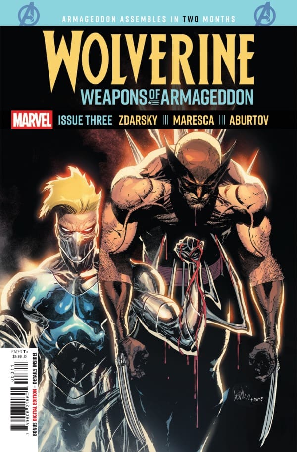
Wolverine: Weapon of Armageddon #3 cover by Leinil Francis Yu and Romulo Fajardo Jr. Image from Marvel Comics

Luca Maresca and Jesus Aburtov really did an outstanding job on this issue. Maresca crafted a really interesting piece of art in the aftermath of the attack by Nuke from last issue. The emotions are raw and easily discernible on the characters’ faces. Some of the panels with Teri O’Barnes are amazing.

In addition to working with Maresca, Aburtov does a beautiful job with colors. I particularly loved the slight reflection of David Coulson’s jacket in a window. It’s a nice little pop of color that contrasts well against the color palette of the scene and shows a nice attention to detail. Travis Lanham does a beautiful job getting readers through the story with a significant number of characters. The narrative flows smoothly, and the SFX are really enjoyable, drawing you into the page.

Final Thoughts

Wolverine: Weapons of Armageddon has been enjoyable. Whether it’s the introduction of Teri O’Barnes or the developing connection between Coulson and Logan, this story feels unique. Zdarsky put his whole heart into this comic rather than just using it as a path to move closer to the main event of Armageddon. Weapons of Armageddon feels like an undercard with the energy of a main event, and that is a testament to this creative team.

Overall Grade: 9/10

Did you enjoy this comic? Let me know in the comments below

Until next time, may your pulls be magical, and your multiverse remain stable.

Leave a Reply

This site uses Akismet to reduce spam. Learn how your comment data is processed.

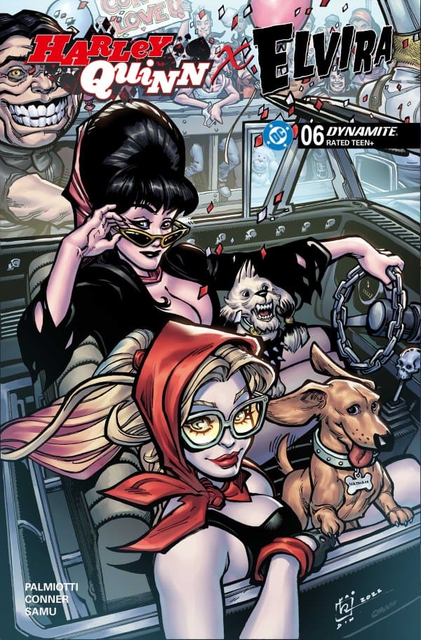
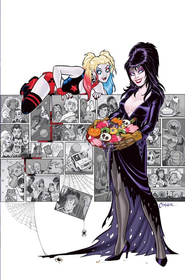
“Harley Quinn x Elvira #6” Review – A Fun, Chaos Induced End

Yet another end this week to another overall great run on a mini-series. This issue sees Harley Quinn and Elvira reach the conclusion of their chaotic, spooky, and space-faring shenanigans in style. From the writing of Conner and Palmiotti and the artwork of Juan Samu and the colors of Walter Pereya, did this finale stick the landing? Let’s find out!

Writers: Amanda Conner, Jimmy Palmiotti
Artists: Amanda Conner (Pages 1-3, 6), Juan Samu
Colorists: Jimmy Palmiotti (Pages 1-3, 6) Walter Pereya

Source: Amanda Conner, Dynamite Entertainment

Writing’s On The Wall

In this final issue of their fantastic miniseries, Palmiotti and Conner seriously stuck the landing! While the previous issue was a bit rocky, this finale was so much better. Where the previous issue put the plot on the back burner, this one makes everything front-and-center and wraps it all up in a neat, blood-soaked bow with bats on it. For example, in my review for “Harley Quinn x Elvira #5”, I stated that the plot with Elvira’s former boss took only one page. However, this finale brings not just this plot back but Harley’s as well, putting them both front and center.

Overall, this final issue, if not the run as a whole, was extremely engaging and fun to read. The pacing, while feeling a bit breakneck, is completely in tune with Harley and Elvira. The chaos and humor both just felt spot on to boot! I especially laughed at a head pun that Harley made, as for some reason, I didn’t expect it at all. Overall, this was a great finale to an equally great run.

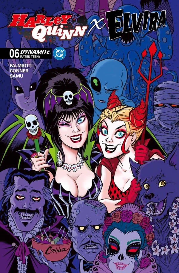
Source: Chad Hardin, Chuck Michael Obach, Dynamite Entertainment

Scary Good Artwork

Over the course of the entire run, Samu, Pereya, Palmiotti, and Conner have proven themselves to be a deadly team, and they didn’t pump the brakes here. Creating and having distinct visuals throughout the run, this team was an absolute tour de force. In just this issue alone, we get at least three distinct styles, my favorite of them being Harley getting an anime look for three panels. Not a single style falters, each having amazing pencil work and detail that come off as being very stylish.

As for the colors and shading, they work amazingly well with the penciling to create this rather unique, spooky pop art style. This, paired with the vast color palette, works to create something that only catches the eye, but makes every panel feel and look unique.

Source: Amanda Conner, Dynamite Entertainment

Final Thoughts – 8.5/10

From the first page to the last, this was a finale that really stuck the landing. Conner and Palmiotti crafted a story that’s hard to put down. Full of laughter, chaos, and crazy sci-fi, a good time will be had by all who pick up this run!

Be sure to read more from me here and check out my socials!

Comments

Did you read the “Harley Quinn x Elvira” mini-series? What did you think of it? Let’s discuss in the comments below!
Leave a Reply

This site uses Akismet to reduce spam. Learn how your comment data is processed.

PUNISHER #3 – Like a Wildfire

Creative Team – Benjamin Percy, José Luis Soares, Oren Junior, Jonas Trindade, Frank D’Armata, VC’s Cory Petit, David Marquez, Guru-eFX

Published by Marvel Comics

Catch up with The Punisher #2!

The Story

Frank Castle has been suffering from blackouts after his time being mind-controlled, and there seems to be no end in site. Micro took him to the hospital to get checked out by a shady doctor, but even after all the tests, they couldn’t find anything that was actually wrong with him. However, the doctor did give him some pills that should help.

Now, Frank, who’s taking pills to help him do what he does, is trying to find his old self. He even visits the park where his family was gunned down to try and find the source of where his anger and violence came from. Unfortunately, that didn’t work. Now he’s lost. He’s a killer that doesn’t want to kill, even if it’s for the good of society.

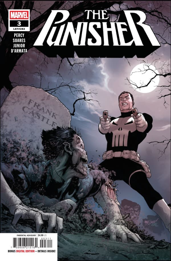
Cover art by David Marquez and Guru-eFX. Published by Marvel Comics

Meanwhile, Jigsaw is trying to take over the criminal underworld of New York, and he’s willing to do it one face at a time. Leaving bodies wherever he goes, Jigsaw is on the fast track to taking down the city.

Benjamin Percy knows exactly how to keep the reader locked into the story. In The Punisher #3, while we follow Frank as he’s struggling, you’re left trying to figure out what exactly is wrong with him. That is, until what’s really wrong with him is revealed. I didn’t see it coming, but it makes complete sense. I love the way it was addressed, and we’re left on a wild last page that makes me very excited to see what’s next for Frank Castle.

The Art

There’s many different emotions throughout The Punisher #3 that the artists really nailed bringing to life. There’s loss, there’s chaos, there’s mourning, there’s violence, all perfectly executed by the creative team. José Luis Soares, Oren Junior, Jonas Trindade, Frank D’Armata, and Cory Petit go out of their way to make this a comic that sticks in your mind.

The panels are detailed intricately while the shading brings each page up a level. The coloring really pushes the grittiness of the story, which fits perfectly. The lettering gives a great flow of dialogue throughout the comic while hammering in the different tones of the story. All in all, the artists did a wonderful job, which isn’t surprising given how incredibly talented this team is.

Final Thoughts

The Punisher #3 continues Frank Castle’s story, and now shows us just how far Jigsaw is willing to go to get what he wants. Benjamin Percy and the creative team continue to impress with this run! If you’re a Punisher fan, then this is the run for you!

Overall Grade – 9.2/10

Let me know in the comments what you thought of The Punisher #3!

Leave a Reply

This site uses Akismet to reduce spam. Learn how your comment data is processed.

This review was written by Megan from the Vigilante Vibes Podcast! If you liked my review, be sure to check out my other reviews! Let me know what you think of Punisher #3, or tell me what comics you’d recommend me trying out! Find me on my socials, and check out my Marvel podcast, Vigilante Vibes, by clicking here!

WONDER MAN #2 – The New Problem

Creative Team – Gerry Duggan, Stefano Raffaele, Mark Buckingham, Aure Jimenez, Rachelle Rosenberg, VC’s Joe Caramagna, Philip Tan, Rain Beredo

Published by Marvel Comics

Catch up with Wonder Man #1!

The Story

Simon Williams, AKA Wonder Man, is in a particularly bad position because the woman that died was found in his car that he leant to his former cellmate, Randy. Randy seems to be making all of the worst decisions, one of them being speaking to the police without any legal council. Simon is more than frustrated with him, but he takes him out of the precinct to meet with his lawyers somewhere more private, at the West Coast Avengers Campus.

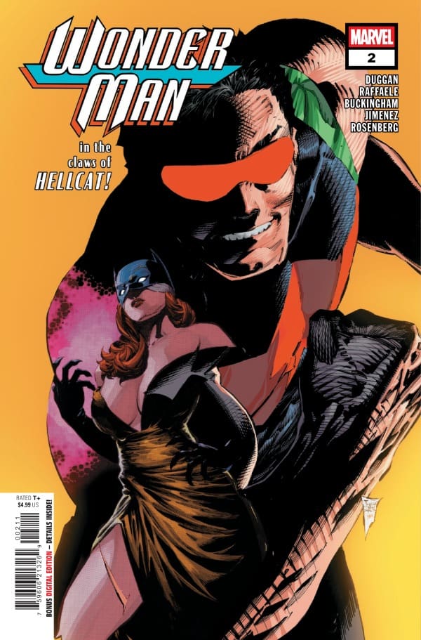
Cover art by Philip Tan and Rain Beredo. Published by Marvel Comics

While Simon and Randy are dealing with the law, they have a new threat to worry about. This villain is on the hunt after being hired by an unnamed source, and is a problem for anyone that tries to get their hands on him. Simon has his work cut out for him here as he tries to track down the villain before any more murders take place.

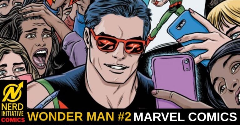
Gerry Duggan proves that the first issue was more than a strong start as the second issue of Wonder Man was even more entertaining. I love what he’s doing with Simon Williams. He’s giving him the chance to prove he’s a hero in his own right, even when he’s in the worst of situations. With Simon’s dynamic with Hellcat, you’re in for a fun ride when checking out Wonder Man #2.

The Art

The artists really continued to make Wonder Man a beautiful comic with their excellent talents. There’s a lot of great detailing and shading that went into every panel, giving a lot of depth to the pages. The flashback pages are what stuck out to me, which were created by Mark Buckingham and Aure Jimenez. The detailing and coloring of those panels felt larger than life, with a great contrast of bright yellow and gold playing off the abstract details.

The artists brought their own talents to the comic, and the readers will benefit greatly from it. Whether it’s the drawings by Stefano Raffaele, coloring by Rachelle Rosenberg, or excellent lettering done by Joe Caramagna, each page is absolutely stunning.

Final Thoughts

Wonder Man #2 continues the fun adventure of Simon Williams written Gerry Duggan. The second issue is proof that the first issue was more than a strong start, but an example of the high quality work that’s expected from this run moving forward.

Overall Grade – 9/10

Let me know in the comments what you thought of Wonder Man #2!

Leave a Reply

This site uses Akismet to reduce spam. Learn how your comment data is processed.

This review was written by Megan from the Vigilante Vibes Podcast! If you liked my review, be sure to check out my other reviews! Let me know what you think of Wonder Man #2, or tell me what comics you’d recommend me trying out! Find me on my socials, and check out my Marvel podcast, Vigilante Vibes, by clicking here!

White Sky #3 – Seeing A World That Shouldn’t Exist

0

The world is haunted. Everything you know has fallen apart, and ghosts are everywhere in White Sky #3. After losing her father, David, to capture by a band of scavengers, Violet is lost and needs a sign. After voices guide her to a man named Walter, she and Walter try to escape the scavengers. Unfortunately for Violet, and the scavengers, the ghosts are on the hunt, and it’s dinner time.

This review is brought to you by Nerd Initiative’s Shawn. You can check out more of my reviews by clicking the link to my name!

Creative Team

Writer: William Harms
Artist: JP Mavinga
Color Artist: Lee Loughridge
Letterer: Ed Dukeshire
Cover Artist: JP Mavinga

Writing

Bill Harms continues to do an amazing job developing the relationships and characters in this story. There’s been a lot of talk in the comics world about White Sky and why it works. I think the greatest reason why White Sky works is the synergy between Bill Harms and JP Mavinga.

The relationship allows Harms to focus on the relationships and growth of the characters. Violet and Walter’s newly found situation is further explored in this issue in a way that is both interesting and seems to portend things to come. Harms finally shows us what has happened to David, and we get to understand a little bit more exactly what these scavengers are after. This issue does a really good job of catching readers up with David while still keeping Harms’ focus on Violet being the center of the story. The developing trust and relationship between Walter and Violet that Harms is crafting has me on the edge of my seat and I can’t wait to see where it goes.

Art

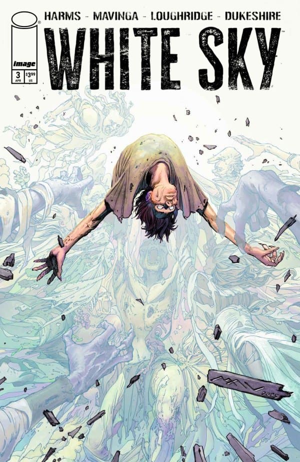
White Sky #3 cover by J.P. Mavinga. Image from Image Comics

JP Mavinga’s work is simply stunning. This issue is easily the best so far and continues to show why White Sky is receiving such acclaim from the comic community. Every issue manages to be better than the issue before and perhaps nowhere is that more evident than Mavinga’s work. Mavinga gives readers an awesome glimpse at the scope and power of these ghosts while feeling like it’s but a smidgen of their true power. The art is hauntingly beautiful. There is a particular panel that is a headshot of Violet that is so stunning it would be worthy of a cover.

Mavinga’s work deserves particular praise when it comes to us seeing what befalls some of the scavengers. The art feels so incredibly well done while maintaining the grit and grime of the post-apocalyptic setting. Even the blacks in Mavinga’s art feel darker and more foreboding than those of regular artists.

Mavinga and Loughridge combine beautifully on the art and colors to create massively effective uses of negative space within the pages. While traditional panels are used, Mavinga and Loughridge are not afraid of utilizing space outside of the panel and white negative space to move the narrative forward in meaningful ways. The negative space scenes of Warren make you feel the weight of the story. Ed Dukeshire really gets a chance to shine on this issue with significant SFX that pop off the pages. In the muted tones of the story, Dukeshire’s choices with SFX snap you back to the action of the story and drop you in the moment.

Final Thoughts

This creative team is unstoppable. White Sky is easily one of the best stories out right now across any publisher. While William Harms is known for Impaler in the comics world, three issues in and it already feels like White Sky will take its place as his magnum opus. I don’t have words to explain the feeling of synergy I get from the team of Harms, Mavinga, Loughridge, and Dukeshire. It seems like every single part of this story is firing on all cylinders. Simply spectacular from beginning to end.

Overall Grade: 10/10

Did you enjoy this comic? Let me know in the comments below

Until next time, may your pulls be magical, and your multiverse remain stable.

Leave a Reply

This site uses Akismet to reduce spam. Learn how your comment data is processed.

UNCANNY X-MEN #27 – The Great Switch

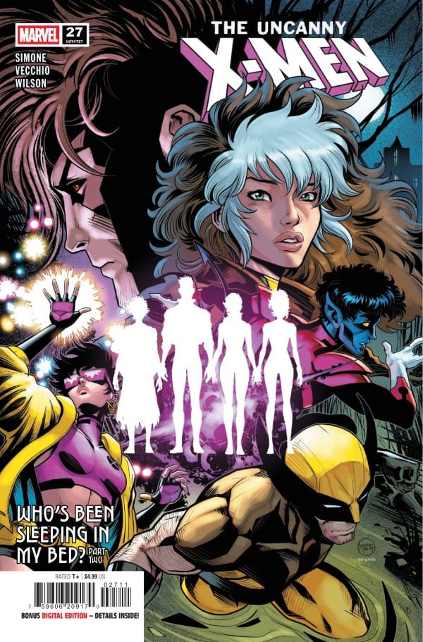
Creative Team – Gail Simone, Luciano Vecchio, Matthew Wilson, VC’s Clayton Cowles, Edgar Delgado

Published by Marvel Comics

Catch up with Uncanny X-Men #26!

The Story

Everything has changed! Dogs and cats are living together! Mass hysteria! Well, not mass hysteria exactly, but certainly a lot of confusion from our favorite mutants. The Outliers, Ransom, Deathdream, Calico, and Jitter found themselves meeting each other for the first time once again, since they don’t remember ever knowing each other. Brought together by Moira MacTaggert, the young mutants are at their new home, Xavier’s School for Gifted Youngsters. The Outliers, along with Mutina, donned in the very familiar and iconic New Mutants uniforms, start their training immediately in the Danger Room. Putting their skills to the test, they endure the same training as did past mutants in the history of the X-Men comics.

Cover art by Luciano Vecchio and Edgar Delgado.

Meanwhile, back in Louisiana, the X-Men are frantically looking for the Outliers who have seem to have disappeared in the night. I suppose there’s your mass hysteria. Rogue, Wolverine, Jubilee, and Nightcrawler are all searching high and low to find the young mutants they’ve grown to think of their own. Gambit is noticeably absent, as he has a different way of searching for the kids. His idea of a way to find the kids is somewhat crazy, but not as crazy as what happens next. The return of some legendary characters that are staples in the history of Marvel’s mutants in all their yellow and black glory was shocking, but so very appreciated.

Gail Simone keeps the reader on their toes throughout the entire comic. In the last issue, Uncanny X-Men #26, I really didn’t know where we were going but I was excited and had high expectations due to loving every issue of this run. In this issue, Gail exceeded every one of my expectations. If you’re a lifelong mutant fan like myself, you will absolutely love this issue.

The Art

Luciano Vecchio, Matthew Wilson, and Clayton Cowles return to bring us another splendid comic that keeps your eyes locked into the pages until the very end. Luciano has such a signature style when it comes to drawing the X-Men, that his talents shine brightly in each panel. He’s able to draw the characters beautifully, perfectly portraying their heightened expressions and capturing the action they’re in in that moment. Alongside him is Matthew, who handles the colors. What Matthew Wilson does is make each page drip in vibrancy, with excellent contrasting colors that make the characters feel larger than life. Clayton Cowles handles the lettering, and captures the emotions of the story perfectly. With that, Clayton also handles the sound effects excellently, allowing the reader the experience even more of the story. The artists really showed up and showed out in Uncanny X-Men #27!

Final Thoughts

This comic was made with Marvel’s mutant fans in mind. With an excellent story that you can’t guess how it’ll end, a huge switch up of the teams that brings back some iconic characters, and artwork that practically tells the story itself, you can’t go wrong with Uncanny X-Men #27! Add it to your pull lists, read it immediately, and thank me later!

Overall Grade – 10/10

Let me know in the comments what you thought of Uncanny X-Men #27!

Leave a Reply

This site uses Akismet to reduce spam. Learn how your comment data is processed.

This review was written by Megan from the Vigilante Vibes Podcast! If you liked my review, be sure to check out my other reviews! Let me know what you think of The Uncanny X-Men #27, or tell me what comics you’d recommend me trying out! Find me on my socials, and check out my Marvel podcast, Vigilante Vibes, by clicking here!

PLANET SHE-HULK #6 – Mind Wiped Clean

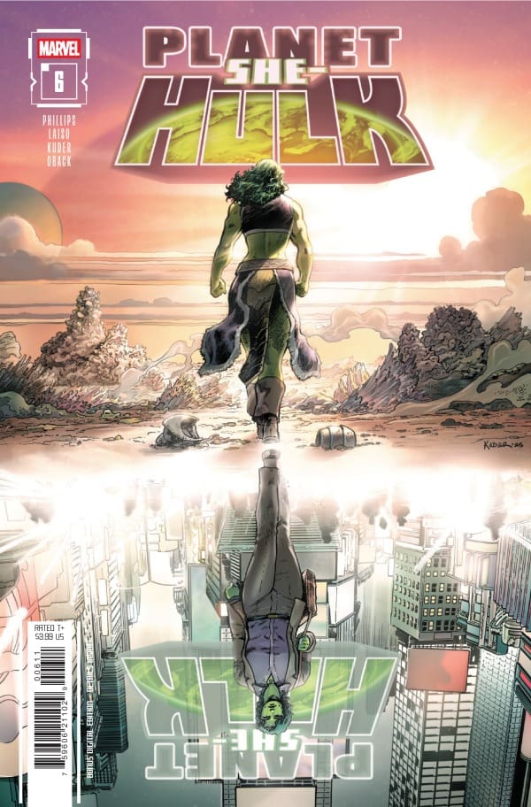
Creative Team – Stephanie Phillips, Aaron Kuder, Emilio Laiso, Sonia Oback, and Joe Caramagna.

Catch up with Planet She-Hulk #5!

The Story

This is a joint review from Matt of Hops Geek News and Megan from the Vigilante Vibes Podcast!

Matt – This run has been a lot of fun for me personally, and I feel as though it really expanded on Jen’s character and who she is at her core. With the announcement that this would end after issue 6, I thought that Stephanie did a great job getting to end it on her terms and laying out what the future had in store for Jen as she returned to Earth and back to being a lawyer. It is no easy task to take something you had planned and find a way to end it while still making sense. Jen doesn’t remember her time on Sakaar and is filled in on everything that went down. Is it a perfect way to end, and does it do She-Hulk justice? Unfortunately, no, however, that is not on Stephanie or the team in any way, as they did this the best they could, and I thought this issue was still a lot of fun.

Cover art by Aaron Kuder and Sonia Oback. Published by Marvel Comics

Megan – Jen Walters wakes up to her normal life, getting ready for her normal job, and living a day that’s like any other. This obviously is very different from the last issue, where she was on Planet Sakaar fighting for the peace of the planet and its people. However, it seems Jen remembers none of that. It’s not until a portal opens right in the middle of a courtroom that it’s very clear to Jen that something isn’t right. Juno appears out of the portal, demanding to see her, but Jen has no idea who she is. That’s when Juno goes into exactly what happened.

Planet She-Hulk has been thrilling right from the beginning, and now we’re sadly at the end of the miniseries. We’ve seen Jen accomplish so much on Sakaar after she promised her cousin, Bruce, to watch over the planet. Now, we see how it all ended, and it’s absolutely not what you’d expect. Understanding that this comic run was cut short, Stephanie Phillips, the writer of Planet She-Hulk, did what she could to bring this to a graceful ending. I’d say, given the circumstances, Phillips did a fantastic job at bringing the story to a close that left room to revisit She-Hulk in the future.

The Art

Matt – Hats off to the entire art team who played such a huge role in making this 6-issue story engaging and beautiful. I loved how they were able to go back and forth between the flashbacks showing a fierce She-Hulk in battle and then to Jen in her courtroom attire, who looks far less intimidating at times. There was even the inclusion of mini Jen and Juno, which I found to be adorable! This issue maintained the vibrancy and beauty we’ve become accustomed to getting and I would love to see them get to continue down the road.

Megan – Aaron Kuder, Emilio Laiso, Sonia Oback, and Joe Caramagna brought this run to a beautiful closing, making a huge shift from the setting being in Sakaar to Jen’s life in New York. Letting Jen’s facial expressions tell the story, you can see just how confused and worried she is, not knowing what happened on Sakaar. The use of flashbacks to Sakaar was done incredibly well, having the juxtaposing tone of the excitement in Sakaar versus the more normal tone of New York City. What really sells the flashbacks and the huge difference in them versus Jen’s current life is the coloring work by Sonia Oback. Oback makes the flashbacks seem more like a dream with her use of vibrancy that works perfectly with the artist’s drawings.

Final Thoughts

Matt -7.5/10. It isn’t easy ending a run, and truly Stephanie, Aaron, Emilio, Sonia, and Joe did the best they could and still managed to make the ending make sense and capture the heart of the previous issues. Marvel’s sudden decision to cut this short at 6 made it so the ending feels jarring, especially when the series had found its footing and set up something truly amazing on the horizon. I do think everyone should read this run because the team did an excellent job, and we could use more She-Hulk!

Megan – 7.5/10. This series was progressing beautifully, with each issue getting better and better until the run was cut short. Stephanie Phillips gave an ending that worked well with having an aggressive stop, but I would really have liked to see this series continue and see Jen’s time in Sakaar through to the end.

Overall Grade -7.5/10

Let us know in the comments what you thought of Planet She-Hulk #6!

Leave a Reply

This site uses Akismet to reduce spam. Learn how your comment data is processed.

SWAMP THING 1989 #1 – A Travel Through Time

Creative Team – Rick Veitch, Michael Zulli, Vince Locke, Trish Mulvihill, John Costanza, Todd Klein

Published by DC Comics

MORE FROM NERD INITIATIVE HERE!

The Story

This is a joint review by  Matt from the Hops “Geek” News podcast and  Megan from the Vigilante Vibes Podcast

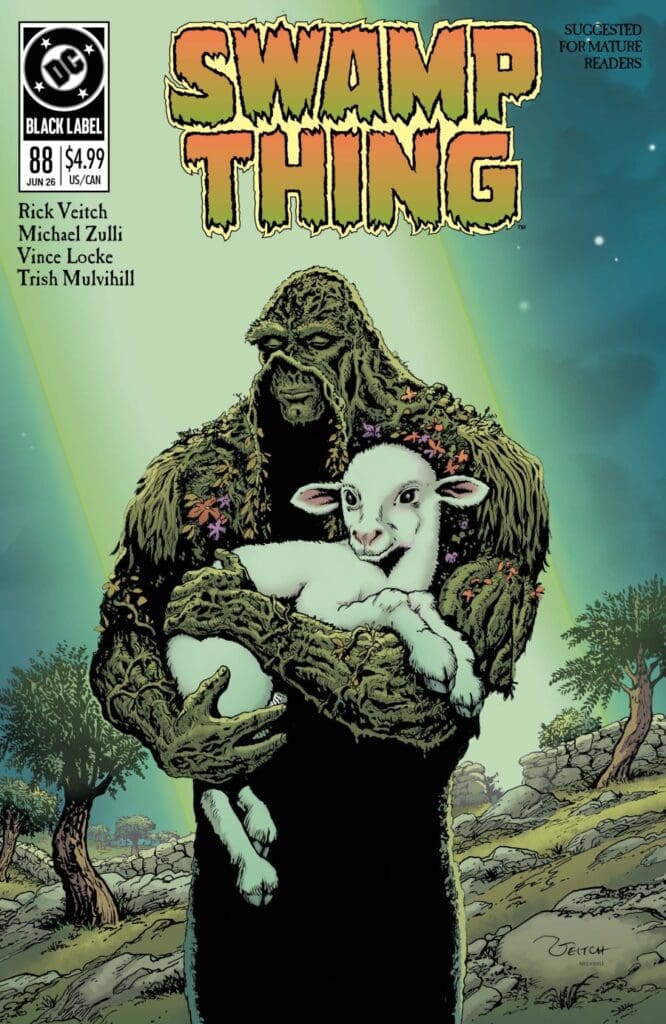
Matt – This story is powerful in every way. Swamp Thing is floating through time and finds himself connected to Jesus, and takes us down an intense road of pain and sorrow. This was interesting to me as I am not a religious person, admittedly at all. In fact, maybe I would have gone to church more if they had woven comics and Swamp Thing into them more. This issue was poetic and also captures what I have always championed Swamp Thing to be, which is a soft-mannered, philosophical being. It challenges us to think, and that’s what a good story does. Of course, this issue will also make you want to turn away at times as well, and there are easter eggs within.

Cover art by Rick Veitch and Trish Mulvihill. Published by DC Comics

Megan – With a blast to the past, we are treated to the lost stories of Swamp Thing from Rick Veitch. In Swamp Thing 1989 #1, Swamp Thing is sent back through time and he meets probably the most influential person of all time, Jesus Christ. Seeing how it all went down from the eyes of Swamp Thing was fascinating from beginning to end.

Veitch takes you back in time to his incredible two year run of Swamp Thing, and even farther back in time to a more biblical atmosphere. There are many perspectives in the comic, such as Mary Magdalene’s or Marcus’, which makes the story feel larger than life. With Swamp Things narration throughout the story, it’s not hard to get lost in the story. I didn’t know what to expect going into the comic, but I had a great time with what Veitch gave us!

The Art

Matt -The artwork is stunning and teleports us back into the old days of comics. The art is bright and Earthy as a Swamp Thing comic should be; however, the colors aren’t as vibrant as modern art, which adds flavor to the pages. The scene of Jesus on the cross was an intense and powerful art sequence that even took my breath away despite not having a religious background. Lost within this issue as well is how violent it is and how gruesome as the demon eats the false Wise Men and the scenes showing Jesus’s arrest. It was all beautiful and oddly inspiring artwork full of life amongst the sorrow.

Megan – The artwork takes you back to a time of the older comics that have artwork that’s driven by intricate details and creative shading work. Each page of Swamp Thing 1989 #1 paints a new picture of the story clearly and brings even more depth to the story of Swamp Thing. The coloring is a great juxtaposition of vibrancy in the characters and the more muted backgrounds. Marcus’ character works as an excellent focal point in a lot of the panels with his bright golden armor. The lettering work creates a great flow of dialogue even when switching from Swamp Thing’s narration and the character’s words.

Michael Zulli, Vince Locke, Trish Mulvihill, John Costanza, and Todd Klein really go above and beyond to ensure the energy of the older comics is illustrated beautifully in Swamp Thing 1989 #1.

Final Thoughts

Matt – 9/10/Truthfully, I had no clue what I was going into. I am a Swamp Thing fan, not as deep into his lore as. I would like. I was surprised to see this one take a more religious setting, and it was one that was immensely powerful at that.

Megan – 8.8/10. I went into the comic not knowing what to expect, and left very happy with what I read. Rick Veitch brought this blast from the past back in a huge way.

Overall Grade -8.9/10

Let us know in the comments what you thought of Swamp Thing 1989 #1!

Leave a Reply

This site uses Akismet to reduce spam. Learn how your comment data is processed.