Home Blog Page 65

Street Sharks Annual # 1 – Here We Go Again Boys!

It’s Street Sharks Annual #1. Witness the return of Moby Lick in the story “Old Friends, New Depths” from series writer Stephanie Williams and artist Ariel Medel. The boys old friend Moby Lick is back and he’s not just stopping by for a Humongo Burger.

In the second story of this annual, Jordan Morris and Margeaux Pepoy give us a look at a day in the life of The Street Shark’s main sidekick and resident tech partner, Bends. What happens when Bends tries to enjoy a normal day? Stop in and find out in Street Sharks Annual #1.

This review is brought to from Nerd Initiative’s Matt and Shawn.

Creative Team

“Old Friends, New Depths”

Writer: Stephanie Williams
Artist: Ariel Medel
Colorist: Valentina Pinto
Color Assistant: Jonathan Dobbs
Letterer: Sandy Tanaka

“Odds and Bends”

Writer: Jordan Morris
Artist: Margeaux Pepoy
Colorists: Valentina Pinto and Heather Breckel
Color Assistant: Jonathan Dobbs
Letterer: Neil Uyetake

Writing

Matt: This annual issue serves as a way for readers who have not read Stephanie’s run (which you should!) and for those who have. We get a quick catch-up, then hit the ground running with Moby coming into the picture. Honestly, I had his toy as a kid, so seeing him had me screaming with absolute joy. I love how Moby is down to fight; he is serving a greater purpose by helping endangered animals, which was an easy way to keep him around for the future while explaining his absence from the mini-series.

Seeing Jordan Morris involved already had my attention, but having him write a story focused on Bends was genius! As the so-called guy in the chair, we got a chance to explore Bends and really give him his moment to shine. Just because he isn’t a shark doesn’t mean he can’t hop in a suit and whoop some tail! The poor guy just wanted to have a date for the first time, and it really led to some hilarious action moments while tugging at our heartstrings.

Shawn: “Old Friends, New Depths” is a really great story from the mind of Stephanie Williams. While I’ve read Street Sharks, I love that she provides a quick background out of the gate to allow readers to pick up this Annual with little previous information. I was so excited to see Moby Lick return. I consistently wondered where he was during the initial run, but Williams saving him for the annual turned out to be a brilliant idea.

One thing Williams has consistently done on this series and continues on this issue is provide a connection to the original stories that 90s kids grew up with, without the story ever feeling like just pure fan service. Old Friends, New Depths is genuinely a good story that happens to feature the characters many comic nerds grew up with. Villains were used perfectly, and the story feels warm and character-centered, like readers have come to expect from Williams.

Odds and Ends from Jordan Morris was another great addition to this annual. I loved that Morris gave us a Bends-centric story. Bends is such an important part of the Street Sharks story that it was so fun to get to see him get some shine. Anyone who knows anything about the Street Sharks knows that Bends is smart, but it was nice of Morris to show us just how creative and intelligent he really is.

Art
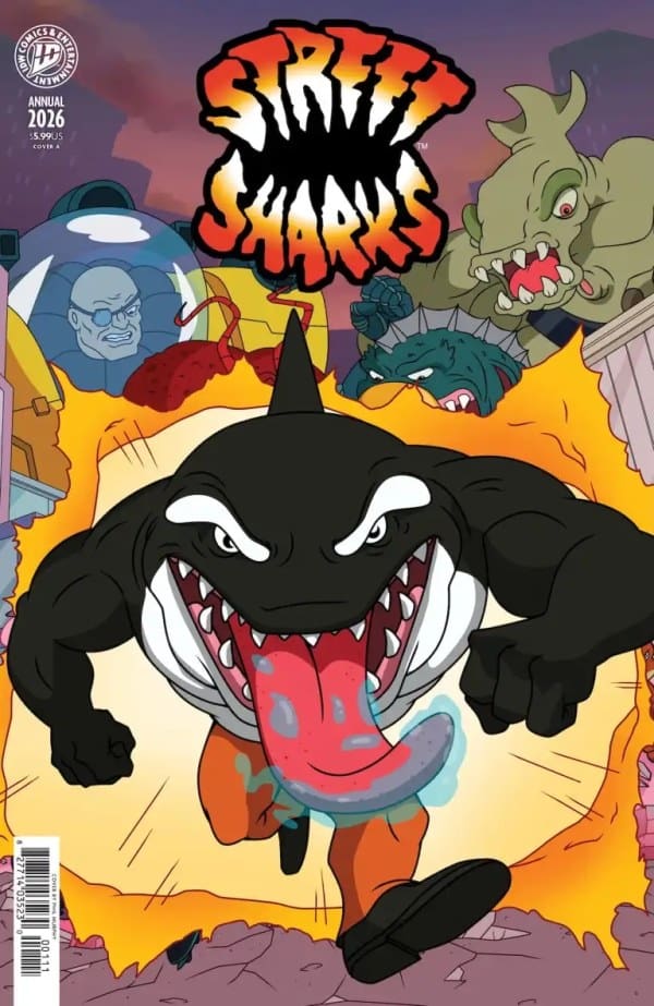
Street Sharks Annual #1 Cover by Philip Murphy. Image from IDW Publishing

Matt: The art has consistently been able to capture the tone and spirit of a franchise I hold near and dear to my heart. Getting to see Moby leap from the water and how well colored and fierce he looked showed the love put into the artwork from the team. Despite the fighting being chaotic, at no point was I ever confused about who was fighting whom or what was happening. The spacing and line work allowed the moments to breathe and happen organically across the panels.

Both stories featured stellar color work, making the pages vibrant and catching my eye. It truly felt as though we were watching a cartoon play out before us!

Shawn: On Old Friends, New Depths, it’s more of the awesome work from Ariel Medel we’ve come to expect. I said this when reviewing the regular Street Sharks series, but I continue to be in awe of Medel’s ability to capture the authentic 90’s feel of this story with modern techniques.

Valentina Pinto and Jonathan Dobbs brought beautiful, vibrant colors to life. Moby Lick looks like his old self but more vibrant and ready to rock. Sandy Tanaka does an amazing job on lettering, letting the story flow and ensuring that the art gets to be center stage in each panel. The background information introducing us to characters goes a long way to making this issue accessible to fans who may have missed the original series.

In Odds and Bends, Margeaux Pepoy, along with Pinto and Dobbs, and the addition of Heather Breckel managed to capture the feel of the original series and Medel’s art without missing a beat. Pepoy manages to capture the style of the first story while also making this story uniquely hers. It still maintains a lot of the 90’s feel but also feels much more updated and digital than previous stories.

Final Thoughts

Matt: 10/10! I hope this annual delivers for people the way it delivered for me. Street Sharks is such a fun and wonderful franchise. I love that IDW has brought them to life once again. Stephanie just gets it with these characters, and she is the perfect fit to capture the attitude and the loving brotherhood they have.

Shawn: 10/10. The world needs more Street Sharks. IDW is sitting on a goldmine with the creative team of Williams and Medel on this IP. This series and the Annual managed to put together a writer and artist that are able to tell fresh creative stories that still connect to the original. I’ve loved everything about Street Sharks. This annual feels like another love letter to the 90s in the best way.

Overall Grade: 10/10

Did you enjoy this comic? Let me know in the comments below

Until next time, may your pulls be magical, and your multiverse remain stable.
Leave a Reply

This site uses Akismet to reduce spam. Learn how your comment data is processed.

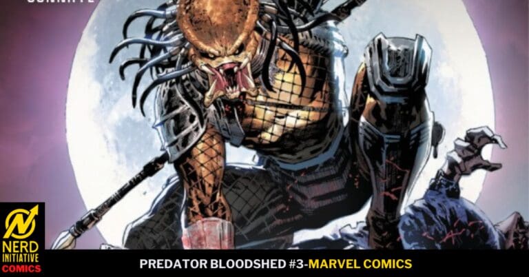
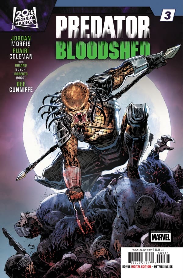
PREDATOR BLOODSHED #3: The Hit List

An unlikely team-up with our fighters and the dangerous Yautja gives short reprieve for our “heroes,” that is, until the spectators’ attempt at escaping draws the Predator’s attention! There seems to be a method to his hit list, and nobody is safe as the remaining fighters catch their breath for the final looming battle.

Predator Bloodshed #3. Credit Marvel Comics. Cover by Ken Lashley and Romulo Fajardo Jr.

Creative Team: Jordan Morris, Ruairi Coleman, Roland Boschi, Roberto Poggi, Dee Cunniffee, Clayton Cowles, Ken Lashley, and Romulo Fajardo Jr.

The Story:

One thing we haven’t seen enough of, and what adds so much intrigue to stories like this, is when the Yautja team up with people and fight alongside them. I know that is not exactly what is happening in this issue, as he is killing anything that comes his way, but watching them battle side by side still brings a fun angle into the Predator franchise.

What was shocking as well is how Jordan throws in another wrench and twist, where we see that the Yautja has a certain hit list he is going after. This adds such an incredible element to the story because it is not something I have seen before in this lore. Each issue, we get to learn about a certain character as well, and how the common theme of the rich and the system is causing these fighters to do what they don’t want to do in the first place. The story is a ton of fun and kept me on my toes throughout.

The Art and Letters:

The team showcases the various methods in which the Yautja will kill their prey, and that’s what makes the action stand out for me in this issue. Watching as the team details the blood being slashed and splattered across the panels in creative ways reminds us that nobody is safe while capturing the brutality of the species. At the end of the day, everything bleeds, and the way they parallel the Yautja and our fighters tending their wounds in the same manner shows how we are not so different after all.

Final Thoughts:

Predator Bloodshed #3 shows some interesting new world-building into this franchise as The Predator is not out for anyone and everyone, but specific targets. Jordan and the team deliver on the brutality of the Yautja while also delivering a human element to all involved, leaving us unsure of who to root for at the end of the day!

Overall Grade: 9.3/10

Be sure to let us know your thoughts below and check out more reviews by Matt!

The New Space Age #5 – Saving Humanity at All Costs

Mark wants nothing more than to bring his brother home. A little brother that was beamed up many years ago. After learning the literal magic of space travel, Mark became hopeful. However, in the new space age, nothing is sacred, and a friend back stabbing him was much more than a personal set back. Even if the friend quickly regretted it.

Creative Team

Writer: Kenny Porter;

Artist: Mike Becker;

Colorist: Kevin Betou;

Letterer: Buddy Beaudoin;

Editor: James B. Emmett;

Logo Designer: Tim Daniel;

Book Designer: David Reyes;

Book Production: Eisy Celis;

Main Cover Artist: Mike Becker with colors by Kevin Betou.

Check out another comic from Mad Cave Studios: Is Ted Ok? #1

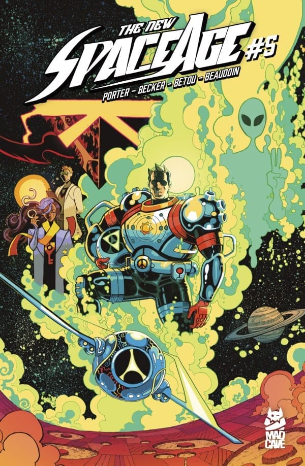
The New Space Age #5 Cover. Image by Mad Cave Studios

The Story for The New Space Age #5

As chaos ensues, Mark continues to do whatever it takes to save lives. As he fights for humanity in more ways than one, a little call back to Cynthia the flying cow, turns out to be a big help. Then what should be back to square one, seems to be something different. Guilt can be heavy, but having that guilt lifted can take one to new heights.

The Art

This entire run has been some fun and gorgeous art. Issue 5 is no different. From explosions to spaceships, to a surprise moment for Mark. Every page was captivating, and incredibly detailed. The colors truly brought it all together making even the most explosive pages still look so calming and beautiful. The purples and pinks used in the sky gave such a different feel than your average comic book art would. There are also so many details worth noting for the story, and some just worth enjoying. So make sure to take it all in.

The New Space Age is one of those runs, where every single page can be analyzed and enjoyed solely for the art. Of course, the fantastic storytelling accompanying said art, doesn’t hurt.

Overall Grade: 9/10

The New Space Age from Mad Cave Studios is a fun, heart filled story filled with space, magic, guilt, imagination, and more. This 5 issue run will take you on a mystery through Mark’s past, and the stars. All while Mark deals with the guilt of not protecting his baby brother, while facing the impossible to redeem himself.

For more from Lauren, check out ‘Hops GEEK News.’

Have you checked out The New Space Age yet? Let us know your thoughts.

Leave a Reply

This site uses Akismet to reduce spam. Learn how your comment data is processed.

Is Ted Ok? #3 – Finding a Work/Life Balance can feel like Murder

Last we saw Ted, we were still wondering, Is Ted Ok? What started as something that seemed like an overreach in monitoring your employee’s mental well being, turned into something impossible. From accidents suddenly all better, to spaceships, and aggressive employers, will Ted ever be ok?

Creative Team

Story, Art, & Letters: Dave Chisholm;

Editor: Ryan Carroll;

Book Designer: David Reyes;

Book Production: Juan D. Posada;

Cover Artist: Dave Chisholm;

Check out a review for another comic from Mad Cave Studios: The New Space Age #1

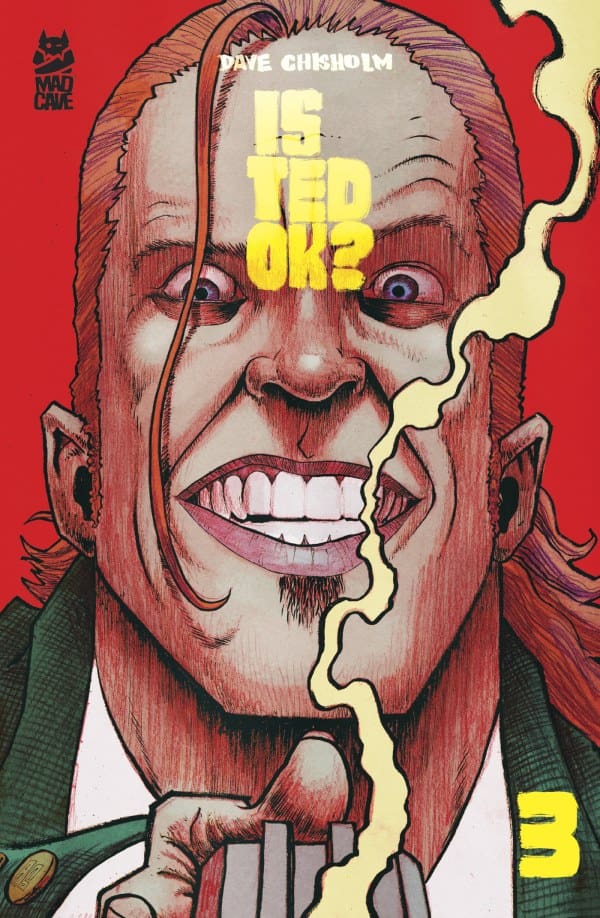
Is Ted Ok? #3 Cover. Image by Mad Cave Studios.

The Story for ‘Is Ted Ok?’ #3

Once again Ted wakes up safe, but still not ok. On top of his ever depressing life, and padded room level of insane job, he continues to have the same nightmare. However, he’s found Sarah, and for the first time ever he has someone to confide in. It’s comforting, even if she’s not being completely honest. However, a mandatory work gala is about to flip everything on its head, and somehow turn it all up to a higher level of padded room. With an evil plan about to be told.

Art

The art for ‘Is Ted Ok?’ is absolutely fantastic. It’s creepy at times, dark at others, and always nails the feel of the story while beautifully moving it all forward. The lettering takes this to an even creepier artsy feel. The shift in art as a memory is told was done in such a sad and lovely way. I’m absolutely loving how the art so perfectly captures this sad, mysterious, and captivating tale that is being told. We can feel the desperation Ted feels not just in his words, but also in his eyes, and how he carries himself.

Overall Grade: 10/10

I cannot stress how much I am enjoying this comic. Every time I think I have an idea of what is going on, another bizarre wrench is thrown into my theory. I’m loving Ted and Sarah, and I’m loving where this is all going. If you’re looking for a unique comic unlike any other with amazing characters, beautiful dark art, and a story with endless twists, pick up ‘Is Ted Ok?’

For more from Lauren, check out ‘Hops GEEK News.’

Did you grab this comic? What were your thoughts?

Leave a Reply

This site uses Akismet to reduce spam. Learn how your comment data is processed.

“Red Roots #1” Review – A Fantastic Crisis of Two Worlds

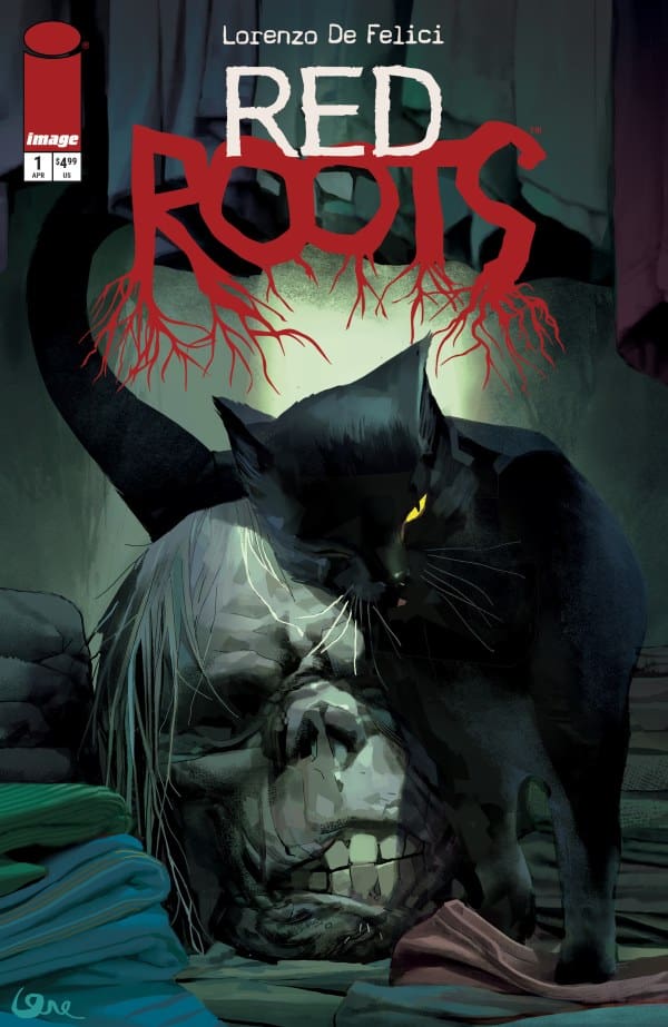
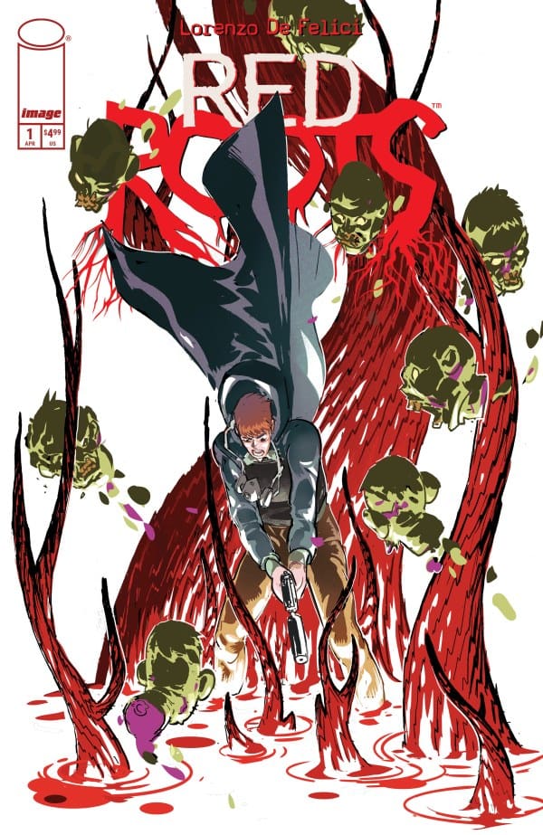
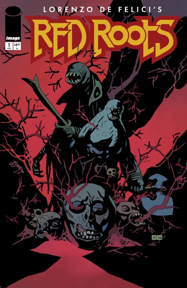
As said by Lorenzo De Felici himself, the important word here is “two”. Two main characters, two different stories, two different life experiences. Yet through strange events, the worlds of a killer and a schoolteacher are connecting, slowly but surely in unexpected ways. Be ready for the ride of your life as Sean and I tackle “Red Roots #1”.

Writer/Artist: Lorenzo De Felici
Letters: Rus Wooton

Source: Lorenzo De Felici, Image Comics

The Roots of a Classic

Shawn: It’s always a rare treat when you get a creative pulling double or triple duty on a comic. It’s even more impressive when they manage to do all of them well. Lorenzo De Felici manages to do an outstanding job with both writing and art in “Red Roots #1”.

De Felici almost gives me whiplash with the quick narrative jump from dark and deadly to bright classroom, but it works. The story is dark and foreboding, but reels you in. De Felici gave us so many twists and turns in this single issue I really can’t see where the story goes from here. This truly is a case of world’s colliding, and I loved every minute of it. I was on the edge of my seat and left wanting more.

Edalyn: Right from the very first page, I knew we were in for something special. The opening quote pulled from the song “Roots Bloody Roots” by Brazilian metal band Sepultura really sets the tone here. The song is about heritage, identity and inner resilience, all themes that present themselves beautifully in this opening issue. Though how De Felici presents them really makes me wonder what level of brilliance and insanity is going on in his head.

Also, as Shawn said, there’s so many twists and turns here. At no point was I able to guess what would happen next, and I loved it. It feels as if De Felici grips your hand tight, pulls you in and whisks you away without warning, expecting you to trust him. I don’t know how, but it just works and wonderfully at that. The story will leave you asking several questions, enticing you to come back for more. The spell most certainly worked on me.

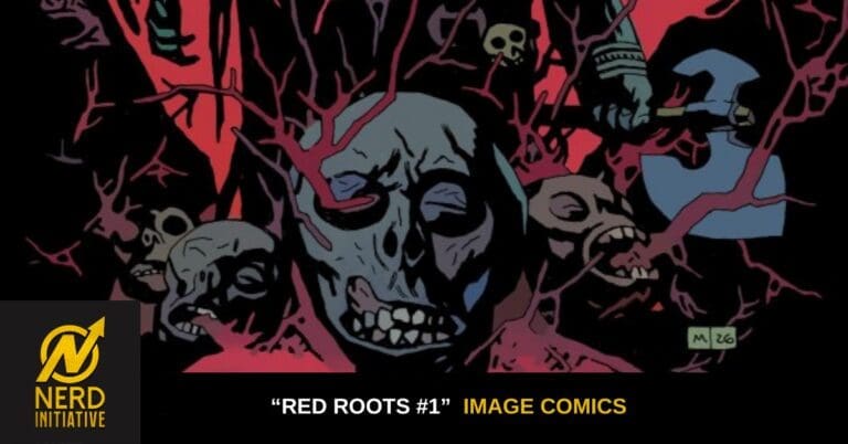
Source: Riley Rossmo, Image Comics

Imagery Connects Us

Shawn: As I mentioned, De Felici pulled double duty, taking care of the art as wel,l and it’s beautiful. I think De Felici shows one of the beautiful things about joint artists/writers, which is that when you’re handling the art as well, you can sometimes tell more story because you know what you want.

The art in this issue is stunning. The colors and the lines all match the moment and mood. When you finally understand the namesake of the story, you’re treated to some of the most gorgeous but outrageous art in the issue. De Felici manages to shine both as a writer and an artist in this issue.

Edalyn: With as much as he shined in the writing, De Felici did equally so in the artwork. Everything about it is so visually striking that it will be on your mind for weeks. In fact, as I’m writing this, several pages stand out to me, mainly the ones that didn’t use character dialogue at all.

That, to me, can be one of the beauties of being great at both writing and art. De Felici knows when to let which lines tell the story: the spoken ones or the drawn ones. The moments here of showing and not telling are absolutely brilliant, from the details to the lighting and coloring. Phenomenal work all around.

Source: Mike Mignola, Image Comics

Final Thoughts – Overall: 10/10

Shawn: What a ride. I’m on the edge of my seat, waiting to see where this goes next. This is intriguing and unique. The story provides a solid foundation to build on going forward. – 10/10

Edalyn: De Felici does nothing but work wonders in this introductory issue. So far, this is like nothing I’ve ever read before, and it got me hook, line and sinker. – 10/10

Read more from Shawn here!

Read more from Edalyn here and follow my socials!

Comments

Were you able to pick up “Red Roots #1?” If so, what did you think? Let us know in the comments below!

Leave a Reply

This site uses Akismet to reduce spam. Learn how your comment data is processed.

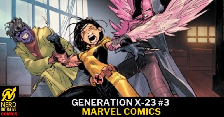
GENERATION X-23 #3 – “A Number’s Game Part 3”

Last we saw Laura Kinney, and her sister/clone, Gabby Kinney, things weren’t going the way they anticipated. Always ready to help a mutant in need, Laura was doing just that. Or at least trying. However, no good deed goes unpunished. Last we saw her she was waiting for her healing factor to do its magic, and being blamed for a death that was not her fault.

Creative Team

Writer: Jody Houser;

Artist: Jacopo Camagni;

Color Artist: Erick Arciniega;

Artist: Marco Renna [pages 8-20]

Letterer: VC’s Ariana Maher;

Cover Artists: Partha Pratim Sarkar; & Romulo Fajardo Jr.;

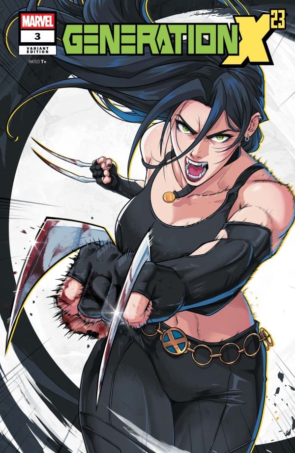
Variant Cover Artists: Jhony Caballero; Ivan Talavera.

*** “Dedicated to the memory of Jacopo Camagni — Thanks for sharing your art with us.”

Check out the review for the last issue of GENERATION X-23

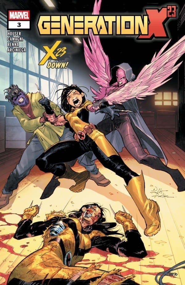
GENERATION X-23 #3 Cover. Image by Marvel Comics.

The Story for GENERATION X-23 #3

As Laura continues to heal, she tries to put the pieces together of what happened. How and why she was led here, she’s not sure. She simply sees a group of kids with a past not unsimilar to her own, but something is very different, and there is something they’re hiding. As a new and unexpected threat cuts a slumber party short, all the cards are finally laid on the table.

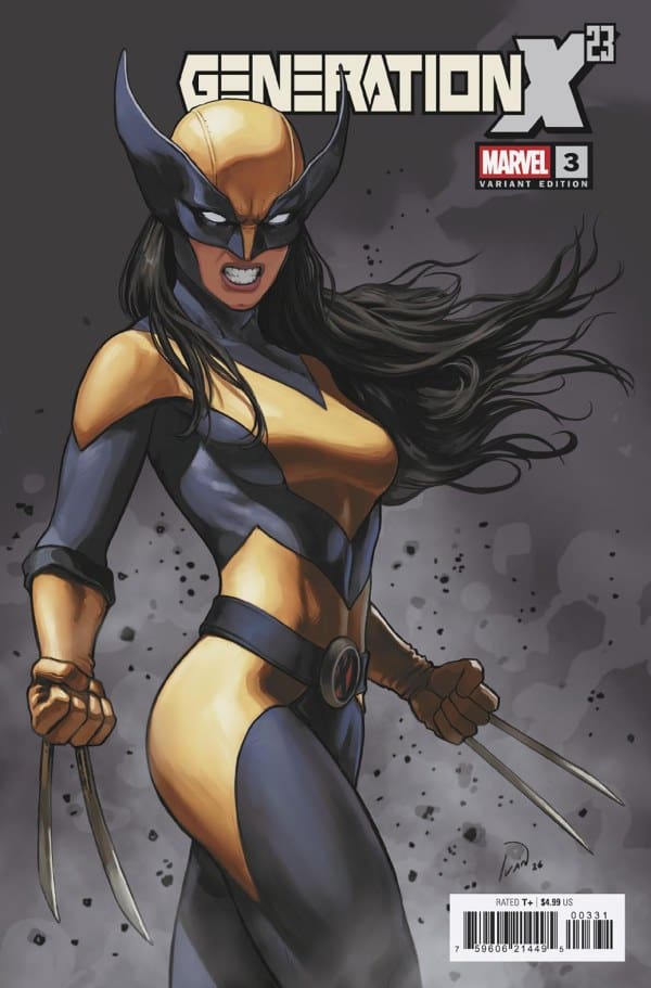
GENERATION X-23 #3 Variant Cover. Image by Marvel Comics.

The Art

Generation X-23 #3 continues to showcase some beautiful and powerful art. Even with more than one artist on this issue, the art never skipped a beat, and continued to flow along with the story and letters perfectly. From a recovering Laura, to some badass action moments, it all kicked ass. However, the array of emotions was a highlight for me in this issue. From Gabby’s incredibly annoyed face, to Laura’s confusion and frustration written all over her face, to X-Finite caught in a moment of happy surprise. The facial expressions sucked me deep into the story making it go way too fast.

With the original artist, Jacopo Camagni, having passed while working on this run, it makes the art hit a bit different. Art can continue on long after the artist, and there is something truly beautiful about that.

Overall Grade: 9.5/10

I am absolutely loving this. As a long time Logan fan, I am loving these new stories featuring Laura. Generation X-23 continues with the fantastic Laura storytelling. Mixed with Gabby, the sister vibes are hit perfectly creating moments of levity and humor in an overarching dark story.

Any and all Wolverine fans should absolutely grab Generation X-23. It continues to dive into the world of Wolvie powers and mutant experimentation in a new way that has definitely got me excited for what’s to come. SNIKT!

For more from Lauren, check out ‘Hops GEEK News.’

Have you checked out this comic? Let us know your thoughts.

Leave a Reply

This site uses Akismet to reduce spam. Learn how your comment data is processed.

WICCAN: WITCHES’ ROAD #5 – Never Alone

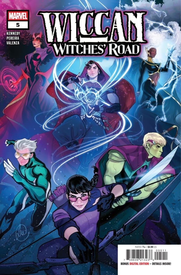
Creative Team – Wyatt Kennedy, Andy Pereira, Bryan Valenza, VC’s Ariana Maher, Lucas Werneck

Catch up with Wiccan: Witches Road #4!

The Story

This review is a joint review from Nerd Initiative’s Megan and Shawn!

Shawn – Now THAT is how you do cameos. Kennedy brings in some heavy hitters for this final issue of Wiccan and does so in a way that still lets Teddy and Billy be the center of the story. Wyatt Kennedy gave me life with that exchange between Morgan and Teddy. Even Kate Bishop’s attitude is captured perfectly by Kennedy.

Kennedy crafts a perfect ending to the story. The narrative threads are pulled together in a way that feels satisfying and complete. We are treated not only to the epic battles early issues led up to, but tender stories of family and love as well. The inclusion of some of Billy and Teddy’s closest friends and family really hammer home the overarching theme of this arc.

Cover art by Lucas Werneck. Published by Marvel Comics

Megan – As fantastic as this comic run has been, there’s nothing that beats that ending. Wyatt Kennedy gave everything you could have wanted from an ending. There was action, there were clever tricks and plans, plenty of magical goodness, excellent cameo usage, and above all else, there was heart. Kennedy wrapped this story up with a perfect bow, and all I’m asking is that Wyatt Kennedy gets a chance to write for Billy again. The depth he brought to the story, while having the best parts of Billy shine alongside his vulnerability makes this one of the best miniseries I’ve read in a long time.

With Billy outmatched, outplanned, overwhelmed, and literally on fire, all hope seems lost. No matter what Tommy tries to do to help Billy, it doesn’t work out. As hopeless as the situation feels, it’s a perfect time to remind Billy that he’s never alone. With the help of his brother, Hulkling, Wanda, Storm, and even a Young Avengers team mate, there seems to be a light at the end of the tunnel.

The Art

Shawn – Andy Pereira, Bryan Valenza, and Ariana Maher bring this one home. Every single panel in this issue feels perfectly crafted. The art on Baba Yaga feels truly terrifying and worthy of such a creature with such a dark reputation. Pereira really nailed the emotions in this issue with me finding myself being able to read the faces of the characters even if Ariana Maher’s brilliant lettering wasn’t there.

Maher again does an amazing job on lettering, helping to drive the emotion and story. The spellcasting moments are particularly well done. Valenza’s colors are spectacular, with several poster-worthy moments with vivid color set against the backdrop of the dark and grim colors of Baba Yaga.

Megan – There is not one page that dulls from the others in terms of the artwork. Andy Pereira, Bryan Valenza, and Ariana Maher made each page powerful, cementing what I’d call a perfect ending. What truly sticks out about this particular issue is how the artists were able to capture the high energy of the story and make the reader feel every bit of it. Whether it be the exasperation of Billy being on fire with Tommy not having a way to put the magical flames out, or the incredibly sweet ending that makes an audible “aww” come from your mouth. The artists brought every emotion to the surface and allowed the artwork to tell the story itself.

Pereira and Valenza worked perfectly well off of each other’s work, combining the excellent detailing and the vibrancy of the coloring, making every page hit home. Maher’s work on the lettering is what truly wraps the comic in a neat bow. With so many characters, Maher was able to capture each of their personalities through the dialogue. That and the perfectly portrayed emotions, such as screams only a monster can conjure, keeps the reader locked in completely on the story.

Final Thoughts

Shawn – 9.5/10. This is as satisfying an ending as you can ask for on a limited series. The story comes to a satisfying conclusion while leaving room to return should fans demand it. The series is truly a treat and enjoyable from beginning to end.

Megan – 10/10. This was the perfect ending to what’s been a thrilling story that gives you an entirely new respect for the characters. The creative team put their soul into these five issues and I would love to see them come back to Billy again in the future. That’s how you handle a final issue. Well done to the creative team!

Overall Grade – 9.75/10

Let us know in the comments what you thought of Wiccan: Witches’ Road #5!

Leave a Reply

This site uses Akismet to reduce spam. Learn how your comment data is processed.

Roots of Madness #6 – Some Knowledge Takes Time To Carry

In Roots of Madness, we encounter Etta Knight. Following the death of her mother, Etta inherits a legacy of “root work”, creating medicine and hair formulas using natural ingredients. Unable to decipher the cryptic symbols and dark notes within her mother’s recipe book, and driven by a desire to help women in her community whose hair has been harmed by harsh chemicals, Etta accepts a position with the Meridian Fellowship. The elite and mysterious institute based in Savannah, Georgia, is quickly becoming more than it seems. As her fellowship reveals ancient eldritch forces, Etta wonders if she will be able to break the curse before the madness consumes her.

This review is brought to you by Nerd Initiative’s Shawn. Did you miss my review for Roots of Madness #5?

Creative Team

Writer: Stephanie Williams
Illustrator: Letizia Cadonici
Colorer: Alessandro Santoro
Letterer: Andworld Design
Cover Artist: Juliet NNeka

Writing

And….breathe. Just like that, it ends. What an amazing story from Stephanie Williams. In Roots of Madness #6, Williams brings home the incredible story of Etta Knight. I won’t be foolish enough to pretend I understand everything Williams is trying to communicate in this story, and I believe that is in part because different parts of this story are for different people. Roots of Madness has been such a complex, unique, breath of fresh air in the comics world.

Williams weaved the threads together masterfully in this issue as the story winds down. It’s clear from Williams character’s first writing style that Hollywood is sitting on their next successful series once a producer finds Roots of Madness. Every page of this series has flowed with Williams’ love and dedication to her characters and to her story, and there is perhaps no better example of it than issue #6. The greatest power is choosing what we do with what we’re given, is such a poignant and beautiful line that perfectly encapsulates what this story has been all about.

Art

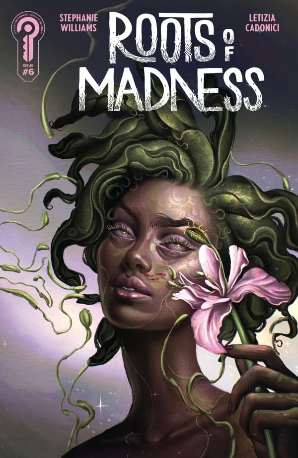
Roots of Madness #6 cover by Juliet Nneka. Image from Ignition Press

Letizia Cadonici and Alessandro Santoro saved their best for last. The art for this entire series has felt like its own character and this issue was no different in that respect. I truly feel like Cadonici pulled out all the stops and gave readers everything left in the tank in this issue. Santoro beautifully captures the colors of this issue. The hues and auras radiate across the panels.

Every color, every line in this issue feels intentional and meaningful. Cadonici and Santoro spared no attention to detail in this issue and Andworld Design beautifully brought together the narrative and the art through distinct lettering.

Final Thoughts

Roots of Madness is a modern masterpiece. From the first panel to the last, this entire series has been an absolute thrill ride. I’ve stayed on the edge of my seat the whole time. While I know it seems like this is where the story ends, I really hope it isn’t. The world needs more stories like Roots of Madness. It needs unique stories told in unique ways for unique audiences. Roots of Madness did all of those things.

Overall Grade: 10/10

Did you enjoy this comic? Let me know in the comments below

Until next time, may your pulls be magical, and your multiverse remain stable.
Leave a Reply

This site uses Akismet to reduce spam. Learn how your comment data is processed.

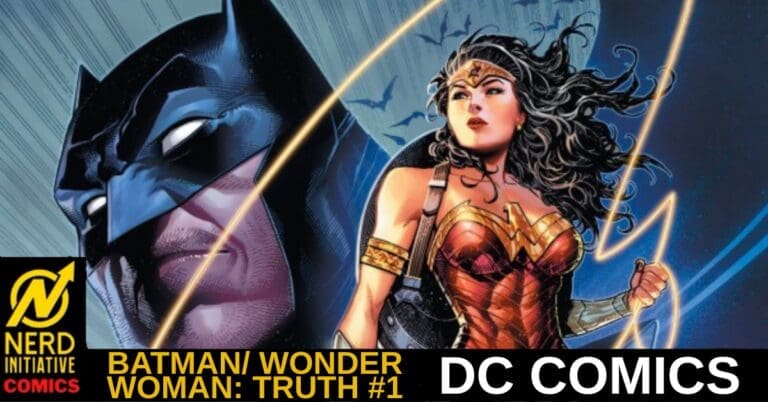
BATMAN/WONDER WOMAN: TRUTH #1 – Race for the Truth

Creative Team – Jeph Loeb, Jim Cheung, Jay David Ramos, Richard Starkings, Comicrafts’ Tyler Smith

Published by DC Comics

MORE FROM NERD INITIATIVE HERE!

The Story

This is a joint review by  Matt from the Hops “Geek” News podcast and Megan from the Vigilante Vibes Podcast!

Matt – Bruce and Selina this, Diana and Trevor that, no, give me Bruce and Diana please now and forever. Whenever these two come together and are the focal point of a story, it is some of my favorite character bonding and storytelling. This issue is tragic at its core, as deep down Bruce feels he is not worthy of anything except the promise he made to his parents. I love how we get the inner monologue of both of these characters and how they operate.

Bruce and Clark have a respect for one another; this issue shows that Diana and Bruce have a sort of mutual love. Getting the line where Bruce tells Diana he would only touch the lasso and do this for her hits emotionally like a mountain of bricks. There is still plenty of action, and it even brings to the forefront the question of why Batman keeps doing the same song and dance. This issue was full of thought-provoking dialogue and gave the reader a much better understanding of these two Mount Rushmore heroes.

MeganBatman/Wonder Woman: Truth #1 brings together two iconic heroes in a harrowing story of achieving what was stolen from Wonder Woman. That’s the basic plot of the comic, but the story itself goes so much deeper. what Jeph Loeb does with this story is zero in on what makes these two characters who they are. In the comic, we see Wonder Woman as she truly is, an Amazon Princess who is the perfect example of truth and light. We also see Batman, someone who has taken his past trauma and used it for the good of others around him, even if it means putting his own feelings on the backburner.

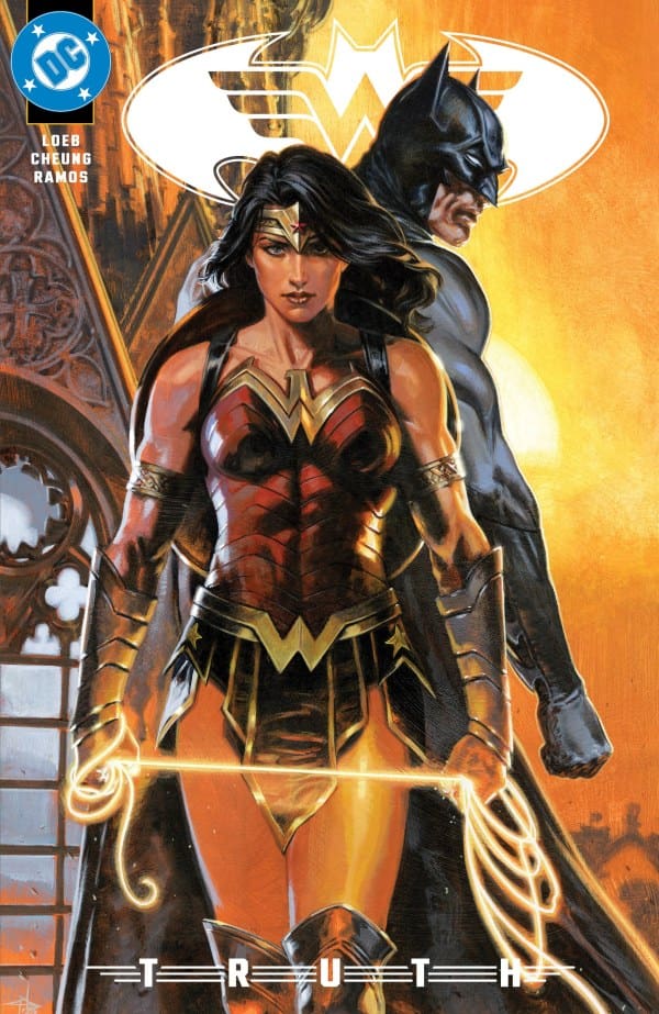
Cover art by Jim Cheung and Jay David Ramos. Published by DC Comics

In the story, Wonder Woman is putting her gifts from the gods in a museum so the public can have a better understanding of her and her people. The Lasso of Truth is one of the gifts to be displayed, but it doesn’t last long before it’s stolen. Batman and Wonder Woman go on adventure to get back the Lasso of Truth, but not before having to fight off some classic villains who want it for themselves.

By the end of the story, the reader is given a better understanding of Batman and Wonder Woman, and their very close friendship that’s built off honesty, understanding, and mutual respect.

The Art

Matt – The art is gorgeous throughout this issue. The way the lasso, at times, is the brightest thing in the panel or on the page adds depth to the background surrounding it. The action pieces where Catwoman is leaping across a page are drawn beautifully, and the various emotions that Diana and Bruce emote hit home and match the emotional tone.

Megan – The artwork of Batman/Wonder Woman: Truth #1 is nothing short of stunning thanks to Jim Cheung, Jay David Ramos, Richard Starkings, and Tyler Smith. Every page is gorgeously detailed, leaving nothing to the imagination. The facial expressions of the characters practically tell the story themselves. With the coloring, there’s an excellent contrast of darker colors with vibrancy in the comic. Often times, the Lasso of Truth is used as the vibrant focal point of the panel, which is beautifully done. All in all, Batman/Wonder Woman: Truth #1 is amazingly well done with artwork that’s as fantastic as the story itself.

Final Thoughts

Matt -10/10. This issue hits incredibly deep and delivers a deep understanding of two heroes who care so much for one another, even without having to say a word. It’s a trip through Gotham City and Batman’s mind, making this a must-read this week.

Megan – 10/10. Batman/Wonder Woman: Truth #1 was a very fun read with an even deeper meaning. The comic shows the best of both characters and really signifies what makes the friendship between Batman and Wonder Woman something so special. The creative team did a fantastic job!

Overall Grade – 10/10

Let me know in the comments what you thought of Batman/Wonder Woman: Truth #1!

One response to “BATMAN/WONDER WOMAN: TRUTH #1 – Race for the Truth”

  1. Sapphy Avatar
    Sapphy

    “ We also see Batman, someone who has taken his past trauma and used it for the good of others around him, even if it means putting his own feelings on the backburner.”

    Wow, what insight about Batman…

Leave a Reply

This site uses Akismet to reduce spam. Learn how your comment data is processed.

This review was written by Megan from the Vigilante Vibes Podcast! If you liked my review, be sure to check out my other reviews! Let me know what you think of Batman/Wonder Woman: Truth #1, or tell me what comics you’d recommend me trying out! Find me on my socials, and check out my Marvel podcast, Vigilante Vibes, by clicking here!

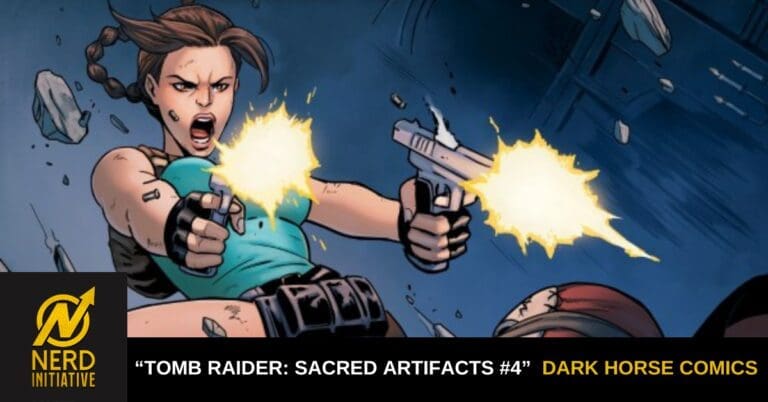
“Tomb Raider: Sacred Artifacts 4” Review – The End of a Great Run

From Lara losing a relic in her home to finding the cult in a cave, it’s all been leading to this. In this explosive finale, Lara faces her past while leading into the future. From writer Casey Gilly, “Sacred Artifacts #4” answers all of our burning questions and more!

Writer: Casey Gilly
Artist: Antonio Di Caprio
Colorist: Enrica Angiolini
Letterer: AndWorld Design

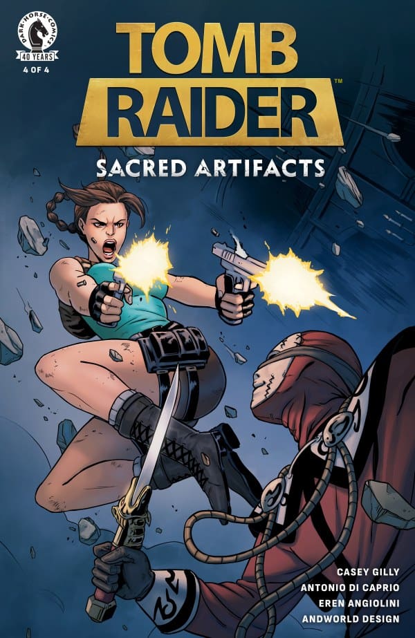
Source: Antonio Di Caprio, Dark Horse Comics, Crystal Dynamics

The End is The Beginning

As a Tomb Raider fan that’s been reading and reviewing this mini-series from its beginning, I’m deeply saddened to see it end. This is largely due to Casey Gilly’s amazing story and how well-crafted it was. From the character moments to the action and everything in-between, I was hooked. This latest issue was no different.

Right in the opening moments, you’re grabbed by a rather interesting plot twist; one that ties directly into “Tomb Raider 2” and retcons it ever so slightly. With this twist comes what I believe to be some very solid answers to questions that readers have been having. Amidst all of this, none of the new info will let readers down in the slightest, let alone franchise fans. What further backs this up is the pacing, keeping things easy to follow and absorb so we can process this new information.

Something else that I loved in this issue is something I love about the run as a whole: how well Lara was written and understood. She was confident, intelligent, strategic, witty, a bit flirty and totally badass but far from perfect. She felt real and tangible, a stark contrast to the epic adventures she goes on. Speaking of said adventures, the way this story was written was such a great entryway for new fans! It didn’t feel too overwhelming with prior info, while giving just enough to get people interested in finding out more.

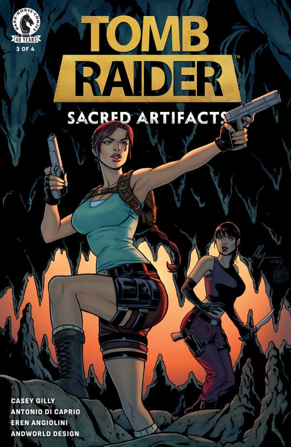
Comic cover for Tomb Raider: Sacred Artifacts, issue 3 of 4, showing Lara Croft aiming two pistols in a cave with a sunset glow and a companion behind her, logo and credits visible on the left.
Source: Antonio Di Caprio, Enrica Angiolini, Dark Horse Comics

Artistry in Motion

As with the previous issues, Di Caprio and Angiolini absolutely killed the art in this issue! For this last and final issue, every shot looked carefully chosen. The penciling and shading were both not only detailed, but exceptional. Di Caprio’s work paired with Angiolini’s command of color really brings a lot to this finale and made everything feel cinematic in nature. This was made all the better by the pairs use of lighting and how it interacted with the environment. Absolutely stellar work!

Source: Taurin Clarke, Dark Horse Comics

Final Thoughts – 10/10

As sad as I am to see this series go, I’m beyond ecstatic that I got to experience it as it happened. From the first issue to the last, Gilly and crew take readers on a wild ride, not allowing us to let go. The writing, art and colors worked together to create something truly electric and worth remembering. I’d even go so far as to say that Gilly, Di Caprio and Angiolini cemented themselves in Tomb Raider’s legacy.

Be sure to read more from me here and to follow my socials!

Comments

Did you read all of “Tomb Raider: Sacred Artifacts” or are you planning to pick up the trade paperback in August? Let us know in the comments below!

Leave a Reply

This site uses Akismet to reduce spam. Learn how your comment data is processed.