Home Blog Page 503

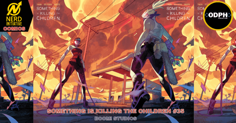
SOMETHING IS KILLING THE CHILDREN #35 – The Final Round

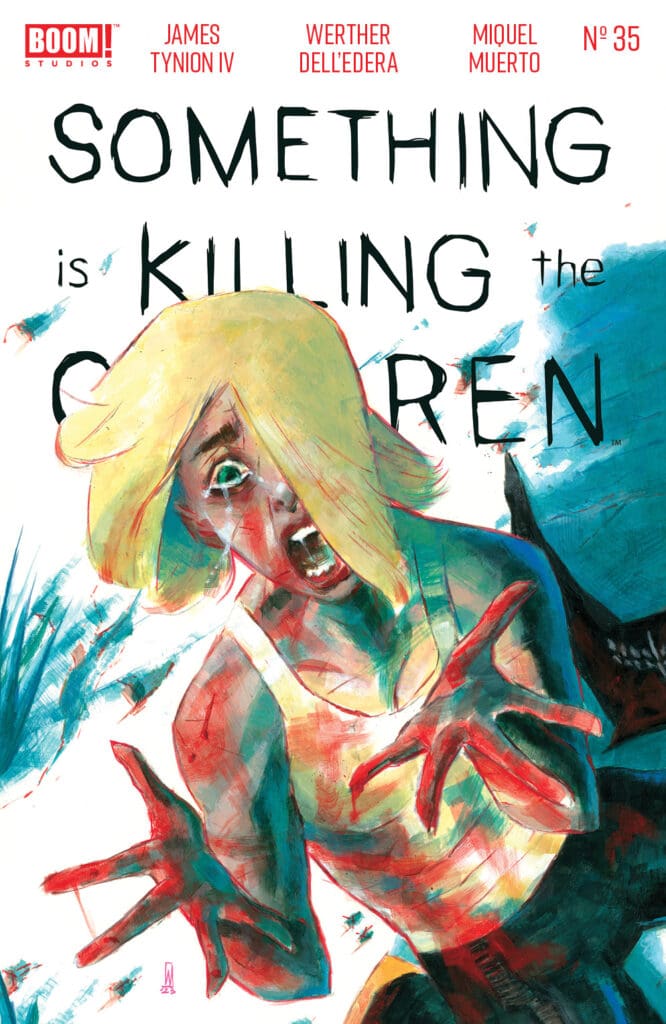
SOMETHING IS KILLING THE CHILDREN #35 by James Tynion lV, Werther Dell’ederaMiquel Muerto and Andworld Design (Credit: Boom! Studios)

Welcome to an all-new edition of Parlay points, the comic book review blog to the ODPH Podcast!

For this entry, the showdown fans of Erica Slaughter have been waiting for is finally here! After an excellent slow-burn build, “The Showdown at the Easy Creek Corral” pits BOOM! Studios legendary monster hunter against her greatest rival to date!

Considering last issue’s cliffhanger ending with a character’s life hanging in the balance, losing is not an option.

SOMETHING IS KILLING THE CHILDREN #35 by James Tynion lV, Werther Dell’edera Miquel Muerto and Andworld Design gives readers the “big fight aura” with its’ story arc conclusion. Let’s not delay any longer and jump right into the action, shall we?

*** POSSIBLE SPOILER WARNING ***

Erica Slaughter’s current investigation has led her to Tribulation, New Mexico. When a monster known as the Duplicitype (who now has taken the form of Erica) violently murders a family, a lone survivor named Gabi is on borrowed time.

Gabi is now under the custody of Riqui, a bartender doing all she can to help her. Even with Sheriff Carter’s involvement, the danger hasn’t left Tribulation. It’s only grown more terrifying. This is all because of an insane force of nature: Charlotte Cutter.
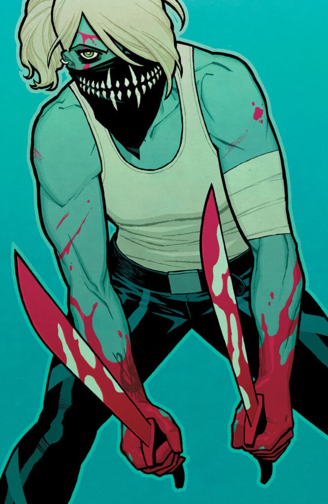
SOMETHING IS KILLING THE CHILDREN #35 by James Tynion lV, Werther Dell’ederaMiquel Muerto and Andworld Design (Credit: Boom! Studios – Cover: Cliff Chiang)

Cutter has been hired by the Order of St. George to eliminate Erica as she is considered a loose end to business. Knowing that re-emerging would put her life in danger, Erica took the chance to help Gabi anyway. Unfortunately, death and destruction has been left in Evil’s wake.

Erica, Riqui and Gabi make a final stand to draw out the Duplicitype but Cutter has crashed the party. Once Gabi is captured by Cutter, Erica makes a tough call to shoot the poisoned arrow meant for the monster at Cutter. Unfortunately, Cutter grabs it in mid air and stabs Gabi with the poison!

This issue wastes no time as Erica makes a direct line to attack Cutter. Gabi is screaming in pain as the poison starts taking hold. Riqui is helpless to stop it. Their words provide the soundtrack for an all-out violent throwdown between Erica and Cutter.

Nothing is held back as the two fight to the death. Readers get their money’s worth and then some as the rivals deliver on the emotional tension that’s been building. All the while, the monster is still walking towards their location.

The drama never stops escalating as the chaos swirls around Erica like a hurricane. Once the smoke clears, the resolution leaves scars that won’t fade away for Erica and the readers. Get ready for an intense payoff as one chapter closes but another one prepares to begin within these epic pages.
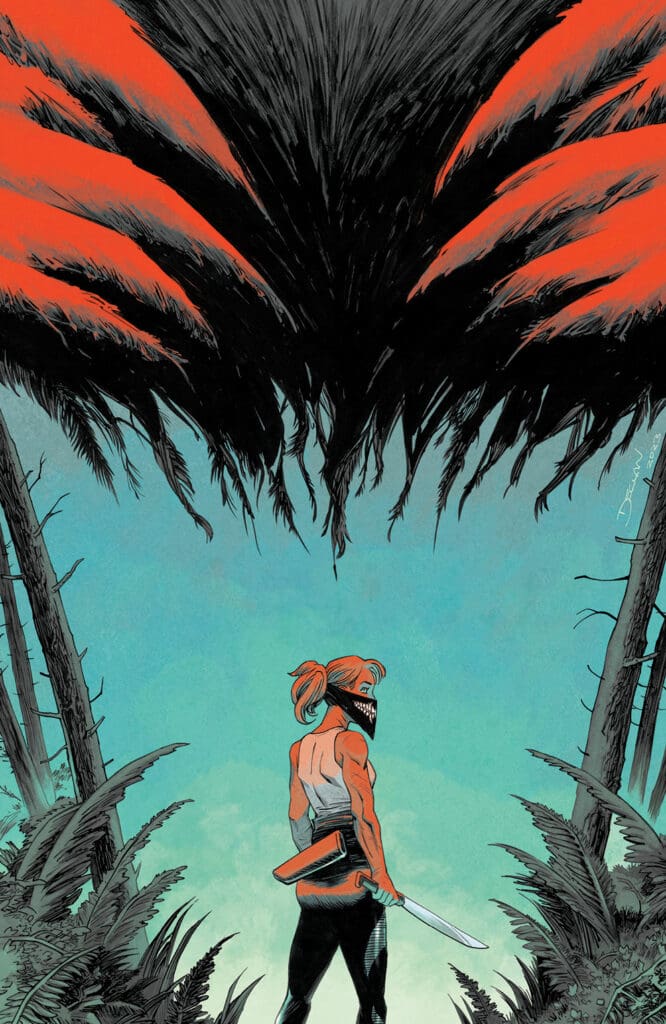
SOMETHING IS KILLING THE CHILDREN #35 by James Tynion lV, Werther Dell’ederaMiquel Muerto and Andworld Design (Credit: Boom! Studios – Cover: Declan Shalvey)

Being the champion of Slow-Burn drama, Tynion delivers a highly emotional conclusion to this arc. Erica’s struggle to find a win has been a major driver for this arc. Cutter has been one step ahead of her at every phase.

With their final confrontation here, Tynion unleashes Cutter at her most deadliest. With stabbing words while hurting Erica, the dialogue uses words as weapons. It plays completely into how unhinged Cutter is. It also pushes Erica to go into another level to win.

The second confrontation nails the impactful build-up for the case as well. Gabi’s story has been the backbone of the entire arc and receives an magnificent send-off.

Tynion mixes in elements of tragedy and triumph in an even blend to close out this tale. The ending issue arc reminds readers of how even in victory, there is much defeat. It further defines how incredible this series is

Dell’edera and Muerto bring the action at a fast pace throughout this issue. They mix in only a few moments to let readers catch their breathes. Those moments still jump out as you see Cutter’s insanity go toe-to-toe with Erica’s unbreakable will.

It’s a great compliment to the fighting. Readers are gifted a full page panel that kicks off the conclusion of their altercation. It’s also a visual that will arguably cause a vocal “YES!’ reaction as well. That’s how much the art will lock you into the drama.

There are also a few other full-page images that will connect with readers in other ways. The story ranges with extreme highs and lows involving those panels. closing moments bring the story back down to set forth a solid overall conclusion. The parting image couldn’t be crafted any more perfect to conclude this chapter of Erica Slaughter.

FINAL POINT: 10 OUT OF 10

The latest challenge in Erica Slaughter’s life comes to a chaotic and explosive conclusion with an amazing issue. Tynion’s superb writing orchestrates the thrilling showdowns fans have been waiting for. Dell’edera, Muerto & Andworld Design showcase through incredible imagery the brutality and heart-breaking reactions to another SIKTC classic! Absolutley DO NOT LEAVER THE LCS WITHOUT THIS ISSUE!

Hit me up on ODPH social media and let me know your thoughts on Something Is Killing The Children #35. Thanks for reading Parlay points on Nerd Initiative!

CLICK HERE FOR MORE CONTENT FROM KEN

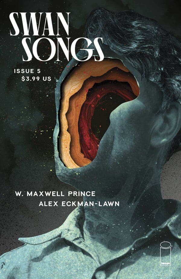
Swan Song #5 – The Depth of Self-Discovery

0
Credit: Image Comics

Writer: W. Maxwell Prince

Art & Main Cover: Alex Eckman-Lawn

Letters and Design: Good Old Neon 

publisher: IMAGE COMICS

Where does unhappiness come from? Certainly, life provides plenty of reasons to be unhappy, but what beyond those external reasons?

What about those individuals who simply cannot find joy in anything, including what most of society would consider pleasant parts of everyday existence?

Well in Swan Songs #5 W. Maxwell Prince and Alex Eckman-Lawn literally and figuratively dive deep into one individual to discover what has made him the person he is today. 

For those who have not previously read Swang Songs, each issue is its own individual story. Instead of a narrative connection, there is a thematic one, and as the title suggests that theme has been on how things end.

For this issue, we see how things end by returning to the beginning. Albert undergoes a process called soft induction, which is type of hypnosis where he enters a type of dream-like state. 

Each issue has had a different artist and this time it is Alex Eckman-Lawn. Part of the fun if this series and trying to determine why this artist is for this issue. I cannot say for sure but he does do a number of experimental things with this issue. Almost seems like he is doing multimedia design with a few pages. I wonder if he cut out pieces of paper and magazines and placed them on top of one another with some of the unique creatures we see. I cannot tell if it was done physically or digitally which makes it impressive either way. A big part of why this issue works as well as it does is the wondering about what he will do next. 

Credit: Image Comics

Not only do the aesthetics work it is vital for this narrative. The story here is perhaps the simplest of the series thus far. We are simply traversing the subconscious of Albert as he looks within himself and his suppressed memories.

Eckman-Lawn’s choices give these pages depth upon depth so it feels like you are traversing through multiple dimensions panel to panel and page to page.

Every individual unit is unique onto itself. Giving you the sense these are pieces of Albert that are forming perhaps for the first time. 

To be honest I usually do not like stories like this. I tend to have an emotional disconnect when everything that you are seeing is not real, because why should I invest in something that is just pure randomness?

Here it is different because despite the location not being a physical place it is getting to something that is very real. All of which is set up rather well in the opening discussion.

Right away we know the type of person Albert is and why this exercise is important.

At first, Albert is as unlikeable as you can get. The type of person that would cause and entire room to drop their head in disappointment if he were to enter. Someone who is miserable just to be miserable.

As we go on this journey with him that misery starts to find its ownership. Maybe, there is more to him than he even realizes. For a character to have that type of journey when the story takes place entirely in his head is quite the feat. 

Considering how this narrative is designed, and the entire point of this series a lot hinges upon the ending. Does it make that journey worth the climb?

Without spoiling it, at first, it left me feeling a bit hollow. Perhaps I was expecting something a bit cleaner than what they wanted to give me. It could also be my inability to see something that is clearly there. I do get the sense this is a type of issue that gets better the more times you read it. Still, that was my experience, but the beauty of art is that we can experience it differently.  

Score: 4.5 / 5

Click here for more reviews from Comic Concierge!

Howard the Duck: Celebrating 50 years of Quacky!

0
Howard the Duck #1 by Daniel Kibblesmith, Chip Zdarsky, Joe Quinones, Jason Loo, Merrit K, Stacey Lee, Jordan Gibson, Annie Wu, Ian Herring, Derek Charm, Dee Cunnifee, Will Robson, Pete Pantazis, and Travis Lanham. (Credit Marvel, covers by Chip Zdarskey, Joe Quinones, Ron Lim, Ed McGuinness, Laura Martin, Israel Silva, Annie Wu, Stacey Lee, and Skottie Young.)

Creative Team:

Writers- Daniel Kibblesmith, Chip Zdarsky, Joe Quinones, Jason Loo, and Merritt K

Artists- Stacey Lee, Jordan Gibson, Annie Wu, Ian Herring, Derek Charm, Dee Cunniffee, Will Robson, and Pete Pantazis

Letterer- VC’s Travis Lanham

Covers Artists- Ed McGuinness and Laura Martin

Variant Cover Artists- David Aja, Ron Lim, Israel Silva, Joe Quinones, Stacey Lee, Annie Wu, and Skottie Young

PUBLISHER: MARVEL ENTERTAINMENT

The Art:

It is truly a celebration as we get a fantastic collaboration of talented artists from across the spectrum to draw up various stories featuring our cheeky duck. The different take each story has seeing Howard as president to him as Star Lord is an homage to one of the quirkiest characters Marvel has under their belt. We get retro styles meshing with new-age art making every page a colorful work of art.

Howard the Duck #1 by Daniel Kibblesmith, Chip Zdarsky, Joe Quinones, Jason Loo, Merrit K, Stacey Lee, Jordan Gibson, Annie Wu, Ian Herring, Derek Charm, Dee Cunnifee, Will Robson, Pete Pantazis, and Travis Lanham. (Credit Marvel, covers by Chip Zdarskey, Joe Quinones, Ron Lim, Ed McGuinness, Laura Martin, Israel Silva, Annie Wu, Stacey Lee, and Skottie Young.)

The Writing:

The list of writers is truly heavy-hitting in this celebration issue and it does not disappoint. There is a larger story at play yet, each mini-story weaving a web throughout leaves the reader a lot to be delighted with.

The way each writer takes on and makes Howard their own flavor despite feeling as though they never change at all is a testament to everyone’s talent making this issue stand out in a big way.

Overall:

This issue is a celebration and homage to 50 years since Howard’s first appearance and it truly feels so. We the readers get to see him as president battling giant projector spaceships here for our character’s rights, lounging with the X-Men in the mansion, to a creepy rendition of the Watcher’s brother who looks more like a distorted creature from a mob cartoon.

Howard the Duck is not a serious character and this comic sheds light on that while making it a lot of fun. Fans should make it a point to dive into the various stories told by some of the best in the business and take a ride through the multiverse.

5/5 Cigars.

Thank you for taking the time to read my review! If you liked this and want to know what else I am reading follow the link below and let me know what books have made it onto your pull list. You can follow me on social media @hopsgeeknews. https://nerdinitiative.com/?s=HopsGeekNews

LOCAL MAN #7 – WHAT A LONG STRANGE TRIP

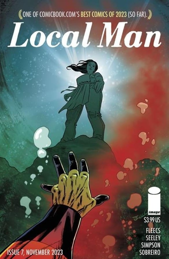
LOCAL MAN #7 by Tony Fleecs, Tim Seeley, Brad Simpson and Felipe Sobrerio (Credit: Image Comics)

Welcome to an all new edition of Parlay Points, the comic book review blog to the ODPH Podcast.

For this entry, we’re jumping into the next adventures of CROSSJACK aka Jack Xaver. Since his fall from grace, the superhero life hasn’t left his side in quiet Farmington. Now caught up in another mystery, can Jack survive long enough to see what is happening around him?

LOCAL MAN #7 by Tony Fleecs, Tim Seeley, Brad Simpson and Felipe Sobrerio brings the vintage themes of 90’s IMAGE COMICS to the modern day with another cant miss issue. Let’s take a closer look and see how things shape up now, shall we?

*** POSSIBLE SPOILER WARNING ***

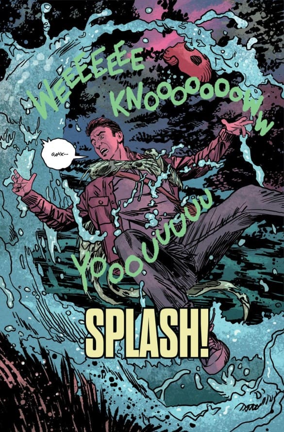
Jack and his loyal dog Pepper are investigating a possible lead in Mackenzie Cheng’s murder. As they’re walking by a riverbank, Jack hears a song. Readers quickly see this is a distraction. A creature emerges from the water and pulls Jack down.

While under water, Jack is trying to fight back. As two figures look to reach for him, Jack goes on the offensive. When he emerges, Jack finds himself in a mysterious place. A person of interest is asking him questions of what he was doing near the water so late. Readers follow along with Jack as he now finds himself in the heart of the Star tribe compound.

Meeting with Coochie Poo, Jack evades and asks questions concerning the tribe’s possible involvement with Cheng’s death. The talk leads Jack into a new direction but its’ not one that he might be ready to handle.

LOCAL MAN #7 by Tony Fleecs, Tim Seeley, Brad Simpson and Felipe Sobrerio (Credit: Image Comics)

The path to the truth sends Jack into uncharted territory. Will Jack crack the case or is this the start of a bigger conspiracy? The closing act is a mix of emotions as Jack’s search for truth takes him on a path to dealing with his own issues. Once the final image hits the page, readers are served another reminder of why this book stands out on every NCBD.

The writing sets up a unique path for justice concerning Jack. the interaction with the Star Tribe comes off as unpredictable and off-beat as one might expect. Jack’s newfound role as redeeming hero plays out with a solid does of humor and heroics. Jack is flawed (putting it mildly). These elements shine as he progresses on his investigation.

The writing throws in some excellently timed moments that exemplify the awkwardness of Crossjack. Once the latter portion of the issue begins, readers see how Jack deals with his challenges but still tries coping with his past. Even with his set-backs, the writing never looses sight of trying to redeem Jack even if he might never be able to handle that moment.

The art sets a strong tone early. Opening the investigation of the Star Tribe, there is a great full page visual of Jack getting taken into deep water. The panels with Coochie Poo demonstrate the humor and anxiousness of Jack’s heroic plan. However, nothing will prepare readers for the walk home from their camp.

The “mind-bending” sequence of events plays into a more light-hearted feel to the seriousness of Jack’s mission. Readers will need to do a double take followed by a good laugh when the “text messages” start. The emotions start pouring out as Jack gets closer to a solid lead & its’ effect on Inga. The art mirrors the grief and anger involved with the case at hand. This builds towards a closing visual that sums up Jack’s struggles involving what is happening around him. Another great job showcasing the road to redemption isn’t always an easy path to walk.

FINAL POINT: 9 OUT OF 10

The saga of CROSSJACK takes a humorous and dark turn with an unexpected trip within these pages. With excellent writing and art from Fleecs, Seeley and the team, readers have a wild journey on the way to finding justice in Image Comics’ latest smash hit. Don’t miss this book on New Comic Book Day!

Hit me up on ODPH social media and let me know your thoughts on Local man #7. Thanks for reading Parlay Points on Nerd Initiative!

CLICK HERE FOR MORE CONTENT FROM KEN
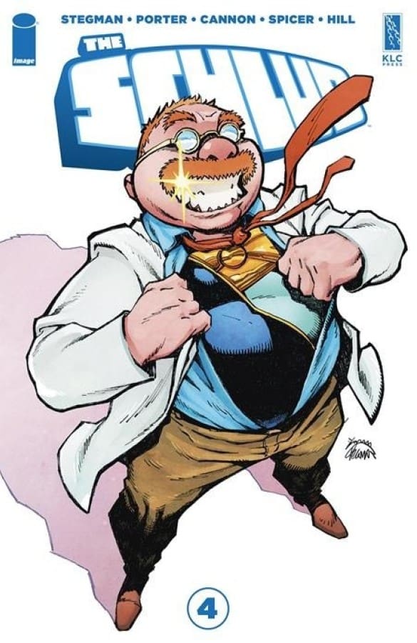
The Schlub #4 – Dinner, Wyrm, and Family Ties

0

Creative Team: Ryan StegmanKenny PorterTyrell CannonMike Spicer and John J. Hill

Tyrell Cannon & Mike Spicer
© 2023 Image Comics, Inc. All rights reserved.


Introducing: The Schlub! Hold on tight as we dive into this epic issue that has left our nerd initiative bullpen buzzing with excitement! Brace yourselves, because this review is not just from one team member, but an entire squad of comic aficionados ready to dissect every thrilling detail! Without further ado, let’s delve into the wild world of The Schlub and uncover the intriguing perspectives of our dynamic team!

Check out Issue 3 Review Here!

The Writing:

Marty:

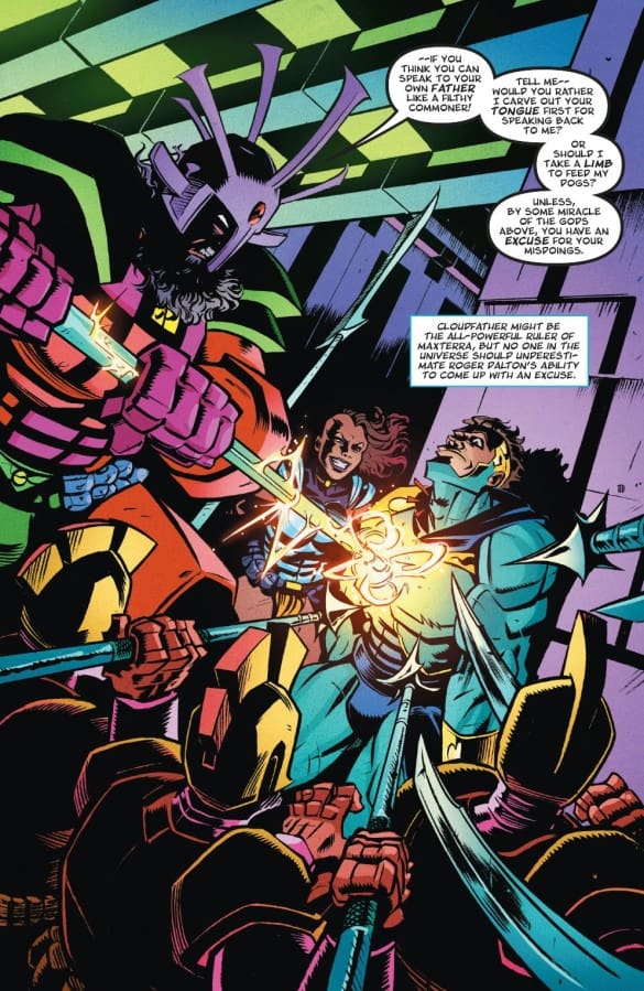
The interweaving of Roger and Cirrus’s family dynamics is a brilliant narrative choice, showcasing how they thrive better in each other’s worlds than their own! The parallel family situations add depth to the characters, making their struggles more relatable and allow the readers to become more emotionally invested.

Tyrell Cannon & Mike Spicer
© 2023 Image Comics, Inc. All rights reserved.

Cirrus’s sister emerges as a formidable antagonist, adding an intriguing layer to the storyline. The exploration of family dynamics and dysfunction injects humor into the plot, creating problems that resonate with readers.

Wyrm’s relentless display of powers adds a palpable sense of danger, elevating the stakes for both Roger and Cirrus. The convergence of three storylines promises an exciting and complex narrative, leaving readers eager to see how they will intertwine in future issues.

The Schlub maintains its status as a favorite on the shelves, blending humor with dysfunctional family vibes, creating a unique and engaging reading experience.

Lauren:

Tyrell Cannon & Mike Spicer
© 2023 Image Comics, Inc. All rights reserved.

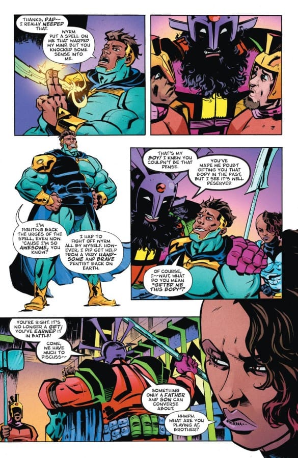
Right away we learn Roger possesses a unique superpower that Cirrus has never had. The power of making an excuse. When done properly it can get you extra time for an assignment, out of a ticket, or stop the father of the guy whose body you’re possessing, from killing you.

Roger and Cirrus both survived their toughest battles yet: meeting each other’s families. Meeting someone’s family can definitely give you a different perspective of them, and for these two heroes (I think Roger has earned that title at this point) it did just that. While Roger and Cirrus didn’t share a single scene together, I feel like this was the first time where they truly understood each other.

We also see how Roger has turned what his dad views as his biggest failure, into a superpower which Cirrus himself doesn’t possess. Having dyslexia motivated Roger to master the skill of studying, which just may give him what he needs to defeat Wyrm. Four issues in, and this is the first time I really felt for Roger and didn’t just see him as a self loathing, never takes personal responsibility, type of guy.

All the while, we’re learning about the tragic past, and terrible fathers both our main characters have endured, the story continues to progress with laughs on almost every page. Every issue makes me giggle throughout, and if you’ve ever incurred a student loan debt, there is definitely at least one line that will make you chuckle.

Matt:

This issue delivers insights into each character. Showcasing Rodgers horrible family and the similarities between our two heroes all the while giving us those comedic moments this series is known for make this issue extremely fun.

Don’t Forget to Vote For Your Favorite Comics and Creators Here!

The Art, Colors and Letters:

Marty:

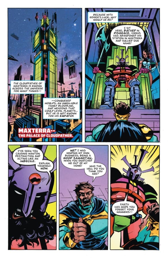
The design of Maxterra is a visual delight, with its futuristic and vibrant aesthetic adding an extra layer of excitement to the story. The artists, Tyrell Cannon and Mike Spicer, skillfully capture the essence of this high-tech world.

Tyrell Cannon & Mike Spicer
© 2023 Image Comics, Inc. All rights reserved.

The paneling techniques during fight scenes, particularly the use of a half circle atop larger panels, enhance the flow of action. This innovative approach keeps readers on the edge of their seats, providing a dynamic visual experience.

John J. Hill’s lettering proves to be a crucial element in conveying the intensity of the fight scenes. It not only guides the reader through the action but also contributes to the pacing, creating a sense of urgency.

The bright and playful tone maintained by the colors adds to the overall enjoyment of the comic. The cohesive collaboration between artists and colorists is evident, creating a visually stunning and immersive world.

Lauren:

The art Tyrell Cannon delivers in every issue is absolutely beautiful and full of detail. As Roger becomes a bit more comfortable in Cirrus’ body, as well as begins to take things more seriously, we see a shift in his demeanor. It’s subtle, but says so much about how this character is developing, in a way that words cannot. That is truly the beauty of the comic book story, when the art matches the story so perfectly.

Matt:

Tyrell is continuing to raise the bar as every little bit of detail exudes brightly in this issue. The level of detail in battle sequences to the moments around the dinner table continue to impress me and draw me in.

Final Thoughts:

Marty:

The Schlub #4 excels in both writing and visual elements. The fusion of family dynamics, impending danger, and futuristic aesthetics makes it a standout comic on the shelves. Fans of the series will undoubtedly be eagerly anticipating the next installment.

Overall Rating 9 out of 10

Want More Reviews From martystoked? Click HERE

Lauren:

All in all, if you’re looking for a great story with action, family trauma, and lots of laughs (because how else do you deal with family trauma), you should definitely add this to your pull list. Each issue gets better and better as we learn more about our unlikely duo.

Overall Rating 9.25 out of 10

Want More Reviews From Lauren? Click HERE

Matt:

This may be the best issue of this series yet. It delivers in the emotional moments, physical moments, and world building. We’re digging deeper into the story while Wrym is close to accomplishing what he sets out to do creating even more suspense.

Overall Rating: 5/5 cigars

Want more Reviews From Matt? Click HERE

Kaya #13 – Navigating Uncharted Waters

0

Kaya Issue 12 –  Image Comics

Creative team: Wes Craig (story, art and design), Jason Wordie (colors), Tom Napolitano (letters), Erika Schnatz (design)

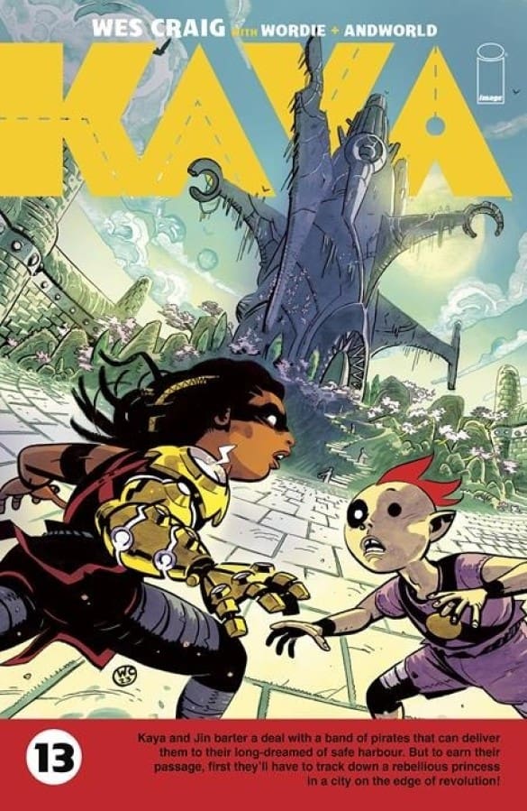
Kaya #13 Wes Craig (art and design), Jason Wordie (colors), Credit Image Comics

Kaya #13 embarks on a thrilling new story arc that not only earned it a spot as a 2023 Ringo Awards nominee but also left readers eagerly anticipating the unfolding adventures. The creative team, led by Wes Craig, delivers a captivating narrative complemented by Jason Wordie’s vibrant colors, Tom Napolitano’s skillful lettering, and Erika Schnatz’s thoughtful design.

Check out issue 12 Review Here!


Kaya #13 Wes Craig (art and design), Jason Wordie (colors), Credit Image Comics

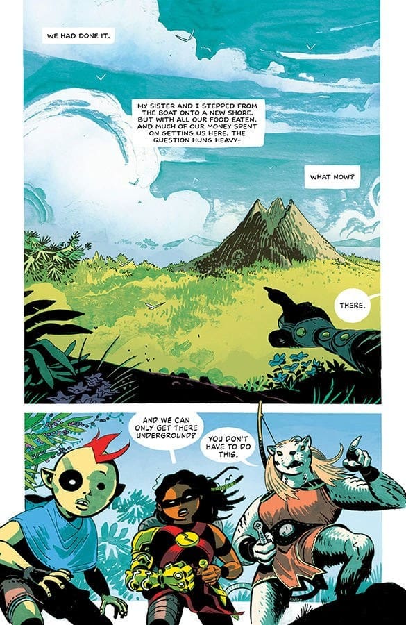
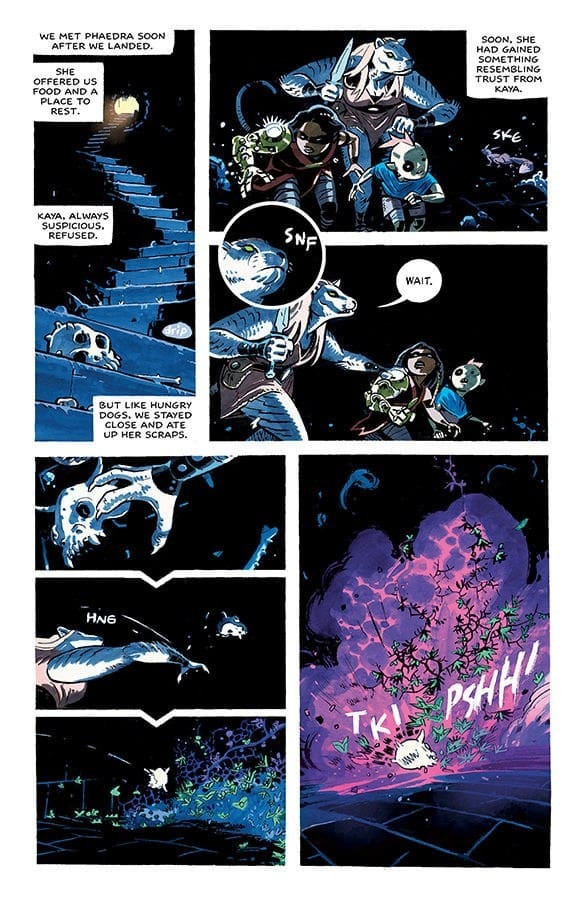
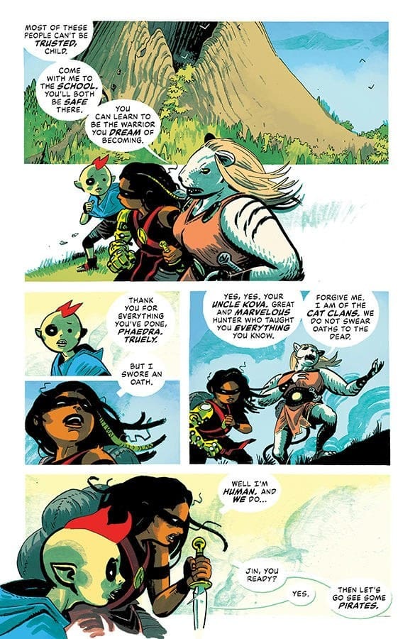
The diverse dangers and challenges in each new world Kaya explores with her brother Jin showcase the ongoing commitment to world-building, ensuring a dynamic and unpredictable reading experience. Phaedra’s arrival injects a captivating layer of intrigue into the storyline, and her battle beast-like design is bound to win the hearts of fans!

The visual storytelling hits its peak during the thrilling escape sequence reminiscent of Indiana Jones, where Kaya, Jin, and Phaedra navigate perilous traps. The artistic prowess shines, especially in showcasing Jin’s powers and introducing visually striking new characters, including an octopus-like creature and the intriguingly diverse pirates with distinct anamorphic characteristics.

Don’t forget to vote for your favorite comics and creators here!

The splash a MC pages depicting cityscapes overrun by the Atria robot empire are a visual feast, showcasing Wes Craig’s incredible artistry. The level of detail and creativity displayed in these pages adds depth to the narrative, immersing readers in the dystopian landscapes the characters must navigate.

The lettering by Tom Napolitano plays a crucial role in amplifying the visual storytelling, seamlessly guiding readers through the narrative’s highs and lows. The moment of despair turns into a turning point when a stag pirate offers Kaya and Jin a deal, injecting a new layer of suspense and anticipation into the storyline.

Final Thoughts:

Wes Craig and the creative team prove once again their ability to weave a captivating tale, combining compelling characters, inventive world-building, and visually stunning artwork. This issue promises an exciting journey ahead, making it a must-read for fans of the series.

Overall Grade 8.5 out of 10

Thanks for checking out my review for the NI Comics Bullpen. Let me know what comics you’re reading and hit me up on Twitter. Till next time…

Want More Reviews From martystoked? Click HERE


Edenwood #2 – Who can you trust, when you can’t even trust demons?

Creative Team (Image Comics)

Story & Art: Tony S. Daniel

Colors: Leonardo Paciarotti; 

Letters: Nathan Kemf; 

Editor: Kel Symons;

Cover A: Tony S. Daniel & Marcelo Maiolo; 

Cover B: Tony S. Daniel & Arif Prianto;

Cover C: Gary Frank & Jay David Ramos; 

Cover D: Yanick Paquette & Jay David Ramos

Cover E: Sean Gordon Murphy & Dave Stewart

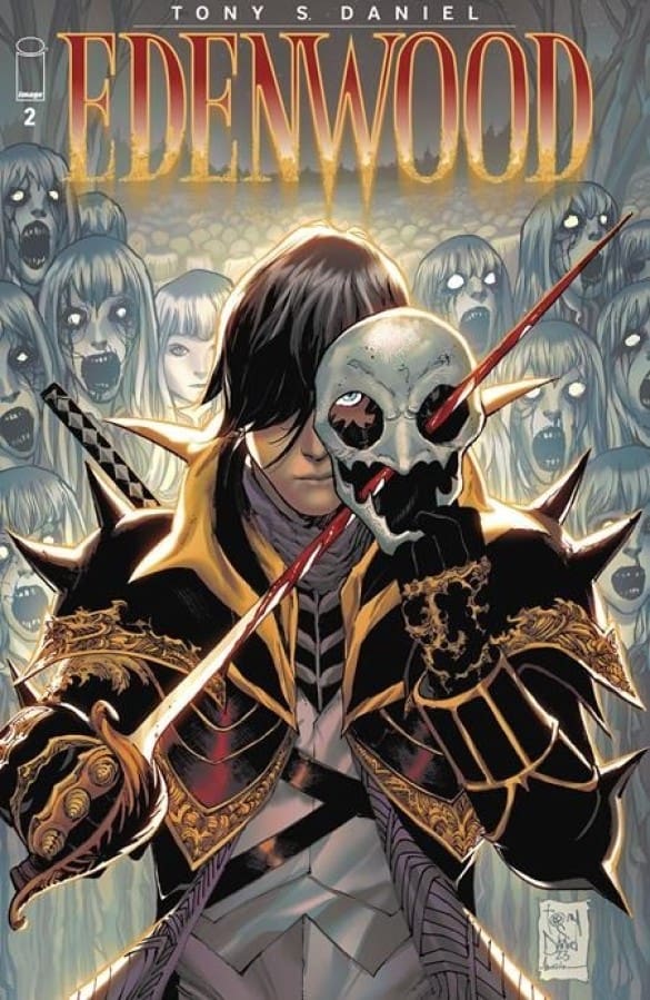
Cover of Edenwood Issue 2 by Image Comics.
Edenwood Issue #2 – All images by Image Comics

Edenwood, from Image Comics

The first issue of Edenwood showcased a supernatural spin on a dystopian future. However, the mention of the rich being able to ignore the imminent death and destruction all around them, made it feel modern at the same time. We started with a group of teenagers on page one.

Before we knew it, we had demons, an army, that one loner we all love to cheer for, and so much mystery. Time moves differently in Edenwood, which alone can create confusion and mystery at the same time, while also answering some questions (such as why the dog turned to bones so quickly). Then that last page had me going back to the beginning of the story and wanting to read it all again. While also making me very excited for issue 2.

Check out the Review for Issue 1.

First page of Edenwood Issue 2.
Edenwood Issue #2 – Images from Image Comics.

The Story for Issue #2

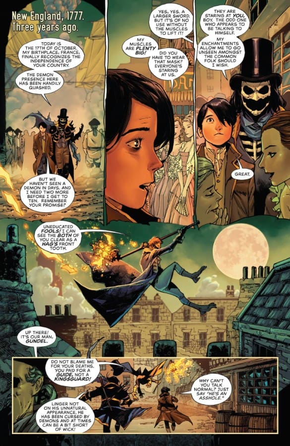
While eagerly awaiting what comes next, as issue one ended with a turn I did not see coming at all, issue two drops us in New England in 1777. However, it says “Three years ago.” Time continues to not make sense, while creating interesting stories and mysteries.

Rion, who has now become squire to Bastille, runs into an old friend, and learns that vampires are real, and chickens really do run around with their heads cut off. 

We then come back to present day (complete with armies, tanks, and tall buildings), and we learn how Rion survived, and so much more. Countries all over the world have fallen to the demons, as Rion, and many others continue to hunt and kill them while also having to avoid monsters and navigate a supernatural world where no one can be trusted, not even in a dream.

The United States government is in talks with demon liaisons in hopes of achieving peace, while others know peace does not exist with demons. Some things shouldn’t need to be taught.  

The Art

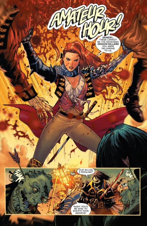
Edenwood encompasses so many creatures, timelines, and worlds, and the art conveyed all of it beautifully. From attire to the background settings, there was detail in every page.

Seeing a dark queen dressed in medieval looking attire, stare out into a modern city on a beautiful day, didn’t look off. It showed contrast, and helped explain what was happening on a bigger scale throughout this story. Even the monsters are somehow absolutely beautiful, while creating a feeling of wonder and disgust at the same time. 

Edenwood Issue 2 Rating: 9.25/10

Only two issues in and a lot has happened! While this dystopian story combines modern day, the supernatural, and time that makes no logical sense, the story flows beautifully, and keeps you entertained throughout.  

Inside issue 2 of Edenwood by Image Comics.
Edenwood Issue #2 from Image Comics.

Lauren is half of Hops GEEK News: a weekly podcast that discusses all things geek pop culture, while enjoying a craft beer of the week. They also interview many different people from the comic book world and beyond.

GRIM #15 – Threads of Destiny

0

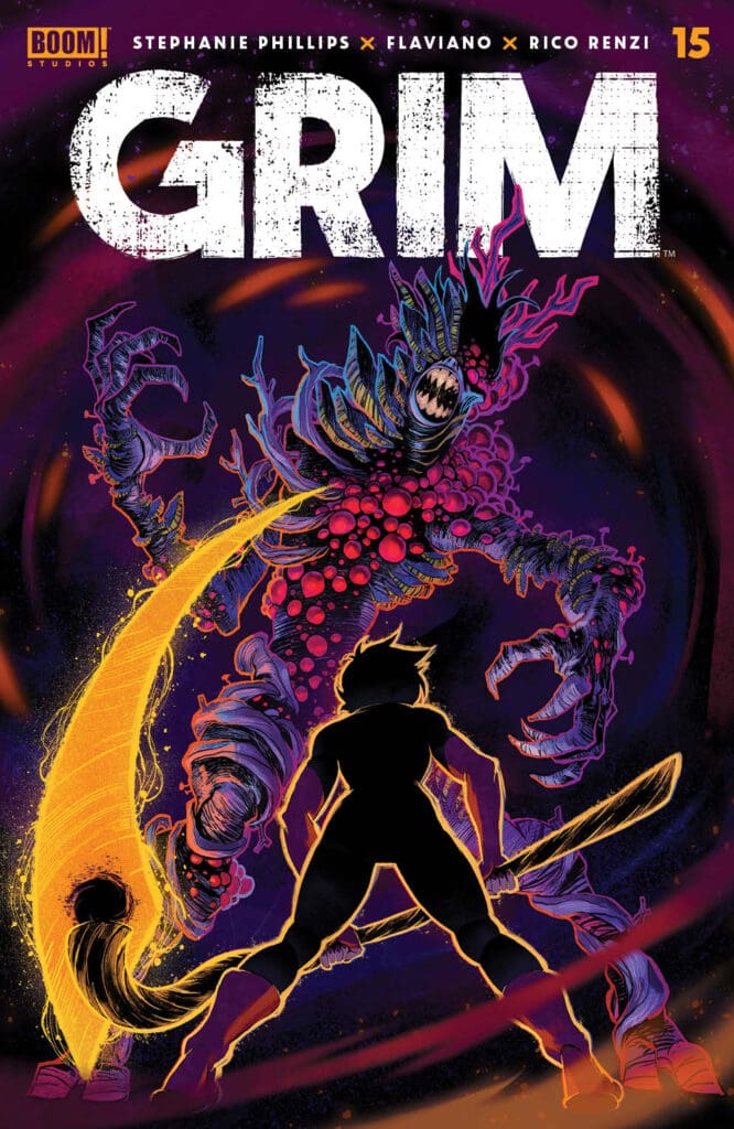
GRIM #15 by BOOM! STUDIOS

CREATIVE: Stephanie PhillipsFlavianoRico Renzi & Tom Napolitano

The magnitude of this final installment was too immense for a single reviewer to tackle alone. Hence, Ken and Marty join forces once again to deliver a collaborative review as the curtains draw on this epic third arc.

Check out Issue 14 Review Here!

Grim 15, the riveting conclusion to its third arc, orchestrates a narrative tapestry that skillfully intertwines rescue, reunion, and the impending consequences of Annabel’s grand plan. Stephanie Phillips, the architect behind this gripping tale, demonstrates a keen understanding of storytelling dynamics, weaving a complex yet accessible plot.

The Writing:

Marty:

The reintroduction of the mysterious trio, reminiscent of the mythological Fates, is a stroke of brilliance. These three enigmatic figures, echoing Clotho, Lachesis, and Atropos, serve as a narrative thread, subtly guiding the reader through the intricacies of fate. Their appearances at strategic points in the story not only provide context but also deepen the overall mythology of the series.

Phillips’ narrative prowess shines through in her treatment of characters. The reunion between Jessica, Eddie, and Marcel is a testament to her ability to infuse emotion and humor seamlessly. The storytelling rhythm is enhanced by the judicious use of cutbacks to the three sisters, creating a narrative flow that feels both engaging and well-orchestrated.

Ken:

If anyone is checking out this series for the first time, expect to be blown away by the fantastic mood and vibe Phillips sets up with each character. Right from the start with the Sisters of Fate, readers see how chaotic the world has become yet it is a normal time for the afterlife’s finest. The rescue of Marcel plays out superbly as the friends are reunited to face the unknown.

The latter half of the issue speeds up the pace but never loses the reader. Annabelle’s master plan comes front and center. Jessica leaps right into the challenge, further winning her over with readers. The resolution throws a great swerve into her things are heading. Phillips’ writing reflects the pressure Jessica puts on herself to win. This has only become more apparent once she received her father’s scythe. Even facing certain doom, the mood never shifts away from hope. This plays right into the final page, leaving readers much to think about until the next issue drops.

Vote For Your Favorite Comics Here!

The Art, Colors and Design:

Marty:

The panel work in Grim 15 is a visual triumph. Massive splash pages and strategically placed single panels enhance the impact of key scenes, providing a dynamic visual experience for readers. The artistry of Flaviano brings Jessica’s power to life, particularly through meticulous attention to detail, such as the expressive intensity of her eyes. The contrasting black and yellow color scheme not only adds aesthetic flair but also serves as a visual representation of Jessica’s formidable abilities.

Annabel, a pivotal character in this installment, stands out not only for her role in the plot but also for her striking character design. The vibrant colors used in her depiction create a visual dichotomy – colorful yet fearful, underscoring the complexity of her character.

Rico Renzi’s colors continue to be a standout feature, injecting vibrancy into a dark narrative. The use of bold and contrasting colors contributes to the atmospheric tone of the story, ensuring that each panel is visually impactful.

Ken:

As previously mentioned, Grim is a vibe. Flaviano and Renzi take the opening scene and gives it a Tarantino type feel from “Reservoir Dogs”. This is on display with a two page visual stretching across the diner. Even as chaotic as the situation has become, the art never steers into panic and stays firmly planted in calm neutral. The book shifts to rescuing Marcel with a great use of shadows and light. The visuals mirror Marcel’s personal redemption for his past, looking for light in the center of darkness.

The latter half brings the danger full forward with excellent full page panels. As Vegas is burning down under red skies, the art depicts Jessica bracing for trouble. The full page panel connects readers to the threat at hand and how Jessica needs to find a way to win. This all blends into the closing images with throws a new idea into the mix for dealing with the world gone mad.


GRIM #15 
by BOOM! STUDIOS
CREATIVE: Stephanie PhillipsFlavianoRico RenziTom Napolitano (cover Dan Mora)

The Letters:

Marty:

Tom Napolitano’s lettering is the unsung hero, amplifying emotions and providing a cinematic quality to the reading experience. The careful placement of text enhances the overall composition of each page, guiding readers through the story with finesse.

Ken:

Napolitano raises every panel where the moment needs it. From Jessica using the scythe to the skies opening up, tearing into the diner, Napolitano takes a subtle moment and leaves readers with a lasting impression. His work is another element of why this book is a consistent hit with fans.

Final Thoughts:

Marty:

The collaborative efforts of Stephanie Phillips, Flaviano, Rico Renzi, and Tom Napolitano have produced a comic that excels in storytelling, artistry, and lettering. This issue stands as a testament to the creative synergy that can elevate a comic book from mere entertainment to a thrilling and immersive experience.

Overall Grade: 9 out of 10

Thanks for checking out my review for the NI Comics Bullpen. Let me know what comics you’re reading and hit me up on Twitter. Till next time…

Want More Reviews From martystoked? Click HERE

Ken:

With a unique style all its’ own, Jessica Harrow and company delivers a solid cliffhanger to the dangers of the second arc. Phillips’ superb writing guides readers through the emotional turns of reuniting the three friends while Flaviano, Renzi and Napolitano construct the magnificent visuals that have become a staple for this series. Always a must-have on New Comic Book Day!

FINAL POINT – 9 OUT OF 10

CLICK HERE FOR MORE CONTENT FROM KEN
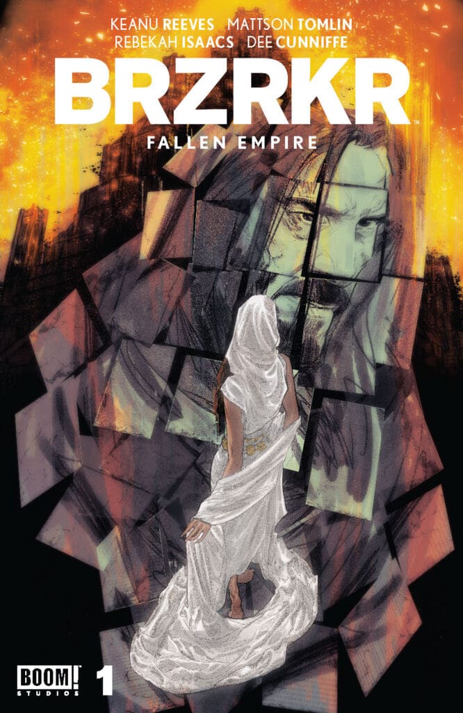
BRZRKR: Fallen Empire #1

0
Credit: BOOM! Studios

BRZRKR: Fallen Empire has been anticipated for a long time. The creative team consists of writers: Keanu Reeves, Mattson Tomlin. Accompanied by artist, Rebekah Isaacs and Colorist, Jordan Bellamy. 

BRZRKR’s protagonist is a survivor of  Olos, that talks about a man that is prone to a curses and violence. There is a storytelling element from B. that talks a lot about the past, and what B. has been through. 

There are many things that B. has done, that has made an impact on the people who come around him. The survivor talks about also about the many thoughts that he had in his head, as his quest moved him on the outskirts of his homeland. 

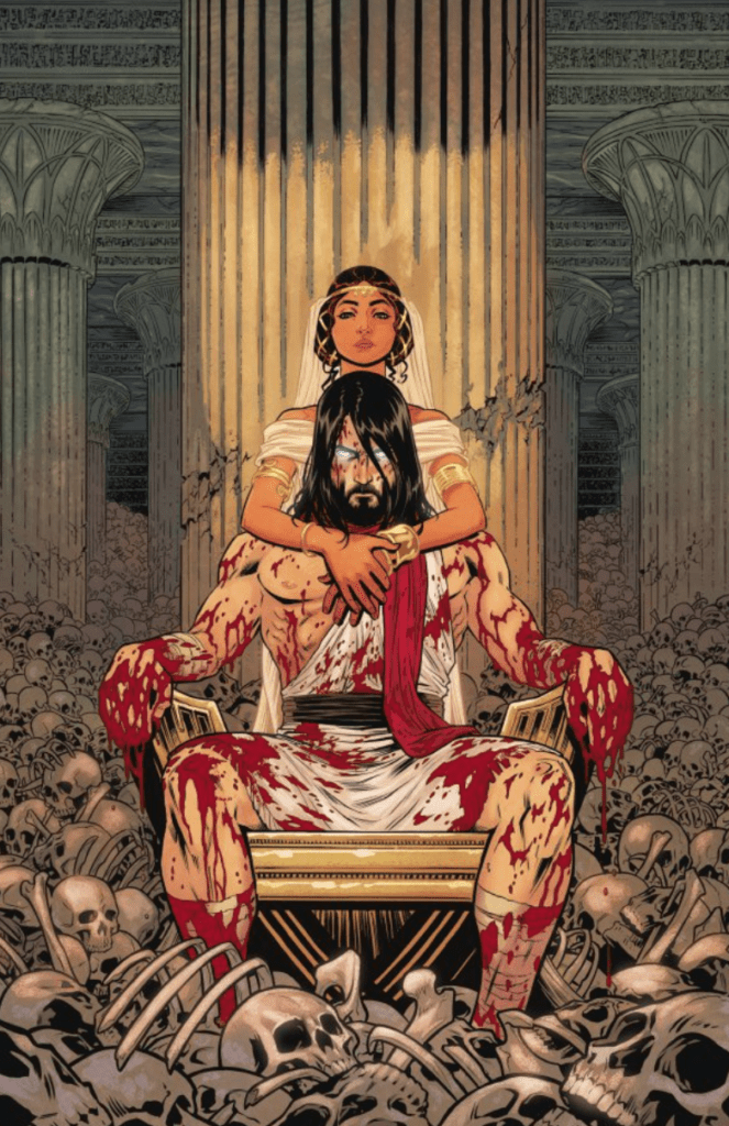
Image Credit: BOOM! Studios

There is love that intwined as well, of the protagonist talking about B., in a way where he seems charming and having a heart.  What I like about BRZKR’s first issue, is that the story is very straight-forward. There is no guessing as to where the story goes next.

I would like to know more about the world around them,  maybe some more characters involved. Flushing out the world-building is most important, in my opinion.  I love the illustrations, and how they catch the eye quickly. Rebekah and Jordan’s collaboration on the art, gives a unique balance of colors throughout each comic panel. 

Image Credit: BOOM! Studios

I want to know more about B.’s character, and I’m wondering where his journey will land him after this. It has become apparent, that Keanu Reeves has brought together an incredible team, to tell an interesting story. Keanu Reeves debut for a comic, absolutely makes me want more from Keanu and the creative team.   I am hoping and wishing for more characters to be explored. It would be a wonderful addition, to this wonderful comic. 

Overall, BRZRKR: Fallen Empire is a solid 9/10 for me. 

CLICK HERE FOR MORE FROM JANELLE!

Fire Power #29: Navigating Love, Fear, and Artistry in a Riveting Penultimate Chapter

0

Creative Team: Robert Kirkman (co-creator/writer), Chris Samnee (co-creator/artist), Matthew Wilson (colorist) and Rus Wooton (letters)

Fire Power #29 Robert Kirkman (co-creator/writer), Chris Samnee (co-creator/artist), Matthew Wilson (colorist) and Rus Wooton (letters) Credit: Skybound Entertainment

Fire Power #29-  Skybound Entertainment

Fire Power #29 delivers a bittersweet yet stunning experience as Chris Samnee’s art nears its end in this minimalist masterpiece. With only one issue remaining until the curtain falls on Samnee’s visual narrative, each installment unfolds with a breathtaking allure that leaves readers yearning for more. The latest offering, Fire Power #29, not only maintains but surpasses the visual brilliance of its predecessors.

Check Out Issue 28 Review Here!

The thematic core of Fire Power #29 delves into the ever-potent conflict between love and fear, echoing the foreshadowing meticulously planted in issue 27. Kirkman’s narrative strength shines through as he masterfully incorporates callbacks to earlier setups, creating a tapestry of interconnected threads that enrich the reader’s engagement. The payoff from these breadcrumbs not only validates the careful construction of the story but elevates the overall narrative impact.

Fire Power #29 Robert Kirkman (co-creator/writer), Chris Samnee (co-creator/artist), Matthew Wilson (colorist) and Rus Wooton (letters) Credit: Skybound Entertainment

The familial aspects of the storyline continue to be a poignant highlight, with an emotional resonance that transcends the confines of the comic book medium. The tribulations faced by the Johnson family, especially the children, provide a relatable touchpoint for readers at various stages of their life journey. The exploration of family dynamics amidst a crisis adds depth to the narrative canvas, creating a tapestry that is both intricate and universally resonant.

Don’t Forget To Vote For Your Favorite Creators and Comics!

A commendable aspect of Fire Power #29 is the infusion of humor, skillfully delivered by the character Master Wei. In the midst of turmoil, these comedic notes provide a refreshing and delightful counterbalance, allowing readers to experience a gamut of emotions. The seamless integration of humor into a storyline fraught with tension showcases Kirkman’s ability to navigate diverse narrative tones.

Turning attention to the artistic realm, Fire Power #29 showcases the consummate skill of Chris Samnee through incredible splash pages that unfold into glorious action scenes. The use of eye-popping colors, courtesy of Matthew Wilson, serves as a visual feast that keeps readers on the edge of their seats. The artistically drawn action set pieces, coupled with the masterful lettering by Rus Wooton, create an immersive experience that transcends the boundaries of the comic book medium.

Fire Power #29 Robert Kirkman (co-creator/writer), Chris Samnee (co-creator/artist), Matthew Wilson (colorist) and Rus Wooton (letters) Credit: Skybound Entertainment

Final Thoughts:

As the penultimate issue sets the stage for the series finale, readers are left eagerly anticipating the resolution of the narrative arcs and the fate of the characters they’ve grown attached to. The meticulous craftsmanship evident in this issue coupled with its emotional depth, family-centric themes, and visually arresting artwork, culminate in an absolute masterpiece. This installment not only stands as a testament to the excellence of the series but also paves the way for a finale that promises to be nothing short of explosive and unforgettable.

Overall Grade: 9.5 Out Of 10

Thanks for checking out my review for the NI Comics Bullpen. Let me know what comics you’re reading and hit me up on Twitter. Till next time…

Want More Reviews From martystoked? Click HERE