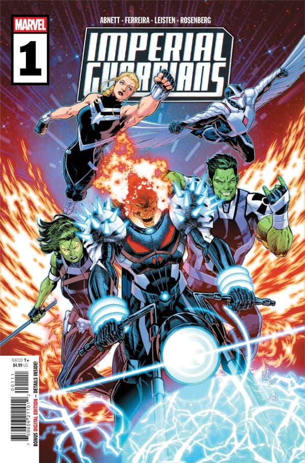
The cosmic peace teeters on the brink. A variety of diplomatic and political maneuvers are needed to keep everyone happy, but what happens when diplomacy and politics fail? Enter the Imperial Guardians. Even though they don’t officially exist, it’s up to the Imperial Guardians to solve problems that can’t be solved through traditional measures.
Writer: Dan Abnett Penciller: Marcelo Ferreira Inker: Jay Leisten Colorist: Rachelle Rosenberg Letterer: Cory Petit Cover Artist: Sean Izaakse Cover Colorist: Nolan Woodard
Writing
I thought Dan Abnett did a really good job crafting a fun read. I like the team. Captain Marvel feels a little out of place with the others, but how do you have cosmic Marvel stories without Captain Marvel around? This ragtag band of misfits is primed for both serious and not-so-serious content.
Perhaps my favorite inclusion in this group is Cosmic Ghost Rider. I fully understand that Cosmic Ghost Rider is inspired by Deadpool when it comes to the personality department, but I find Cosmic Ghost Rider to be more enjoyable. This comic reads like part cosmic heist, part buddy comedy, but also throws in some pretty serious material as well.
Art
One of the things that really drew me to this comic was seeing that Marcelo Ferreira, Jay Leisten, and Rachelle Rosenberg were all working on it. In the digital era of comics, it’s always nice to see a penciller, inker, and colorist work their magic. This issue did not disappoint.
The art was crisp when it needed to be, bright and colorful when it needed to be, and even conveyed the somber tones when it needed to. Rosenberg’s coloring and shading really stand out in this issue. It’s sometimes tough to convey colors, etc., when we are talking about cosmic Marvel, but the art team really killed this issue.
Imperial Guardians #1 cover by Sean Izaakse and Nolan Woodard. Image from Marvel Comics
Final Thoughts
Overall, this is a satisfying read. It does make me want to see more of this team meeting up and getting up to hijinks, but with the fate of cosmic Marvel kinda in limbo, I’m not sure what’s going to happen. It’s a nice addition to your pull list that shows you a new team in a new way.
Overall Grade:8 /10
Until next time, may your pulls be magical, and your multiverse remain stable
What did you think about this issue? Are you a fan of Marvel’s cosmic stories?
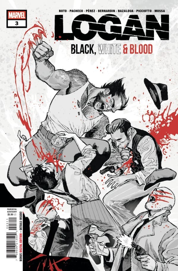
This short story takes place in the 1930’s. We see Logan staying and working on a farm with an elderly man. News gets out that there was a breakout at the prison, and a “gang” is now terrorizing the town. Doesn’t take Logan long to figure out who is involved with the “gang” and takes them all out in true “Logan” fashion!
Logan: Black, White & Blood #3, Credit Marvel Comics. Cover by Sara Pichelli
This story really shows Logan’s true, good-hearted nature. But Travis, you just said he took out the members of the “gang”. Yes, I did, but I am referring to Logan’s relationship with the elderly man. He builds a bond with the man. But it is when something happens to that man that Logan acts. It is almost a “don’t mess with my family” type of tone.
“Hate is Enough“
This story is set in New York City in the 1960s, when civil rights were being fought for. Logan has gotten the jump on a group of men who have planted a bomb… Inside of a (at the time) black church. Logan is not okay with this and saves the church while giving us a gruesome show of him taking out the ones responsible for the bomb.
This story has a lot of emotion in it. You sense that just from Logan’s dialogue and the narration. The timeframe this story is in was a rough time for this country. The Civil Rights period was more than a struggle for acceptance from one race to another. It was an all-out war. This story portrays that. Blowing up a church because of the color of the skin of the congregation is real in this book and was very much real during the war for Civil Rights.
“Clinical Trial“
This story takes us to the lovely Hollywood, California, in the rocking year of 1982. Logan is jokingly moody about being in Hollywood and not on vacation. But his reasoning for the visit is justified. A dear old friend of Logan’s needs his help finding his daughter. Logan follows the trail to an industrial building where they conduct clinical trials for big pay-outs.
Logan secures his friend’s daughter and returns her safely home, but not before tearing apart the rest of the facility before leaving. Then we get a small comedic side of Logan as he jokes about taking a vacation. This story has a mixture of tones to it, from Forest Gump to Taken. You see, Logan does whatever is necessary to find the girl and bring her home. Personifying what it means to be a true friend.
The Writing
Karla Pacheco did a wonderful job with this story. The way the dialogue and plot are written out to support the events that could and probably did take place in the 1930’s in a small country town. You get a sense of a Western theme as well. And the sudden shift in events from the beginning sets the tone for the Logan we have come to expect from previous stories.
Marc Bernardin did something I have yet to read personally in comic books that I have read. Centering the plot of this story around the Civil Rights era. The dialogue and narration burst with emotion throughout the entire story. The patient questioning, anger/rage, and innocence. Love this take on a Logan story!
Phil Noto makes their story so joyous. The dialogue between Logan and his old war buddy is so humble and inviting till it shifts toward a favor. The change of emotions is so perfectly timed and is very entertaining to read! It’s also nice to see inner dialogue more throughout this story with Logan.
The Artwork
Pere Pérez did a fantastic job making the art for this story so simple and smooth. Lines and shading are outstanding and help to focus on important details. The enticing use of different shades of red to bring out important details within the panels is a joy to see.
Daniel Picciotto has a very different style from Pere in terms of pencil work. The art is rough, which adds to the aura and personification of Logan. And the action/fighting panels are so detailed that you get lost in the violence of them. Andres Mossa did such a good job within those action/fighting panels to shade and use the color rest to focus your attention on the devastation left by Logan.
Phil Noto not only wrote this story but also did the artwork/coloration as well! Dual threat status! Absolutely stunning work. The lines are clean; shading is where it is needed and then some! The characters all have their distinctive features that make you start to look for more details throughout the panels. Job well done, and I want to see more!
My Thoughts
Issue three’s collection of Logan short stories is continuing on with the stellar art and storytelling from different creators. This is one of the things that makes this series so unique. Each issue contains three short stories that aren’t generated by the same creative team week to week or month to month. Making you, the reader become exposed to more creators, some of whom you may have never heard of till now. Sparking new interests. Amazing series, I highly recommend you add this to your pull list. This is issue three, so there is plenty of time to get issues one and two as well!
The struggle against Vyrbodin grows! Doctor Strange and Angela are hot on the trail of leads that may help them understand Vyrbodin and the source of his power more. As they inch closer to revealing the truth, a battle between the Angels and the Dark Elves seems closer than ever.
Writer: Derek Landy Artist: Ivan Fiorelli Colorist: Dono Sánchez-Almara Letterer: Cory Petit Cover Artist: Alex Horley
Writing
Derek Landy has done a really outstanding job with the helm of Doctor Strange. Each issue feels like a piece of the puzzle, if each piece of the puzzle had another puzzle within it. Issue four, like the previous issues, reaches a satisfying resolution while also revealing more about the greater dance that Doctor Strange and Angela are partaking in.
Angela continues to be one of the highlights of this entire run. If Angela, as a character, was always written as Landy has guided her, I would be the first person begging Marvel for more Angela comics. My favorite part of Landy’s writing in this issue is that we finally get to the most quintessential of Doctor Strange trope but it feels different. Since the days of Lee and Ditko, Doctor Strange has frequently found himself humbled by his writers.
In this issue, it is finally Landy’s turn to humble the good Doctor, but this feels different. The humbling of Doctor Strange has been many things to many of his writers. For Donny Cates, it was Strange hubris that served as the nexus for the Damnation event. For Landy, his hubris feels like genuine growth. Strange accepting his hubris is such a unique place for Doctor Strange, and it was genuinely enjoyable to see.
Art
Ivan Fiorelli is doing some of my favorite work at Marvel right now. The styles and variety of worlds he is able to do through this series have been phenomenal to see. There is a panel involving Angela and a fight that is just superb. One of the reasons that panel hits so hard is the coloring work of Dono Sánchez-Almara. One of the really stellar things Sánchez-Almara has done this entire series is choosing the right color palette for the setting.
Sánchez-Almara and Fiorelli combine to create what is probably my favorite artistic rendering of dark elves that I’ve seen in any media. Dregthorn removing his mask is such an awesome moment in this issue, and it’s just superb. The use of scythes by Landy in the storytelling has allowed Fiorelli and Sánchez-Almara to craft contrasting palette versions of various characters, and it’s so beautiful to see. Cory Petit continues the great work by making a story that is easy to follow while allowing the words and art to speak for the series.
Doctor Strange #4 cover by Alex Horley. Image from Marvel Comics
Final Thoughts
Landy, Fiorelli, and Sánchez-Almara are doing something really unique with Doctor Strange. Like any art, it won’t be for everyone, but the art, lore, and enjoyment added to the history that is Doctor Strange in Marvel Comics will reverberate far into the future. This series feels like the reins have been loosened and the entire creative team is free to play with ideas and push boundaries, and it’s worked so well!
Overall Grade: 9.5/10
Until next time, may your pulls be magical, and your multiverse remain stable
What did you think about this issue? Let’s chat about it in the comments.
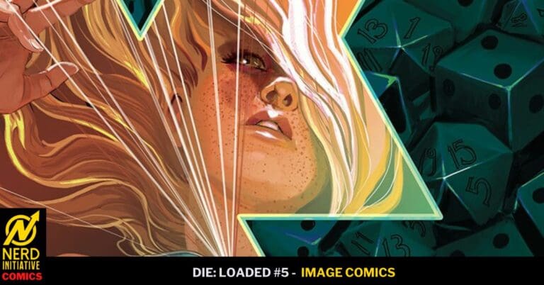
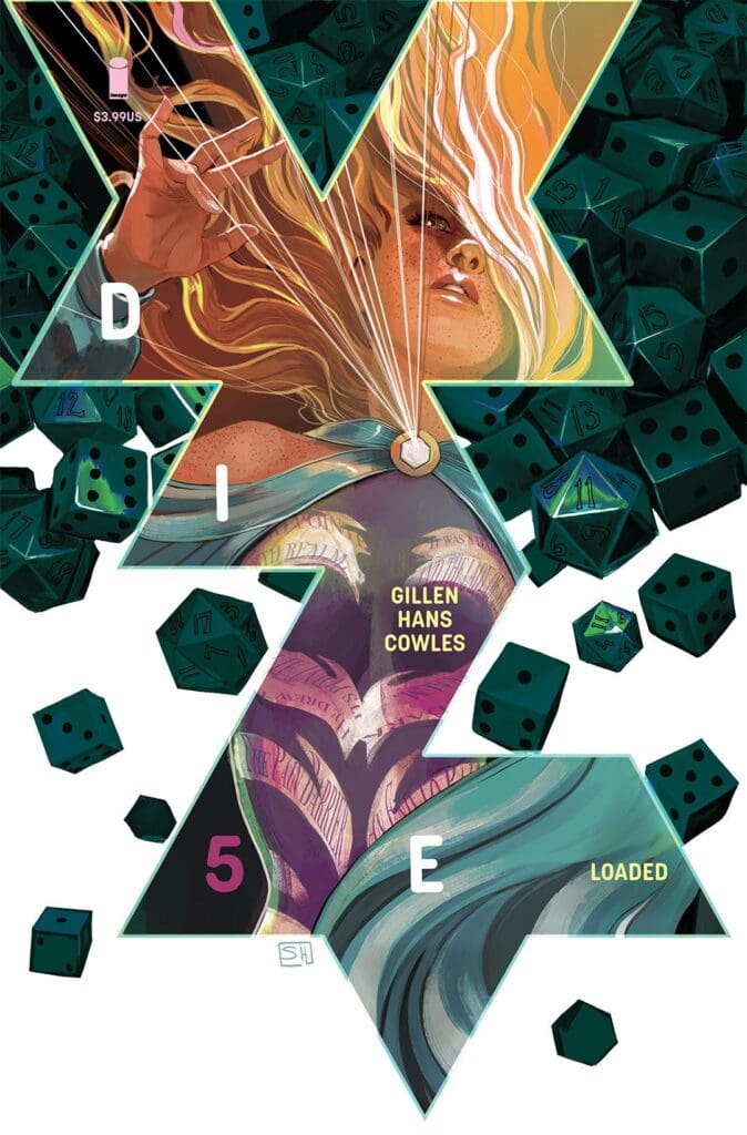
DIE: Loaded #5 Cover A By Stephanie Hans (Credit: Image Comics)
Stephanie’s art in this issue is amazing. She really outdid herself with the art. The characters in this issue are dealing with a lot, and Stephanie’s art is really amazing in showing that. Clayton’s lettering work also helps with telling the book’s story as well.
Kieron outdid himself with this issue’s story. I love that the comic’s story is focused on Sophie. She is such a complex character, and Kieron has figured out how to weave her in effortlessly. I cannot wait to see where she goes from here.
So this issue sees Sophie going out on a solo quest. She heads to a throne made of crystals, and has an out-of-body experience. She then gets into 2 different fights, and also has a flashback to before DIE was real. We also see Violet in this issue, and she is not having a good time.
Overall Grade: 10/10
We’re almost halfway through the series, and it’s getting crazier with each issue. Kieron and the team are doing an amazing job with the series. I cannot wait to see where we go next.
Storm struggling with the challenge laid before her reaches out to the Sorcerer Supreme of Earth, Wanda Maximoff for help. As Storm formulates a plan so does Akujin and her sisters to take over Earth. After surviving the fall of Krakoa, assassination attempts, and knowing many powerful sorcerers, Storm feels up to the task before her. Is she ready? As with issue #1 of Storm: Earth’s Mightiest Mutant, I’m teaming up with Megan for this review. You can find more from Megan by clicking her name, or more from me here!
Writer: Murewa Ayodele Artist: Federica Mancin Colorist: Javier Tartaglia Letterer: Travis Lanham Cover Artist: R.B. Silva Cover Colorist: David Curiel Published by Marvel Comics
Writing
Megan: There is so much happening in Storm: Earth’s Mightiest Mutant #2, and it’s all written with a perfect flow by Murewa Ayodele. On the end of the tragic chaos that took place in Biarritz, Storm makes a public announcement that she will be taking in the survivors until their homes are rebuilt. In the Storm Sanctuary in France, things aren’t going as easy as Storm would like as there will always be heightened emotions between humans and mutants. However, Storm sticks to her guns and provides a safe haven to those in need. While all this is happening, there’s a countdown to Akujin’s invasion of Earth. Akujin is the entity that left Storm with a warning; if she doesn’t free her lord, there will be more tragedy on Earth. Akujin fully plans to see her plans out, and Storm is more than prepared to fight.
Shawn: This issue was a definite change of pace from what Murewa Ayodele has given us from Storm in the past. I enjoyed the narrative-heavy issue of Storm #2. It’s always nice to see Wanda make an appearance. The side story can get a little convoluted, but based on my previous experiences with Ayodele’s writing, I have full faith that it will pay off in the end.
Ayodele does a great job keeping me on the edge of my seat as the build-up happens in this issue. We see an instance of Storm being confident in herself and her abilities but as a long-time Doctor Strange fan, I wonder if that will result in her being humbled as so many heroes before her have felt. Either way, it feels like Ayodele is building something truly special with this character building on his magical series from 2024.
Art
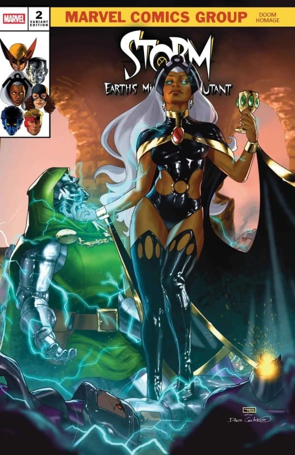
Storm:Earth’s Mightiest Mutant #2 Doom Homage Variant Cover by Taurin Clarke. Image from Marvel Comics
Megan: The artists do an incredible job of switching the scenes back and forth with huge tonal changes. Whether it be from the Storm Sanctuary or to Wanda and storm training together in a mystic battle, each panel is powerful. Federica Mancin, Javier Tartaglia, and Travis Lanham give Storm: Earth’s Mightiest Mutant #2 their all and it shows on every page.
Federica Mancin gives gorgeous detailing work to every page of the comic, putting you right into the action. Javier Tartaglia does an incredible job at mixing vibrancy with muted tones with his work in the coloring. Travis Lanham does very well with switching back and forth and matching the dialogue to the tone. All in all, the artists did a beautiful job at bringing Murewa Ayodele’s story to life.
Shawn: Federica Mancin and Javier Tartaglia really showed their stuff in this issue. As I mentioned in my writing review, this issue was pretty narrative-heavy, but that shouldn’t be taken to mean that the art is anything less than stellar. Of course its impossible to talk about a narrative heavy issue without mentioned great work from a letterer like Travis Lanham. Issues with a lot of conversation like these can really trip up letterers, messing with the flow, and obscuring the art, but Lanham does a great job keeping the reader on track even with the admittedly confusing conversation between the sisters.
Mancin and Tartaglia did an outstanding job with all the wide variety of settings that Ayodele took readers through with this issue. There are scenes of battle, magic, and even Storm’s Sanctuary and nature. All are done with crisp lines and colors. The art team also gives us a nod to Storm’s history through her outfits at one point in the issue that is a really subtle but well done series of panels.
Final Thoughts
Megan: 9.2/10. Murewa Ayodele continues the incredible story of Earth’s Mightiest Mutant while giving the story even higher quality than the issue prior. Storm’s story is nothing short of magnificent and Murewa constantly proves that he’s the man for the job.
Shawn: 9/10. This is another solid issue. Murewa Ayodele continues to craft a story befitting of Ororo Monroe’s character. I got a little bogged down in the discussion with the sisters during the heavy exposition, but it is nice to read some familiar locations and name drops, particularly those outside of the traditional X-Men lore. I can’t wait to see where this creative team takes this story from here as it continues to build upon the lore of one of the world’s favorite X-Men.
Overall Grade: 9.1/10
How are you liking Storm? Let us know in the comments.
Magik and Colossus are on the trail. Back home in Russia, after the fall of Krakoa, the pair encountered Lady Midday, a piece of Russian folklore come to life. After Colossus kills Lady Midday to save the town, the pair find themselves on the path to St. Petersburg. The quest to find the person who sent Lady Midday takes the siblings on a surprising quest of magic, trust, and twists. This review is from Megan and Shawn.
Writer: Ashley Allen Artist: Germán Peralta Colorist: Arthur Hesli Letterer: Ariana Maher Cover Artist: David Nakayama
Writing
Megan: If there’s one thing Ashley Allen is going to do, it’s outdo her last issue. Magik and Colossus #2 the thrilling story of the brother and sister duo continue their thrilling tale. Learning who the true villain is that has caused chaos all over the homeland of the Rasputins, Illyana and Piotr have their new mission in mind. However, while facing off a demonic entity, they have to face off with each other. Piotr is running from his past while being overprotective of Illyana, while Illyana wants him to face his trauma head on. Perhaps more than one problem will get solved if there two are able to work together peacefully.
Ashley Allen continues to make the story even larger than life, while having the classic issues between Illyana and Piotr. Piotr has always been very protective of his sister, but Illyana isn’t a child anymore. Illyana sees that Piotr is suffering on his own with trauma that haunts him, but he isn’t willing to work through the pain. Both siblings care so much for the other, that it gets in the way of their mission.
Shawn: Ashley Allen is just phenomenal. To this day she is my favorite person to write Illyana, but this issue show shows she not only understands Magik as a character, but understands the importance of her relationship with her brother. When I saw the previews for this series and even reading the beginning of the first issue, this felt like it was going to be a buddy cop type story. With her writing, Allen has completely thrown that on its head.
In the series so far, we have been consistently treated to a level of vulnerability in both Illyana and Piotr that we have not seen consistently throughout their history in comics. Ashley Allen is not only telling a story, but she is using the story as an opportunity to explore what made these characters who they are and how they got to this poem.
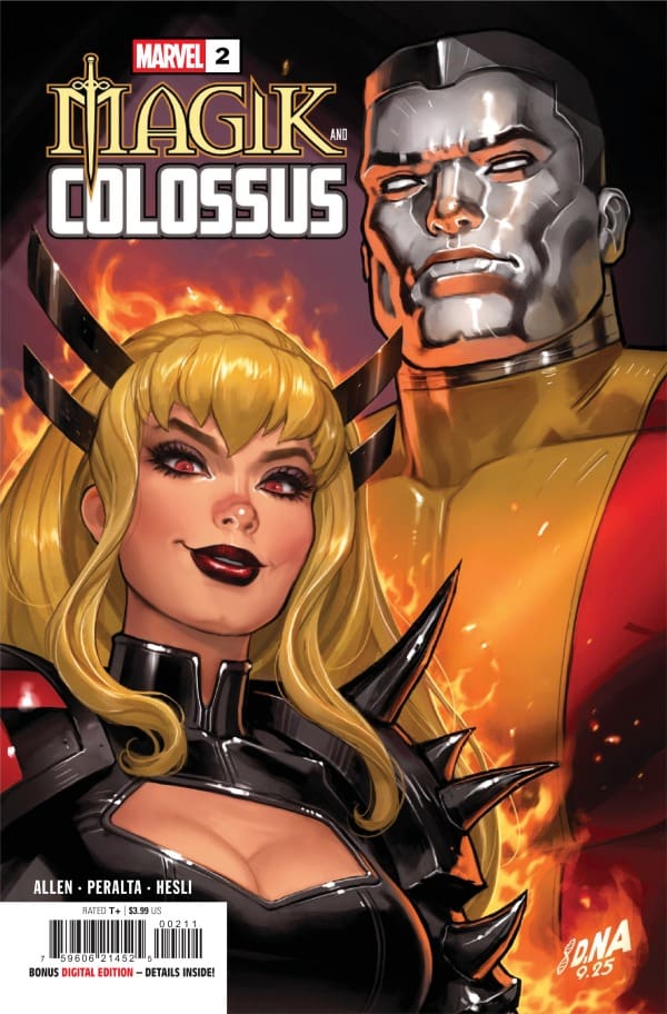
Magik and Colossus #2 cover by David Nakayama. Image from Marvel Comics
Art
Megan: Magik and Colossus #2 was very emotion-heavy and the artists captured that perfectly. Germán Peralta, Arthur Hesli, and Ariana Maher are able to illustrate the action and chaos as well as the emotional turmoil between the siblings through their artistry. Peralta brings a unique look of mystical chaos and beauty to the dark story with his use of detailing and larger than life powerset displays. Hesli creates beautiful depths in the scene changes with his different uses of color tones. I especially loved how the underwater panels were colored. Ariana Maher captured the heightened emotions through the dialogue and kept a perfect flow that smoothly pushed us through the story. The artists truly elevated the already fantastic storyline!
Shawn: Germán Peralta and Arthur Hesli put in some really great work on this issue. There is a panel that features both of the characters together with a shadow of their younger selves, appearing almost as a silhouette. This panel was drawn perfectly by Peralta, and Hesli chose the perfect colors to convey the message of the narrative without distracting from the scene.
One thing that was true an issue one and has continued an issue issued too is that the visual team does a great job of adding emotional weight to the words on the page. You not only read words from Ashley Allen that convey the care that Illyana and Piotr have for each other, but it is displayed through the art crafted by this incredible team. Ariana Maher continues to shine with her lettering in this series. Peralta and Hesli crafted some gorgeous scenes We’re even the backgrounds shine, even the cobblestones stand out, and still, Maher manages to allow the story to flow without obstructing, the intention, and the emotion conveyed by the artists.
Final Thoughts
Megan: 10/10. Magik and Colossus #2 is proof that the first issue wasn’t just a great start, but a continuity of high quality storytelling. Ashley Allen is the best person to write for Illyana, and now it’s proven again that she has the same talent for writing for Colossus. I couldn’t even try to tell you where the story is going, but I am very excited to see where Allen takes us.
Shawn: 10/10. What can I say? I am a sucker for a good backstory. As I said before one of the things I have truly enjoyed about this series so far even though it has only been two issues is the story within a story that Allen tells.
Instead of being like some of the incredible ”lost chapter” style stories we have gotten from the X-Men recently, this creative team still manages to feed the readers new pieces of information about the Rasputin’s childhood in a way that feels natural, authentic and reasonable as part of the larger ongoing story. From the very front cover of this issue with the gorgeous cover art all the way to the last page I couldn’t put this one down. Ashley Allen doesn’t seem content with being recognized as the best person to have written Illyana, she’s out to make her mark as the definitive writer for the entire Rasputin team. The visual team that is paired together with Allen have accomplished that goal in the first two issues.
Overall Grade: /10
Did you enjoy Magik and Colossus #2? Let’s chat about it in the comments.
This comic review is brought to you by the dynamic duo of Megan and Shawn!
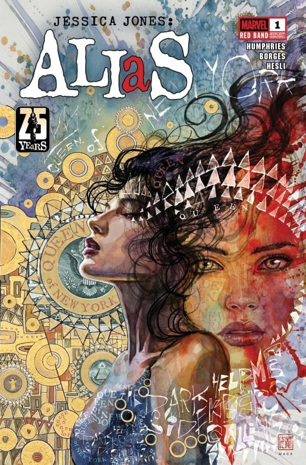
Megan – Jessica Jones is back for the 25th anniversary of the character, and what a strong way to come back! In Alias: Red Band #1, we see Jessica come back to her old office, Alias Investigations, after forfeiting her license for her husband, Luke’s, career. Jessica misses this life so much, but isn’t able to go back to it with Luke being the mayor, and the police force already unhappy with a superpowered man being in office. When she leaves her old office, she notices her neighbor’s mail has been delivered but she has never received. Finding this strange, Jessica starts to put her skills to work and investigates for her neighbor’s well-being. What she finds is nothing short of disturbing.
Cover art by David Mack. Published by Marvel Comics
Unfortunately for her, she had a photojournalist right on her tail who took pictures of her investigating, which isn’t legal. Being nothing more than a paparazzi with a more formal name, he sent the pictures to the paper, causing an uproar for Luke at work. The only way for Jessica to investigate the death of her neighbors is to do so quietly. Oddly enough, a very unexpected person offers their services to help her, which Jessica agrees to. All seems to be falling into place until we reach the final pages.
Sam Humphries brought so much heat to Jessica Jones return with Alias: Red Band #1. With a compelling case to investigate, emotions as high as they’ve ever been, and Jessica more motivated than ever, I cannot wait to see what Humphries brings in the best issue.
Shawn – What a great way to honor the 25th Anniversary of Jessica Jones. Sam Humphries immediately jumps into the narrative vibe fans have come to expect from a Jessica Jones story. This issue is so well written and serves as a great example of why Jessica Jones works so well as a red band comic. Humphries does a great job tapping into the tension that does and has always existed in Jessica’s relationship with Luke. While this is a great issue for Jessica Jones, Humphries does a great job highlighting the pressure Luke feels as the Mayor of the City.
The Art
Megan – If there’s one thing the artists did with Alias: Red Band #1, it’s create something perfect for the story. Geraldo Borges, Arthur Hesli, and Cory Petit put their talents on full display with how they brought Sam Humphries story to life.
Geraldo Borges brought heavily detailed panels with striking linework that put you straight into the mind of the story. Arthur Hesli perfectly captured the grittiness of the story and stuck to more muted tones until the story called for vibrancy to show Jessica exactly who she was dealing with. Cory Petit excellently captured the emotions of the characters through the dialogue, making you feel every bit of Jessica’s inner feelings. Together, the artists brought a dark and powerful comic that was authentic to Jessica Jones, and the readers will benefit heavily from it.
Shawn – Geraldo Borges and Arther Hesli really blew me away with this issue. Considering it was a Jessica Jones red band series, I expected everything to be very dark and muted, but I was pleasantly surprised. Sure, Borges crafted some scenes that Hesli fit perfectly with dark colors, but there were still lots of opportunities for Hesli to show off a real knack for coloring. The bar scene in particular is a brilliant piece of work with Hesli and Borges showing incredible depth with lines, shadows, and simple colors. Cory Petit does a great job with lettering by adding some pop to the pages. There are a few dialogue-heavy scenes where the conversation could overshadow the art, but Petit’s work does an outstanding job of avoiding that pitfall.
Final Thoughts
Megan – 10/10. I can’t say enough good things aboutAlias: Red Band #1. For those who read the original Alias comics, you’re going to love this. For those that didn’t, you’re still going to love this. All gas, no breaks.
Shawn – 10/10. This issue threw me for loops in the best way possible. I expected this issue to be a slow build and the series to take off in issue 2, but after only a page or two, we jump right into the drama and action. Not only does the creative team do an amazing job with the drama and tension created by the main issue, but they capture the human element so well. This feels as close to a spiritual successor in comics as I’ve ever seen. Humphries captures the same energy we’ve come to know and expect from Jessica Jones, carrying her story forward in the same vein Bendis created her in.
Overall Grade – 10/10
Let us know in the comments what you thought of Alias: Red Band #1!
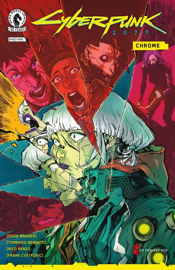
Unquestionably, the world of Night City is unforgiving, something writer Doug Wagner reminds us of constantly. Not only does it affect those who keep to themselves, but also the scavengers, mercenaries, and elites who get their hands dirty. Contrary to popular belief, there isn’t one way to tackle that, and Wagner proves that flawlessly. Where the original tabletop RPG, video game, and Netflix’s “Edgerunners” anime show action-heavy mercenaries with nothing left to lose, “Chrome” leans heavily into being a bloody slasher that fans of “Terrifier” would be proud of. However, Wagner also does everything he can to subvert your expectations.
Continuing from before, our main character Vik is being used by scavs as bait to lure an invisible enemy. However, despite the first page, Wagner does well at luring readers into a false sense of security and playing with expectations. Just when you think he’s going to zig, he zags and throws in a twist, befitting of a punk. Even so, Wagner manages to keep the tension high while delivering on characters we root for.
Source: Tommaso Bennato & Dark Horse Comics
Gruesome Beauty
In case you thought only the writing would be stellar, the same goes for the art. The pairing of Tommaso Bennato and Rico Renzi creates pieces that’re beautiful, tragic, and gory all rolled into one. As a fan of “Cyberpunk” for the last few years, not once have I seen brutality like this come out of this world. The graffiti influence is heavy, with not a single page lacking.
Overall Grade – 10/10
From the slasher influence to the properly grungy art style, everything about “Chrome” is an absolute masterclass of both the genre and the property. I can’t recommend this enough and intend to have everyone I know read it.
Read more from me here and be sure to follow my socials!
Comments
Have you been reading “Cyberpunk 2077: Chrome”? If so, what’re your thoughts so far? Let me know in the comments below!
This comic review is brought to you by the dynamic duo of Megan and Shawn!
Shawn – Man, I loved what Eve L. Ewing did with this issue. I really like the idea of X-Men United and having a “central hub” of sorts for X-Men and issue #1 shows that Ewing is the perfect person to take that mantle and run with it. As a self professed Kitty Pryde fan, I love that she is front and center. In addition, I like that Ewing is giving us a familiar idea in a way that feels new and different. Sure trouble is around the corner, because when is it not for the X-Men. That said seeing Ewing write Scott Summers as complaining about people being unwilling to compromise feels like a piece of delicious irony for X-Men fans to enjoy.
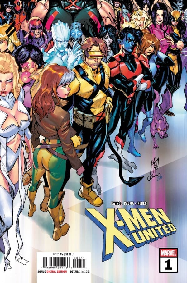
Megan – Charles Xavier’s dream of having a school for young and wayward mutants continues to be something to achieve, and it seems like Emma Frost and Kitty Pryde did it! Introducing Graymatter Lane, created and run by some of the most iconic mutants around! Graymatter Lae is a mind palace that can be accessed anywhere across the world by any mutant that holds the telepathic key. Inside Graymatter Lane, there are classes, there is safety, and there’s unity. That is, until someone is against the plan and goes out of their way to watch it all burn.
Cover art by Stefano Caselli and Federico Blee. Published by Marvel Comics
Inside X-Men United #1, you’re taken back to when the X-Men were training in the Danger Room, or when students were taught by famous mutant mentors. There’s a sense of familiarity while having the new and shiny feeling. With characters that we’ve all read about and loved under one roof, continuing the dream of Professor X, you’re reminded of that special thing that made the X-Men what they are.
Eve L. Ewing, the writer of United X-Men #1, brought back beloved characters, new characters, and characters that we’ve gotten to know in the From the Ashes era. Ewing brilliantly creates a fantastic and smooth flow for the story while having so many different characters in the story. The heightened emotions, twists and turns, and brand new world-building while still having the classic X-Men vibes is a testament to her spectacular writing skills.
The Art
Shawn – Tiago Palma and Brian Reber really had their work cut out for them with this debut issue, and they hit a home run. When you’re bringing together mutants from all different places and situations, you’re going to have a wide variety of art styles and color palettes. Palma and Reber come off as a Swiss Army knife in the art for this issue, with every setting, background, and character feeling perfect for the narrative. One of my favorite things the art team accomplished with this issue is the expressiveness of the characters. I feel like if you had given me blank speech bubbles, I would still know how characters are feeling based on their art alone. Joe Sabino juggles lots of characters perfectly, making it clear who is speaking while controlling the flow of the story and letting the words and art sing.
Megan – The artwork of X-Men United #1 is simply divine. The artists captured the magic of the mutants through their looks and through their powersets with ease. Tiago Palma provides excellently detailed panels that allow the pictures to speak for themselves. Brian Reber brought a beautiful amount of vibrancy through his work on the colors that make the characters feel like they’re popping off the pages. Joe Sabino was able to capture each character’s personality through their dialogue, which brought a lot of depth to what they were saying.
Final Thoughts
Shawn – 10/10. This feels good. This feels like a race jumping off on the right foot. Eve L. Ewing’s writing is spectacular, and Marvel has paired the writer with an art team that emotes the characters so well to match her narrative. I love the idea and the concept of Graymatter Lane. I can’t wait to see how the story evolves.
Megan – 10/10. This comic was made with the X-Men fans in mind. There’s an incredible essence of what makes the X-Men who they are, while introducing new factors. This was an absolute home run!
Overall Grade – 10/10
Let us know in the comments what you thought of X-Men United #1!