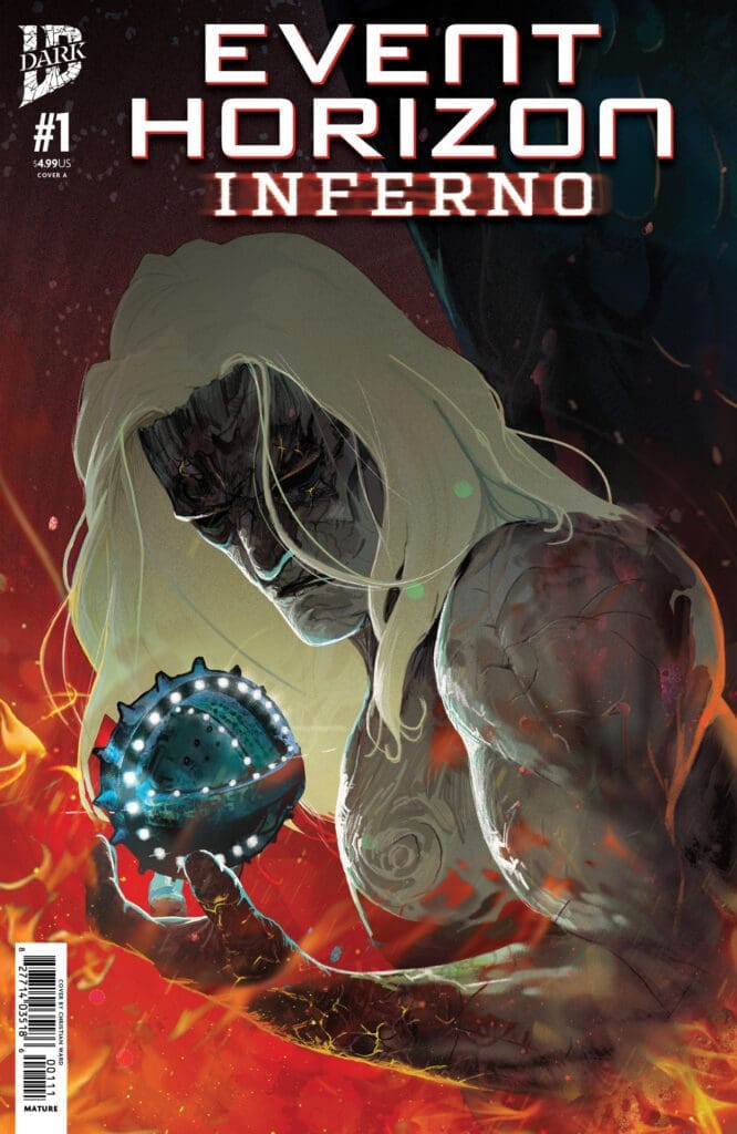
Creative Team: Christian Ward (WRITER), Rob Carey (ARTIST), and Alex Ray (LETTERS),
NON-SPOILER THOUGHTS:
Taking place 200 years after the starship Event Horizon was lost on its maiden voyage another ship is traveling the stars in search of finding its secrets. Ward has not skipped a beat as he picks up where he left off in Event Horizon Dark Descent taking us immediately back into the chaos only he can so perfectly plot. There are heavy hints of the science fiction properties we love such as space marines working for a billionaire psychotic nepo baby.
From the first page this new run thrusts us back into the mouth of hell and punches us with the sinking feeling in our stomachs. The way the art is able to convey pure evil and fear on our characters faces hammers home what type of adventure we are about to embark upon.
Event Horizon Inferno #1 is a love letter to 80’s science fiction while taking us once more into the haunting halls of the Event Horizon. If this first issue is a taste of what’s to come IDW Dark is further cementing themselves in the horror genre.
FOC is March 16th so RUN do not walk to your LCS and make sure this is in your pull pile on April 22nd when it releases.
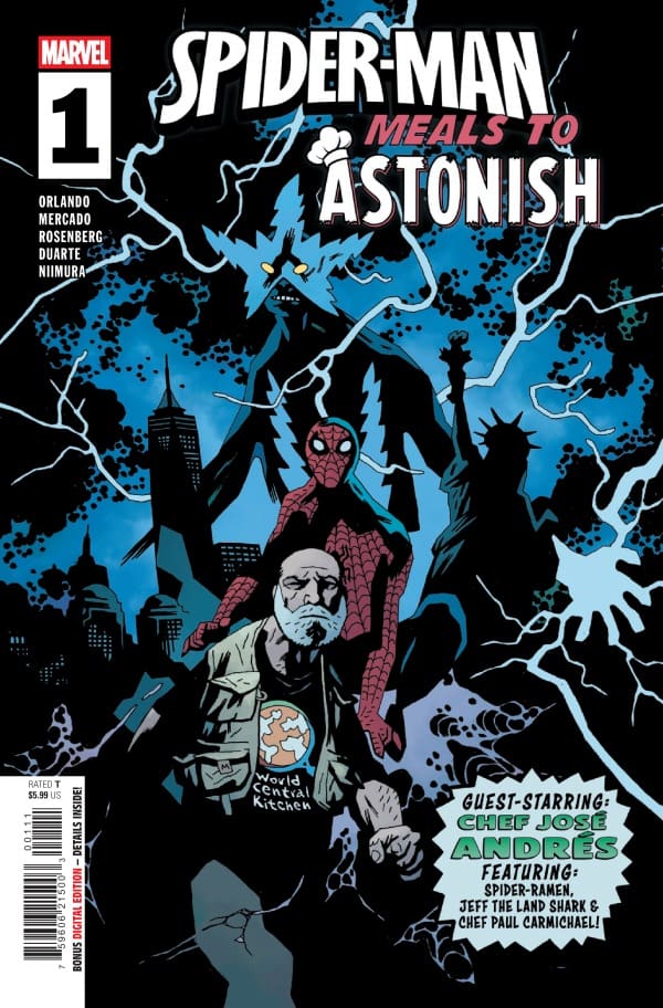
Creative Team – Steve Orlando, Roi Mercado, Rachelle Rosenberg, VC’s Joe Sabino, Mike Mignola, Dave Stewart, Gustavo Duarte, Paul Eschbach, E.J. SU, Ken Niimura
Spider-Man: Meals to Astonish #1 is a comic made up of four different stories, all shining a light on the culinary arts that take place in the Marvel Universe.
Cover art by Mike Mignola & Dave Stewart. Published by Marvel Comics
The first story introduces Chef Andres, a culinary master and a humanitarian. Chef Andres assists Spider-Man when the peaceful night of dining out takes a sinister turn. The second story involves Jeff the Landshark and Chef Paul Carmichael, who are put into a very strange situation by none other than Mojo. In the third story, we see Spider-Ramen taking on Doctor Takoyaki. In the fourth story, we meet Anna Ameyama, a chef whose food truck was destroyed by Iron Man during his fight with Fin Fang Foom. Realizing her incredible cooking skills, Iron Man offers Anna a job as his personal chef, which takes some convincing for her.
Together, the writers of the stories, Steve Orlando, Gustavo Duarte, Paul Eschbach, and Ken Niimura, do a wonderful job at creating stories that come from the same foundation: food. The best way to describe these stories is “fun”. With a couple of great cameos,
The Art
Each story brings its own kind of artwork to the story, which sets it apart from the others. The story with Chef Andres was very detailed with gorgeous, vibrant colors. The second story with Jeff the Landshark and Paul Carmichael has a much more comedic kind of artwork that fits the story perfectly. Spider-Ramen’s story, while it was short, had heavier linework with reds and blues used as the focal points. The fourth story with Anna and Iron Man was simpler in the backgrounds, which really let the characters tell the story. The artists really brought their own talents to the stories, and the readers will benefit from this heavily.
Final Thoughts
Spider-Man: Meals to Astonish #1 was a ton of fun with some really excellent cameos!
Overall Grade – 8/10
Let us know in the comments below what you thought of Spider-Man: Meals to Astonish #1!
This review was written by Megan from the Vigilante Vibes Podcast. If you liked my review, be sure to check out my other reviews! Let me know what you think of Spider-Man: Meals to Astonish #1, or tell me what comics you’d recommend me trying out! Find me on my socials, and check out my Marvel podcast, Vigilante Vibes, by clicking here!
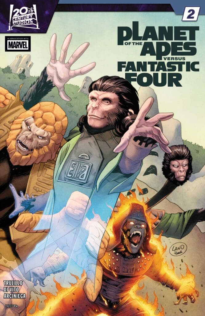
The Fantastic Four have been transported to a mysterious planet where the apes are the ruling species! To make matters worse, they have been left powerless while General Ursus, Dr. Zaius, Dr. Zira, and Dr. Cornelius have their powers! Back on Earth, Red Ghost seeks out a new ally in none other than Doctor Doom..
Planet of the Apes Versus Fantastic Four #2: Credit Marvel Comics. Cover by Greg Land and Rachelle Rosenberg.
Creative Team: Josh Trujillo (WRITER), Andrea Di Vito (ARTIST), Erick Arciniega (COLORS), Joe Caramagna (LETTERS), and Greg Land with Rachelle Rosenberg (COVER).
*SPOILERS AHEAD*
The Story:
I’m continuing to love the retro setting that fits perfectly into the era that both these franchises debuted in, and Josh is capturing it perfectly. There is a level of understanding between the apes and Marvel’s first family, also, so much for them to learn. When Ben and the Dr. are having their talk while headed to the crashed ship, there is a moment where Josh peels back everything, showcasing how alike both creatures are. Unfortunately Doom has arrived and things are very quickly about to get messy.
The Art and Letters:
It’s fun seeing how Erick and Andrea display the abilities of the Fantastic Four within the four apes. When Ursus goes flame on, it is stunning the way the duo wraps the flames around his fur, and it brings such a fiery sequence. This is playing out like a fun Saturday morning cartoon crossover and the art team is delivering in the fun with every bit of detail.
Planet of the Apes Versus Fantastic Four #2 is setting us up for the arrival of Doom, delivering a moment of calm and moments of genuine understanding between the two species. Apes and humans are not so different, and this story has made that a fun focal point.
Writers: Jimmy Palmiotti, Amanda Conner Artists: Amanda Conner, Juan Samu Colors: Amanda Conner, Walter Pereya
*POSSIBLE SPOILERS AHEAD*
Source: Amanda Conner & Dynamite Comics
Spacey Writing
Continuing from the previous issue, Harley & Elvira get picked up by the space-faring DC superhero Vartox for a lavish shindig in the stars. This somewhat forces the main plot to take a bit of a backseat, but this doesn’t feel like a massive detriment. In fact, this sidetrack has a potentially massive outcome which I won’t spoil here, as it could have an impact on the main plot in a roundabout way!
Despite the slight sidetracking of the main plot, the writing from Jimmy Palmiotti and Amanda Conner remains as witty and sharp as ever! For instance, there are several good sight gags, like a teddy-bear alien race that travels in a ship looking like Elvira’s torso or a human-sized cat just seen off to the side. I especially love the human-sized cat and require a plushie immediately. Along with the sight gags are some inventive fourth wall breaks, specifically a scene involving Kara watching James Gunn’s “Superman”.
Unfortunately, as previously stated, the main plot does take a bit of a backseat here. While there’s a page filling readers in on what’s going on with Elvira’s former employer, that’s as much as we get. As much as I’m enjoying the chaotic nature of things, it feels odd here. While chaos is in character for the pair, it shouldn’t be detrimental to the plot. Though with how this comic ends, I can only imagine how the plot will carry forward.
Source: Chad Hardin, Chuck Michael Obach & Dynamite Comics
Artistic Space
Between Amanda Conner doing two pages and the duo of Juan Samu & Walter Preya carrying the rest, I’m in love with the artistry here. There’s so much on display and not a single piece lacks. The usage of color from Preya is simply astonishing and vibes perfectly with Samu’s work. To provide an example, my favorite panel shows Harley from behind, the vibrant colors of a party coming in as the moon shines bright on her face, stars shining.
The work of Samu & Preya pairs perfectly with the two pages of Amanda Conner. The way she commands the space, forgoing panels altogether in favor of visual thought bubbles, is something I’d love to see far more of. Those bubbles are so rich in both design and color that I was completely blown away! Truly stunning work from all parties. The variant covers, most certainly, aren’t anything to scoff at either, with Ben Caldwell’s piece being one I’d love to add to my collection.
Source: Ben Caldwell & Dynamite Comics
Overall Grade – 7.5/10
While the main plot takes a bit of a backseat, Palmiotti & Conner deliver a fun time with an interesting twist, coupled with fantastic artwork! This run overall is so far something special, and I very much look forward to the future!
Be sure to read more from me here or check out my socials!
Comments
Have you been reading “Harley Quinn x Elvira”? What do you think so far? Let us know in the comments below!
Edward is now a fugitive on the run and can no longer trust anyone. He has battled near-death, billionaires, and now must gear up for his final test if he is to uncover the truth behind the Masterminds.
Masterminds #4. Credit Dark Horse Comics. Cover by Stephen Thompson.
Creative Team: Zack Kaplan (WRITER), Stephen Thompson (ART and COVER), Thiago Rocha (COLORS), and Hassan Otsmane-Elhaou (LETTERS).
*SPOILERS AHEAD*
The Story:
Zack has taken this issue and fully drug us into the chaotic thriller story that he has been setting up. I was not ready for the betrayal Edward would face from Angie and Zack has written the two of them so well I hope still she was set up herself. I am loving the trust no one aspect of this plot and this is such a captivating thriller. I can safely say that I have no idea how this will end because everyone is a suspect and Edward feels truly alone.
The Art and Letters:
Thiago and Stephen continue to bring such a realistic style of art to the panels of this comic. The shock and fear Edward is facing has been expertly detailed across his expressions and the moments of him running throughout the streets left me searching for clues in their background. The team details and brings to life the thriller genre of this story blending it in with the plot so well it will leave you feeling as though you too are apart of the game.
Final Thoughts:
Masterminds #4 delivers a massive twist to this story leaving us on the edge of our seats setting up the final issue of this mini-series. Zack has written this story with so much depth and knowledge I can honestly say I do not know how this will end. If anyone is able to figure out the clue on the final page let us know!
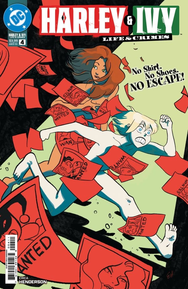
Where we last left off, Harley and Ivy were in the throws of passion when they were so rudely interrupted by the police. Now, naked and on the run, the two women have to find a safe place to hide until the police are off their tails. The only choice the two villains have is to seek out help from someone who’s from Harley’s past.
Cover art by Erica Henderson. Published by DC Comics
While all of this is happening, it’s all being retold by Harley and Ivy. Getting to see their remarks and quips throughout the story really adds a great bit of humor. It’s interesting to be able to compare where they started in the beginning to how comfortable they are now with each other. Erica Henderson perfectly portrays this growth of the two characters throughout the story.
With this being the official story of Ivy and Harley’s love story, I’d say Henderson is doing a fantastic job at creating something that feels authentic to both characters. With the next issue being the last, I’m very interested to see how it ends!
The Art
Erica Henderson also handles the artwork as well as the writing with Hassan Otsmane-Elhaou, who handles the lettering. Some great panels in the comic show a lot of impactful emotion. Whether it’s Ivy showing her vulnerability or Harley, who’s downright confused at some points, you can easily tell the emotions of the characters through their facial expressions. Otsmane-Elhaou knocks it out of the park with the lettering, expertly creating a great flow of dialogue throughout the comic.
Final Thoughts
Harley & Ivy: Life & Crimes #4 continues what’s been an exciting retelling of the character’s love story. There’s drama, there’s excitement, there’s humor, there’s really everything you’d want from this story.
Overall Grade – 8.7/10
Let me know in the comments what you thought of Harley & Ivy: Life & Crimes #4!
This review was written by Megan from the Vigilante Vibes Podcast! If you liked my review, be sure to check out my other reviews! Let me know what you think of Harley and Ivy: Life and Crime #4, or tell me what comics you’d recommend me trying out! Find me on my socials, and check out my Marvel podcast, Vigilante Vibes, by clicking here!
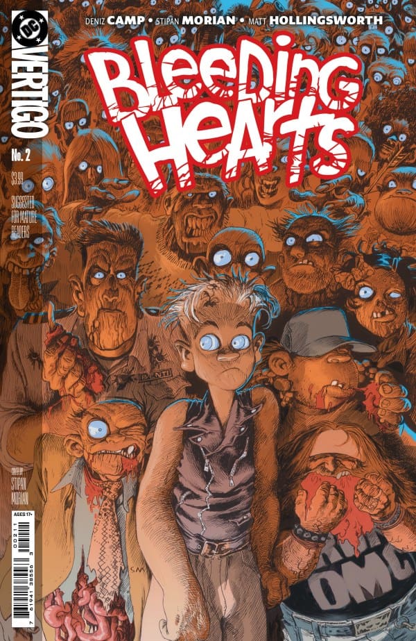
Rabbit and her mother Cara have only ever known a life of loss and pain. They lost Solomon their father and husband and now are faced with the zombie apocalypse alone. Sometimes the heart tells us how we should feel but, more often than not the heart lies.
Bleeding Hearts #2. Credit DC and Vertigo Comics. Cover by Stipan Morian.
Creative Team: Deniz Camp (WRITER), Stipan Morian (ART and COVER), Matt Hollingsworth (COLORS), and Hassan Otsmane-Elhaou (LETTERS).
Bleeding Hearts Spoilers Ahead!
The Story:
A story that shifts the points of views that we are living in is often some of my favorite types of storytelling. Deniz joins the miserable world of the zombies with the opposite point of view this time which is the human perspective. Cara is narrating and telling us how much loneliness and pain her and her daughter Rabbit have endured during the apocalypse. Deniz is able to paint such a heart-breaking tone and picture that is full of bleakness but, also there is still beauty to be found. The world can be an ugly place however, there can be beauty sometimes which Camp reminds us of in issue 2. I love the way this issue was narrated and told with the help of Hassan on the letters offering us a different perspective as the two sides meet.
The Art:
In issue one the zombies were drawn and colored in a softer and more inviting tone. This issue since it is from the perspective of a human none the wise paints our main zombie friend in a harsher and vicious manner. We only ever see him a couple of times and so it can be hard to miss but, the lines on the face and rawness of his decaying flesh shows us how they look from the human side of this nightmare. When it comes to the various panels I love how Solomon was drawn as his jawline is solid and he has a strong demeanor of him. There are the scenes which are grotesque and hard to look at but again this is what endears me to this run.
Final Thoughts:
Bleeding Hearts #2 takes us into the shoes of the surviving humans during the never ending nightmare of flesh eating monsters. It’s allowing us to see two unique perspectives marrying them together allowing us to empathize with both sides of the aisle. This is a must read story for fans of this genre!
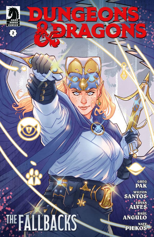
Dungeons & Dragons: The Fallbacks #2 Cover A By Marguerite Sauvage (Credit: Dark Horse Comics)
Wilton and Edvan’s art in this issue is incredible. I love that they were able to take everything in this book, and make it look perfect. I also love that the art tells the story so well, and even if there wasn’t any writing, the art could tell the story so well. Raul’s coloring work and Nate’s lettering tied the art all together.
Meanwhile, Greg’s writing on this issue rocks so much. I love that he was able to take everything that was happening and weave it into one amazing issue. Greg has also been able to take Tess and the entire team and put them into this crazy situation.
This issue sees Tess and the team plundering inside the Lost Lord of Loudwater’s tomb. Now, they find treasure in it, but they also found a White Dragon that has now descended on the city. We also get to see the group compete in the Tournament of Heroes, and that was fun to see.
Overall Grade: 10/10
I love what Greg and the team are doing with this series. I love these characters, and this series is taking them to new heights. I cannot wait to see where these last 2 issues go.
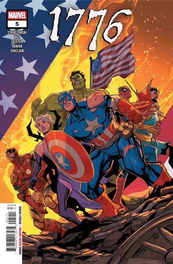
This is the epic conclusion to this time-traveling adventure! Our heroes are up against the ropes and must dig deep if they hope to save their country from failing before it has even begun!
1776 #5. Credit Marvel Comics. Cover by Pete Woods.
Creative Team: J. Michael Straczynski (WRITER), Jay Leisten (ART pg 1-4,7, and 14-20), Oren Junior (ART pg 8-12), Scott Hanna (ART pg 5,6, and 13), Sean Damien Hill (PENCILS), Alex Sinclair (COLORS), Joe Caramagna (LETTERS), and Pete Woods (COVER).
*SPOILERS AHEAD*
The Story:
Does Straczynski know how to wrap up a story and leave you ready to run through a brick wall or what? This issue is so clever and full of fun. I loved how well it wraps up. Morgan gets trapped in a good old-fashioned time trap set after the war, which was a fun way, without killing her, to also make sure she could not just go back in time again. There are still so many fun quips, such as Tony quoting Gandalf with a solid “You shall not pass!” Quote and Spider-Man just ordering pizzas. As the series winds down, Captain America delivers an epic speech, and one that really hit home for me. The speech will leave you sitting there amped up and really left deep in thought. It was an incredible ending by J.
The Art and Letters:
The artwork in this epic conclusion really stands out incredibly well. While there were a few different artists who lent their hands to the details, they blended so seamlessly in such an impressive way. Sinclair’s colors stood out to me as well. He colored the clothing and armor in such a way that everyone seemed to have this shine about them. To me, being able to do that blows my mind, and it’s as though the pages are metallic themselves. All of this culminates in some glorious one shots and none more stunning than Captain America with the Founding Fathers in the background. This team crushed the artwork and left such an impression all at the same time.
Final Thoughts:
1776 #5 brings about a heroic and epic conclusion to this short run. The blending of American history with our favorite heroes will leave you grinning from ear to ear. I had an incredible amount of fun with this run and will be revisiting this many more times in the future.
When the town is taken over by a mysterious treasure, Geralt has to begin looking for what’s causing the issue. Believing the town is victim to a gorgon, Geralt prepares a plan, but all is not as it seems. Like the review for The Witcher: Blood Stone #1, Travisand I will be teaming up for this review.
Creative Team
Writer: Daniel Freedman Artist: Pius Bak Colorist: Roman Titov Letterer: Hassan Otsmane-Elhaou
Writing
Shawn: I love the story Daniel Freedman is crafting with The Witcher: Blood Stone. It’s not always smooth transitioning an IP from one medium to another, but Freedman has done a masterful job in crafting a story that feels like it could easily be DLC for The Witcher III. The dialogue used and speech patterns capture the spirit of the story perfectly. I think Freedman perfectly captures Geralt with the “I’m just here for the monster” attitude we continue to see in the story.
Travis: Daniel Freedman continues to give Witcher fans exactly what they want with his writing! The story continuation from issue one to this issue is spot on! No loops or time jumping to be had! The dialogue and narrative capture the essence of an Irish tone. I became entranced by the story, so much so that it felt like I turned four pages, and it was over. Amazing!
Art
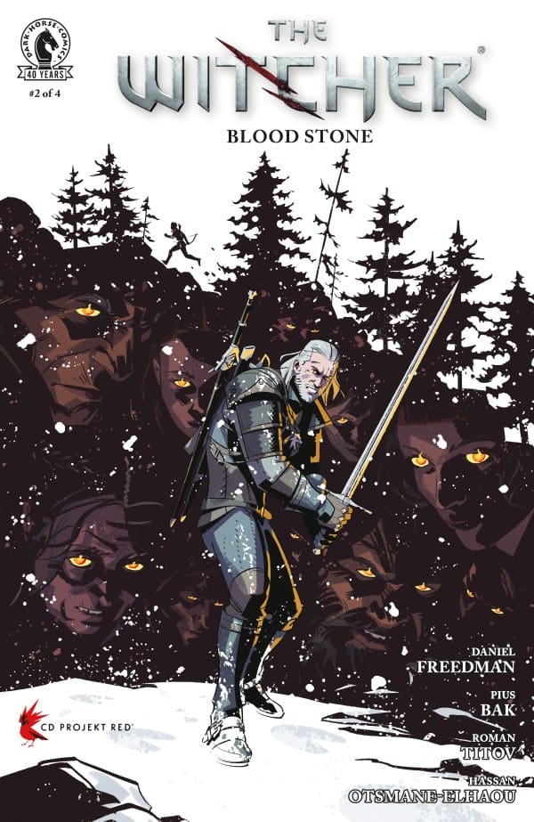
The Witcher: Blood Stone #2 cover by Pius Bak. Image from Dark Horse Comics
Shawn: Pius Bak continues to blow me away with the art on this series. Roman Titov makes exceptional choices for his color palette. The art feels perfect for the period and setting, and it really makes the town a character in this story as much as Geralt or Baker Smith.
Travis: Pius Bak and Roman Titov are exceptional artists for The Witcher! Pius’s crisp bold The lines mixed with Roman’s choice of colors really bring the mood of this story to life. When certain scenes are meant to be gloomy, the colors and shading emphasize it perfectly!
Final Thoughts
Shawn: 9/10. This was a really solid entry in The Witcher: Blood Stone Series. I can’t wait to see where the story goes, but even with its page length, this issue felt a bit short to me. I finished the final page and saw the “to be continued” and said, “Oh man, that’s it.” Don’t get me wrong, this issue is outstanding and deserves a spot on your pull list, but I felt like I could have used 1-2 more pages in this issue headed into the penultimate issue.
Travis: 9/10. This second issue continues to tell the story amazingly. I enjoy Geralt’s demeanor when he is asked to save this town, but he is only there for the monster. Proving to be overwhelming for him. The plot is growing, and with only two more issues to come, I was sure the climax of the story would have happened in this issue. But you will have to wait for that in issue three. Go pick up this second issue of The Witcher: Blood Stone, as well as issue one! Regret will not be yours when you do!
Overall Grade: 9/10
What did you think of this issue? Let me and Travis know in the comments below.