BRZRKR is one of my favorite ongoing series. This run seems to have a lot of different elements that made me laugh. The main character has excellent lines that I was not expecting. Just like the original BRZRKR series, it has some world-building immediately. This mostly does not focus on the main character, but on the two scientists. These scientists are so smart and willing to take chances when it comes to experiments. I really didn’t know where the story was going at first. I suddenly realized that it was taking a comical approach to the entire lore.
It does have some world-building, as the scientists play a major part in all of it. I like world-building because it sets the standard as to what to expect. I was pleasantly surprised that there was not a lot of gore in this. Maybe I am being impatient, and have to wait for the next issue. BRZRKR is most notable for the gore. That is one of the many reasons as to what keeps me coming back to this world.
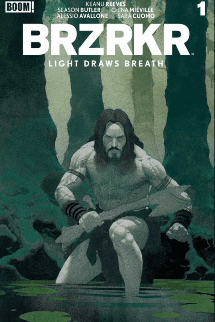
To be honest, I was a little underwhelmed with this one. I was waiting for a lot of action, and it just wasn’t there. I am willing to give it a chance for later issues. Maybe something far more sinister is coming for the beloved anti-hero. As far as the art, it’s always nice. Both Ribic and Avallone did a wonderful job with the cover art and art in general. I love seeing the textures in each comic page, and that engages me to read more and more. Overall, this first issue was just okay. I really want them to ramp it up the next time that I read BRZRKR.
What did you think of BRZKR Light Draws Breath? Sound off in the comments below!
In the previous issue, writers Tim Seeley and Ryan O’nan introduced us to their modern, horrifying version of “Hamlet” in “Pretty Hate Machine”. We met our main character, Thomas, going through the trials and tribulations of losing his father at the hands of those he should trust most: his own family. Will he continue to struggle as he’s urged towards violence? Or will he give in? Find out with me as we dive into “Pretty Hate Machine #2”!
Writers: Tim Seeley, Ryan O’Nan Artist: Hank La Marca Colorist: Roman Stevens
Thaw And Resolve
Picking up from the incredible first issue, Seeley and O’Nan continue their wonderous work here. Not a single bit of the intensity has been lost, as this issue gets readers straight into the action, quite literally! I loved how things played out right in the beginning, showing the planning going on but bringing in an element of dark humor. While it may not be everyone’s taste, I always feel that dark humor in horror can be great in the right momnts to ease the tension. It’s used expertly here throughout the entire issue, making me giggle on more than one occasion!
Also, throughout the entire issue, Seeley and O’nan do a great job at making the reader guess. Will Thomas succumb to the dark urges? Will he forgive his mom & uncle for what they did? The constant wonder keeps this a wonderful page turner. Simultaneously, they make the reader afraid to turn the page, making us guess what horrors await on the other side.
Source: Todor Hristov, Mad Cave Studios
Art of the Kill
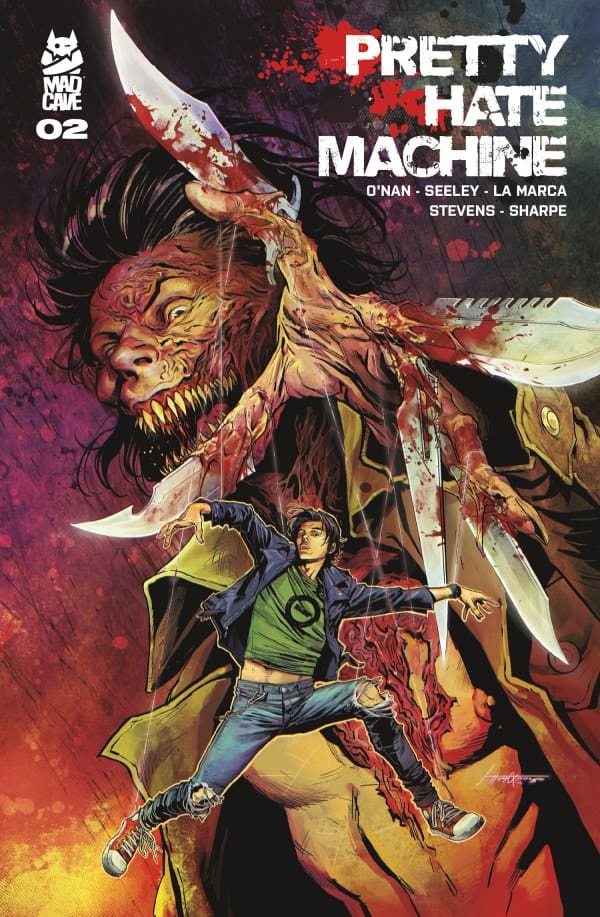
Not only did the writing stand out, but the art and colors of Hank La Marca and Roman Stevens did as well! Together, they create pieces that feel both tangible and intensely grotesque. This is the kind of stuff people like Tom Savini dream about. Without going into too much detail, the final shot is absolutely something that will stick with you. If I could give a comparison, think of the bedroom scene in “Terrifier 2”.
Every shot here felt intentionally meant to put the reader in either disgust or unease, and I absolutely loved it. Paired with the so far excellent writing, “Pretty Hate Machine” is something you need to be checking out.
Final Thoughts
So far, this whole team can do no wrong. From Seeley & O’Nan’s intense story evoking the likes of “Hamlet” or “Death Note” to the insane artwork, “Pretty Hate Machine” is a whole different beast. This is a beast clawing its way from the pits of Hell itself, demanding to be read, and it should be.
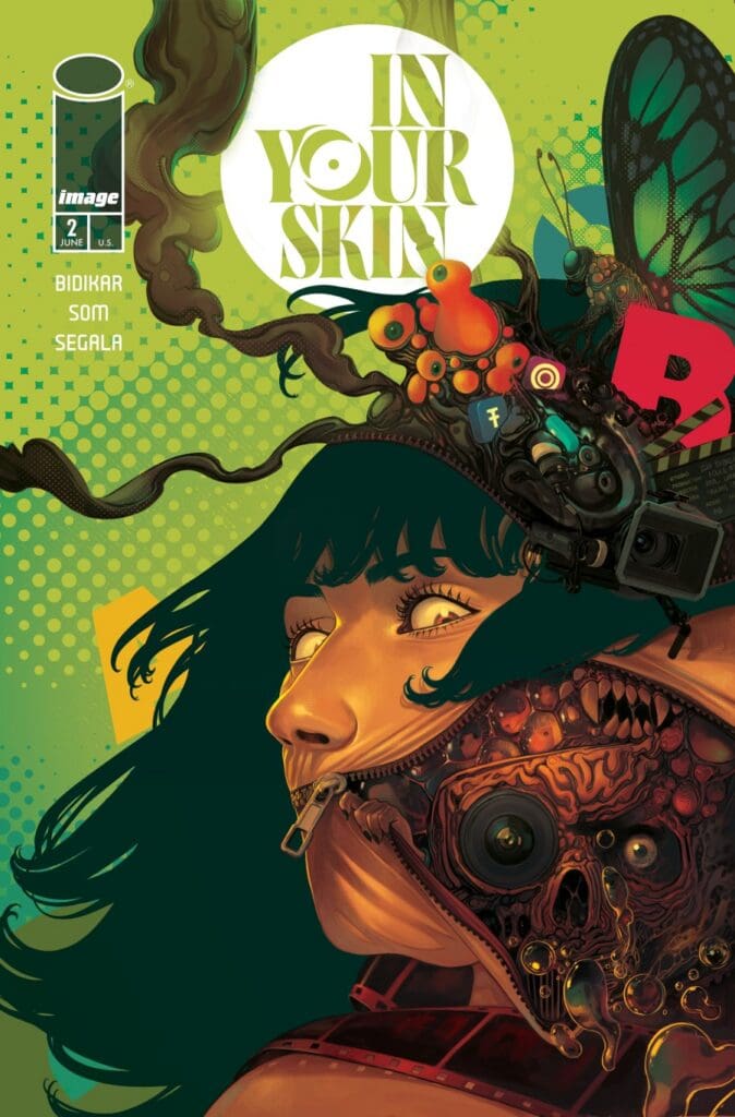
In the previous issue of “In Your Skin”, writer Aditya Bidikar dared to ask the question, “What happens if a parasocial relationship is taken too far?” Here, he seems to want to ask the opposite: what might happen if a celebrity tired of the spotlight gets a chance at a new life? Bidikar continues to push the boundaries, and I’m absolutely loving every second of it.
Writer: Aditya Bidikar Artist: Som Pal Colorist: Francesco Segala Color Assistant: Gloria Martinelli
Source: Som Pal, Image Comics
The Other Side
After having read the first issue, seeing things from the other side isn’t where I expected to go, but I’m so happy that Aditya Bidikar took things there. Seeing things from Ayesha’s perspective was such a unique yet perfect layer to this already spectacular story! Bidikar works hard here to make readers feel the stress of her everyday life and body dysmorphia from getting older. In an industry where age, for some reason, matters, it can really weigh someone down, make them feel like they’re too old, and question what things would be like if they were young again. Bidikar tackles this issue with beauty and grace.
The other thing that he continues to excel at here is the horror. The issue has this near-perfect balance of the body and the psychological. Aditya Bidikar truly forces readers to be inside the skins of the two main characters, putting us through this psychological torture in the best way imaginable. I seriously can’t get enough of this series and am looking forward to a re-read as well as the next issue.
The Art of the Body
Artist Som Pal and colorists Francesco Segala and Gloria Martinelli were all on their A-game here. Matching Bidikar’s efforts to put readers in a horrifying position, the team does a stellar job depicting every moment of body horror. How those moments are drawn by Pal just feel and look so twisted and gross, and I mean that as an utter compliment. For the first time in a while, I felt truly disgusted at times while reading, unsure of what awaited me on the next page.
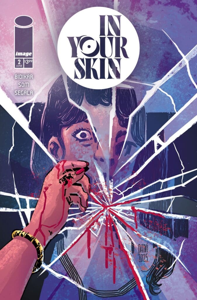
Coupled with the art style is the usage of colors from Segala and Martinelli. The way they used color to show the psychological differences both characters were going through was simply a masterclass. To exemplify this, there were several moments throughout where these deep reds were used. In each of those moments, I felt nothing but pure anger, confusion, and terror all rolled into one. When you can elicit those reactions from a reader, you know you’ve done something right. Here, the art and colors truly come together to elevate something that’s already perfection.
Source: Dani, Image Comics
Final Thoughts
Aditya Bidikar and his art team continue to astound and amaze. So far, “In Your Skin” is something that feels truly timeless, especially in this modern age of fandom and social media. Bidikar continues daring to ask the questions everyone else is afraid to, and I love this all the more for it. I feel as if it’s safe to say we have a modern horror classic on our hands, and you should be reading.
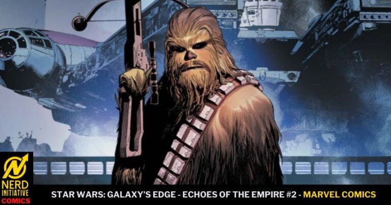
Darth Vader is on the hunt for a special artifact that the rebellion is also after. Will Princess Leia and the rebels be able to outmaneuver Vader while on Batuu?
Jay Bowen / Anthony Gambino (Designers), Mikey J. Basso (Assistant Editor), Mark Paniccia / Grace Orriss (Editors), Robert Simpson (Senior Editor), C.B. Cebulski (Editor-in-Chief)
Issue two of Star Wars: Galaxy’s Edge – Echoes of the Empire continues to tell the story of a special artifact that the rebels are searching for. Little do the rebels know, Darth Vader is also on Batuu searching for the same artifact. According to context clues, this artifact holds some sort of power that both the rebellion and the empire want.
This issue does an outstanding job of taking readers into the streets and underground compounds of Batuu. Readers will see iconic characters getting involved in Star Wars situations. As if this were a movie that was transferred to panels and pages. One aspect of this is the visuals of C3-PO and R2D2 sharing a moment during the middle of a battle causing R2-D2 to make signature noises and whistles. A sound every Star Wars fan knows immediately.
The Writing
Ethan captures the pure essence of a Star Wars adventure in this issue. It seemed as though every page and every panel we had a place or character that had me feeling like a living version of the Leo meme. I loved that he found a way to continue the adventures of our OG heroes while bringing them face-to-face with Darth Vader once again. He is on a rampage, looking for what appears to be an egg or something vital, while the Black Spire Outpost bands together to resist him defiantly.
Throughout the story, Ethan’s ability to unfold the narrative made it easy for me to transport myself into the story, having been to Galaxy’s Edge a ton of times. Seeing these characters come to life in a place fans can visit has my imagination going wild, hoping to see them in the parks myself one day.
The Artwork
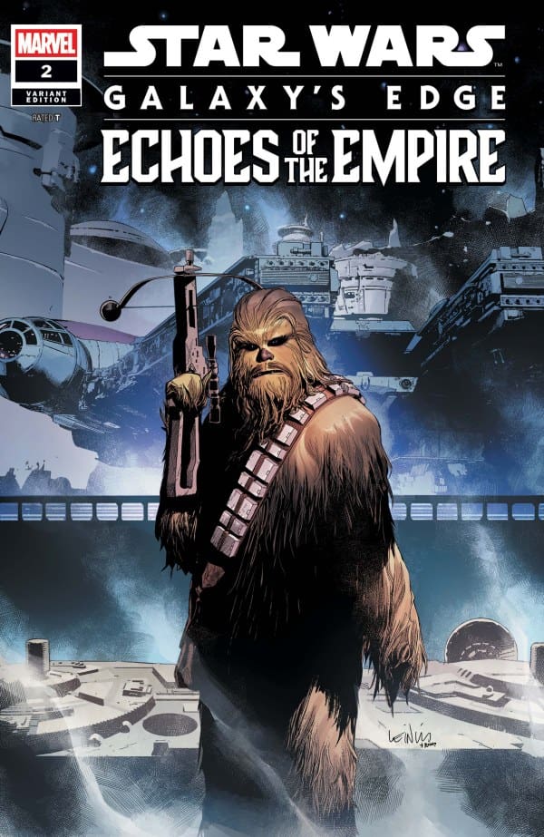
The artwork captures every single detail of Galaxy’s Edge, making me feel as though I were standing in Batuu watching this issue for myself. The details inside of Oga’s Cantina had the booths detailed to perfection, and even the placement of the Falcon was where it would be found if we were visiting for ourselves. The art team gave me an even bigger fun surprise, and one I never thought I would see, and that was Chewy landing a hit on Darth Vader! It’s a quick action sequence; however, you can feel through his helmet the surprise Vader felt in that moment. The final page was colored so beautifully as we see Vader ignite his saber, leaving us on an epic cliffhanger.
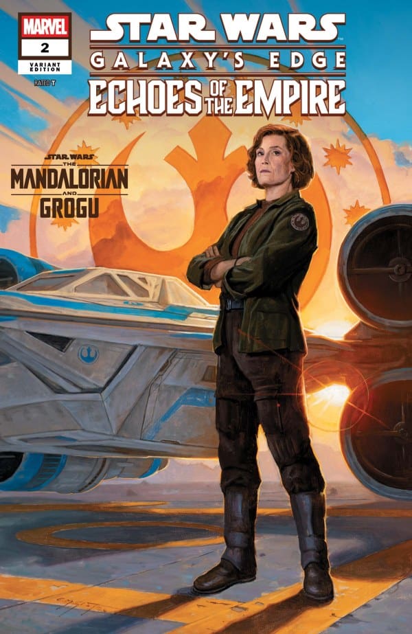
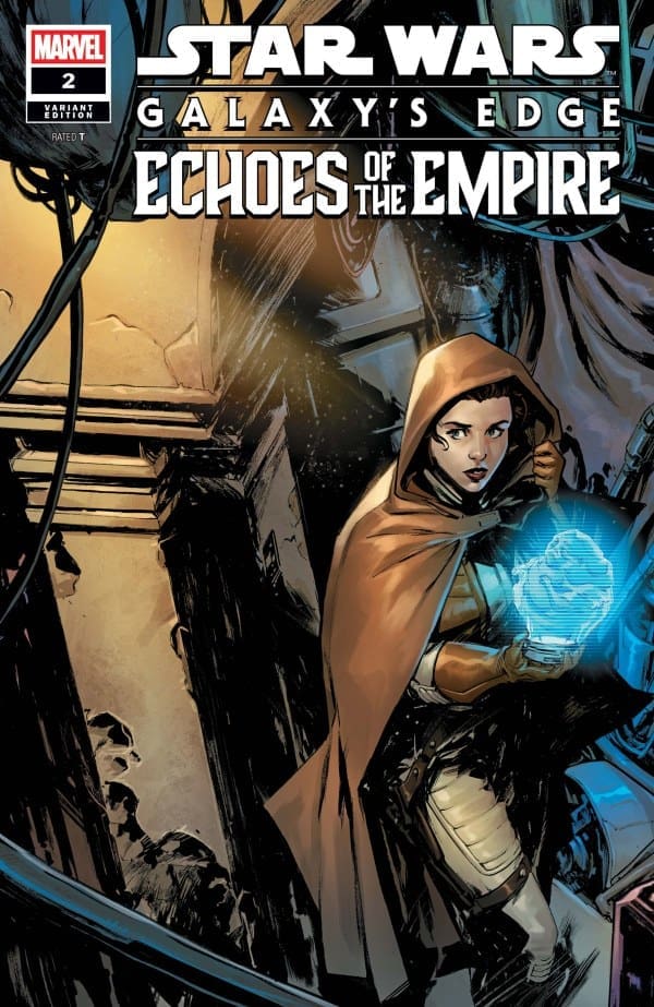
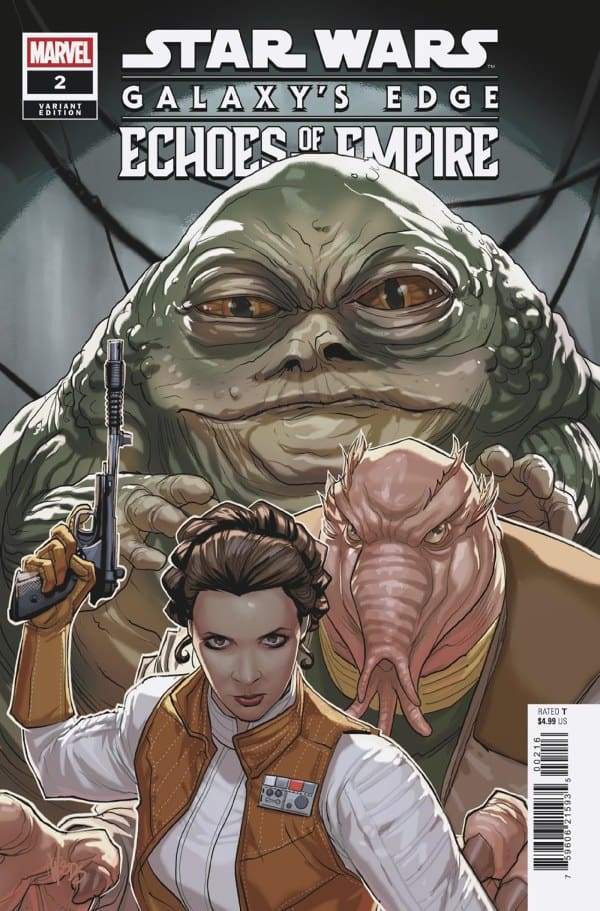
Variant Covers
Erik M. Gist
Leinil Francis Yu
Paolo Villanelli
Pete Woods 1:25
Final Thoughts
I had an incredibly fun time with this issue, having been to these exact locations at Disney many times. Ethan, Jethro, Roi, and Rachelle transport us into this issue seamlessly and build an adventurous tale that captures the heart of what makes Star Wars so great. If you are at the parks for a visit, you may be able pick up Ethan’s Galaxy’s Edge comic. It even comes with various covers and figures as well!
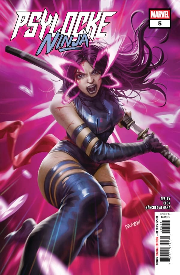
Betsy Braddock’s mind has been violently fused into the body of Hand assassin, Kwannon. In that moment, Psylocke is born. Flashing back to the pivotal events of Uncanny X-Men #251, readers begin to see how Psylocke comes to be. Dispatched on a brutal mission to locate and eliminate Elektra from The Chaste, the psychic interaction throws both Betsy and Elektra into turmoil. Betsy seeks refuge by teaming up with Wolverine and Jubilee in Madripoor, only to have to recover Jubilee. While Betsy is trying to save everyone, Elektra and the Snakeroot Clan have borne down on Psylocke. Will Elektra join Betsy in a bid to save Jubilee?
This review is brought to you by Nerd Initiative’s Shawn!
Creative Team
Writer: Tim Seeley Artist: Nico Leon Color Artist: Dono Sánchez-Almara Letterer: Ariana Maher Cover Artist: Derrick Chew
Writing
Tim Seeley, take a bow. Psylocke: Ninja #5 wraps up another really satisfactory “lost chapter” series from Seeley. The story is heartfelt and meaningful as we get a chance to see if Psylocke and Elektra can realize there’s more they share than the differences between them. Seeley aptly used Elektra as an examination of the darkness that can still be found inside of us, even when we think we’ve got it beat.
Relationships have been at the center of this series since it launched, and Seeley keeps that pace with this final issue. From the relationship between Kwannon and Tsurayaba to Betsy and Elektra, this series is so good because of how well we see these characters interact with each other. The story is well done and meaningful, but it’s the interplay between the characters that makes a difference.
Art
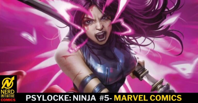
Psylocke: Ninja #5 cover by Derrick Chew. Image from Marvel Comics
Nico Leon and Dono Sánchez-Almara get a lot of action to play with in this issue, and they do a spectacular job with it. Leon seems to have a spectacular sense for where the reader’s eye should focus in each panel, using greater details to draw readers to that area.
Dono Sánchez-Almara really gets to play with a variety of colors this issue. The presence of the Snakeroot Clan, as well as Psylocke and Elektra, really opens up what he can do with colors. Sánchez-Almara does some really great work coloring cliffs in this issue as well, so that you can’t help but pay attention to the line work from Leon. Ariana Maher gets to really shine with some unique SFX in this issue, as well as guides us easily through the story. My eyes flowed through the panels naturally, always knowing where to go.
Final Thoughts
Now that it’s over, I can’t wait for the trade paperback for Psylocke: Ninja to come out. This has been a unique and fun look at key moments in Psylocke’s history. Seeley takes what is perhaps one of the most convoluted retcons in comic history and crafts a meaningful story that fills in some gaps along the way. If you haven’t been reading this issue to issue, you absolutely must check it out now that the series has wrapped up.
Overall Grade: 9.5 / 10
Now that it’s over, how did you like the Psylocke: Ninja series? Let me know in the comments
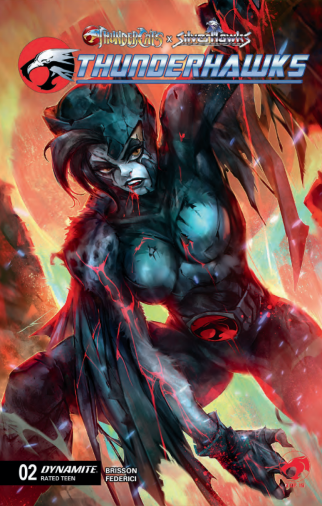
This series of the ThunderHawks has these characters either fighting or working together. When it comes to a newer series, I like being engaged right away. There are so many unique elements that are presented in this series. From love to action, to a little bit of gore, I like it all.
ThunderHawks gives a real-life view and relatable settings to the reader. I like seeing the simple stuff that people usually see on the street. It definitely gives me that Spider-Man feel, which keeps the story grounded. I also like that it seems that all the characters actually care about each other. I love it when teams actually want to be together and work together for the common good. I really hope to see more of that throughout the series as it goes on. ThunderHawks also has an element of fantasy, and growing up as a fantasy fan, I really enjoy that element.
Credit: Ivan Tao Dynamite
When it comes to the art, it is really unique. All different kinds of hairstyles, as well as each page is different than the first page. I see the art style of the villains is also unique. ThunderHawks does not shy away from the gore. This makes me happy because I don’t want artists to play it safe. I want them to express the characters the way they need to be. It either gives them a look into their lives, and the reader can make their decision on how they feel about them. This is a great stepping stone that ThunderHawks has made, and I can’t wait to read more.
A couple of things I think it is missing are world-building. If there is a fantasy element going to be used, I need a lot of world-building. Tell me more about what is going on. Not just the fighting that is presented in the forefront. One other thing is, is about the pacing. Sometimes I just don’t want to see action; I like a little bit of a break in that. Hopefully, the next issue will give it a break.
Overall Grade: 8.5/10
What did you think of ThunderHawks #2? Sound off in the comments below!
This comic review is brought to you by the dynamic duo of Megan and Shawn!
Shawn – Gerry Duggan has killed it this entire series, but this may be the best yet. Duggan perfectly captures Simon Williams at times goofy approach to life with some crazy one-liners. I really appreciate Duggan continuing to incorporate real-life events into this series, with the Altadena Fires serving as a backdrop for some of the scenes we see unfold.
In addition to the somewhat silly tone, there is an actual good story put in place by Duggan as we begin to understand a little bit more about Randolph and why folks are after him. Duggan gives us some prime character moments from Simon Williams, as well as a glimpse at the relationship between Wonder Man and Hellcat, as unsteady as it may be.
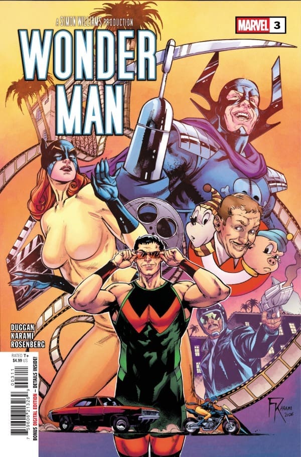
Cover art by Farid Kamari and Rachelle Rosenberg. Published by Marvel Comics
Megan – This is easily the most exciting issue yet, and that’s saying a lot. Spot continues to be an absolute menace for anyone he has his eyes set on, and that just so happens to be Simon and Randolph. Simon has been in the middle of this entire fiasco completely against his will, and now he’s even further to blame as police footage has been leaked everywhere.
Now, he’s on the run and still has to keep Randolph safe. Even with how much is going on, there’s still so much Simon doesn’t know, and has yet to find out. Like, who can he trust, for example? Things are heating up quickly, and Gerry Duggan is pulling all the right stops out to continue the high quality that we’ve seen in the previous issues. With the varying tones of the story and the wildly different emotions that play out in the comic, Wonder Man #3 continues the exciting story, raising the stakes higher than they’ve ever been.
The Art
Shawn – Farid Karami, Rachelle Rosenberg, and Joe Caramagna really did a phenomenal job with this issue. Karami’s work really stands out with the characters in this issue. The lines on their faces, a small grin, or Randolph’s smug smile all show great detail and expressiveness. Karami also does a brilliant job on Hellcat, using some lines and hatching techniques to add depth to her character design. He’s giving us an “old school” feel using modern assets.
Rachelle Rosenberg continues to put forth some of her best work with this series. The colors and shading feel just perfect. One thing I continue to be impressed with is Rosenberg’s ability to capture light so well. Whether it’s Simon’s sunglasses or the sun setting at a taco shack in Altadena, Rosenberg seems to always perfectly capture the light and how it strikes objects within the panel. Joe Caramagna moves everything through the story, marking clear differences between Simon’s internal monologue and actual interactions between characters. I really love a moment that happens in this issue where Caramagna busts the work bubble, creating an automatic impact of the words.
Megan – Farid Karami, Rachelle Rosenberg, and Joe Caramagna knocked this issue straight out of the park. The action scenes were drawn in a way that made you feel right in the middle of the action, especially when Spot was flexing what he could do. There was excellent symmetry between the characters, giving each one their own spotlight to shine in. The colors were perfectly handled by Rosenberg, playing really well off of the drawings. Rosenberg is one of the best colorists in the comic book industry, and with every comic she works on, that proves to be more and more true. Caramagna perfects the story with excellent lettering work, pushing the emotions of the story from the characters. Together, the artists did a marvelous job at making this comic as fantastic as it is.
Final Thoughts
Shawn – 9/10. This creative team continues to put together an amazing series about Wonder Man. I really wish Marvel had dropped this series right after the debut of the Disney + show because I feel like Duggan, Karami, Rosenberg, and Caramagna are really capturing the essence of what makes Wonder Man such a unique character in the Marvel mythos. He’s both serious and ridiculous at the same time. A poet and all one-liners. This series captures that perfectly.
Megan – 9/10. This series continues to be a lot of fun with characters that just aren’t given enough of a spotlight until now.
Overall Grade – 9/10
Let us know in the comments what you thought of Wonder Man #3!
Tommy Brazen is on a mission to find his father. In a crazy turn of events, he is invited to a competition to find the greatest fighter or Final Boss on the planet. Turns out the location of this tournament is the same island his father went missing on. As Tommy advances in the tournament, will he be able to figure out what happened to his father…
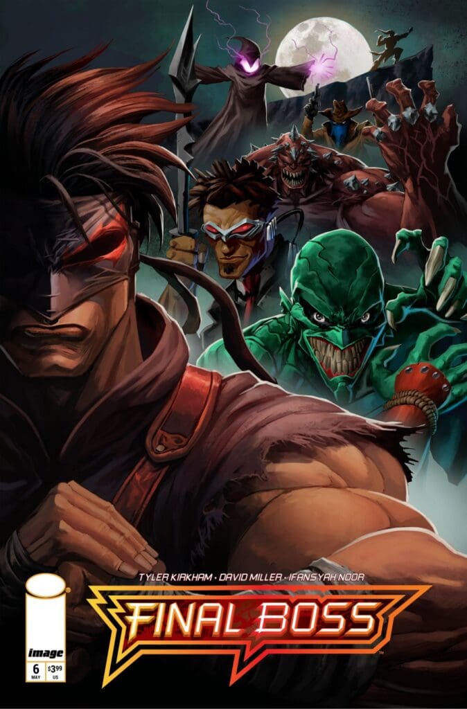
Issue six of Final Boss from Image Comics brings the main character (Tommy Brazen) to his first battle within the Mortal Kombat-style tournament to find the greatest fighter on the planet. Before the real action takes place, readers are taken back in time to when Tommy was a teenager in school. In this flashback, Tommy is a witness to a cruel act that he tries to stop. Unfortunately, he is too late, causing a rage that he has never felt before, a rage that is so perfectly written that readers will fully grasp the emotion Tommy feels.
Final Boss #6, Credit Image Comics. Cover by Tyler Kirkham.
This story fast forwards to the present where Tommy is prepping for his first battle within the tournament. His opponent is an interesting creature who embodies the abilities of an owl. This poses some challenges for Tommy in terms of his striking. Just as in previous bouts, Tommy figures out a way to work around those hurdles.
Readers of this series already know that Tommy absorbs power and energy from his opponents. There is yet another aspect to his abilities that readers will come to realize within this issue. That aspect has everything to do with how this book starts. Tommy channels most of his abilities from what he learned from his late grandfather who is a god in his eyes. He understands that he is blessed with not of this world abilities and continues to learn what he is capable of.
A very relatable tone to this story is that one never truly knows their own capacity within the world. Tommy is constantly learning about himself. Before entering this competition, Tommy was a star within the underground fight scene. Now that he has been invited to this tournament, he is quickly learning that he may not be as good as he was within the underground.
The Writing
Tyler Kirkham is giving this story so much substance with each issue. The dynamic of splitting each issue into two separate parts, back story and present, really gives this series a dynamic platform for storytelling. The plot for this story opens up many different avenues for it to travel down. The script for this story is very simple yet packed with mystery and adventure.
The Artwork
Tyler Kirkham, David Miller & Ifansyah Noor generate amazing visuals for the story. The pencil work is sharp with so much focus on details throughout. The details are then highlighted by the astonishing coloration on display. All of the action splash pages are a comic book fan’s dream!
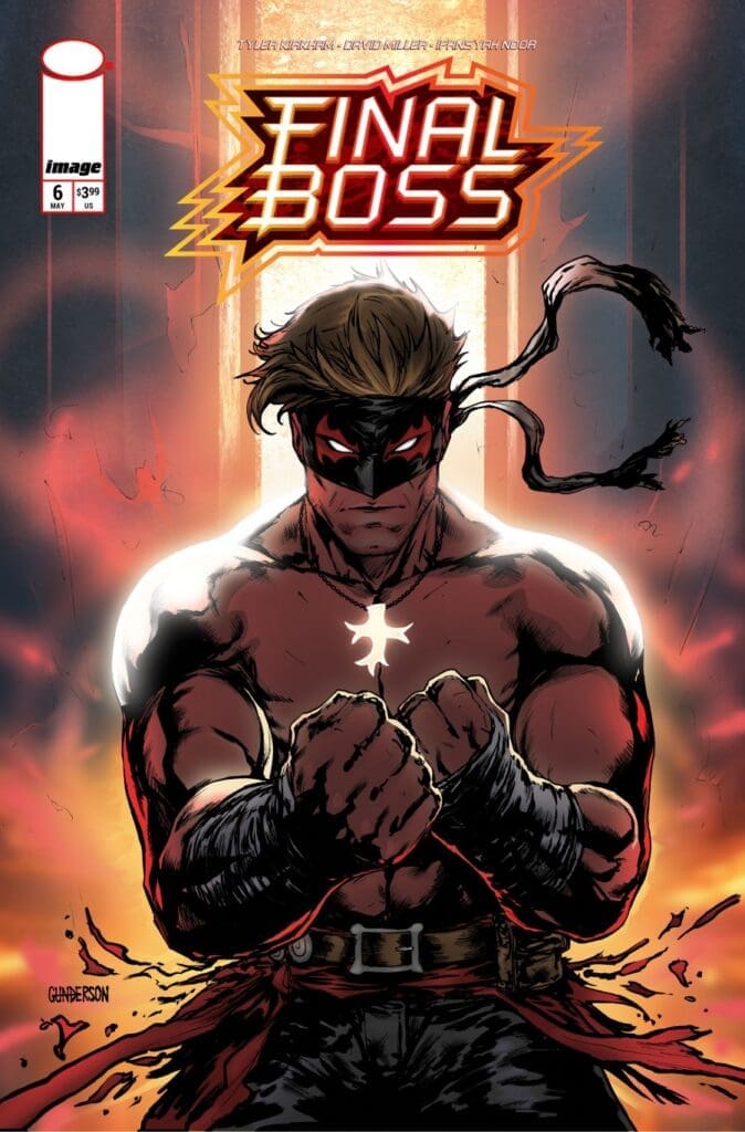
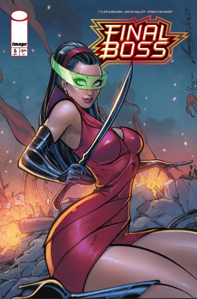
Variant Covers
Jordan Gunderson
Narcelio Sousa
Final Thoughts
This issue comes after the release of this series’ first volume trade (issues one through five). After taking the time to read the first five issues, I was hooked and wanted to cover this series! There is a fan base for Mortal Kombat, and this is a modern-day version. This series gives readers amazing backstory details mixed in with brutal fights that power up the main character! Who could ask for more from a series like this? If you’re a fan of Mortal Kombat, then you need to check out Final Boss!
The demon child Rose Hornsby, and the angelic child, Zachary Halo, are back. This issue continues their story, and ties in some other Ghost Machine Pro stories. Both old and new.
Creative Team
Creators: Peter J. Tomasi & Peter Snejbjerg;
Letterer: Rob Leigh;
Color Artist: John Kalisz;
Editor: Brian Cunningham;
Designer: Steve Blackwell;
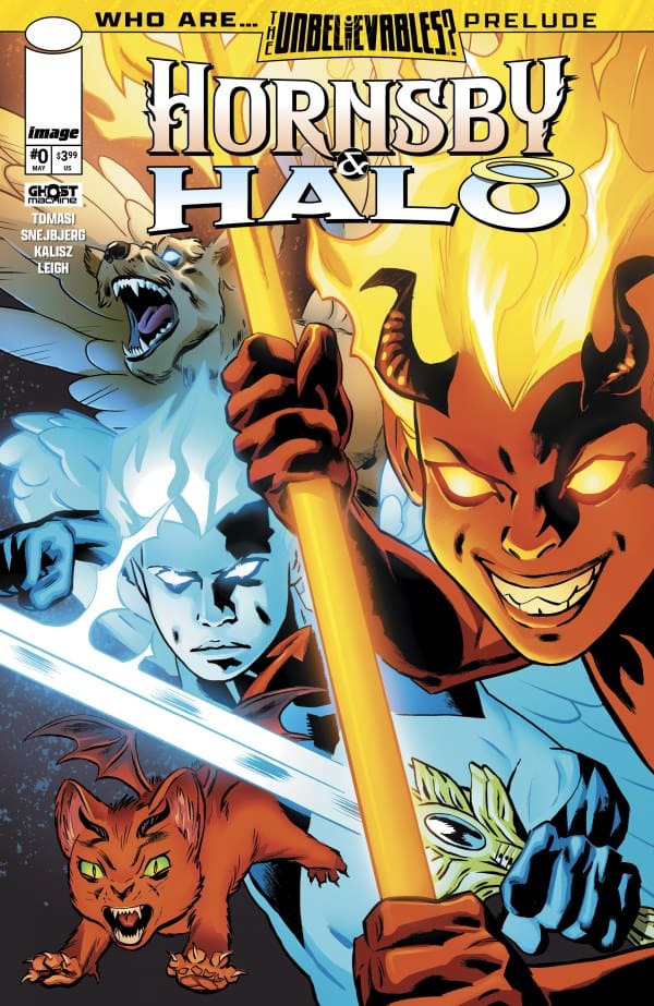
Cover A: Peter Snejbjerg & John Kalisz;
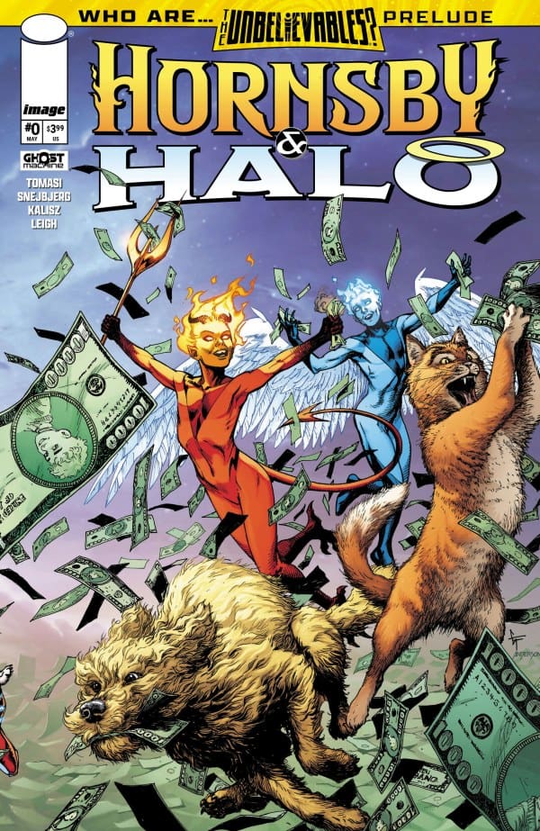
Cover B: Gary Frank & Brad Anderson;
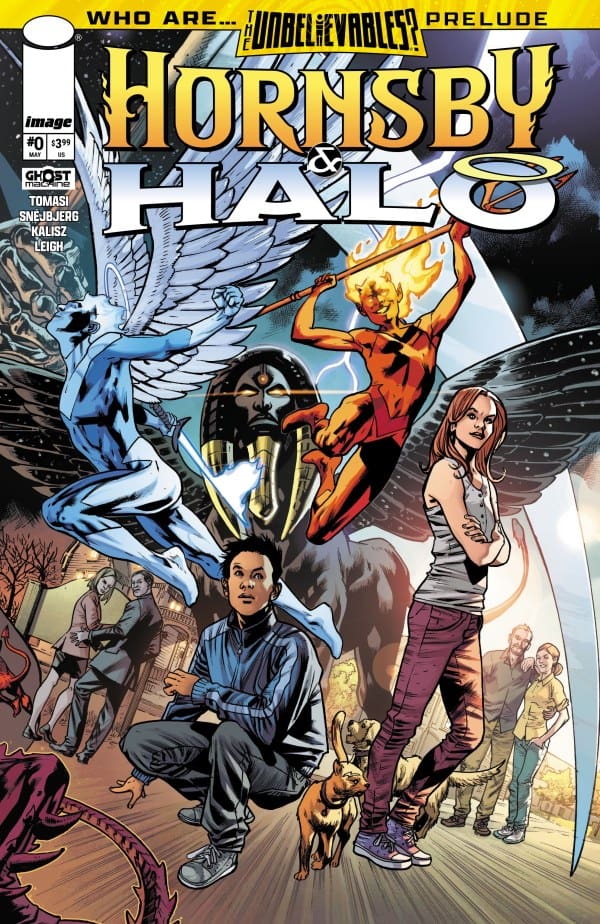
Cover C: Bryan Hitch & Brad Anderson.
Hornsby & Halo #0 Cover. Image by Ghost Machine at Image Comics.
The Story for Hornsby & Halo #0
After seeing some other familiar Ghost Machine faces, and some new ones, we pick up right where Hornsby & Halo #13 left us. The Halos are still in prison, and the Hornsbys are still decent people helping others. As Rose and Zachary struggle with a recently made decision, they both wonder why the Adjudicator suddenly left them. A question that is answered in the most unexpected way, which then leads them to learn about their past, and possibly their future.
The Art
Hornsby & Halo #0 introduced new faces, took us to other realms and times, and gave us some absolutely gorgeous art. I’ve been covering this comic from the beginning, and I continue to just love the art on every page of every issue. A standout moment for this issue had to be the glimpse we were given of a potential future. From the shading to the colors, intensity, and detail, it got me very excited for what’s to (potentially) come from the demonic child and the angel child.
Check out a review for another comic from Ghost Machine: GEIGER #23.
Hornsby & Halo #0 Variant Cover. Image by Ghost Machine at Image Comics.
Hornsby & Halo #0 Variant Cover. Image by Ghost Machine at Image Comics.
Final Thoughts
As this issue of Hornsby & Halo kicked off, it set up The Unbelievables. I was instantly sucked in, wondering what was happening and how it would all be connected. After our main story continued, we then got a setup not only for what’s to come with Rose and Zach, but also how it may all be connected. Thereby getting me excited for the next issue of Hornsby & Halo, and so many other Ghost Machine stories on the horizon.
Overall Grade: 9.5/10
Do you need to read everything from Ghost Machine to enjoy a single run? No. BUT, you absolutely should. All these stories are fantastic alone, but together they just get more and more interesting.
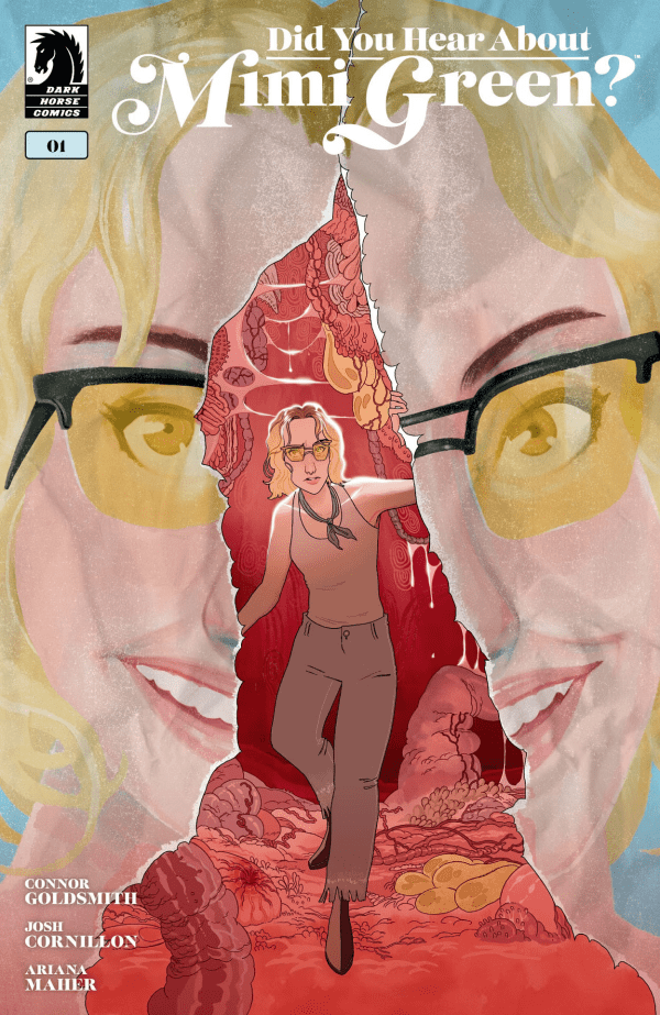
Mimi Green has it all. She’s a well-known online influencer until an old blog post in which she cruelly mocks fat people resurfaces. When the post resurfaces, it’s the spark that ignites a viral firestorm. This comic’s debut from Connor Goldsmith sees Mimi check into an isolated and pricey mental health retreat to ride out the viral wave. What happens when days of sound baths and crystal healing are met with nights in alternate dimensions that seem designed to punish vanity?
This review is brought to you by Nerd Initiative’s Eda and Shawn!
Eda: Being a debut comic writer can be a gamble. You’ll be great, in the negative or somewhere in the middle. For me, Connor Goldsmith is that “somewhere in the middle”. While reading, if someone didn’t read the author’s note at the end, they’d be a bit confused, like I was. Are we supposed to root for Mimi or hate her? Is the message for or against cancel culture? For both, without the context, it’s a bit unclear where Goldsmith wants us to be. That being said, figuring everything out intrigues me enough to read the next issue.
On a total side note, being a queer trans-woman in this space, it felt awesome as hell to get this amount of representation in a book! It can be hard to come across a character I can relate to, let alone someone in the background. This was like a breath of fresh air.
Shawn: This was a pretty solid debut from Connor Goldsmith. I thought the story was interesting and had a really unique premise. The words feel natural, and the characters feel lived in, but the story still needs some fleshing out. The author’s note is a must-read at the end of the series, as it really helps you understand what Goldsmith is going for in a way that is not always evident throughout the issue.
It’s very clear that through this four-issue series, we are going to be treated to a deep dive into the psychological impacts of body dysmorphia, shame, and the toxic life of influencer culture. While that much is made very clear, the narrative still leaves room for more clarity on how this series feels about those things. Cancel culture will be a central tenet of the story, but I would have liked to see more clarity around if the narrative is truly addressing cancel culture or taking the often-seen route of society, where accountability for actions and words is labeled cancel culture.
Art
Did You Hear About Mimi Green? #1 cover by Josh Cornillon. Image from Dark Horse Comics
Eda:Up front, I really couldn’t help but love the art and colors here. Josh Cornillon & Ariana Maher really showed they know how to put work into a page. The moments of horror felt truly terrifying while the scenes set in the hospital evoked a whole range of emotions through the use of color. Josh and Ariana should be proud.
Shawn: The art and colors here are phenomenal. Josh Cornillion really set the tone right out of the gate. The body dysmorphia and psychological thriller really come through in the art that Cornillion utilizes throughout the issue. Cornillion really also nails it on the coloring. Not only does Cornillion pick the right colors, but there are times when there’s a more glossy look and times when there’s a flatter look that just seem to work. Ariana Maher as always, does a great job with lettering. While her work with the big two is phenomenal, it’s independent series like this where she’s not beholden to traditions and expectations for established characters and fonts that her work truly shines.
Final Thoughts
Eda:8/10. While not perfect, “Did You Hear About Mimi Green?” by Connor Goldsmith is still worth a look. Even with the mixed messaging, the moments of terror truly hit and the artwork is stunning.
Shawn:8/10. This is a solid first issue of a comic. I would have liked to see a little more clarity on where the characters in the story fall on the issues addressed in the opening issue, but this is worth the pickup. With only four issues, I’m expecting we will get some real clarity on how the topics this creative team is addressing are deeply intertwined with the narrative in the next issue.
Overall Grade: 8/10
Are you picking up this new series? Let us know in the comments