Home Blog Page 18

Star Wars: Shadow of Maul – Friends in Low Places

Lawson has lost the majority of his new squad, which leads to a lot of questions that need to be answered. This, in turn, leads to a surprising turn of events for Lawson as he is working to obtain those same answers.


Creative Team

Benjamin Percy (Writer), Madibek Musabekov (Artist), Luis Guerrero (Colorist),
VC’s Joe Caramagna (Letterer), Derrick Chew (Cover Artist)

Carlos Lao (Designer), Mikey J. Basso (Assistant Editor), Mark Paniccia (Editor),
C.B. Cebulski (Editor-in-Chief)

Publisher: Marvel Comics


Friends in Low Places

This issue is flooded with mystery and explosive action! Readers are along for a mystery-filled adventure as Lawson works to uncover why he is on multiple “hit lists.” While he isn’t surprised that hits have been placed on him because of his prior work experience. It still begs the question as to who and why he is being targeted.

Star Wars: Shadow of Maul #3, Credit Marvel Comics. Cover by Derrick Chew.


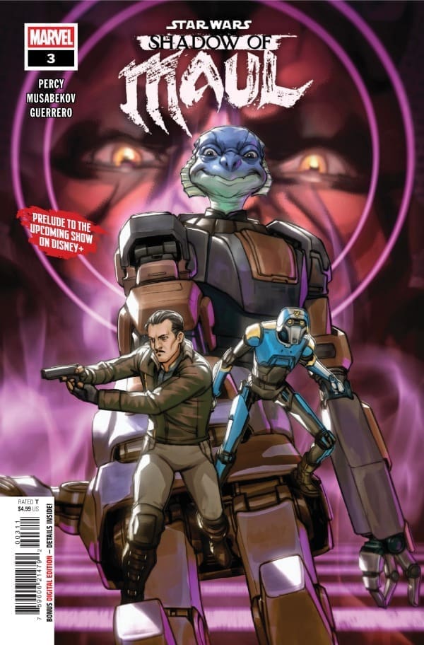
The explosive action within this issue is just that, explosive! Lawson is being investigated for the loss of his newly formed team within the department. I agree that the scope of the situation is disreputable. As well as the members of the team (introduced to in earlier issues). After only having this new squad for a few days, it is quite skeptical that they have already been taken out. Causing an explosive reaction between Lawson and internal affairs!

The final pages of this issue will leave readers in utter dismay! Questionable team-ups and stomach-turning interrogation tactics are on display. Readers need to focus on the fact that this mini-series takes place before the hit Disney+ show Maul: Shadow Lord. It is within this issue that some events within the show start to make sense. As well as making readers who have watched the show connect dots that they previously did not notice.


The Writing

Benjamin Percy brings yet another amazing Star Wars story to the fans! The levels of drama and mystery within this issue will hook readers into wanting more. There are some comedic undertones as well within the narrative from Lawson, which had me snickering while reading. The script for this issue is mapped out so methodically to have readers worried about a certain event, forgetting that there is two folds to this story. Amazing work! I can’t wait for the final two issues!

The Artwork

Madibek Musabekov and Luis Guerrero continue their astonishing art for this series! These two do an amazing job capturing the true essence of Star Wars, its architecture, galaxies, ships, and people. The pencil work is so clean, while the coloration really brings it home with dark tones and shading to elevate the narrative and setting of the planet Janix. Truly a beautiful piece!

Joe Caramanga provides the lettering for this issue, and I am always in awe of his work. Lettering is a craft, just like art and writing. You could have a good issue with just two of the three… But this issue gets all three categories checked off! Narration and dialogue are easy to read and understand, especially with added coloration to narration bubbles to distinguish who is speaking. As always, Joe does an amazing job!
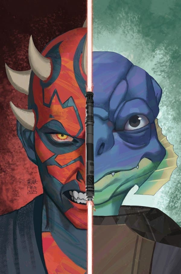
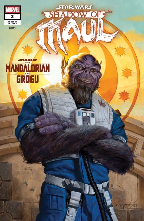
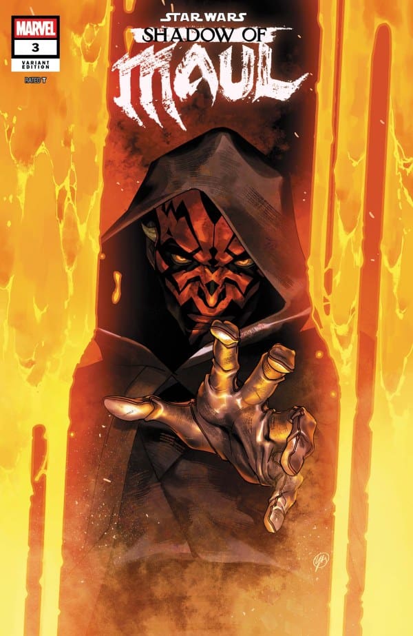
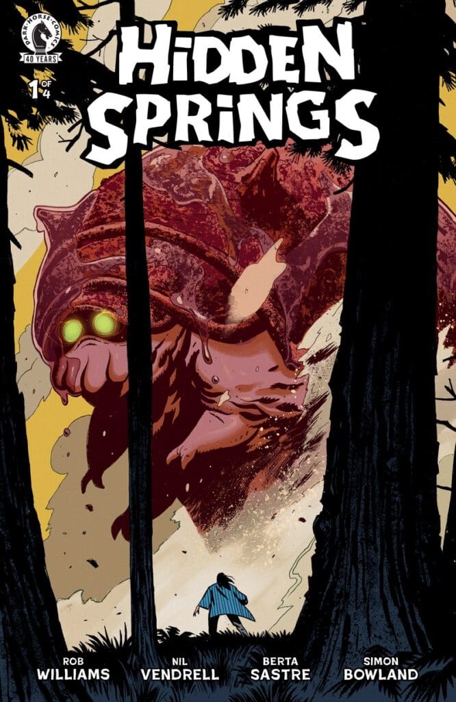
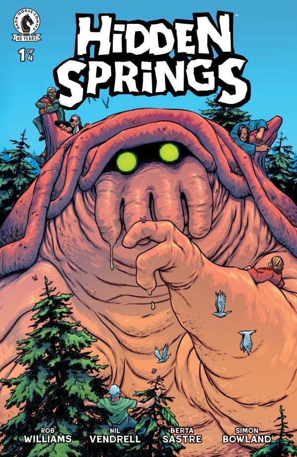

Variant Covers


Final Thoughts

Issue three of this five-part story is a wonderful stepping stone to the series conclusion in the next two issues. This story provides an informational backstory to events that take place in the TV Series Maul: Shadow Lord. Everything about this series makes it worth collecting. The script is on point, the art magnifies the script, and the lettering makes this easy to follow along. I do want to stress again that this series is a prequel to the TV series. Readers are given a deeper backstory than what is given within the show. Do not miss out, get this series now!

Grade: 10/10


Links

Comic Book Reviews & Entertainment News: Nerd Initiative
Previous Shadow of Maul Review: Star Wars: Shadow of Maul #2 – Game Tactics
Travis’ NI Portfolio: TravisComicHaven – Nerd Initiative
Travis’ Personal Content: Travis’ Comic Haven


PLEASE SHARE YOUR THOUGHTS IN THE COMMENTS SECTION BELOW!

Leave a Reply

This site uses Akismet to reduce spam. Learn how your comment data is processed.

“Something is Killing the Children#47” Review – Tough Choices, Strong Wills

In last month’s issue, writer Werther Dell’Edera brought us just a bit deeper into Erica’s past while Jessica continued to unravel. In the latest, he shows us just a bit more while young Jessica learns some of the harsh truths of the job. Take this ride with me as we go through this week’s new issue of SIKTC, spoiler-free!

Writer: James Tynion IV
Artist: Werther Dell’Edera
Colorist: Miquel Muerto
Letters: AndWorld Design

Source: Werther Dell’Edera, BOOM! Studios

Someone’s Killing the Writing

Tynion must’ve been given a dare because he somehow unpredictably upped the ante. Despite this being a flashback, he somehow kept readers gripped and engaged, fearing for the characters’ safety in the past. This issue was a true page turner from start to finish, keeping me on the edge of my seat while further proving that the monsters aren’t always the scary thing in the dark. Sometimes, they can be the person next to you or something inside yourself if you let it.

There’s a throughline message here that I absolutely love and feel I, as well as anyone else, can relate to: darkness can consume any of us, but when it tests us, we need to keep our hearts strong, lest we let the monster take hold. This message, along with Tynion’s testing of it, continues to drive the plot forward in ways I never thought possible, and I’m so glad he’s taking things this way! At almost fifty issues in, plus spin-offs, he continues to prove that the gas tank isn’t empty yet and there’s so much more to explore in this world. I, for one, am more than excited to see where things go from here!

Source: Tula Lotay, BOOM! Studios

Art of Darkness

Much like the writing, the art in this series continues to be absolutely incredible. The work of Dell’Edera and Muerto does nothing but perfectly accompany the writing of Tynion. Just as an example, the splash page here has got to be one of the best I’ve seen in months. How the blood is colored on the snow just looks beautiful, and the overall design is something that belongs in a museum. The characters and monster parts are framed perfectly, while the coloring and shading look just like a painting… and that’s just the one splash page. Imagine that for the whole book, and you know just how perfect it all is.

Source: Teddy Kristianson, BOOM! Studios

Final Thoughts – 10/10

From the message being told to the almost painting-like artwork, everything about SIKTC #47 is an absolute masterpiece. This deep into the franchise, Tynion and crew continue to prove that true artistry never runs out of gas and that it can always dig deeper. This series continues to be an absolute triumph!

Read more from me here and follow my socials!

Comments

Are you a fan of SIKTC? What’re your thoughts on the latest issue? Let’s discuss in the comments below!

Leave a Reply

This site uses Akismet to reduce spam. Learn how your comment data is processed.

Teenage Mutant Ninja Turtles #18 – Reunited

The story of Ujigami comes to a close. The Ninja Turtles have overcome so many obstacles within this six-part series. Will they have the “happy” ending they deserve, or will the turmoil never subside?


Creative Team

Gene Luen Yang (Writer), Freddie E. Williams II & Fero Pe (Artists),
Andrew Dalhouse & Luis Antonio Delgado (Colorists), Shawn Lee (Letterer)

Nathan Widick (Designer), Jake Thomas (Editor), Tommy Stella (Assistant Editor), Ben Bates (Ujigami Designer)

Publisher: IDW Publishing


Reunited

Issue eighteen of Teenage Mutant Ninja Turtles (TMNT) is the final installment of a six-part series entitled “Ujigami“. This short story has been an emotional adventure for readers, which comes to a beautiful end with issue eighteen. Gene Luen Yang has provided a different scope for readers of TMNT, and I hope readers have enjoyed the style in which it was delivered.

Cover of Teenage Mutant Ninja Turtles issue 18: four turtles with weapons crouch in a neon-lit room as a gigantic purple creature looms outside the glass walls.
Teenage Mutant Ninja Turtles #18, Credit IDW Publishing. Cover by Freddie E. Williams II.


Within this entire series, Gene has introduced mystical elements as well as Japanese lore to give the Turtles a deeper connection to their heritage. On top of these beautiful additions, Gene gives every issue their own life lesson for a single Turtle or the collective. This is one of the main reasons I kept reading TMNT into this new run. Add in the amazing storytelling and majestic artwork you have a recipe for comic book success!

Issue eighteen, as mentioned before, is the conclusion to this mini-series and a continuation of the events that readers left off with in issue seventeen. Things are getting out of control for the Turtles. Master Splinter has lost all but one of his marbles. New characters are added to this story, and their impact in this ending is especially poetic.

This issue is absolutely a “family affair” as the Turtles team up to not only fight, but to bring some sort of control to Master Splinter. In doing so, the Turtles are reintroduced to someone from their past, and it shocks them all to the core. This is a beautiful story of family and the importance of being there for them. Not one family in existence is perfect, and the Turtles’ family is no exception to the rule.


The Writing

Gene Luen Yang does an excellent job writing this six-part series of Ujigami. You can feel every emotion within the panels, ranging from happiness to rage. Gene Luen Yang is bringing a unique perspective to these iconic Turtles. Drawing more attention to their Japanese roots and a different backstory. Gene’s writing style is very emotional within this TMNT run, and I’m here for it! He (Gene) really focuses on each Turtle’s personality with a fine-tooth comb, so readers can relate to each Turtle. The plot for this six-part series is packed with so much ethos and pathos, which will make readers get lost within the pages.

The Artwork

The art team for this entire mini-series needs to stick together for as long as they can! Freddie E. Williams II provides spectacular pencil work! It reminds me of earlier TMNT art with more modern tones and definition. This captures the emotional details within panels so well! The coloration for this series has been amazing as well! Bringing to readers a gripping combination of bright and faded scenes that keep readers on their toes while reading. The splash pages are engulfed with so much detail that readers need to take time while reading to take in all the challenging work that goes into those pages. Beautiful work!

Shawn Lee completes this series with his lettering. The font selection is spot on in terms of size and readability. A range of styles is used depending on the panel and which character is speaking. The use of bold text also gives a powerful tone to impactful dialogue as well. The placement of the comment bubbles is meticulously arranged, giving ample space for the art to tell the story. Great work!


Variant Covers

  • TMNT comic cover: four turtles in midair battle in a neon city at sunset; masks blue, purple, orange, red; wielding swords, bo staff, sai, and nunchaku.
  • Front cover of Teenage Mutant Ninja Turtles comic featuring four turtles in rain, ready for battle, wielding swords; bold title at top.

Final Thoughts

This entire creative team has created an authentic TMNT story that true fans will enjoy. It provides so much detail into their new backstory that even new readers of TMNT will find enjoyment in this run. This issue is the conclusion of the mini-series, leaving issue nineteen wide open for an epilogue story. I say that because issue twenty is going to be the start of a new story! Issue twenty will also be the three-hundredth issue of TMNT! Exciting times for TMNT fans as well as new readers!

Grade:10/10!


Links

Comic Book Reviews & Entertainment News: Nerd Initiative
Previous TMNT Review: Teenage Mutant Ninja Turtles #17 – Fears Conquered
Travis’ NI Portfolio: TravisComicHaven – Nerd Initiative
Travis’ Personal Content: Travis’ Comic Haven


PLEASE SHARE YOUR THOUGHTS IN THE COMMENTS SECTION BELOW!

Leave a Reply

This site uses Akismet to reduce spam. Learn how your comment data is processed.

“Hidden Springs #1” Review – A Monstrous Good Time

From writer Rob Williams (Judge Dredd, Suicide Squad) and following in the footsteps of “Iron Giant” comes “Hidden Springs”. Centering mainly on a group of formerly famous senior citizens from the Hidden Springs living home, they work together to protect a new kaiju. Will they be able to prevent the end of the world? Only time will tell!

Writer: Rob Williams
Artist: Nil Vendrell
Colorist: Berta Sastre
Letterer: Simon Bowland

Source: Nil Vendrell, Dark Horse Comics

Monstrously Good

Let me tell you right off the bat; if you like the movie “Iron Giant”, you’ll love this. Going into it, I went off the cover and fully expected a monster-filled horror romp. What I got was so much more than that. “Hidden Springs” is something that makes readers both feel good and excited. In more ways than one, I was reminded to not ever judge a book by its cover, as the monster itself feels very innocent and like something you instinctively want to protect.

Williams did an utterly fantastic job at crafting the beginning of this story and its characters. There were several times throughout where I’d go from keeling over in laughter to worrying about potential fates. Already, I can’t help but feel as if this story is going to make myself and other readers cry. To top it off, this first issue was very well paced and fun to read, helped in part by the humor and the variety of its characters. Not one character is similar to another, each having their own distinct looks and personalities, my personal favorites being Loretta, Tyrone and Bazza.

Springing Into the Art

Speaking of the characters having distinct looks, artist Nil Vendrell and colorist Berta Sastre worked together to make sure each character stood out. I absolutely love that they each have their own distinct physical differences that completely match their personalities. Not only that, but they stand out in my mind, much like how one can easily imagine Spider-Man or Superman! The individual character expressions are also very on point, giving everyone more relatability and personality.

I also really dug the overall design and how it sort of felt like looking at a classic monster movie poster. Whether it was intended or not, the line work, coloring and shading really come together to create something that’s absolutely fun to look at. There’s one page in particular that I love dearly, though I won’t spoil that here! If you want to see it, you’ll have to read for yourself!

Source: Simon Parr, Dark Horse Comics

Final Thoughts – 8/10

From start to finish, Williams crafted a genuinely great start to a so far light-hearted horror ride! A true page turner that’s sure to please anyone missing the era of “E.T.” to “Iron Giant.” The writing is coupled only by the great art and colors from Vendrell and Sastre!

Read more from me here and follow my socials!

Comments

Are you a fan of Rob Williams’ work? Are you picking up “Hidden Springs?” Let’s discuss in the comments below!

Leave a Reply

This site uses Akismet to reduce spam. Learn how your comment data is processed.

Dungeons & Dragons: The Fallbacks #3- A (Slight) Winning Edge

Dark Horse’s Dungeons & Dragons: The Fallbacks is back with Issue #3. This time around, the team is finally making some money, and the book’s creative team is here to help you see that happen in the book:

  • Writer: Greg Pak
  • Artists: Wilton Santos & Edvan Alves 
  • Colorist: Raul Angulo 
  • Letterer: Nate Piekos

Read Dungeons & Dragons: The Fallbacks #2 Review Here

Dungeons & Dragons: The Fallbacks #3 Cover A By Marguerite Sauvage (Credit: Dark Horse Comics)

I said it with the first 2 issues, and I’ll say it here: Wilton & Edvan are creating magic with the art in the series. I love that they are taking Tess and the team, and really showing what they can do within this series. It’s really amazing, and fun at the same time. I also love that Raul’s coloring and Nate’s lettering really tie the whole book together. 

There are not enough good things I can say about Greg’s writing in this book. He has really taken this group of adventurers, and really made them a story that works so well together. I love how he wrote each character as theta re in the novels, and that is quite amazing to read on the page. He also just knows how to make these characters work together in the comic, and that is amazing. 

Now, this issue sees the team working for Lady of Loudwater, which comes with their first bittersweet taste of authority. They also now have a steady paycheck, and they now also have power to make real change.  Now, they also get confronted with some injustice by way of the system they now enforce, and they have to kinda decide where their priorities now lie. Plus, we see Cazrin making a pretty shocking discovery about the White Dragon that is terrorizing the town. 

Overall Grade: 10/10– Greg and the team have just one issue left in the series, and I am very excited to see where the series ends. This comic is so good, and fans of this team and D&D will find something in it to love.

Leave a Reply

This site uses Akismet to reduce spam. Learn how your comment data is processed.

THE FURY OF FIRESTORM #2: The Nuclear Man.

To understand the path of Firestorm and how he became The Nuclear Man, we must go back to the start and learn how Martin Stein and Ronnie Raymond bonded in the first place. It’s an age-old tale of a boy who wants to impress a girl and gets in over his head. Unfortunately, both Stein and Ronnie are lost to something else, and that entity wants to ensure it stays that way.

Cover art for Firestorm: The Anatomy of a Nuclear Man, featuring a fiery-headed superhero in an orange suit surrounded by glowing atomic orbit lines.
The Fury of Firestorm #2. Credit DC Comics. Cover by Rafael De Latorre and Marcelo Maiolo.

Creative Team: Jeff Lemire, Rafael De Latorre, Marcelo Maiolo, and Lucas Gattoni.

This is a joint review by Matt of Hops ‘Geek’ News and Megan of Vigilante Vibes Podcast!

The Story:

Megan: Jeff Lemire proves that the first issue of The Fury of Firestorm was much more than a strong start, but an example of the high quality work that we can expect from this run. The second issue is impactful, it’s powerful, and it’s emotionally driven by the narration of Ronnie Raymond.

Getting a look into the past life of Ronnie, we see the self esteem issues he’s had since childhood. We can see how he’s never felt like enough. That is, until he merged with Professor Stein and became Firestorm. Lemire takes you back into the origin of Firestorm to the current story of him where he is a loose cannon in the eyes of the military. Lemire has me very excited to see what happens next in this run, and if it’s anything like what we’ve already gotten, it’ll be fantastic!

Matt: I love that Lemire is taking us a step back in this issue to build upon the story and beginnings of Firestorm as a character. Stein and Raymond have an endearing relationship, and it works to build trust with the reader, diving into their backstory, even a little bit. I can truthfully say I have no clue where this is headed as Lemire keeps things close to the chest and only gives out breadcrumbs of information. While this issue is very narrative-driven, we are still immersed in the setting as we go from past to present and find our heroes fighting for their lives. The final page has help on the way, and with the characters chosen, this is not going to be an easy fight.

The Art and Letters:

Megan: The artists capture the emotions of Ronnie in such a stellar way throughout the comic. Rafael De Latorre, Marcelo Maiolo, and Lucas Gattoni put in the work and the readers benefit from it greatly. Rafael De Latorre brings excellent detailing work to his drawings, allowing the facial expressions of the characters to tell the whole story. Marcelo Maiolo handles the coloring and makes the comic have a slow burn kind of feel to it. Starting off with more muted tones, as the story gets more and more exciting, the colors get more vibrant and eye-catching. Lucas Gattoni is a master of lettering, and this comic is no exception. Capturing the emotions of the story, Gattoni gives a great flow of dialogue that captures the reader and doesn’t let go until the ending page.

Matt: The artwork is a genuine joy to watch unfold from panel to panel as we move from a rustic newspaper-type style to a more new-age style, working within the past and present. It is telling how well the team is doing when such a detail, such as Firestorm’s face changing, can be such a sinister piece of art. I also couldn’t begin to tell you the formulas on the chalkboard, so I empathize with Ronnie as someone who hates these kinds of classes!

Final Thoughts:

Megan: 9.2/10. The Fury of Firestorm #2 continues the high quality work of the creative team. I’m very excited to see what the next issue will bring!

Matt: 9/10. This second issue of The Fury of Firestorm takes us back into the past, showing us how Stein and Raymond bonded and what their relationship was like. We are gearing up for a massive battle ahead, and I hope our heroes are up for the task!

Overall Grade – 9.1/10

Let us know your thoughts in the comments below!

Leave a Reply

This site uses Akismet to reduce spam. Learn how your comment data is processed.

SPACE GHOST Vol. 2 #11 – Dinosaurs in a Space Story?

Last we saw Space Ghost he had been plucked from time, while the kids suddenly faced an “old friend.” An old friend whose presence is never a good sign.

Writer: David Pepose;

Artist: Jonathan Lau;

Colorist: Andrew Dalhouse;

Letterer: Taylor Esposito;

Cover: Francesco Mattina;

Editor: Joseph Rybandt.

Special Thanks to Josh Anderson, Victoria Selover, and Megan Logan.

Check out a review for the last issue of SPACE GHOST.

Space Ghost Vol. 2 #11 Cover. Image by Dynamite Entertainment

The Story for SPACE GHOST Vol. 2 #11

We kick off in the cretaceous period. Hoping Space Ghost will have been worn down by some prehistoric living, the “Time Tyrants” head off (or back) to get him. Some a little more cocky than others. It all comes down to an old “foe.” One who knew better than to doubt Space Ghost, but still couldn’t help himself.

Meanwhile back in the present the kids have teamed up with grown up Jace to fight killer robots, and figure out what in the timey whimey hell is going on. As this unlikely trio works together, they uncover the root of it all. Or simply evidence, that changing the past, doesn’t exactly ever seem to work out the way it’s intended.

The Art

Whether we’re dropped in prehistoric times, or fighting giant robots, the art is all beautifully done on every page. This is a comic book with time travel, dinosaurs, and spaceships, but there’s a serious story underneath all the laughs and chaos. The art does a perfect job of capturing that. It’s got realism where needed, and some amazing explosions and insanity where needed. All while capturing those emotions on each character’s face, that is so vital to a good comic book. Inside and out, the art killed it.

Space Ghost Vol. 2 #11 Variant Cover. Image by Dynamite Entertainment

Final Thoughts

With a Jurassic size ending, and a cliff hanger, this was another fantastic issue of Space Ghost! If you’re looking for an adventure full of vengeance, space, time travel, dinosaurs, action, and more… look no further. Space Ghost #11 is a time traveling adventure with mystery and amazing build ups. While never losing sight of its humanity. I got to give issue #11 of Volume 2, 9 out of 10 Chrono Bands.

Overall Grade: 9/10

For more from Lauren, check out ‘Hops GEEK News.’

Have you checked out Space Ghost yet? Let us know your thoughts!

Leave a Reply

This site uses Akismet to reduce spam. Learn how your comment data is processed.

Magik and Colossus #4 – Love Doesn’t Mend All Bridges

Russian folklore has come to life. In Magik and Colossus, readers encounter Piotr and Illyana as they return to their homeland to try to understand why demons from Russian folklore have come to life and are starting to attack innocent civilians. As their search continues, they’re led to Koschei, the Immortal who survives by draining the magic from his victims. Trapped in Koschei’s personal coliseum, Magik struggles to save herself without depleting her energy. When Colossus comes to her rescue, the pair is forced to fight Baba Yaga.

This review is brought to you by Nerd Initiative’s Megan and Shawn!

Creative Team

Writer: Ashley Allen
Artist: Germán Peralta
Colorist: Arthur Hesli
Letterer: Ariana Maher
Cover Artist: David Nakayama

Writing

Megan: Another issue, another example of how incredibly talented Ashley Allen is as a writer. Magik and Colossus #4 continues the run with being an emotional gut punch while simultaneously showing the truly magical side of the Rasputin family. After being trapped in a magical arena, Illyana and Piotr tellported with Kaoz out of the clutches of Koschei.

However, they may not be safe quite yet as Kaoz had them teleport to one person that isn’t afraid of Koschei and that’s Baba Yaga. Illyana and Piotr’s conflict seems to dull in comparison when Babe Yaga is shown to be the sister of Koschei. From one conflict to another, Illyana and Piotr have to find a way to stop all this madness while working through their emotional madness that they internally.

Shawn: It feels ridiculous that Ashley Allen crafts stories this good, yet is somehow criminally underrated in comics. Just when I thought I had a grip on where this series was going, I got a curveball thrown to me. The fact that happened in the fourth issue of a five-issue series is a testament to Allen’s ability to weave a story. This story is beautiful and impactful when it comes to the dynamic between Magik and Colossus.

Magik and Colossus #4 cover by David Nakayama. Image from Marvel Comics

I really appreciate that Allen doesn’t shy away from the complex history of these two characters. It’s clear from the writing that losing Illyana to Limbo is one of Piotr’s greatest failures in his mind, and he will always struggle to deal with. I love that Allen crafts the almost combativeness between the siblings as they struggle to move past that failure. The dynamic plays out in some pretty satisfying ways in this issue.

Art

Megan: Germán Peralta, Arthur Hesli, and Ariana Maher make this an absolutely gorgeous comic, which continues their streak of excellence in the comic run. Peralta draws the characters bold and beautifully, allowing each character to shine in their own light. What I really appreciated was how he was able to capture the horror of Baba Yaga but then switch to the calmness of her in her human form on a dime.

Hesli works off Peralta’s drawings so well, capturing the horror aspect and really driving that theme through the story with his work on the colors. Maher captures the emotions of the characters perfectly through the dialogue, allowing the reader to experience the tones of the story expertly.

Shawn: Germán Peralta did an absolutely amazing job with this issue. Not only are Magik and Colossus captured perfectly, but Baba Yaga is both terrifying and beautiful. The battles are so well drawn that they feel lifelike.

Arthur Hesli just picks the perfect color for each panel of this issue. Every color feels meaningful. As the narrative develops, Hesli provides some very unique ethereal looks for the panels. The colors are bright when they need to be and muted when it helps better set the scene. Ariana Maher’s lettering feels really well-sized for this issue. Despite a complex narrative in this issue, Maher’s work makes the story easy to follow.

Final Thoughts

Megan: 9.5/10. I’m so disappointed that this story will be concluded in the next issue because Ashley Allen has made this mini series an emotional roller coaster that’s packed with action and magical goodness. If you haven’t checked out Magik and Colossus yet, it’s never too late! Head to your local comic shop and pick up the comics!

Shawn: 9.5/10 We are finally seeing some of these threads start to come together. This whole series has been immaculate. This issue feels like a meaningful exploration of the siblings’ relationship and the loss that will always be a connection between the two. Magik and Colossus could not be more opposite, but this creative team tells their story in a way that develops the characters and provides a satisfying narrative.

Overall Grade: 9.5/10

What did you think of Magik and Colossus #4? Let us know in the comments

Leave a Reply

This site uses Akismet to reduce spam. Learn how your comment data is processed.

BARBARA GORDON: BREAKOUT #1: Kangaroo Court.

Vandal Savage’s reign of terror across Gotham has set his sights on the Bat Family. Throwing all of his enemies in Supermax, Barbara has gotten herself arrested to be the man on the inside, helping out anyone wrongfully imprisoned. Unfortunately, Barbara’s worst enemies are also in the prison, and she is on her own with no mask and no backup and a giant target on her back. How long can she survive on her own?

Barbara Gordon Breakout #1. Credit DC Comics. Cover by Karl Kerschl.

Creative Team: Mariko Tamaki, Amancay Nahuelpan, Tamra Bonvillain, Ariana Maher, and Karl Kerschl.

This is a joint review by Matt of Hops ‘Geek’ News and Megan of Vigilante Vibes Podcast!

The Story:

Megan: Following the intense story of Batman #9 by Matt Fraction, we now see Barbara’s point of view from inside Supermax. Barbara already has a target on her back with being the new girl, but once the other inmates find out who her dad is, that adds a whole new layer of danger. Barbara shows the others pretty quickly that she isn’t one to be messed with, but it seems that the other inmates aren’t the only ones she has to worry about. The guards are made up of ex cons that her dad personally arrested. With no way for the Bat-Family to rescue her from the prison, Barbara has to figure out how to keep herself safe all on her own.

There’s so much in this comic to enjoy. Seeing Barbara, who’s an iconic character in her own right, being put in this position is terrifying, but seeing how she handles herself is powerful. Mariko Tamaki does a beautiful job as nailing the intensity of the story and continuing Barbara’s story from Batman #9.

Matt: I am loving this take on Barbara, who has always been a strong and amazing character in the Bat Family. Mariko sets her up to be in prison, and there are familiar faces off the bat, such as Die, the daughter of Two-Face, who has immediately set her sights on Barbara. The way her inner monologue is written gives us insight into her plan and showcases how fearless and badass Gordon is. There are some intense fight sequences as Barbara shows off her skills, and you cannot help but cheer in the moment. The cheers are short-lived because the final page of the issue casts a massive shadow, and it’s the first time we see her truly terrified since being thrown into prison. I love how this first issue played out and am sold on this run already.

The Art and Letters:

Megan: Amancay Nahuelpan, Tamra Bonvillain, Ariana Maher perfectly capture the grittiness of the story which I think pushes the depths even harder. Nahuelpan brings excellently detailed drawings mixed with abstract backgrounds that allow the characters to be the perfect focal points. Bonvillain is able to capture the loneliness of prison with the darker colors, but still have a beautiful array of vibrancy throughout the comics. Maher keeps a very tense and even inner dialogue of Barbara, even when there’s heightened energies all around her. All in all, the artists really knocked this out of the park!

Matt: The artwork is extremely well colored, as Bonvillain paints the prison in such a desolate and helpless setting. The sands are lifeless, and the orange jumpsuits jump out from the panels. Amancay draws up beautiful fight sequences with a swiftness and just enough of a punch to each hit that leap from the panels. I love how fierce Barbara is drawn, and you can see how determined she is. It makes the final page stand out that much more when she sees something in her cell that strikes fear into her. Maher’s letters take us into Barbara’s mind and show us how confident she is when entering this unknown.

Final Thoughts:

Megan: 9.1/10. I found Barbara Gordon: Breakout #1 to be a breath of fresh air when it comes to Bat-stories. Seeing all of this from Barbara’s perspective was fasicanting, but to also see how truly alone she was in a place that’s full of people who are working against her was impactful.

Matt: 9.5/10. Barbara Gordon: Breakout #1 is an excellent first issue that shows us how far members of the Bat Family are willing to go in order to protect their city. The team sets the tone instantly with this first issue, and I am really excited to keep reading!

Overall Grade – 9.3/10

Let us know your thoughts in the comments below!

Leave a Reply

This site uses Akismet to reduce spam. Learn how your comment data is processed.

Geiger #23 – A Glimpse of Hope

Geiger #23 from Ghost Machine comics is out today. Last we saw the glowing man, Malcolm North gave him something he thought impossible: his family back. Or did he?

Creative Team

Creators: Geoff Johns & Gary Frank;

Color Artist: Brad Anderson;

Letterer: Rob Leigh;

Editor: Brian Cunningham;

Designer: Steve Blackwell;

Covers A Art: Gary Frank & Brad Anderson;

Cover B Art: Francis Portela & Brad Anderson

Cover C Art: Lee Ferguson & Brad Anderson.

Check out the review for the last issue of Geiger by CLICKING HERE. For an interview regarding the current story and future of Geiger, CLICK HERE.

Geiger #23 Cover from Ghost Machine Pro at Image Comics.

The Story for Geiger #23

“History has always burned. Not every fire is arson.” That is an ice cold line to tell a man who lost everything in the Unknown War. Yet, it’s the truth.

Tariq Geiger had seemed to accept that his family was gone, until Malcolm North gave him hope. Hope can be a wonderful thing, however, it an also drive someone insane. Having seen his wife and kids for the first time in years… alive, Geiger seems to have been reborn. Still not sure who or what is behind everything, his mission now seems very clear. Despite having no real direction.

Geiger #23 Variant Cover. Image from Ghost Machine at Image Comics.

The Art

We got some awesome glowing man action, some beautiful time travel details, and we got a lot of emotion. While every page was (as always) beautifully done, a highlight for me in this issue was Tariq Geiger’s face. So much can be conveyed with an expression, and his expressions in this issue were pure. It’s not too often a comic will really pull at my heart strings, but damn if I didn’t have to dab my eyes reading this issue. The face of a man who has been brave and defeated for too long, suddenly is at peace. At least for a moment.

Final Thoughts

The plot thickens, as more questions arise! Geiger truly gets better with every issue. I have loved the duo of The Glowing Man and The Northerner. Plucked from very different time periods, and realities, yet very similar. I absolutely cannot wait to see where we go next. I have so many questions, and am absolutely loving how this story has developed and intertwined with other comics from the Ghost Machine world.

If you haven’t picked up a Geiger comic, yet there is no time like the present. I got to give this issue another 10 out of 10.

Overall Grade: 10/10

For more from Lauren, check out ‘Hops GEEK News.’

Have you checked out the world of GHOST MACHINE? Are you a Geiger fan? Let us know your thoughts!

Leave a Reply

This site uses Akismet to reduce spam. Learn how your comment data is processed.