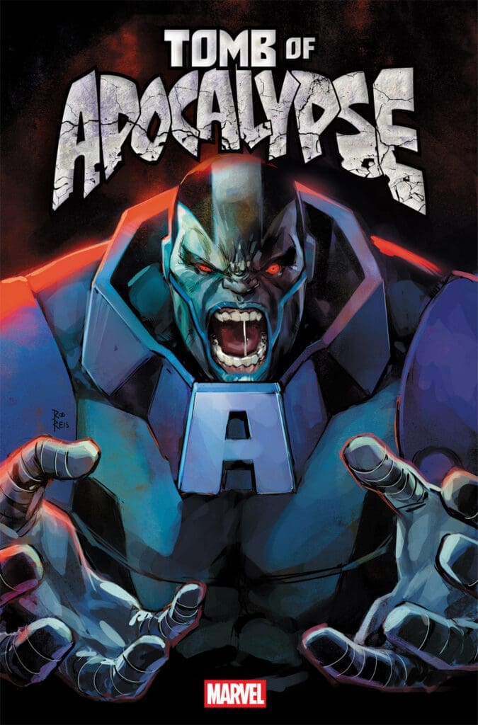
Tomb Of Apocalypse #1 Cover A By Rod Reis (Credit: Marvel Comics)
Magik & Colossus Writer Ashley Allen and Moon Knight: Fist of Khonshu Artist Domenico Carbone are teaming up on Tomb Of Apocalypse. Now this story starts off:
“When an unknown device from Mars crash lands outside the X-Men’s home at Haven House, Jubilee answers the call in a bid to prove herself as more than just a babysitter for the Outliers. Activated by her mutant powers, the device sends both Jubilee and Wolverine across the world to a desert outpost in Egypt being excavated by armed mercenaries – the Tomb of Apocalypse! As they descend deep into the earth to uncover what Apocalypse has planned for humanity, mutantkind, Earth and Arakko, they’ll discover they’re not alone as they cross paths with long-time allies Rictor and Shatterstar.”
Both Ashley and Domenico are pulling from X-Men storytelling and long-simmering plot points across multiple eras of mutant history to light the way forward with Jubilee and Wolverine leading the charge. Now the book’s official description reads:
“ANCIENT AND UNFATHOMABLE POWER!
From his exile in space, the shadow of the mutant called APOCALYPSE looms over all life on the pale blue dot from whence he hailed. Once dedicated to ensuring the strongest and fittest mutants would inherit the Earth, now Apocalypse’s attentions have turned to a new deadly undertaking – for which he will need the unique abilities of…JUBILEE and WOLVERINE!”
Writer Ashley Allen mentioned this about the comic:
“For Earth’s mutants, it has taken time to regroup and process the fall of Krakoa. But unfortunately for our heroes, Apocalypse values action. And he’s never been one to miss out on an opportunity.”
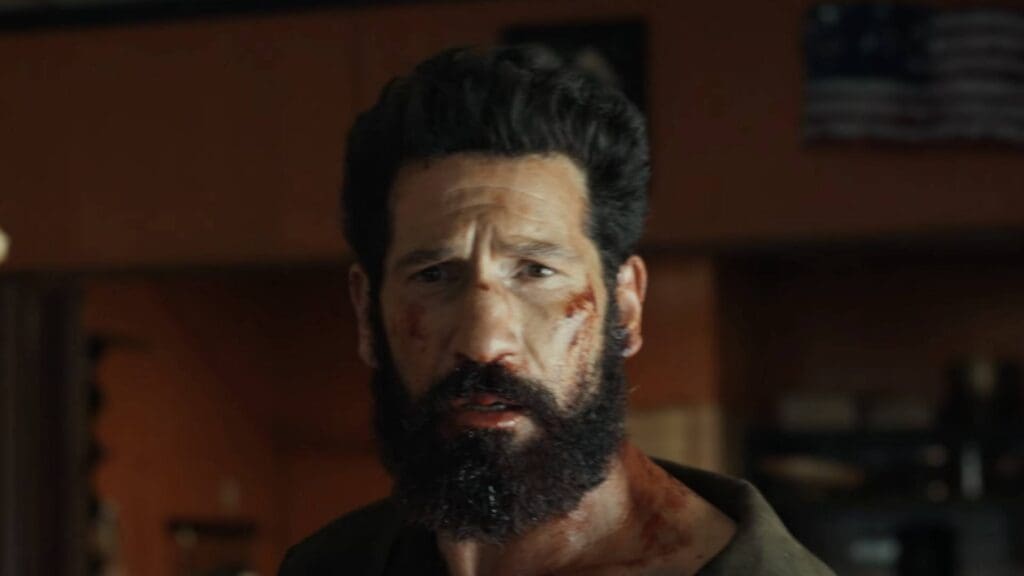
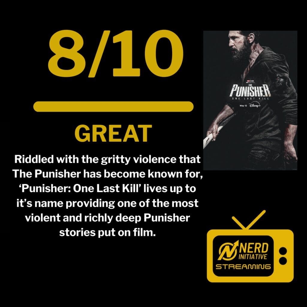
When Disney announced a new Punisher One-Shot for Disney+, fans were concerned that the iconic Frank Castle would get the classic Disney family friendly reimagining. Rest assured, Frank will not be doing his own rendition of “A Dream is a Wish Your Heart Makes.” Instead, Castle is every bit as violent as the titular character deserves. While it would be easy to get lost in the blood and gore, ‘One Last Kill’ delivers on a deeply tragic and dark narrative. This is easily one of the BEST specials Marvel has produced. Riddled with the gritty violence that The Punisher has become known for, ‘Punisher: One Last Kill’ lives up to it’s name providing one of the most violent and richly deep Punisher stories put on film.
Coping with the trappings of PTSD, Frank Castle has seemingly fallen off of the face of the planet after taking out the Gnucci Crime Family, descending the New York neighborhood that Castle is living in into outright violence. Leaving one member of the family alive, Castle finds himself going toe to toe with the matriarch of the Gnucci family, Ma Gnucci. What follows is genuinely one of the darkest hours of television to bear the Marvel moniker. While many will argue that it could have gone on longer, and it could have, ‘Punisher: One Last Kill’ has absolutely placed itself at the head of the table of Marvel Entertainment.
Jon Bernthal in ‘Punisher: One Last Kill.’ Courtesy of Marvel Studios.
The World In Tatters
For The Punisher to work, Marvel had to create the perfect setting. The filmwork needed to be dark, the action: violent. Marvel nailed this aesthetic beautifully. The neighborhood from the word go was a haven of chaos. This one-shot classic sets the tone early, showing the audience that this was not Spider-Man’s New York City, but darker (Rest in Peace that guy’s dog). Castle to his credit is trapped in the hellscape of his own mind, which mimics the streets of the New York neighborhood. Both are truly a piece of hell in a neighborhood that is circling the drain.
From Castle dealing with his own mental health and the consequences of his actions, ‘Punisher: One Last Kill’ was a mile a minute gorefest that felt like it should’ve been longer, but when put in the context of a One-Shot comic book, it makes perfect sense. The show does a lot in a very short amount of time. What ‘One Last Kill’ does the best, however, is set up the future of the MCU. Audiences know that Castle will make his next appearance in ‘Spider-Man: Brand New Day.’ What will the version of Frank post-‘One Last Kill’ be like and how will that fit into the less gritty world of Peter Parker? While that has yet to be seen, the set up is crucial and ‘Punisher: One Last Kill’ provides the perfect alley for Spider-Man to oop come July.
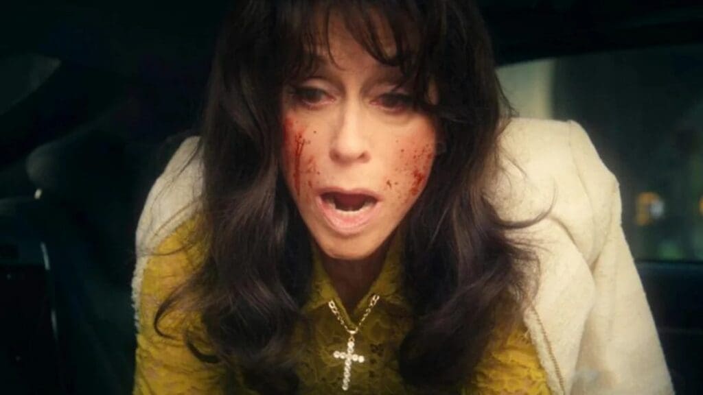
Judith Light in ‘Punisher: One Last Kill.’ Courtesy of Marvel Studios.
Crime & Punishment
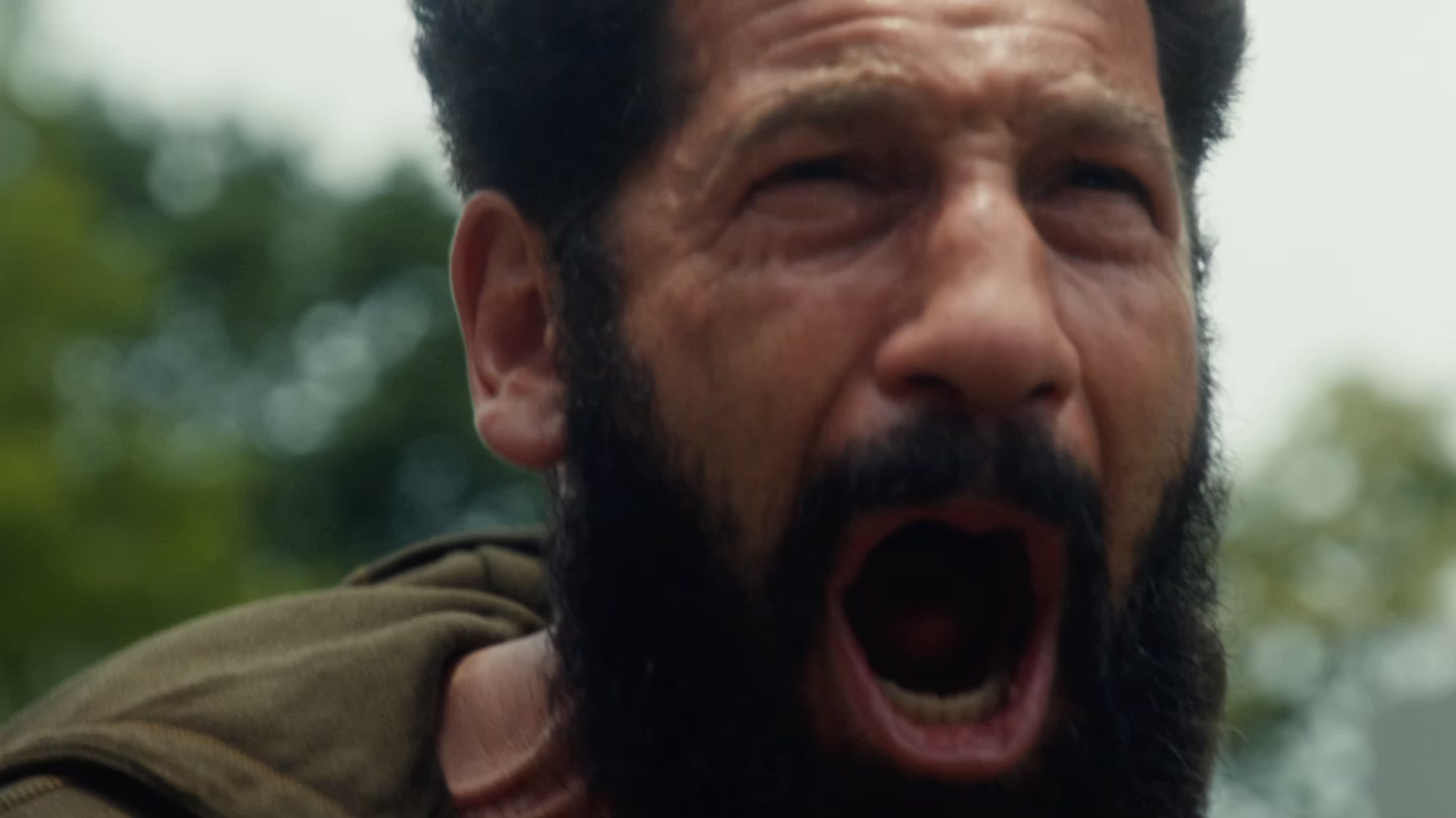
There is only one person who was specifically put on this planet to play Frank Castle. That individual goes by the name Jon Bernthal. Bernthal put on an absolute masterclass of dramatic and action-packed acting. The audience could feel rank’s torment, feel his pain. It should be noted here that Bernthal pulled double duty, writing this episode as well. Bernthal’s approach to Castle’s mental health and trauma was gutwrenching. Jon Bernthal gets who, and most importantly, WHAT The Punisher is and that will pay in dividends if Marvel continues to push this character.
A hero, or rather, anti-hero is only as good as his villain. Judith Light matched Jon Bernthal step for step, going toe to toe with Bernthal’s Castle with her venomous portrayal of Ma Gnucci. Light presented not only Gnucci’s search for vengeance, but she portrayed it sympathetically. Gnucci is the perfect foil to Castle. As the audience and fans of Marvel, we should be thankful that we got to watch Light and Bernthal spar with one another. This most certainly will not be the last we see of Light’s Gnucci.
Jon Bernthal in ‘Punisher: One Last Kill.’ Courtesy of Marvel Studios.
Final Thought:
While it most certainly could have been longer, which seems to be the biggest criticism, ‘Punisher: One Last Kill’ did everything it was supposed to do: set the next stage for what comes next in the MCU and deliver a dark, violent and gritty outing with The Punisher. ‘One Last Kill’ provides that in droves. It’s certainly not without it’s faults, but Marvel has provided what should be the template for every one-shot that comes after ‘One Last Kill.’
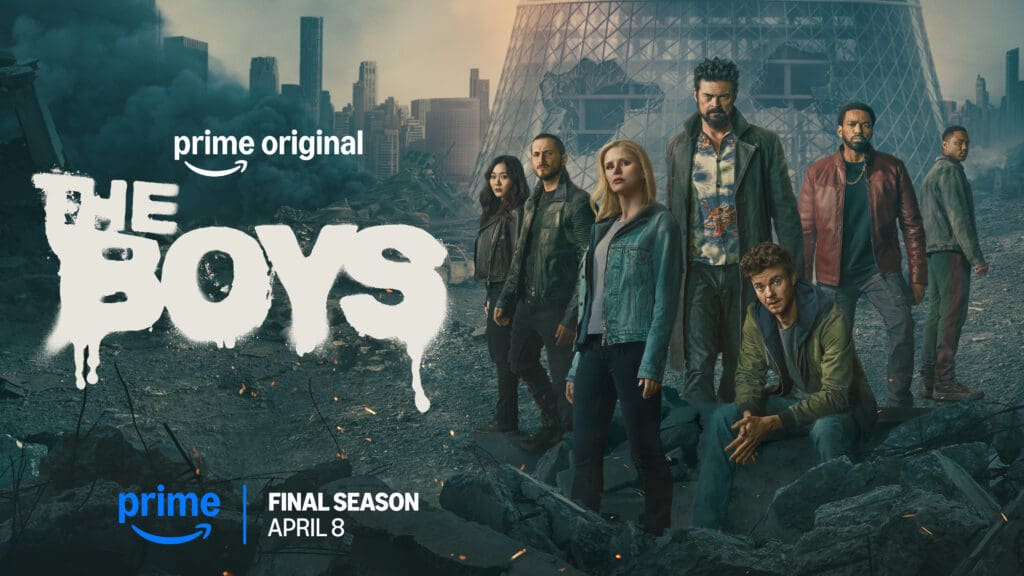
The penultimate episode of THE BOYS on Prime Video just dropped, and a lot went down. How they’re going to wrap this all up in one last episode I haven’t a clue, but I can’t wait to see it. If you’re avoiding spoilers, check out my spoiler-free review of the first 7 episodes. However, if you have watched “The Frenchman, the Female, and the Man Called Mother’s Milk” it’s safe proceed. If not, then here’s your cue to run like Butcher just told you run.
***WARNING: SPOILERS AHEAD***
Image courtesy of Amazon MGM Studios
Last Seen on THE BOYS
After a quick and eventful trip to a Vought retirement facility, Bombsight was reunited with Goldie. Meanwhile, the Legend dropped some truth on Homelander (who let him live), Sage attempted to pit Soldier Boy against his son, Annie faced Oh Father for the first time in years, and the Deep sent Noir #2 to sleep with the fishes, after killing half of them. We wrapped up last week with a sweet moment between two centurions, and a father and son bonding moment. After Soldier Boy depowers Bombsight so he can live his happily ever after, he hands the V1 over to Homelander. Now unstoppable the boys have no choice but to run.
Episode 7: “The Frenchman, the Female, and the Man Called Mother’s Milk”
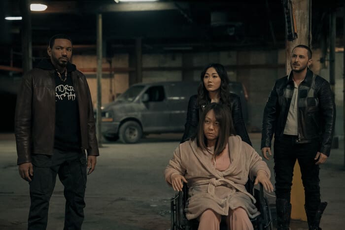
After an amazing musical number by Oh Father (Daveed Diggs), we’re back to the main objective. The ultimate goal has always been to take out Homelander. Plan after plan has failed. After getting a virus together that could take out the cape loving asexual weirdo, it all goes to hell in one moment. With the V1 in his system, he’s immune to the virus like his father before him, and the boys are back to square one. With footage of Soldier Boy being experimented on in Russia, and Sage reluctantly now on their side, they decide they’ll make their own Soldier Boy with a f***** up chest blast: Kimiko. They get to work. However, their work is interrupted.
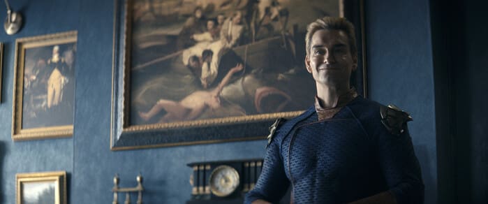
Homelander prefers to be loved
With Homelander now having obtained the ultimate power physically, mortally, and politically, his next goal… to be truly loved. Something he has said he prefers. We saw this in season 1. Him and Madeline Stillwell had a very interesting relationship, but she was always scared of him. He was unaware. The second he learned this, she was instantly dead. While he clearly still mourns her, and views her as a literal angel, he deeply needs to be loved more than anything or anyone, and now we know why there was a wall full of pictures of psychic supes. He’s testing those who claim to love him.
One of those people was the president of the United States. He was living on borrowed time. His death most likely didn’t shock anyone with the trailer showing a scene of Homelander sitting in the Oval Office, but it was still a mind blowing moment. If you’ve read The BOYS Comics from Dynamite Entertainment, that seemed like a fun nod as well. He probably should have stuck to making Manhattans.
We finally learn where the kids from Gen V have been. Annie is keeping them benched, but still useful. Later as the anti-Starlighters are rescued by Starlight, we get a bitter sweet moment with Marie and Jordan from Gen V. The scenes with these two should have been a Leonardo DiCaprio moment to anyone who watched the spinoff, but with the recent cancellation of Season 3, that moment felt more bitter than sweet. Supposedly there is still a future for them in THE BOYS universe, so I hope to see them, and the others, again.
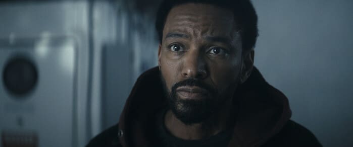
As someone who read the comics I always wondered how they were going to handle Marvin Milk’s nickname: Mother’s Milk. In the comic book, his mother was exposed to an unstable form of Compound V before he was born. When she weaned him as a baby, he began to get very ill. So she began nursing again, and he was suddenly healthy and thriving. After a few times of attempting to wean him, she realized without his “mother’s milk” he wouldn’t survive. This continued into adulthood.
It was clear they weren’t going to follow this for the show, but they still gave him the nickname. I loved how it was spun. Marvin simply owned a nickname/insult he was given for being caring, and saving a pigeon. This season we’ve seen a side of M.M. that feels off. He didn’t leave with his wife and daughter, and now his whole life is the mission. He’s lost that hope that made us all fall in love with him in season 1. As he tells the origin of his nickname, we see the old M.M., not the one ready to commit mass genocide. He’s trying to give Annie back some hope, but he seems to give himself back some too.
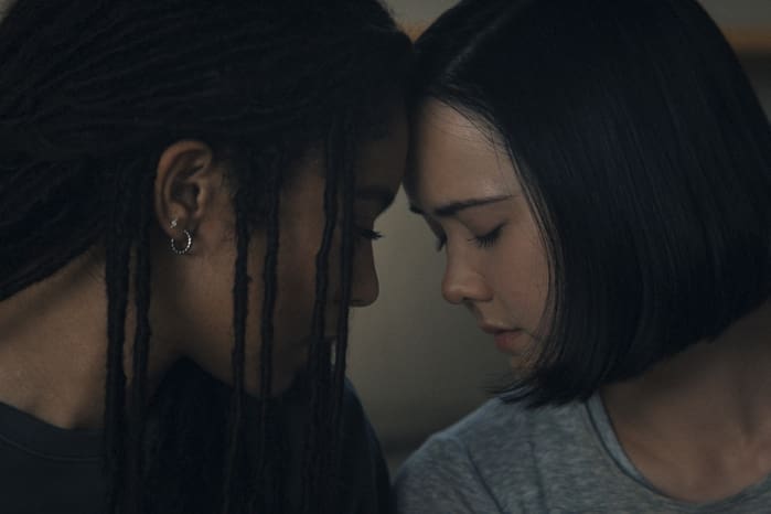
Wow. This was gut wrenching, but beautiful. We were warned that no one was safe, and Kimiko and Frenchie were seeming a little too happy and hopeful to have a future. However, Frenchie was able to do the one thing he truly wanted: save Kimiko. In episode 5 we see him stressed over the fact he almost killed Terror. How could he ever keep 3 kids and a dog alive. A future Kimiko wants. In the end Frenchie saved Kimiko’s life, but she saved his soul.
Frenchie was the only one who saw her as a person early on, and I loved watching their story evolve as they both want to make up for the horrible things they’ve done in the past. Kimiko has done nothing but shine this season, and every sweet moment she had, the Frenchman fell even more in love with the Female. Now we wait to see if Frenchie’s experiments on her worked. I also wonder if she’ll suddenly no longer be able to talk again. Even this season when her emotions have gotten overwhelming we’ve seen her revert to sign language. Will she see red for now, and grieve later? She’s not one to give up, but picking your heart up off the floor is no easy feat.
This scene ends episode 7, and we hear the song, Dream a Little Dream of Me. This was the same song Kimiko imagined herself singing back in Season 3 before she got her voice back.
To end on a happier note, this one is for all the Supernatural fans. As Soldier Boy packs his bags to enjoy coke and women, Homelander is not having it. He wants his milk, and his dad too. As he tries to stop him, Soldier Boy responds:
“This was never gonna be a playing catch in the front lawn, fixing up the old impala bullshit”
Sadly this, combined with Soldier Boy telling Homelander he’s not God, leads to Soldier Boy once again getting the Sleeping Beauty treatment, but I definitely had my Leo moment there pointing at the TV.
For those who haven’t seen the show Supernatural Jensen Ackles stars in it, and Eric Kripke (the showrunner for THE BOYS) created it. Ackles’ character, Dean Winchester drives a 1967 Chevy Impala. However, this is not an ordinary car in the show. It’s a character named ‘Baby.’ She’s in all 15 seasons and even had an episode that took place completely in the car, called “BABY.” When the show wrapped, Ackles took Baby home. With multiple Supernatural alum behind the camera as well as in front of it, I’d love to know if Impala was in the script, or if it was changed on set, and who made that call. No matter what I got to imagine Soldier Boy once drove an Impala.
Now we wait to see how this series wraps up. I was already nervous, but with the title “Blood and Bone,” I’m even more worried. Kripke ended his 5 year story arc on Supernatural perfectly, and I have faith he’ll nail it again. Or he’ll nail Homelander to a cross. At this point who knows. With real life mirroring the show so terrifying well I’m almost hoping for an unexpected happy ending.
However, I do wonder… where is Ryan, will someone wake up Soldier Boy? Will the Deep and Ashley manage to survive another season? Will the Deep ever set flipper in the ocean again? Will Sage ever get to read a book in peace??? Will Homelander survive? How close (if at all) will they follow the comic book ending? Will Butcher ever get to meet the Spice Girls? I have so many questions.
Overall Grade: 9.5/10
While this one hurt, it was beautifully done. I got to give this episode 9.5 bottles of Mother’s Milk out of 10. Until next week, God Bless Homelander.
For more coverage on THE BOYS including interviews with the cast, post show reactions, and comparisons to the comic books from Dynamite Entertainment, head to our YouTube playlist, ‘Saturdays are for The Boys.’
What happens when Doctor Strange finally sees a path back to Midgard? Is it too good to be true? Have his adventures in Asgard truly run their course? With Strange unable to remember what the other half of his deal was with Vyrbodin, will there be a greater threat on the horizon? Magic users across the Nine Realms have turned up dead. A magician here, a skald there, a wizard somewhere else. One by one, they are found dead. With Stephen Strange now a magic user across two worlds, is he the next target?
This review is brought to you by Nerd Initiative’s Shawn!
Creative Team
Writer: Derek Landy Artist: Ivan Fiorelli Color Artist: Dono Sánchez-Almara Letterer: Cory Petit Cover Artist: Alex Horley
Writing
Derek Landy really ramped up the action in this one. I’ve enjoyed this entire series, but I really enjoyed seeing the narrative of this issue. The impact of seeing three of the most powerful Sorcerer Supremes in the Marvel Universe together was astounding. I’m intrigued by this new antagonist. One thing that I’ve really appreciated throughout this series is that Landy has not been afraid to take chances and try something new. He hasn’t really done anything that has shaken the core of Doctor Strange lore, but has toyed with new ways to see how it can be viewed and impacted. This new antagonist feels like the latest entry into that.
Every time I think I’ve figured out all the wrinkles in Landy’s story, a new one reveals itself. That’s how this issue felt with both seeing Vyrbodin again as well as this new antagonist. This issue feels both satisfying and full of promise which serves as a testament to the quality of writing that Landy put into this issue.
Art
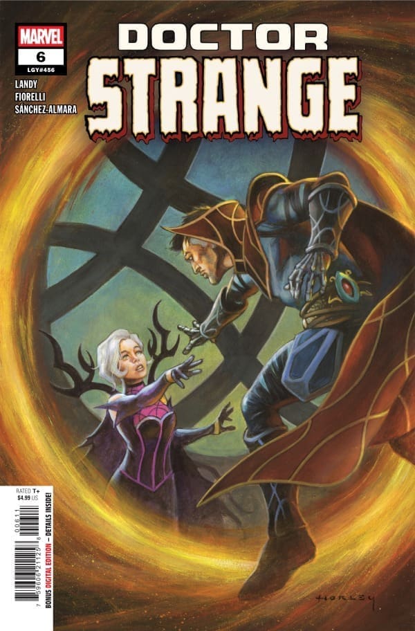
Doctor Strange #6 cover by Alex Horley. Image from Marvel Comics.
Ivan Fiorelli continues to stun. It was amazing and spectacular to get to see him finally draw Clea and Stephen together in panels. The work with Fiorelli’s lines and shading this issue really stand out. Vrybodin’s face and the subtle yet distinct lines add depth to the character and a weight that only the recognizable face of age can provide. Fiorelli does a superb job. All three Sorcerer Supremes are expertly drawn.
Dono Sánchez-Almara does a wonderful job with colors. This was not an easy issue to color. As exciting as three Sorcerer Supremes are narratively, the idea is a nightmare for a color artist, as all three have distinct palettes that aren’t complementary to each other. Sánchez-Almara handles this with the skill of a surgeon, coloring scenes where each of the characters appears together in a way that is so visually appealing. Cory Petit helps readers keep track of each character and the overall narration making it easy to follow the course of the story.
Final Thoughts
This is everything you would want in a Doctor Strange story. There’s magic, a compelling story, and beautiful art. This issue feels like it could set the tone going forward. It brings in relevance from the previous arc and adds weight to it. This issue set a fire in my bones that I’m ready to see grow.
Overall Grade: 10/10
How are you liking this Doctor Strange series? Let me know in the comments
The battle rages on. In Ultimate Endgame #4 two groups struggle to defeat the maker. Inside of the city Iron Lad, Doom, Spider-Man, and America Chavez all battle against the Maker. The problem? The Maker isn’t just a person but the city itself. With the Immortus Engine no more, the Maker is free. After manipulating Doom to find the group, the Maker has taken the life of Spider-Man. On the outside, Captain America, Storm, and Black Panther all fight to turn the tide.
This review is brought to you by Nerd Initiative’s Shawn!
Creative Team
Writer: Deniz Camp Artists: Terry Dodson, Rachel Dodson, Jonas Scharf Color Artists: Terry Dodson and Edgard Delgado Letterer: Cory Petit Cover Artist: Mark Brooks
Writing
Okay, time to stop and breathe. That was a lot to take in. Deniz Camp is crafting a really cool narrative with Ultimate Endgame that even I don’t fully grasp. This is deep. The Maker is undeniably evil. In this issue, bigger events are set up but Camp really gives us action on every page. The bread crumbs that have been left across the Ultimate universe are finally starting to lead down a path from Camp.
This issue feels like easily the heaviest so far, and that’s saying a lot since the last issue ended in the death of Spider-Man. This issue makes it feel like Camp really wants readers to feel the depth of helplessness that our heroes feel. Even where there is a brief respite from what feels like almost certain defeat, it still feels like you’re waiting on the other shoe to drop. That might not be for everyone, but I love that Camp is crafting a narrative where you truly begin to wonder if maybe victory just isn’t in the cards for these heroes.
Art
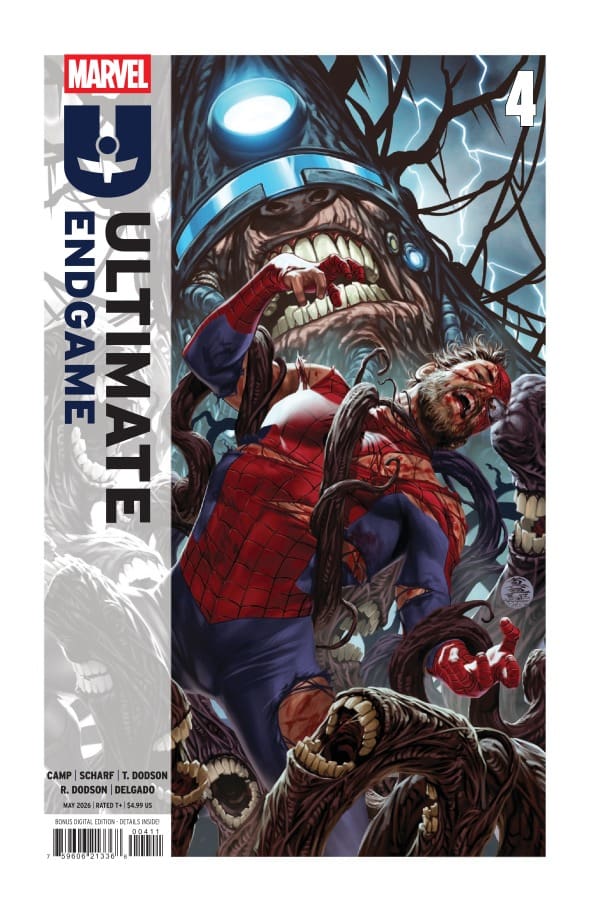
Ultimate Endgame #4 cover from Mark Brooks. Image from Marvel Comics.
Terry Dodson, Rachel Dodson, Jonas Scharf and Edgard Delgado did a really good job with the characters showcased in this issue. It’s been a joy to watch these artists bring various characters from different writers and artists throughout the Ultimate universe to the page together. The characters are definitely the same characters you fell in love with during the other Ultimate storylines but each feels imbued with a little of the artists on this series.
The colors in this issue are so good. Dodson and Delgado, at times, craft color combinations that help reinforce the overwhelming sense of hopelessness. As new characters join the fight, the colors really pop. While the lines craft the Maker, it’s the color work that truly makes him terrifying
Final Thoughts
This was a heavy issue. It continues to build up some key conflicts. I’m so intrigued by how this story will end. I can honestly say Deniz Camp is doing a great job keeping me on my toes and thinking. At times, I truly feel like the Maker will reign but there’s enough in the narrative to help me hold out hope. That shows Camp’s ability to weave an intriguing tale that hooks you and has you waiting for the next issue.
Overall Grade: 9/10
What did you think of this issue? Let me know in the comments
Thor finds himself reborn, in a reality where Earth is unaware of Asgard having ever existed. The Mortal Thor finds our title character as, Sigurd Jarlson, a New York construction worker, haunted by dreams of time as a king. After defending his neighborhood, Sigurd finds himself hunted by the Roxxon Corporation. As Thor begins to remember his story, a villain from his past, Dr. Chen Lu, better known as Radioactive Man, reappears. Lu seeks to rid the world of Thor before he can remind them of Asgard and his power. Now the real battle begins.
This review is brought to you by Nerd Initiative’s Shawn!
Creative Team
Writer: Al Ewing Artist: Pasqual Ferry Color Artist: Matt Milla Letterer: Joe Sabino Cover Artist: Alex Ross
Writing
Al Ewing continues to tell a really great story with The Mortal Thor. I love that we are seeing Sigurd begin to remember more and more of his life as Thor. We are seeing some of the same Thor traits but Ewing is giving them to us in a stripped-down version. We get to see what Thor looks like without powers, relying on his sheer willpower to succeed. This issue began to reap the fruits of those planted seeds in a really enjoyable way.
The battles in this issue are phenomenal, but Ewing really captures how sinister Dario is. It’s not enough to defeat Thor; he wants to consume him, to be in total control. Ewing shows exactly how disposable Dario views everyone in his quest to establish control. I love the cliffhanger that Ewing leaves readers on this issue because it left me instantly excited for the next issue to see how this plays out. Mortal Thor continues to tell an interesting story that develops more of Thor’s character apart from just his strength and status as a God.
Art
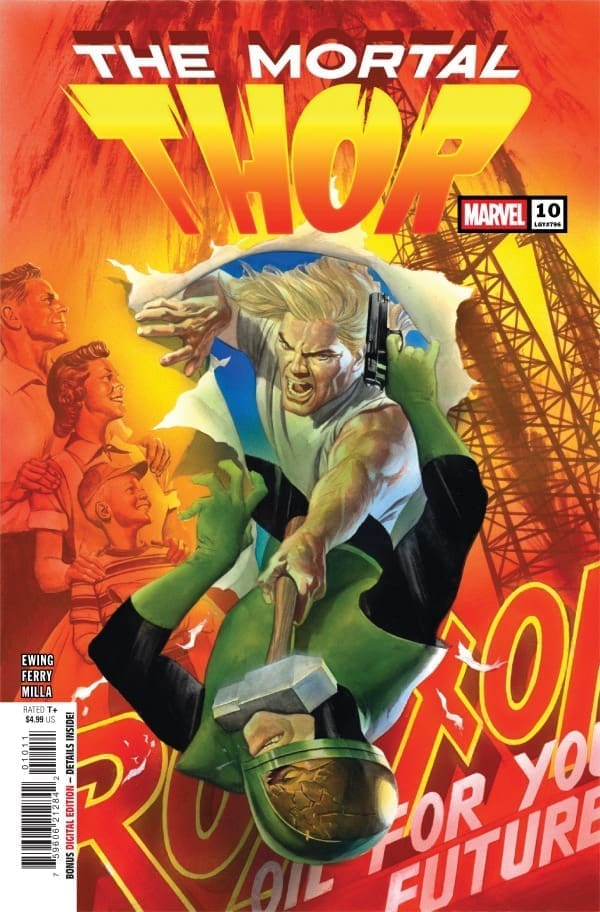
The Mortal Thor #10 cover by Alex Ross. Image from Marvel Comics
Pasqual Ferry and Matt Milla really got to show off this issue. It shows a little more action than we’ve seen in previous issues, and Ferry really shone with those conflicts. The art was crisp and clear and really well drawn, even in the chaos of battles.
Milla does a great job with colors. I really loved the way he colored Duval. Every color felt purposeful. Milla really captured the colors of Roxxon. The building still felt full, but the color palette created the drab corporate feel for the building perfectly.
Final Thoughts
This continues to be a really good story. It feels like the foundation that Ewing has been building is finally getting the walls and roof put on it. This story that has been taking shape is finally letting us see what it looks like with a coat of paint and I love it. I’m really excited to see where the next few issues take this story. Mortal Thor has been building to the kind of conflict we see in this issue!
Overall Grade: 9/10
Are you enjoying Mortal Thor? Let me know in the comments
Tony faces off against the Advanced Iron Man! Can he make it out alive with the other captives? Iron Man has to confront his greatest nightmares in order to succeed and see the future he’s dreaming of to come to past.
The Writing:
Joshua Williamson just continues to put out really solid work in this series. The emotional beats, mixed with the stellar action and mystery all coalesce into a genuinely incredible narrative of hope springing from despair. Williamson’s take on Tony Stark and who he is at his core makes this book one that cannot be missed. The dialogue throughout is quick, the tag at the end is intriguing and exciting, and the overall message of the story is one of working together for a better tomorrow.
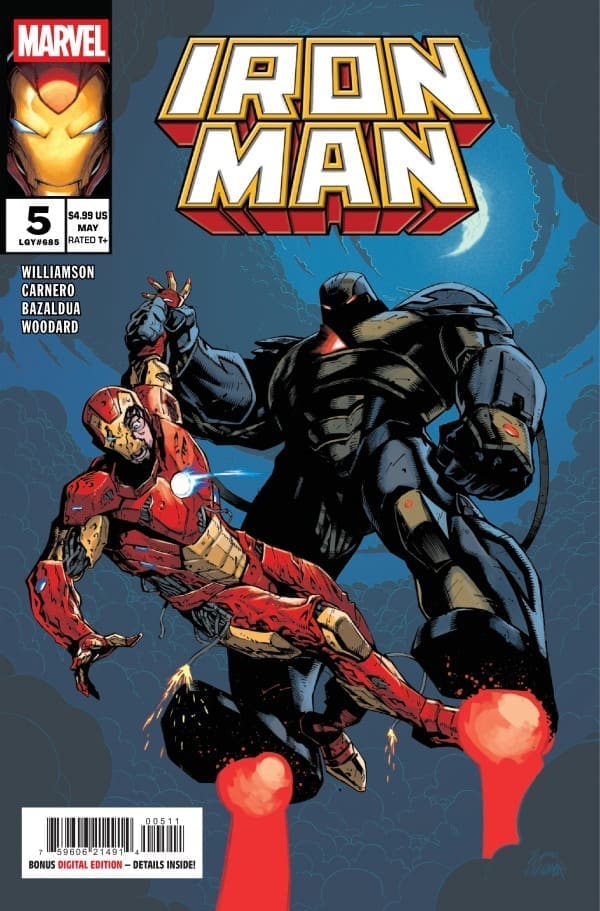
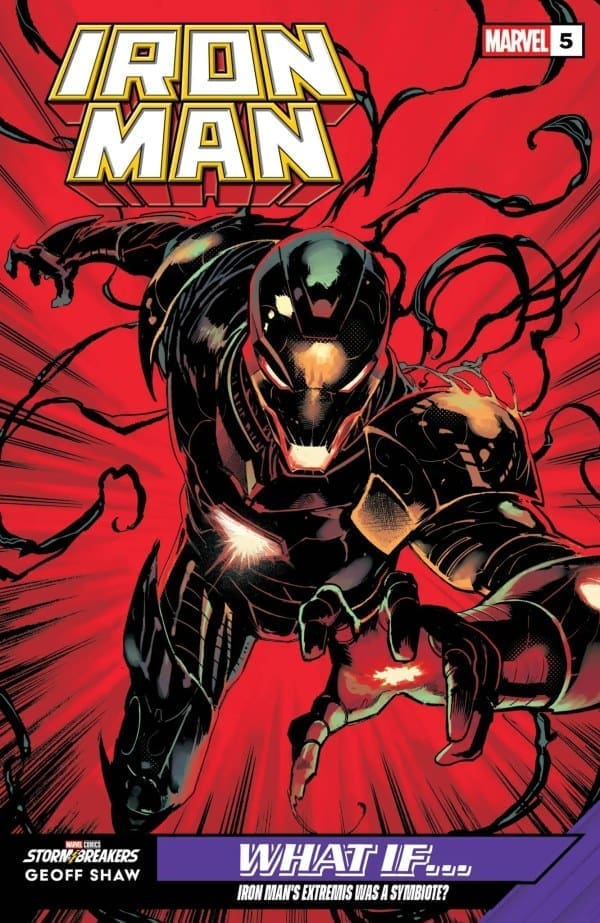
Iron Man #5 – Cover – Geoff Shaw (Credit Marvel Comics)
The Art:
Much like the writing, the art in this issue is fantastic. The design of the Advanced Iron Man is imposing and dangerous, and the fear is evident on Tony’s face throughout the encounter. The set pieces and the panel layouts are all beautiful works of art. Without spoiling the ending, the design of the new antagonist is perfectly balanced between creepy and cool and I can’t wait to see what this team does with them next.
Overall Grade: 10/10
Another 10/10 and this book is peak Iron Man storytelling! At this point I’ll be surprised if this run doesn’t go down as one of the best Iron Man runs in decades.
This comic is reviewed by Nerd Initiative’s Shawn, and your truly, Megan!
Shawn – Dan Slott did a really good job of hooking me in with this story. I’ve not been much of a Spider-Man fan for a while, but I found the story fun, unique, and engaging. Slott providing a little bit of backstory with how we reached this moment in the universe was a nice touch. My favorite thing about this issue was Slott’s ability to remove the lore barrier. From the very first panel of this comic, it felt like it was distinctly Spider-Man for people who are familiar with the character, but it also felt like a really good jumping-off point for someone wanting to get into Spider-Man. Slott does a great job working some great familiar characters into the story in a meaningful way. The humor was well-suited to the character and created a fun read that didn’t sacrifice story.
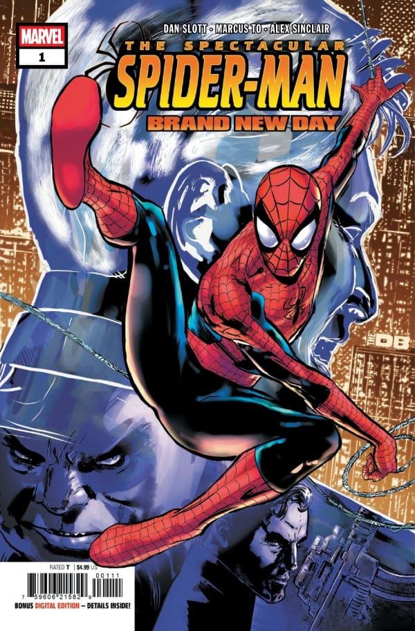
Cover art by Alex Sinclair and Phil Jimenez. Published by Marvel Comics
Megan – Spectacular Spider-Man: Brand New Day #1 starts with Spidey getting his hands on what’s probably the most important thing he could have as a crime-fighting hero: the Lexicon. The Lexicon is a book that has every single one of Wilson Fisk’s criminal enterprises, which means Spider-Man basically has a directory of every bad guy in New York. Spider-Man uses this to his advantage and stops crime left and right with the help of his new connect on the police force.
While this is all well and good, this paints an even bigger target on his back. Everyone who’s anyone wants that Lexicon. Frank Castle would want it for himself for similar uses like Spider-Man, but with much more permanent solutions on how to handle the villains. Mr. Negative would love to use this to his advantage to know who his competitors are. Spidey may be in way over his head with not only using this Lexicon, but with the villains the Lexicon points him to.
The Art
Shawn – Marcus To and Alex Sinclair really set a high bar for themselves with this first issue. Everything about this issue feels perfect from an art perspective. Some of the opening panels with New York as the backdrop are a beautiful way to set this story in motion and distinct enough that anyone with even passing familiarity with the city will recognize it. The lines are crisp and detailed, whether it’s Spidey’s suit or even a massive tuna. Sinclair really does a great job with color.
One thing that really stood out in this issue with regard to Sinclair’s work was the lighting. Whether it’s a direct light from a room or even moonlight, every character feels perfectly lit in each panel, with the colors doing a great job. The moonlight framing certain characters’ faces was a beautiful bit of color work. Joe Caramagna does a great job keeping the story flowing while giving enough information to help newer readers get to know the characters they are encountering.
Megan – Marcus To, Alex Sinclair, Marcos Martin, Muntsa Vicente, and Joe Caramagna perform a lifetime with Spectacular Spider-Man: Brand New Day #1. The detailing work is dramatic and makes each panel its own work of art. The colors are beautifully handled, with vibrant focal points that play off the darker backgrounds very well. The lettering work is phenomenal, with Joe Caramagna able to bring the emotions of the characters to life through the dialogue.
The artwork keeps your eyes glued to the pages until the very end. At the end, you’re treated to a very interesting cliffhanger that’ll have you waiting very impatiently for the next issue to drop. There’s not one negative thing I can say about the artwork, which goes to show you how incredibly stacked the creative team is.
Final Thoughts
Shawn – 10/10. I don’t think this series could have gotten off to a better start. This feels like a fun and vibrant Spider-Man story. It’s got all the hallmarks of Spider-Man stories, like action and signature Spidey humor. I can’t wait to see where this series goes from here.
Megan – 10/10. There’s so much to love about Spectacular Spider-Man: Brand New Day #1! The creative team did a marvelous job with our favorite wall-climbing webster! I can’t wait for the next issue to drop!
Overall Grade – 10/10
Let us know in the comments what you thought of Spectacular Spider-Man: Brand New Day #1!
Doom’s shadow continues. Captain America is fighting for the future of Latveria. It’s a future that a lot of people are fighting for. After standing up to Salvation and showing him that the people of Latveria will not be under Salvation’s control, Cap revealed the true secret power hidden by Doom. Unfortunately for Captain America, his discovery happened just in time for Red Hulk’s secret team to begin their trek into Latveria.
This review is brought to you by Nerd Initiative’s Shawn!
Creative Team
Writer:Chip Zdarsky Artist: Valerio Schiti Color Artist: Romulo Fajardo Jr. Letterer: Joe Caramagna Cover Artist: Valerio Schiti Cover Color Artist: Romulo Fajardo Jr.
Writing
Chip Zdarsky put his foot on the gas this issue and doesn’t let off. We pick up with a little more story about the big reveal from last issue before jumping straight into the action. Captain America has been action-packed, and this issue makes the action feel like a runaway train as we head towards Avengers: Armageddon. Every character in this issue feels perfect.
I don’t know that Zdarsky could craft a more terrifying Red Hulk. The terrifying aspect, though, is that it’s not just the sheer power of Ross that Zdarsky uses; it’s the “might makes right” attitude of Ross. Ross is at the end of his rope when it comes to people not listening to his ideas, and that explosion finally takes place in this issue. Zdarsky perfectly captures Ross’ rage and emotion. The end of this story was an absolute shock that took my breath away.
Art
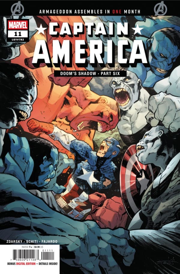
Captain America #11 cover by Valerio Schiti and Romulo Fajardo Jr. Image from Marvel Comics
Valerio Schiti and Romulo Fajardo Jr. created such beautiful art in this issue. This was an action-packed issue, and we really got to see how great a job Schiti can do with drawing the battles between some of these figures. I loved seeing the variations in the different Hulks present in this issue. Each was easily recognizable for what they were, but felt distinct from the others.
Romulo Fajardo Jr. really shone in this issue. The final panel was so dark, foreboding, and beautifully colored that it would be easy to focus on it as the highlight of the book. That, however, would overlook the amazing work Fajardo did on this issue throughout the rest of the book. The colors of the action were vibrant and popped, providing a nice contrast against the war-torn Latveria.
Final Thoughts
What an amazing issue. Where does the story go from here? Doom is back, but what happens now that he has returned? What awaits Ross for acting on his own? So many questions that this team left in waiting, and I can’t wait to see where the story takes us in the run-up to Armageddon.
Overall Grade: 10/10
How are you liking this Captain America series? Let me know in the comments
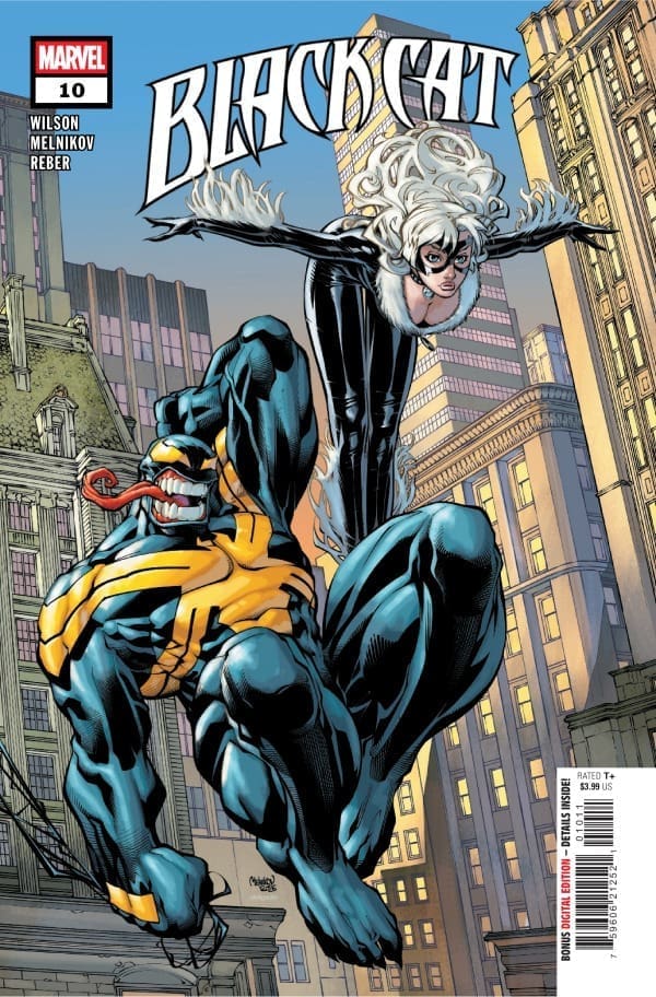
Black Cat in the Multiverse? While on a trip to the Negative Zone to recover something valuable to Mary Jane Watson, Felicia Hardy grabbed the Siege Perilous. The enchanted item sent Felicia and MJ on a trip through the Multiverse, seeing alternate versions of themselves. Returning to their proper timeline, the two ladies encounter someone most unexpected within the Negative Zone: J. Jonah Jameson
This review is brought to you by Nerd Initiative’s Shawn!
Creative Team
Writer: G. Willow Wilson Artist: Gleb Melnikov Color Artist: Brian Reber Letterer: Joe Caramagna Cover Artist: Gleb Melnikov Cover Colorist: Edgar Delgado
Writing
This issue brought a really satisfying ending to the journey of MJ and Felicia that we’ve been on for the last few issues. Black Cat #10, like the issues before it, has messages within the story that, if you aren’t paying attention, you will miss. G. Willow Wilson has really shone on this series, and the message she tells through the narrative has been one of the highlights. For this issue, it felt like we all got a really good reminder that all of us can see things a little bit differently.
It’s easy for us to forget that what may be something small and meaningless to us may be the worst thing possible to someone else. I was really surprised to see Wilson show a shocking bit of humanity from Jameson, which is something that it’s nice to occasionally get a reminder of. I found myself speed-reading through the comic to get to the reveal of who was actually blackmailing MJ. Wilson put a perfect bow on this arc with an enjoyable ending that finishes with a message reinforcing the power of friendship.
Art
Black Cat #10 cover from Gleb Melnikov and Edgar Delgado. Image from Marvel Comics
Gleb Melnikov did a really amazing job with this issue. The Negative Zone gave him a chance to get really creative with some negative space in his panels, and that was one of the highlights. As has been consistent for Melnikov’s work on Black Cat, the characters are incredibly expressive, with you feeling the passion and emotion on their faces.
Brian Reber follows the art with an absolutely stunning job coloring the issue. Reber deserves particular praise in this issue for the coloring and backgrounds on the panels showing MJ transitioning to Venom. The colors in these panels aren’t overbearing but help you feel the weight of the moment. As always, Joe Caramagna does a great job moving the flow. I love showing the emotion of Venom by having the words burst forth from the thought bubble.
Final Thoughts
Satisfying and enjoyable. These are the types of stories I love to see in my comics. A few issues that contain an arc with good development and a satisfying ending that allows the characters to grow. While this is likely the end of Felicia and MJ’s hijinks for a while, I loved seeing the ladies in action together. More importantly, than just the good story we got in this arc, I really loved the messaging surrounding support, friendship, and understanding that Wilson put forward.
Overall Grade: 10/10
How are you liking the Black Cat series? Let me know in the comments