Home Blog Page 102

NEW HISTORY OF THE DC UNIVERSE: The Dakota Incident #1

Creative Team – Joseph P. Illidge, Valentine De Landro, Marissa Louise, Stephanie Williams, Carlo Pagulayan, Stephen Segovia, Jason Paz, John Kalisz, Morgan Hampton, Fico Ossio, Ulises Arreola, Nikolas Draper-Ivy, Edwin Galmon, Andrew Dalhouse, Andworld Design, Diego Olortegui

Published by DC Comics

MORE FROM NERD INITIATIVE HERE!

The Story

New History of the DC Universe: The Dakota Incident #1 is everything I hoped it would be and more. It was powerful, it was compelling, it had a story that you wanted to see more of by the time you got to the last page. Setting the tone immediately, we see Amistad Ervin, AKA Beacon, in the midst of an all-out brawl with a villain that’s escaped being locked up once again. Just as Amistad was on his way to figuring out where to put him so he wouldn’t escape, something happened.
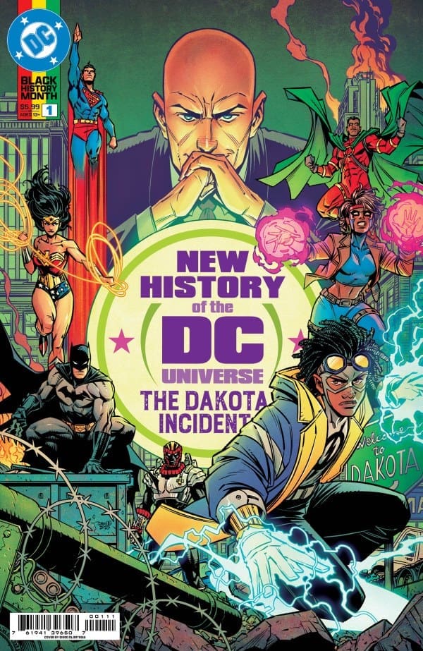
Cover art by Diego Olortegui. Published by DC Comics

The universe Amistad called home disappeared, ceasing to exist, but he escaped into the time stream just in time to save himself. Not knowing what to do, he remembered the wise words of his mentor, Static, saying the past is the key to solving problems in the present. So, that’s exactly where he headed to: the past.

Arriving in what his mother, Rocket, called Dakota’s “golden year”, Amistad showed up in the past of the place he calls home. He went to a time when Dakota had barely any crime, no metahuman heroes, and nothing that resembled Amistad’s present. It sounds all good and well, but things were about to change in a big way at the hands of the government, forcing the metahuman’s hands.

What I loved so much about New History of the DC Universe: The Dakota Incident #1 was the highlight of characters we rarely get to see. Amistad, Rocket, Icon, Static, these are characters that DC fans are begging to see more of, and I hope this is the beginning of new stories and new adventures for these underrated characters.

The writers truly made something special when they wrote New History of the DC Universe: The Dakota Incident #1. Joseph P. Illidge, Stephanie Williams, Morgan Hampton, and Nikolas Draper-Ivey are all to thank for this powerful comic.

The Art

The lineup of the creative team on New History of the DC Universe: The Dakota Incident #1 is absolutely stacked with artists bringing so much talent to the pages. Valentine De Landro, Marissa Louise, Carlo Pagulayan, Stephen Segovia, Jason Paz, John Kalisz, Fico Ossio, Ulises Arreola, Edwin Galmon, Andrew Dalhouse, and Andworld Design all did their part in creating this iconic comic that has artwork that speaks for itself. The characters were brought to life in a beautiful way, with each character having their own time to shine. Alongside that, some action panels in here are absolutely stunning!

With so many powersets on full display, each is illustrated and made to feel larger than life. The coloring of the comic is phenomenal as there’s a great amount of vibrancy juxtaposing the darker tones. Using the powersets as the focal point, the vibrant colors practically make the powers pop off the pages.

The artists all brought something different to the comic, and it shows in a big way. Their talents speak for themselves!

Final Thoughts

New History of the DC Universe: The Dakota Incident #1 should be on everyone’s pull list. This is a powerful comic and a beautiful spotlight on the characters that I would love to see so much more of.

Overall Grade – 10/10

Let me know in the comments what you thought of New History of the DC Universe: The Dakota Incident #1!

Leave a Reply

This site uses Akismet to reduce spam. Learn how your comment data is processed.

This review was written by Megan from the Vigilante Vibes Podcast. If you liked my review, be sure to check out my other reviews! Let me know what you think of New History of the DC Universe: The Dakota Incident #1, or tell me what comics you’d recommend me trying out! Find me on my socials, and check out my Marvel podcast, Vigilante Vibes, by clicking here!
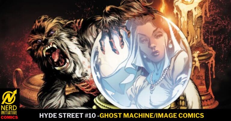
HYDE STREET #10: Play Your Cards Right

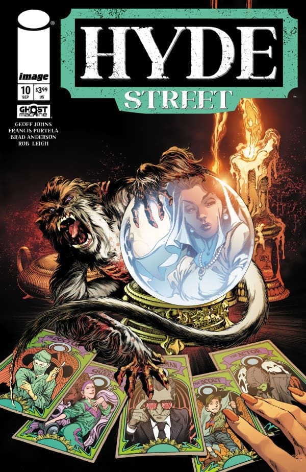
Hyde Street is ever-changing and ever-consuming as Clarissa once found out. She has also found that if you play your cards right the ticket out of Hyde Street can come sooner than later but will the same fate meet her sister Lucinda or will she fall victim to the Scorekeeper?

Hyde Street #10. Credit Ghost Machine and Image Comics. Cover by Brad Anderson, Danny Miki, and Ivan Reis.

Creative Team: Geoff John’s (WRITER), Francis Portela (ARTIST), Brad Anderson (COLORS and COVER), Rob Leigh (LETTERS), Danny Miki and Ivan Reis (COVER).

*Spoilers Ahead*

The Story:

Geoff weaves in and out of story that builds upon suspense and grief. I have fallen truly in love with the various stories of Hyde Street’s victims in a twisted way thanks to Geoff’s abilities to bring a sense of sympathy to these otherwise twisted characters. Clarissa’s story being that her and her sister used to rip off grieving families until they stumbled into Hyde Street, and then losing Lucinda brings exactly the right amount of sympathy. I personally have never liked psychics, and Geoff manages to pull out the ‘got what they deserved’ emotions as well.

Amongst all of the backstory we are met with a new faceless character who is locked away inside of a room as The Monsters castle. The way Rob letters the voice sent chills down my spine and the two capture the uneasy essence of this mysterious figure so well. It appears we are about to meet someone nasty in the coming issues and I cannot hardly wait.

The Art:

The artwork continues to be a strong point in capturing the various emotions that are painted throughout the panels of these issues. The subtle way they show only the chin and sly smile of this mysterious figure builds up the mystique around him and delivers the uneasy sense we get as he speaks. There were moments as such in the flashback when I nearly forgot that Clarissa was ripping the family off because the drastic changes in the colors from bright to the dark purple as though she was hearing their son sucked me right in as well. The way the background and the text boxes shift in colors and the tiniest bit of details all do a tremendous job at building up this story.

Final Thoughts:

Hyde Street #10 continues to place breadcrumbs that we follow into the ever darkening street of death. Every time we think the team has shown us the worst that Hyde Street has to offer we are set up with someone or something even worse! There are details on the board of names we have not met yet that play on our imaginations thanks to the art team and Geoff. Will I ever get out of Hyde Street myself or does this comic have me trapped forever with how good it is?

Overall Grade: 10/10

For more from Matt at the Hops “Geek” News podcast!

Leave a Reply

This site uses Akismet to reduce spam. Learn how your comment data is processed.

SUPERNATURAL #5 – Justice is Served

It’s early on in the Supernatural days, and Sam and Dean keep finding themselves in crazy situations. Even for them.

Creative Team

Writer: Greg Pak;

Artists: Pasquale Qualano, Andrea Arcari, & Gerardo Gambone;

Colorist: Ellie Wright;

Letterer: Jeff Eckleberry;

Cover Artist: Clayton Crain;

Packager & Editor: Nate Cosby;

Special Thanks to: Josh Anderson, Victoria Selover & Megan Logan;

Consulting by: Preeti Chhibber.

Check out the review for the SUPERNATURAL Valentine’s Day Special.

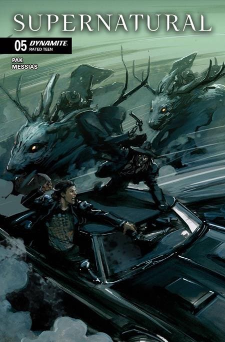
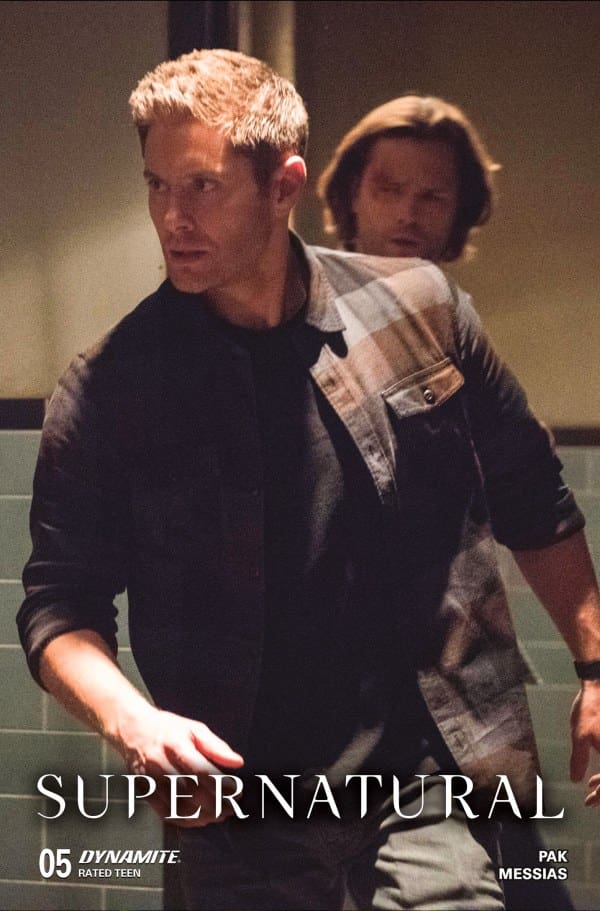
SUPERNATURAL #5 Cover. Image by Dynamite Entertainment

The Story for SUPERNATURAL #5

We kick off right where we left off in a library full of books and ghosts. A familiar face shows up, and the possessed car once again takes on a mind of its own. As the boys suddenly find themselves in a ghost town, it’s time to face the judge, jury, and executioner. In the only one they know how… as brothers.

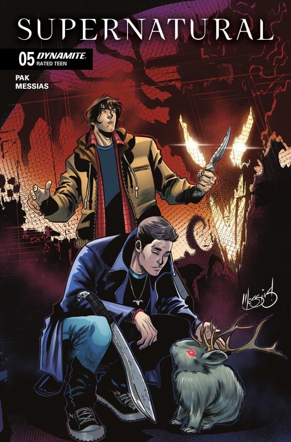
SUPERNATURAL #5 Variant Cover. Image by Dynamite Entertainment

The Art

Supernatural was on air for 15 glorious seasons. During that time, they covered a lot of monsters. From creepy to comical, and everything in between. However, no matter how creative they got, or how much CGI and budget changed over the years, there are things only comic book art can do. Supernatural #5 absolutely took advantage of the beautiful fact that comic book art can set a tone and feeling like no other.

From giant jackalopes, to a courtroom full of monsters, to a gorgeous BLAM scene. The art was incredibly enjoyable to take in. I truly loved every page, right up to the beautiful and unexpected last page.

Check out a review for a Supernatural novel: Heart of the Dragon

Final Thoughts

It’s no secret to anyone who knows me that Supernatural is my favorite show. I didn’t drink the Kool-Aid until October 2016, but it was so good, I just can’t get enough. This comic book run has been a fun little side step into the lives of the Winchester brothers, early on. Supernatural #5 wrapped up a bit of the overarching story and left us with one line that got me amped for issue 6.

Overall Grade: 8/10

To any other idjits out there who need more of the Winchesters, definitely grab these comics. There’s so much story to uncover on the road so far.

Check out Lauren’s First Supernatural Convention

For more from Lauren, check out HOPS GEEK NEWS! Her, and her co-host, Matt, do all sorts of GEEK content, and regularly talk SUPERNATURAL!

Are you part of the Supernatural family? Did you grab this comic? What are your thoughts?

Leave a Reply

This site uses Akismet to reduce spam. Learn how your comment data is processed.

Sorcerer Supreme #3- Family, Friendship, and Memories

The Sorcerer Supreme is down but not out. Wanda finds herself sent to Limbo where she encounters a ruler far too eager to make a name for herself. The Vishanti maintain a singular focus on the Pretender but at what cost? Join Megan and Me as we review Sorcerer Supreme #3.

Creative Team

Writer: Steve Orlando
Artist: Bernard Chang
Color Artist: Ruth Redmond
Letterer: VC’s Joe Sabino
Cover Artist: Leirix

Writing

Megan: In Sorcerer Supreme #3, we see Wanda continuing to not back down from any fight that comes her way. Whether it be with Limbo’s Sorceress Supreme, Madelyne Pryor, or Agatha Harkness herself, Wanda will defend her title by any means necessary. With quite a few appearances from some beloved characters, the third issue packs a real punch given how much actually happens. Wanda spends her time flexing her powers, proving she is the most powerful of all her enemies. Setting up for the ultimate battle between Agatha, who claims the title of Sorcerer Supreme is hers, and Wanda. It seems we are in for a thrilling time in the next issue.

Shawn: Steve Orlando continues to show why he is the preeminent Scarlet Witch writer. This issue gives readers a little bit of everything. My favorite thing Orlando provides in this issue is an opportunity to see Wanda in a whole new light. This feels like the confident but cautious Wanda that fans love. She’s realizing that she was chosen and she will stand as Sorcerer Supreme.

Several of Orlando’s panels seem to hint at exploration of some different relationships and dynamics in the final issues of this limited run. They’re intriguing threads to pull and I hope we get to follow them to see where they lead.

Art

Megan: The artwork of Sorcerer Supreme #3 is nothing short of gorgeous thanks to Bernard Chang, Ruth Redmond, and Joe Sabino. Bernard Chang brings drawings that hold so much depth with excellent detailing and beautiful abstract factors, particularly when in Limbo. Ruth Redmond, who always delivers high quality work when they lend their coloring talents, makes each page a striking work of art that is covered in vibrancy and juxtapositions. Joe Sabino nails every emotion from the characters through the dialogue with his work on the lettering. Together, the artists truly elevated the story by bringing it to life.

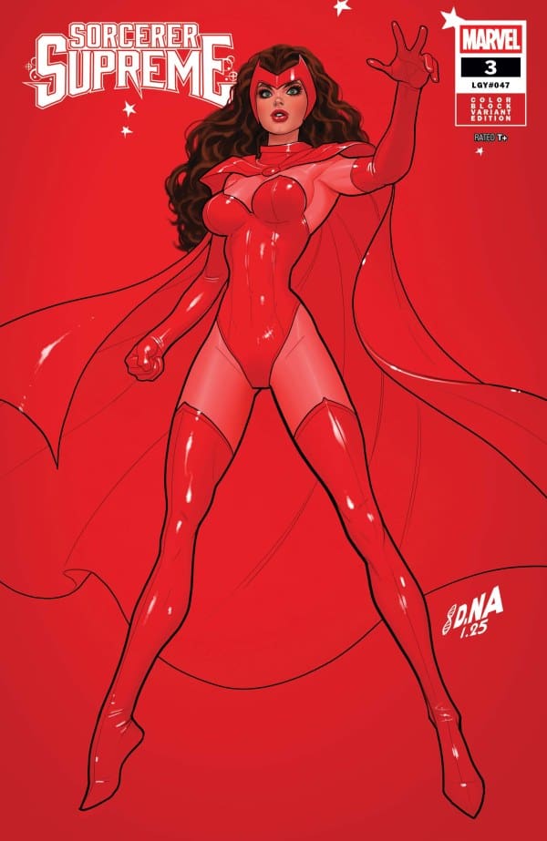
Sorcerer Supreme #3 Color Block Variant by David Nakayama. Image from Marvel Comics

Shawn: The art continues to stun in every issue of this series. While being distinctly Scarlet Witch, Chang manages to channel Ditko vibes throughout this run and that may be nowhere more present than this issue. Chang and Ruth Redmond combine to give comic fans some of the most crisp and vividly colored looks at The Vishanti we’ve gotten.

There’s a lot of moving parts in this issue and Joe Sabino does a great job keeping the flow going. Sabino’s work allows the eyes to flow easily without allowing the lines or colors to be impacted. Unique to Sorcerer Supreme has just been amazing variants week after week to go with amazing covers. That’s not the case with all comics but the cover art has set the tone for what to expect every issue of this series.

Final Thoughts

Megan – 8.8/10. – So much happened in Sorcerer Supreme #3, and it still feels like it’s setting up something even bigger for the next issue. I can’t wait to see what it is!

Shawn: 10/10. Steve Orlando has planted his flag making his work the standard for Scarlet Witch going forward. This series is Wanda at her best. It’s been so impressive to see the written and visual creative teams match each other in both quality and content in every issue and I can’t wait to see how it ends.

Overall Grade: 9.4/10

What did you think of this issue? Let us know in the comments.

Leave a Reply

This site uses Akismet to reduce spam. Learn how your comment data is processed.

PREDATOR BLOODSHED #1: Earth’s Mightiest

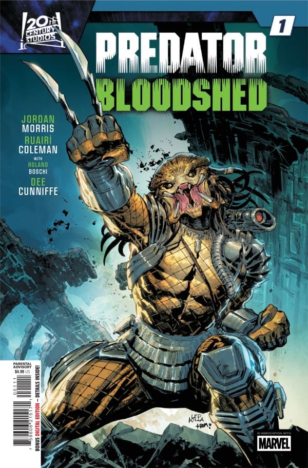
In the future there is a tournament featuring Earth’s mightiest fighters all with the hopes of taking home the grand pot of money. However, unbeknownst to them a new player has entered the ring and they will now be fighting for their lives against the infamous Yautja!

Predator Bloodshed #1: Credit Marvel Comics. Cover by Ken Lashley and Romulo Fajardo Jr.

Creative Team: Jordan Morris (WRITER), Ruairi Coleman and Roland Boschi (ARTISTS), Dee Cunniffe (COLORS), VC’s Clayton Cowles (LETTERS) and Ken Lashley and Romulo Fajardo Jr (COVER).

*SPOILERS AHEAD*

The Story:

Jordan jumps right into things with an almost Mortal Kombat type feeling for this tournament. I love how we get a taste of the Predator’s skills in the beginning of the story before meeting our main players. Of course, it doesn’t seem to matter how far in the future we go as healthcare will never get properly fixed which leaves our main character Kai to come out of retirement for his son. The old one last fight trope is always a fun one and Jordan makes it very heartwarming all the same. There are some interesting threads left at the end of this issue that have me on the hook guessing what will happen next!

The Art and Letters:

I enjoy how graphic Ruairi, Roland, and Dee get with the fight styles in this issue. The way the team details out the panels showcases the variations in the competitors fighting. We have cyborgs and humans facing off with subtle upgrades abound and they do an excellent job at showcasing this. There is a lot of time spent allowing them to also get to know who we are dealing with to which Clayton brings out their personalities excellently.

Final Thoughts:

Predator Bloodshed #1 is a great introduction into what is promising to be a brutal battle against the Yautja. It delivers on heart, humor, and gives us just an enough to hook the reader having us ready for the next issue immediately!

Overall Grade: 9.5/10

For more from Matt at the Hops “Geek” News podcast!

Leave a Reply

This site uses Akismet to reduce spam. Learn how your comment data is processed.

Amazing Spider-Man/Venom: Death Spiral #1

Peter tries to recover what is left of his life while a serial killer is on the loose. Who is this mysterious killer, and who will be able to stop them?


Creative Team

Joe Kelly, Al Ewing & Charles Soule (Writers), Jesús Saiz (Artist), Matt Hollingsworth (Colorist),
VC’s Joe Caramagna (Letterer), Ed McGuinness & Marte Gracia (Cover Artists)
Dave Rapoza / Skan / Stonehouse / Iban Coello / Jesus Aburtov (Variant Cover Artists)

Sarah Spadaccini (Designer), Kaitlyn Lindtvedt (Assistant Editor), Tom Groneman (Associate Editor),
Nick Lowe (Editor), C.B. Cebulski (Editor-in-Chief)

Publisher: Marvel Comics


Death Spiral Pt. 1

This debut issue of Amazing Spider-Man/Venom: Death Spiral by Joe Kelly, Al Ewing, & Charles Soule is full of mystery! This issue takes place alongside the current The Amazing Spider-Man (ASM) story also written by Joe Kelly. Which makes the beginning of this story easy to follow if you’ve been reading that story. If you need to play catchup, please visit the Nerd Initiative site for ASM reviews!

Amazing Spider-Man/Venom: Death Spiral #1, Credit Marvel Comics. Cover by Ed McGuinness & Marte Gracia


This issue starts off with Peter overcome with stress as he tries to put the pieces of his life back together. Which is a powerful part of this story. I’m sure that there are people out there who when reading this section of this story could relate. It gives you a feeling of hopelessness for Peter. Not to mention the amount of stress that ensues while going through all of the events that took place in Peter’s absence.

Throughout this first issue there are multiple murders taking place. Various panels sprinkled in that just give the basic info regarding the murders. These take place throughout the issue making you start to question, where is Spider-Man…? How can all this be taking place and Spider-Man has yet to notice or even look into what is really going on?

There are guest appearances within this issue that really make this a star-studded story. Obviously, Mary Jane and Venom are in this issue (based off of the title). As well as Eddie Brock and Carnage. Carnage in all of his mischievous ways is playing mind games with Eddie. There are multiple panels where you, the reader, will shout out “shut up Carnage”!

This issue has a massive reveal at the end that will leave you absolutely flabbergasted! I was so stunned and entranced that I kept moving closer and closer to the pages while reading. Then I was left in disbelief!


All images by Marvel Comics.


The Writing

Joe Kelly, Al Ewing, & Charles Soule deserve so much more than a pat on the back or a round of applause for this first issue. The storytelling within this issue is so captivating and full of details that you almost want to get a notebook and be a detective. You feel the raw emotion from Peter and his struggles through the dialogue and narration. And the subtle details within the murder panels send your mind spinning as you start to connect the dots. Their (Joe, Al, & Charles) writing of this story is flawless and smooth, making transitions within the story flow effortlessly.

The Artwork

Jesús Saiz rocked out when he did this issue! His attention to details that you normally wouldn’t try to even look for is outstanding. One panel that is an example of this is a bedroom scene that has wood paneling on a wall. The amount of detail in the line work to make you really notice that it is wood is out of this world. The emotional details within the faces of this issue are fascinating! Such a wonderful job!

Matt Hollingsworth did an amazing job giving this issue a dark gloomy presence. The color choices, various shades of said colors and the variations of shading really bring out the tone of this story. Matt also shows his exceptional eye for detail as he colors this issue. He assists in bringing minor details that may not seem to mean anything to the story to your attention. Phenomenal!

VC’s Joe Caramagna deserves credit as the letterer on this issue. His choice of fonts and various “comment bubbles” helps to deliver the dialogue of this story. The comment bubble placement is also perfect as well! Not too far away from the characters and placed within panels in a way that doesn’t take away from the scene that you’re looking at.

My Thoughts

Amazing Spider-Man/Venom: Death Spiral #1 is dark, heavy and full of mystery. Can Peter put his life together? Can Mary Jane come to terms with being attached to Venom? Same can be said about Eddie and Carnage. Will Spider-Man take notice of the serial murders that have rocked this debut issue? All of these things are woven perfectly together making this a real page turner. A captivating story with dark gritty artwork that will make you want more! I loved this issue, and I am not even questioning if I should get this for my collection. It shouldn’t even be a question for you either, go pick up this first issue, and follow along with this mystery.

Overall Grade: 9.5/10


Comic Book Reviews/Nerdy News: Nerd Initiative
Recent Spider-Man Review: The Amazing Spider-Man #22: Homeward Bound
My Personal Content: Travis’ Comic Haven


PLEASE SHARE YOUR THOUGHTS ABOUT THIS REVIEW IN THE COMMENTS BELOW!

Leave a Reply

This site uses Akismet to reduce spam. Learn how your comment data is processed.

Is Ted Ok? – Big Brother is Always Watching

I do not think Ted is Ok. However, a story that began looking like depression, pivoted into depression with a layer of, what the hell just happened?

Creative Team

Story, Art, & Letters: Dave Chisholm;

Editor: Ryan Carroll;

Book Designer: David Reyes;

Book Production: Juan D. Posada;

Cover Artist A: Dave Chisholm;

Cover Artist B: Christian Ward.

Check out a review for another comic from Mad Cave Studios: The New Space Age #1

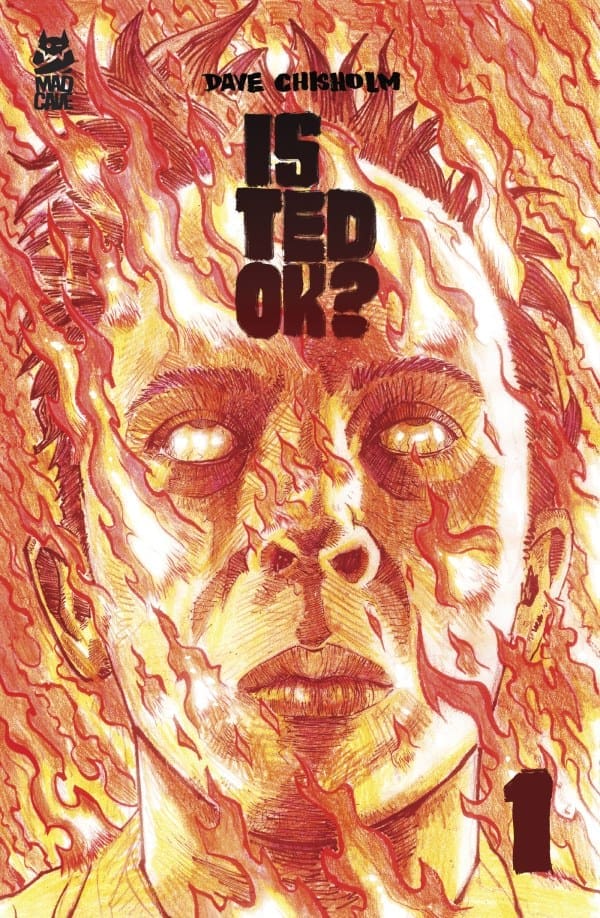
Is Ted Ok? #1 Cover. Image by Mad Cave Studios.

The Story for Is Ted Ok? #1

Our story doesn’t start with Ted. It starts with Sarah, who is watching Ted. While she’s been tasked with the job to assure he (and others) are neither suicidal nor homicidal, her watch of Ted becomes an almost Truman Show feel. She’s sucked into his life, and can tell he needs help. Despite her task of watching him, the business that employs her doesn’t want to help when she tells them he needs her. So she takes matters into her own hands. The result is nothing she could have expected.

Art

Is Ted Ok? is a dark, intense, and immensely entertaining comic. The art and letters fit that feel beautifully. It’s clear Ted is troubled, and Sarah is invested. Both characters come across in a way that makes you feel for both of them. The emotions throughout are all over the place, and the art and letters beautifully convey them as the story moves along. A story with turns I never could have seen coming.

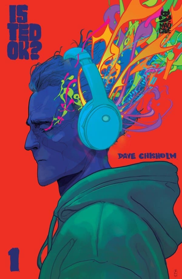
Is Ted Ok? #1 Variant Cover. Image by Mad Cave Studios.

Overall Grade: 10/10

You never know how a story is gonna go when the characters and backstory are brand new. Is Ted Ok? exceeded every expectation I had. It was entertaining, elicited all sorts of feelings, and kept me guessing at every turn. There are layers to peel in this story, and I can’t wait to dive further in. If you’re looking for a brand new, fresh comic story, Is Ted Ok? is the way to go.

For more from Lauren, check out ‘Hops GEEK News.’

Did you grab this comic? What were your thoughts?

Leave a Reply

This site uses Akismet to reduce spam. Learn how your comment data is processed.

THE PUNISHER #1 – A New Era

Creative Team – Benjamin Percy, José Luis Soares, Oren Junior, Frank D’Armata, VC’s Cory Petit, David Marquez, Guru-eFX

Published by Marvel Comics

MORE FROM NERD INITIATIVE HERE!

The Story

The Punisher #1 is review by Nerd Initiative’s Megan and Shawn!

Shawn – Marvel has found the perfect match when they paired Benjamin Percy with Frank Castle. Fresh off the Punisher: Red Band series, Percy jumps right in with this issue. The issue starts off a little slow, but I can appreciate that Percy is using that time to catch folks up and get them to hit the ground running if they missed out on Punisher: Red Band.

Percy’s writing in this issue just feels like some of the quintessential Punisher stories. Between this and the Red Band series, I haven’t enjoyed reading a writer’s work in Punisher this much since the Garth Ennis Punisher Max runs.

Cover art by David Marquez and Guru-eFX. Published by Marvel Comics

Megan – Benjamin Percy brings us a fantastic continuation of The Punisher after he was used as a brain-controlled assassin in Punisher: Red Band. Now, Frank is still feeling the aftereffects of having to carve out Kingpin’s device out of his head and is in desperate need of help. Meanwhile, what The Punisher doesn’t know is that Jigsaw is making moves and one of those moves is pointed directly at Frank.

The story of The Punisher #1 has all the things you love about Frank Castle and his stories. The grittiness, the violence, the street-level hijinks that perfectly sums up who Frank Castle is as a character, all of that Benjamin Percy excellently nailed.

The Art

Shawn – What a team. Soares, Junior, and D’Armata really capture the feel of Punisher. Starting with the very first panel you can’t help but notice that for the visual team this issue was not just a job but a labor of love. Whether you’re looking at the details of the buildings in the background or the graffiti on the subway entrance, your eyes find a new detail every time you look.

The visual team keeps this up the whole issue. I’ve always felt as a comic book fan that doing colors for Punisher may be one of the hardest gigs in comics because outside of black, white, and red what are you going to work with? D’Armata really serves as a credit to the craft with this issue choosing just the right pops of color to bring some flavor to panels. Of course the art and narrative wouldn’t work as well as it does without the work of Corey Petit helping the eyes flow and really letting the story and art merge together in a beautiful symphony of darkness and pain that have come to mark the Punisher.

Megan – With a creative team as stacked as this one, it’s a guarantee that the artwork would be spectacular. Perfectly capturing the essence of a classic Punisher story, José Luis Soares, Oren Junior, Frank D’Armata, and Cory Petit knocked it out of the park with their incredible talents. Soares and Junior bring a great deal of detailing to each and every page, with shadings that really nail the grit of the story. Frank D’Armata relies heavily on the darker tones while still adding the vibrancy to the focal points. Which brings so much depth to each page. Cory Petit nails the different tones from the different characters through the dialogue, such as Frank’s worry or Jigsaw’s unhinged planning.

Final Thoughts

Shawn – 10/10. I don’t know that Marvel could have asked for a better first issue of Punisher than this. The creative team takes the familiar “man on a mission” m.o. of Frank Castle and tweaks it adding nuance and new challenges. Percy and Company set the stage for some of the best Punisher work since the Ennis era.

Megan – 10/10. Benjamin Percy does a fantastic job with starting off this new ongoing series with a bang! The artists brought the story to life in the most impressive ways. This story could go so many ways, and they have me hooked already just by the first issue!

Overall Grade – 10/10

Let us know in the comments below what you thought of The Punisher #1!

Leave a Reply

This site uses Akismet to reduce spam. Learn how your comment data is processed.

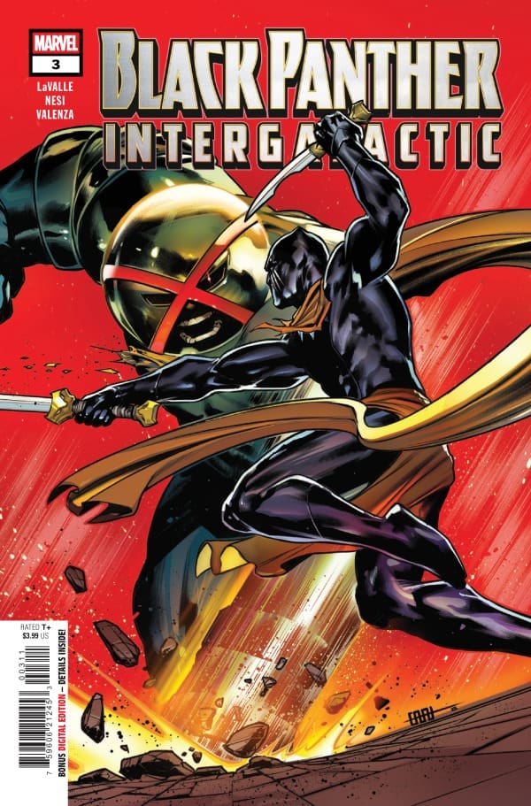
Black Panther Intergalactic #3: Will Wakanda Recover From Evil?

Writer Victor LaValle

Artist Stefano Nesi

Color Artist Bryan Valenza

Letterer Ariana Maher

Publisher Marvel Comics

In Black Panther Intergalactic #3, the theme of intergalactic threats is apparent. It seems that T’Challa is not only navigating these threats, he is second guessing himself… a lot. I love how this comic run is dealing with a lot of T’Challa’s emotions. Only he can figure out what he wants to do. Normally he is really confident and always has Wakanda on his mind.

In terms of story Black Panther Intergalactic #3, is full of action packed sequences, and T’Challa really shows his martial arts side. I love how he incorporates others to help him, and also looks out for others. The story overall is very well written, with LaValle paying close attention to keeping The Black Panther, true to his origin.

Credit: Stefano Nesi Marvel Comics

As far as art, visually you can see that T’Challa is very into fighting for what he believes. I like seeing all the vibrant colors with either a certain character or event happening. The colors bring a certain energy that makes it pop off the page. Nesi does a great job balancing colors, and making everything on the page look really appealing. It of course has that classic Marvel art style, that I absolutely love. I am really hoping to see more visually appealing colors throughout this comic run.

Overall, this is a solid story when it comes to Black Panther. I want to see more intergalactic threats, who come to fight The Black Panther. It will add more intensity, but, I also want to see even more characters that will join him in this fight. Intergalactic threats are usually really big events, and I hope to see them displayed in this comic run. I love the character of Black Panther, and I can only hope that he will continue to get better and better over time.

Overall Grade: 9.5/10

What did you think of Black Panther Intergalactic #3? Sound off in the comments below!

CLICK HERE TO READ MORE COMIC REVIEWS FROM JANELLE!

Leave a Reply

This site uses Akismet to reduce spam. Learn how your comment data is processed.

The New Space Age #3 – Humans Ruin Everything

Mark’s brother vanished into thin air at a young age, in a way that no one believed him. Now with science and magic on his side, he’s one step closer to bringing his brother home.

Creative Team

Writer: Kenny Porter;

Artist: Mike Becker;

Colorist: Kevin Betou;

Letterer: Buddy Beaudoin;

Editor: James B. Emmett;

Logo Designer: Tim Daniel;

Book Designer: David Reyes;

Book Production: Alexandra Colorado;

Main Cover Artist: Mike Becker with colors by Kevin Betou.

Check out a review for issue 1 of The New Space Age from Mad Cave Studios.

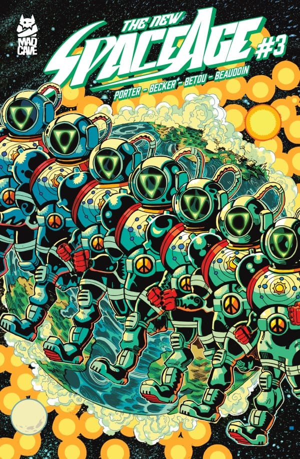
Comic book cover for The New Space Age #3 from Mad Cave Studios.
The New Space Age #3 Cover. Image by Mad Cave Studios

The Story for The New Space Age #3

Mark is confident in himself and his friends. They made the discoveries and built the ship. Now it’s time for Mark to remedy his biggest regret in life: not protecting his baby brother. As Mark and his friends prepare for his first trip into space, what he finds up there, and what happens back on Earth, were both unexpected. Leaving more questions and concerns than when they started. Humanity and friendship are both put to the test.

The Art

From beginning to end, the art is beautiful. Whether our trio of space explorers is looking up at the stars or Mark is traveling through them, every page is gorgeous. While life on Earth is drawn and colored in a way that makes you want to stop and take it all in, space adds an extra element. Ruins in space go even deeper. In art and story. Surrounded by beautiful scenes, the reactions on our characters’ faces are always in perfect sync with their characters, further pushing this story forward perfectly.

Overall Grade: 9/10

We’re another step into the mystery of what happened to Mark’s kid brother, Joey, all those years ago. He’s proven he’s not crazy, but he hasn’t solved the mystery. While this issue had some unprecedented hiccups, Mark has made it this far. There’s no turning back now. He made a spaceship fly with magic, so what can’t he do to try and save his baby brother?

For more from Lauren, check out ‘Hops GEEK News.’

Have you checked out The New Space Age yet? Let us know your thoughts.

Leave a Reply

This site uses Akismet to reduce spam. Learn how your comment data is processed.