Share this
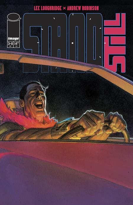
Colin and Kate desperately put together the pieces necessary to construct their new time-stopping device. And while that’s happening, Ryker is settling an old score with a Beverly Hills housewife/reality star.
Creative Team: Lee Loughridge (Story & Color), Andrew Robinson (Art), and Rob Tweedie (Design & Lettering), Jason Shawn Alexander (Variant Cover)
STANDSTILL Published by Image Comics
Check out my review of STANDSTILL #1 here.

THE STORY
This series continues to slowly build toward some kind of confrontation between Colin and Ryker. While that’s probably true, Ryker is unaware of what Colin is attempting to do so he’s just doing his thing. What is it? Revenge? Maybe? This issue leans in the direction of revenge for Ryker, but the cliffhanger of this issue makes that a little confusing as well. It’s hard to tell what someone with the means to stop time will do, so we’re all here for the ride.
Lee Loughridge has been crafting a intriguing and fun story that uses the freedom that comics allow him, but could make for a very interesting television miniseries with a modest budget. I think that’s what I like about it. It reads with smooth dialogue and has very human and flawed characters. No one here is a superhero. Everyone has their strengths and their flaws and Loughridge puts those on the page.
THE ART
If there’s anything that someone not reading this book already needs to know is that the art in this whole series has been stunning! Andrew Robinson’s art is incredible, but then add on Lee Loughridge’s colors and there’s very little that can compare. Robinson’s linework and character designs move across the page with a lot of life and expression. His work with the characters’ eyes is amazing because you can easily understand their situation and emotions just from their eyes.
Loughridge’s coloring remains top notch and at the top of his game. The color on the opening scene in Los Angeles with Ryker is just amazing. The sun glaring in the background causes you to squint just at the thought of how bright it is in reality. The stark difference at Colin’s garage from the dimly lit space from all of the monitors to what it looks like just outside the garage door – striking!
Rob Tweedie’s lettering and design in this issue, and series, has been great. The opening credit page looks right out of a movie. The bus and bike scene is amped up by the lettering on that page alone.
FINAL THOUGHTS
I really enjoyed the first issue of this miniseries, and felt like the second issue was pretty good, too. The problem I’m having at this point is I don’t understand Ryker’s motivation outside of this just being a revenge story for him. If that’s the case – I’m good with that, but I feel there’s way more to it than that, so I’m sitting back a little more and waiting with this issue. The cliffhanger for this issue (the 3rd issue) makes me wonder what’s going on in Ryker’s mind even more than before. This is just a crazy book.
THE RATING
This gets a 7 out of 10 reality star makeovers.

