
The Run Down
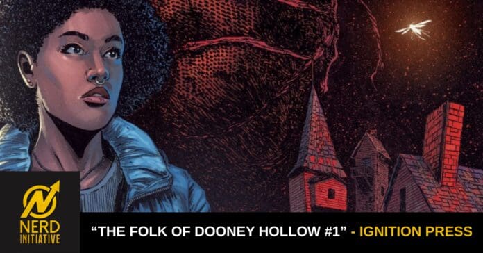
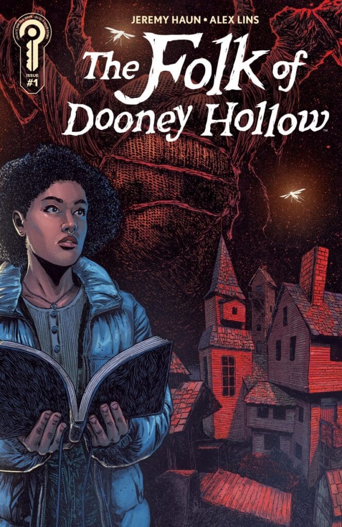
If you know me, then you know I always love not just a slow burn horror, but a new idea with great franchise potential. Thankfully for me, Jeremy Haun’s “The Folk of Dooney Hollow” is both of those things. Following young graduate student Kerri as she explores the Ozark Mountains and all it has to offer, even if that endangers her and the village of Dooney Hollow. Dark caves, monsters and old ladies, oh my! Does this sound up your alley? Then follow me as we explore Dooney Hollow alongside Kerri.
Writer: Jeremy Haun
Artist: Alex Lins
Colorist: Trish Mulvihill
Letterer: AndWorld Design
The Writing
Right from the beginning, Haun shows why his work in horror gets talked about as much as it does. He does an utterly fantastic job at establishing not just the setting, but the tone and pace as well. Within just a couple of pages, he lets the reader know what’s going on and what we’re in for. Going in, you should know this is very much a slow burn with stellar build up to the scares. Within that build-up, he works to make you feel uneasy and it pays off amazingly well!
As for the actual story itself, it’s making me ask a boat load of questions. Why do certain characters feel shady? What exactly is Kerri’s goal and why’s she in Dooney Hollow? Speaking of Kerri, she’s probably one of the most interesting characters I’ve come across in a hot minute. Despite all of the very weird things going on, she doesn’t feel deterred and keeps pushing.
The Art
The one thing that admittedly sold me on wanting to read this was the art and colors of Lins and Mulvihill. When it comes to the penciling, Lins’ work here pairs perfectly with Haun’s writing in making readers feel uneasy. For example, there’s one specific panel that comes to mind where Dooney Hollow is made to look otherworldly and disorienting. Not only that, but the way he’s illustrating this story gives it the vibes of stuff like “Sleepy Hollow” and “Over the Garden Wall”. If you love the look and feel of those properties, you’ll love this!
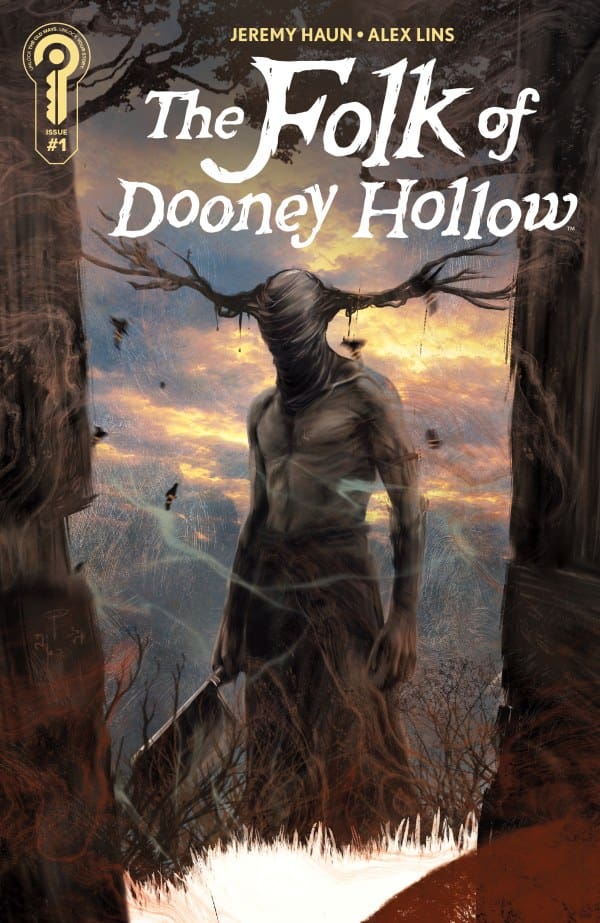
On the other hand is the coloring of Mulvihill and let me tell you, she did some truly phenomenal work. Her work here very much keeps to how Lins illustrates, making a perfect pairing. The fall vibes are completely kept, with a gorgeous blend of yellows, browns, oranges and reds.
Lastly comes the lettering from AndWorld Design. As you might know by now, I love great usage of onomatopoeia and it’s used perfectly here. It can be used to build out scenes and worlds, and here, its usage makes each and every scene feel cinematic in scope. AndWorld Design truly helped to make this whole book genuinely scary as I felt like I could hear each and every sound. Not only that, but I love the very unique design of the speech bubbles and how text messages are represented. Overall, truly fantastic work.
Final Thoughts
The things that Haun and his team are doing are truly electric and terrifying. “Dooney Hollow” is for those that love slow burn horror with plenty of mystery and fall vibes. If you want that, then you need to pick this up!
Overall Grade: 10/10
Read more from me here and be sure to check out my socials!
Comments
Are you excited for “The Folk of Dooney Hollow”? Are you a fan of Jeremy Haun’s work? Let’s discuss in the comments below!

Leave a Reply