
Share this
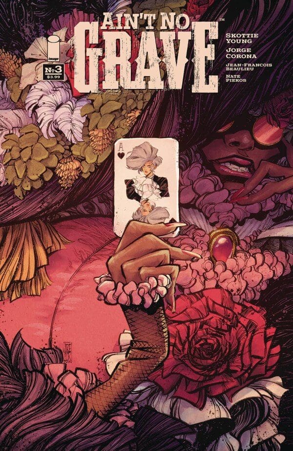
Writer: Skottie Young
Artist: Jorge Corona
Colorist: Jean-François Beaulieu
Letterer: Nate Piekos
PUBLISHER: Image Comics
How do you make a character that does such horrific things redeemable? Well, the creative team behind Ain’t No Grave has been trying to answer that exact question. Ryder has a past she never fully shook. Even when she may have good intentions like saving her family the way she goes about her business leaves a lot of people hurt and dead. Now to keep that family she is literally fighting for her life in the afterworld with a mission to take out Death. Before she can get there she has a few obstacles to overcome.
This chapter is aptly named Bargaining as Ryder finds herself on a Riverboat that has been waiting for her. A riverboat of this nature will have several depraved people trying to gamble for their internal souls. They say the house always wins, so can Ryder walk away unscathed? We have seen she is quick with a gun but what happens when chance wins the day? Well, you cheat of course, or at least you try to without getting caught.
DON’T MISS THE TOP 10!
Naming a chapter Bargaining and having the central conflict surrounding a poker game does run the risk of being heavy-handed. Not to mention the countless times people have used the Stages of grief to structure a story. It is easy to look at this on paper and knock it for its lack of subtlety and originality. Still, ultimately ideas are just the opening step as the quality of stories is found in their execution.
So how is that execution? This issue like past installments includes flashbacks of Ryder with her family but this time it is a bit different. Here Ryder appears a bit cantankerous with her husband as they disagree on how to properly raise their daughter and present themselves to the other townsfolk. For example, not allow their daughter to play in the dirty creek in one of her few nice dresses. As often is the case with relationships that issue stems from something much deeper as their family is behind with payments on their farm and at risk of losing it. So Ryder once again tries to solve this problem in a way she knows best…with the great game of poker.
So two parallel poker games in one issue. Despite that, it never focused much on the machinations of either game because it is not what is important. The importance is how Ryder’s mortality is tested in both situations. For her, any means to an end is valid if it helps support her family. That brings me back to the opening point regarding making her more redeemable, and so far that has yet to occur. As demonstrated in this issue how she acted in the past is how she acts now is pretty much the same mostly because it continues to work. My assumption is that is largely by design as Ryder is set to have a classic ‘Come to Jesus’ moment when her old ways do not work. I just hope it happens soon because the more they push her as a character the more challenging it becomes to root for her. To be fair that may also be the point.
Despite my issues with narrative what I do not have any issues with is the art. This is a drop-dead gorgeous book. Gorgeous may not be the right word because what we see in the afterlife portion can be plain ugly. It is a good type of ugly though. Characters are covered in warts or other disfigurement. Teeth are jagged and Jorge Corona uses a lot of sharp lines to aid in amping up the uneasiness. Corona’s storytelling has hit a new high with this series as his page layouts are continuously engaging and inventive. He plays with the breaking of panel borders continuously and never uses the same angle more than once. One of the best pages came with the climatic poker game as a multitude of character shots are paired with poker chips flying throughout the page. It was a rather impressive way to demonstrate the passage of time all within one sequence.
Credit should also go to colorist Jean-François Beaulieu. His color palettes did a lot of the heavy lifting when it came to differentiating between the past and the present. Often colorists will choose drastic measures like
having one sequence with washed-out colors. The choice here was a bit more subtle. The present utilized a lot of reds and purples to further that sense you are in this world’s version of Hell. The present was filled with softer colors like blue, green, and sunshine yellow to make it clear we are looking at reality. Nate Piekos’s letter choices need a shoutout. As mentioned this is a very ugly world with harsh conditions.
His dialog balloons help reflect that. Instead of having the normal clean circles they were jagged and uneven, which also corresponds with Corona’s art style. It is one thing for a book to look good. Ain’t No Grave hits another level because this is a creative team that actively utilizes their craft to enhance the art of everyone else on the series as well. It tells you this is a story the team cares about and believes in beyond the paycheck.
Any fan of the Western genre should be giving Ain’t No Grave a shot because it takes what this genre is known for and tries to tell a classic story in a new way. On a sheer aesthetic level, it is one of the most unique and best-looking books out today, and that fact helps me ignore my minor qualms with some of the character choices.