Share this

Writer: Zac Thompson
Artist: Nicola Izzo
Colorist: Francesco Segala
Letterer: DC Hopkins
Publisher: BOOM! STUDIOS
You can learn a lot through observation. Thanks to watching some helpful YouTube videos I have been able to solve problems that I would otherwise need help solving. Still within the act of observation is room for interpretation. Different people can watch the same sequence and take away completely different thoughts on what happened.
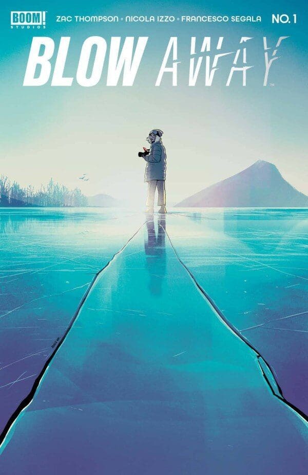
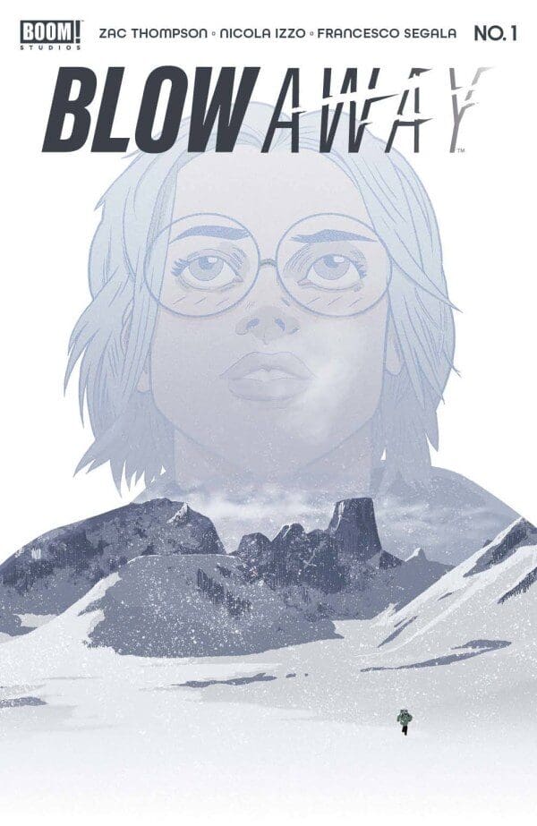
Sometimes that can be innocuous, but when murder is involved things become more serious. Such is the case with Blow Way #1 by Zac Thompson and Nicola Izzo as wildlife photographer Brynne Brautigan finds herself in a mystery that only she can solve.
For Brynne Brautigan, her job has taken her to a remote Canadian island in hopes of capturing a photo of an endangered bird. Nature simply does not want to cooperate but on the bright side, a pair of climbers are also traversing the mountain she is photographing. As the days go on she begins to notice some strange trends. Is tension growing between the climbers? Then it happens…or does it? Also what if she wasn’t the only one watching?
When reading through this the immediate connection would be to classic films by Alfred Hitchcock like Rear Window. A person is stuck in a situation where all they can do is watch the world around them. In this case, though the character is in a barren wilderness compared to an apartment building. I do not envy the art team on this because this is not the easiest setting to make visually engaging. Through some clever techniques illustrator Nicola Izzo, colorist Francesco Segala, and letterer DC Hopkins made it work.
True to this story we are seeing much of this world through the lens of a camera. To make that apparent on the page Izzo’s linework is a bit loose at times to demonstrate when things are not quite in focus. We are seeing many events play out from afar, so it is sometimes challenging to fully comprehend what is happening. Typically that would hinder the experience, but here it is important to place us within the mindset of our main character. We know as much as she does which is often not very much.
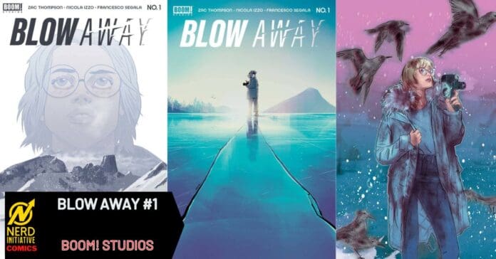
With much of the landscape being not much more than snow and rock Segala covers the page with a color palette containing mostly white, grey, and black. The benefit is when that pattern is broken it becomes rather noticeable. For example, Brautigan’s hair is a stark blonde shade. A chance encounter with a polar bear involves some blood that is bold red. When that is placed against the pristine white snow the tension becomes immediate.

That polar bear sequence is the one moment within this first issue I still wrestle with. It was an action that seemed reckless for a person who makes a living photographing nature. At the same time, it does provide insight into who Brautigan is as a person. Someone willing to risk their well-being to help another in need. Without it, we wouldn’t know much of anything about her since she is alone and only able to contact others with a cell phone with bad reception.
While the connection to past cinema classics is apparent this very extensively speaks to the now. Considering we are still in the shadow of the Covid pandemic there is much to relate to regarding a person isolated from the rest of society and only able to interact with others through a screen. The repetition of daily life along with the
loneliness can lead you to find a connection in anything. For many during covid it was social media for Brynne it’s these mountain climbers. Your life seems rather redundant so why not get invested in someone else’s? The new phenomenon of Parasocial relationships is where you form a relationship with individuals who do not even know you exist. Is Brynne seeing something or is she lost in the narrative she created through her observation? This is a rather clever way to explore that concept in the framework of a murder mystery.
I found the construction of this issue rather fascinating. One that utilized film and photographic techniques in a way that is rare for this medium. It demonstrates the power of giving the audience the least amount of information possible. You have just enough to have an idea of what is happening but nowhere close enough to being certain. When you have that much room for interpretation it makes it that much more fascinating because of all the different avenues the story can travel. This all leads to one of the most unique first issues I read all year and I cannot wait to see how this all develops.

