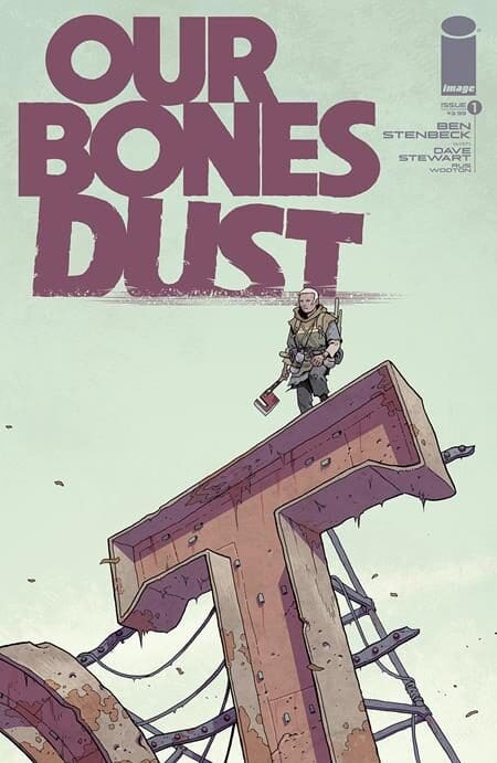
Story / Art: Ben Stenbeck
Colorist: Dave Stewart
Lettering & Logo Design: Rus Wooton
One of the biggest challenges with the first issue of a new comic series is finding balance. You want to build your world and story, but at the same time leave room to establish characters. That is a lot to do in only a few pages.
I equate it to trying to write a TV pilot where everything important is established before the first commercial break. In Our Bones Dust #1 Ben Stenbeck, Dave Stewart, and Russ Wooton look to use the broken world they are building to inform the story being told.
The issue opens on a set of aliens excavating the land of what seems like a dead society. Space junk orbits the earth in great abundance while the land appears full of garbage and discarded human remains.
Right away, the setting is established and we get a few more clues regarding the current state of the world with knowledge of body parts being forcefully removed from the found corpses.
Don’t Forget to Vote For Your Favorite Comics and Creators Here!
That is by far the greatest attribute of this issue. So much is established about this world without having to blatantly say it or start with an endless prologue that gives a paragraph of text before we get into the story. We are thrown right in and it is up to us to figure things out. I appreciate this approach because it demonstrates trust in the audience. The key though is being able to pull it off.
Ben Stenbeck is on both writing and art duties, which may explain the confidence in the storytelling. This is best summed up in a scene that involves the spilling of a bottle of water. Based on the character reactions to that moment we learn what is valued in this world. The fear placed in the eyes of one character informs so much about the lack of resources that exist.

Stenbeck tends to use four to five panel grids so with the larger sized panels it makes for a breezy read. By switching between a variety of vertical and horizontal shots it avoids the imagery becoming stale. He also has a knack for staging knowing where exactly to place the camera to set the stage. Zooming into characters faces just at the right moment to set the intensity only to back away quickly when the moment passes.
One of my favorite moments comes with the alien plants a tree into the ground. It is a wordless sequence that gives off a sense of tranquility in a story that is otherwise full of chaos. It was rather a brave choice to have a quiet moment like this that does not move the plot along, but tells us so much about this alien’s desires. It also juxtaposes well against the actions of the humans that continue to destroy while this being looks to create and preserve.
As I was reading this I was quite impressed with the colors. The palette at times is limiting but never dull. This is a desolate world so a great deal of grays and browns are used. You can smell the rust if you look at the page long enough.

That sells the world’s atmosphere, but then you get small bits that pop off the page like a pair of sunglasses or a character with blue hair. When violence does occur, backgrounds explode with scratched orange to sell the intensity. This was a professional job in ever sense of the world, and when I saw it was Dave Stewart it made perfect sense. The man is a legend in the industry.
Credit should also be given to Rus Wooton. Beyond doing the unsung duty of being a letterer he designed the logo as well. By no means am I a graphic designer, but as a person who reads comics it informs so much about the story. It is clean, simple, and effective. Everything you want in a good logo.
To get back to the concept of balance there was some struggle there. After this issue I have a great sense of what this world is, but I am not fully sure what the story is about or who these characters are on a deeper level. We have a conflict that is built upon survival.
This is a world that makes Mad Max look like a day spa. Placing a young boy into that world as the apparent main protagonist brings with it inherit investment. The pieces are certainly there, and I again appreciate the trust in the audience to put them together.
Any person with an ounce of empathy can feel for his plight, but not much is known about who or what he is to have any true emotional connection. Rather looking forward to see this story further balance out in upcoming issues.

