Image Comics’ DIE: Loaded is back for Issue #6. Writer Kieron Gillan, Artist Stephanie Hans, and Letterer Clayton Cowles have created another amazing issue.
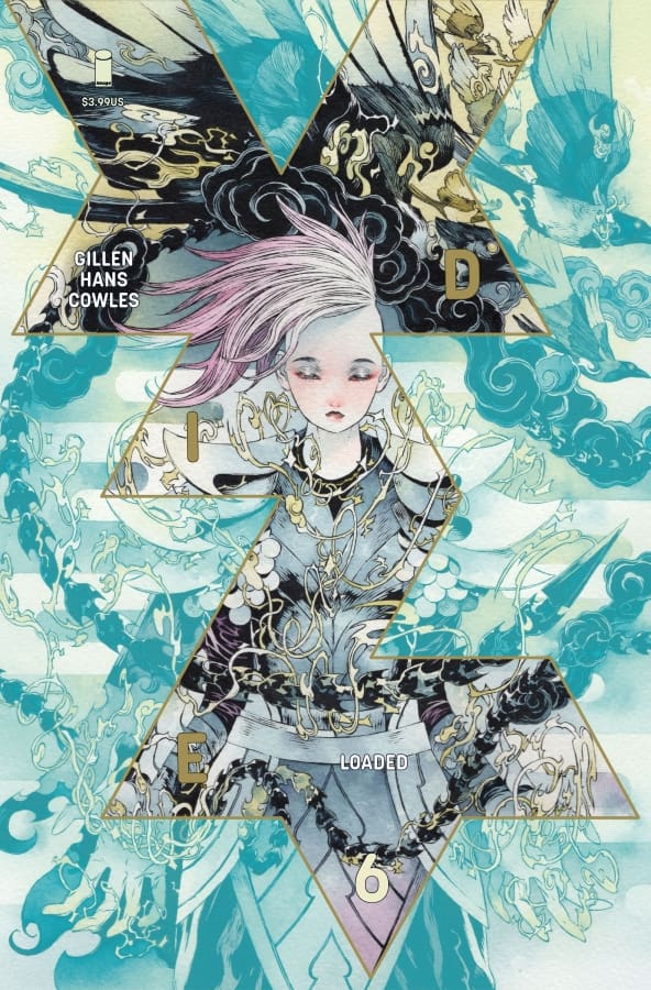
DIE: Loaded #6 Cover B By Toru Terada (Credit: Image Comics)
Stephanie’s art this issue is amazing. This issue has some fantastic moments in it that are detailed very well with the art. Stephanie also did a really amazing job with all of the character’s body language being told through the art. The character designs in this issue as well are amazing, and Clayton’s lettering work really ties everything together.
Kieron has written another amazing issue. Seeing Sophie and the party going through it this issue was incredible. I also love that we get a Lord Of The Rings reference in this issue as well. Kieron really hasn’t lost a single stet in this world, and it’s evident in this issue. I loved everything with the writing.
Now, this issue sees Sophie and the team finally getting a break (of sorts) from the main adventure. One fun thing is seeing Molly attacking a tavern patron for misgendering them. Sophie then goes and has a long conversation with Tommy, and they find that the rest of Sophie’s party got killed at the end of the book.
Overall Grade: 10/10– I love where this series is heading. Kieron and the team are really pulling out all of the stops, and I cannot wait to see where we go from here.
In Mortal Thor, Thor has been cast into Midgard. Now, Sigurd Jarlson, a New York construction worker, Thor is haunted by the echoes of his former divinity. After having survived a series of attacks and issues relying on his wits and a heavy sledgehammer, Thor now comes face to face with his greatest crisis yet, as Sigurd Jarlson in the form of a ghost from his past.
Writer: Al Ewing Artists: Pasqual Ferry Colorists: Matt Milla Letterer: Joe Sabino Cover Artist: Alex Ross
Writing
Al Ewing truly gets Thor. This issue was an absolute treat. I love that Ewing treated us to a full-circle moment with Thor reintroducing one of Thor’s oldest nemeses to this modern story. The thing I really enjoyed about the use of the character is not that Ewing introduced it, but that Ewing did so in a way that makes narrative sense. This issue gave Ewing the chance to really show how Thor as Jarlson has not only started adapting to his new life but has learned some key lessons from his work.
It’s also clear that Ewing is crafting Roxxon into the type of shady business that we’ve come to know and extending their reach even further. As with many issues in this series so far, issue #9 of The Mortal Thor feels like a classic Thor story in a modern setting. Despite the great narrative Ewing crafted, it was also nice to see him step back in some panels and really let Ferry and Milla tell the story through their art.
Art
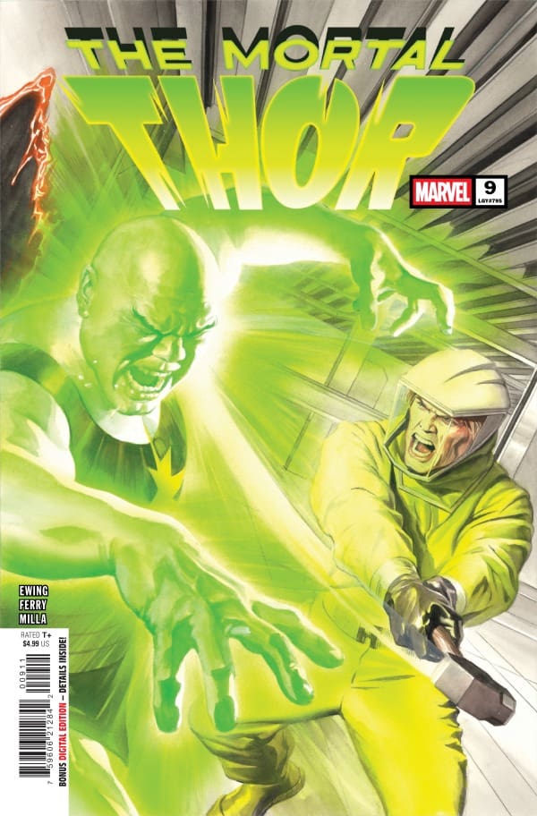
The Mortal Thor #9 cover by Alex Ross. Image from Marvel Comics
The art for this issue was outstanding. With the reintroduction of a classic character, Ferry and Milla were able to give them a little bit of a glow-up for the modern audience. Ferry’s lines are crisp and clear. It’s also clear that Ferry spares no detail with even background details being well drawn and lifelike.
Milla does an amazing job with colors in this issue. Because of the subject matter, there was a chance for a few particular colors to drown out the panels, but Milla does an amazing job balancing the tones and colors. Joe Sabino does a particularly impressive job in this issue, filled with SFX, getting creative and ensuring that the art gets full billing in each panel.
Final Thoughts
This is another solid issue in the series. Everything about this feels like the updated adventures of Thor. For long-time Thor fans, it feels familiar yet distinct.
Overall Grade: 9/10
Until next time, may your pulls be magical, and your multiverse remain stable
What did you think about this issue? Let’s chat about it in the comments.
The Twilight Zone is back with a new installment. In this issue, Nicole Goux takes us on a domestic thriller style story rather than a true “sci-fi” story. Piper unable to care for even her most basic needs like social interaction, cleaning her house, or cooking for herself orders a home delivery meal kit to give her purpose. A strange inclusion in the delivery leads Piper on a discover about the dangers of losing yourself by giving too much to another.
Nicole Goux does it all in this issue. As with many of the Twilight Zone series, this issue has a single creator taking on all the duties. Goux does a really great job with writing this issue. For people who have been the throes of severe depression, Goux creates a character in Piper that readers will almost instantaneously connect with.
While part of the Twilight Zone series, Goux leans a little more into body horror or domestic thriller for this issue rather than a true sci-fi setting. I appreciated Goux’s cautionary tale approach to the story as well. Goux lays incredible groundwork throughout the story, but the ending is still pretty surprising
Art
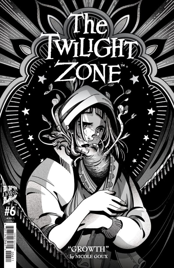
The Twilight Zone #6 cover by Nicole Goux. Image from IDW Publishing
As mentioned previously, Goux also handles the art for this issue. Goux really makes good use of the limited palette available for writing and drawing a Twilight Zone story.
The characters are still emotive, the backgrounds are still lush, and the attention to detail is still superb while maintaining the true Twilight Zone aesthetic. Goux’s tiny little plant baby is both adorable and slightly grotesque at the same time displaying an impressive merge of written and visual creative arts.
Final Thoughts
Issue 6 of the Twilight Zone shows why the series moved beyond a limited series into additional issues. Growth feels like a significant double entendre as Nicole Goux crafts a story that holds up the spirit of the Twilight Zone while being unique and distinct from each of the five issues that came before it.
Overall Grade: 9/10
Until next time, may your pulls be magical, and your multiverse remain stable
What did you think about this issue? Let’s chat about it in the comments.
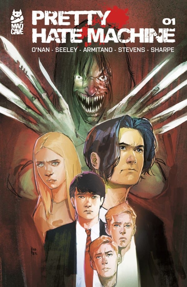
What would you do if you found out your parent was murdered and you were presented the chance to have your revenge? For Thomas, this is the exact conundrum he has to answer for himself once given the chance by Luther. A choice that isn’t the easiest for him to make, as family matters are involved. Afterall, fighting to find the truth always comes at a cost.
Writers: Tim Seeley, Ryan O’Nan Artist: Paolo Armitano Colorist: Roman Stevens Letterer: Dave Sharpe
*POSSIBLE SPOILERS AHEAD*
Source: Todor Hristov, Mad Cave Studios
Pretty Spectacular Writing
First, I have to commend co-writer Ryan O’Nan for this being his first foray into the comic book medium. For those who don’t know, he’s usually a TV writer, having written for shows like “Skins” and “Legion”. Between him and Tim Seeley, they created something that, so far, is masterful. From the first page onward, everything feels gripping. At the start, we meet three kids who talk about a mysterious accident and see what looks like red lights across the way. This moment gives our first big, gory twist which I won’t spoil here. This whole first issue is turn after bloody turn, making for terrific pacing yet keeping things easy to read.
As far as the story goes, it very much seems inspired by the likes of Shakespeare’s “Hamlet”. If you know Shakespeare, let alone that particular story, it can be very easy to see where this might go. That being said, the story feels very fresh and modern while making for a very interesting mystery with a horror twist. On top of that, for anyone who’s ever lost a loved one, the main character Thomas feels highly relatable. I especially love how he seems very conflicted about the opportunity presented to him, as I feel most would be.
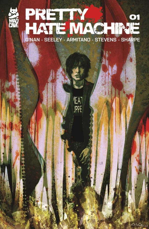
Source: Rod Reis, Mad Cave Studios
The Art of Murder
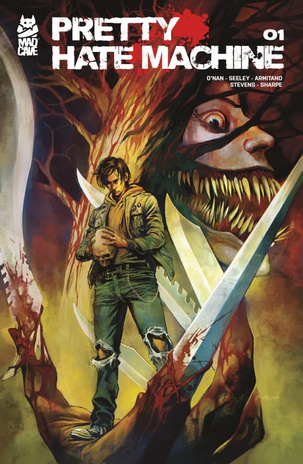
Do you want to know the other great things about this book? The absolutely stellar artwork and paneling. The work from colorist Roman Stevens as well as the penciling from all of the artists, especially Todor Hristov on the main cover and Paolo Armitano on the interior, is gorgeous to look at. Every frame is just as intense and detailed as the last, with the gutter space working perfectly to match the tone of the page. Not only that, but the paneling is easy to follow, despite being creatively disjointed. All of it together blends seamlessly, creating a beautiful work.
Source: Michael Gaydos, Mad Cave Studios
Overall – 10/10
Seeley, O’Nan, Armitano and Stevens all worked together to create a beautiful and horrifying take on a Hamlet-like story that would surely make Shakespeare himself proud. If you love tense tales of revenge, murder, devious beings and a dash of teen-angst, this is the run for you!
Be sure to read more from me here and check out my socials!
Comments
Are you checking out “Pretty Hate Machine #1”? If you did, let me know your thoughts in the comments below!
Free from his ancient prison, Kyron, along with the ancient sword Dainsleif, seeks to purge the world of all life. Having witnessed the sacrifice of Yanisa, Dani finds herself in search of Kyron with a standoffish Kian. Now Dani and Kian must hurry to recover an ancient relic before Kyron if there is any hope to preserve the world they know and love.
This review is a joint review from Nerd Initiative’s Megan and Shawn!
Creative Team
Writer: Ashley Allen Artist: Edoardo Audino Color Artist: Arthur Hesli Letterer: Clayton Cowles Cover Artist: Germán Peralta
Writing
Megan: Ashley Allen continues to give Dani Moonstar a story that keeps you on the edge of your seat, eyes glued to the pages. There’s an excellent depth that Dani has that Allen is able to bring out of her, making her so much more than just a mutant. Allen did the same when she wrote for Magik, and shows that she truly knows the characters and knows how to let them shine.
In Moonstar #2, Dani and Kian are on their way to find a way to stop the ancient warrior Kyron. Kyron has the goal of destruction with his death ritual, and it’s up to Dani and Kian to stop him from completing the ritual. This already sounds complicated, but tensions are high which makes it even more difficult. Kian is stuck in his emotions after Yanisa was killed when she sacrificed her life in order to allow Kian and Dani escape to safety. Now, Kian blames Dani for Yanisa’s death. So, Dani and Kian have to find a way to get along enough to stop Kyron or disaster will follow after he completes his death ritual.
Shawn: Ashley Allen is doing such an amazing job adding depth to Dani Moonstar’s character. Dani like many mutants, has had her share of tragedy and obstacles to overcome, but Allen is crafting Dani in a way that Dani feels wise beyond her years. It feels like a breath of fresh air, having Dani articulate the ways she has grown from her tribulations. Not only has she grown, Allen also allows her to show she recognizes the recklessness present as she was overcoming her grief and see it in others. Dani’s empathy is on full display but not in a blank check kind of way, but a way that indicates she can understand the hurt and the pain without making it her or others blind to the task at hand.
With such a unique history, Allen does an impressive job of weaving the whole of who Dani Moonstar is into this series. This is particularly evident in Issue #2. Allen has managed to work Dani’s role as a member of the X-Men, the Cheyenne Nation, and even a Valkyrie into the story in a way that feels meaningful to the story, adding to the story rather than feeling like a one-off mention. Not only does Allen do a great job with Moonstar, but she’s crafting Kian into a complex character. He is simultaneously more seasoned than Dani but still more reckless.
Art
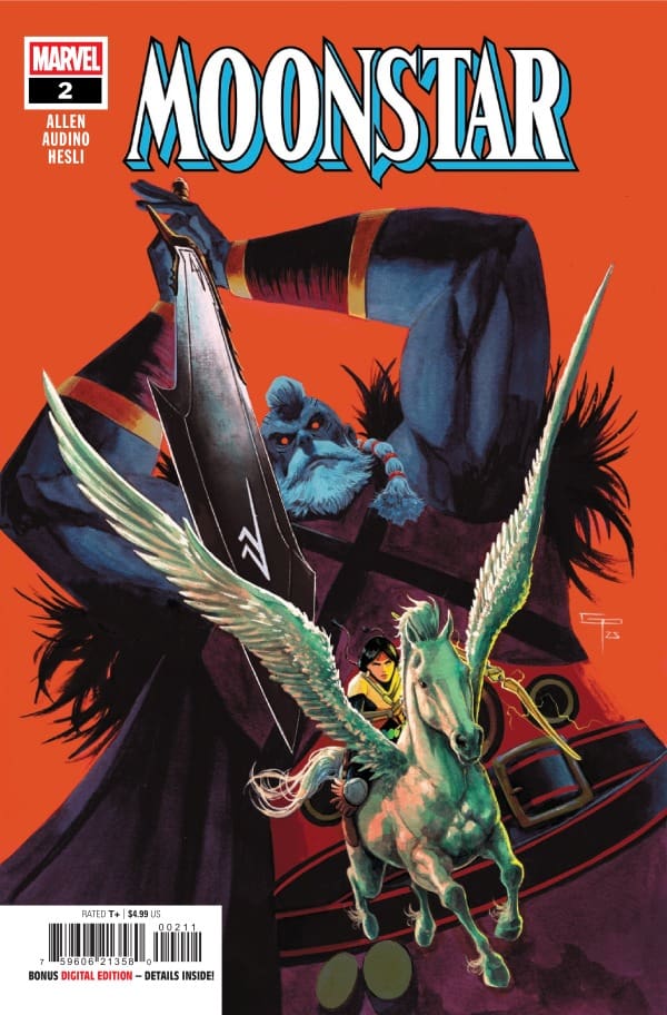
Moonstar #2 Cover by Germán Peralta. Image from Marvel Comics
Megan: The artwork for Moonstar #2 brings the horror factors in that match the tone of the story perfectly well. If you’re on a mission to stop a death ritual from happening, then you can be sure it’s bound to be a spooky time. Edoardo Audino, Arthur Hesli, and Clayton Cowles bring all the right notes that make this comic an absolute banger. Audino brings beautifully detailed panels that easily portray the tone of the story. Hesli is able to match muted tones with vibrancy, which really matches the tone of the horror energy very well. Cowles brings a perfect flow of dialogue throughout the story and brings emotion and power to the character’s words.
Shawn: The art for Moonstar continues to stun. Audino and Hesli continue to team up for images and colors that are so evocative and perfect for the setting. In times where Audino has set a dimly lit scene, Hesli still manages to utilize Dani or other characters to bring a pop of color to the scene, not only bringing the characters to the forefront but also adding depth.
Hesli’s colors really pop and create a drastic shift in the panels where Audino shows us the type of abilities Kian possesses. Clayton Cowles does an impressive job with lettering as well as SFX. The lettering flows well moving readers easily from panel to panel and clearly distinguishes when you are getting dialogue versus internal monologue
Final Thoughts
Megan: 9/10. I absolutely love this creative team on Moonstar. There’s no one better working on Dani Moonster’s story than them! The second issue was everything the first issue was and more. This should be on everyone’s pull list!
Shawn: 10/10 The creative team of Allen, Audino, Hesli, and Cowles crafted another amazing issue. The story adds depth to the character of Dani Moonstar that fans have needed for so long. The narrative is meaningful and heartfelt, truly feeling like the reader is coming along on a journey with Dani as she learns and grows. The last few panels of this issue had me reminding myself to breathe!
Overall Grade: 9.5/10
Are you enjoying Moonstar? Let us know in the comments below!
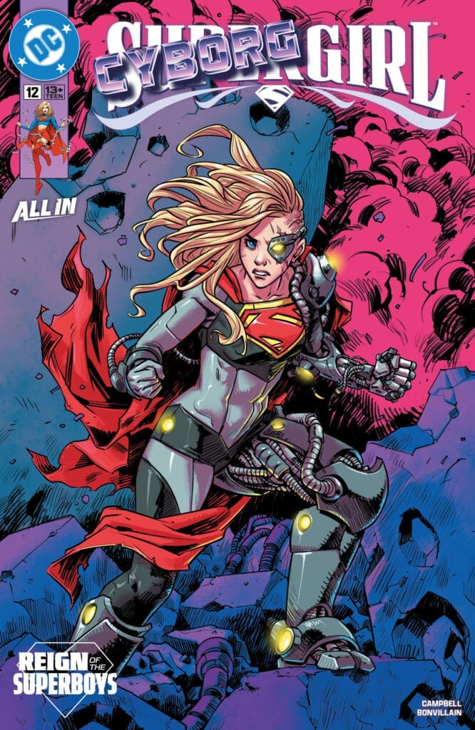
Matt – Cyborg Supergirl was unexpected but also a nice change of pace! The science council thought they were doing the right thing, were truly in the wrong, and so seeing how they justified themselves against Kara, who remained aware of what was going on throughout the book, was a great back and forth dillema. Especially as the more we get from Black Flame, the more I find myself agreeing with them. Sophie does a great job blurring the lines of who is right and who is wrong, showing us that not everything is always black and white.
Megan – The battle between the Science Council and Black Flame intensifies to new heights! Supergirl is without her powers as she doesn’t have her Yellow Ring of Nor-Kann and is gravely injured. She’s taken to the Science Council who perform life-saving measurements to help Kara without her permission. Kara wakes up to brand new cyborg parts added to her body that can make her the ultimate weapon.
This issue was very eye-opening in showing how toxic the Science Council truly is, and Kara is more than aware. It seems that every step the council takes in order to stop Black Flame, Kara rightfully disagrees with. Although Black Flame is the villain, as she’s the rebel of Kandor, she’s starting to seem to have a point. The tone of the comic will have you second guessing who the actual villains are of the story, which I think is a testament to the writer’s fantastic writing talents. Sophie Campbell continues to knock Supergirl’s story out of the park with the depth she provides, and the emotions that ring loudly in the story.
The Art
Matt – Speaking of cyborg Supergirl, I loved the various little details Sophie put in, such as around her eyes or throughout various parts of her, which made Kara look wicked awesome. The color worked as the battle began to rage and we see more of Kandor stood out as there was a ton of vibrant colors being used to pop off the panels. The various characters were all given their own flair, making them stand out and making this one visually appealing.
Megan – Sophie Campbell, Tamra Bonvillain and Becca Carey bring a great amount of excitement to the pages of Supergirl #12. Besides Kara looking really cool with her cyborg gear, the other characters are drawn to shine on their own. Each character has their own vibe that Sophie Campbell captures well. Tamra Bonvillain handles the colors, giving the story a beautiful vibrancy with each page looking like a work of art with juxtaposing bright colors. Becca Carey is the letterer, and delivers top quality work as always. What I really appreciate about Carey is how she portrays the sound effects of the comic, making you feel each effect and getting a better vision of the story.
Final Thoughts
Matt – 8.5/10. While I did enjoy this issue, I do feel it was slightly jarring, but not in a bad way. I am excited to see where Sophie takes this story, as I have loved every issue and will keep this one at the top of my pull list!
Megan – 8.8/10. I’m very excited to see where this battle goes with Kara and Black Flame, and especially interested to see what happens with the Science Council.
Overall Grade -8.7/10
Let us know in the comments what you thought of Supergirl #12!
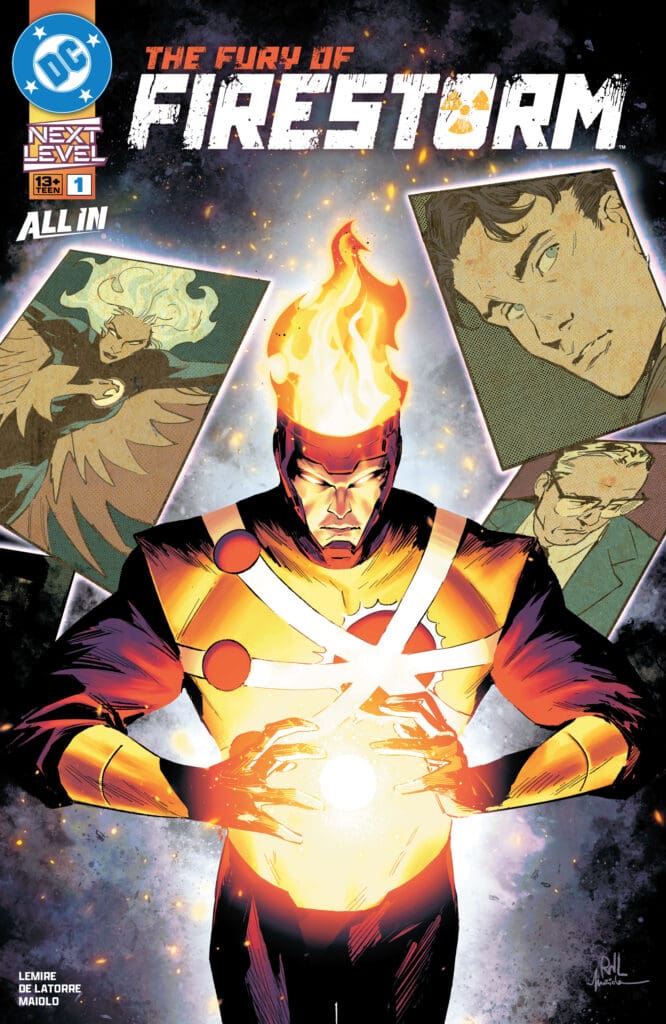
The town of Bedford, Colorado, is the target of Firestorm as he lands here, turning everyone to dust or worse! The government, in a desperate attempt to appeal to Ronald Raymond’s human nature, calls upon his ex-girlfriend Lorraine Reilly, who knows one thing: whoever this Firestorm is, he is not Ronnie Raymond.
The Fury of Firestorm #1. Credit DC Comics. Cover by Rafael De Latorre and Marcelo Maiolo.
Creative Team: Jeff Lemire (WRITER), Rafael De Latorre (ART and COVER), Marcelo Maiolo (COLORS and COVER), and Lucas Gattoni (LETTERS).
Matt: I’m not too familiar with Firestorm aside from knowing that Martin Stein and Ronald Raymond are the two who have fused to create him. Jeff does a great job giving a brief introduction into the history of the character and the various iterations of those who have held the mantle, as well as bringing us up to speed quickly. Unfortunately for those in this run, it does not look like things are going to be as happy-go-lucky as Bedford, Colorado, turned into a house of horrors real quickly.
Lemire shows off the strength and power of Firestorm, as well as shows us that something is keeping Raymond trapped. We know things are awry because, in their desperation, Lorraine and the government need to find Stein, and the final pages allude to something going on deeper than expected as they have unbound from one another. I’m pumped to see where this goes.
Megan: The Fury of Firestorm #1 starts with the title character coming into town and making an absolute mess. Chaos and destruction follows wherever he goes by his own design. Meanwhile, the Department of Defense have been keeping a close eye on Firestorm. Knowing the threat he is, they seek out assistance from Lorraine Reilly, AKA Firehawk. The DoD have no idea the threat they’re up against, but Firehawk has a better idea. Seeing the damage that’s been done, and seeing how Firestorm is acting, Firehawk is more than sure that this can’t be him.
Once Firehawk and the Department of Defense make contact, it’s confirmed that this isn’t the Firestorm the public knows. This isn’t the Firestorm that Firehawk dated. This isn’t the Firestorm that holds two different personalities in his body due to the Firestorm Matrix. Something is very very wrong and it seems that there’s no one strong enough to step to this Firestorm.
The Art and Letters:
Matt: The team showcases Firestorm’s abilities beautifully as we see the various methods of molecular manipulation come to life across these panels. There is true horror in the panels, as the terrified faces are captured in detail as they meet their demise, letting the art team show off an array of abilities. The art style switches up midway through the issue, giving it an old-timey, more newspaper-feeling. I love the switch-up, allowing the team to play with various styles, showing off different details as well, and it helps impact the mood of the issue.
Megan: Rafael De Latorre, Marcelo Maiolo, and Lucas Gattoni somehow managed to achieve a grittier energy to the art while making the story feel larger than life. The artwork of The Fury of Firestorm is nothing short of fantastic all the way through. Rafael De Latorre provides immaculately detailed panels while Marcel Maiolo finds an excellent balance in the muted tones and vibrancy. Lucas Gattoni handles the lettering and perfectly portrays the tones of the story through the dialogue. What I loved that the artists did was excellently capture the varying tones of the story, whether it be the fright of the characters or the aggression of Firestorm, and let the reader feel the heightened emotions for themselves.
Final Thoughts:
Matt: 9.5/10. The Fury of Firestorm #1 does a great job bringing in new readers, catching them up on the character’s backstory, while introducing something ominous at play. It captures your attention from page one and never lets go as the team plays with various art styles, and the story is incredibly engaging. I am really on board with this run so far!
Megan: 10/10. The Fury of Firestorm is the perfect book to jump into a character that you may not know much about. With the origin of Firestorm told, we also get a whole new story that keeps you hooked into the pages of the Fury of Firestorm #1. The story is compelling, the characters are very well written, and the artwork is gorgeous.
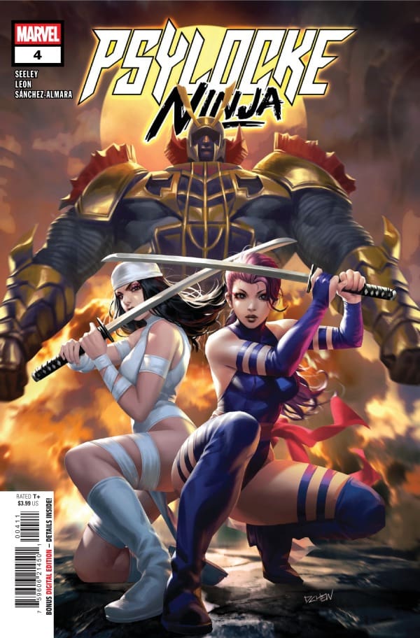
Jubilee has been kidnapped and it’s up to Psylocke to save her. After being freed from the influence of the Hand, Betsy was laying low trying to enjoy some anonymity in Madripoor. With Jubilee following her like a shadow, Jubilee witnesses a murder that results in her being kidnapped. Little does Psylocke know that Elektra and the Snakeroot Clan are both close on her heels.
Writer: Tim Seeley Artists: Nico Leon Colorists: Dono Sánchez-Almara Letterer: Ariana Maher Cover Artist: Derrick Chew
Writing
Tim Seeley really gave readers an interesting story in this issue. The world continues to fill in as we learn more and more about Psylocke. I’m always game to see a battle between Psylocke and Elektra and this feels meaningful for a penultimate issue of a series. I liked Seeley giving us a glimpse into the politics of Madripoor as well.
This feels like a really good setup for the final issue of this limited series. While maybe as not big in the major impact or reveals department as some of the other issues, it is clear that Seeley is doing a great job drawing all the threads found in this series closer together as he prepares to wind it up. Seeley is doing so in a way that feels authentic to Psylocke’s character and allows the story to breathe.
Art
Psylocke: Ninja #4 cover by Derrick Chew. Image from Marvel Comics
As amazing as this run has been, it simply would not reach the heights it has without the amazing visual team. Through the dirty streets of Madripoor, seedy office meetings, and even beautifully drawn fights, Nico Leon has crafted a beautiful world for these characters to play in.
Dono Sánchez-Almara has stunned with colors, perfectly capturing the mood of each panel. Nightclubs feel bright, lively, and fun, while you immediately jump into darker colors, the next panels feel just right. It feels like Sánchez-Almara is giving us exactly what we would expect from established characters but in a way that still feels his distinctly. Ariana Maher does an amazing job with lettering helping the reader flow through the story. With characters with psychic energy like Psylocke it can be easy to get bogged down or distracted. Maher avoids that perfectly
Final Thoughts
This series has been so satisfying and rejuvenating. The series has rekindled my love for both Kwannon and Betsy Braddock. The stories have been fun and interesting, and it will be sad to see the series end.
Overall Grade: 9 / 10
Until next time, may your pulls be magical, and your multiverse remain stable
What did you think about this issue? Let’s chat about it in the comments.
Wolverine and Silver Sable have done everything they can to keep their community safe and prepared. However, there is only so much they can do when the hits never stop coming.
Creative Team
Writer: Saladin Ahmed;
Artist: Martin Coccolo;
Color Artist: Jesus Aburtov;
Letterer: VC’s Cory Petit;
Cover Artist: Dan Panosian;
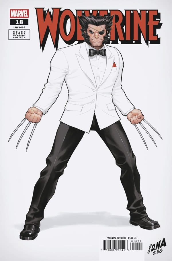
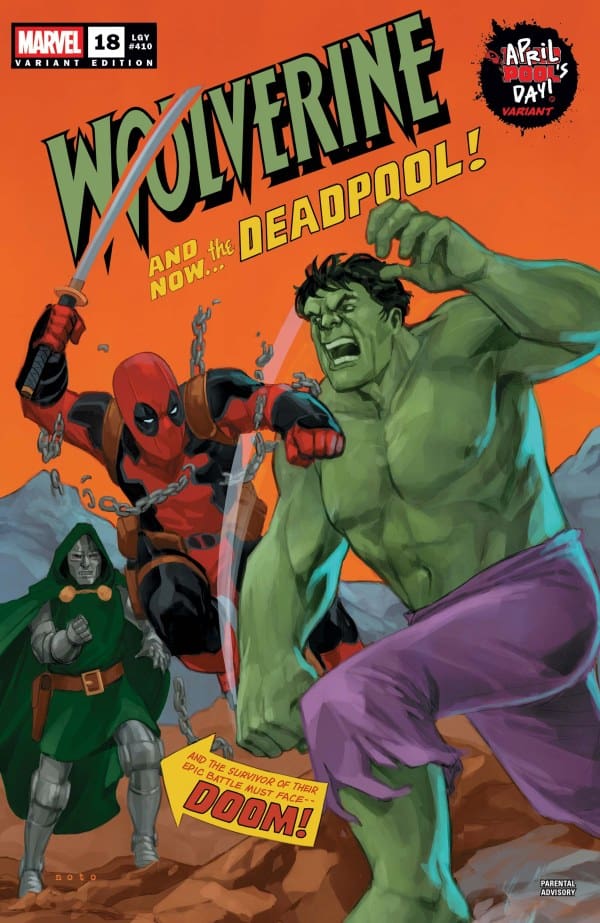
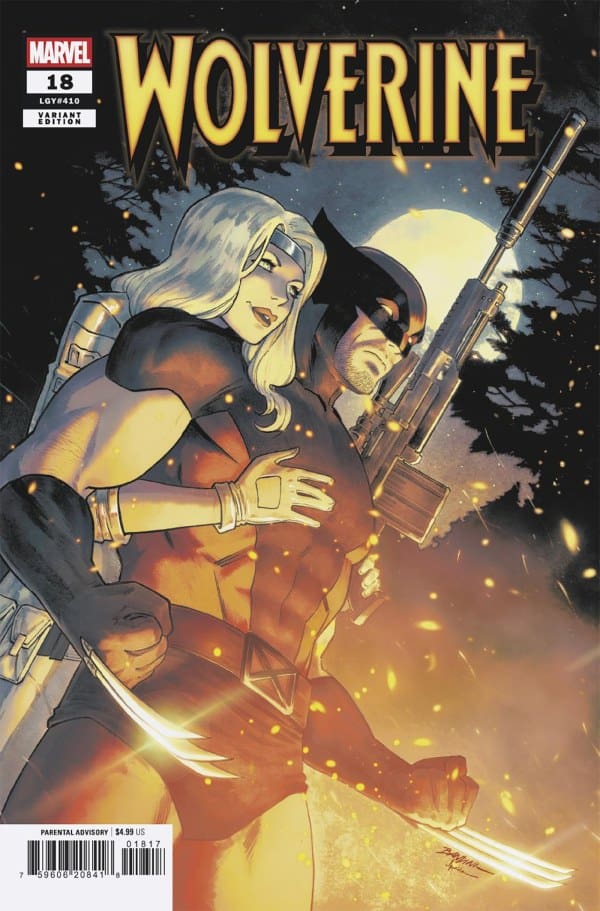
Variant Cover Artists: Michele Bandini & Marcelo Maiolo; Domenico Carbone [Ultimate Farewell]; David Nakayama [Color Block White]; Phil Noto [April Pool’s Day].
Check out the review for another current Wolverine run: GENERATION X-23 #1.
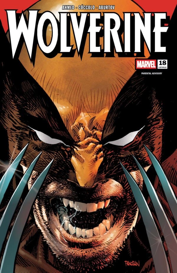
WOLVERINE #18 Cover. Image by Marvel Comics.
The Story for WOLVERINE #18
All the training this mutant community has endured, is being put to the test. Wolverine smells a familiar threat nearby. However, as he gets closer what he expected gets flipped upside down. Who he expects to find, he finds, but it’s not at all how he expected to find them. A reunion then shifts to an intervention as a not so in past problem becomes an issue once again. This time though, the problem is more force majeure…or an act of God.
WOLVERINE #18 Variant Cover. Image by Marvel Comics.
WOLVERINE #18 Variant Cover. Image by Marvel Comics.
WOLVERINE #18 Variant Cover. Image by Marvel Comics.
The Art
The art in this issue of Wolverine pulled out all the awesome comic book stops. We got some beautiful scenes in the woods, an epic moon silhouette, and a ton of perfect action shots with perfect lettering and coloring. This issue truly nailed the freeze frame shot, quite literally.
Overall Grade: 9/10
This run of Wolverine continues to twist and turn in directions that always feel like a Wolverine story, but still keep you on your toes. With the addition of new characters in Wolverine #18, I’m excited to see where we go from here. Wolverine may be the best at what he does, but he’s definitely got his work cut out for him now. SNIKT!
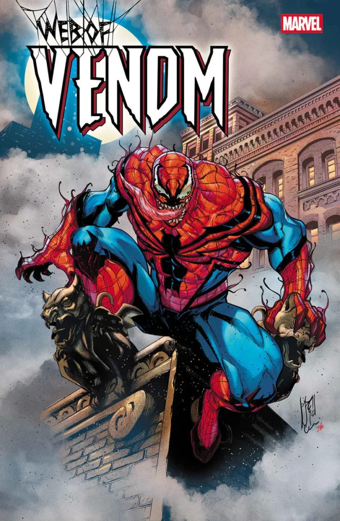
A symbiote by the name of Passenger has overtaken someone Peter Parker knows very well! With their newfound partnership, this person hopes to make an epic comeback..that is, unless The Avengers and others have something to say about it!
Web of Venom #1. Credit Marvel Comics. Cover by Stefano Cassello and Federico Blee.
Creative Team: Jordan Morris (WRITER), Luke Ross (ART), Ramon Rosanas (ART), David Curiel (COLORS), VC’s Clayton Cowles (LETTERS), and Stefano Casselli and Federico Blee (COVER).
SPOILERS AHEAD
The Story:
I have to be honest, I thought for sure Jordan would use this moment to bring Paul in as the big mysterious character. It would have been hilarious and fit the bill for his type of humor. However, what we got is way better in fact! I love that Jordan brings out a bit of a deeper cut with Fred Myer the former baseball star turned Boomerang! This issue is full of hilarious moments, making it a lot of fun. The comedic timing hits just right when Fred wants to think back on how he got to this moment, and the back-and-forth banter fits in perfectly with Passenger and Fred.
We get Hawkeye and other low-level criminals making an appearance even which delivers some web-slinging action across the panels. This was a story of a guy who just wants to do good and is down on his luck, which I respect. Morris does a wonderful job making us feel empathy for not only Fred but Passenger as well, who was trapped for 200 years! All in all, I would love to get more of this fun story!
The Art and Letters:
The art is full of incredible sequences and details. When Fred talks about having his home on Staten Island, I loved how we had the generic Live Laugh Love wall art and the Merlot pun. The colors were abundant, and seeing the beefed-up Spider-Man suit as a symbiote was incredibly fun. The way the art team had the tentacles emerge from various parts of Fred’s body and how they made this symbiote feel similar and yet different, all the same. Moments like revisiting the bar and seeing who they opted to put in as the villains of the “lower tier,” along with details and easter eggs like these, made the artwork hand in hand with the story, bringing us a lot of fun.
Final Thoughts:
Web of Venom #1 promised someone we would not expect and a big surprise, and man, did it deliver! This issue was full of cheesy dialogue and action, all making it so much fun to read. Web of Venom #1 is a perfect example of what makes comic books fun to read, so check this one out!