Home Blog Page 58

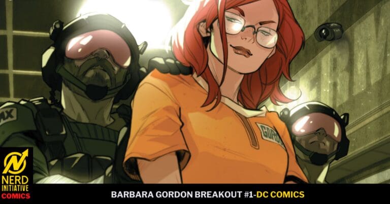
BARBARA GORDON: BREAKOUT #1: Kangaroo Court.

Vandal Savage’s reign of terror across Gotham has set his sights on the Bat Family. Throwing all of his enemies in Supermax, Barbara has gotten herself arrested to be the man on the inside, helping out anyone wrongfully imprisoned. Unfortunately, Barbara’s worst enemies are also in the prison, and she is on her own with no mask and no backup and a giant target on her back. How long can she survive on her own?
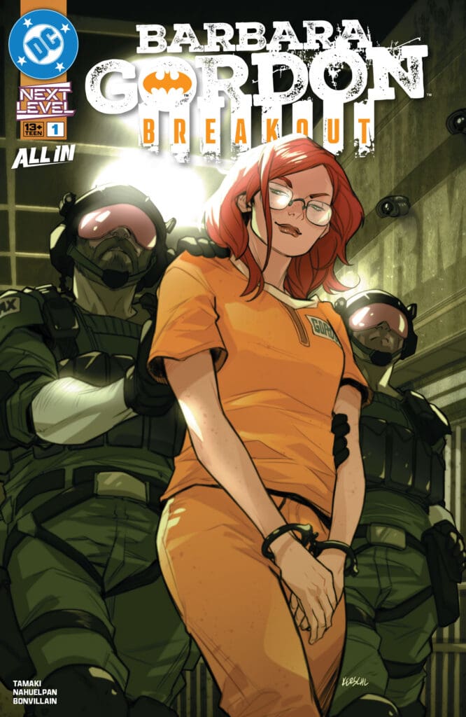
Barbara Gordon Breakout #1. Credit DC Comics. Cover by Karl Kerschl.

Creative Team: Mariko Tamaki, Amancay Nahuelpan, Tamra Bonvillain, Ariana Maher, and Karl Kerschl.

This is a joint review by Matt of Hops ‘Geek’ News and Megan of Vigilante Vibes Podcast!

The Story:

Megan: Following the intense story of Batman #9 by Matt Fraction, we now see Barbara’s point of view from inside Supermax. Barbara already has a target on her back with being the new girl, but once the other inmates find out who her dad is, that adds a whole new layer of danger. Barbara shows the others pretty quickly that she isn’t one to be messed with, but it seems that the other inmates aren’t the only ones she has to worry about. The guards are made up of ex cons that her dad personally arrested. With no way for the Bat-Family to rescue her from the prison, Barbara has to figure out how to keep herself safe all on her own.

There’s so much in this comic to enjoy. Seeing Barbara, who’s an iconic character in her own right, being put in this position is terrifying, but seeing how she handles herself is powerful. Mariko Tamaki does a beautiful job as nailing the intensity of the story and continuing Barbara’s story from Batman #9.

Matt: I am loving this take on Barbara, who has always been a strong and amazing character in the Bat Family. Mariko sets her up to be in prison, and there are familiar faces off the bat, such as Die, the daughter of Two-Face, who has immediately set her sights on Barbara. The way her inner monologue is written gives us insight into her plan and showcases how fearless and badass Gordon is. There are some intense fight sequences as Barbara shows off her skills, and you cannot help but cheer in the moment. The cheers are short-lived because the final page of the issue casts a massive shadow, and it’s the first time we see her truly terrified since being thrown into prison. I love how this first issue played out and am sold on this run already.

The Art and Letters:

Megan: Amancay Nahuelpan, Tamra Bonvillain, Ariana Maher perfectly capture the grittiness of the story which I think pushes the depths even harder. Nahuelpan brings excellently detailed drawings mixed with abstract backgrounds that allow the characters to be the perfect focal points. Bonvillain is able to capture the loneliness of prison with the darker colors, but still have a beautiful array of vibrancy throughout the comics. Maher keeps a very tense and even inner dialogue of Barbara, even when there’s heightened energies all around her. All in all, the artists really knocked this out of the park!

Matt: The artwork is extremely well colored, as Bonvillain paints the prison in such a desolate and helpless setting. The sands are lifeless, and the orange jumpsuits jump out from the panels. Amancay draws up beautiful fight sequences with a swiftness and just enough of a punch to each hit that leap from the panels. I love how fierce Barbara is drawn, and you can see how determined she is. It makes the final page stand out that much more when she sees something in her cell that strikes fear into her. Maher’s letters take us into Barbara’s mind and show us how confident she is when entering this unknown.

Final Thoughts:

Megan: 9.1/10. I found Barbara Gordon: Breakout #1 to be a breath of fresh air when it comes to Bat-stories. Seeing all of this from Barbara’s perspective was fasicanting, but to also see how truly alone she was in a place that’s full of people who are working against her was impactful.

Matt: 9.5/10. Barbara Gordon: Breakout #1 is an excellent first issue that shows us how far members of the Bat Family are willing to go in order to protect their city. The team sets the tone instantly with this first issue, and I am really excited to keep reading!

Overall Grade – 9.3/10

Let us know your thoughts in the comments below!
Leave a Reply

This site uses Akismet to reduce spam. Learn how your comment data is processed.

Geiger #23 – A Glimpse of Hope

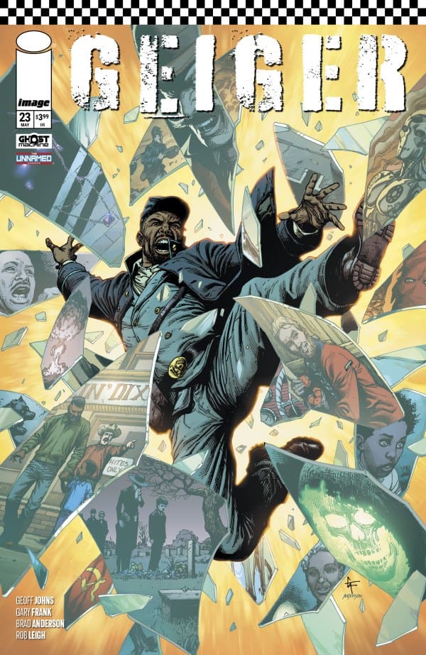
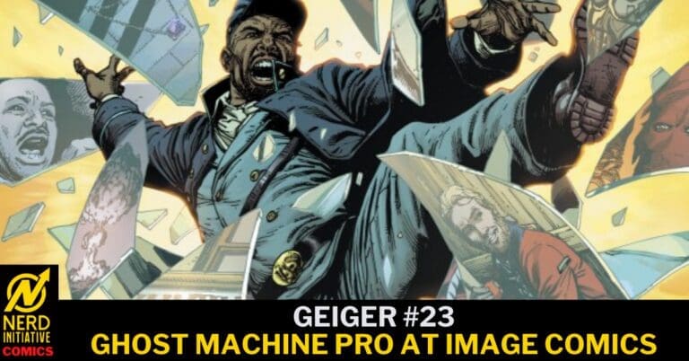
Geiger #23 from Ghost Machine comics is out today. Last we saw the glowing man, Malcolm North gave him something he thought impossible: his family back. Or did he?

Creative Team

Creators: Geoff Johns & Gary Frank;

Color Artist: Brad Anderson;

Letterer: Rob Leigh;

Editor: Brian Cunningham;

Designer: Steve Blackwell;

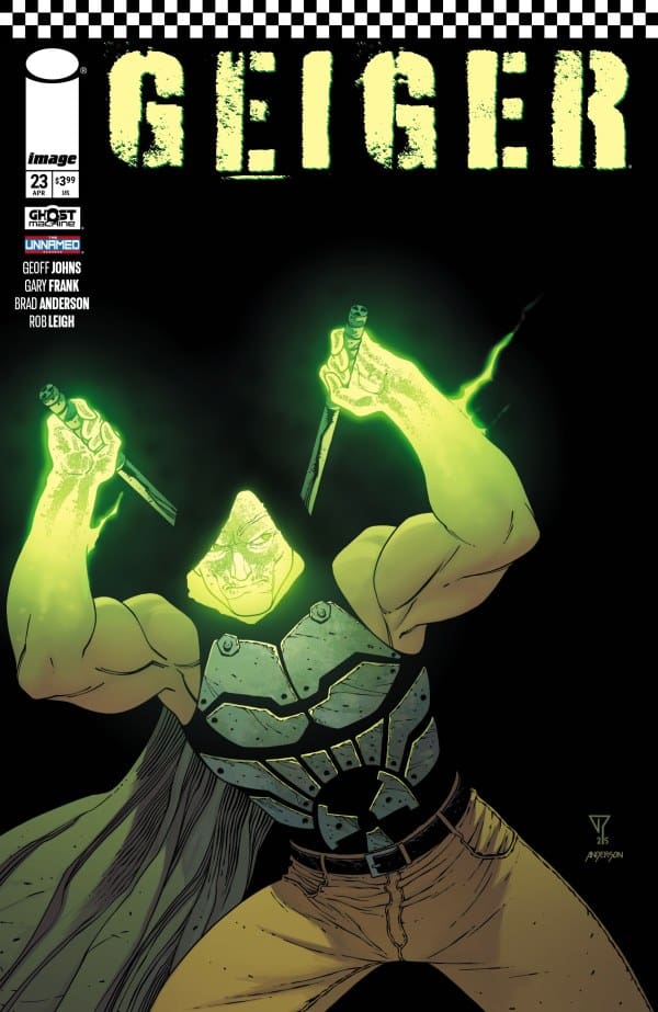
Covers A Art: Gary Frank & Brad Anderson;

Cover B Art: Francis Portela & Brad Anderson

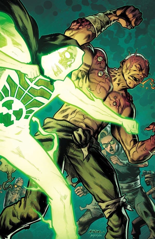
Cover C Art: Lee Ferguson & Brad Anderson.

Check out the review for the last issue of Geiger by CLICKING HERE. For an interview regarding the current story and future of Geiger, CLICK HERE.

Geiger #23 Cover from Ghost Machine Pro at Image Comics.

The Story for Geiger #23

“History has always burned. Not every fire is arson.” That is an ice cold line to tell a man who lost everything in the Unknown War. Yet, it’s the truth.

Tariq Geiger had seemed to accept that his family was gone, until Malcolm North gave him hope. Hope can be a wonderful thing, however, it an also drive someone insane. Having seen his wife and kids for the first time in years… alive, Geiger seems to have been reborn. Still not sure who or what is behind everything, his mission now seems very clear. Despite having no real direction.

Geiger #23 Variant Cover. Image from Ghost Machine at Image Comics.

The Art

We got some awesome glowing man action, some beautiful time travel details, and we got a lot of emotion. While every page was (as always) beautifully done, a highlight for me in this issue was Tariq Geiger’s face. So much can be conveyed with an expression, and his expressions in this issue were pure. It’s not too often a comic will really pull at my heart strings, but damn if I didn’t have to dab my eyes reading this issue. The face of a man who has been brave and defeated for too long, suddenly is at peace. At least for a moment.

Final Thoughts

The plot thickens, as more questions arise! Geiger truly gets better with every issue. I have loved the duo of The Glowing Man and The Northerner. Plucked from very different time periods, and realities, yet very similar. I absolutely cannot wait to see where we go next. I have so many questions, and am absolutely loving how this story has developed and intertwined with other comics from the Ghost Machine world.

If you haven’t picked up a Geiger comic, yet there is no time like the present. I got to give this issue another 10 out of 10.

Overall Grade: 10/10

For more from Lauren, check out ‘Hops GEEK News.’

Have you checked out the world of GHOST MACHINE? Are you a Geiger fan? Let us know your thoughts!

Leave a Reply

This site uses Akismet to reduce spam. Learn how your comment data is processed.

EMPEROR AQUAMAN #17: Destroyer of Worlds!

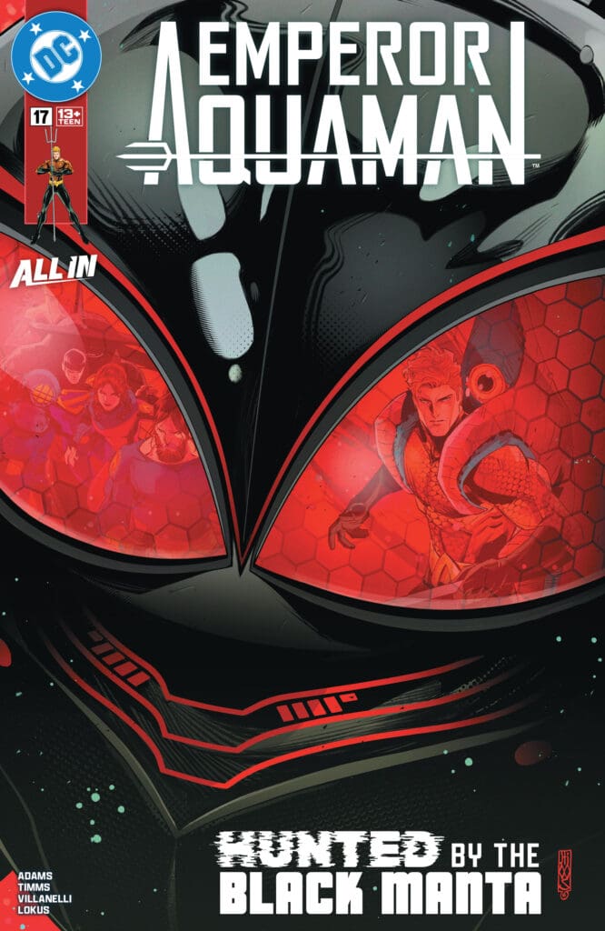
Arthur’s journey has taken him to The Father Star! Attempting to continue his efforts of placing lighthouses around the universe, Arthur has found himself alongside Jarro and on his home planet of evil killer Starfish! Would you kill one to save many? Or in this case, destroy a world to save billions? Arthur may have to make a tough choice to survive. Meanwhile, Black Manta has joined forces with Lolanna, and the duo are out to destroy everything Aquaman loves.

Emperor Aquaman #17. Credit DC Comics. Cover by John Timms.

Creative Team: Jeremy Adams, John Timms, Paolo Villanelli, Rex Lokus, and Dave Sharpe.

The Story:

The tease that Jeremy gives us of Black Manta has me ready for so much more! Just his mere presence is enough to send chills down your spine as he seeks only to destroy Aquaman and everything that he loves. However, Jeremy takes us on another journey, and this one has massive implications. Jarro is not like his kind and doesn’t seek to murder other planets, and yet they have found themselves on The Father Star. We continue to get glimpses and teasers of the full power of The Blue without fully knowing just yet the scope of Arthur’s abilities. Each journey shows us just a little bit more while bringing fair warning. Jarro takes control, and we see him start to destroy the planet and even offer a warning to Aquaman. It’s the way Jeremy can give us just enough in each issue, keeping us hooked on the line and coming right back!

The Art and Letters:

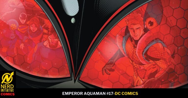
Starting with Timm’s cover, this is one of the best covers of the series yet! Trading out the lighter colors for black and red offers a glimpse and a warning to the readers. I love the reflection in Manta’s eyes as we haven’t even opened the book yet. Paolo and Timms both have exquisite detail in this issue, especially when we go to The Father Star and the insane amount of lines laid out. What really captured my attention about this issue is the page of Atlantis. The city sprawled out so beautifully puts into perspective how gorgeous it truly is. Lokus has a vibrancy when showing this page, and you can see why this city is so sought after. The artwork is incredible throughout, and the team is doing so well.

Final Thoughts:

Emperor Aquaman #17 continues to offer glimpses into Arthur’s potential with the Blue while teasing us with his greatest foe yet. There is a touch of sadness and emotion in this issue, but it is overshadowed by the excitement this team brings every month.

Be sure to let us know your thoughts below and check out more reviews by Matt!

Leave a Reply

This site uses Akismet to reduce spam. Learn how your comment data is processed.


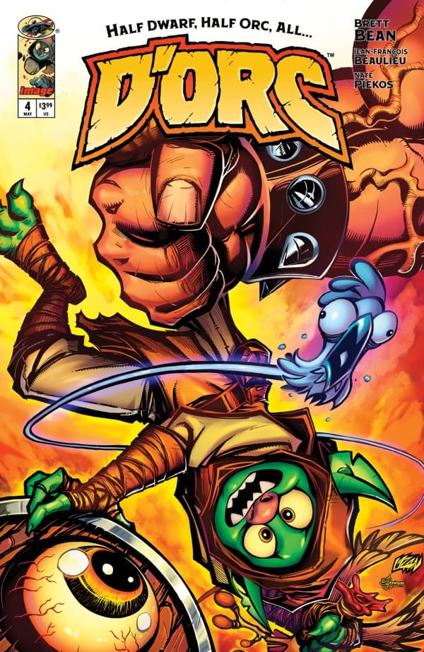
D’Orc #4 – Keep Standing Out, The World Will Catch Up!

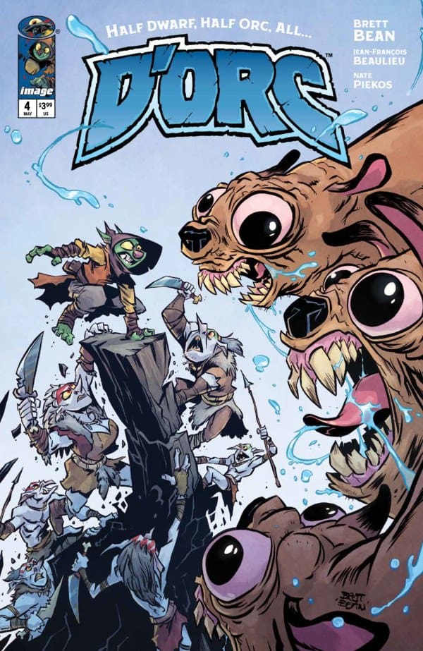
D’Orc #4 – Cover – Brett Bean & Jean-François Beaulieu (Credit Image Comics)

D’Orc #4

Writer – Brett Bean

Artist – Brett Bean

Colorist – Jean-François Beaulieu

Letterer – Nate Piekos

Cover – Brett Bean & Jean-François Beaulieu

Read the review of the last issue in this series HERE!

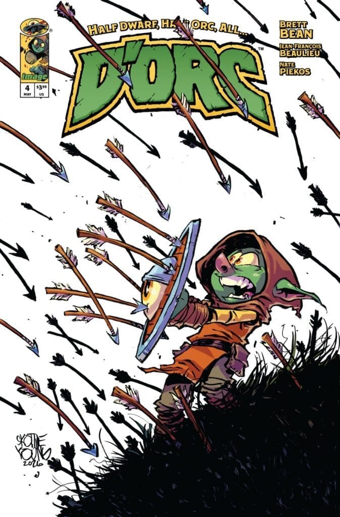
D’Orc #4 – Cover – Skottie Young (Credit Image Comics)

The Story:

D’Orc, his ghost chicken, and his possessed talking shield are still working their way towards the Silver Witch. However, a giant three-headed dog and two warring factions of goblins are in his way. D’Orc is starting to question what his place in the world really is.

The Writing:

Man… this is a masterclass in understanding how to maintain fun and engaging action story while also being able to take a beat and get into the emotional state of your character. Brett Bean is crafting a modern fantasy masterpiece in front of our eyes. The humor is on point just like it has been throughout this series. The over the top action is intact just like it has been in each issue. However, where this issue really sings in in the quiet moments. Having D’Orc admit the fear he is experiencing with the rage and darkness inside of him brings this bombastic story down to a more personal level. It also gives his shield the chance to deliver the line, “You don’t fit in, D’Orc. So keep standing out. The world will catch up, I promise.” This is a deeply profound and inspirational line that doesn’t feel out of place even with the cartoonish nature of the book and that is a real feat.

D’Orc #4 – Cover – Franck Uzan (Credit Image Comics)

The Art:

Brett Bean and Jean-François Beaulieu continue to shine with the most enjoyable art work in any comic on the market today. Each panel is dripping with energy, gore, and humor and I cannot stress enough how well this art perfectly enhances the story. The standout artistic moment in this issue is the same as the standout written moment, a single tear running down D’Orc’s face as he admits his fear and sadness at where he finds himself hit incredibly hard. On top of the wonderful quiet moments, the action is top notch as well. The design of the goblins and the three headed dog are both excellent and make for wonderful additions to this ever expanding world of weird and wild creatures.

Overall Grade: 10/10

D’Orc is the best book on the shelves right now, pure and simple. With incredible heart, over the top action, violence, and hilarious gore, D’Orc is a book that every comic book fan should be reading!

Check out more from Derek here!

Have you read this issue? What did you think? Let us know in the comments below!
Leave a Reply

This site uses Akismet to reduce spam. Learn how your comment data is processed.

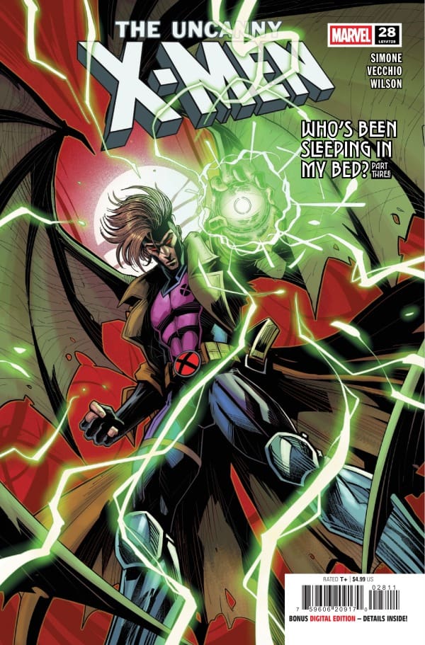
THE UNCANNY X-MEN #28 – Everything Everywhere All at Once

Creative Team – Gail Simone, Luciano Vecchio, Matthew Wilson, VC’s Clayton Cowles, Edgar Delgado

Published by Marvel Comics

Catch up with The Uncanny X-Men #27!

The Story

The Uncanny X-Men #28 has so much happening, so much excitement, that by the end of the comic, you’re left asking “wait, that’s all?! I want MORE”! That speaks on how well Gail Simone is able to keep the readers invested in the story, to the point they’re begging for more by the last page. In this issue, we continue the “Who’s Sleeping in My Bed” arc that has turned the world of mutants upside down in the most interesting way. The New Mutants are back, but are very, very off. The Outliers are at Xavier’s School for Gifted Youngsters fighting off Sentinels. On top of all that, something extraordinarily dark is happening in Graymalkin Prison.

Cover art by Luciano Vecchio and Edgar Delgado. Published by DC Comics

Starting with the prison, we get a little backstory on why Corina, the warden, is as hateful as she is to the mutant population. Even going as far as bringing in her mutant brother, it seems Corina has always hated mutants with a fiery passion. Her first introduction to a mutant was her abusive brother who tortured her as a game. That doesn’t excuse her behavior of how she’s treated the mutants of the X-Men world, but it is interesting to see just how deep rooted her hatred goes. Speaking of her brother, he is a piece of work. I’m very interested to where this goes because the Graymalkin story is absolutely brutal, and I love it.

Now for the Outliers! Our favorite young mutants are in the place of The New Mutants at Xavier’s Mansion watched over by Moira MacTaggert. Taking on the Sentinels for the first time, the Outliers are completely lost and extremely confused because everything feels off. Jitter knows she has romantic feelings for Calico, but can’t understand why. Deathdream sees Ransom as his brother, but couldn’t explain how come. Mutina is there with them, and she’s as pleasant as ever. As aggressive as Mutina is, she does bring some positives along with her, like the fact that she can read emotions in others. She can tell that the X-Men at the mansion have no emotion and no thoughts in their heads. Mutina realizes that these mutants aren’t real, which adds even more mystery to all of this.

Back at Haven House, Rogue is more than aware that something is off with these mutants, but they’re no help when they’re asked. Actually quite the opposite. Sunspot actually gets aggressively upset when asked questions by Jubilee. These New Mutants are wanting a fight, and they don’t care who they’re taking out.

The Writing

This story gets better and better the more complex it gets. Usually I’d say this was all gas and no breaks, but I feel that just isn’t a strong enough way to describe it. Emotions are high, the action is fantastic, and you truly don’t know what’s going to happen next.

With the Haven House, the X-Men are battling through confusion, worry for the Outliers, and the confusing feelings of having to fight these New Mutants. At the Mansion, confusion is all over the board, but with the Outliers, there’s very different emotions. Even in a world where they’ve never met, they don’t remember each other, their love for each other shines through. This shows the best in a particularly adorable moment between Calico and Jitter, who know they love the other, but have no explanation for it. At the prison, there’s something dark and spooky happening. We’re learning more about Corina’s backstory, but we’re also getting treated to some amazing mutants making appearances.

The Art

Along with a fantastic story, you have to have fantastic art, and when Luciano Vecchio, Matthew Wilson, and Clayton Cowles are on the creative team, that’s exactly what you’ll get. There’s so many different tones throughout the story, and Vecchio brings them all to life in a beautiful way. The characters look otherworldly and gorgeous. The fights are the highest of energies, and makes you feel as if you’re in the action yourself. Vecchio also has some fullpage panels that are absolutely stunning, such as one in particular involving Deathdream putting his powers on display.

Alongside Luciano Vecchio is Matthew Wilson, who always brings a beautiful array of colors. However, I have to admit, in this run, this issue has to be Wilson’s best work yet. Wilson perfectly captures the comic booky energy with vibrancy, but also is able to portray that everything is confusing and upside down in the story with colors that bring a whole new level of depth. Clayton Cowles handles the lettering, and once again, knocks it out of the park! With a beautiful flow of dialogue and excellent usage of sound effects, Cowles makes the reading experience even more amplified with his expert lettering talents.

Final Thoughts

The Uncanny X-Men #28 does so much more than packs a punch. It’s like taking an uppercut from the Hulk. There’s so much to love in this comic, and this arc as a whole. The creative team continues to knock it out of the park and sing to our X-Men-loving hearts.

Overall Grade – 10/10

Let me know in the comments what you thought of this issue!

One response to “THE UNCANNY X-MEN #28 – Everything Everywhere All at Once”

  1. Katy Avatar
    Katy

    Agreed! This is such a phenomenal issue. This story line has left me on the edge of my seat and that Deathdream panel as breathtaking! Sooooo good! Also, I think that Gail is do amazingly good at creating really creepy villains!

Leave a Reply

This site uses Akismet to reduce spam. Learn how your comment data is processed.

This review was written by Megan from the Vigilante Vibes Podcast! If you liked my review, be sure to check out my other reviews! Let me know what you think of The Uncanny X-Men #28, or tell me what comics you’d recommend me trying out! Find me on my socials, and check out my Marvel podcast, Vigilante Vibes, by clicking here!

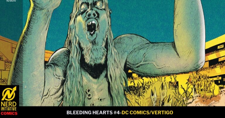
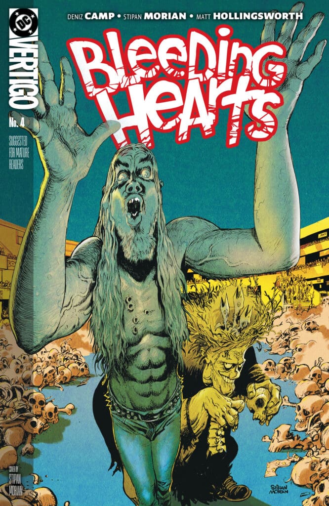
BLEEDING HEARTS #4: One More Time.

One more time, Poke keeps saying to himself as he promises to leave the living he has befriended and never betray his horde or his best friend, Mush, for that matter. While Poke keeps on disappearing, Mush has begun to notice, and it may not be long until Poke must choose between the weird new feelings inside of him or his best friend.

Bleeding Hearts #4. Credit DC Comics and Vertigo. Cover by Stipan Morian.

Creative Team: Deniz Camp, Stipan Morian, Matt Hollingsworth, and Hassan Otsmane-Elhaou.

The Story:

This issue has brought the two separate worlds and stories that Deniz has been building together into a big clash. Camp makes us sympathize and feel so much for Poke as he struggles with a battle within himself. Does he betray his family and his culture that he has been a part of since outbreak day, or does he give in to the humanity buried deep within? The entire issue shows both sides of this inner conflict in such a beautiful way. Spending time with Mush, you cannot help but want to be his friend as well, which is a testament to Camp’s wonderful storytelling.

There are also stories inside this issue where you see the ugly side of humanity once more. It creates inner turmoil and creates conflict for the audience. There is still a child-like wonder with Rabbit, who has so much curiosity and experiences joy. Rabbit brings out the best of who we are deep down.

The Art and Letters:

Stipan and Hollingsworth continue to bring the art to a whole new level that aids in the world-building that is being built. There are certain pages where the color work in the background makes the shadowy figures in the foreground of the panels. The shading on the zombies’ faces continues to push the narrative forward, and the way we see them in various perspectives is my favorite part of this run. Even with Hassan’s lettering showcasing how torn Poke is, the way they manage to capture it across his lifeless and decaying face tells so much. There are moments as well in the background that will cause you to pause in an almost “did I see that” sort of way. The art team deserves to be proud of what they continue to do with this run, as it is some of the best work in comics right now.

Final Thoughts:

Bleeding Hearts #4 continues to push the envelope of what incredible storytelling can be when you marry beautiful artwork with a haunting inner conflict. This run speaks so loudly beyond a story of a zombie outbreak and continues to be one of my favorites out there currently.

Be sure to let us know your thoughts below and check out more reviews by Matt!

Leave a Reply

This site uses Akismet to reduce spam. Learn how your comment data is processed.

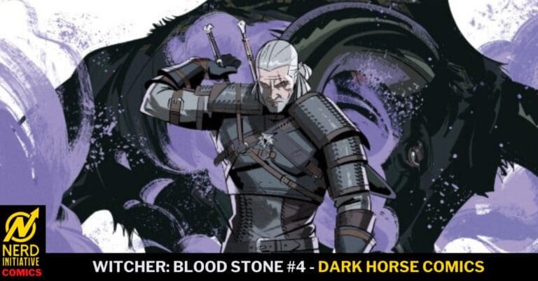
The Witcher: Blood Stone #4 – The Cost of Greed is Death

The end is here! Geralt has found himself in the isolated mountain town of Plinth. What began as a standard contract to help rid the town of a beast has devolved into a nightmare of psychological horror set in the world of The Witcher. After the fabled dwarven treasure is located in the local mines, it turns out that the treasure is actually a collection of cursed, hallucinogenic stones. The community succumbs to a fever dream of violent greed, blinded by visions of gold, and descends into a murderous frenzy, turning their blades on each other. Geralt watches and decides where to go from here in a town where the real monster is the darkness of the human heart.

This review is brought to you by Nerd Initiative’s Travis and Shawn!

Creative Team

Writer: Daniel Freedman
Artist: Pius Bak
Colorist: Roman Titov
Letterer: Hassan Otsmane-Elhaou

Writing

Shawn: What an outstanding finale from Daniel Freedman. With this issue of The Witcher: Blood Stone #4, Freedman shows that a story’s quality isn’t defined by its resolution but by its impact. While this might be the ending people imagined, it stays true to the story and feels authentic to The Witcher. Freedman really captures the horror of greed with this story and shows how even a “good” community can be destroyed because of it.

I found this issue to be an incredibly satisfying ending to the story. Freedman really showed the ability to build an intriguing and full story over the course of four issues. While the outcome seems inevitable, Freedman shows that Geralt is more than just a Witcher in it for the coin. That deep within Geralt has a desire to help.

Travis: Daniel Freedman provides a poetic ending to this four-issue mini-series! Building off the previous three issues, Daniel takes readers down from a killer climax to a violent but somber conclusion. I thoroughly enjoyed the use of Keltic style language which assisted in making this story feel like a Witcher story. I would also like to note that I am a sucker for a great Shakespeare reference, and Daniel uses an iconic one within this final issue!

Art

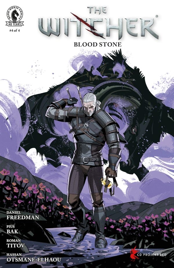
The Witcher: Blood Stone #4 cover from Pius Bak. Image from Dark Horse Comics

Shawn: As great as the writing in this series has been, the art has been equally as breathtaking. Pius Bak and Roman Titov finish strong with high-quality work that matches the previous four issues.

The art flows. It fits the story and Bak’s line work is immaculate. Everything about the drawn art feels perfect. Lines feel thick where they should be and thin where the moment calls for it.

Combine this line work with the hauntingly beautiful colors from Roman Titov, and it was a guaranteed success. Titov’s use of purple is particularly impressive as it communicates the importance of the story in a visually pleasing way and color. Hassan Otsmane-Elhaou’s lettering is perfect. It’s easy to follow, allowing your eyes to seamlessly move from panel to panel.

Travis: Pius Bak and Roman Titov continue their outstanding work bringing this story to an entertaining visual level. The pencil work from Pius continues to be light on the eyes, yet strong in terms of capturing facial expressions and various accent details within the panels. The coloration is spot on, just like the previous three issues. The color selection and shading within battle panels give the reader a sense of what it would feel like if you were present at that moment! Also want to compliment the amazing coloration of a sunset within two panels, beautiful!

Hassan Otsmane-Elhaou’s lettering for this story is impeccable! The text size is perfect for readers to be able to see. And the placement of the dialogue bubbles themselves is positioned perfectly within the panels, so they do not distract the reader from the amazing artwork that is on display. The text style changes when characters who are cursed are speaking, giving those characters a different tone, which is easy to discern
for readers. Great job!

Final Thoughts

Shawn: 10/10 Simply perfect. Everything about this story scratches the right itch. The series not only feels like it’s plucked right from The Witcher, but also feels unique enough to distinguish the creative team. It takes an existing IP and adds a new and unique wrinkle to the story. I find myself unable to believe that we only get four issues of this series as I crave more from this creative team.

Travis: 10/10 Issue four of The Witcher: Blood Stone is a great conclusion for a stellar four-issue mini-
series. This issue really brings the events of the previous issues to a full circle ending. This mini-series has “Witcher” aura from beginning to end. Readers and fans of this character and the world of “Witcher” will enjoy this series and should not hesitate to pick this up!

Overall Grade: 10/10

What did you think of The Witcher: Blood Stone? Let us know in the comments

Leave a Reply

This site uses Akismet to reduce spam. Learn how your comment data is processed.

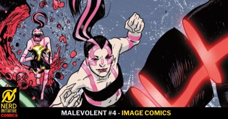
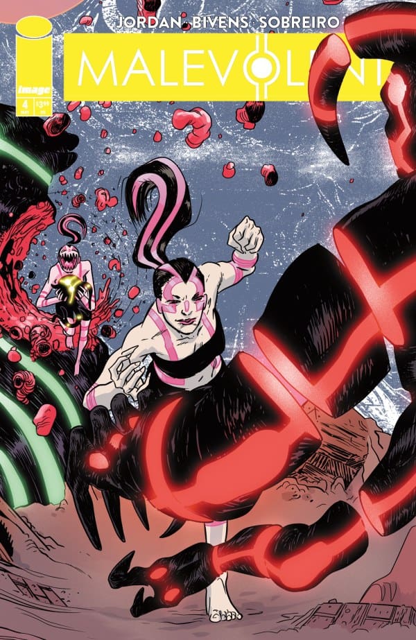
Malevolent #4 – How Did We Get Here…

Mals have been on earth for thirty years. Yet the population hasn’t a clue as to how or why… Till now…


Creative Team

Justin Jordan (Writer), Felipe Sobreiro (Artist/Coloration), CRANK! (Letterer), John Bivens (Cover Artist)

Publisher: Image Comics, Inc.


How Did We Get Here…

Issue four of Malevolent takes a step back from the present action of Mals being on earth and takes a step back in time to deliver the history of these monsters. Justin Jordan does an amazing job at flipping the script for this series. Readers are taken back to the very beginning of this travesty, to its creation. Which is going to make reader’s jaws drop!

Mals
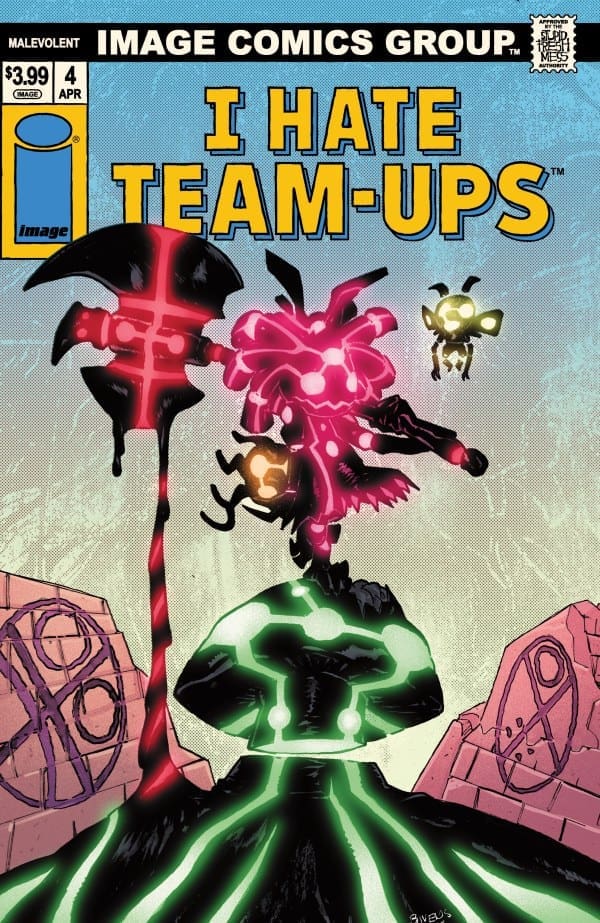
Malevolent #4, Credit Image Comics. Cover by John Bivens.


With this issue being set back in time thirty years, readers won’t realize this till much later in the issue. Once this becomes known, readers will have a much better understanding on who the main players are that helped this Mal invasion happen. Some might think it surprising, while an overwhelming majority of readers will not be as shocked to learn who the coordinators are. This issue sent me into a deep internal rabbit hole in terms of thinking of possible real-life experiments that could be taking place in our world today. Which turned out to be a very scary thought!

Readers are met with plenty of gore and violence within the middle of this issue! The art really grips the reader during these panels with the level of severity of the violence. With the gore and innocence of the characters involved, readers will start to have an emotional pull for what happens to them. You’re just going to have to get a copy and see for yourself!

The ending for this issue will leave everyone in total disbelief! Justin Jordan writes this ending in such a fashion that leaves you flabbergasted! I certainly was! If you’ve been missing out on this series so far, this issue could suffice as a starting point, while you return to issues one through three to continue reading. You’re not going to want to miss out on the rest of this series, that much I can bank on!


The Writing

Justin Jordan continues to surprise with this amazing new series! With this issue taking a step back and giving readers the opportunity to see how we got here is fantastic! This provides a deeper dive into the plot and storyline development! The issue does start off a little slow, but when the action picks up, so does the storytelling! Awesome writing!

The Artwork

Felipe Sobreiro is credited with not only the pencil work but also the coloration for this issue. Absolutely NAILED it! The coloration in the beginning is dark and subtle adding to the tone of the narrative. Once the story starts to pick up traction, so does the art! Vibrant colors and amazing attention to detail within the violent panels guarantees to get the reader’s attention! Amazing use of colors within this issue along with shading to add to the gritty tone of the narrative. Visual entertainment at its finest!

CRANK! provides the lettering for this issue and hits the ball right over the green monster in Boston! The subtle narrative bubbles throughout the beginning of this issue provide a dark yet mysterious tone for the reader to interpret. Placement is spot on as well, making the art within the panels easily visible.


Variant Cover

Malevolent #4 – I Hate Fairyland Team Up Variant, Credit Image Comics. Cover by John Bivens

Final Thoughts

Issue four of Malevolent provides an understanding of why this story is the way it is. Which is such a relief! Getting a full issue of nothing but backstory is refreshing simply because now readers are more informed than they were in issue one. I’ll say it again, do not sleep on this series from Image Comics by Justin Jordan! He has an amazing plot that is proving to provide more storytelling for future issues!

Grade: 9/10


Links

Comic Book Reviews & Entertainment News: Nerd Initiative
Previous Malevolent Review: Malevolent #3 – Ratcatchers
Travis’ NI Portfolio: TravisComicHaven – Nerd Initiative
Travis’ Personal Content: Travis’ Comic Haven


PLEASE SHARE YOUR THOUGHTS IN THE COMMENTS SECTION BELOW!

Leave a Reply

This site uses Akismet to reduce spam. Learn how your comment data is processed.

ABSOLUTE BATMAN #20: The Batman Project

Absolute Batman #20 brings us a Batman who is being hunted, wanted for the death of Jim Gordon! Bruce has cut off communication to Pennyworth and Quinn as his leads have brought him back to Joe Chill, the man who murdered his father. Two men have orchestrated everything in his life, and the revelation is about to bring Bruce’s foundation crumbling down.

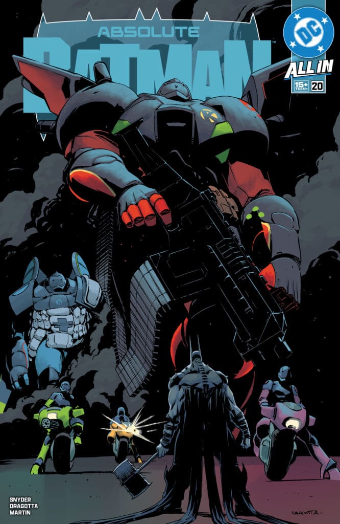
Absolute Batman #20. Credit DC Comics. Cover by Nick Dragotta and Frank Martin.

Creative Team: Scott Snyder, Nick Dragotta, Frank Martin, and Tom Napolitano.

The Story:

There is so much to unpack in this issue, and I seriously am amazed at how Scott manages to lay it out without convoluting the issue at all. First, we see Waylon meeting with Eddie, who is in some sort of contraption built to help his mind, and the dialogue between them is truly heartbreaking. We get a glimpse of Harvey and Oswald as their lives have become something much different, while Waylon is pleading with Eddie to help with Bruce. Scott gets us to empathize with every party in the matter, as their lives have been ruined at the hands of Bane.

The story overall is getting so much deeper than anything we’ve seen before. Mr. Grimm and Scarecrow have been behind everything in Bruce’s life. The revelation that they set him up to take down the Court of Owls blows my mind entirely. Scarecrow is perhaps the scariest he’s ever been portrayed in any medium, and I’m so here for it.

The Art and Letters:

The opening pages of this issue are truly horrifying and littered with gruesome details. The imagery of the man in the chair with what looks like the heads of children or babies is truly horrifying and sets the tone for Scarecrow and what is coming. Speaking of Scarecrow, he is drawn so damn well, and the way his eyes are buttons, and his mouth sewn together is just incredibly twisted. The way that the jailhouse sequence is colored is full of darkness and the shadows, and the coloring blends into the horror elements.

The dark background setting makes the chilling sequence of Chill hanging himself pop out in the panel in such a scary manner. I love the issue then brightens back up when the Robins burst onto the scene with their robotic suits. The way the robotic suits look and how the Robins move and take it to Batman in their fight, is amazing. Hats off to Napolitano with the lettering as he makes every word spoken by Scarecrow hit with a hiss and you can feel Bruce in agony as he screams.

Final Thoughts:

Absolute Batman #20 brings Bruce’s foundation crumbling down at his feet and ups the stakes of this entire run. I am excited to see what the Robins bring to the table in the next issue as the walls close in around Batman.

Be sure to let us know your thoughts below and check out more reviews by Matt!

Leave a Reply

This site uses Akismet to reduce spam. Learn how your comment data is processed.

Marvel Comics Announce New Midnight Universe

Marvel Comics have revealed their newest universe.

MORE FROM NI’S COMICS BULLPEN HERE 

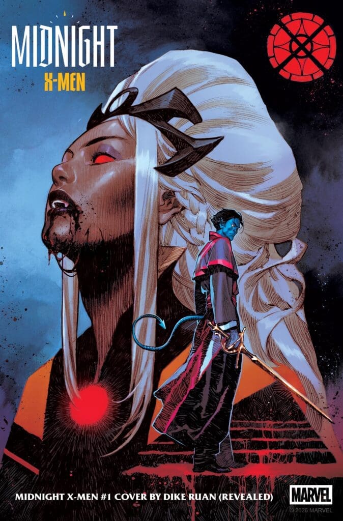
Midnight X-Men #1 Main Cover By Dike Ruan (Credit: Marvel Comics)

Their new Midnight Universe is sending their heroes into the darkness, and it will also bring haunting new visions of your favorite Marvel Comics characters. The first 3 titles include:

  • Midnight X-Men:
    • Writer: Jonathan Hickman (House of X, Ultimate Spider-Man)
    • Matteo Della Fonte (Nova: Centurion)
  • Midnight Fantastic Four: 
    • Writer: Benjamin Percy (Wolverine, Punisher) 
    • Artist: Kev Walker (Infernal Hulk) 
  • Midnight Spider-Man: 
    • Writer: Phillip Kennedy Johnson (Infernal Hulk) 
    • Artist: Scie Tronc

Now, first off in Midnight X-Men: 

“The shadows of New York City are stalked by vampires and the mutant empyres. The sword of Damocles hangs over the peace between these two species and the factions within them. An outright war is brewing and the unturned will be caught in the crossfire.” 

Writer Jonathan Hickman had this to say about the new X-Men series: 

“I’m so enthusiastic about this project—it’s the most excited I’ve been in years. The conceit of MIDNIGHT X-MEN aligns perfectly with the kind of stories I like to tell. It has a rich, open-ended mythology that equally mixes old and new ideas into something that feels both familiar and original.” 

Then, Midnight Fantastic Four shows: 

“An obsessive scientist delves into the secrets of the universe perhaps best left unknown to mankind, leaving himself and three others warped in strange and horrifying ways. What horrible secrets lie in the new dimensions they have discovered? And can humanity survive the discovery?” 

Writer Benjamin Percy mentioned this about the haunting retelling of Marvel’s First Family: 

“If you’ve read my work, you know that I see the world through a dark, disturbed lens. To me, it’s always midnight,” Percy explained. “When Hickman called me, it was from a landline in the basement of an abandoned house with the wires cut. Blood poured from the receiver into my ear. I said yes. 

When I imagined this other version of Marvel—a terrifying, poisoned universe—my mind immediately went to the Fantastic Four. This is a title I have always loved, but would never be allowed to write otherwise. Now I could lean into my worst instincts and reimagine their story as one of cosmic, Lovecraftian dread. I am joined in this by the visionary Kev Walker, who is hard at work bringing a new origin story for Marvel’s ‘first family’ to screaming life. I can’t wait to share our nightmares with you.” 

Finally, Midnight Spider-Man shows: 

“A young Peter Parker is transformed into a hideous spider hybrid by the ruthless Oscorp Corporation in their pursuit for eternal life. When Oscorp begins to use the secrets unlocked by his mutation to create more human-animal hybrids, Peter embraces his grotesque new form to stop them.” 

Writer Phillip Kennedy Johnson mentioned that: 

“The work we’re doing right now on the Midnight line feels like history being made. We’re all bringing creator-owned sensibilities to our projects, we’re redefining boundaries, we’re reinventing these timeless characters in a way that’s never been done. Midnight is nothing like the main line, nothing like the Ultimate line. You will see things in these books that shock you. 

You don’t take on a job like reinventing Spider-Man to go halfway. I’m leaving it all in the ring with Midnight Spider-Man and I know Jonathan and Ben are doing the same.” 

Release Dates

Midnight X-Men releases August 5th, while Midnight Fantastic Four drops in September, and Midnight Spider-Man releases in October.

Leave a Reply

This site uses Akismet to reduce spam. Learn how your comment data is processed.