
Hello there! Padawan J here, the resident Star Wars expert from the ODPH! And this week I’m going to be reviewing the FIRST issue of The Mortal Thor from Marvel Comics!
Thor is dead. So just who is the guy on the cover? And why does he look like Thor? Let’s jump into it!
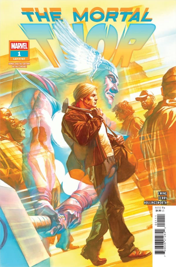
The Mortal Thor #1 by Al Ewing (Writer), Pasqual Ferry (Artist), Matt Hollingsworth (Color Artist), VC’s Joe Sabino (Letterer) is one of the most compelling & interesting single issues of a comic I have ever read. And this is going to be a very memorable run for Al Ewing!
The Story
This is quite possibly the most intriguing story I’ve read in a comic in quite some time, if not ever. And I absolutely cannot wait to see where it goes from here!
Our story involves a man with a very familiar look, but with an unfamiliar name. His name is Sigurd Jarlson, and he looks A LOT like Thor. But is he Thor? The answer is unclear, and that’s sure to play out over the future issues.
One thing that’s made very clear at the outset is that Norse Gods are NOT real. Sigurd is watching a discussion take place on TV about myths & legends, when Beta Ray Bill gets brought up. And the last thing the professor says is, “I wasn’t trying to suggest the Norse myths were ever real.”
What plays out over the remaining pages is a story of a man who doesn’t know much about himself or how he ended up where he is. Also, he is extremely gifted in the use of his hammer, which he also doesn’t know how he came into possession of. There is a mischievous imp-like character that we meet at one point, and I think we can all figure out who that is.
There are hints & clues to something much greater for Sigurd Jarlson, but that’s the fun of the journey. Is finding out just who he is. And that’s going to be so incredible to read.
The Artwork
Pasqual Ferry & Matt Hollingsworth do an absolutely masterful job with the art in this issue. Everything in this issue is unique and different from what you might see in a Marvel Comic, and that really helps it stand out from the rest. I really liked how detailed the characters were in the panels, and you can tell how much time and effort were put into them. It really puts across a strong emphasis on how important the characters are going to be in this story.
FINAL POINT: This first issue is as clear as it gets. It’s an incredibly compelling story, together with some fantastic artwork that comes together for the most intriguing story I’ve read ever. This series NEEDS to be put on your pull list ASAP! You do NOT want to miss out on this series!
Overall Grade: 10/10
Thanks for checking out my review on Nerd Initiative. For more of my content, check out ODPHpodcast.com, follow me on Twitter, and check out more of my reviews here on Nerd Initiative: https://nerdinitiative.com/author/padawanj/!
What did you think of the issue? Be sure to comment your thoughts below, or reach out to me on social media!
Leave a Reply