Iron Man #1
Writer – Spencer Ackerman
Artist – Julius Ohta
Colorist – Alex Sinclair
Letter – VC’s Joe Caramagna
Cover – Yasmine Putri
This review may contain mild spoilers for Iron Man #1!

The Story:
As soon as Tony Stark gains control over his company from Feilong and Orchis, he is in danger of losing it again! A joint effort between the new board of directors, A.I.M and Roxxon Oil has led to Tony being on the defensive as he struggles to hold on to what is his while trying to heal from a devastating injury!
The Writing:
Spencer Ackerman had an uphill battle with this first issue. Not only is he following an excellent previous series but he also has to strip down a seriously overpower Iron Man in a believable way. I’m very happy to say that he succeeded on both counts. Each time a new writer takes over a well known and beloved character, they have a dance that they have to nail in order to set up their new story while not stepping on the toes of the long time fans. Again, I will sing Ackerman’s praises in this aspect. With well done nods to both the recent and distant past of Iron Man, this story picks up where the last left off and takes an unexpected turn immediately. Thankfully, the turn it takes is a jarring, but exciting turn. The inclusion of Justine Hammer was a wonderful callback to one of the most well regarded Iron Man series and it was a smart and interesting inclusion. I’m excited to see how she was able to make her return!

The Art:
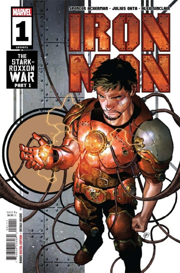
I want to start with the cover of this first issue. Because, as much as we are told not to, we all judge a book by it’s cover from time to time. Thankfully, this cover is amazing! The composition is excellent and the look of the new armor is enough to hook me immediately. As for the rest of the art team, I enjoyed the overall look and feel of this issue. The line work, colors, and inks all melded together to create an interesting vibe and visual language. I am always down for seeing older and iconic armors as well. Seeing the Bleeding Edge and Prime armor was a treat to this long time fan! The look of the new villain was also a great design. My one downside to the art in this issue was the character design for Tony Stark. He felt too thin and gaunt, this makes sense by the end of the book due to the physical toll the story takes on him. However, it was off-putting from the start as I am not used to Tony Stark being drawn with such a lanky and thin frame. This was, of course, not enough to ruin the experience or my excitement for what is to come. It simply was a small critique in an otherwise great first issue!
The Verdict 8.5/10
This series started out with an uphill battle for me. I enjoyed the last series so much that I was already coming into this with an air of skepticism that was not fair to the book. However, a mild dislike for Tony’s character design aside, I found myself truly enjoying this first issue. I am excited to see where this story takes me and I’m looking forward to what this creative team has in store for some iconic Iron Man villains. At the end of the day, this is an Iron Man issue #1 and I am always ready to be taken on a new adventure with my favorite character! This is definitely worth picking up and checking out. I have a feeling we are all in for a wild ride!

