
Iron Man #3
Writer – Spencer Ackerman
Artists – Julius Ohta and Jethro Morales
Colors – Alex Sinclair
Letters – Joe Caramagna
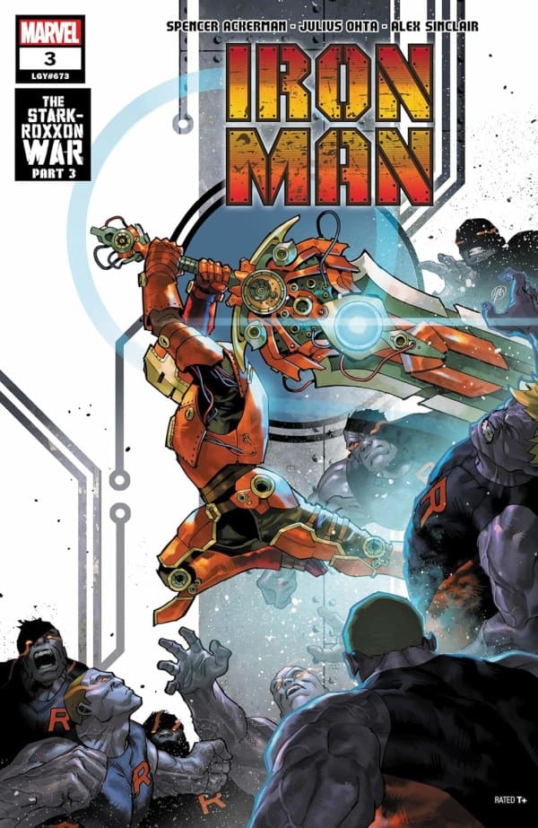
Cover – Yasmine Putri
Read the review for the last issue in this series here.
*This review may contain spoilers for Iron Man #3*

The Story:
Tony continues to try to convince the Stark Unlimited board to not go through with the ROXXON/A.I.M merger. Meanwhile the mysterious “silent partners” are revealed.
The Writing:
I have been pretty critical of this series so far, and a lot of that criticism has been laid at Spencer Ackerman’s feet. While I cannot say that the problems from the previous two issues are completely gone, this was huge step in the right direction.
The pacing was tightened up, the dialogue was quick and interesting, and the characterization of Tony Stark was more in line with the character that I’ve been a fan of for over two decades. I maintain my thought from the previous two issues of this series, that if we give him the time and space, Spencer Ackerman may be on the verge of giving us something pretty special!

The Art:
The art team continues to turn in a solid performance with this issue. The action beats in particular were wonderful! We are treated to two fight scenes, both are full of interesting panel layouts and brilliant line work. The colors really pop as Iron Man, wielding a massive sword, goes up against different energy projectiles.
My biggest complaint from this series as far as the art is concerned has been the Tony Stark design. It is slightly downplayed here and I found it much easier to get behind what the team is trying to portray. Overall, this issue was a hit from an art perspective.
The Verdict: 8/10
While not a perfect issue, Iron Man #3 is a swing back in the right direction after a lackluster issue #2. I am starting to get on board with this creative team and I look forward to what they have for me next month!