Share this
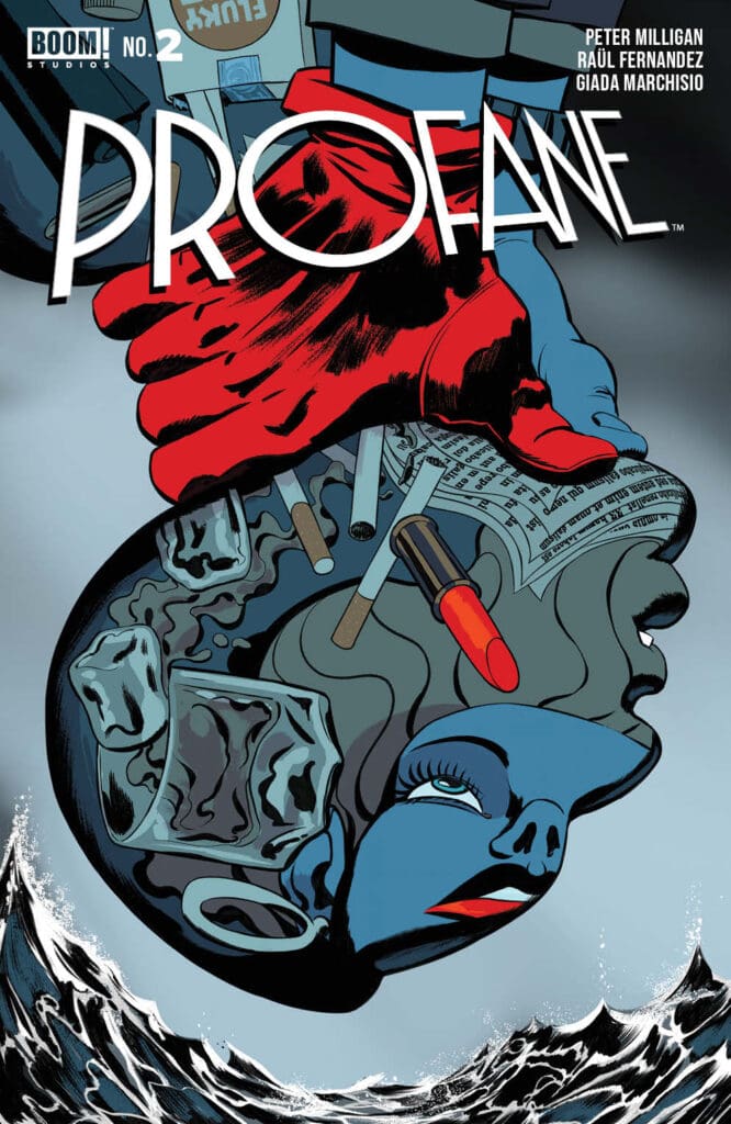
Creative Team: Peter Milligan (Writer), Raul Fernandez (Illustrator), Giada Marchisio (Colorist), Jeff Eckleberry (Letterer), Javier Rodriguez (Cover Artist), Patrick McGrath (Logo Designer), Madison Goyette (Designer), David Mariotte and Kathleen Wisneski (Editors)

PROFANE Published by BOOM! Studios
FIRST THOUGHTS
Two issues into this miniseries and even the lead character isn’t sure if he’s in the fictional or non-fictional world at the end of the issue. That might worry some readers, but should you worry or enjoy the twisted reality that is Will Profane’s world?
THE STORY
There’s something about second guessing what’s happening in a book that can be fun for some readers and annoying to others. There’s a swerve to the swerve in this issue of PROFANE, but is it really a swerve?
Peter Milligan seems to enjoy keeping the reader guessing as they move through this series because he provides enough of a foot in the world of non-fiction long enough that the reader may forget that Will Profane is a fictional character out of a private detective novel.
READ LAST ISSUE’S REVIEW
Milligan a story that when something pops up like the scrying, a reader may not even question what’s happening and look at it as part of Profane’s world like The Red Glove is.
This issue introduces readers to the idea of a ‘sponsor’ for a fictional character to use to work in the non-fictional world, and then that’s when things get really blurry. The concept is interesting, a non-fictional person offers themselves up as a sponsor so that the fictional person can exist in the non-fictional world, but there is zero explanation to it or how it works. For Milligan that explanation isn’t worth spending the time telling the reader more about it. He’s asking readers to trust him, he’s got their best interests in mind and won’t lead the estray. Two issues into this book and Milligan hasn’t so far.
THE ART
Raul Fernandez’s linework in this issue is great. There’s a realistic look to his cartoony style that doesn’t allow for over exaggerations. Each character’s look is unique to them and while you may not know a side character’s name you will remember their look and their face, and that’s a great artistic contribution to any comic book.
Giada Marchisio’s colors bring a lot of life into Fernandez’s art that wouldn’t come off as strong with a black and white image. The scene in the book with Will and Egbert is very doable with just linework and some shadows, but bring in Marchisio’s colors and these pages take on a whole new look that elevates the storytelling.
Jeff Eckleberry does a fabulous job with the lettering throughout this issue being that anchor for readers to Will’s world and his thoughts. He switches things up with a completely different lettering set up for Will’s internal monologue that uses a typeface that could be mistaken for a typewriter or computer since his thoughts could be from the pages of a book that Will is just reciting. That extra touch is a nice addition to this issue and helps add to the storytelling.
FINAL THOUGHTS
Overall this is a good second issue to a five issue arc. A lot of the players are in motion and readers just have to wait, much like Will, to see what happens next. This is slowly building to a book that could be a joy to go back and re-read once it concludes.
RATING – A solid 7 out of 10

