Share this

Co-Creators/Writers: Tim Seeley and Tony Fleecs
Artist: Tim Seeley and Tony Fleecs
Colors: Brad Simpson, Felipe Sobreiro
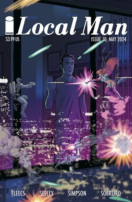
How can you move on when you can’t move forward? That’s a question that has been permeating much of Local Man since the series began. Often portraying how the past informs the future both within the comic book world and outside of it. Now that it is entering a new story arc the question shifts a bit to how this narrative moves forward without leaving what came before behind while not retreading the same major story beats.
The first step appears to be having Crossjack leave the land that has defined this book as he is forced into hiding. He is wanted for the murder of beloved hero Camo Crusader and considering everything that happened he does not have a great way to explain what actually occurred. I did find it a bit odd that despite the heat he was facing he was able to attend his father’s funeral without any major disturbance until the end. Perhaps that is simply the local small-town aspect of the story as the police wanted to give him the time he earned to grieve. It also gave us some great laugh-out-loud moments as members of the town told him exactly how they felt despite the fact they

were attending his father’s funeral.
After the funeral, this local story becomes national and impacts the entire Third Gen Team as they are put on the shelf with the ongoing investigation. The entire world is mad at Jack but he finds an unlikely ally who provides some reprieve from the chaos with a safe house, although it does not take long for Jack to be forced to answer that question, “Can you go home again…again?”.
Strong art has been a staple with this series since the beginning with both the work of Tim Seeley and Tony Fleecs. So much of Jack’s personality is said through body language, and that is one of Fleecs specialties. From Jack’s thousand-yard stare during his father’s funeral to the desperation he feels while hiding out you can see so much of who he is from beyond the words he is saying.
There are so many storytelling choices made within the art that I find fascinating as well. Specifically how the pages are designed to slowly convey key information that is easy to overlook. You need to pay attention as something that seems trivial at first means much more a few pages later. For example, while hiding out Jack receives a call from someone from his hometown. The opening shot is on that inviduals face as you would expect for a scene of this nature. In the next panel, it pulls back to reveal a room filled with boxes and other random goods. It appears to be nothing more than simple background to fill out the scene. As the issue concludes the location of that call seems far more important.
As has been the custom we get two stories in one with a flashback adventure of Crossjack going out for a night on the town with fellow superhero Softkore. (This series is so good at coming up with names that feel so authentic to the 90s) As expected things get a bit chaotic as gunmen enter the dance club and Crossjack is without his trusty shield. As a story, there is not much here but clearly, it is designed to introduce elements that will play into the present later down the road. Softkore makes her presence felt right away so one assumes her character will be playing a major role in this next arc. It’s a way of linking to continuity as you are creating it. That piece is part of what has made this series such a standout.

Tim Seeley draws that part of the story and it’s wonderful to see him go full force into the 90’s style. Also have to credit Colorists Brand Simpson and Felipe Sobreiro. Simpson handles the Farmington art and uses such varied and more down-to-earth color palettes. Great shadow work reminds us we are more within the world of today. Sobreiro however goes another way with much more vibrant choices that fit Seeley’s bombastic style. This is a book that knows what it wants to do and executes it with precision.
The same could be said for the lettering as well. Specifically, there is a scene where Jack and Neon are arguing. It’s an extensive conversation but only takes place within two panels. A choice like that could go poorly because the scene can instantly feel bogged down with text. Instead, the lettering surrounds Jack and Neon to demonstrate how trapped both are within this moment. It is a great piece of design that would trip up lesser creators.
One downside of this issue is that it does appear to take one step forward into something new only to take two steps back to where we already have been for some time. I understand the need to get Crossjack to leave his hometown again to build mystery. It feels a bit more contrived than what this series has previously shown it is capable of with narrative structure. Always important to point out that we are just in the midst of this story so what at first seems contrived can develop into something far more complicated. Even with that issue, it remains one of the best superhero stories on the shelves today.
Overall: 7.5 / 10

