Home Blog Page 69

Amazing Spider-Man #27: Death Spiral Pt. 9 – A Means to an End

“But killing an enemy instead of trying to help them, bowing to animal rage and righteous anger… That’s childish weakness.” – Spider-Man


Creative Team

Joe Kelly (Writer), Ed McGuinness / Carlos Gomez / Francesco Manna (Artists),
Mark Farmer / Wade Von Grawbadger / Ed McGuinness / Carlos Gomez / Francesco Manna (Inker),
Marcio Menyz & Erick Arciniega (Colorist), VC’s Joe Caramagna (Letterer)

Sarah Spadaccini (Designer), Kaitlyn Lindtvedt (Assistant Editor), Tom Groneman (Associate Editor),
Nick Lowe (Editor), C.B. Cebulski (Editor-in-Chief)

Publisher: Marvel Comics


A Means to an End

Issue twenty-seven of Amazing Spider-Man (ASM) is the final installment of this “Death Spiral” mini-series between the ASM and Venom storylines. Within this conclusion, Joe Kelly brings out the absolute best of Spider-Man. Touching on the very essence of who Peter Parker is when he dons the Spider-Man suit. This issue reminds me of a quote from Spider-Man, the movie (2002), “You’re not Superman.” Which is true on so many levels if you try to compare Spider-Man and Superman. But the moral character of the two has astounding similarities.
Spider
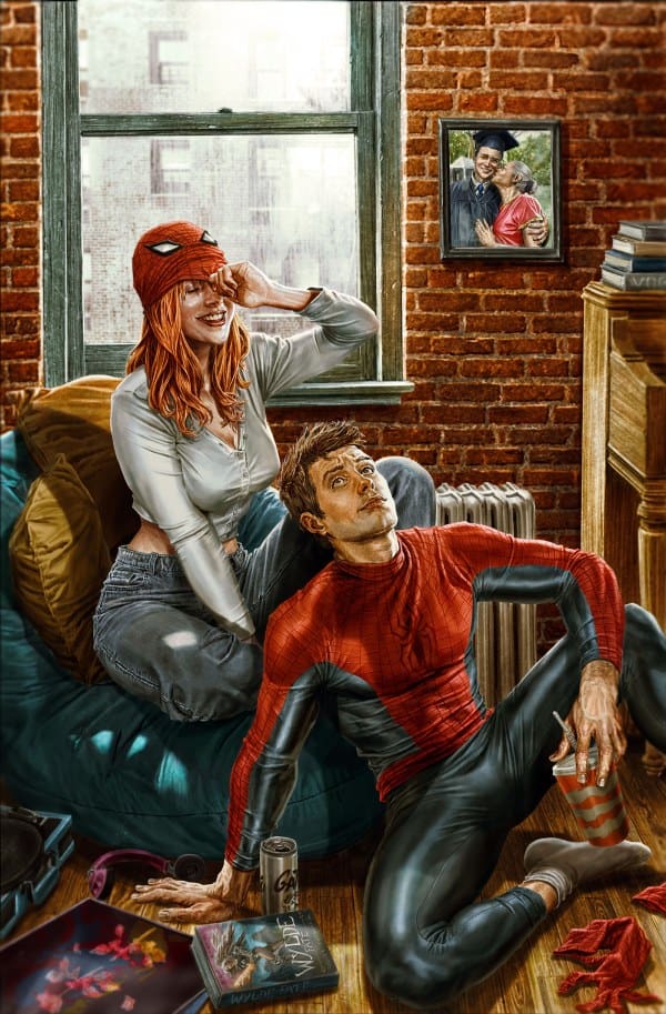
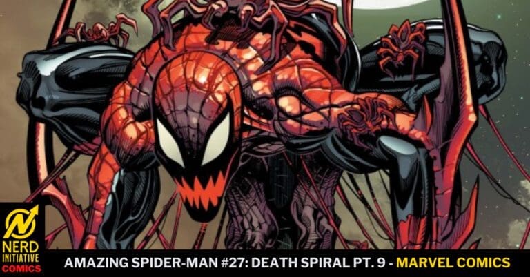
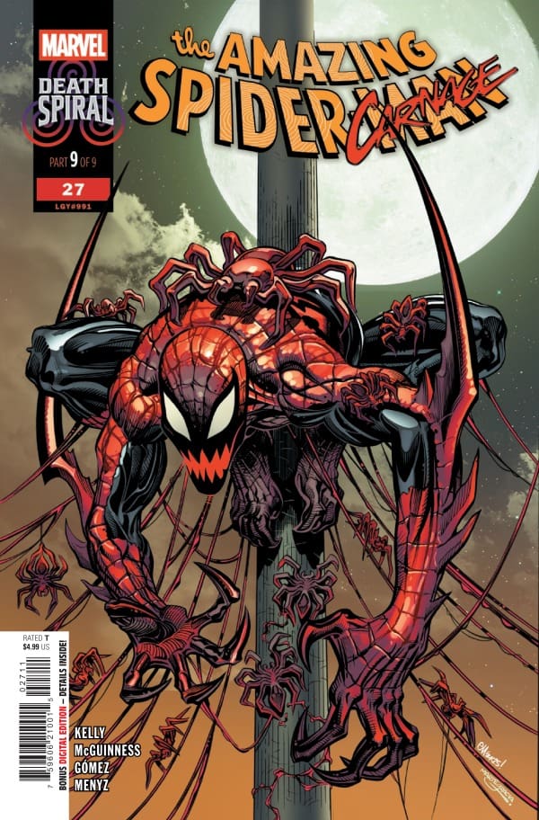
Amazing Spider-Man #27: Death Spiral Pt. 9, Credit Marvel Comics. Cover by Ed McGuinness & Marte Gracia


Within the previous two installments of “Death Spiral,” readers are shown who Torment’s final two victims are before completing his “spirals” with our heroes in this series. Spider-Man fans (comic books or movies) know the emotional impact that Aunt May has on him. So much so that you get this “Peter tingle” that if anything were to ever happen to her, Peter/Spider-Man would go down a road that he could never return from. Joe Kelly does an excellent job of toeing that line within this issue! Causing readers to wonder if this is the moment we see our beloved Spider-Man turn heel.

Throughout this mini-series, readers have been introduced to so much character development from every main character. Spider-Man to Torment and the heavy hitters meshed in between. All of that comes full circle within this issue. The roller coaster of thoughts, theories, and emotions that readers will endure is rather poetic within Joe Kelly’s writing of this story. Events that happen will leave you stunned, questioning, baffled, and for some, somewhat emotionally traumatized.

This final issue of “Death Spiral” continues with the theme of Peter’s moral compass and the compassion that he evokes in people, especially the ones he cares deeply for. Mary Jane (MJ) and Peter share a subtle moment spanning multiple pages over a phone call. These two love each other and will till the end of time. Have they had falling outs before? Of course, what relationship doesn’t go through ups and downs? It is within these final pages of this issue that readers are greeted with a small ember of hope for MJ and Peter.


The Writing

Joe Kelly does an exceptional job writing Spider-Man. From the main story arc to collaborating with the creative team of Venom to bring readers this mini-series. His ability to hold readers in the palm of his hand while “tormenting” their emotions is enjoyable. The storytelling is fluid and makes sense throughout the series. There is not one moment that leaves you questioning why something is taking place. Every piece plays and feeds off of the others. This makes the writing satisfying to read.

The Artwork

Ed McGuinness, Carlos Gomez, Francesco Manna, Mark Farmer, Wade Von Grawbadger, Marcio Menyz, and Erick Arciniega ALL provided beautiful interpretations of the script laid out to them by Joe. This entire series has been so detailed and full of amazing splash pages! The pencil work is sharp, making details within panels easy to find and to enjoy. Accenting the pencil work is the coloration. The color wheel for this series has been all over the place, particularly! Doom and gloom to bright and powerful!

VC’s Joe Caramagna brings everything home with this issue. Amazing story, stunning art, and captivating lettering. Letterers aren’t given the same recognition as writers or artists, which is sad. VC’s Joe Caramagna gave this story from Joe’s life for the reader to take in. Having different fonts, sizes, colors, and bubbles adds to the story being told. Placement of comment bubbles is also important, and I’m sure no easy task. Amazing work!


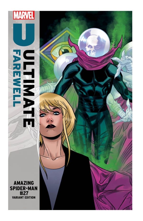
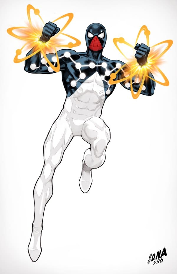
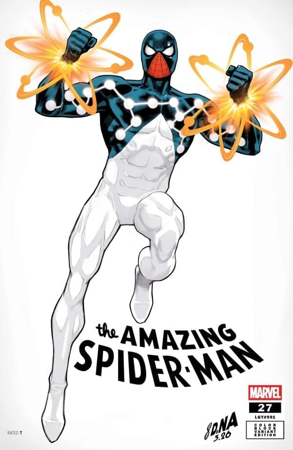
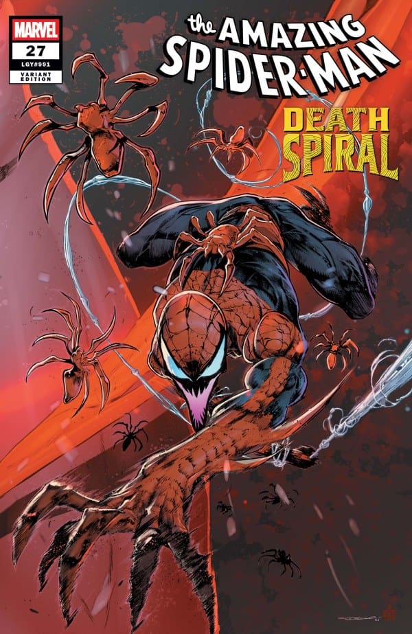
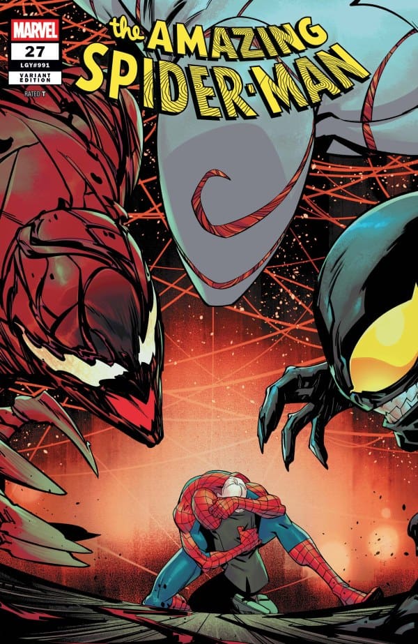
Variant Covers

Final Thoughts

Issue twenty-seven of ASM is yet another great issue in a phenomenal run by Joe Kelly. This issue brings to a close a nine-part mini-series with Venom as they try to stop a common enemy. A thriller of a mini-series, with captivating events and stunning artwork! Jaw-dropping moments that will cause you to go back and read it again! Make sure to add this issue and the other eight from this mini-series!

Grade: 9.5/10


Links

Comic Book Reviews & Much More: Nerd Initiative
Previous ASM Review: The Amazing Spider-Man #26: Death Spiral Pt. 7 – Torment Evolves
Travis’ Reviews: TravisComicHaven – Nerd Initiative
Travis’ Personal Content: Travis’ Comic Haven


PLEASE SHARE YOUR THOUGHTS IN THE COMMENTS SECTION BELOW!
Leave a Reply

This site uses Akismet to reduce spam. Learn how your comment data is processed.

THE INFERNAL HULK #6 – The Battle for the World

Creative Team – Phillip Kennedy Johnson, Adam Gorham, Matthew Wilson, VC’s Travis Lanham, Nick Klein

Published by Marvel Comics

Catch up with The Infernal Hulk #5!

The Story

The Infernal Hulk #6 might be the most impactful and the most powerful of the run so far, and the tone is set immediately by Phillip Kennedy Johnson. Eldest, who has used Hulk’s body as a vessel, is a disaster-causing menace that has no plans on stopping. This is very clear, and now the government and Earth’s mightiest heroes have had to devise a plan to try to take out The Infernal Hulk once and for all. Even Iron Man had to create a new suit called the Hellbuster for this plan, but will it be enough?

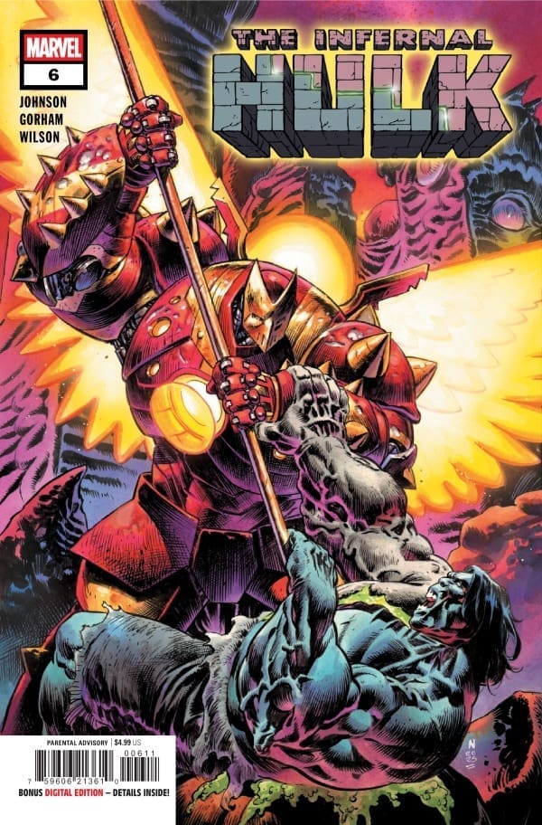
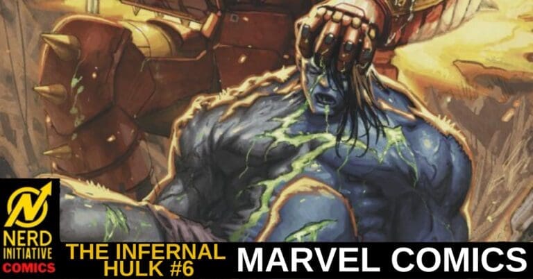
Cover art by Nick Klein. Published by Marvel Comics

The Infernal Hulk always proves to be one step ahead, even before the smartest minds in the world. I didn’t think this run could raise the energy even more than it has in the past issues, but here we are. Phillip Kennedy Johnson knows exactly how to keep an audience captivated and knows how to write a powerful story that can speak for itself.

The Art

The artwork of The Infernal Hulk #6 is simply magnificent. Adam Gorham, Matthew Wilson, and Travis Lanham give so much to the comic, bringing the energy and emotions to a whole new level. Gorham provides gorgeous details of The Living City and all that lives there. Along with a battle between Iron Man and Eldest that’s enough to change the world to its core, it’s accompanied by drawings that put you right into the action.

Matthew Wilson brings so much vibrancy to the comic that each page is more stunning than the last. Wilson makes a great focal point of the bright green in the middle of Eldest that shows brightly throughout the fight, which makes the character practically pop off the page. Travis Lanham nails the calm intensity of the voice of Eldest, which sent a shiver up the spine during the battle of the ages between Eldest and Iron Man.

Final Thoughts

The Infernal Hulk gets better and better with every issue, and this comic is proof of that. The only way to describe The Infernal Hulk #6 is all gas, no breaks.

Overall Grade – 10/10

Let me know in the comments what you thought of The Infernal Hulk #6!

Leave a Reply

This site uses Akismet to reduce spam. Learn how your comment data is processed.

This review was written by Megan from the Vigilante Vibes Podcast! If you liked my review, be sure to check out my other reviews! Let me know what you think of The Infernal Hulk #6, or tell me what comics you’d recommend me trying out! Find me on my socials, and check out my Marvel podcast, Vigilante Vibes, by clicking here!

THE FLASH #32: The Enemy of My Enemy..

Wally has been stretched thin running through the city, into people’s bedrooms, into bathrooms, and barely having any time to catch his breath. Luckily for him, an unlikely ally is about to lend their hand as Captain Cold may be the key to unraveling this entire mystery and saving the city. The enemy of my enemy is my friend, right?

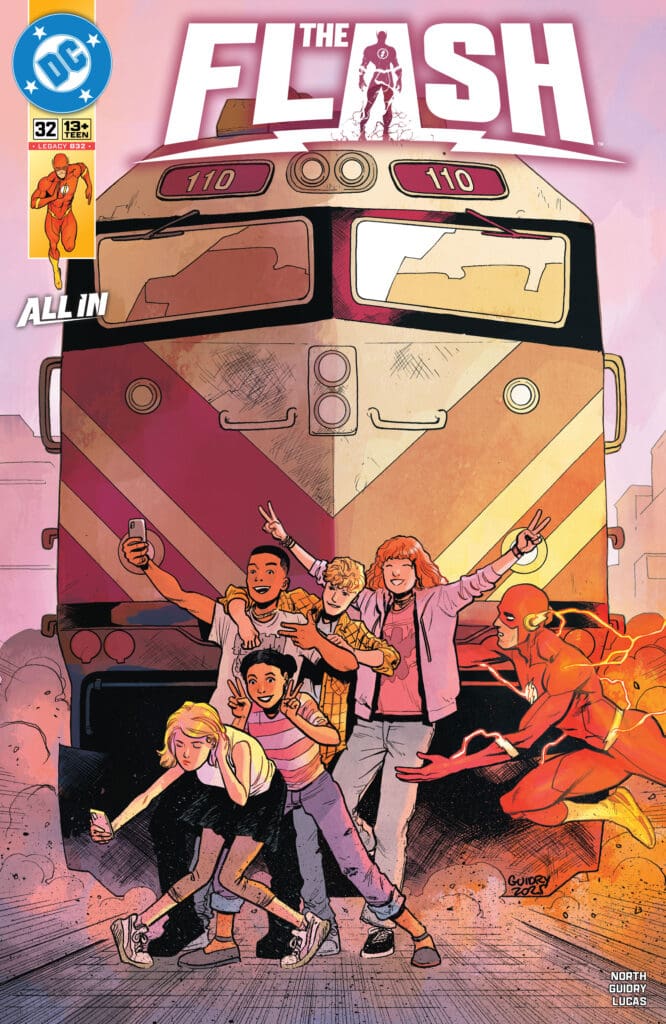
The Flash #32. Credit DC Comics. Cover by Gavin Guidry and Giovanna Niro.

Creative Team: Ryan North (WRITER), Gavin Guidry (ART and COVER), Adriano Lucas (COLORS), Giovanna Niro (COVER), and Buddy Beaudoin (LETTERS).

The Story:

Ryan North has me needing to catch my breath and take a nap, let alone how Wally is feeling in this issue. He is non-stop trying to prevent people from putting themselves in harm’s way while trying to figure out what is going on and how to stop it. North brings in an unlikely partnership with Captain Cold, and honestly, it is my favorite bit about this arc so far. The banter between the two of them is top-notch as Cold tells Wally to lighten up a bit, as he doesn’t trust Cold, understandably. There’s an injection of scientific explanations, and we even see The Flash not able to save everyone, which I thought was a great addition to this story and added some levity.

The Art and Letters:

Lucas’s touch of color work is all over here and adds flair to this issue. Wally is zipping through the streets, and Gavin’s ability to capture the details of the world remaining still while Wally zooms by is expertly detailed. The way they bring these panels to life had me out of breath at times because I felt so immersed in this world and Central City. The way they manage to also make the setting of Central City work its way in as a character as well showcases just how creative the people are getting in trying to earn money, even. I’m loving this arc a lot.

Final Thoughts:

The Flash #32 is a mad dash against time as Captain Cold and Wally West have found themselves in an unlikely team-up. The issue is fun and at the same time immerses us into this world, making the reader feel as though we have been chasing down everyone ourselves.

Overall Grade: 10/10

Be sure to let us know your thoughts below and check out more reviews by Matt!

Leave a Reply

This site uses Akismet to reduce spam. Learn how your comment data is processed.

In Your Skin #1 – Killer obsessions in Bollywood

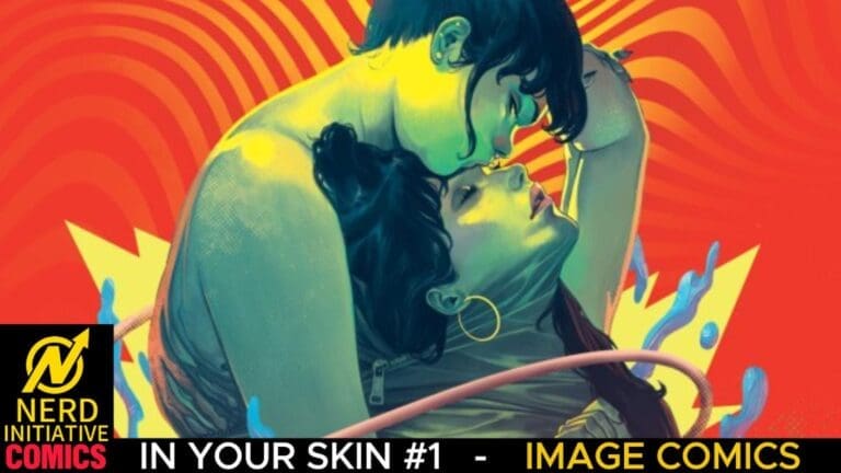
Gorgeous, erotic, and horrific…In Your Skin #1 by Aditya Bidikar, Somnath Pal & Francesco Segala from Image Comics

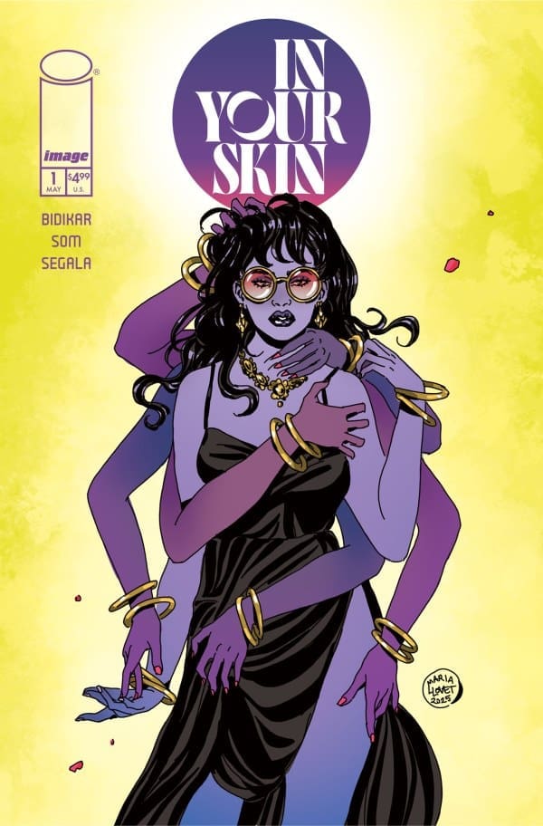
In Your Skin #1 Cover B by Maria Llovet, Image Comics

This review article was made possible with the combined efforts of Yancy Arce & Eda

SOLICITATION:

“Priyanka is a Bollywood uber-fan who has been obsessed with film star Ayesha Sen since she was a kid — she’s watched her movies over and over, and knows her dances beat for beat. But after a once-in-a-lifetime chance to meet her idol goes awry, and Ayesha announces her impending retirement from movies, Priyanka decides that if Ayesha isn’t going to live the life she’s supposed to, Priyanka would be more than happy to take over for her…” – Image Comics

*SPOILERS FOR ISSUE #1*

PARASOCIAL RELATIONSHIPS

Yancy: While usually harmless, these relationships exist on a spectrum. They range from the casual to the deeply invested and all the way to the delusional. Here is where In Your Skin #1 finds its lane. Because Priyanka’s life is consumed by her fixation on Ayesha Sen, to the point where she knows everything about the life of this person. Or at least Priyanka thinks so. Highlighting her obsession is the lengths she goes to for the slightest opportunity of meeting her idol in person. Eventually, when idols don’t live up to their fans’ expectations, they are let down. But in Ayesha Sen’s case, that wasn’t even an option. At least not one that her biggest “fan” would allow.

THE ABSORPTION-ADDICTION MODEL

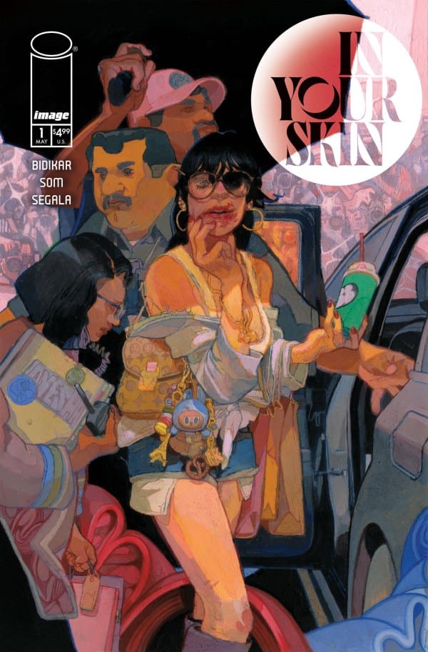
In Your Skin #1 Cover C 1 in 10 Variant by Anand Radhakrishnan, Image Comics

McCutcheon (2002) proposed the Absorption-Addiction Model to explain parasocial relationships. She suggests that people engage in celebrity worship to compensate for some deficiencies in their life, such as difficulty forming intimate relationships, poor psychological adjustment, and lack of identity”(1). Which, in all fairness, explains a lot of Priyanka’s character. For there was nothing of consequence about her life. If anything, one could say she had a sad existence. From her home living situation, to her relationship with her mother, I could not help but feel sorry for her.

*(1) “Parasocial Relationships”, CGS Psychology Blog: Mrs Harris https://mrsharrispsychology.school.blog/parasocial-relationships/

THE WRITING

Eda: I’ll be completely honest, I chose this based on sense and feeling, and I’m so happy that I did. “Sense” and “feeling” are also arguably great words to describe this masterpiece from debut writer Aditya Bidikar. Blending body horror with sensual desires, one could swear Bidikar was a veteran of the industry. This especially shows in several instances throughout, where you can clearly tell he trusted his artist & colorist, Som & Francesco Segala. To further prove himself, Bidikar seamlessly blends several messages. From celebrity idolization to body image, these messages are represented brilliantly in ways I won’t describe here. Just know that if you’re a fan of horror with something to say, you’ll love this.

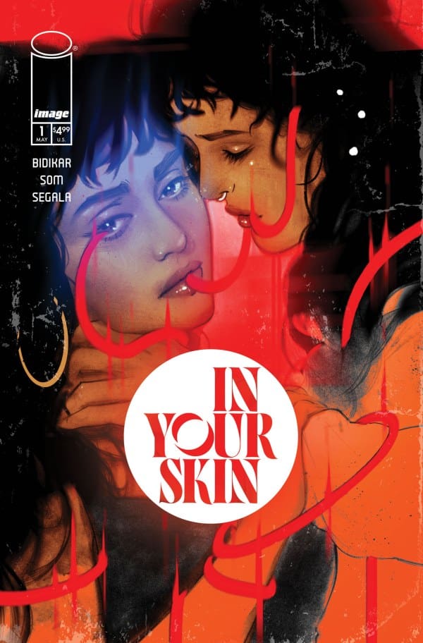
In Your Skin #1 Cover D 1 in 25 Variant by Tula Lotay, Image Comics

HOW ABOUT THE ART?

Yancy: Although Somnath Pal has a handful of credits in comic books, his work here is quite remarkable. The cinematic camera angles, the deliberate paneling, and the emotional heaviness of the characters were palpable. This is the work of someone who has already mastered the craft of comic book storytelling. Let alone the actual body horror depicted.

Eda: Artist Som and colorist Francesco Segala both gave superb and unsettling work. Their combined effort made me feel a wide mix of emotions, with disgust, anxiety, and loneliness being the ones that came through the most. A lot of this is thanks to the level of detail and use of color. Every muscle and stretch of skin is expertly drawn while hues of red, blue, and brown create this sense of crazed mixed emotion. Absolutely genius.

Yancy: 10/10

Eda: 10/10

OVERALL GRADE: 10/10

FINAL THOUGHTS

Yancy: Aditya Bidikar managed to share the one thing that makes art invaluable: perspective. In his letter at the end of issue #1, he shared some of his thoughts about celebrity culture. Specifically, his view on celebrity culture in Bollywood and the god-like treatment actors got from their fans. Bidikar is bringing together the flair and style of Bollywood films with the body horror genre. Also merged with parasocial relationships in an erotic style of storytelling. As a result, we get a thriller of a comic book series that will have you on the edge of your seat. 

Eda: In his writing debut, Aditya Bidikar proves that he has something to say and knows how to say it. At the level of the best horror writers. He created something truly lasting that’ll stick with you for a long, long time.

LET US KNOW YOUR THOUGHTS ABOUT IN YOUR SKIN #1 IN THE COMMENTS SECTION BELOW

Leave a Reply

This site uses Akismet to reduce spam. Learn how your comment data is processed.

Marc Spector: Moon Knight #3 – I Am Everything You Fear

The Agence Byzantine’s quest for Marc Spector’s old friend Frenchie has led to Marc being captured and experimented on. With the help of Mister Fear, the now-revealed Bushman built a fictional life to trick Marc. Unfortunately for them, Moon Knight’s constant enemy, Zodiac, helped rescue Marc. Not interested in saving Marc, Zodiac pushes Marc to reach his full potential as Moon Knight, leaving him to fight Bushman alone. What happens when fear takes over in a fight for survival between Moon Knight and Bushman?

This joint review is brought to you by Nerd Initiative’s Megan and Shawn! You can click on each name for more reviews from each of us.

Creative Team

Writer: Jed MacKay
Artist: Devmalya Pramanik
Color Artist: Rachelle Rosenberg
Letterer: Cory Petit
Cover Artist: Ryan Stegman
Cover Color Artist: Arthur Hesli

Writing

Megan: Jed MacKay has done nothing but bring Moon Knight to new heights throughout his time writing the character, and he continues to do just that. 

Starting the comic, the tone is established immediately with Zodiac setting up an epic battle between Moon Knight and Bushman. Moon Knight and Bushman have a history filled with hatred and rage, and we get to see it all come out in the fight. Bushman uses fear gas to take Moon Knight down with his own fear, but he has severely underestimated his opponent. The whole fight is in the tone of a professional fight, even with a ringside visit from Steven and Jake. This brought the excitement up several levels, keeping me on the edge of my seat. The fight was thrilling all the way through, with Moon Knight proving that he’s back and better than ever since he was drugged and lost to the world. 

Shawn: If you had given me 100 guesses on how this issue would start after the last issue’s ending, I wouldn’t have guessed how it started. Zodiac elicited an audible laugh from me. Bravo, Jed MacKay! This entire arc has been incredible. Moon Knight vs Bushman is just a classic Moon Knight story, but this still somehow feels different.

I loved the emphasis on fear and control in this issue. The carryover from Mister Fear is palpable even when he isn’t present. I’ve long been a fan of MacKay’s work, but perhaps the best thing he does in this comic is sit back and let Devmalya Pramanik and Rachelle Rosenberg get to work. MacKay crafts a compelling story, but it’s clear that with Devmalya Pramanik and Rachelle Rosenberg, MacKay has reached a level of comfort that he’s fine stepping back and letting his art team truly coauthor the story.

Art

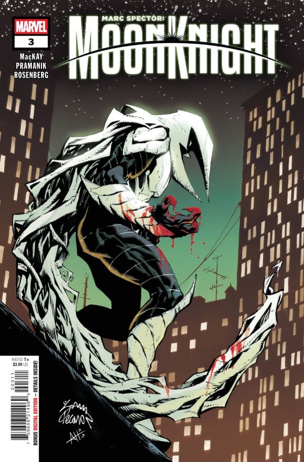
Marc Spector: Moon Knight #3 cover by Ryan Stegman and Arthur Hesli. Image from Marvel Comics

Megan: The artwork is nothing short of stunning thanks to Devmalya Pramanik, Rachelle Rosenberg, and Cory Petit. The fight is drawn by Pramanik to look larger than life, and I’d say he achieved that. Each panel is excellently detailed and leaves nothing to the imagination.

Rosenberg brings her A-game and uses the green fear gas as a way to bring vibrancy to the fight, with Moon Knight being a great stark white focal point. Rachelle Rosenberg is the only person who could make each page look like a colorful work of art, playing off of Moon Knight’s suit. She even uses the bright red blood to highlight the violence of the fight.

Cory Petit matches the tones of the story wonderfully with the dialogue. You can feel the craziness of Zodiac’s unhinged narration or Moon Knight’s fear through the dialogue, clear as day. 

Shawn: Devmalya Pramanik and Rachelle Rosenberg may be the best artist and color artist pairing in comic books right now. Their work has such a weird synergistic feeling to it. Pramanik continues to stun not only with the work on the page but also with the unique and wild approach to panels. If you’ve enjoyed the use of nontraditional panels in this series, buckle up because this series may be the best yet.

Devmalya Pramanik and Rachelle Rosenberg’s connection is best shown in the battle scenes in this comic. The artists crafted a story that feels part WWE and part comic book. Rosenberg shines with the hues and almost echoes of color she utilizes, and that happens perhaps nowhere better than in this Moon Knight series. Cory Petit does a great job with lettering using unconventional shaping to convey tone and seriousness.

Final Thoughts

Megan: 10/10. I loved so much about this issue. Jed MacKay gives the reader so much to be excited about and leaves you wanting to read so much more by the end of the comic. The writing, the art, the action, the story, second to none. 

Shawn: 10/10 This series is an absolute white-knuckle ride. From the first panel to the last, this entire creative team is going full throttle and firing on all cylinders. I keep waiting for five years of Moon Knight to hit for MacKay, but the series continues to be fresh. This entire issue feels all killer and no filler.

Overall Grade: 10/10

Are you enjoying this Moon Knight story? Tell Megan and Shawn below!

Leave a Reply

This site uses Akismet to reduce spam. Learn how your comment data is processed.

Sorcerer Supreme #5 – Becoming Boring is Still A Crime

Wanda Maximoff, Earth’s newest Sorcerer Supreme, has battled the Vishanti. Not content with Wanda being the Sorcerer Supreme, they sent her friend Agatha Harkness after her after invoking her oath. Now, as Wanda recovers, one of her closest advisors, Clea Strange, Sorcerer Supreme of the Dark Dimension, may need Wanda’s help with Clea’s Uncle, the Dread Dormammu, who comes calling.

This joint review is brought to you by Nerd Initiative’s Megan and Shawn! You can click on each name for more reviews from each of us.

Creative Team:

Writer: Steve Orlando
Artist: Bernard Chang
Color Artist: Ruth Redmond
Letterer: Joe Sabino
Cover Artist:Lesley Li

Writing

Megan: Life as the Sorcerer Supreme is no easy task, especially for Wanda. It seems like around every turn, there’s a new situation that needs her expertise. This time, it’s Clea. Clea puts out an alert that she’s in dire need of help, and Wanda is the only person who can do just that. Dormammu is weak and desperate to make himself strong, so he’s after his bloodline’s power. So, he’s come to feast in the Dark Dimensions.

In Sorcerer Supreme #5, we see Wanda flex her powers and prove why she’s the rightful Sorcerer Supreme. With Clea and Bats by her side, the reader is in for a battle filled with beautiful, magical work and fantastic team-ups. Plus, can you ever have too many Bats? The answer is absolutely not.

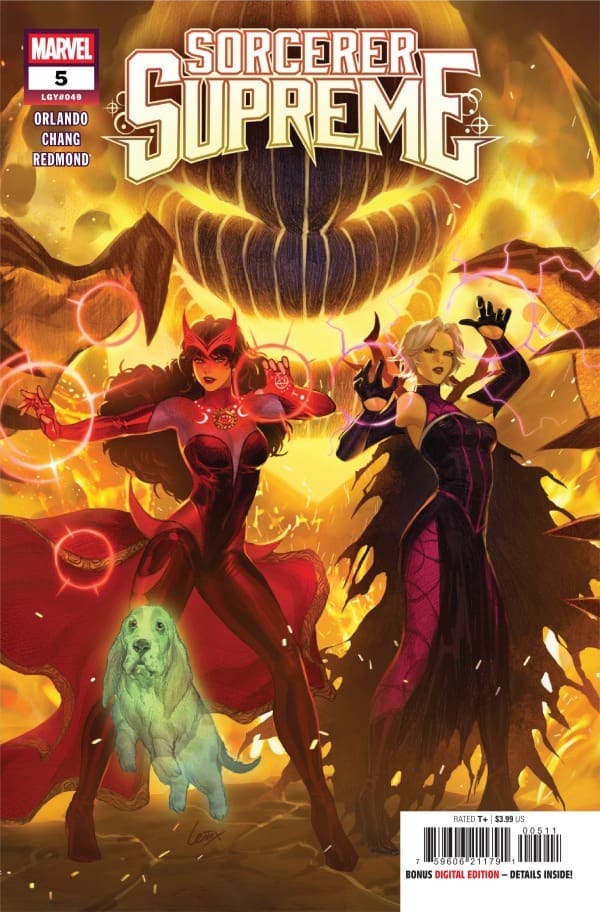
Shawn: Look, I’m going to keep it real with you. When I saw Clea Strange on the cover and the bestest of boys, Bats, I was already sold on this issue. Steve Orlando did not disappoint. Issue after issue, Sorcerer Supreme continues to give us a healthy blend of entertaining action as well as some intrigue.

I won’t spoil what happens, but this was an entertaining read. I really loved that Orlando took some of the ideas North laid out during last year’s One World Under Doom and brought them into this story. It’s little inclusions like the kind found in this issue that make me appreciate how Marvel can sometimes tie together various stories.

Art

Sorcerer Supreme #5 cover by Lesley Li. Image from Marvel Comics

Megan: Goodness gracious, Bernard Chang and Ruth Redmond showed up and showed out in this issue. With Dormammu, Clea, Wanda, and Bats in one issue, it’s guaranteed that it’ll be an absolutely stunning issue with these two handling the artwork. The detailing and coloring work is second to none. Chang brings beautiful drawings that are dripping in mystical goodness, and Redmond plays off that perfectly, using excellent vibrancy that juxtaposes the darker colors. Joe Sabino serves as the letterer of the comic and really drives home the heightened emotions of the characters, most notably Wanda. Along with that, Sabino brings excellently timed sound effects that allow the reader to experience the story even better.

Shawn: Bernard Chang and Ruth Redmond continue to astound in this issue. There’s a lot of crazy art and colors in this issue, and they’re both handled perfectly by Chang and Redmond.

The main battle sequence of this issue is beautifully drawn and even more perfectly colored. While Orlando’s story is really good, from the front cover to the final panel, the art is really the star of this issue. While Joe Sabino does a great job with lettering, Chang and Redmond craft a story that you could follow through emotion alone.

Final Thoughts

Megan: 10/10. There was so much to love about Sorcerer Supreme #5! The action, the magic, and the dynamics of the characters all deserve an easy 10 out of 10 for me.

Shawn: 10/10. Full disclosure, I love Bats. Having gotten that out of the way, this feels like the most complete issue of Sorcerer Supreme so far. The narrative is satisfying, and the art is spectacular. Even if you missed every issue of Sorcerer Supreme so far, you could pick this issue up and get a complete and satisfying story. More of this in future issues of Sorcerer Supreme, please.

Overall Grade: 10/10

What do you think about issue #5 of Sorcerer Supreme? Let Megan and Shawn know in the comments below

One response to “Sorcerer Supreme #5 – Becoming Boring is Still A Crime”

  1. Steven Stahl Avatar
    Steven Stahl

    The issue failed as a story because of the broken premise and plot. Dormammu wasn’t actually wounded; he didn’t need Donna’s life force; Donna wasn’t brimming with magical energy (Orlando apparently misread a Fandom entry); Wanda’s solution was artificial and unconnected to any problem. Orlando apparently thought that if he listed plot elements in a blurb, he wouldn’t have to justify them in the story. Practically every story he writes fails because of plot defects.

Leave a Reply

This site uses Akismet to reduce spam. Learn how your comment data is processed.

EVENT HORIZON INFERNO #1: Into the Mouth of Hell.

The starship Event Horizon disappeared and has resurfaced, blown in half with its crew murdered. Now, 200 years later, a billionaire and their private ship have brought their crew, hoping to uncover the secrets behind what happened and, in doing so, may have unleashed something terrifying!

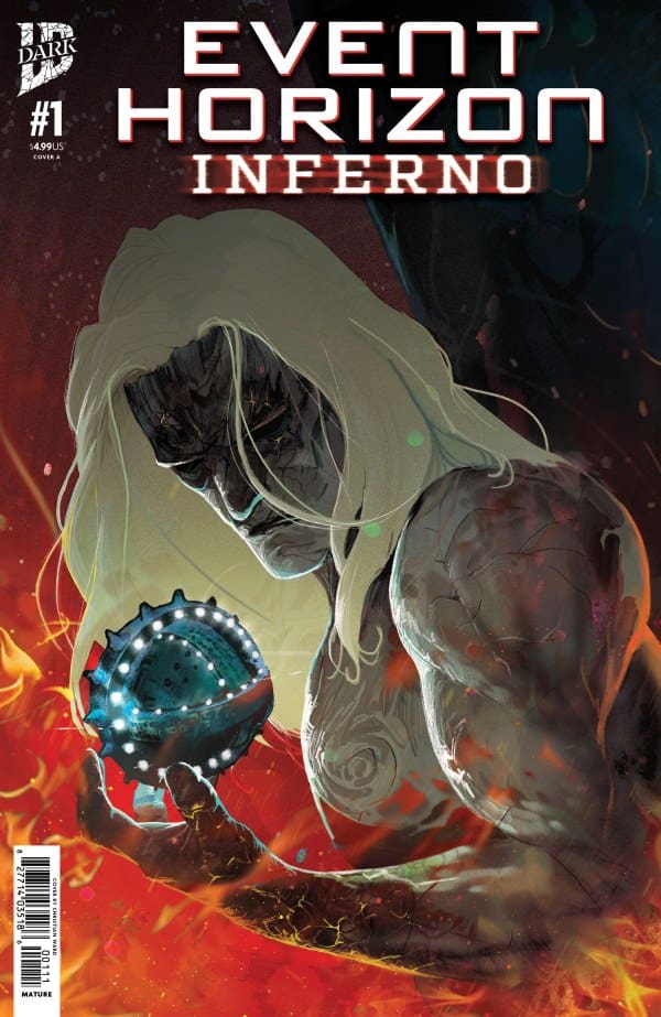
Event Horizon: Inferno #1. Credit IDW Dark. Cover by Christian Ward.

Creative Team: Christian Ward (WRITER and COVER), Rob Carey (ARTIST), Xenon Honchar (COLORS), and Alex Ray (LETTERS).

The Story:

Christian Ward hasn’t skipped a beat as he picks up in this haunting universe and this time hits home with another tale of a selfish billionaire. I love that there is a blend of mercenary marines, and there is a darker tale being told with Daniel’s past. Christian sets the start of the story in a manner where we feel sympathy, and a tale of a dying mother slowly turns things on its head in such a clever way that we peel back each page and panel. I love how seamless Ward can build suspense and immerse us into the horrors of this specific universe while building on the universal lore.

The Art and Letters:

I love how Rob weaves together space horror and builds this hellish landscape we are living in. There are a few jump scares scattered throughout the panels; whether we see the Devil on Daniel’s shoulders or the mysteries left behind on the ship, they each hit a bit differently. Honchar’s colorwork, where the usage of darker greens or mixing in shadows allows the imagination to work, creates the eerie vibe we are being fed in this issue. So much of these horror moments hinge on the art team, and they all nail it perfectly.

Final Thoughts:

Event Horizon Inferno #1 picks back up in this horrifying universe without missing a beat. Christian and the crew create a sense of dread and unease, working their way through the book, gearing us up for what’s to come.

Overall Grade: 9.5/10

Be sure to let us know your thoughts below and check out more reviews by Matt!

Leave a Reply

This site uses Akismet to reduce spam. Learn how your comment data is processed.

MARVEL/DC: SPIDER-MAN/SUPERMAN #1 – Iconic Together

Our Kryptonite” Creative Team – Brad Meltzer, Pepe Larraz, Matthew Wilson, VC’s Clayton Cowles

Metropolis Marvels” Creative Team – Dan Slott, Marcos Martin, Muntsa Vicente, VC’s Joe Caramagna

Sweethearts” Creative Team – Joe Kelly, Humberto Ramos, Edgar Delgado, VC’s Joe Caramagna

Identity War” Creative Team – Geoff Johns, Gary Frank, Brad Anderson, VC’s Joe Caramanga

Ghosting” Creative Team – Louise Simonson, Todd Nauck, Rachelle Rosenberg, VC’s Joe Caramagna

Remarkable” Creative Team – Stephanie Phillips, Phil Noto, VC’s Joe Caramagna

The One Thing…” Creative Team – Brian Michael Bendis, Sara Pichelli, Federico Blee, VC’s Joe Caramagna

The Wondrous & The Worthy” Creative Team – Jason Aaron, Russell Dauterman, Matthew Wilson, VC’s Joe Caramagna

One of Those Days” Creative Team – Jeph Loeb, Jim Cheung, Jay David Ramos, VC’s Joe Caramagna

Published by Marvel Comics

The Story

This comic review is brought to you by the dynamic duo of Megan and Shawn!

Shawn – Main Story: Brad Meltzer put together a really good story for his Marvel debut. Somehow, Meltzer captured a story that is distinctly both Spider-Man and Superman. There’s beautiful action as well as heartfelt moments that make this comic a must-add to the collection for this story alone.
Other Stories: Like the DC counterpart, Spider-Man/Superman features multiple stories in addition to the main story. Each story featured some unique team-ups and enjoyable stories. As good as each story was, I found Phillips “Remarkable” story and Aaron’s ” Wondrous and Worthy to be among the best in the additional stories. Everyone’s story was amazing, but these really hit home for me.

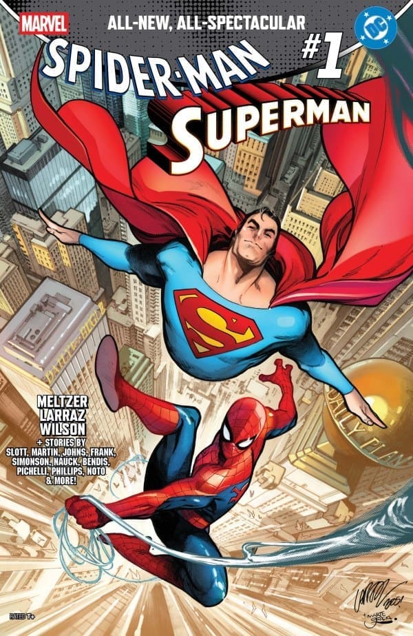
Cover art by Pepe Larraz and Marte Gracia. Published by Marvel Comics

MeganMarvel/DC: Spider-Man/Superman #1 celebrates the first time Superman and Spider-Man made acquaintances 50 years ago with all-new stories of Marvel and DC characters colliding. Inside this comic, there are several different stories with our favorite characters joining forces in their own stories written by some of the best writers in the comic book industry. We get to see the personalities of the characters shine through and represent who they are in their own stories, while collaborating with characters from another franchise.

In the first story, written by Brad Meltzer, Spider-Man and Superman find themselves in a particularly dangerous trap created by their biggest villains, the Green Goblin and Lex Luther. While the action is fantastic and keeps the energy high, what really draws you in is the heart of the story. We see two iconic characters come together, support each other, and save the day together. We see the best of both characters shine brightly throughout the story, and really throughout the comic as a whole.

As I said before, the best writers are involved with Marvel/DC: Spider-Man/Superman #1, and they bring some really fantastic team-ups with them. Ghost-Spider and Supergirl, Gwen Stacy and Lana Lang, and Miles Morales and Superman, just to name a few. There’s something in the comic for any Marvel or DC fan to love, and it brings so much power to these iconic team-ups.

The Art

Shawn – Pepe Larraz did a beautiful job along with Matthew Wilson in the main story. The colors and lines were crisp, clean, and beautiful. Clayton Cowles made sure the story flowed well and gave us some really awesome SFX in the story.
Other stories: Among the additional stories included, I really loved the art from Marcos Martin and Muntsa Vicente on the “Metropolis Marvels” story from Dan Slott. It gave me a distinct newsprint feel that I loved. Todd Nauck and Rachelle Rosenberg did a beautiful job with “Ghosting,” showcasing not only an awesome look for Steel but also for Hobgoblin as well.

Megan – So many incredible artists are involved with Marvel/DC: Spider-Man/Superman #1, bringing all of their talent with them. Artists like Phil Noto, Rachelle Rosenberg, Todd Nauck, Gary Frank, Joe Caramagna, and Sara Pichelli are just a few of the artists involved with the comic that made it such a stunning piece of art. Each artist brought something new to the pages of the comic and made the stories their own. In the main story, Pepe Larraz, Matthew Wilson, and Joe Caramagna start this comic off with a bang, with a powerful story that has the art to match the quality of the writing. This sets up the reader with high expectations for the rest of the comic, which will not be disappointed.

The shining star of the comic has to be Joe Caramagna, who letters almost every story. It’s fascinating and impressive how well Caramagna can have such a range as a letterer and bring a different vibe to each story and match the tone of the stories. Caramagna deserves all his flowers for the incredible work he’s done in Marvel/DC: Spider-Man/Superman #1.

Final Thoughts

Shawn – 10/10. I loved everything about this issue. As great as seeing Brad Meltzer’s Marvel debut was in this issue, I would read a series featuring any of the other stories that were included. Miles Morales and Superman together? yes please. Geoff Johns giving me a heartfelt combination of Superman and The Thing? Please, sir, may I have some more! Even Gwen Stacy and Lana Lang were a story I never knew I wanted to see, but now want to see more of. The only story I may not want more of is the last one from Jeph Loeb, not because it wasn’t great, but because it hit me straight in the heart. Beautiful issue. Bravo, Marvel and DC.

Megan – 10/10. There’s something powerful about bringing the two biggest heroes of all time together in one comic, and Marvel/DC: Spider-Man/Superman #1 celebrated the two meeting 50 years ago in a huge way. The writers, the artists, the colorists, and Joe Caramagna, the letterer of the comic, showed up and showed out. This was simply Marvelous!

Overall Grade – 10/10

Let us know in the comments what you thought of Marvel/DC: Spider-Man/Superman #1!

Leave a Reply

This site uses Akismet to reduce spam. Learn how your comment data is processed.

The Sentry #2 – Tragedies You Can’t Fix

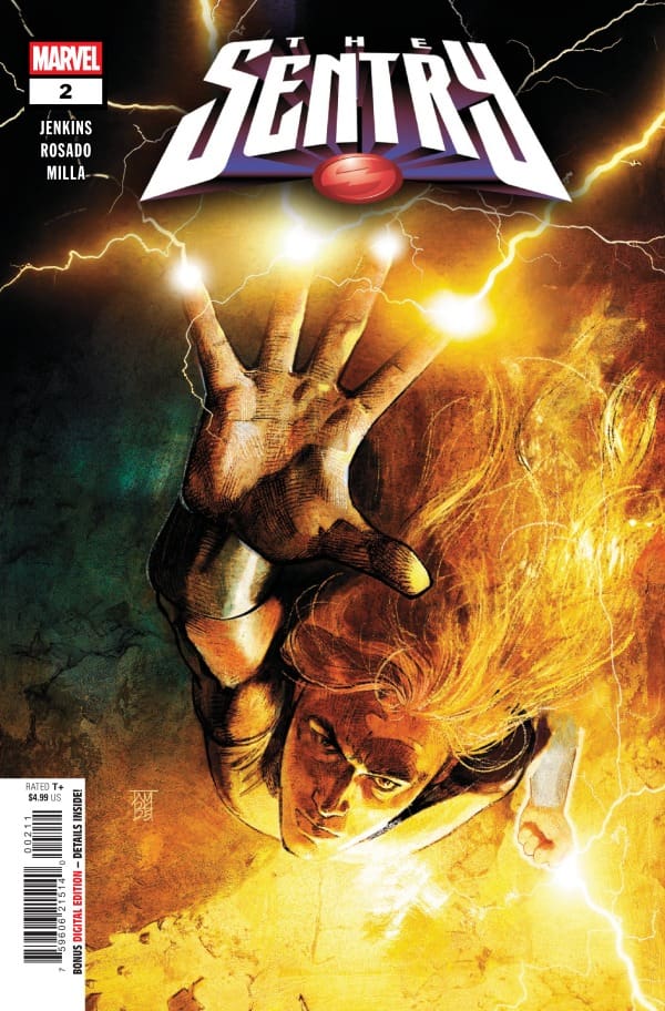
The Sentry, Bob Reynolds, is teetering on the edge. Despite being one of the most powerful beings in the universe, Bob’s depression threatens to push him over the edge. The impending loss of his dog and an infection wreaking havoc across the world threaten to overwhelm Bob, unleashing The Void, Bob’s alter ego. Bob and his AI computer C.L.O.C. work to identify the cause of the threats. As Bob rushes to help those already infected by the crystals, the forthcoming loss of Normie, his dog, brings up deep-seated memories that often lead to depressive episodes.

This review is brought to you by Matt and Shawn from Nerd Initiative. Click on their names for more reviews!

Creative Team

Writer: Paul Jenkins
Artist: Christian Rosado
Color Artist: Matt Milla
Letterer: Joe Caramagna
Cover Artist: Alex Maleev

Writing

Matt: This issue takes the emotion we experienced with Bob in issue 1 and doubles it. Paul makes Bob relatable in a manner that only one can when someone has dual personalities with superpowers, and that is by losing his dog. As someone who lost their dog a few months ago, I felt every ounce of what Bob is going through. His inability to talk about it to anyone at all seeps from the panels even when he isn’t speaking.

Reed Richards, no matter who writes him, is still the worst, and I love that Paul highlights that a bit in the intro, and then we get parallels with Hulk at the end of the book, as Hulk, even in his most simplistic form, understands what Bob is going through and puts words to it. Overshadowed entirely, however, is the fact that Wilson Fisk has Ebola?? That was not on my bingo card, and Jenkins even goes into how, despite being awful, Fisk employs a lot of people, and the impact is going to be felt like a ripple effect across the city and beyond.

Shawn: Paul Jenkins continues to be my favorite writer for Bob. I feel like Paul might find Reed Richards as insufferable as I do. Jenkins continues to give us a glimpse into the day-to-day life of someone dealing with severe depression who is also expected to function not only as a productive member of society but as society’s hero.

One of the things that I really appreciated about this issue is Jenkins giving us context. Most comic fans are not going to be sad about Wilson Fisk losing money, but Jenkins also gives us a great reminder that with Fisk’s businesses damage comes lots of economic impact in the form of lost jobs. Jenkins isn’t going to make you feel bad for Wilson Fisk, but he is going to make you think twice about what the damage to Fisk’s enterprise means for the everyday citizen of the city. Jenkins continues to give us an eerie look at someone battling with the throes of depression while also trying to be everything to everyone.

Art

The Sentry #2 Cover by Alex Maleev. Image from Marvel Comics

Matt: Even with no words spoken, there is a moment in the final panels where Sentry rests his head in his wife’s arms, and you can see the depression and the sadness and even guilt across his face. Rosada and Milla have it drawn perfectly while Joe helps deliver the whimper of Bob saying how The Void may have completely taken over. It’s such a simple scene; however, it speaks volumes through the art and the detailing.

AS someone who struggles with depression, there is a haze or a grey-like void of color in every page and the way the book is drawn that I feel captures what depression is like. Even the sunniest days have a twinge of gloom to them, and the way the team can capture it through the pages is well done and it hits hard.

Shawn: Christian Rosada and Matt Milla continue to set a high standard for this series in issue two. Rosada continues some of the best use of shading and negative space in a comic I’ve seen in a long time.

Milla’s coloring is perfect in this issue. As great as the narrative and Rosada’s art are, the colors from Milla really set the tone for each issue. Between Rosada’s shading and Milla’s colors, you really feel the darkness creeping into each panel, even the “happy” ones. Caramagna captures the feeling perfectly with the lettering and SFX, allowing the story to flow easily and building on the tension created.

Final Thoughts

Matt: 9.7/10. Sentry #2 captures the feeling of hopelessness and despair that someone with depression struggles with, and brings us a line of empathy as Bob is fighting what he feels is a losing battle. Losing his dog and not being able to help despite having all of these abilities on top of his mental illness hits extremely deep for me, and this issue is emotional in every way.

Shawn: 9.5/10. This issue sent shivers up my spine. Jenkins, Rosada, Milla, and Carmagna crafted a story that feels wrapped in darkness. I love how the art combines with the narrative to make you feel like the Void is following you, just like it’s following Bob. This series is spectacular. It’s shaping up to be another masterclass in how to approach a series subject like depression in a way that feels strangely relatable, even though we aren’t superheroes.

Overall Grade: 9.6/10

What do you think about Jenkins and company’s work on The Sentry so far? Let us know in the comments.

Leave a Reply

This site uses Akismet to reduce spam. Learn how your comment data is processed.

ROGUE #4 – The Truth Revealed

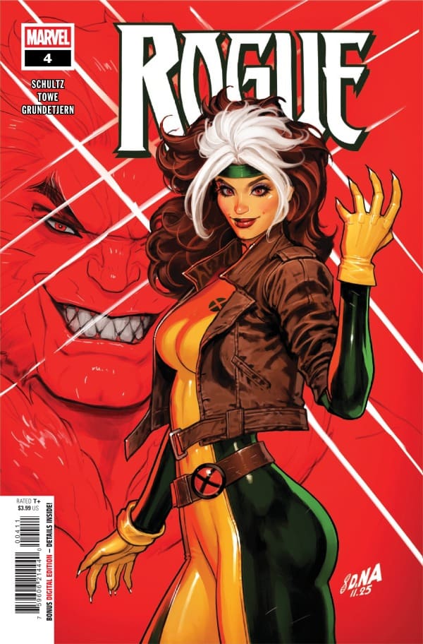
Creative Team – Erica Schultz, Jim Towe, Espen Grundetjern, VC’s Ariana Maher, David Nakayama

Published by Marvel Comics

Catch up on Rogue #3!

The Story

This comic is reviewed by Nerd Initiative’s Shawn, and your truly, Megan!

Shawn – Erica Schultz continues to capture the essence of what fans love about Rogue in this run. I love that Schultz crafts Rogue as independent and capable, but still reminds us that she’s part of a pair. Working some of Remy’s Cajun slang into her lexicon is a nice callback to her and Remy’s relationship without taking away from Rogue being the main character.

Schultz continues to give us glimpses into Rogue’s past that feel grounded and painful. Anyone who has followed Rogue knows that her past has never been rainbows and sunshine, but Schultz has forced Rogue to contend with the ripple effect her past actions have caused in this series, and that feels refreshing in a superhero comic. Schultz’s story also feels fulfilling. It’s nice to see, as a long-time X-Men fan, the real-life aspect of how spending time with folks changes us. Schultz lets us see how time with folks Betsy and Rachel, taught her new skills that she uses.

Cover art by David Nakayama. Published by Marvel Comics

Megan – Rogue is on a journey to figure out these missing memories and these strange visions she’s been having, and this journey is anything but simple. She’s already visited Mystique, who wasn’t any help, she’s had to take out The Constrictor, and now she’s appeared on national news as causing mutant chaos out in the public. It’s not until Rogue saves the mutant public image by going live on the news that she gets a chance to sit and meditate to figure out what is going on with her memories, and that’s when she remembers the horrible truth.

Erica Schultz sets the tone immediately in Rogue #4 with Rogue in the midst of a violent battle, and the energy never drops from there. We finally find out what happened to John Stelton, and the truth is alarming for Rogue. I’m very interested to see where this goes with John because this issue gives us a look at just how terrified he still is of Rogue. Erica Schultz knows exactly how to keep the reader locked into the story and keeps the excitement going for the next issue.

The Art

Shawn – Jim Towe and Espen Grundetjern do a phenomenal job on this issue. While Towe’s art maintains the comic feel to it, the proportions of the character and the details feel realistic and highly polished. Every stroke of the art from Towe feels intentional. This is a series that doesn’t need to feel gritty but clean, and Towe crafts some high-fidelity art that does just that. The backgrounds feel lived in rather than just sketched.

Espen Grundetjern really nails it with colors. The contrast between Rogue’s bright colors that pop against the sullen and sunken cooler tones when John Stelton begins to become more worried allows the art to tell the story in addition to the narrative. Ariana Maher is her usual outstanding self, getting to play around with some unique SFX and bubble shapes that create tension and excitement in the story

Megan – Jim Towe, Espen Grundetjern, and Ariana Maher bring a lot to heat to the pages of Rogue #4! Jim Towe draws the panels with such detail that you can feel the intensity of the fighting scenes clearly. Along with that, Towe expertly has the emotions of the characters on full display, allowing their facial expressions to tell the story. Grundetjern makes Rogue’s classic yellow and green the focal point of the panels, which makes her practically pop off the page. Mixing the muted tones with the vibrant rogue pays off in a big way because every panel is absolutely stunning. Maher, who handles the lettering of the comic, gives the dialogue an even pace, giving the story a perfect flow. With that, there are also great sound effects that bring the comic up several levels when it comes to excitement.

Final Thoughts

Shawn – 9/10 This issue felt like the creative team kicked it up a notch. The story has been compelling and unique, giving us a side of Rogue we haven’t seen as much. It’s one thing as a comic fan to know that Rogue has been through it. It’s another to pull back the curtain and see what has happened to make her who she is.

Megan – 9/10. Rogue #4 brings so much depth to Rogue’s journey in the series and gives us a great amount of action. This comic run feels like it was written with the Rogue fans in mind, and any Rogue fan will love it!

Overall Grade – 9/10

Let us know in the comments what you thought of Rogue #4!

Leave a Reply

This site uses Akismet to reduce spam. Learn how your comment data is processed.