Home Blog Page 52

Imperial Guardians #3 – In Search of Answers and Closure

0

What happens when you need X-Force but aren’t mutants? You get the Imperial Guardians. In a political space-faring world where survival outweighs heroism, Gamora, Captain Marvel, Amadeus Cho, Darkhawk, and Cosmic Ghost Rider may be your last hope. After deploying to a warship under the direction of Maximus, and tracking down major galactic threats, the team tries to plan their next steps. Captain Marvel provides Darkhawk with the power to continue while facing her own demons and failures. It’s enough to help our team as they move on to their next black-ops mission

This review is brought to you by Nerd Initiative’s Shawn!

Creative Team

Writer: Dan Abnett
Penciller: Marcelo Ferreira
Inker: Jay Leisten
Color Artist: Rachelle Rosenberg
Letterer: Cory Petit
Cover Artist: Sean Izaakse
Cover Colorist: Nolan Woodard

Writing

I don’t pretend to fully understand why this team works so well, but I do know it’s because of the writing of Dan Abnett. In Imperial Guardians #3, Abnett gives readers another satisfying special mission for this rag-tag band of misfits. One of the things that Abnett has done particularly well in this series and this issue in particular is to show other sides of some of our favorite heroes. I mean, c’mon how often do we get to see the fun joking side of Carol Danvers? Rarely, dear reader, the answer is rarely. Despite that here’s Carol playing along.

Abnett managed to craft a story featuring this group of characters and got Gamora to be the serious mom of the group, rather than the most obvious choice in Carol. This series has gotten better with every issue, and that is in part because Abnett has developed this loose band of renegades into something that, while not feeling like family, definitely has a closeness to it. I know this series has an end in sight, but Abnett’s writing leaves me wanting more of this series than readers are going to get.

Art
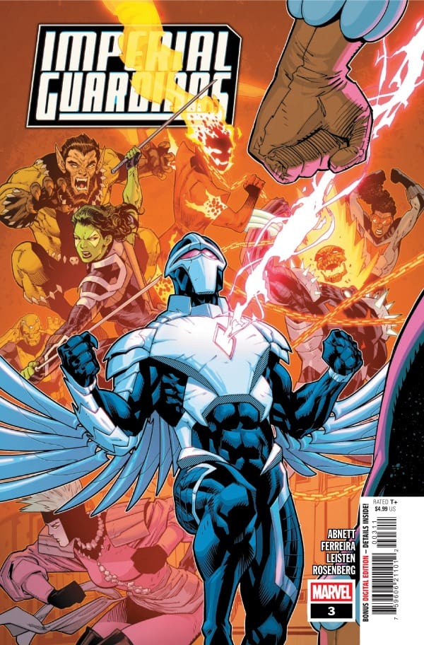
Imperial Guardians #3 cover by Sean Izaakse and Nolan Woodard. Image from Marvel Comics

Marcelo Ferreira, Jay Leisten, Rachelle Rosenberg continue to stun on Imperial Guardians. Ferreira shows impressive versatility this issue. When the scenes demand chaos, he displays a raw, looser style but can quickly shift to meticulously clean line work when the scene demands clarity. His line weight mimics the emotional weight of the scene in a meaningful way.

Jay Leisten and Rachelle Rosenberg work in perfect harmony. Leisten blends the sharp definitive line work with Rosenberg’s rich palette through his inking. Leisten provides the weight, texture, and shadow while Rosenberg crafts a masterclass in light and hue to bring life into the shapes, lines, and edges crafted by Ferreria and Leisten. Cory Petit continues to show off some of his best work on this series. This issue with it’s interview style panels could pose a real problem both for spacing as well as flow and Petit guides you easily through the panels and pages.

Final Thoughts

Imperial Guardians continues to get better every issue. I understand why the interview-style panels were chosen and have to admit they’ve grown on me. This is just good, serious, fun. The series has an old school feel with its art style and beautiful writing that allows us to see characters in ways we aren’t used to.

Overall Grade: 9/10

Are you loving Imperial Guardians? Let me know in the comments
Leave a Reply

This site uses Akismet to reduce spam. Learn how your comment data is processed.

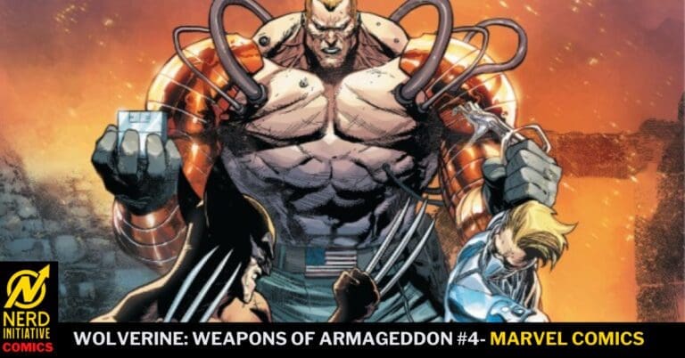
Wolverine: Weapons of Armageddon #4 – It’s Time To Help People Again

Wolverine has a kindred spirit in David Colton. The former Captain America is now a thorn in the side of Prime Warrior, a private company seeking individuals to replicate the super soldier program. With his time as Captain America over and his status as a royal pain to Prime Warrior in full effect, the leaders of Prime Warrior have deployed Nuke to recover what they seek. After all, the promise of the Origin Boxes to turn the best warriors into super soldiers is too good an opportunity to pass up.

This review is brought to you by Nerd Initiative’s Shawn!

Creative Team

Writer: Chip Zdarksy
Artist: Luca Maresca
Color Artist: Bryan Valenza
Letterer: Joe Sabino
Cover Artist: Leinil Francis Yu
Cover Color Artist: Romulo Fajardo Jr.

Writing

Chip Zdarsky crafts a satisfying end to the Weapons of Armageddon storyline in the lead-up to next month’s Armageddon event. While Colton and Logan might not be friends, it’s clear through Zdarsky’s writing that in each other they have found a kindred spirit. I really admire the way that Zdarksy was able to wrap up this story arc with a satisfying conclusion that also left threads running out to the big event.

Marvel has a lot of events that feel like only temporary shifts in the status quo, but Wolverine: Weapons of Armageddon, as well as Captain America, feel like Zdarsky may follow through on the promise of an event that has long-standing ramifications for the Marvel Universe. This feels different. This issue is full of action, but the entire arc has felt cerebral. Zdarsky has left readers bread crumbs for an event that will feel more impactful than much we have seen, while also acknowledging the role that a Doom-less world from the One World Under Doom event plays. With Wolverine: Weapons of Armageddon #4, Zdarsky shows us a world that doesn’t ignore the past, but will definitely have its future reshaped.

Art

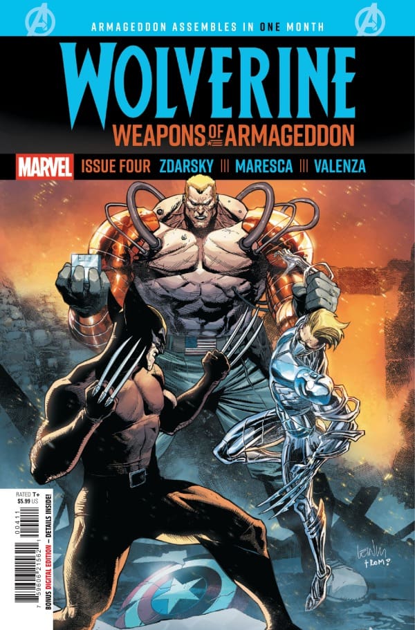
Wolverine: Weapons of Armageddon #4 cover by Leinil Francis Yu and Romulo Fajardo Jr. Image from Marvel Comics

Luca Maresca, Bryan Valenza, and Joe Sabino did fine work on this issue. This issue is easily the most action-packed of the four, and the team was up to the task. The fight scenes flow clearly with great art, colors, and lettering.

Maresca crafted a truly terrifying Nuke 2.0. The character not only looks like someone you don’t want to meet in a dark alley, but someone you don’t want to run into, period. The character does a great job of building suspense for just how dangerous these Origin Boxes could be if they fell into the hands of already enhanced soldiers.

Bryan Valenza does a beautiful job with colors. There’s a lot of variety in the panels and settings in this issue and it feels like Valenza captures the mood in each setting perfectly.

Final Thoughts

A satisfying end to a really well-written story arc. While Logan might now have many friends, he’s ever the teacher, and this issue proves it. This series is gritty and a perfect setup for what comes next in the Marvel Universe.

Overall Grade: 9.5 /10

Did Wolverine: Weapons of Armageddon get you excited for Armageddon? Let me know in the comments
Leave a Reply

This site uses Akismet to reduce spam. Learn how your comment data is processed.

Fantastic Four #11 – A Future For Everyone

Invincible Woman is defeated. The Fantastic Four are victorious. What comes next? The Sue Richards who used her powers without care, remorse, or morals is gone. Under the careful care of Maria Hill and S.H.I.E.L.D., Maria approaches the Fantastic Four with a new proposal. How would the team feel about a new Future Foundation?

This review is brought to you by Nerd Initiative’s Shawn!

Creative Team

“Future’s Foundation”

Writer: Ryan North
Penciller: Pat Boutin
Inker: Serge Lapointe
Color Artist: Edgar Delgado
Letterer: Joe Caramagna
Cover Artist: Humberto Ramos
Cover Colorist: Edgar Delgado

The Digger In The Dark”

Writer, Artist, Letterer: Stan Sakai
Color Artist: Brittany Peer

Writing

In the main story for this issue, Ryan North really poses an interesting question. When the Fantastic Four’s biggest villain, Dr. Doom, is nowhere to be seen, what is the team’s goal? One of the things that I have really enjoyed about North’s run is the willingness of Sue to push back on Reed. This shines through in this issue as well. North writes Sue as a really powerful grounding rod for Reed’s crazy ideas. It’s through Sue that North tries to remind us that despite Reed’s best efforts, it’s going to take more that just sheer intellect to solve the problems of the world.

Fantastic Four #11 also shows off another of North’s strong points with these characters, which is his ability to touch the core of what Ben Grimm is about. I love the glimpses into the relationship between Ben and Alicia that North has given us throughout his run on the Fantastic Four. While Ben has always had the support of his fellow team members, Alicia provides him with the support in the way only a life partner can and that really oozes through in this issue. There was a moment between the two that genuinely caused me to tear up. This is also just kind of a silly classic Fantastic Four-style story. It provides a nice palette cleanser after the intense last arc of the series.

Stan Sakai’s short story at the end of this issue was really enjoyable. He wears lots of hats for this one and manages to craft a story that feels right at home in the Fantastic Four universe but is distinctly his. The writing feels like Silver Age Fantastic Four stories with a new twist.

Art

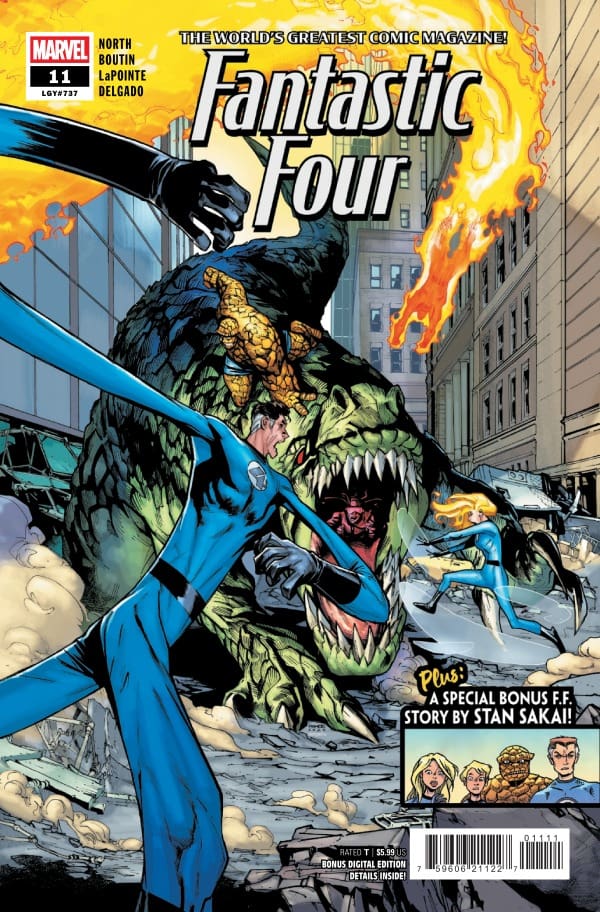
Fantastic Four #11 cover by Humberto Ramos and Edgar Delgado. Image from Marvel Comics

Pat Boutin takes over for Humberto Ramos this issue on penciling with Serge LaPointe taking over for Victor Olazaba on inking duties. The transition between the two visual art teams is as seamless as can be. While Ramos is a legend, Boutin comes out strong with bold, clear lines that pop. While the obvious intention is to keep the look of the series going, Boutin works to still make each character his own.

Serge LaPointe does an amazing job on the inks. The use of shading and shadow with the inks creates great contrast with the bright colors throughout the issue. Colors from Edgard Delgado continue to be a highlight of the series. The color on Alicia Master’s face and the shade created, deserve particular praise as it shows a masterful understanding of lighting a panel. Joe Caramagna makes the right words pop in each word bubble. In particular, his work on Johnny Storm really captures Johnny’s personality well.

Stan Sakai’s story provides a sharp contrast in the best way. His art is so detailed and the line work is incredible. Whether it’s the detailed scales of a monster or the cracks throughout The Thing, there’s really impressive line work. Sakai’s characters are easily distinguishable as the classic team and some of their villains but each character also display’s Sakai’s unique art style

Final Thoughts

One thing this series is going to do is provide the heartfelt family moments, and this issue has them in loads. Ryan North really captures the heart of the Fantastic Four and what makes each of them unique. While not as action packed as the previous Invincible Woman story arc, it feels like a fresh batch of hope after the Fantastic Four looked down the barrel of certain destruction. I will always be a fan of any story that gives me more of the beautiful relationship between Ben and Alicia.

Overall Grade: 9/10

Excited to see where Fantastic Four goes now? Let me know in the comments
Leave a Reply

This site uses Akismet to reduce spam. Learn how your comment data is processed.

“Alias: Red Band #3” Review – A Delightful Ball of Chaos

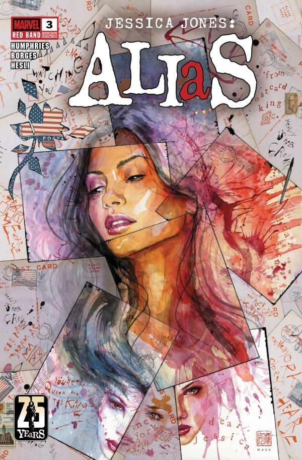
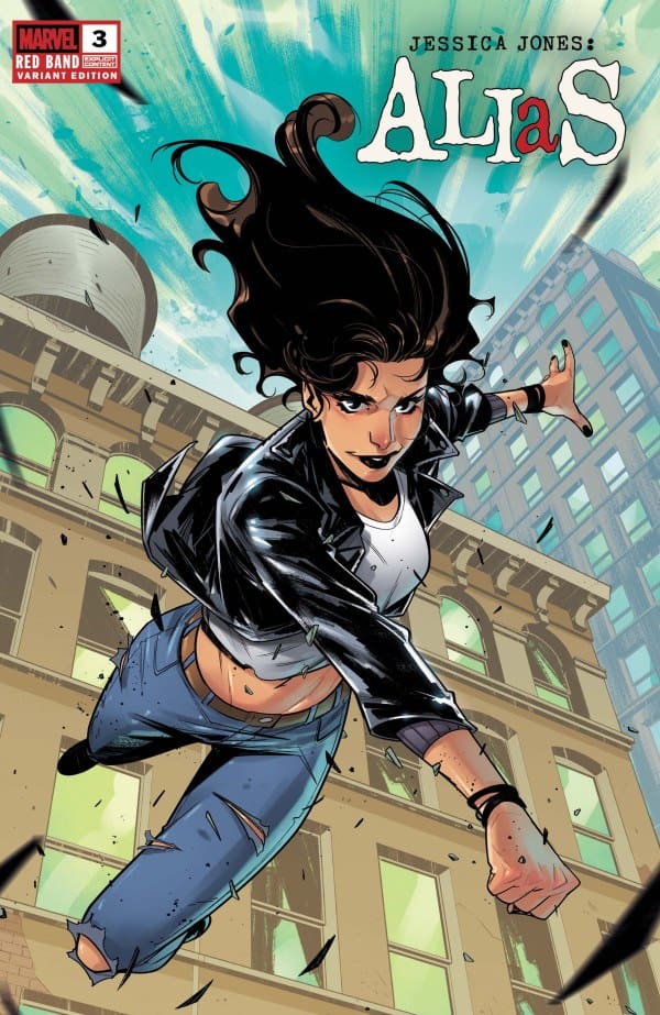
Jessica Jones and Typhoid Mary; the dynamic duo that none of us knew we needed. They’ve now found the Postcard Killer, but where will things go from here? That’s for Megan and I to know and for you, dear readers, to find out! Join the two of us as we review “Alias #3” by writer Sam Humphries.

Writer: Sam Humphries
Artist: Geraldo Borges
Colorist: Arthur Hesli

*SPOILERS AHEAD*

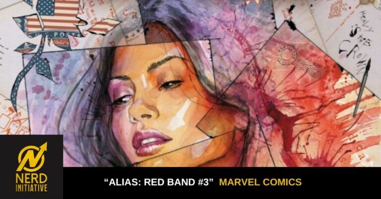
Source: David Mack, Marvel Comics

The Story & Writing

Megan: Jumping into issue three of “Alias: Red Band”, Typhoid Mary is under the trance of one of the postcards and she’s in a blind rage. Typhoid Mary isn’t one to be messed with. When she wants to hurt you, she’s going to hurt you. Jessica see’s the dangers she’s in and it seems hopeless. That is until Typhoid Mary’s alter comes through and puts a stop to the chaotic rage. She can only hold Typhoid Mary back for so long, so Jessica has to act fast. Finally finding the supposed Postcard King, Jessica finds out everything she can on how to switch off the button on Typhoid Mary’s rage. When she pushes for more information, the writer of the postcards proves that this isn’t just a one and done bust. There’s much more sinister hands at play and it’s up to Jessica and Typhoid Mary to put a stop to it all. On their investigation, their only lead seems like a bust, but what they don’t see is that it’s only the beginning of the chaos.

Sam Humphries delivers another phenomenal issue of “Alias: Red Band” that keeps you locked into the story. What I love about how Sam is writing this is that you truly cannot guess what’s around the next corner. There’s no telling what’ll come up in the investigation, but what I do know is that I am sat and I am excited.

Edalyn: I’ve got to say that I’m completely with Megan on this one! For this entire issue, I was sat and on the edge of my seat. Throughout this entire run so far, I’ve loved not ever knowing what was coming next, and that continues here. Not once could I ever have guessed what was going to happen, and that to me is a mark of a truly great mystery. That being said, not a single moment felt wasted either. While the action heavy moments felt exciting, Humphries also really allows us to soak in those small moments and take in all that these characters are, which leads me into my next point.

Something else that I loved about this issue too was getting more of Jessica’s inner monologue. With what she goes through in this issue, the inner monologue acts as a great way to see how she processes everything she sees or feels. There are several instances here that are very much heightened by the usage, and I loved it. The writing from top to bottom was absolutely amazing and I need so much more.

Source: Lorenzo Tammetta, Marvel Comics

The Art

Megan: What stands out the most in this comic for me is the action. Geraldo Borges brings the action to life in the most detailed ways, leaving little to the imagination. Arthur Heslie works perfectly off of Borges’ drawings and uses the colors to bring in more depth. I really appreciated how the tones of the colors changed when Typhoid Mary was on a terror. The vibrant colors did well showing that she’s in a trance and a completely different headspace than she normally would be in. Cory Petit handles the lettering and perfectly captures the emotions of Same Humphries’ writing through the dialogue. With some well-timed sound effects, Petit gives the comic its voice in a beautiful way.

Edalyn: The art on display here was both Geraldo Borges and Arthur Heslie at the tops of their games. Borges’ use of detail has this almost indescribable edge to it, making you feel the grit of every scene. There’s several panels that look like they’d be right at home in Billie Joe Armstrong’s bedroom, and this is further helped by the colors of Arthur Heslie. the colors are intense and bright when needed, and subdued when the moment calls for it. The two together make everything just feel real, sucking you into the world and making you feel like you’re there.

Final Thoughts

Megan: Sam Humphries isn’t writing this comic specifically for me, but he might as well have. The action, the Jessica Jones style investigation, and the mystery of the story are all 10s in my book. Absolutely phenomenal job by the creative team! – 10/10

Edalyn: I don’t think I can really praise this run enough. It’s so far remained consistently stellar and this installment doesn’t disappoint. I can easily say that you can read all three of these first issues and not at all feel like you’re missing a beat. The creative team is putting in the work and it shows! – 10/10

Overall grade: 10/10

Read more from Megan here and check out her podcast & socials!

Read more from me here and check out my socials!

Comments

Are you a Jessica Jones fan? What’re you thinking of this new run so far? Let us know in the comments below!
Leave a Reply

This site uses Akismet to reduce spam. Learn how your comment data is processed.

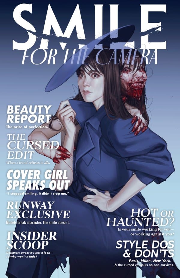
“Smile: For The Camera #3” Review – The Plot, And Horror, Thicken

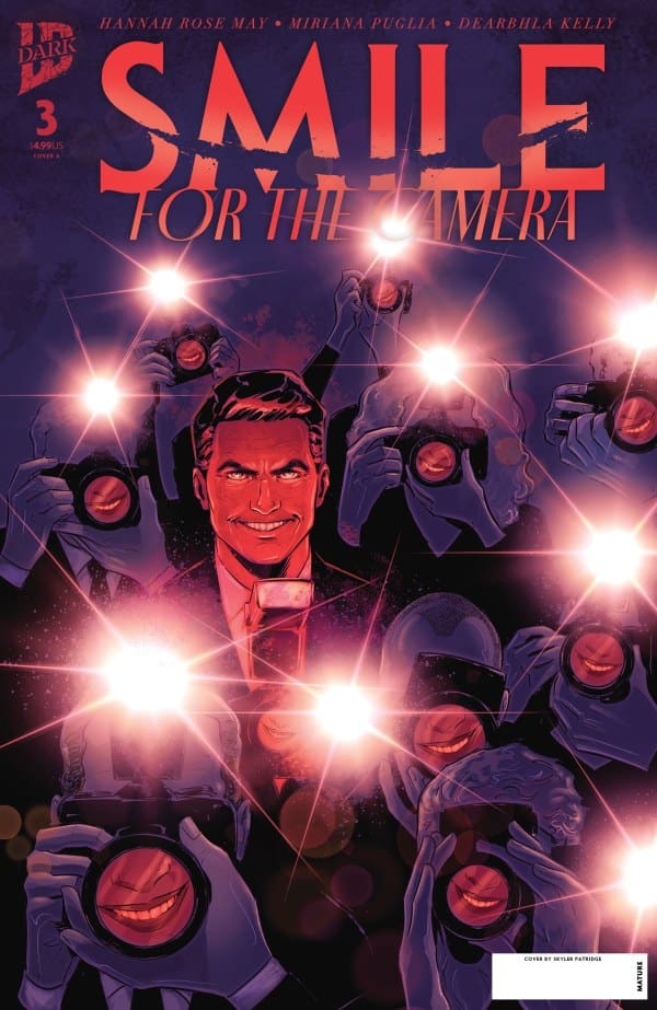
Keeping up with the previous two issues, we catch up with Ivy as she starts putting in the work to truly figure out what’s going on. As her newfound friends continue to drop like flies, Ivy hopes to uncover the truth and save whoever’s left. At the risk of increasing her debt and losing her job, will she put an end to the violence? Or will more bodies be left on the runway?

Writer: Hannah Rose May
Artist: Miriana Puglia
Colorist: Dearbhla Kelly

Source: Skylar Patridge, IDW Publishing

Smile: For the Story

Once again, Hannah Rose May proves that she deserves a top spot amongst horror comic book writers. At now three issues in, she keeps the formula feeling fresh and creative. Where last issue, we followed the previous victim from beginning to end, May reverts back to Ivy’s point-of-view here, putting readers in the shoes of someone struggling with the chaos. While reading, I was able to feel every ounce of worry, tension and anger. When the inevitable sweet release comes, it comes twofold in a way I won’t soon forget.

To top it off, the pacing feels fast, much as a heartbeat of a potential victim in a horror movie. This, for me, made it a very easy and quick read. That being said, I was still able to retain every important bit of information and the pacing feels intentional. I feel as if it further enhances what I said before, where Hannah Rose May works to put readers in Ivy’s shoes. Feeling heated and like she has to work quickly to figure out what’s going on, the pacing matches that perfectly.

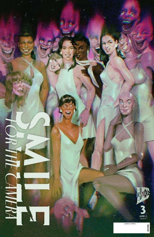
Magazine cover showing a group of women in white dresses posing together in a surreal club-like scene, with pink alien figures in the background.
Source: Steph C., IDW Publishing

The Art of the Issue

The art and colors of Miriana Puglia & Dearbhla Kelly also both continue to be absolute top notch. The work of Puglia coupled with Hannah Rose May’s writing really work to make every character feel as human as possible. The characters coupled with the setting designs actively work to make everything feel real and tangible, lending even more to the horror when things get bloody.

The colors from Kelly help with this even more. The use of color works to make things feel intense and grotesque. However, in moments where that isn’t needed, they make things feel more focused and real, using a wide variety of colors like greens, purples and blues. Overall great work from a stellar team!

Source: Joshua Swaby, IDW Publishing

Final Thoughts – 9.5/10

While things might feel a bit too fast paced for some, Hannah Rose May crafted yet another stellar entry to her “Smile” series. Tension and horror ran high, with stellar art and color work to boot! The creative team continues to prove they’re here to stay and that Rose May is an absolute icon on the rise. With only a few issues left, I’m more than excited to see where things go from here!

Read more from me here and follow my socials!

Comments

Have you been reading “Smile: For The Camera”? What’re your thoughts so far? Let’s discuss in the comments below!

Leave a Reply

This site uses Akismet to reduce spam. Learn how your comment data is processed.

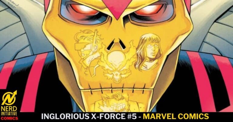
Inglorious X-Force #5 – Horseman of Death or Guardian Angel?

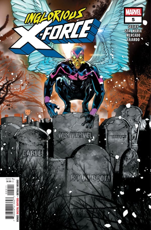
Inglorious X-Force #5 – Cover – R. B. Silva & David Curiel (Credit Marvel Comics)

Inglorious X-Force #5

Writer – Tim Seeley

Artists – Michael Sta. Maria & Roi Mercado

Colorist – Romulo Fajardo Jr.

Letterer – Joe Caramagna

Cover – R. B. Silva & David Curiel

Read the review for the last issue in this series HERE!

Inglorious X-Force #5 – Cover – Declan Shalvey (Credit Marvel Comics)

The Story:

Angel has been transformed into Mr. Sinister’s Blood Angel! With the team engaged in battle, it’s up to Boom Boom to try snap Warren out of it and get him back on X-Force’s side!

The Writing:

Tim Seeley’s work on this series has been and continues to be fantastic. The deep character beats between Ms. Marvel and the rest of the team and Boom Boom and Angel are deep and full of rich dialogue. Seeley’s handling of Mr. Sinister and his ridiculous monologuing is absolute perfection. On top of the great team dynamics, the story is pushed forward in a meaningful way with Cable finally coming clean about why he put together this team. But, in stead of resting on that and letting it be the cliffhanger of the issue, Seeley hits the reader with one last gut punch to get us all salivating over what is to come.

Inglorious X-Force #5 – Cover – Adam Gorham & Fabi Marques (Credit Marvel Comics)

The Art:

With incredible action paired with emotional beats, the art team really showed up in this issue. Blood Angel’s design alone makes this book worth the cover price. I have to say that the standout moment would be Boom Boom’s resourceful tactic to try to take out Sinister. The quick cuts from panel to panel as she made her move, to the surprise on Sinister’s face, to the resulting disappointment were all incredible. And of course, the way that Sinister is… handled at the end of the story was another stellar bit of artwork from this team. Finishing up the issue with the epilogue and the huge surprise with Domino and Cable and the gnarly design in those panels had me scratching my head while saying out loud, “Well that was awesome!”

Overall Grade: 9.5/10

Inglorious X-Force #5 is an excellent read from beginning to end and a series that I wish would never end. Action, villainous monologue, heart, and a mystery that keeps the reader engaged? What more could you ask for in a comic book?

Check out more from Derek here!

Have you read this issue? What did you think? Let us know in the comments below!
Leave a Reply

This site uses Akismet to reduce spam. Learn how your comment data is processed.

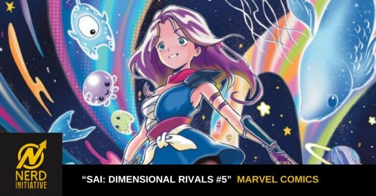
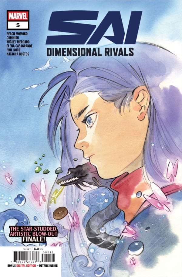
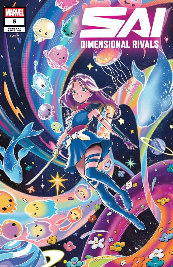
“Sai: Dimensional Rivals #5” Review – All Adventures Must End

After all of her travels through the multiverse for the seventh stone, Sai’s adventures finally come to an end. From fighting drunkards to seeing gods, was Sai able to complete her goal for Beast and Galactako? Were Peach Momoko and crew able to stick the landing after such a fantastic run? Find out with me as I review “Sai: Dimensional Rivals #5”!

Writers/Artists: Peach Momoko, Phil Noto, Elena Casagrande, Gurihiru, Natacha Bustos, Miguel Mercado

Source: Peach Momoko, Marvel Comics

Multidimensional Storytelling

I’ll start by saying this: the story was wrapped up about as perfectly as it could be. I won’t spoil how it ends, but it’s certainly an ending I could see being divisive. Personally, I loved it and am really hoping for more in the future. All involved did a great job at not just looking back at what Sai experienced, but looking towards the future of what could come. The pacing felt quick, but not in any negative way, as it was here that they let the artwork do the majority of the talking.

Across the entire run, the fact that this project worked is an absolute marvel, pun intended. Tackling something like this with as many people as were on board is no easy feat, yet Peach Momoko and crew made it look so. The story stayed cohesive and sensical, keeping its sense of identity along the way. This whole project team is what every team strives to be.

Source: Benjamin Su, Marvel Comics

Artwork Worth Hanging

As I stated before, the team really let the artwork speak for itself here. With minimal words spoken, the art and colors of all involved did all of the heavy lifting, and the comic was all the better for it. I could feel myself getting sucked through every warp point, being taken into these different worlds that I wanted nothing more than to stay in.

Not only were new pieces provided, but the issue served as a retrospective, showing pieces from every issue as Sai recounted her travels. Then came the absolute piece de resistance; the eye-wateringly beautiful splash page. Looking like shattered glass with Sai’s silhouette smack dab in the center, it was a piece that I would absolutely love to hang on my wall. The entire team should be proud of the effort they put in.

Overall Grade – 10/10

While the final pages may prove to be a bit divisive amongst fans, the team stuck the landing overall. With as hard a project as this run, Peach Momoko and crew kept things tied tight with an overall great story and utterly fantastic artwork. All involved in this genre-defining project should pat themselves on the back and stand proud of the perfection they created. “Sai: Dimensional Rivals” is an absolute masterclass from start to finish, and I’ll absolutely be buying the trade paperback when it releases.

Read more from me here and check out my socials!

Comments

Were you able to read all of “Sai: Dimensional Rivals”? If not, will you be buying the trade paperback when it releases? Let’s discuss in the comments below!
Leave a Reply

This site uses Akismet to reduce spam. Learn how your comment data is processed.

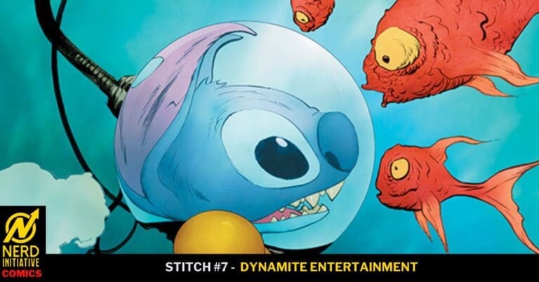
Stitch #7- An Undersea Adventure

Dynamite’s Stitch comic is back with Issue #7, and so is the book’s creative team:

  • Writers: Connor Ratliff & James III 
  • Artist: Greta Xella 
  • Letterer: Fabio Amelia

Read Stitch #6 Review Here

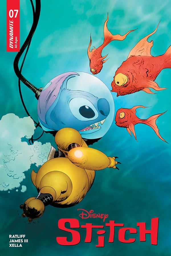
Stitch #7 Cover B By Jae Lee (Credit: Dynamite Entertainment)

The issue starts with Stitch, Pleakly, and Jumba in the lab. The 3 of them are admiring Juman’s handiwork and his latest invention, a ship that can translate what underwater creatures are saying. 

After admiring it, they take it into the ocean for a test drive. They can now hear what all of the animals are saying. Stitch is also scuba diving as well. We then see Jumba and Pleakly diving as well. 

Pleakly finds a group of dolphins, and they mention that they want to dry land and take over the world. Jumba and Pleaky then work on designing land suits for the dolphins. While that is happening, Stitch and the sea creatures are having a musical number. 

Jumba and Pleakly then work on the suits and are talking about as well. They then finish, and the dolphins try on the suits, which fit them. The dolphins then put Jumba in a jail cell, and head with Pleaky to the surface. 

Lilo is then looking for Stitch, and the dolphins pop up from the ocean. She then goes and finds Bubbles to try to warn him, but the dolphins have caused chaos. Jumba is still trying to break out when he hears the music playing. 

The final panel shows Stitch and the band using the music to lure the dolphins back into the ocean. 

Overall Grade: 10/10– The entire team has created an amazing issue. This is so fun to read, and fans of the series will have an amazing time reading it.

Leave a Reply

This site uses Akismet to reduce spam. Learn how your comment data is processed.

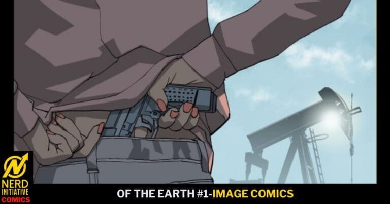
OF THE EARTH #1: A Place of Solitude.

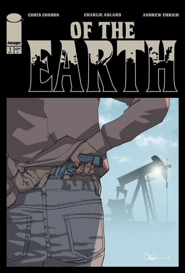
Tabby is on the run from something in her life and headed to her Grandmother’s house in Solitude, Texas, where she can be alone in the place she was raised. As Tabby is about to find out, however, things have changed since she has been gone, and her Grandma may not be alone.

Of The Earth #1. Credit Image Comics. Cover by Charlie Adlard.

Creative Team: Chris Condon, Andrew Ehrich, Charlie Adlard, Pip Martin, Mike Tivey, and Hassan Otsman-Elhaou.

SPOILERS AHEAD

The Story:

Nobody writes a story that can make you feel textures, grit, and grime the way Chris can. He has a way of crafting stories that both narratively make us feel uneasy and yet captivate us all the same. I’m a sucker for a good horror tale at that, and this is setting us up for something potentially sinister. I couldn’t quite pinpoint exactly what in this issue made me feel uneasy, whether it was Tabby’s interaction with the cop, the suspicious truck as she is attempting to rescue the dog on the highway, or seeing the town population saying 150. From panel 1 onward, as we go through this story and meet our main character, something just feels off, and it’s incredible storytelling from Condon in the way he can create that feeling so effortlessly. Lastly, I already hated basements before, and the final page sealed the deal for me. Thanks, Chris.

The Art and Letters:

There are some simply incredible works of detail in this opening issue. Aiding in the uneasy feeling is perhaps the addition of this issue, making us feel the need to shower. Martin and Adlard set up the scenery, and you just feel hot and as though your skin is covered in sand and sweat the entire time. There is a panel where we get a close-up of Tabby, and the sweat is drawn in such a manner that it almost looks as though her face is melting a bit. They capture the vast nothingness that is this area of Texas well, and the panel with the dog was utterly heartbreaking. Hats off to them for showing the aftermath and not pulling away. Hassan puts his mystique and flavor into the letters, and it’s the way the cops’ words feel lifeless and yet stern, creating a tense scene in the middle of nowhere. The whole team paints a perfect picture of unease, and we are just getting started.

Final Thoughts:

Of The Earth #1 sets the mood instantly, leaving the audience feeling uncomfortable and dirty all the same. This is the perfect way to start a suspenseful horror story, and I’m hooked right away. This book should generate some buzz and be at the top of lists this week! P.S I already didn’t need another reason to stay away from Texas, but this book just adds another.

Overall Grade: 10/10

Be sure to let us know your thoughts below and check out more reviews by Matt!

Leave a Reply

This site uses Akismet to reduce spam. Learn how your comment data is processed.

Leave a Reply

“Vampirella #2” Review – A Fantastic Tale of Two Twins

In the previous issue, new readers were introduced to Vampirella’s sister Draculina, having been turned back into a vampire after living a human life. We watch and read as she recounts her troubles to Vampirella’s therapist, who comedically thinks they’re the same person and doesn’t realize the bigger picture of what’s going on, namely, when it comes to the bigger family matters involving Lilith and Dracula. Will she be able to prove otherwise? Will she learn to forgive her sister, and just why Vampirella bit her? Let’s find out together!

Writer: Christopher Priest
Art: Davis Goetten, Ergün Gündüz (Pages 1 – 3)
Colors: Giovanni Caputo, Ergün Gündüz (Pages 1- 3)

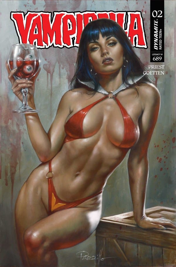
Source: Lucio Parillo, Dynamite Entertainment

One of the Best

Right off the bat, I’ll say that I absolutely love where this story is going. This book gives readers our first good look at a certain figure, and it feels appropriately dramatic. Without giving away too much, the dialogue is utterly fantastic, being sophisticated yet easy to follow. To further back it up and show the character’s true power to the audience, the church setting was such a fantastic choice, lending this sense of eeriness to boot. In order to fully grasp what I mean, I guess you’ll need to read the issue!

In order to leverage the drama, Priest expertly interlaces the drama with comedy. A lot of the humor on display here feels highly relatable, such as people getting confused between siblings. An aspect that I found relatable was not wanting to be involved with family affairs. In both the humor and the drama, it always feels nice having a story and characters that feel relatable. Relatability makes things that much easier when trying to connect with what’s going on, and that’s something Priest has always excelled at.

Source: Elias Chatzoudis, Dynamite Entertainment

The Art of the Bite

First off, I have to say that I absolutely loved seeing Priest’s previous “Vampirella” partner Ergün Gündüz return for the first few pages of the issue! As always, his work here was absolutely breathtaking, perfectly matching the work of Goetten and Caputo. This was an absolutely stellar art team if I ever saw one.

Much like in the previous issue, Goetten shows that he knows how to perfectly capture a scene. To go back to the church scene for a moment, everything in it felt perfectly dramatic and brooding. From the angles to the shading, I couldn’t help but feel both fear and tenseness. Alternatively, in the more comedic moments, facial expressions were on par with the comedic beats. All of this showed in Caputo’s usage of color as well, feeling darker and muted when needed, but a bit brighter when the moment called for it. Shades of red, yellow, blue, and white were played with throughout, lending nothing but beauty to each panel.

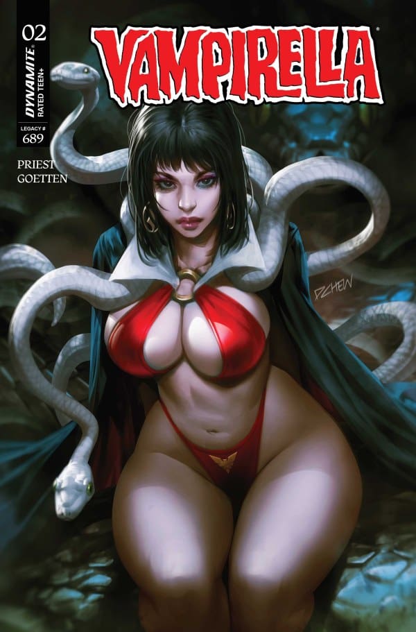
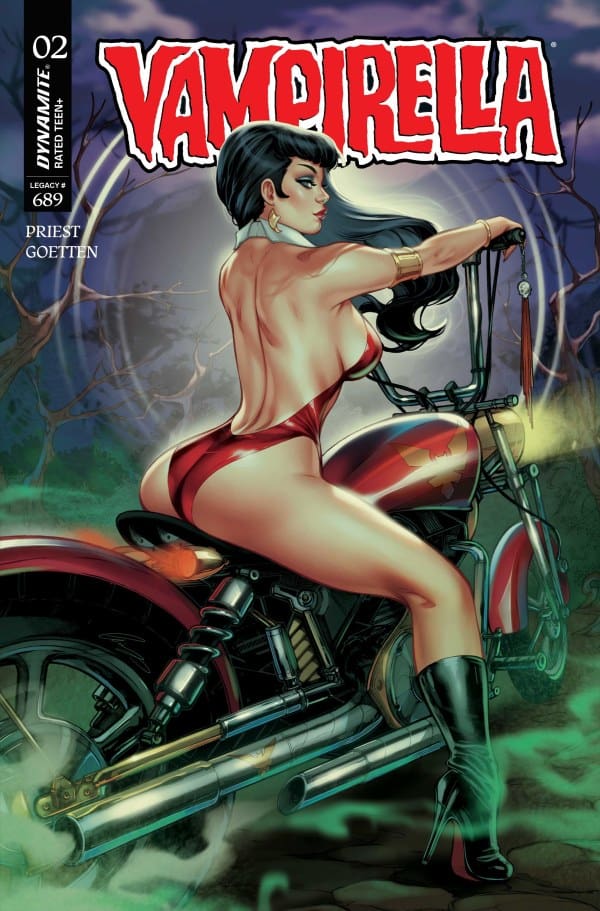
Source: Derrick Chew, Dynamite Entertainment

Overall Grade – 10/10

From the tenseness, horror, and relatability of writing to the matching tenacity of the artwork, Priest led and created yet another highly exceptional installment of “Vampirella”. One will laugh as much as they feel fear and will want to keep coming back for another bite.

Be sure to read more from me here and check out my socials!

Comments

Have you been keeping up with Priest’s work on “Vampirella”? What do you think of his take on the character and her story? Let’s discuss in the comments below!
Leave a Reply

This site uses Akismet to reduce spam. Learn how your comment data is processed.