Home Blog Page 45

DC X SONIC THE HEDGEHOG: THE METAL LEGION #2

Creative team – Ian Flynn, Adam Bryce Thomas, Matt Herms, Becca Carey, Pablo M Collar

Published by DC Comics

Catch up with DC x Sonic the Hedgehog: The Metal Legion #1!

The Story

The world of the Justice League and the world of Sonic has been linked together, and the Legion of Doom has both of them as targets. The newest member of the Legion of Doom, Dr. Eggman, feels he’s leagues above his Doom colleagues and has a secret plan up his sleeve. Never one to be outsmarted, Lex Luthor has a secret scheme of his own. Both aren’t each other’s biggest fans, even though they’re both so similar, which I found hilarious.

Cover art by Pablo M Collar. Published by DC Comics

Each villain has sent a spy to the other, Catwoman and Rouge, who are two peas in a pod with how similar they are. Both con artists are playing the villain that hired them, so it’s all a mess. But Dr. Eggman and Lex are none the wiser. The evil geniuses have come up with a plan to take over both worlds in one go and there’s a lot of moving parts involved. Hopefully, Lex and Dr. Eggman are smart enough to have thought through every scenario, including the other’s secret plan.

The second issue of DC x Sonic the Hedgehog: The Metal Legion has a much more linear story as the first issue was seeing each character from the Sonic world meet their DC counterpart. Ian Flynn continues to keep the energy high, while keeping the fantastic team ups deep in the action. I can’t wait to see how the next issue turns out, because this ended with quite the cliffhanger. I’m not sure what will come of it, but if Flynn is behind it, it’s safe to say it’ll be excellent.

The Art

There’s so much to love in the pages of DC x Sonic the Hedgehog: The Metal Legion. The story is wrapped in so much action between so many different characters. Each character is drawn splendidly, and every one of them has their own light to shine while not dulling the others.

The coloring of the comic is vibrant and exciting, full capturing the energy of both Sonic the Hedgehog’s world and the world of DC. Becca Carey handles the lettering and always delivers high quality work and this is no exception. There are many different tones that change from character to character and Carey is able to perfectly capture their different vibes through the dialogue. All in all, the artists continue to impress in this run and they make me very excited to see what they’ll bring next issue!

Final Thoughts

DC x Sonic the Hedgehog: The Metal Legion #2 continues to be pure fun! I’m having the best time seeing some of my favorite characters from two different worlds team up together in what can only be described as a chaotically good time!

Overall Grade – 9/10

Let me know in the comments what you thought of the second issue!

Leave a Reply

This site uses Akismet to reduce spam. Learn how your comment data is processed.

This review was written by Megan from the Vigilante Vibes Podcast! If you liked my review, be sure to check out my other reviews! Let me know what you think of DC x Sonic the Hedgehog: The Metal Legion #2, or tell me what comics you’d recommend me trying out! Find me on my socials, and check out my Marvel podcast, Vigilante Vibes, by clicking here!

The Twilight Zone #7 – Death in the Illusion of Life

Henry Wallanowski brings death to life as a taxidermist. From decay and rot comes beauty. What if, though, the pursuit of that one perfect moment consumes you?

This review is brought to you by Nerd Initiative’s Shawn!

Creative Team

Writer: Tony Fleecs
Penciller: Andy Price
Inkers: Andy Price and Maria Keane
Shade Assist: Maria Keane

Writing

Wow, what a mind-bender. Tony Fleecs crafted a true-to-the-bone Twilight Zone adventure. Even when I thought I saw the twist coming, it still surprised me. This issue felt so unique and original. Despite the obvious gore etc associated with taxidermy, I don’t know that in a millions years and given hundreds of chances I would think to craft a horror or suspense story around taxidermy like Fleecs did in this issue.

Fleecs creates with Henry, a character who feels lonely and aloof. Who among us has never felt the impact of a parent asking when something will happen according to their timeline rather than ours? Fleecs draws you in, and makes you feel like you truly know Henry. It makes the surprise ending of this story all the more impactfly

Art

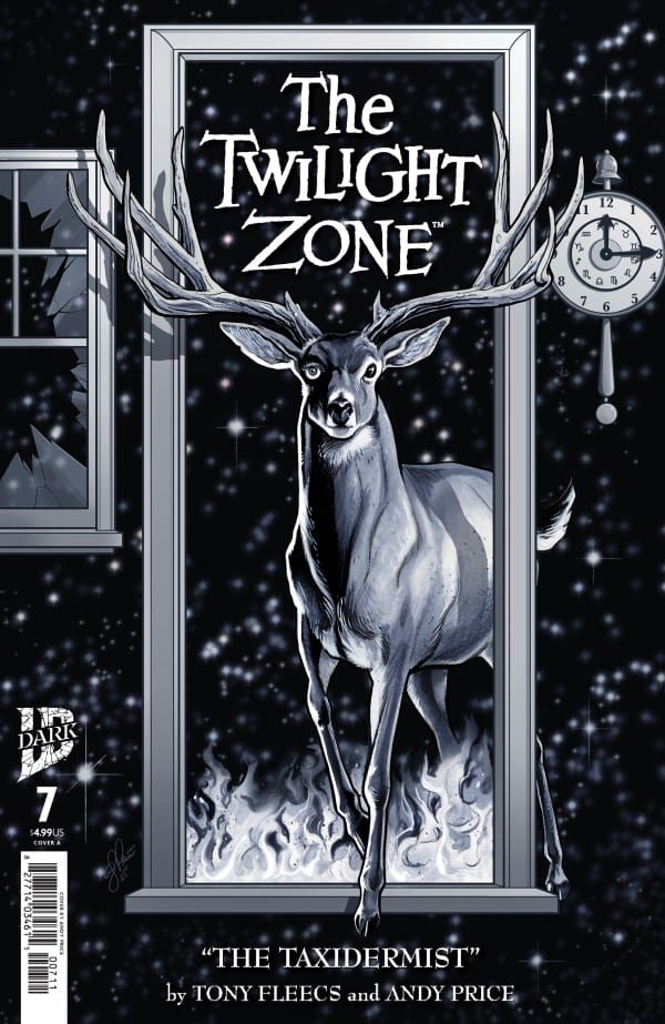
Cover of Twilight Zone comic: a deer with large antlers stepping through a doorway against a starry night, with a clock on the wall and flames at the bottom, title 'The Twilight Zone' above and 'The Taxidermist' by Fleecs and Price below.
The Twilight Zone #7 Cover by Andy Price. Image from IDW Publishing

Andy Price and Maria Keane did amazing work on this issue. The storefronts and the community look lifelike and lived in. Because of the focus of the narrative being on taxidermy, Price and Keane needed a severe attention to detail to accurately represent the animals in the story, and they nailed it. The shading helps not only make the lines more crisp, but also helps build the Twilight Zone feel to the story. When you’re relying on a limited color palette as the Twilight Zone series does, it can make it easier for errors and uncrisp lines to stand out. Price and Keane avoid this pitfall with every line, every shadow, every inch of each panel being perfect. The art helps sell this story in the best way possible.

Final Thoughts

IDW has dropped another fabulous entry into The Twilight Zone series. Fleecs, Price, and Keane work together to craft a beautiful narrative of a lonely, misunderstood man that you can’t help but be drawn into. Fleecs takes a unique setting and idea and weaves a spine-tingling narrative around it.

Overall Grade: 10/10

How are you liking The Twilight Zone? Let me know in the comments

Leave a Reply

This site uses Akismet to reduce spam. Learn how your comment data is processed.

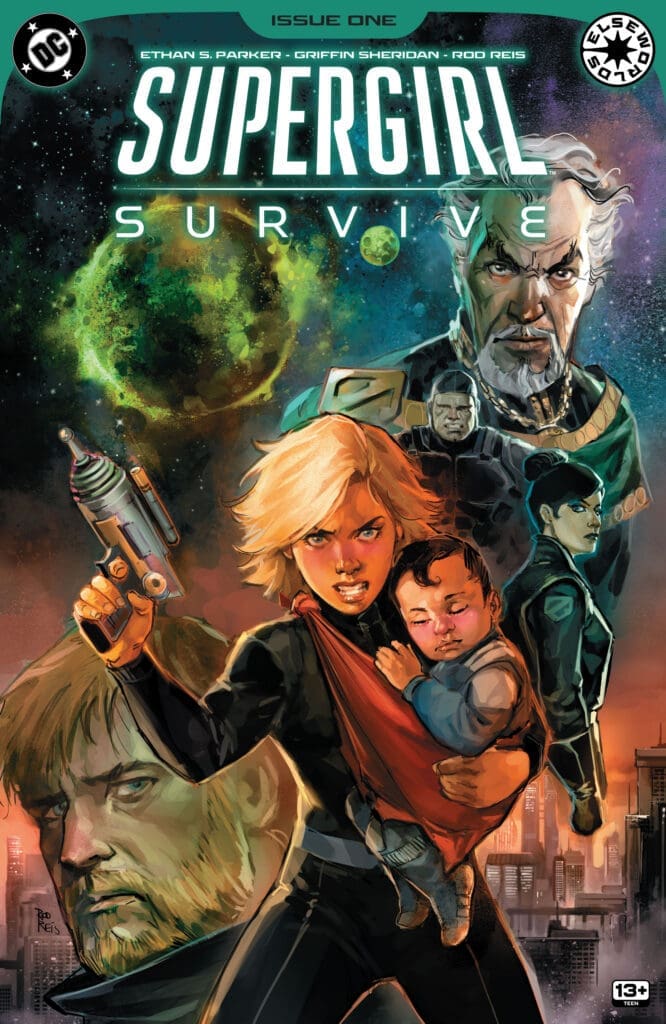
SUPERGIRL SURVIVES #1: To Have Love And Lost.

KAl-El is the first natural born Kryptonian bringing happiness to his family and his cousin Kara. Meanwhile Kara, is struggling to navigate the hardships of being a teenager dealing with an upcoming dance and classes. Everything has suddenly come crashing to a halt as her home world of Krypton begins to explode forcing her and her newly born nephew to flee. With a course set for outer space Kara realizes her problems have only just begun.

Supergirl Survives #1. Credit DC Comics. Cover by Rod Reis.

Creative Team: Griffin Sheridan, Ethan S. Parker, Rod Reis, and Lucas Gattoni.

The Story:

To be completely honest the second I saw Griffin and Ethan on this book I knew it would be an instant pull for me. The duo have written some incredible stories the last few years and so I had high expectations coming into this one as well. Suffice to say I was not let down as this first issue had it all. We spend time with Kara and see her as just a regular normal Kryptonian teenager. She has friends, she has a crush, and she navigates school just as any of us have done. I love the idea of having the story lay this foundation and she us that Kara is a timid girl who just wants to live a normal life.

We get a glimpse into the horrors Krypton has faced with the Atom drills and then their dear Emperor pledging to stamp out anyone who isn’t loyal. It felt a little too real in that sense that by the time we get to the chaotic escape our hearts were pounding. The fluidly move from emotion to emotion telling a linear and tragic tale of Krypton’s final moments. Now we are set up for a Kara protecting baby Kal space adventure and I could not be more excited.

The Art and Letters:

I love Rod’s softer almost paint brush like way of coloring the panels in this issue. It gives this a softer tone that allowed me to warmly feel at home on Krypton and almost feels like a classic Sci-Fi book in a way. The opening panels of Kara and baby Kal were beautifully drawn with an innocence to them that isn’t there by the ending of the book. This is a different version of Krypton as well than I feel like we have seen as Rod builds skyscrapers and makes it look as though it were Earth itself we are watching explode. The fiery reds and oranges stand out against a dark background which sets the mood for the escape. Lucas aids in giving life with the soft touch in the lettering. There is so much of a child like innocence throughout this book matching Kara in tone.

Final Thoughts:

Supergirl Survives #1 gives us just enough backstory into who this version of Kara is and the amount of development I am sure we will see by the time she reaches Earth if she does at all. I love the coloring and the art as it brings a warmth to the pages along with the lettering. This is going to be a fun ride and I am here for it!

Overall Grade: 9.7/10

Be sure to let us know your thoughts below and check out more reviews by Matt!

Leave a Reply

This site uses Akismet to reduce spam. Learn how your comment data is processed.

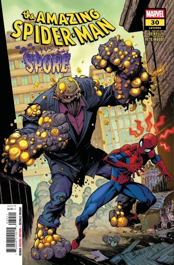
The Amazing Spider-Man #30 – Expect the Unexpected

After training with Daredevil on the capacity of his Spidey-sense, Peter gets confronted by a new threat that has taken control over the scientists from Rand Enterprises. Peter must atone for a mistake his clone made but is fighting with how to bring this threat down.


Creative Team

Joe Kelly (Writer), Pete Woods (Artist/Colorist), VC’s Joe Caramagna (Letterer)

Jay Bowen (Designer), Kaitlyn Lindtvedt (Assistant Editor), Tom Groneman (Associate Editor),
Nick Lowe (Editor), C.B. Cebulski (Editor-in-Chief)

Publisher: Marvel Comics


Expect the Unexpected

Issue thirty is an amazing action-packed continuation from issue twenty-nine. If you are needing a refresher, please check out my review of issue twenty-nine below in the “links” section. Within issue thirty you will see devastation, confusion and a host of other emotions! Which is why I’ve titled this issue “Expect the Unexpected.”

Unexpected
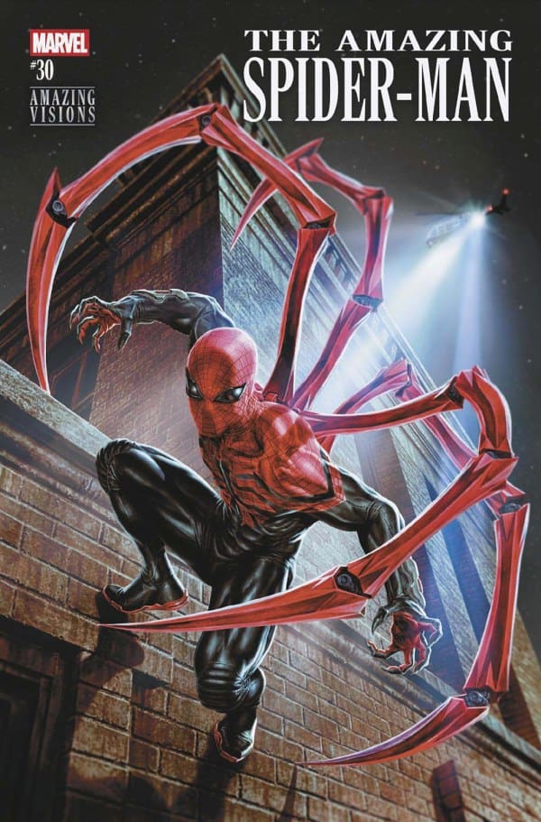
The Amazing Spider-Man #30, Credit Marvel Comics. Cover by Mark Bagley & Dean White.


This story starts off right where the previous issue left off. Peter Parker and his co-workers from Rand have been trapped under the control of a new villain, Spore. Peter is trying very hard to figure out a way to put a stop to Spore without fully exposing his Spider-Man identity. Which as you may have guessed is proving to be more of a challenge than Peter is expecting. Within this period of the story we are introduced to a young man who is ill. When readers come across this portion of the story you may become confused as to what he has to do with the story. Stay the course and keep reading! Joe Kelly will not disappoint you!

Another special guest arrives midway through this story to provide aide to Peter and the Rand employees. That special guest is none other than Kintsugi, the new vigilante that has fought alongside Spider-Man in prior issues. This character is a wonderful addition to the Spider-Man character directory! A humble character who has connected with Spider-Man on an emotional level last issue.

This issue wraps up with the announcement of some very striking and unexpected news from another new character, Cormac Crane. This individual was introduced at the end of the Death Spiral storyline and that introduction brought some very interesting information with it. After making an unexpected appearance at Aunt May’s apartment, things take a VERY unexpected turn leaving readers to feel every emotion that funnels through the panels during this scene.


The Writing

Joe Kelly provides an amazing emotional adaptation to this issue. Yes, fans are accustomed to Peter Parker being the subject to various different emotional situations within his life. This is no different. Joe has such a way with taking hold of reader’s emotions and twisting them throughout a 25-page story. Providing great shifts to the plot leaving readers guessing where the story is going to head too next. This series continues to bring the “shock and awe” factor to me.

The Artwork

Pete Woods provides the same stellar work that he gave to readers for issue twenty-nine! The amount of detail within these pages is stunning! So stunning that the thought of all of the work that went into this makes my hands and wrists numb. Not only is the pencil work perfect, but the coloration is just as perfect as well! Bright bold colors are used within the action panels to bring an illumination to the action. I am very impressed with the work of Pete Woods these last two issues!

VC’s Joe Caramagna‘s lettering for this issue is spot on as well. Which I am not surprised because he has yet to produce a terrible work that I have seen. The styles that he uses to differentiate the tone and who is speaking is so easy on the eyes for readers!


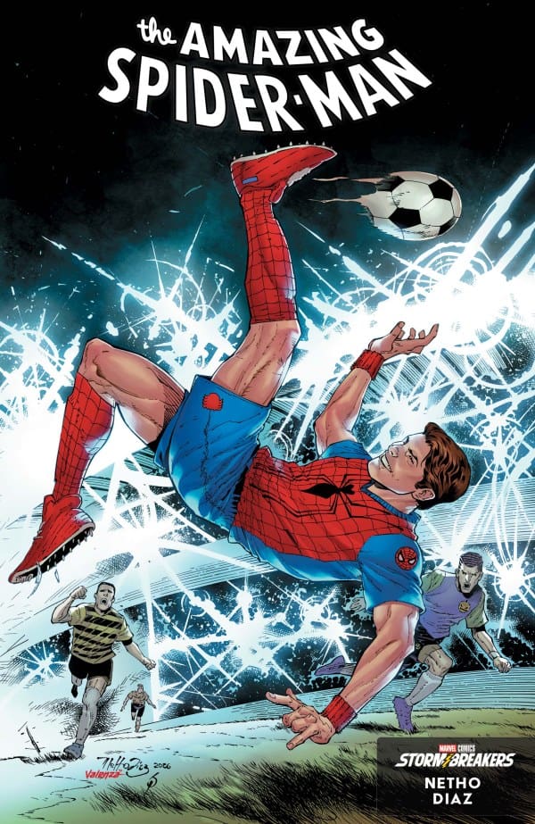
Variant Covers

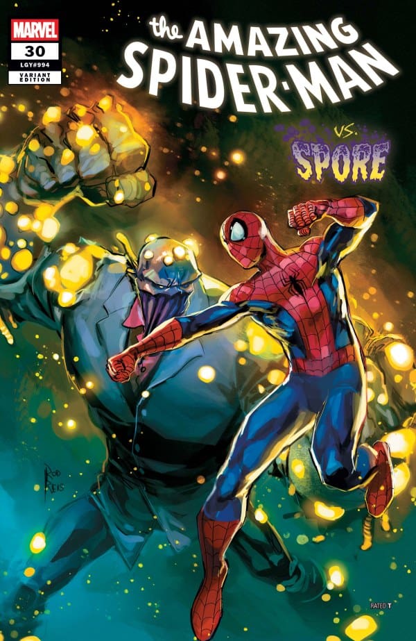
  • Spider-Man battles a large glowing monster in a comic cover titled 'The Amazing Spider-Man vs. Spore'.
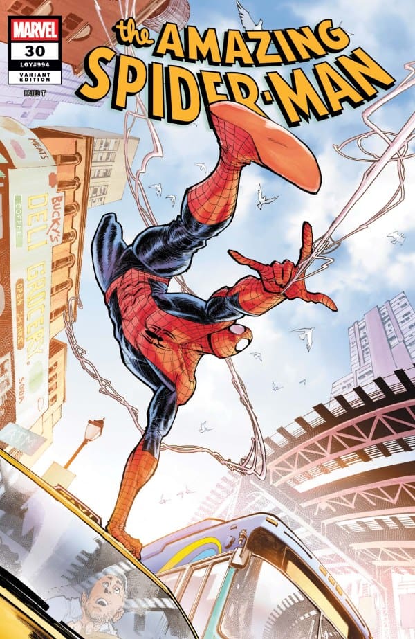
  • Comic book cover: Spider-Man swinging between tall buildings above a speeding train in a sunny cityscape, title 'The Amazing Spider-Man' at top, Marvel logo left.

Final Thoughts

The amount of emotional pull and potential drama that present themselves in this issue keeps readers on the edge of their seats. The beautiful art that accents the storytelling bring a pleasant yet unexpected attraction to the turmoil of Peter Parker. If you’ve been a fan of this Spider-Man series from Joe Kelly, you will want to continue reading this ever-growing story. Things are about to get really interesting once you know all of the finer details that lie within the cracks of this review!

Overall Grade: 10/10


Links

Comic Book Reviews & Entertainment News: Nerd Initiative
Previous Review: The Amazing Spider-Man #29 – Apology Tour
Travis’ NI Portfolio: TravisComicHaven – Nerd Initiative
Travis’ Personal Content: Travis’ Comic Haven


PLEASE SHARE YOUR THOUGHTS IN THE COMMENTS SECTION BELOW!

Leave a Reply

This site uses Akismet to reduce spam. Learn how your comment data is processed.

Wade Wilson: Deadpool #5 – Back in Action

The letters flow. With them, Deadpool saved people and made a nice bit of change in the process. Everyone wants part of a good thing, and Hammerhead took notice. Intending to force Wade to give up the source of the letter, Hammerhead and his goons attack Blind Al, Wade’s roommate, and set the place ablaze. As the world burns around her, Blind Al reveals the truth. The letters are from her.

This review is brought to you by Nerd Initiative’s Shawn!

Creative Team

Writer: Benjamin Percy
Artist: Geoff Shaw
Color Artist: Alex Sinclair
Letterer: Joe Sabino
Cover Artist: Geoff Shaw
Cover Color Artist: Alex Sinclair

Writing

Benjamin Percy continues to craft a truly enjoyable Deadpool series. Last issue, we got the big revelation of Big Al being behind the omens, but in this issue, we get to see the fallout. Throughout this series, the classic hallmarks of a Deadpool comic that fans love have been there, but it feels like Percy wants more. Percy seems to be crafting Deadpool into more than just juvenile humor and an aversion to death.

With this version of Deadpool, we finally get to see Wade truly dealing with the death of Ellie and the impact that has on his life. I love that it feels like Percy is setting up a buddy cop kinda arc with Wade and Blind Al. I loved the inclusion of Hammerhead in this story and hope that resolving the omens story doesn’t mean the end of Hammerhead.

Art

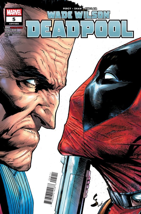
Wade Wilson: Deadpool #5 cover by Geoff Shaw and Alex Sinclair. Image from Marvel Comics

Geoff Shaw and Alex Sinclair continue to do amazing work on this series. This is nowhere more apparent than in a panel in this issue that involves Deadpool doing a cartwheel in the air across the panel. The lines are perfect, and the colors and faded hues are impeccable.

Shaw and Sinclair get a wide variety of work in this issue, with some close-up work as well as some more wide-open scenes. They handle both with a deft touch, showing great detail in the face of Blind Al as well as making a boat yard feel as large as it should be.

Final Thoughts

Wade Wilson: Deadpool continues to be entertaining, fun, and well-written. The art is perfect, and the story adds a depth to Wade that makes him more than just a punchline.

Overall Grade:10 /10

How are you liking this Deadpool series? Let me know in the comments

Leave a Reply

This site uses Akismet to reduce spam. Learn how your comment data is processed.

WHAT IF…? UNCANNY X-MEN #1 – Bred from Love

Creative Team – Gerry Duggan, Jan Bazaldua, Arthur Hesli, VC’s Clayton Cowles, Lucas Werneck

Published by Marvel Comics

MORE FROM NERD INITIATIVE HERE!

The Story

This comic review is brought to you by the dynamic duo of Megan and Shawn!

Shawn – It’s always nice to see Uatu make an appearance, and I feel like Gerry Duggan does a really good job of utilizing him in this story to move the narrative along. Uatu serves as a grounding rod for a story that is both deep and devastating. At its core, Duggan’s story asks a question about sacrifice and what it means to try to save one at the expense of many.

Duggan does a really great job showing us some new dynamics and interactions. He also does so without negating major events that have happened as part of the X-Men’s story. The story allows us to see familiar characters in a new light, one that feels both intriguing and dark.

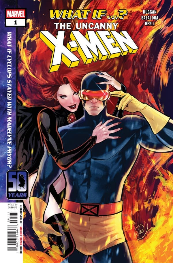
Cover art by Lucas Werneck. Published by Marvel Comics

Megan – In the world of What If, anything and everything is possible. The smallest change can have the biggest consequences. That proves true for What If…? Uncanny X-Men #1. In this story, told by Uatu the Watcher, the question is asked what if Cyclops stayed with Madelyne Pryor and the answer was chaotic.

Plenty of us know the story of Nate Summers, Madelyne, and Jean Grey and how Scott Summers handled the whole situation. Jean was supposedly dead, Maddie was pregnant, and Scott was happy. That is until Jean comes back and Scott leaves his child and Maddie. In this story, Scott never left Maddie. He left Jean instead to be a father to his son. It’s a noble thing to do, and surely Scott had no idea how tragic the outcome would be, even resulting in the Earth being completely uninhabitable.

In this story, Gerry Duggan tells just how tragic the outcome could have been if Scott didn’t follow his heart and followed his responsibilities instead. In a perfect world, with a perfect mutant family, tragedy strikes again and again. Duggan’s storytelling skills will have you hooked in by the first page and your eyes won’t leave the book until you’re done reading.

The Art

Shawn – Jan Bazaldua and Arthur Hesli did a really great job on this team-up, with Clayton Cowles handling lettering duties. It was really exciting to see Bazaldua interpret some classic X-Men characters in new ways. One panel near the beginning stands out in particular, where we almost get the shadow of Scott’s father as Scott contemplates what it means to be a father. This panel is particularly well drawn by Bazaldua.

Arthur Hesli continues to stun on any issue he works on. This issue Hesli makes a really good use of shadow, whether it be part of the scene or a hidden part of a character’s face, the colors really pop because of the contrast of the shadow. Clayton Cowles keeps the story flowing well despite handling a regular narrative plus Uatu’s narration.

Megan – Jan Bazaldua, Arthur Hesli, and Clayton Cowles bring so much to the table when they’re on the creative team. There’s an abundance of excellent panels in here that capture so many different tones. There’s love, death, heartache, contentedness, and all are portrayed beautifully by the artists. Bazaldua brings drawings that are perfectly detailed and leave nothing to the imagination, giving you every detail you’d want. Hesli does a marvelous job with contrasting colors that work perfectly off of each other. There’s a big difference in tone during the story and Hesli makes that known when working with the darker colors. Cowles handles the lettering wonderfully, capturing the heightened emotions through the dialogue. There’s also an excellent use of sound effects that makes the reader experience the story even better.

Final Thoughts

Shawn – 9/10. This was an enjoyable issue that added more heartbreak and depth that I was expecting from a What If? issue. Duggan crafted a story that was interesting and held my interest through the last page.

Megan – 10/10. I’m not usually a big What If…? fan, but this top tier storytelling. What If…? Uncanny X-Men #1 was an emotional roller coaster ride that you don’t want to get off of.

Overall Grade – 9.5/10

Let us know in the comments what you thought of What If…? Uncanny X-Men #1!

Leave a Reply

This site uses Akismet to reduce spam. Learn how your comment data is processed.

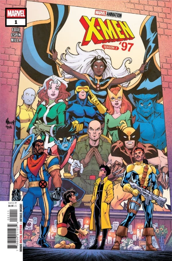
X-MEN 97 SEASON 2 #1 – Back at it Again

Creative Team – Steve Foxe, Salva Espin, Matt Milla, VC’s Joe Sabino, Todd Nauck, Rachelle Rosenberg

Published by Marvel Comics

MORE FROM NERD INITIATIVE HERE!

The Story

If you’re like me, then you’re waiting with bated breath for the second season of X-Men 97. If this is true, then there’s no better way to raise the hype than to check out X-Men 97 Season 2 #1! Picking up right where the show left off, majority of the X-Men are missing. Believed to be dead, there are memorials dedicated to their bravery and people are mourning. Some people are mourning. That doesn’t include the mutant-haters of the world who are going of their way to cause issues for the remaining mutants.

Cover art by Todd Nauck and Rachelle Rosenberg. Published by Marvel Comics

Forge is in his feelings about the loss of the X-Men, especially one X-Man in particular. The Modest Goddess herself, Storm, is missing as well. Bishop shows up and tells him that it’s not a matter of where they are, but when they are, and we are off to season 2 of X-Men 97.

In this comic, there’s some great moments, especially from Jubilee and Sunspot. There’s also our introduction to X-Factor, who is here on a much different mission than the X-Men ever would be. We also see some looks from Psylocke, Cable, and Archangel, which is always appreciated. So much happens in this first issue, so much excitement packed into the pages all thanks to Steve Foxe. This got me more excited for the newest season to drop and even more excited for the next issue of this run to hit the shelves.

The Art

Salva Espin, Matt Milla, and Joe Sabino put in the work to make this a gorgeous comic that has the same vibe as the TV series, but gives you the excitement of comic book art. Espin gives bold details to the characters that wear their emotions on their sleeves. Their facial expression practically tell the story themselves. Milla brings a lot of vibrant colors that juxtapose the darker tones, making the characters practically pop off the page. Joe Sabino captures the emotions of the characters and gives them a voice through the dialogue. Sabino always does a brilliant job with the sound effects that make reading the comic an even bigger experience.

Final Thoughts

If you’re excited for the next season of X-Men 97 on Disney+, then you’ll want to check out this comic. The creative team did a fantastic job at keeping the energy high and the excitement at the highest level.

Overall Grade – 9.5/10

Let me know in the comments what you thought of the issue!

Leave a Reply

This site uses Akismet to reduce spam. Learn how your comment data is processed.

This review was written by Megan from the Vigilante Vibes Podcast. If you liked my review, be sure to check out my other reviews! Let me know what you think of X-Men 97 Season 2 #1, or tell me what comics you’d recommend me trying out! Find me on my socials, and check out my Marvel podcast, Vigilante Vibes, by clicking here!
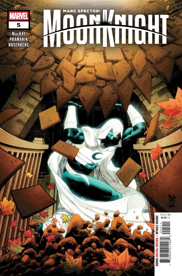
Marc Spector: Moon Knight #5 – Prey or Predator

Conduit of Destruction

Something is consuming the world, and the Midnight Mission is out to find out what. With the Mission’s leader Moon Knight, missing for the last two weeks, they decided to tackle the problem themselves. Unfortunately for Moon Knight, when his trusted members of the Midnight Mission went into the building, they never made it out. Moon Knight enters to find them. Will any of them make it out alive?

This review is brought to you by Nerd Initiative’s Megan and Shawn!

Catch up on Moon Knight with the reviews for issues #1, #2, #3, and #4.

Creative Team

Writer: Jed MacKay
Artist: Dev Pramanik
Color Artist: Rachelle Rosenberg
Letterer: Cory Petit
Cover Artist: Paulo Siqueira
Cover Color Artist: Rachelle Rosenberg

Writing

Megan – I am loving everything Jed MacKay is doing with Moon Knight and that couldn’t be more obvious with Marc Spector: Moon Knight #5. Marc’s body is failing him, his friends are missing after a house ate them, and he has to carry around an obnoxious sword with him to defeat whatever is in the house. When he goes into the house, he sees pretty immediately that it’s going to much more difficult than assumed. Battling evil constructs left and right until he finally reaches the soul of the house. In a callback to MacKay’s last run, Moon Knight sees who he’s up against, and any plan he did for a victory have goes right out the window. We’re left on a cliffhanger that has me so excited, I’ll be waiting very impatiently for the next issue to drop.

Jed MacKay has done some pretty incredible things with Moon Knight and that streak continues. My excitement is through the roof! Marc Spector: Moon Knight #5 will keep you on the edge of your seat, locked into the story until the very end. MacKay makes these comics with the Moon Knight fans in mind and that’s obvious

Shawn – Jed MacKay continues to surprise issue to issue with Moon Knight. It would be easy after so many years of working on Moon Knight to think MacKay is out of ideas, but it’s clear he has a vision unlike any other when it comes to laying out his story. Marc Spector: Moon Knight #5 really allows MacKay to give us a good look at Moon Knight’s dedication to both his mission and his friends, but also his ability to get tunnel vision because of this.

This issue is really action-packed. MacKay really sets the tone for what is coming up in the next few issues of this series. Marc Spector: Moon Knight #5 works in part because MacKay continues to build on the narrative while expertly teasing what is to come. This entire series is not only a testament to MacKay’s writing ability but an argument for a series being given at least 10 issues to really tell a story. MacKay makes it clear in issue #5 that we’ve already gotten a really good story so far, but he’s just getting started.

Art

Comic book cover: Moon Knight lunges forward through falling brown tiles and autumn leaves, white cloak billowing.
Marc Spector: Moon Knight #5 cover by Paulo Siqueira and Rachelle Rosenberg. Image from Marvel Comics

Megan – The artists bring a mystical factor to this issue that we haven’t seen much of before. It really pushed the horror feeling you get when Moon Knight is in the house. Dev Pramanik makes the artwork as haunting as the house is in the best way possible. There’s a ghostly feeling that’s immediately stopped when Moon Knight sees who he’s truly up against. After that, there’s a tension so thick that Ginnarr would have trouble cutting through it. Pramanik expertly captures these tones and shows them through the artwork, leaving nothing on the table. Rachelle Rosenberg masterfully adds to the horror element of the comic with her use of striking colors against the darker tones that makes each page have a perfect focal point. Together, the artists really knocked this out of the park.

Shawn -Dev Pramanik, Rachelle Rosenberg, and Cory Petit continue to be a killer visual arts team on this series. Dev Pramanik does a beautiful job drawing one of my favorite characters in comics and does so in a way befitting of the power they hold. Pramanik continues to set the standard when it comes to non-traditional panel design, and Cory Petit does a great job keeping the flow through the panels, including little editor’s notes.

Rachelle Rosenberg continues to beautifully capture colors. One thing that Rosenberg consistently does in this series that is perhaps more apparent in issue #5 than in the previous issues is contrast. Rosenberg has always excelled at lighting, but in this issue in particular, she uses both light and shadows to really make an impact with the colors she lays down. Even colors that would normally be bright feel washed in the darkness Marc is facing, helping to feed the feeling of the comic narrative. I continue to be in awe of her coloring on Moon Knight giving him that perfect glow that provides such a strong contrast against the shadow.

Final Thoughts

Megan – 9.2/10. To say I’m excited for the next issue would be an understatement. Jed MacKay can stop fishing because he already has me hooked.

Shawn -10/10. I’m a sucker for the mystical, and Dev Pramanik and Rachelle Rosenberg made some absolutely gorgeous mystical art in this issue. Marc Spector: Moon Knight continues to provide readers a look at a great character through fresh eyes.

Overall Grade: 9.6 /10

What was your favorite part of Marc Spector: Moon Knight #5? Let us know in the comments

Leave a Reply

This site uses Akismet to reduce spam. Learn how your comment data is processed.

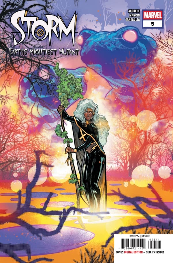
Storm: Earth’s Mightiest Mutant #5 – Deep Love Draws Hatred

Storm is engaged in a battle for not just the planet but for her soul. Having broken her bond with Eternity, Storm is now chased by Eternity’s sister, Death. Having defeated a variety of storm Gods, Ororo finds herself no longer hunted by Gods but demons sent by Death herself. To save the world and save herself, Storm will have to escape back to her universe first.

This review is brought to you by Nerd Initiative’s Megan and Shawn!

Creative Team

Writer: Murewa Ayodele
Artist: Federica Mancin
Color Artist: Javier Tartaglia
Letterer: Travis Lanham
Cover Artist: R.B. Silva
Cover Color Artist: David Curiel

Writing

Megan: I have loved everything Murewa Ayodele has done with Storm and it’s so unfortunate to see this run ended early. Murewa has cooked and cooked with Storm, and everything he’s brought to the series has only deepened my affection for the character. While he wasn’t given much of a choice to end this run, he did pull of the ending in a beautiful way that shows how much of a powerhouse Storm is, inside and out. So, when you’re on your way to the comic shop to purchase your new issue of Storm: Earth’s Mightiest Mutant #5, keep all of this in mind.

In this issue, we see every part of what’s been running Storm’s life come to fruition. The energy was electric, the emotions were understandably high, and Storm has a moment of realization that she truly needed to find. Learning where all of the tragedy has come from, Storm is able to come to terms with who she is and knows what she needs to do. Along with the current story, we also get a glimpse of Storm as a child with her mother that hit home. Seeing her learning from her mother as a child and then to see Storm bring those same teachings to her daughter was beautiful and felt like a circle was completed. I left this run having all the respect in the world for Murewa Ayodele and the depths he’s brought to Storm as a character. I’m grateful for all the work he’s done with such an iconic character who deserves the best.

Shawn: I’m sad to see this series end. It’s very clear that Murewa Ayodele had more story to tell, and that was cut short by short sightedness. Storm: Earth’s Mightiest Mutant marks the second story series from Marvel this year that was unnecessarily cut short. While Ayodele’s writing in the first 80% of this story is brilliant, it’s clear there was more to be said, and it was forced to be cut short. This series should have been given at least 10 issues to really breathe, but alas, the story that was being crafted was too deep for the current world of comics.


Storm: Earth’s Mightiest Mutant #5 cover by R.B. Silva and David Curiel. Image from Marvel Comics

Ayodele will go down as one of the best to ever write Ororo Monroe. This issue and this series do nothing to alter that fact. In fact, I think this issue may be some of the best work Ayodele has done on Storm because it’s clear he was weaving a story meant to be much deeper, yet still manages to wrap it up in as satisfying a way as possible. It’s a shame that even an Eisner nomination couldn’t encourage Marvel to really see this through. I wanted to see more of Jericho Drumm as the Avatar of Death. I wanted to see more of everything. Ayodele crafted a beautiful series both in the last Storm series and this one. Storm: Earth’s Mightiest Mutant deserved better than it got from its publisher.

Art

Megan: If there’s one thing that’s guaranteed about this run, it’s that the artwork will be nothing short of stunning. Federica Mancin, Java Tartaglia, and Travis Lanham made sure that holds true until the very end of the run. Storm: Earth’s Mightiest Mutant #5 end on a gorgeous note and gives you a look at the high quality work that’s been prevalent in every issue written by Murewa. The artists truly made this something magical, whether it be Federica’s incredibly detailed drawings that you could get lost in or Java’s colors that make it hard for you to look away.

Shawn: Federica Mancin, Java Tartaglia and Travis Lanham crafted a really beautiful final issue. It starts with Mancin’s beautiful lines. There’s clear attention to detail, whether it’s the flower pattern on an old couch or pattern’s weaved into the outfit of a character, Mancin’s line work focuses on crisp, clear details.

Java Tartaglia saved his best coloring for last. Simply put, Storm is radiant. Mancin puts her in a variety of looks in this comic, and Tartaglia colors them all perfectly. The glow added to Ororo’s hair perfectly accentuates her look. Travis Lanham feeds off this and ensures that the art is clear in each story. Using the cover font for the final panel was a beautiful touch from Lanham.

Final Thoughts

Megan: 9.1/10. Even in the complicated situation Murewa Ayodele was in with the run being cut short, he still stuck the landing and gave us something beautiful. The creative team should be extremely proud of the things they’ve done in this run. They gave us beautiful artwork, and incredible story, and a whole lot of heart.

Shawn: 8.5/10 While the 5th issue of this series wasn’t as satisfying as it should be, I don’t hold that against the creative team. This was a beautiful and heartfelt story. It resonated deep within my soul. As much as I mourn the end of this series, I mourn the loss of potential for what it could have been if it had been allowed to breathe.

Overall Grade: 8.8/10

Did you like how Storm ended? Let us know in the comments

Leave a Reply

This site uses Akismet to reduce spam. Learn how your comment data is processed.

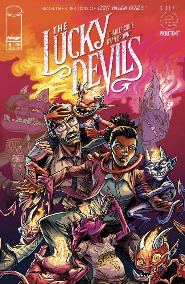
The Lucky Devils #8 – STRAIGHT to HELL!

Our lucky devils have been through hell and back. With one trying to have it all, and the other deep into the revolution. It’s no wonder our humans are so confused. As Collar attempts a hell of a hail Mary, we see how far both sides are willing to go to get what they want.

Creative Team

Written by: Charles Soule;

Art, Design, & Cover A by: Ryan Browne;

Cover B by: Zander Cannon;

Colors by: Ryan Browne & Kevin Knipstein;

Letters by: Christopher Crank;

Logo by: Thomas Quinn;

Production Design by: Erika Schnatz.

Check out another review by Lauren for a comic with art by Ryan Browne: Minor Threats: BARFLY.

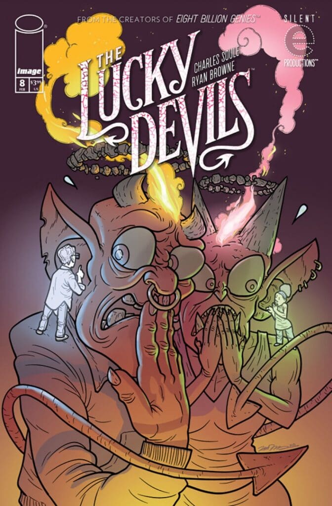
The Lucky Devils #8 Cover. Image by Image Comics.

The Story for The Lucky Devils #8

As Collar gives his human, Cam, one hell of a tour of his home (sorry…the puns are too much fun to stop now), Rake’s human, Starr, continues to reach levels of insane influence. However, Starr is ready to step out on her own with the power of Christ compelling Rake. Meanwhile, Collar and Cam are in it for the long haul together. Now they must get their message out, and there’s no better way to spread the word these days than in the most bro way possible… to the podcast! It’s now Good V. Evil…Devil V. Devil.

The Lucky Devils #8 Variant Cover. Image by Image Comics.

The Art

The art in THE LUCKY DEVILS continues to be beautiful, disgusting, detailed, and hilarious. We continue to get moments so detailed they create visceral reactions. Which isn’t always good when a bucket of urine is being poured on someone, but it’s so hilariously done, that I continually find myself cringing and laughing at the same time.

A highlight in issue 8 is Cam’s podcasting moment. It’s an awesome splash page full of so much story in every little detail, all while sucking you completely into what’s happening, and wondering where it’s going to lead.

When the art is as fantastic as the story, that’s when the comic hit levels of perfection. Which is what we have here.

Check out the review for issue 7 of THE LUCKY DEVILS!

Final Thoughts

My only issue with THE LUCKY DEVILS #8 is that it’s the penultimate issue. This is a 9 issue run, and it’s all about to come to an end. This run has mirrored real life moments and issues, but wrapped them in gruesome and hilarious art and dialogue. All with unexpected twists and turns. Despite not wanting this to end, I can’t wait to see how it all wraps up.

Overall Grade: 10/10

If you haven’t grabbed The Lucky Devils yet, there is no better time, than right before that last issue. Soule and Browne did Eight Billion Genies together which had an amazing ending, so I don’t doubt they’ll nail it again.

Check out more from Lauren at Nerd Initiative AND at ‘Hops GEEK News.

Have you checked out The Lucky Devils yet? Let us know your thoughts!

Leave a Reply

This site uses Akismet to reduce spam. Learn how your comment data is processed.