Home Blog Page 41

SUPERNATURAL SPECIAL: CASTIEL #1 – The Boys are Back in Town

Creative Team – Preeti Chhibber, Pasquale Qualano, Alessandro Miracolo, Alessandro Ranaldi, Robby Bevard, J.L. Briere, Jeff Eckleberry

Published by Dynamite Entertainment

MORE FROM NERD INITIATIVE HERE!

The Story

Supernatural Special: Castiel #1 will be reviewed by Nerd Initiative’s Edalyn and yours truly, Megan!

Edalyn – When it comes to adapting a well established TV show into another medium, that isn’t something that’s exactly easy. However, Preeti Chhibber makes it look so, as she captures the characters beautifully. Here, we see things from Castiel’s point of view and I swear, the whole time, I heard Misha Collins.

If you’ve never seen the show, or you just started and are unfamiliar with Castiel, this serves as an amazing introduction to the character. Chhibber perfectly captures his personality and made me laugh at several points throughout. She also did a fantastic job at capturing his inner turmoil of figuring out his place and purpose in a complicated situation. Any fans will know immediately what I’m talking about. Given the fact this ends in a cliffhanger, I truly hope we get more in a continuation as I’d hate to see this be just a one-off special.
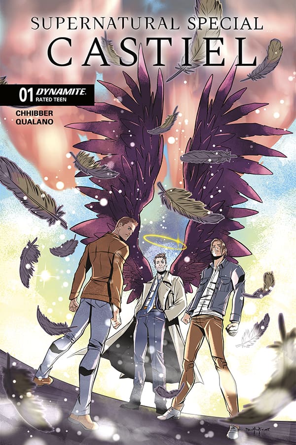
Cover art by Pasquale Qualano. Published by Dynamite Entertainment

Megan – As a giant Supernatural fan, when I see a comic that’s centered around Castiel, I don’t have to give it a second thought; I am all the way in. I had high expectations for Supernatural Special: Castiel #1 and each one of them was exceeded. Preeti Chhibber wrote this in a way that gives us a new story, but was so authentic to the characters. There was a comfortable feeling because you can practically hear Sam, Dean, and Castiel’s voice through the words. What I wouldn’t give to see this be played out in live action with the three icons themselves.

In Supernatural Special: Castiel #1, we see Castiel keeping an invisible distance from the Winchesters, watching them as they go as they are none the wiser. That is until the Winchesters need assistance in their hunt. The brothers think they’re looking for one monster, but Castiel informs them that there’s actually a different monster that needs their attention. Going through their classic monster hunting ways, and getting Castiel involved in the fun, we get to see the three fight evil together. By the end of the comic, I already wanted more. Chhibber kept my Supernatural-loving heart full and excited, but also made me want to see the adventures of Sam, Dean, and Castiel continue. If you’re a Supernatural fan, make sure this one is on your pull lists!

The Art

Edalyn – Qualano, Miracolo and Ranaldi truly outdid themselves here. While reading, I felt like I was in the middle of the action as it all felt very dynamic and three-dimensional. This was helped heavily by the shading and coloring, as the two together really worked wonders.

Speaking on the colors, Bevard put in some truly amazing work here. Each scene felt very unique and like its own character, especially the concert setting. The mix of colors from the lighting really made it come to life.

Megan – With such a stacked creative team, it’s no surprise that the artwork is fantastic. The artists matched the artwork to the tones of the story incredibly well, especially with the action panels. The energy was high where it needed to be, and calm in the best places. What I really enjoyed was the intensity of when the Winchesters and Castiel came across the monsters. You could feel the energy popping off the pages!

The colors were handled perfectly, achieving the grittiness that is so accustomed with the Winchesters. What really shined for me was the lettering. Jeff Eckleberry perfect captured the personalties of the characters and showed their authenticity through the dialogue. You could feel Castiel’s calm and monotoned replies, or Dean’s aggression or joking demeanor. All in all, the artists made this comic feel exactly how you’d want a Supernatural story to feel; exciting, high energy, and the otherworldly feeling of monster hunting.

Final Thoughts

Edalyn – 10/10. Everything came together to create something truly amazing for fans and newcomers alike. Preeti continues to prove that she knows this world and its characters well all while crafting new and interesting stories. This special is more than worth a read, especially if you love Castiel and a good character study.

Megan – 9/10. Supernatural Special: Castiel #1 is precisely what every Supernatural fan would want. Action, adventure, classic moments between our favorite monster hunters and their angelic sidekick. Be sure to add this to your pull list because it’s a special adventure you don’t want to miss!

Overall Grade – 9.5/10

Let us know in the comments what you thought of the comic!
Leave a Reply

This site uses Akismet to reduce spam. Learn how your comment data is processed.

JAY AND SILENT BOB JAYS OF FUTURE PAST #1: Run Fatman Run!

Doctor Doom has been foretold of his undoing, which leads him to place a billion-dollar bounty on two nobodies from Jersey! Jay and Silent Bob find themselves in the crosshairs of the King of Latveria, leading to 47 pages of chaos, X-rated jokes, and fourth-wall-breaking action as Marvel’s greatest heroes and villains converge in this epic event!

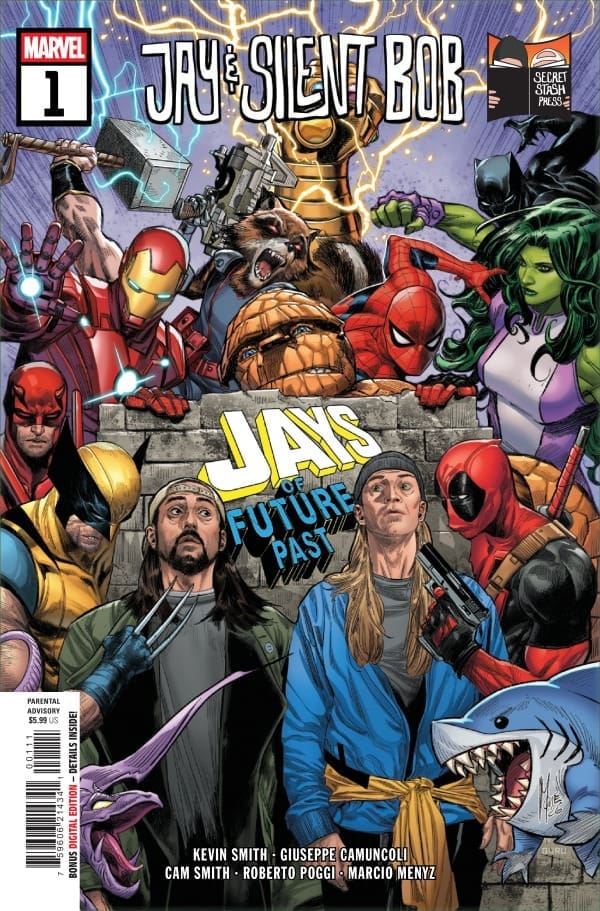
Jay and Silent Bob Jays of Future Past #1. Credit: Marvel Comics and Secret Stash Press. Cover by Marco Checchetto.

Creative Team: Kevin Smith, Giuseppe Camuncoli, Cam Smith, Roberto Poggi, Marcio Menyz, Erick Arciniega, Joe Sabino, Travis Lanham, and Marco Checchetto.

The Story:

This is a love letter not only to the Marvel Universe but also to everything that Kevin has done in his whole career. We get hints and nods to things such as God being Alanis, his own daughter coming to life in a comic, the statue of Dante, Mallrats, and so much more. If you’re a fan of Kevin, then you know exactly what to expect; however, buried in the innuendos and the jokes, there is a beautiful story here. In a way, it feels as though Smith is saying thank you to comic books and those who have created them and to the fans for making him who he is today. There is even a bit of tongue-in-cheek humor towards previous films at the same time.

The story is simple, and it’s that Silent Bob will create the dankest kush known to man, which leads to Doom’s demise. But, as I said, it really is so much more than that. Seeing so much of myself and what made me brought to life on these pages reminds me that Kevin Smith still has it.

The Art:

Holy beautiful art, Batman! There is so much to see and gush over visually in this story, There’s multi page spreads that showcase the Fantastic 4, and we get a fun spread of Jay and Silent Bob as different heroes. My personal favorite being Daredevil in a beanie, of course. The colorwork in this issue was a visual feast, as there wasn’t a color left out. Bright reds, darker reds, blues, and so much more; the art team really crushed the visuals. There was a lot of wonderful artistic detailing, and it was almost a time-traveling issue for us as we saw our heroes’ old costumes and more modern takes as well. Lanham and Sabino do an excellent job with the lettering, and despite there being so much chaos and action happening on the panels, at no point does the lettering feel crowded at all.

Final Thoughts:

Jay and Silent Bob: Jays of Future Past #1 is a love letter to comic books and to all of the things that have made Kevin Smith into the creator he is today. He walks us down memory lane with his own works and with these infamous Marvel characters, bringing an unlikely mash-up to life in such a clever way with the help of the art team. This book is fun, and that’s how it should be. Pick this one up!

Be sure to let us know your thoughts below and check out more reviews by Matt!

Leave a Reply

This site uses Akismet to reduce spam. Learn how your comment data is processed.

The Sentry #4 – Trying To Find A Way To Heal

The Sentry’s life is one of brutal existence. Bob Reynolds exists as a man in two parts. The heroic Sentry and the dark Void. His very existence is a universal law of balance: every good deed of the Sentry must be equalized by a catastrophic act from the Void. As a plague of crystals sweeps across the earth, infecting the world, including the Hulk, Bob’s isolation mounts as he struggles to maintain control. Will the loss of his beloved companion be what pushes Bob over the edge?

This review is brought to you by Nerd Initiative’s Matt and Shawn!

Creative Team

Writer: Paul Jenkins
Artist: Christian Rosado
Color Artist: Matt Milla
Letterer: Joe Caramagna
Cover Artist: Alex Maleev

Writing

Matt: This was a beautiful issue that didn’t just wrap up the story with a pretty bow. Paul understands that sometimes things are messy and that is okay. Bob learns that he has to learn to live with regret, sadness, and the Void, but that he is now finding a way to do that. I feel as though sometimes we can be so hard on ourselves we forget that not everything is our fault. Sometimes we need to learn to forgive ourselves, especially when something is out of our hands. This series has been one that I needed right now as I have been dealing with grief and loss, and Paul feels as though he is talking to me as much as Bob is talking to himself. Every day we as humans have a choice. We can do good things; we can do bad things, but we have a choice, and the traumas we carry can start to heal when we learn to forgive. Shoutout to Paul as well for making Reed Richards somewhat likeable in this series as well!

Shawn: What a beautiful sendoff for this series from Paul Jenkins. Like the battle between the Void and the Sentry, issue #4 of The Sentry provided an uplifting and hopeful contrast to the dark, demoralizing tone Jenkins crafted for issue #3. Jenkins shows us that Bob will never be able to heal a pain that wasn’t caused by his own actions. There’s a lesson in there for us as well. This entire series has been an introspective look at the life of Bob Reynolds and the desperate balance to find the best way to do the most good.

In some ways, Jenkins’s series has felt like a mirror. While not the Sentry, each of us has a capacity for good and a capacity for evil. We must be careful which we choose to feed. Many of us carry trauma, some of which shouldn’t actually be ours to carry. In this series, Paul Jenkins crafted a beautiful dark narrative that made me look more inside myself than I expected.

Art

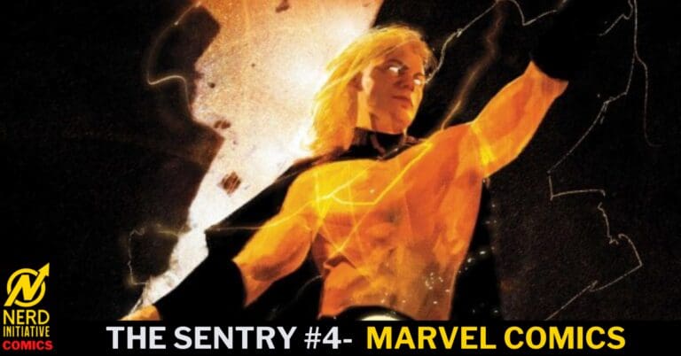
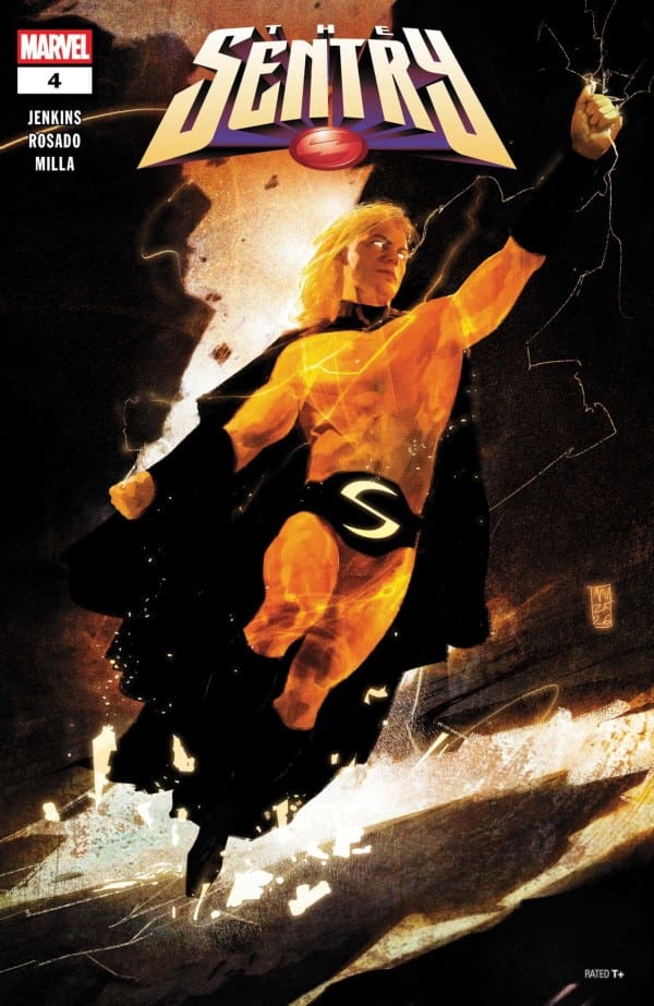
The Sentry #4 cover by Alex Maleev. Image from Marvel Comics

Matt: Nothing will be seared into my brain more than the panel of Hulk wearing a yellow number 1 fan shirt. That alone had me laughing so much, and the art team nailed the little details, such as this one. This issue’s colors were a little bit brighter as they battle the crystals, and one image that really stood out was Bob sending a burst of energy off. It felt inspired by Dragon Ball Z and felt as though Bob was going Super Saiyan in this moment. I found the art to match this dark and rugged series perfectly.

Shawn: What can I say about the world that Christian Rosado and Matt Milla have done on this series that hasn’t already been said? Rosado continues with his beautiful and gritty line work in this issue, crafting images befitting the power of the Sentry. Rosado perfectly captures in art the internal and claustrophobic nature of Bob’s mind and how it affects the world around him.

Matt Milla feeds this design by giving us deep, heavy blacks instead of the bright, sterile environments we are used to in superhero comics. Even the bright suits of the Fantastic Four seem more subdued in this world. Joe Caramagna guides readers easily through the story, ensuring that the word bubbles don’t subtract from the story but carry it forward.

Final Thoughts

Matt: 10/10- The Sentry wraps up on a feeling of hope. This run has been about grief and loss, but also about forgiving ourselves and learning to coexist with the darkness we as people can hold deep within us. My only complaint is that this run was only four issues!

Shawn: 10/10 – The Sentry was everything I wanted it to be. Paul Jenkins showed everyone why he’s the writer you call if you’re looking for an introspection on a character battling their inner demons. Everything about this creative team was in sync. This would have easily worked as a longer ongoing run.

Overall Grade: 10 /10

The Sentry is done. How did you like it? Let us know in the comments

Leave a Reply

This site uses Akismet to reduce spam. Learn how your comment data is processed.

ALIAS: RED BAND #4 – Far Beyond What We Know

Creative Team – Sam Humphries, Geraldo Borges, Arthur Hesli, Cory Petit, David Mack

Catch up with Alias: Red Band #3!

The Story

This joint review is written by the amazing Edalyn and yours truly, Megan!

Edalyn – I’m sure I’ve said it before but I’ll say it again: Sam Humphries is at the top of his game on this series. While this issue answers some questions, it brings up even more. Like, who’s the man with the boundless smile? With every layer that gets peeled back, I become even more tense and on the edge of my seat, not knowing what’s coming next.

To top it off, I love that we got to see this flip side of Luke and Jessica’s relationship from what we saw in previous issues. These two very clearly still love and care for each other despite everything, and that’s so amazing to see. Not only that, but Jessica’s motherhood shines in this amazingly powerful way. Humphries clearly knows what makes these characters tick, and he shows it with raw fire.

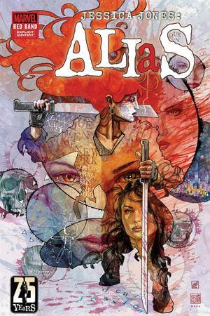
Cover art by David Mack. Published by Marvel Comics

MeganAlias: Red Band #4 continues the thrilling and dark story of Jessica Jones fighting an endless crime with Typhoid Mary by her side. Since the first issue, there has been noticeable tension between the two women, mostly from Jessica’s side. However, in this issue, we see them truly become partners in this investigation, with both of them having the knowledge that they can’t do this without the other. What we also see is exactly how Jessica ended up in police custody, resulting in her trial with Matt Murdock by her side as her lawyer.

Between the trial and where Jessica started, just wanting to find out what happened to her neighbor, so much has happened. It’s hard to believe it’s only been four issues, especially with the stakes being higher than ever. In Alias: Red Band #4, Jessica and Mary find out that this investigation is bigger than either of them could’ve imagined. What they thought was a simple postcard killer is turning out to be something so much bigger and so much darker, coming straight from the depths of hell.

The Art

Edalyn – The artwork and colors of Geraldo Borges and Arthur Hesli both continue to be true standouts from anything else out right now. The panel work is highly creative, keeping the action fluid while further creating tension that matches the writing. The art is bloody and punk-like, capturing the horror and emotion of what our characters are experiencing, while the color helps us feel that too. A true masterpiece.

Megan – What I really love about the artwork is that it really does capture the essence of a gritty investigation story and makes it feel so authentic to Jessica Jones herself. In this issue, there’s that classic darkness, but there’s something so much more added to it. Juxtaposing the street-level energy, there’s a dark and mystical energy that somehow meshes so perfectly well with the artwork that’s so vastly different. I really love how the artists were able to incorporate the larger-than-life factors into the story, making it all work together effortlessly. Issue after issue, the artists put their talents on full display, but I have to say that I think issue four is where their talents truly excelled.

Final Thoughts

Edalyn – 10/10. Humphries, Borges, and Hesli continue to be an undefeated team. Everything here screams “read me,” and I’ll be surprised if this doesn’t get nominated for anything next year. A true work of art.

Megan – 10/10. Alias: Red Band gets more and more exciting with every issue! The artists are cooking with this story, and issue four is no exception.

Overall Grade – 10/10

Let us know in the comments what you thought of the comic!
Leave a Reply

This site uses Akismet to reduce spam. Learn how your comment data is processed.

Star Wars: Shadow of Maul #4 – Blood Gamble

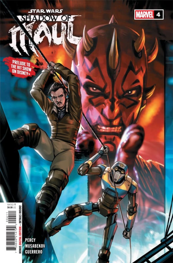
Captain Lawson has his hands full as an illegal pod race returns to Janix. With this pod race, multiple things could and do go wrong. The mystery person behind it all has a plan that needs to be initiated, but under their own terms.


Creative Team

Benjamin Percy (Writer), Madibek Musabekov (Artist), Luis Guerrero (Colorist),
VC’s Joe Caramagna (Letterer), Derrick Chew (Cover Artist)

Carlos Lao (Designer), Mikey J. Basso (Assistant Editor), Mark Paniccia (Editor),
C.B. Cebulski (Editor-in-Chief)

Publisher: Marvel Comics


Blood Gamble

Issue four of this five-part mini-series takes a turn and reintroduces the iconic but deadly sport of pod racing. Star Wars fans will remember pod racing from Episode One: The Phantom Menace. The sport alone is already highly dangerous when conducted outside of city limits. This race, however, is being run within the city of Janix.

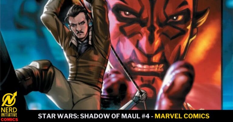
Star Wars: Shadow of Maul #4, Credit Marvel Comics. Cover by Derrick Chew.


Pod racing is very popular in the realm of gambling. That is just the case within this story. Because of the outlandish profits that pod racing brings, the city has no choice but to let the race take place. It’s going to benefit Janix in the financial end. It is when the race gets to be a little too dangerous that Captain Lawson cannot turn a blind eye anymore. Something is suspicious about one of the racers, and Captain Lawson now makes it his mission to figure out the root cause of the racer’s behavior.

At this junction of the story, readers will take a walk down memory lane with Lawson, back to his bounty hunter days. This is entertaining to witness because we know of Lawson’s past employment, but readers haven’t gotten to actually see him as a bounty hunter within this story. I believe that readers will have a better understanding of the person Lawson is and the way he is wired to operate.

The entire issue is action-packed, leaving no room for the reader to take a breath and sit back. The ending of this issue is where the plot from the comic book to the Disney+ show, Maul: Shadow Lord, starts to make even more connections. The high stakes of the pod racing make a large leap into something that Lawson is not expecting. What will come of this ending for the beginning of the final issue of this series? Can Captain Lawson contain what is really happening on Janix? You’re going to have to read this issue and form your own conclusions!


The Writing

Benjamin Percy needs to continue to write Star Wars titles! This man is a pure genius and knows exactly how to tell a compelling Star Wars story. I am still blown away at the fact that pod racing was the center focus of this issue. And the way the narration is split up amongst the panels sends the pacing into a cat and mouse game of fast to slow. Benjamin is one of those writers that just gets the intimate concept of Star Wars which makes him one of my top writers for Star Wars!

The Artwork

Madibek Musabekov and Luis Guerrero continue to bring the Star Wars lore to the art for this series! The most tranquil part about the art is the tone that he helps to set. Just having Maul in the title should give Star Wars fans the notion that this is going to be a dark story. The art replicates that to a tee! Dark surroundings and shading give the expected aura of criminal activity or harsh times. Then you get stunned by beautiful bright colors during high-action sequences of fighting or massive explosions. Your eyes will be astonished by what they see within this issue!


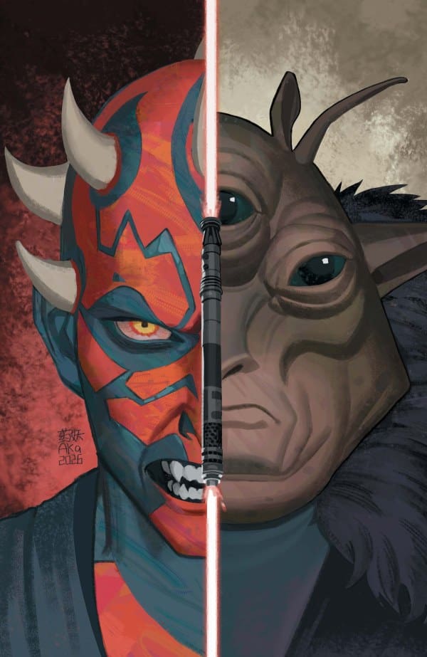
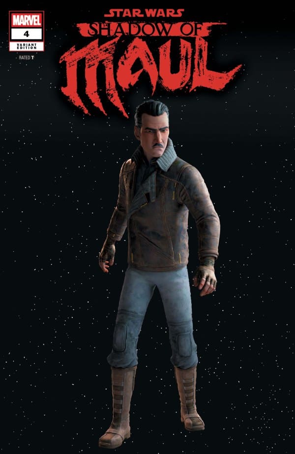
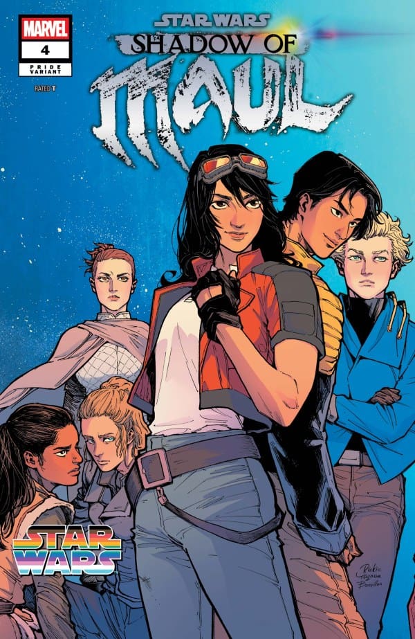
Variant Covers


Final Thoughts

As this story comes to a near close, it continues to bring iconic Star Wars elements into focus again. Which is highly entertaining to this Star Wars fan! As a prequel to the Disney+ show, this series does an amazing job of closing certain gaps between the two, allowing readers and viewers to make key connections to both. Fantastic read; I fully back and support this series and urge anyone who enjoys Star Wars to pick this up!

Overall Grade: 10/10


Links

Comic Book Reviews & Entertainment News: Nerd Initiative
Previous Maul Review: Star Wars: Shadow of Maul #3 – Friends in Low Places
Travis’ NI Portfolio: TravisComicHaven – Nerd Initiative
Travis’ Personal Content: Travis’ Comic Haven


PLEASE SHARE YOUR THOUGHTS IN THE COMMENTS SECTION BELOW!

Leave a Reply

This site uses Akismet to reduce spam. Learn how your comment data is processed.

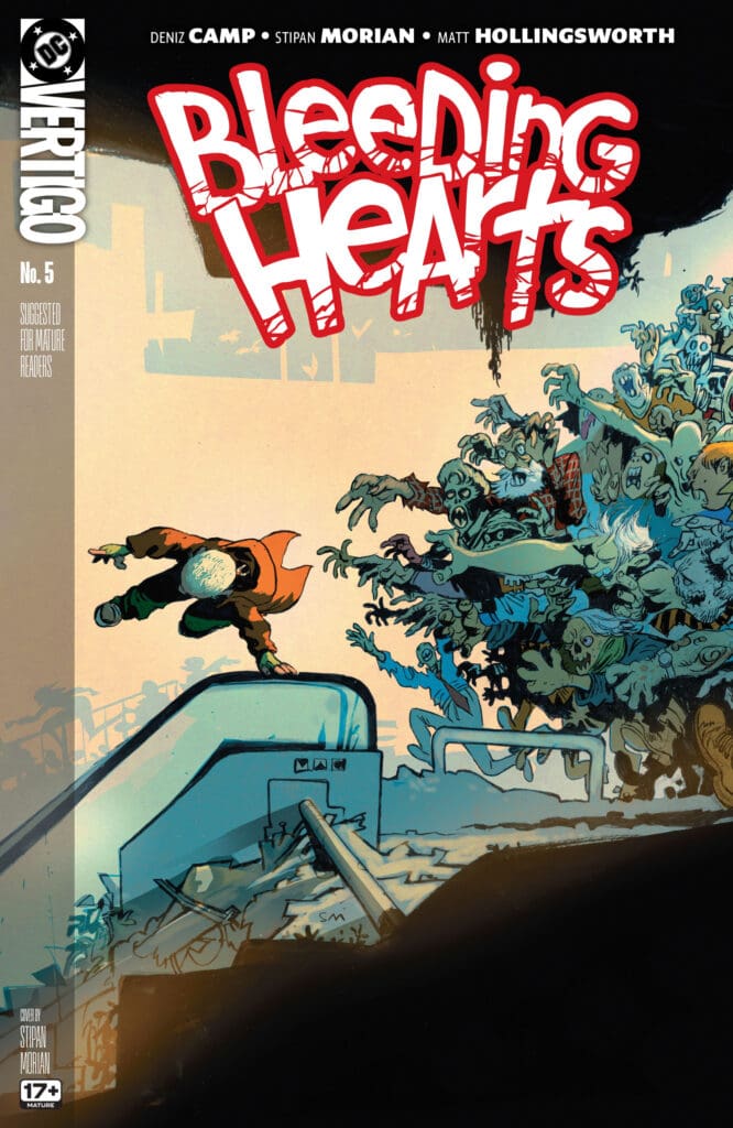
BLEEDING HEARTS #5: Rat in a Cage.

Outbreak Day is upon us, and Poke’s secret has come to light as Mush has discovered he was hoarding live ones for himself! Their friendship is put to the test while Rabbit and the other live ones are held captive for the undead’s ritual hunt. Poke must make a choice and make it fast before it’s too late.

Bleeding Hearts #5. Credit: DC and Vertigo Comics. Cover by Stipan Morian.

Creative Team: Deniz Camp, Stipan Morian, Matt Hollingsworth, and Hassan Otsmane-Elhaou.

The Story:

Up until this point, the story has been somewhat fun, and games as Deniz has Poke and Rabbit bonding with one another while Mama had her reservations. I was absolutely floored as this issue opens up to Rabbit in captivity and Mama had been eaten. Deniz switches up the vibe and tone incredibly fast and furiously shows us that the party is over. The endearing and childlike voice that Deniz writes Rabbit with shows how naive they are, and yet they still know enough of the world. Getting her point of view as she recounts how Mama was eaten and then standing up to Poke is a heartbreaking sequence done so well with the help of Hassan’s lettering work. Camp leaves a subtle out for Poke as Mush only thinks he was hoarding food for himself, and we’ve now come to a crossroads and a cliffhanger that has been executed beautifully. I truly cannot wait until this next issue to find out our characters’ fates.

The Art and Letters:

Stipan and Matt carefully switch up the detailing in the art with Poke in this issue, whereas before we would see a more humanistic side of him. Now that we are seeing him as a member of the undead and in this nightmare scenario for Rabbit, they draw him a bit more grotesquely in the detail. His skin has this leatherly texture drawn and colored to it, which Hollingsworth does an amazing job of making us feel uneasy. Stipan shows off a little bit as well in terms of bringing out new members of the horde and a terrifying version of either The Mad Hatter or a Circus Ringleader, which may be his most unsettling design yet.

Final Thoughts:

Bleeding Hearts #5 abruptly stops the soft and sweet storyline and trades it out for one full of confusion and panic. Poke is put at a crossroads and is being forced into making a decision that will change his future and the future of others forever. This story continues to build and build the anticipation, keeping me on the edge of my seat.

Overall Grade: 10/10

Be sure to let us know your thoughts below and check out more reviews by Matt!

Leave a Reply

This site uses Akismet to reduce spam. Learn how your comment data is processed.

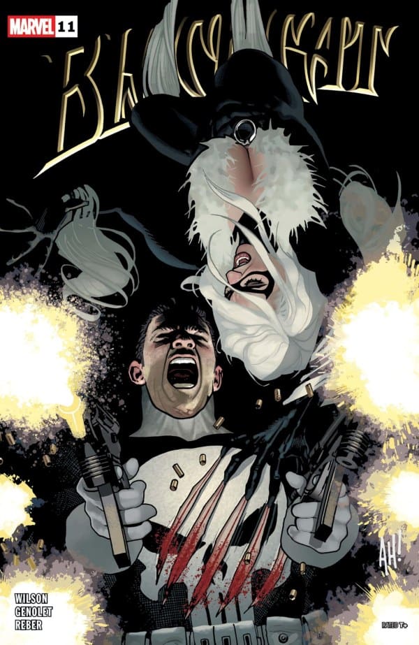
Black Cat #11 – Back to Old Tricks

Felicia Hardy took a run at being a hero. For Black Cat, it backfired spectacularly. After an encounter turned her into a brief hero, a court case involving vampires, and being hated by basically everyone in New York’s underworld, she found a chance to truly help. Her friend Mary Jane Watson, now Venom, needed her help. After a quest to the Negative Zone to recover an audition tape, Felicia is back and wondering if returning to her old ways might be the best option for Black Cat.

This review is brought to you by Nerd Initiative’s Shawn!

Check out my review for Issue 10!

Creative Team

Writer: G. Willow Wilson
Artist: Andrés Genolet
Color Artist: Brian Reber
Letterer: Joe Caramagna
Cover Artist: Adam Hughes

Writing

I love the idea of pairing up Felicia and the Punisher, but I didn’t know how much I would like it after the MJ and Felicia arc. I should have known better than to have any questions. G. Willow Wilson absolutely crushes it. The Punisher is on the hunt, and more than once, Felicia never saw it coming. I really loved that Wilson captured Frank’s this is personal attitude. It’s a unique take on a character that, for most of his history, is strictly all business.

Speaking of business, Marvel needs to sit down and sift through the art and writing on Black Cat and start cranking out posters. It seems like every single issue of this series, Wilson has given readers a poster-worthy quote to hang on the wall. Pair that with at least two or three amazing poster-worthy panels per issue, and Marvel may be sitting on a gold mine. “It’s because of the consequences I’ve faced that I live the way I do” is the quote for this issue. This was simply a fun and, at times, silly issue that leaves me wanting more.

Art

Black Cat #11 cover by Adam Hughes. Image from Marvel Comics.

Andrés Genolet, Brian Reber, and Joe Caramagna did an amazing job on this issue. I once read where G. Willow Wilson said she always tries to write so there’s one panel that the artist could turn into something to sell, and there are quite a few of them in this issue from this creative team. Genolet takes over as artist for this issue and jumps right in. He perfectly captures the playfulness and attitude of Felicia. Heck, Genolet even managed to craft a face that even Castle couldn’t say no to.

Brian Reber continues to do an amazing job with colors in this issue. Black Cat #11 features a scene in which Felicia is in a room with little light, and the colors perfectly capture the warmth leaking into the room from the little light present. Reber also did a really great job with the colors in making sure that while there are silly moments, you realize this is a serious issue with serious implications for Felicia. Joe Caramagna shifts emphasis in the fonts just enough to make sure you know exactly how the characters are feeling and what’s coming next. The panels are easy to follow and flow smoothly thanks to Caramagna’s work.

Final Thoughts

This is a great start to a new arc. As I said earlier, I’m intrigued by the Punisher and Felicia together because, at the end of the day, they aren’t as different as they pretend to be. This continues to be a fun and surprisingly deep series. Wilson and the rest of the creative team continue to mold Felicia into a character with depth and worthy of more issues.

Overall Grade: 9.8 / 10

What do you think of the new story arc? Let me know in the comments

Leave a Reply

This site uses Akismet to reduce spam. Learn how your comment data is processed.

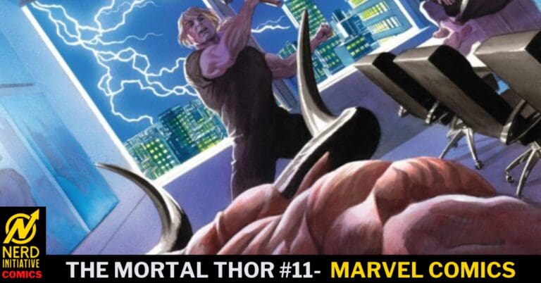
The Mortal Thor #11 – The World Tolerates Monsters!

Reborn devoid of his divinity, Thor has found himself in a world as Sigurd Jarlson, a Norwegian immigrant and construction worker just trying to survive. Now, in a world where the very memory of Asgard is gone and the Norse gods are nothing more than fairytales, Sigurd has been forced to defend his neighborhood from criminals and sleazy corporate overlords. This defense of his community and his innate heroism have put him on a collision course with Dario Agger.

This review is brought to you by Nerd Initiative’s Shawn!

Catch up with my review of Issue #10.

Creative Team

Writer: Al Ewing
Artist: Jesús Saíz
Color Artist: Matt Milla
Letterer: Joe Sabino
Cover Artist: Alex Ross

Writing

This may be the best issue of The Mortal Thor yet. Al Ewing continues to write a compelling story that sees Sigurd maintain so many of Thor’s qualities while being a unique and fresh take on the character. The last issue set up the confrontation in this issue, and it paid off in such a satisfying way. Ewing’s writing for Thor always feels like something old, something new, something borrowed, and something blue come to life.

Thor always feels like a fresh version of the character under Ewing’s watch, but still maintains enough of the classical attachments to make it special for long-time Thor readers. Readers picking up The Mortal Thor #11 will see classic hallmarks of Thor, like a hammer, but still a fresh and unique idea. This issue feels like so much of that buildup is finally coming home, with more still to be shown behind the curtain.

Art

The Mortal Thor #11 cover by Alex Ross. Image from Marvel Comics

Jesús Saíz takes over for Pasqual Ferry on this issue and is immediately up to the challenge. Saíz manages to capture the parts of the art that Ferry brought to the story to make it so distinct while still imparting his own style into the series. I thought the scenes that played out in the panels in this issue were beautifully drawn.

Matt Milla continues to do an amazing job on colors. With the setting of The Mortal Thor #11, Milla didn’t have a lot of opportunities to change up color palette but when he did, it was done beautifully. Joe Sabino made this issue easy to follow with all of the interaction between Sigurd and Dario

Final Thoughts

The Mortal Thor #11 hits all of the best things about this series. It’s powerful, familiar, new, and in some ways wholesome. This entire creative team crafted an amazing issue, and I can’t wait to see where it goes from here.

Overall Grade: 9.5 / 10

Are you enjoying The Mortal Thor? Let me know in the comments

Leave a Reply

This site uses Akismet to reduce spam. Learn how your comment data is processed.

THE FURY OF FIRESTORM #3: You Can’t Handle the Truth!

Lorraine is on the hunt for Dr. Martin Stein, who may be the key to understanding what is going on with the Firestorm Matrix. With Ronnie missing and the hour growing more desperate, the truth behind Firestorm may only be the beginning.

This review is brought to you by Nerd Initiative’s Megan and Matt!

Creative Team

Jeff Lemire, Marcelo Maiolo, Rafael De Lattore, and Lucas Gattoni.

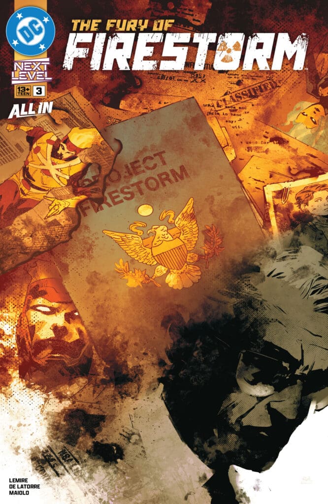
The Fury of Firestorm #3. Credit DC Comics. Cover by Rafael De Lattore and Marcelo Maiolo.

Writing

Megan: Jeff Lemire knows exactly how to keep the reader engaged in the story with his phenomenal writing talents. Each issue of The Fury of Firestorm gets more and more exciting, showing how truly terrifying Firestorm is. In The Fury of Firestorm #3, we get to see exactly what led Ronnie down the path of violence. We get to see Martin Stein’s role in it, and let’s just say Ronnie’s reasoning might be valid.

Things are heating up quite literally an,d I am SO excited to see where Lemire takes us. So far, it’s been so compelling and so exciting, and it has kept me completely hooked to every page.

Matt: Jeff Lemire is one heck of a writer, and the switch-up of how endearing Stein and Raymond’s relationship is in issue 2 to what we get in this issue was insane. Unveiling the truth that Martin Stein tricked Ronnie into joining the Matrix with him as a way to police superheroes shows that you don’t need a villain that can punch hard all the time. Lemire reveals the truth in such a shocking manner that it left me wanting to throw hands with Stein myself, and we understand why Ronnie is upset. Even more impressive is how he includes the Justice League in this issue but never makes them the focal point. They don’t get lines; they show up and are there to display Firestorm’s unleashed abilities magnificently and horrifyingly. This issue truly has it all!

Art

Megan: The artwork has been such a huge factor in what makes this series so fantastic. The action, the emotion, the tone of the story- all perfectly illustrated and brought to life through the art. The artwork itself is a beautiful blend of intricate details and abstract art that makes each page absolutely stunning. In this third issue, the colors are simply gorgeous with a great juxtaposition of vibrancy and muted tones. The lettering captures the emotions of the story perfectly, leaving the characters wearing their feelings on their sleeves. Marcelo Maiolo, Rafael De Lattore, and Lucas Gattoni have put their talents on full display, and the readers will benefit greatly from it.

Matt: I am in love with the design of Firestorm that Rafael has gifted us. It’s simple and yet menacing, with the way Firestorm’s eyes feel empty behind their glow. Marcelo’s coloring and the way his face is shaded with dark colors help with the menacing feeling, but at the same time, it isn’t easy to capture that level of emotion, or lack thereof, in this way. The setting is nothing but a blazing path of destruction as they showcase his powers so fiercely. It may go under the radar, but the duo impressed me so much with how they show Lorraine’s transformation. It is so seamless across the panels and showcases this switch she can turn on, and it’s details like this that really stand out to me.

Final Thoughts

Megan: 10/10. This comic series deserves so much more attention than it’s getting. The story is compelling, the artwork is gorgeous, and every time a new issue drops, I’m left waiting impatiently for the next one.

Matt: 10/10. The Fury of Firestorm #3 sheds light on what is driving Firestorm’s endless warpath. The shocking reveal was set up perfectly, and its impact lands like one gigantic gut punch for me. The art team is displaying the various power sets magnificently, and this run continues to build upon its success.

Overall Grade: 10/10

How are you liking this series? Let me know in the comments

2 responses to “THE FURY OF FIRESTORM #3: You Can’t Handle the Truth!”

  1. Jim James Avatar
    Jim James

    Having been a fan of Firestorm from his first appearance, and also of Jeff LeMire, I am enjoying the series so far. Quite enjoy the retro art for flashbacks, and the art overall 10/10. I feel like many stories being written these days are intended to fit into graphic novel reprints and are paced accordingly, dragging things out, but this can be a real balancing act. So, writing only 8/10. In the current lot of re-launches this is one of the best I just hope for a little tighter/deeper plotting.

    1. Matthew Roth Avatar
      Matthew Roth

      They are doing something fun with this run for sure!

Leave a Reply

This site uses Akismet to reduce spam. Learn how your comment data is processed.

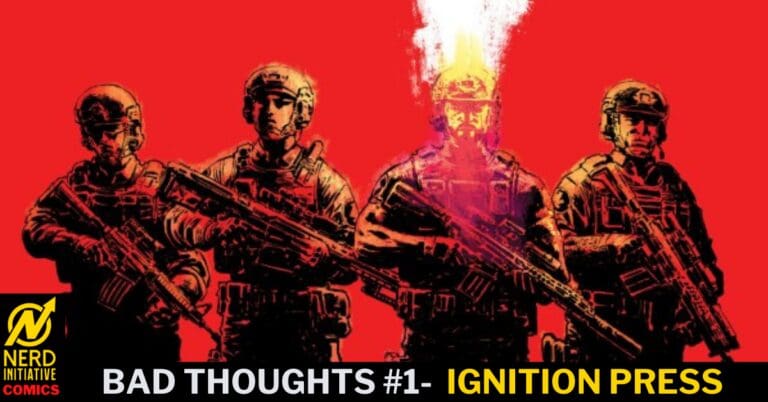
Bad Thoughts #1 – I Know Too Much, and You Have 9 More Fingers

What if you could look inside someone’s mind and see all the terrible things they’ve said or done? In Bad Thoughts, that’s just a reality of life for Jack Coates. While it can make simple tasks incredibly difficult, it serves him well at Bishop Security. He specializes in dealing with difficult situations and even more dangerous people, but what happens when those you trust most are not all that they seem?

This review is brought to you by Nerd Initiative’s Shawn!

Creative Team

Writer: Ande Parks
Artist: Dave Wachter
Color Artist: Brad Simpson
Letterer: AndWorld Design
Cover Artist: Dave Wachter

Writing

Ande Parks absolutely crushed it with this first issue. I was hooked after the first page. Parks lays out some expectations for the readers at the beginning, as they begin to read the issue, only to end with making them question what they thought they knew. The issue kept my attention focused on the story at hand.

Parks crafted heart-pounding action, sensitive moments, and tension all into one single issue. Jack, as a character, feels like an overall good guy with a gift, struggling with how to best use it. He’s a complex character. Not a bad guy, but also perhaps not fully a good guy either. Parks writes the character in a way that you feel the weight he is carrying as if it were your own.

Art

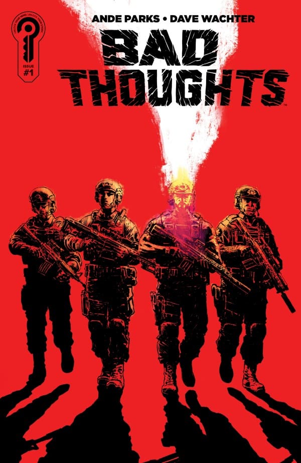
Bad Thoughts #1 cover by Dave Wachter. Image from Ignition Press.

Dave Wachter and Brad Simpson did an amazing job in this issue. Wachter does an amazing job crafting multi-dimensional characters. The characters feel alive and moving rather than just static on the page. Even from the first panel, you can feel the expressions radiating from the characters based on Wachter’s work.

Simpson seems to pick the perfect palette for this issue. He makes exquisite use of shadow as well as muted colors to portray a grittiness and darkness to the story, even in uplifting moments like a romantic night out. I loved the shift in color tones when Jack’s emotions shifted. It worked with Wachter and Park to bring more life to the story

Final Thoughts

This one deserves a spot on your pull list. Parks, Wachter, and Simpson have a hit on their hands. Jack is such a compelling character, and the art team so carefully and professionally contributes to the mood and feeling of the story, helping you feel what the characters feel. What feels like part thriller, part espionage may become more of a psychological thriller before it’s all said and done. I can’t wait to see what this creative team does.

Overall Grade: 10 / 10

Did you like the first issue of Bad Thoughts? Let me know in the comments

Leave a Reply

This site uses Akismet to reduce spam. Learn how your comment data is processed.