Home Blog Page 20

“Sicko #1” Review – A Sickeningly Great Time!

The Run Down

If ever there was a book that yelled “don’t assume what I am from my cover,” it would be Tini Howard’s “Sicko”. Now, from the title and cover, one might think this is solely a horror comic. Well, it’s horror, but it’s like if the genre wanted to be “Doom Patrol” in the “iZombie” universe.

The story follows Valentine Virago, a woman with nothing to lose as she’s stuck with an undiagnosable illness that she learns to weaponize like a superpower. All the while, a strange healthcare agency is working to track her down. If that sounds like your vibe, then follow me for this strange adventure as I review “Sicko #1”!

Writer: Tini Howard
Artist: Amilcar Pinna
Colorist: Amanda Grazini
Letters: Ariana Maher
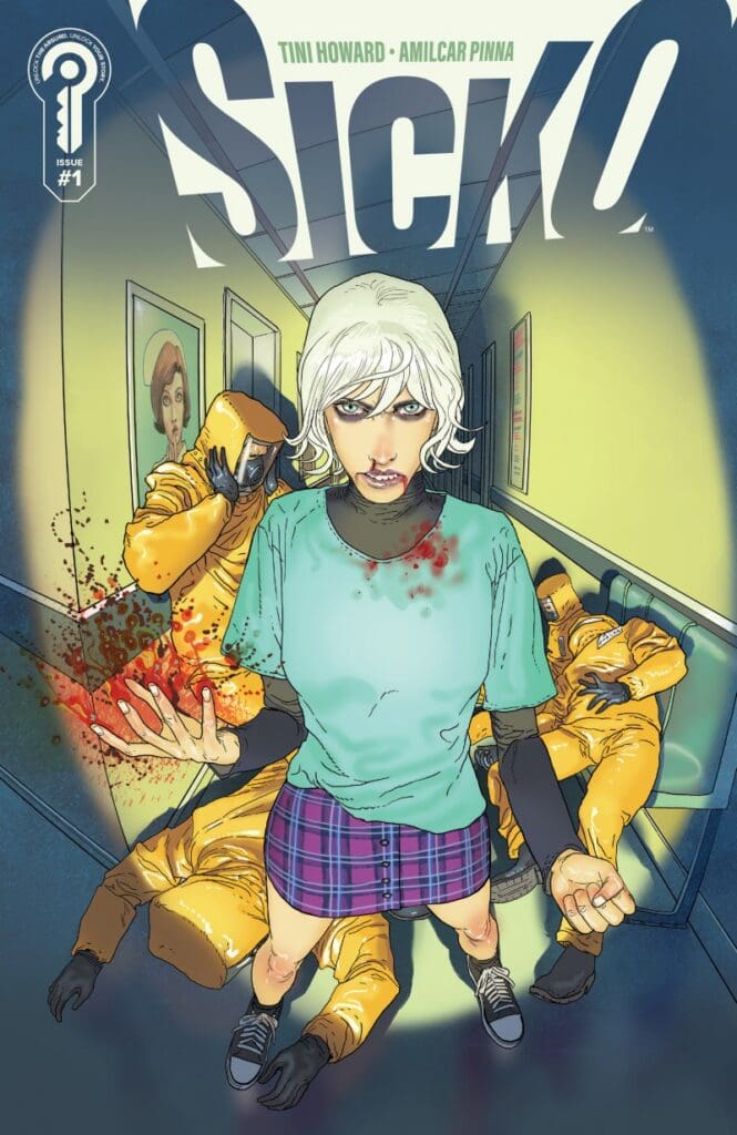
Source: Amilcar Pinna, Ignition Press

The Writing

As they always say, first impressions are important, and boy did this leave a fantastic one right out of the gate! The very first words alone had me hooked and excited due to how ominous they felt. Those opening words also work to set the stage for what the story’s about: the human body and it being different for everyone

Speaking of the human body, that leads me to our main character, Valentine Virago. As I stated previously, she’s stuck with an illness that’s seemingly impossible to diagnose, as not even the top doctors can figure it out. I’ve got to say, she’s probably one of the most interestingly written main characters I’ve seen in a long time! I’m always a sucker for smug and sarcastic characters with a heart of gold, and Valentine’s no different. With nothing left to lose, she’s a carefree badass to boot, though I’ll let you read for yourself about what I mean.

Valentine also has a few aspects I can relate to, namely being an only child. Howard brilliantly brings this through in a great line of dialogue that felt beyond real.
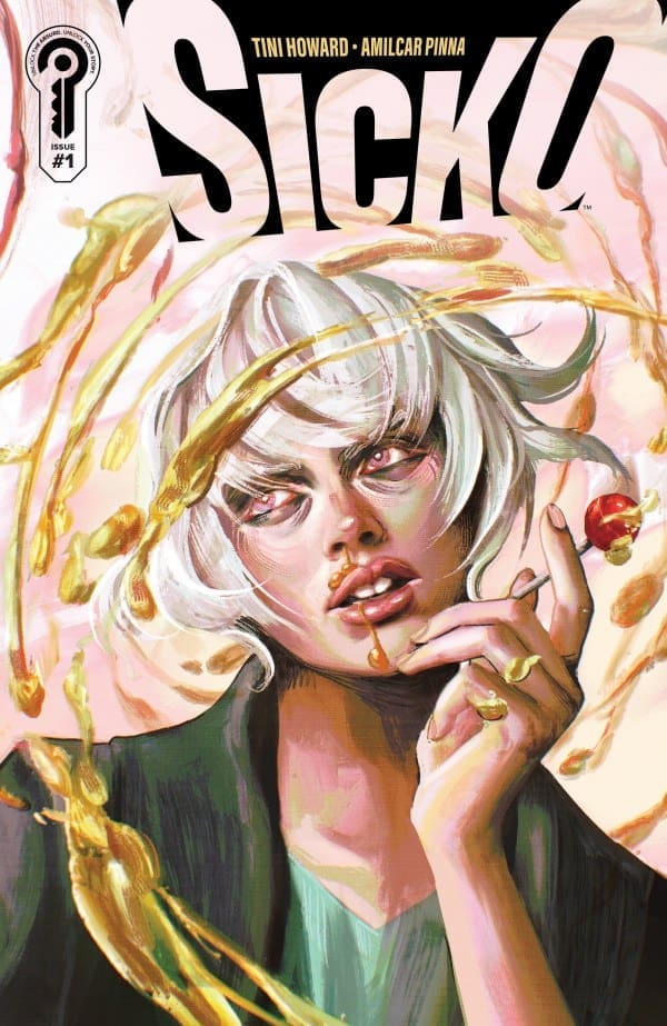
Source: Juliet Nneka, Ignition Press

The Art

Matching the fantastic writing are the art and colors of Amilcar Pinna and Amanda Grazini. The character designs are without a doubt some of the most unique I’ve seen in a while. Each design stands out beautifully, not a single one looking like another. This is due largely to the expert-level shading and line work, giving this book a very distinct look and feel.

The artwork is coupled beautifully with the colors of Grazini. The color work here was absolutely insane! This book had such a range of color that I totally wasn’t expecting, and it blends perfectly with Pinna’s art. There’s one moment in particular that really stands out to me. I won’t spoil what it is, but it reminded me so much of the classic Kirby crackle. I guarantee you’ll love it when you see it too.

Final Thoughts

If this first issue is an indicator of things to come, then you can rest assured “Sicko” will knock your socks off! This first issue is an absolutely incredible promise with fantastic character work and design. If this isn’t already on your radar, it should be.

Read more from me here and check out my socials!

Overall Grade: 10/10

Comments

Are you looking forward to checking out “Sicko”? Are you a fan of Tini Howard’s previous work? Let’s discuss in the comments below!
Leave a Reply

This site uses Akismet to reduce spam. Learn how your comment data is processed.

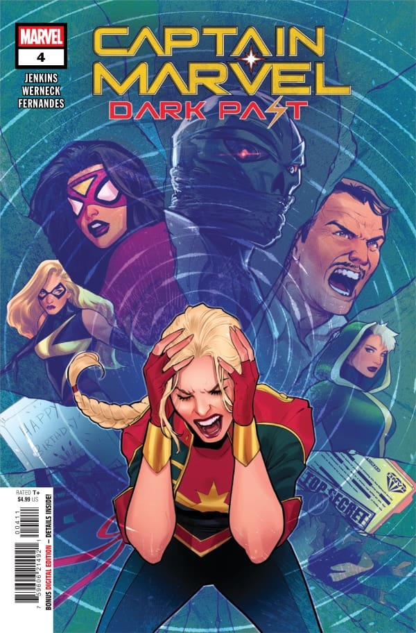
Captain Marvel: Dark Past #4 – Never Afraid of The Fall

Captain Marvel has finally confronted the Desecrator. Their battle has left Carol trapped in a psychic realm formed from her own memories. What happens when Captain Marvel’s troubled past becomes her prison? As she fights against her own demons, Desecrator feeds on her pain. Can she survive his literal mind games and make peace with her past?

This review is brought to you by Nerd Initiative’s Megan and Shawn!

Creative Team

Writer: Paul Jenkins
Artist: Lucas Werneck
Color Artist: Rod Fernandes
Letterer: Joe Caramagna
Cover Artist: Lucas Werneck

Writing

Megan: After following this run for its entirety, I knew to expect a good issue. What I didn’t expect was for Paul Jenkins to give me an emotional punch to the gut. In Captain Marvel: Dark Past #4, we got to the heavy part of the story. The secrets that Eric kept to himself and the past that Carol avoided. There are many plays on the theme of not being good enough, and that shows in the tragedy of Eric’s past. All the while, heroes such as Iron Man, Wanda, and She-Hulk work tirelessly to save Carol. The juxtaposition of the heightened emotions of each scene switch flowed perfectly, highlighting the other. This was brilliantly handled by Jenkins, and he has me anxiously waiting for the next issue to drop.

Shawn: What an amazing issue from Paul Jenkins. Jenkins really took readers to the dark place that is Carol’s memory in a narratively satisfying way. Seeing Carol walk through her biggest disappointments and failures was hard. The best part of Jenkins’ approach was that it leaves this issue not only respecting how physically powerful Carol Danvers is, but also acknowledging how mentally tough she must be to deal with so many painful memories and keep going every day.

While the issue is very serious and dark at times, it is not without humor and wit. I found the exchange between Carol and Eric about Tinder to be hilarious. Jenkins finally pulls the curtain back completely and not only reveals the horror of Carol’s past but also what happened in Eric’s past to bring him to this point. This is a somber issue filled with occasional funny quips that set up the big finale of this limited series.

Art

Captain Marvel: Dark Past #4 cover by Lucas Werneck. Image from Marvel Comics

Megan: Lucas Werneck, Rod Fernandes, and Joe Caramagna knocked this issue straight out of the park. Perfectly grasping the emotions of the story, Werneck portrays them loudly on each and every page. Whether it’s guilt, anguish, action, or blatant trauma, Werneck makes the reader feel every bit of it. Fernandes handles the colors and does so in a way that you can clearly feel the emotions of the characters. I liked how Fernandes used darker colors like blues and blacks to signify loneliness or abandonment, and the warmer colors when the action picked up. Coming to the lettering, Joe Caramagna delivers high-quality work as usual. There are so many tones from the characters in the comic, and Caramagna delivers each one with an even flow of dialogue that allows the reader to feel each of the characters’ emotions.

Shawn: What is there to say about Lucas Werneck that hasn’t already been said? As amazing as this story has been, Werneck brings it to life. As we see the steps of Carol’s past, we get to see updated versions of her classic looks in modern artistic tools, thanks to Werneck. The entire issue feels perfectly drawn as it extracts every emotion from you that it is supposed to from panel to panel.

Rod Fernandes really stands out with the coloring in this issue. I thought the sections dealing with Eric’s backstory were some of the most complex and beautifully colored of the entire issue. The subtle color changes as Carol moves through stories of her past make for a nice touch. Joe Carmagna helps do a good job moving the story along through both memories and Carol’s internal monologues.

Final Thoughts

Megan: 10/10. This comic run has no right to be this good. Paul Jenkins and the artists on the team are blowing my mind with every issue.

Shawn: 10/10. This continues to be just an absolutely amazing series. The absolute heartbreak that the creative team brought to life on these pages is astounding. The series has been phenomenal, but this issue hits you right in the gut with an emotional punch that keeps you begging for the final issue.

Overall Grade: 10/10

What did you think about this issue? Tell us in the comments below!
Leave a Reply

This site uses Akismet to reduce spam. Learn how your comment data is processed.

DREAD the Hall H – The Good, The Bad, and the Murderous at Comic Cons

Tomorrow kicks off the much-anticipated San Diego Comic Con 2026! While some folks from our NERD INITIATIVE team will be there, I’ll be the “guy in the chair” all weekend. Whether you’re attending or not, if you’re a fan of comic conventions, you’ll enjoy this comic. Also, make sure to follow our YouTube channel for all San Diego Comic Con updates all weekend. Including whatever is announced in HALL H!

*For those unfamiliar with Hall H, it is the room at San Diego Comic Con where many amazing announcements are often made, such as upcoming Marvel movies.

Creative Team

Written by: Jordan Hart & Chris Ryall;

Art by: Luana Vecchio, Charles P. Wilson III, Marianna Ignazzi, Tom Williams;

Covers by: Maria Wolf, Luana Vecchio, Jordan Hart, Tony Fleecs, Zach Howard & Nelson Daniel. Nerdy Girl Comics Exclusive Variant by: Jamie Tyndall;

Spicedale Ads and Conland Board Game by: Chris Anderson & Jordan Hart;

Logos and Design by: Jordan Hart;

Dread the Hall H created by: Jordan Hart & Chris Ryall.

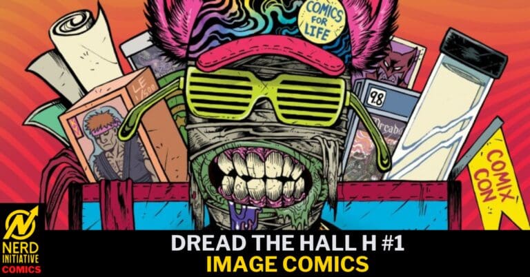
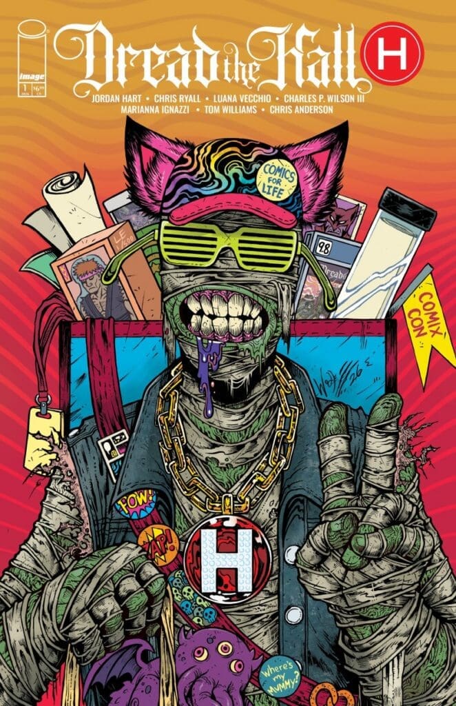
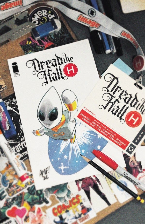
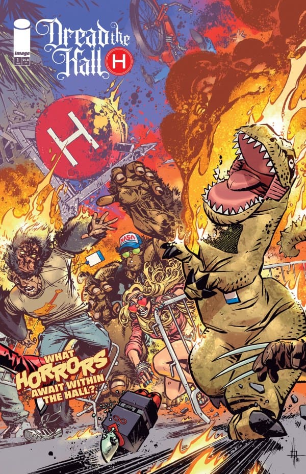
Dread the Hall H #1 Cover from Image Comics.

The Story for ‘Dread the Hall H #1’

‘Dread the Hall H’ from Image Comics has four short stories, some fake ads, and a game to pass the time while in line at a con. The first story kicks off with a hero I truly wish was real. She rights every comic con wrong, while still finding time to host a panel. We also see what happens to the non-exclusive toys who feel more forgotten than Wheezy in ‘Toy Story 2.’ However, this is not very Pixar-friendly. After an unexpected cosplay turn-into-reality panel, we come full circle with our last story. A story from the perspective of a couple of comic convention fans.

Every story had me laughing aloud and truly made me nostalgic for the last con I was at. No matter if you’ve only attended your local con or if you’re a regular at San Diego or New York, you’ll find something in ‘Dread the Hall H’ that will make you laugh and Leonardo DiCaprio point at.

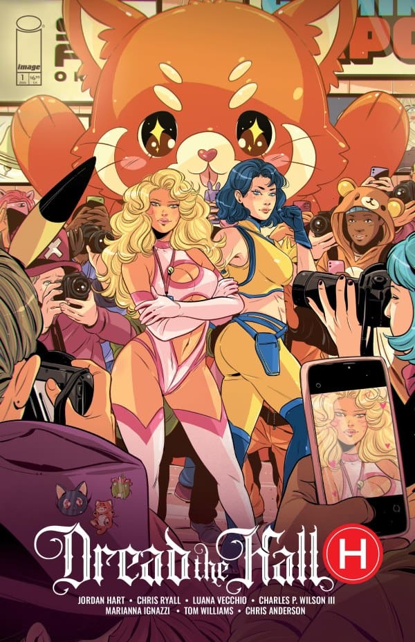
Dread the Hall H #1 Variant Cover from Image Comics.

The Art

Throughout the four different stories, the ads, and the game, we got a variety of amazing art. The ads had an old-school feel that made you think the pages must feel like a newspaper. While the stories had a more current feel. However, they were all absolutely beautiful and filled with so many nods to different fandoms and events we’ve come to expect at cons. This is without a doubt one of those comics that you must take as much time reading the words as you do taking in the art. Otherwise you’ll miss a ton.

A moment in the art that stood out for me was the expressions on our ‘non-exclusive’ toy. They were adorable, hilarious, and vengeful. Make sure to keep an eye out as he pops up in more than one story.

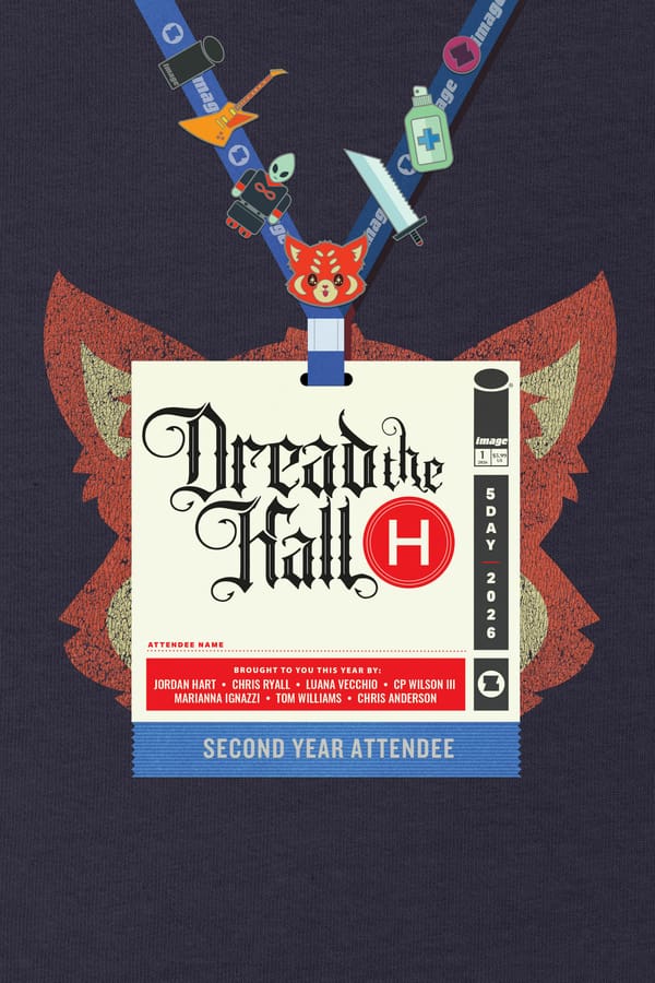
Dread the Hall H #1 Variant Cover from Image Comics.

Final Thoughts

Every story had me wishing I was packing my bags for San Diego right now, but also got me excited for whatever convention I may find myself at next. Any con lover will without a doubt find something to relate to and laugh at in ‘DREAD the Hall H.’ It can also be educational, as I learned there’s a term for that weird hangover that always seems to show up at some point during every con.

Overall Grade: 10/10

If attending San Diego Comic Con this weekend, this comic is the perfect companion for in line entertainment. Have fun, make good choices, and wear deodorant!

Check out more reviews from Lauren.

Are you excited for SDCC? Will you be there, or will you be watching from home?

Leave a Reply

This site uses Akismet to reduce spam. Learn how your comment data is processed.

UNIVERSAL MONSTERS: BLOOD OF THE WOLFMAN #2: Fever Dreams.

Adam begins to remember bits and pieces of his past as his father fights to protect him from what truly happened to his mother and brother. Meanwhile, the cops begin to close in as the mystery of what happened at the college party can only stay hidden for so long.

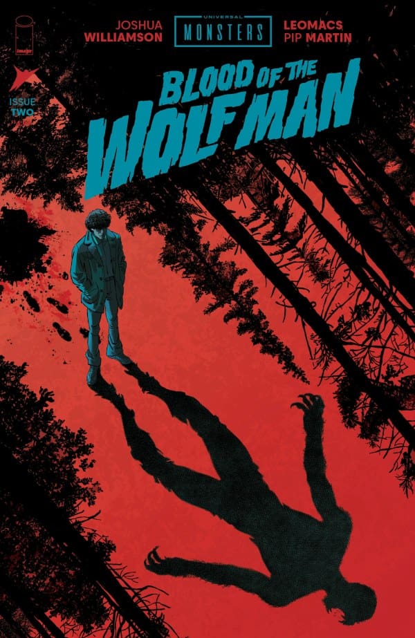
Universal Monsters: Blood of the Wolfman #2. Credit: Skybound Entertainment/Image Comics. Cover by Leomacs.

Creative Team: Joshua Williamson, Leomacs, and Pip Martin.

The Story:

Joshua does an incredible job of making us think we know the truth while also planting seeds of doubt within this issue. While Adam is certain he killed those people and knows what happened, Williamson flashes to his past, which causes me to stop and question myself. We’re also offered bits and pieces as to what the truth is surrounding the death of Adam’s mother and brother, which deepens the mystery of this book. A good horror novel plays on your conscious and subconscious, which I think the plot in this second issue does a wonderful job of doing. I keep expecting there to be a bit of a big twist on the next page, and the more this anticipation builds, the more hooked I get with this run.

The Art:

I’m continuing to love the grainy vibe and detailing that both Leomacs and Martin deliver. Certain scenes where the wolves are chasing Adam and all we see are their mysterious glowing eyes sent chills down my spine. There’s a page where Adam is reading a book as he digs for clues that blew me away with how fine the detail was in the art. Adam’s thumb is over the page, but the little tiny lines and the way they make the book feel old and lost to time were so well captured. This issue may not be a bloody affair like the first but, it’s better as the shadowing and shading allow our imaginations to wander off.

Final Thoughts:

Universal Pictures: Blood of the Wolf Man #3 begins to play with our minds, going back and forth between what Adam believes and a version of the past. I love that this begins to go into psychological horror as any good werewolf story should, as I am gripping the pages and fully hooked on this run.

Overall Grade: 9.5/10

Let us know how you feel about this issue and check out more reviews by Matt!

Leave a Reply

This site uses Akismet to reduce spam. Learn how your comment data is processed.


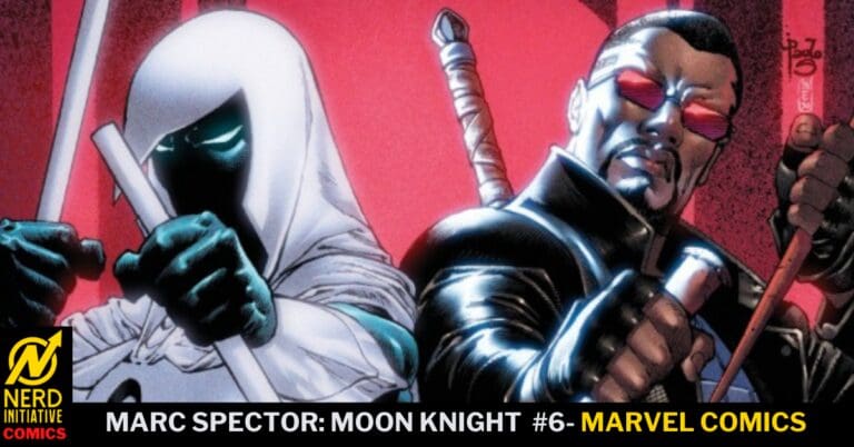
Marc Spector: Moon Knight #6 – Sons and Daughters, Devils and Daywalkers

The Midnight Sons are back…..and there’s hell to pay. Marc Spector, having seen his friends devoured by a ravenous house, charged into the house. Desperate to defeat the Mansion Ravenous and save his friends, his world turns upside down when the house promises Moon Knight’s soul-stealing sword, Ginnarr, the one thing it truly wants, to become a dragon. Betrayed by Ginnarr, Moon Knight escaped the house alive and sought the help of Clea Strange. Clea’s advice? Bring back the Midnight Sons. First on the list? Ghost Rider….

This review is brought to you by Nerd Initiative’s Megan and Shawn!

Creative Team

Writer: Jed MacKay
Artist: Dev Pramanik
Color Artist: Rachel Rosenberg
Letterer: Cory Petit
Cover Artist: Paulo Siqueira
Cover Color Artist: Yen Nitro

Writing

Megan: If the Midnight Sons are ever brought up, just know I am there without hesitation. In Marc Spector: Moon Knight #5, Clea tells Moon Knight that he needs to reestablish the Midnight Sons to save his family. Then, in this current issue, the sixth one, we see exactly that. We get to see Moon Knight ask each potential member to join the Midnight Sons, and there are quite a few dynamics at play here. Different dynamics for different characters are created from their history in the comics. There are so many great references on every page for each character and their history.

For example, Blade was asked to join, and in an instant, he said yes. According to him, if the Midnight Sons ever come calling, he’ll say yes immediately. The dynamic between Marc and Blade is easy; however, the dynamic between Clea and Blade feels fragile ever since Blade’s past actions during the Blood Hunt. I’m very interested to see how this new team works, especially since these heavy hitters are some of my personal favorites.

Shawn: I knew going in I was going to love this issue, and it did not disappoint. I’ve been on pins and needles since the last issue when Clea suggested reforming the Midnight Sons. I loved that right out of the gate, MacKay went into a Donny Cates reference from the Damnation storyline. MacKay uses Clea to beautifully lay out the purpose of the Midnight Sons in a way that has rarely been articulated in comics. I love MacKay reminding us that, unlike The Avengers (whom MacKay just finished writing) or the X-Men (who he currently writes), the Midnight Sons are not a team.

One of the things that I’ve continued to enjoy about MacKay’s time on Moon Knight is that, no matter the storyline, he never loses track of the ridiculous sense of humor hidden under the mask. Assembling a team where four out of the five actively dislike him, as Marc says, is a wild idea. Whether counting himself among those who actively dislike him, admitting he doesn’t even know Robbie Reyes’ real name, or picking some unique ways to get Blade’s attention, MacKay perfectly captures Marc’s sense of humor.

Art

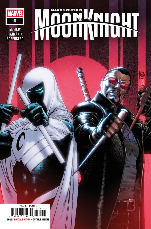
Marc Spector: Moon Knight #6 cover by Paulo Siqueira and Yen Nitro. Image from Marvel Comics

Megan: Dev Pramanik, Rachel Rosenberg, and Cory Petit are at it again, and when I say that, I mean completely slaying another issue. Marc Spector: Moon Knight #6 provides quite a few different characters, all of whom come with their own signature style. Each one brings their own energy to the team, and Pramanik and Rosenberg make that very clear. Blade brings a level of energy that just can’t be replicated with his classic red and black leather look, with the vibrant backgrounds to contrast with. Each character gets put on full display, never watering down the others around them.

Shawn: There’s aura farming, and then there’s what Dev Pramanik does in Blade’s first panel in this issue. Blade’s first appearance in Marc Spector: Moon Knight #6 can’t be considered anything other than a thing of beauty. As much as I have loved this series narrative, what keeps me coming back issue to issue more than anything is the way Dev continues to push himself and his art to new experiential and unique heights in every issue.

On top of Dev’s penchant for one-upping himself, he’s paired with Rachelle Rosenberg, which, as I’ve said before, marks what may be the best artist/color artist pairing in comic books right now. Rosenberg shines on any issue she works on (seriously check out Wonder Man if you’ve been sleeping on it), but the cosmic glow and aura of Moon Knight is bread and butter for her. She expands on that in Marc Spector: Moon Knight #6 and brings some of that aura to Blade as well. Cory Petit beautifully handles the unique panel layouts and wild story, helping readers move seamlessly along as Marc tries to reform the Midnight Sons.

Final Thoughts

Megan: 10/10. In a very “getting the band together” way, we are introduced to each member of the Midnight Sons. Jed MacKay and the artists set up what looks to be an exciting and explosive time all around!

Shawn: 10/10. How does every issue of this series continue to get better? The story is perfect, and the art team is one of, if not the best, pairings in comics right now. This issue has everything.

Overall Grade: 10/10

What did you think about Blade showing up? Let us know in the comments

Leave a Reply

This site uses Akismet to reduce spam. Learn how your comment data is processed.

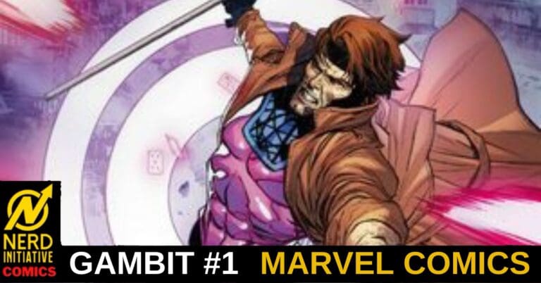
GAMBIT: WANTED #1 – A Cold Welcome Home

Creative Team – Chris Claremont, Robert Gill, Bryan Valenza, VC’s Ariana Maher

Published by Marvel Comics

MORE FROM NERD INITIATIVE HERE!

Story

This review is brought to you by Nerd Initiative’s Megan and Matt!

Megan – Finally, we get a Gambit run! After all the excitement of everything that’s come out in the From the Ashes era, Gambit has been along for the ride every step of the way. And now, we get to focus on him and his story.

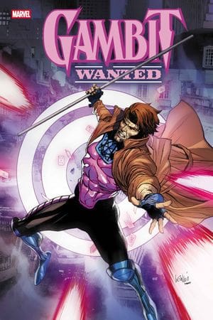
Cover art by Leinil Francis Yu and Romulo Fajardo Jr. Published by Marvel Comics

In Gambit #1, we are taken back in time to when a young Ororo Munroe and Gambit were thick as thieves. Ororo was a part of the X-Men and asked Gambit to join along with her. Unfortunately, Gambit wasn’t into the idea, so he left back home to New Orleans. While there, he gets word that his sister, Elodie, is in trouble. Taking action, Gambit does the right thing and goes to save her, but that makes him a target of someone who will pay anything to have him captured. Unfortunately for Gambit, they hire someone who will stop at nothing until he gets what he wants.

Matt – I can say I never really have had one mutant or X-Men character that I have loved; however, Claremont may have helped me find that in Gambit. Seeing him look after Ororo, and not only that, but all of the kids in New Orleans, shows his true character. He is the big brother and the protector; it has always been in his DNA. Diving into his past and the various ways Gambit has lived off the streets through gambling or other means is beautiful and highlights that not every hero has a glorious past. Some unexpected characters show up in this, and the way Gambit takes the fight to them is nothing short of incredible!

The Art

Megan – The artwork is wonderfully handled by Robert Gill, Bryan Valenza, and Ariana Maher. Gambit #1 has the vibes of the New Orleans life that Gambit lives, and Gill perfectly captured that. Showing the parties in the streets of the city, the different masks and looks of the characters, and the energy of the linework, you can feel yourself getting lost in the energy of New Orleans. Valenza handles the colors and leans into the warmer colors, which sets the tone of the story really well. Ariana Maher captures the voice of Gambit perfectly, and along with some great uses of sound effects, creates a great flow of dialogue throughout the comic.

Matt – Gill, Valenza, and Maher make this issue an artistic feast for our eyes. Taking place during Mardi Gras, mainly in New Orleans, there is a lot of culture shown throughout the panels. We get to see the parade and the parties and then even get the sense of grime that lines the streets there as well. It’s what makes New Orleans special and gives it personality, which the team captures perfectly. Maher gives Gambit an almost somber or gravelly voice with the lettering as he narrates the issue. The final page and the look in the eyes of a certain character pierce straight into our souls, and I truly am beyond excited for this mash-up of action and abilities.

Final Thoughts

Megan – 10/10. Gambit is one of my all-time favorite mutants, and I’ll take whatever I can get of him. That said, Chris Claremont gives a great story, taking us back in time in Gambit’s life. The artwork was fantastic, putting you in the New Orleans headspace. All in all, X-cellent work all around!

Matt -10/10 easily. I am completely sold on this run from the jump. The way the team brings so much culture and personality to the setting in New Orleans and takes us into Gambit’s past was excellent. The art and letters are vibrant and the action is smooth and this is shaping up to be a stacked deck of a run!

Overall Grade – 10/10

Let us know in the comments what you thought of Gambit #1!

Leave a Reply

This site uses Akismet to reduce spam. Learn how your comment data is processed.

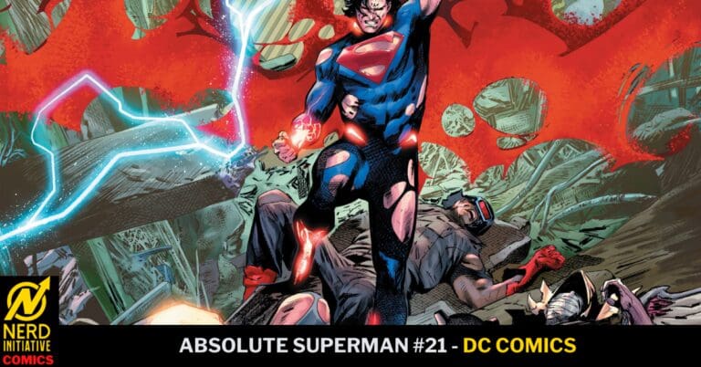
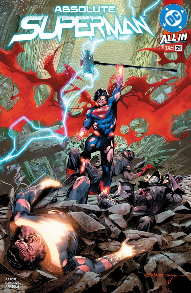
ABSOLUTE SUPERMAN #21: The Final Wishes of Superman.

The heated battle between Teth Adam and Kal-El for Earth comes to a head as Superman delivers his final wishes and takes the fight into space!

Absolute Superman #21. Credit DC Comics. Cover by Rafa Sandoval and Ulises Arreola.

Creative Team: Jason Aaron, Rafa Sandoval, Ulises Arreola, Zander Cannon, and Becca Carey.

The Story:

Jason Aaron truly makes this issue feel like a culmination of a massive event that will shake the foundations of not only Superman but the whole universe. There is so much anger, desperation, and will among these characters that it elevates the stakes. Kal-El continues to mold and shape himself into the hero of Earth, and we see it not by the way he fights but by the things he does when nobody is looking. Jason gives us a glimpse into this when discussing his last wishes to Jimmy and Lois, telling them who and what to look after should he fail. It’s such a powerful bit of exposition and almost feels like a final goodbye. I appreciate that he allows the fight sequences to breathe while still offering minor narratives showcasing the differing ideologies that Adam and Kal-El have. As this arc ends, I am beyond excited to see what happens next on Superman’s hero’s journey.

The Art:

First and foremost, this cover is every ounce of beautiful and eye-popping as they come, and yet it doesn’t compare to how insanely gorgeous the inside artwork is. What stood out to me most was how Zander’s breakdowns and the SFX of the punches and collisions were all colored a different way, allowing for them to leap out at you while feeling as though they are their own character. Despite taking the fight into space, Rafa and Ulises manage to fill the panels with immense detail and coloring, with jolts of lightning and the detailed wounds each fighter carries as the fight rages on. Becca’s lettering aids in making this feel like a spectacle and never once makes us feel as though the art suffers an ounce.

Final Thoughts:

Absolute Superman #21 feels like a true spectacle and lives up to the hype in every way as this arc comes to. a close. There is so much violence, emotion, and power packed into these pages that it may, in fact, be my favorite issue of the run yet.

Overall Grade: 10/10

Let us know how you feel about this issue and check out more reviews by Matt!

Leave a Reply

This site uses Akismet to reduce spam. Learn how your comment data is processed.


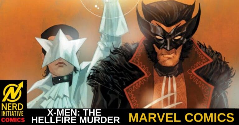
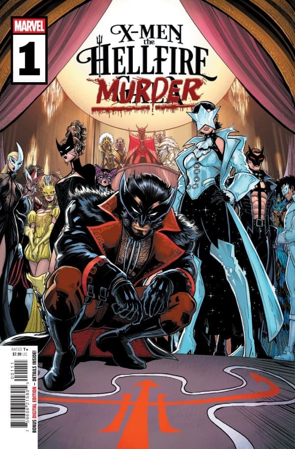
X-MEN: THE HELLFIRE MURDER #1 – A Party Like No Other

Creative Team – Saladin Ahmed & Joëlle Jones(pages 1-3, 7, 8, 13, 50), Gail Simone & Luciano Vecchio(pages 4, 5, 34, 35, 47), Erica Schultz & Aaron Kuder(pages 6, 11, 12, 16, 17), Jed MacKay, Tony S. Daniel & Mark Morales(pages 9, 10, 19, 20, 33), Eve L. Ewing & Federica Mancin(pages 14, 15, 26, 27, 48), Saladin Ahmed & Federica Mancin(pages 18, 21-25, 28-32), Saladin Ahmed, Cory Smith, & Oren Junior(pages 36-46, 49), Fer sifuentes-Sujo, VC’s Ariana Maher

Published by Marvel Comics

MORE FROM NERD INITIATIVE HERE!

The Story

This comic review is brought to you by the dynamic duo of Megan and Shawn!

Shawn – This was a fun take on the traditional Hellfire Gala. I didn’t really know what to expect going into this story, but man, what a unique ending. The best part of the writing for me was how each writer was able to feed off of each other. Despite the story trading hands almost every two pages, the story flowed together beautifully.

Speaking of beautiful, I love that the Hellfire event has become a chance for Idie and Val to rekindle their romance. It’s become a beautiful, almost running gag now. Additionally, Gambit’s solution to make Rogue soup to keep her happy is so hopelessly Gambit, and I loved it.

Cover art by Luciano Vecchio and Edgar Delgado. Published by Marvel Comics

Megan – Continuing the tradition of the Hellfire Saga, X-Men: The Hellfire Murder #1 brings enthusiasm, drama, and action, but this time, it also brings murder. With the energy of a murder mystery party, the story starts pretty innocently. Sebastian Shaw is fresh out of Graymalkin Prison and is looking to throw a shindig. He invites the mutants of the world, including the X-Men from Louisiana and Alaska, Emma Frost, Kitty Pryde, Joseph and Astra of 3K, and many more heavy hitters. Everyone there is skeptical, and everyone seems to have their own agenda. All is going well until the news strikes; there’s been a murder. Not knowing where to turn or who to blame, the mutants have to scramble to find the killer and find the reason for the murder.

X-Men: The Hellfire Murder is a full-course meal that leaves nothing out of the story. There’s the mystery of it all, there’s a sexiness to the story that comes hand in hand with the past Hellfire Galas, and there’s the raised emotions as no mutant can trust the other. With an all-star writing team such as Saladin Ahmed, Eve L. Ewing, Gail Simone, Jed MacKay, and Erica Schultz, there was no going wrong here. This was a home run straight out of the park.

The Art

Shawn – What an absolute rockstar list of artists on this issue. Like the writing, the art flowed well from artist to artist while retaining distinct characteristics of each artist. The Hellfire Masquerade costumes were beautifully designed and perfectly colored, with Kitty Pryde’s and Idie’s being my favorite of the bunch. The colors were perfect in every panel.

I really loved the dramatic art shift in the postlogue of the story. It was not only beautifully colored but also a beautiful stylistic shift from the rest of the story that set it apart in unique ways. The artists in this issue, using a variety of panel shapes and styles, also added to the uniqueness and impact of the story. Ariana Maher is the thread that ties everything together and ensures a consistent story across the artists and writers.

MeganX-Men: The Hellfire Murder #1 is filled with the work of some extraordinarily talented people. Joëlle Jones, Luciano Vecchio, Aaron Kuder, Tony S. Daniel, Mark Morales, Federica Mancin, Cory Smith, Oren Junior, Fer Sifuentes-Sujo, and Ariana Maher all put so much into their parts of the artwork that all led up to a very memorable event. There’s a signature uniqueness to the work of each artist that I loved seeing shine brightly in the comic. The drawings of the comic were beautifully detailed down to the last feather. The colors were dramatic and bold, which added to the energy of the gala. The lettering, done by Ariana Maher, captured the style of each mutant perfectly. Together, the artists really put their talents on full display.

Final Thoughts

Shawn – 10/10. Another outstanding issue in the Hellfire Saga, which in some ways seems to set the stage for what comes next. I’m excited to see where we go from here. Nothing to change about this story. Every line written, colored, or drawn was perfect.

Megan – 10/10. I’m a huge fan of the past Hellfire Galas, and this one exceeded my already high expectations. X-Men: The Hellfire Murder brings excitement, allure, and mystery to the history of the X-Men Galas in a huge way.

Overall Grade – 10/10

Let us know in the comments what you thought of X-Men: The Hellfire Murder!

Leave a Reply

This site uses Akismet to reduce spam. Learn how your comment data is processed.

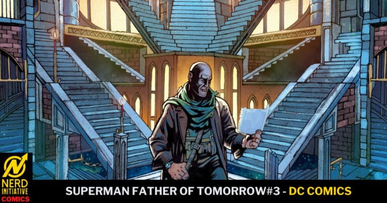
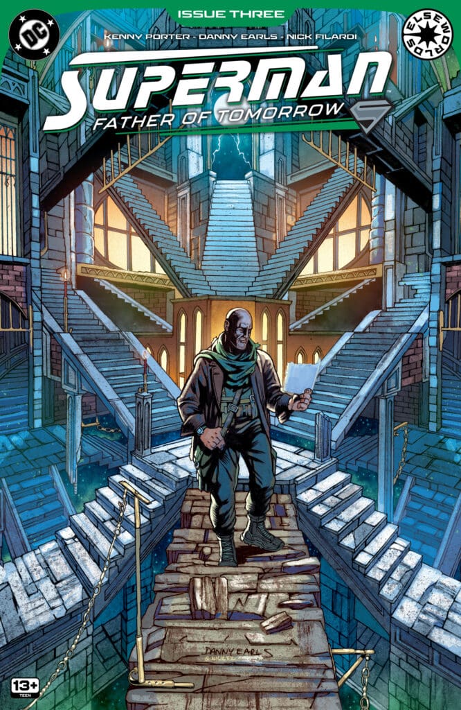
SUPERMAN FATHER OF TOMORROW #3: Peace Is Not an Option.

The more Jor-El tries to share his technology, the more Earth insists on turning it into weapons to be used against one another. As frustrations mount for Superman, Lex Luthor has something sinister up his sleeve that promises to threaten everything Jor-El has worked hard to prevent.

Superman Father of Tomorrow #3. Credit DC Comics. Cover by Nick Filardi and Danny Earls.

Creative Team: Kenny Porter, Danny Earls, Nick Filardi, and Lucas Gattoni.

The Story:

WOW! Kenny goes all out with this issue which is jam-packed full of surprise appearances. You can truly feel the weight of what Superman is carrying as he wants nothing more than to save Earth and prevent what happened to Krypton from happening to them. However, Porter raises good points in that is Jor-El so bent on simply fixing what he could not in his past rather than having Earth’s intentions true at heart? Lex is continuing to be crafted as an absolute menace with this issue, as his journey of revenge has taken him to Doctor Fate and some other of our friends from the magical side of things. It’s an issue full of surprises and has cemented for me how incredible this story truly is. You never know who or what may appear on the next panel. The ending will hit like a freight train as this issue truly has it all.

The Art:

The first thing I want to mention is how beautiful the coloring is by Nick. When we see familiar characters, there’s a depth to the greens and purples that are used. Danny details familiar designs with a flair of freshness, as there are quite a few surprise appearances that, when you see them, will have the excitement levels off the charts. The final few pages stand out stunningly as one is littered with destruction and pain in Superman’s eyes before getting a taste of what is on the horizon. Lucas’s lettering pulls all of the pain and frustration Superman has out from the panels, allowing us to truly feel what he struggles with.

Final Thoughts:

If you’re not reading Superman Father of Tomorrow, change that immediately! This issue takes the series to a whole new level, setting up a troubled future and hitting us with surprise after surprise.

Overall Grade: 10/10

Let us know how you feel about this issue and check out more reviews by Matt!

Leave a Reply

This site uses Akismet to reduce spam. Learn how your comment data is processed.


Masterpiece On PBS And The BBC Announce The Portrait Of A Lady TV Series

0

Masterpiece On PBS and The BBC have announced a new series based off of a classic novel. 

MORE FROM NI’S STREAM TEAM HERE 

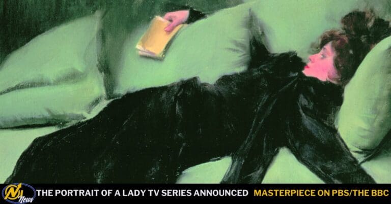
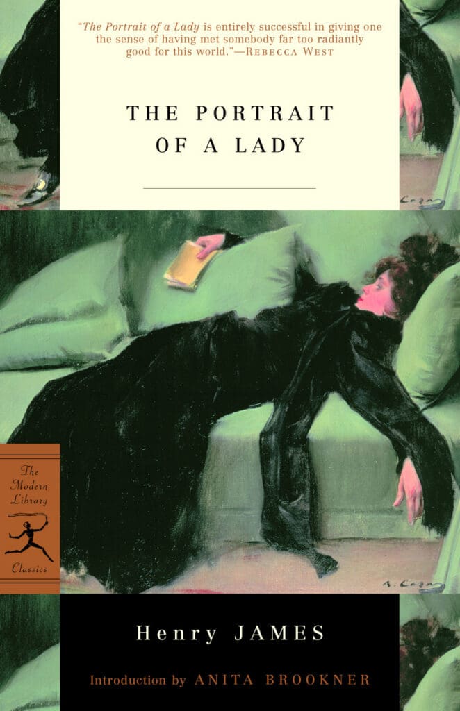
The Portrait Of A Lady Book Cover (Credit: Penguin Random House)

PBS’ Masterpiece and The BBC have ordered a co-commissioned series of Henry James’ classic novel, The Portrait Of A Lady. This series will be executive produced by BAFTA Award Winners Stephen Woolley and Elizabeth Karlsen for Number 9 Films TV in partnership with German-based Beta Film GmbH and Fox Entertainment Global. Meanwhile, Richard Tulk-Hart is the show’s Co-Executive Producer, and Rhonda Smith is the series producer. Rebecca Lenkiewicz will be adapting the book for the series, while Aisling Walsh will be directing.  

The show’s cast was also announced, and if you are a fan of British TV or Powerhouse Cinema, then you will recognize the cast. The show’s all-star talented cast includes:

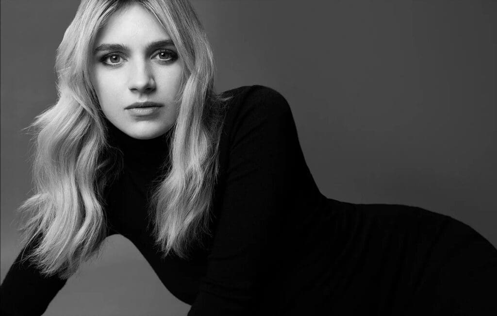
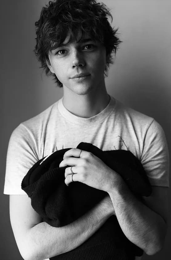
  • Nell Tiger Free (The First Omen & Servant) As Isabel Archer 
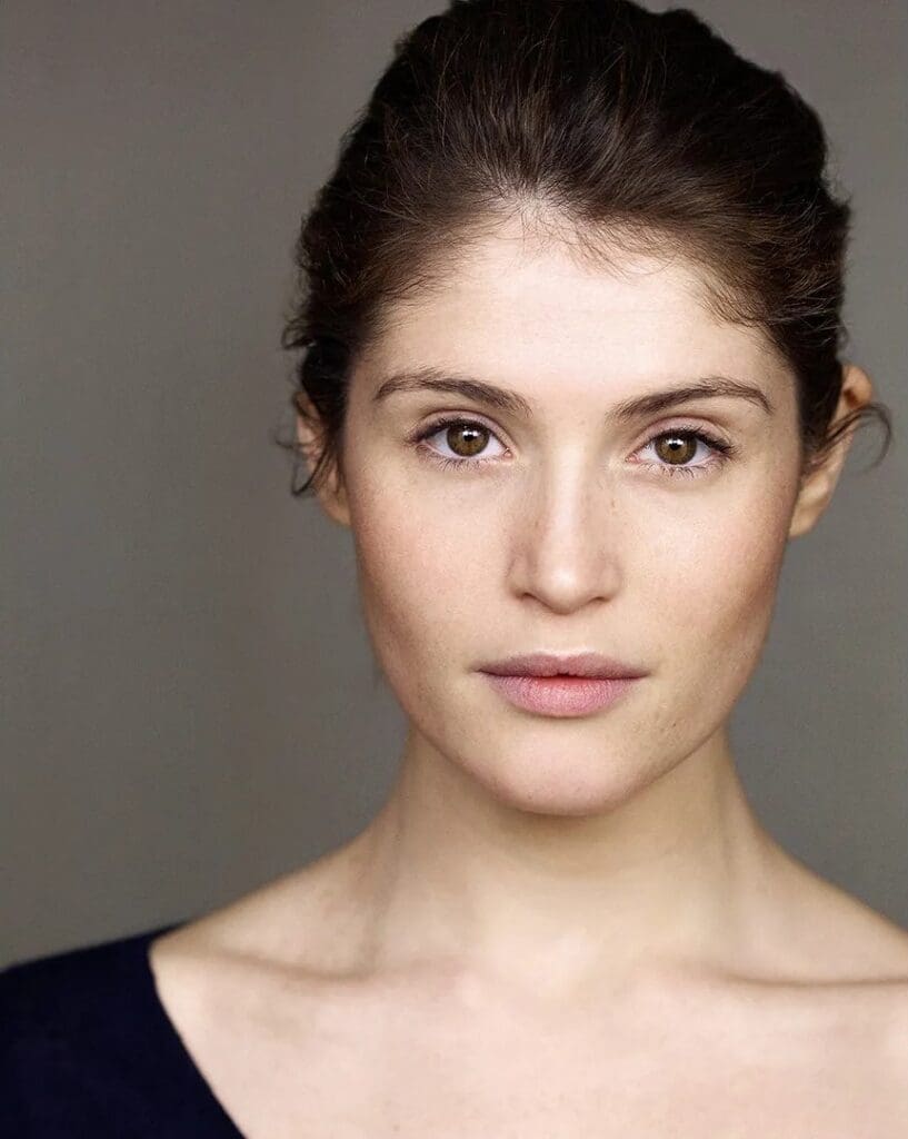
  • Gemma Arterton (Secret Service & Their Finest) As Madame Merle 
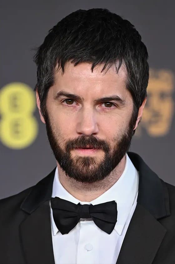
  • Jim Sturgess (Mix Tape & One Day) As Gilbert Osmond 
  • Oscar-Nominee And BAFTA Winner Bill Nighy (Joy & Living) As Mr. Touchett 
  • Oscar-Nominee And BAFTA Winner Miranda Richardson (The Last Anniversary & Harry Potter And The Goblet Of Fire) As Mrs. Touchett 
  • Jack Wolfe (Shadow and Bone & Ancestors) As Ralph Touchett 
  • Calypso Cragg (An American in Austen & Switch) As Pansy Osmond 
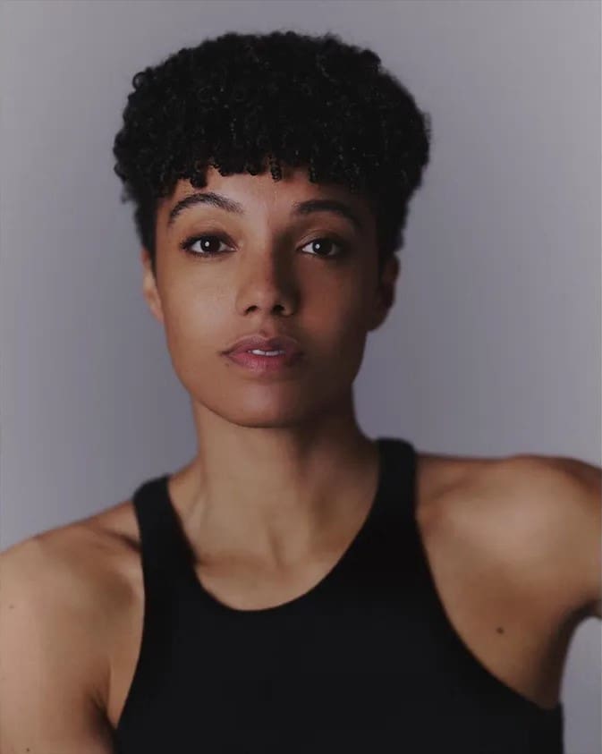
  • Maisie Richardson-Sellers (Nine Perfect Strangers & Insidious: Out Of The Further) As Henrietta Stackpole 
  • Hugh Skinner (Two Weeks in August & Twenty Twenty Six) As Lord Warburton 
  • Hamish Frew (Dear England & The Girlfriend) As Casper Goodwood 
  • Thomas Coombes (The Agency & Legends) As Mr Bantling 
  • Lydia Leonard (A Woman of Substance & Secret Service) As Countess Gemini 
  • Dean-Charles Chapman (1917 & Game Of Thrones) As Edward Rosier

Stephen Woolley and Elizabeth Karlsen had this to say about the new series: 

“We are so pleased to be finally making this Henry James classic, which was far ahead of its time, with our friends at Materpiece and the BBC. It’s wonderful to be reunited with Rebecca Lenkiewicz who we worked closely with on Colette and The Salt Path and to work with Aisling Walsh, whom we’ve admired from afar for many years. 

It’s also wonderful that we can reunite with some of the actors that we know so well from our movies in our first TV show; Bill Nighy, Gemma Arterton, and Miranda Richardson. We’re excited to see Nell Tiger Free in the iconic role of Isabel Archer and Jim Sturgess in the equally iconic role of Gilbert Osmond. We find it astonishing that James’ prescient story has not been made for television for nearly 60 years, but like all great things, it will definitely be worth the wait.” 

Meanwhile, Masterpiece’s Head Of Scripted Content And Executive Producer, Susanne Simpson, mentioned: 

“The caliber of talent behind this series is exceptional. It is a special pleasure to be working with Stephen Woolley and Elizabeth Karlsen, who are remarkable award-winning filmmakers, and with writer Rebecca Lenkiewicz, whose scripts are as beautiful as they are insightful. 

Director Aisling Walsh has brought together a stellar cast led by Nell Tiger Free, Gemma Arterton, and Jim Sturgess. They will all bring the nuance and beauty of Henry James’ story to the screen in an unforgettable piece of television.” 

The BBC’s Head Of Scripted Pre-Buy Acquisitions, Sue Deeks, noted: 

“We are so delighted to be involved in what I have no doubt, given the outstanding talent involved, will be a truly exceptional production of Henry James’ masterpiece.” 

Finally, Fox Entertainment Global’s President, Prentiss Fraser, said: 

“Our collaboration with the BBC, Masterpiece and Number 9 Films TV on The Portrait of a Lady brings together an extraordinary creative team and world-class cast to reimagine one of literature’s most enduring stories for a global audience. It reflects the kind of exceptional premium storytelling we’re building across FOX’s growing portfolio and reinforces our focus on partnering with the industry’s most talented creative voices.” 

The series has commenced filming, and will be filmed across the UK, Hungary & Croatia. The show is due out sometime in 2027 & will premiere on Masterpiece On PBS in the US & Canada, and BBC One & BBC iPlayer in the UK.

  • Portrait of a woman with short curly hair wearing a black tank top, looking at the camera against a neutral gray background.

Leave a Reply

This site uses Akismet to reduce spam. Learn how your comment data is processed.