
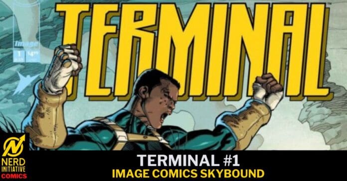
New Universe, Who Dis?
Writer: Robert Kirkman & Joe Casey
Artist: Andy Kubert
Colorist: Dave McCaig
Letterer: Rus Wooten
Cover Artist: Andy Kubert (Cover A)
Terminal #1 is the flagship title of Image/Skybound’s brand new superhero universe in which select humans are genetically activated and serve as soldiers in a war for the fate of the world. Part X-Men, part Team 7, it’s the start of something that feels familiar and, yet, fresh and exciting!
Story
The first issue wastes no time with introductions or back story. Instead, Kirkman and Casey open with blood and violence, give us some mystery to chew on, open hand slap us in the face and leave us asking for another. Both writers are masters of character development and that expertise is evident here. These characters are easy to ingest and parse and I was genuinely invested in each of their personal arcs, a feat rarely achieved with a first appearance. In spite of all of the Sci-Fi and Fantasy elements, the story manages to be relatable and human. The dialogue is natural and motivations are clear even if the point of it all remains a mystery.
This brings me to the very minor problem I have with this issue: I read it and I still have no idea what it really is, beyond being a secret war between two factions of activated super people. That’s expected, though, when it’s just issue #1 and the writers are laying the groundwork for the universe they’re building, but we usually have a full understanding of what the heroes and villains are trying to accomplish by the end of the first issue. Here, it appears Kirkman and Casey are playing the long game, with a storytelling structure reminiscent of TV series like Breaking Bad and Halt and Catch Fire where you don’t really know what the heck is coming but it doesn’t matter because what we’re being given on the way is so damned good! Pacing is a bit erratic, but just a bit and I also attribute that to this being an introductory issue with no prior context. They had a lot to squeeze into the launch and I’m guessing some things that were more connective than informative were cut.
Art
So if you’re reading this, you probably, at least, like comic books. If you like comic books, you have, at least, heard of the Kubert family. Joe Kubert was an iconic trailblazer known primarily for his work on Sgt Rock. His son’s Adam and Andy inherited the art gene and became icons in their own rights. Andy was always my favorite of the clan and I was pumped when I saw he was the artist on this title! The action scenes are phenomenal! Clear, kinetic and full of informative detail that my eyes just gobbled up and fed to my brain.
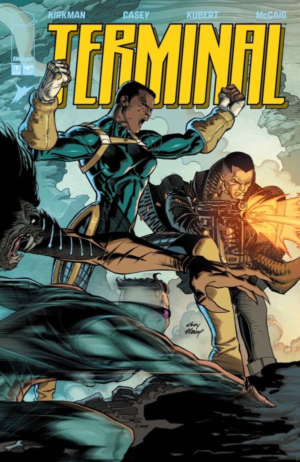
His dialogue scenes convey emotion with ease. You never have to work to understand what a character is feeling at any given moment. And in true Andy Kubert fashion, everything is dynamic and makes excellent use of black to inform shape. No notes. Dave McCaig’s colors are perfect for a book like this. Light and shadow play a major role in this issue, at least, and McCaig’s understanding of how light affects saturation is impressive! It’s apparent that a lot of work went into coloring this and McCaig should take a bow and be recognized because if he makes a run like this, it’s going to be award winning work!
Final Thoughts
Kirkman and Casey deliver an intriguing start to the Terminal Universe (my unofficial name for it). It’s a great setup issue that introduces some really cool characters who feel more like people than plot devices. Kubert and McCaig are electric and really give this book some juice! There are plenty of twists and turns and shocks and even a bit of heartbreak, creating a wild ride that is worth the price of admission and will leave you counting the days for the next installment. But some issues with pacing coupled with, what I assume to be, intentional ambiguity, makes it difficult to call the book perfect.

Leave a Reply